Preface and Thanks
I am a .NET programmer, but a busy one, I do VB .NET and C#, ASP.NET / WinForms / WPF / WCF Flash Silverlight, the lot. Basically, I keep my toe in. But when I started writing this article series, I naturally chose my favourite language (which happens to be C#). I since got an email from an individual who requested that I publish this series with source code in VB.NET and C#. I simply stated I didn't have time. So this individual (Robert Ranck) volunteered to help out and do the translation to VB.NET based on my original C# projects
So for that and the subsequent VB.NET projects that you will find here, I ask you to thank Robert Ranck. Cheers Robert, your contributions will surely make this series more open to all .NET developers.
And another thanks goes out to Karl Shifflett (A.K.A. the blog/article machine, also known as the Molenator) for answering my dumb VB.NET questions. And I'd also like to mention that Karl has just started a more advanced series of WPF articles (which at present will be in VB.NET, but will hopefully appear in C# as well). Karl's new series will be excellent and I urge you all to encourage Karl on this series. It is not easy obligating oneself to write an entire series in one language let alone two. Karl's first article is located right here, and he has also published part 2 now; go have a look for yourself. Personally I love them.
Introduction
This article is the sixth in my series of beginner's articles for WPF. In this article, we will discuss Styles/Templates. The proposed schedule for this series has been as follows:
In this article, I'm aiming to cover a brief introduction into the following:
I will not be covering the usage on animations within Styles/Templates. Josh Smith has an excellent usage of animations within a Style, within this article. There is also a good MSDN article about this right here should you want to do that.
What is This Article all About
If you are reading this and have ever tried to create an owner drawn tab/customised a button (you know, override the OnPaint() and OnPaintBackGround()), then you will probably know that creating custom controls that look different to the standard controls is do-able but just not that much fun.
I've done a fair amount of WinForms custom/user controls, and I have no love for all that method overriding and mouse handling, and have often thought that there must be a better way.
WPF addressed all of this, by creating two UI design pillars, one called styles and one called templating. This article covers both of these within a WPF environment.
What are Styles
Overview
Simply put, Styles allow a WPF developer to maintain a common list of property values within a convenient place to store all these property values. It is somewhat similar to how CSS works within web based development. Typically, Styles will be maintained within a Resource section or a separate Resource dictionary. It is also by using Styles that WPF is able to cater for theme-aware controls. There is an excellent post in Chaz's blog about how to do this.
In this article, I don't want to get too bogged down in how to create themes, I just want to cover the basics, so I'm going to show you a few things that are available within a Style, but after that, I shall be concentrating on the main areas of Styles that you will use most often.
For a Style, the following properties are available
| Name | Description |
|---|
BasedOn | Gets or sets a defined style that is the basis of the current style. |
Dispatcher | Gets the Dispatcher this DispatcherObject is associated with. (Inherited from DispatcherObject.) |
IsSealed | Gets a value that indicates whether the style is read-only and cannot be changed. |
Resources | Gets or sets the collection of resources that can be used within the scope of this style. |
TargetType | Gets or sets the type for which this style is intended. |
Setters | Gets a collection of Setter and EventSetter objects. |
Triggers | Gets a collection of TriggerBase objects that apply property values based on specified conditions. |
Out of these, by far the most important properties are:
BasedOnTargetTypeSettersTriggers
So I think it's worth having a quick look into each of these bits on syntax.
BasedOn
This is like inheritance, where one Style inherits common properties from another Style. Each Style only supports one BasedOn value. Here is a small example:
<Style x:Key="Style1">
...
</Style>

<Style x:Key="Style2" BasedOn="{StaticResource Style1}">
...
</Style>
TargetType
The target type property is used to limit which controls may use a particular style. For example, if we had a Style with a TargetType property set to Button, this Style could not be used against a TextBox type control.
Setting a valid TargetType property is as simple as follows:
<Style TargetType="{x:Type Button}">
....
</Style>
Setters
Setters are simply things really. They simply set an event or a property to some value. In the case of setting an event, they wire up an event. In the case of setting a property, they set a property to a value.
EventSetters for events would be something like this, where a Styled Button's Click event is getting wired up.
<Style TargetType="{x:Type Button}">
    <EventSetter Event="Click" Handler="b1SetColor"/>
</Style>
However, typically Setters are simply used to set a property to a value. Maybe something like this:
<Style TargetType="{x:Type Button}">
    <Setter Property="BackGround" Value="Yellow"/>
</Style>
Property Element Syntax
There are also occasions where you don't want the value to be a single value, but rather a complex chunk of XAML comprising of many elements. In order to do this, XAML allows developers to use the Property Element syntax. The most likely place you will see this in Styles is within a Template Setter. Something like the following:
<Style x:Key="TabItemStyle1" TargetType="{x:Type TabItem}">
<Setter Property="FocusVisualStyle" Value="{StaticResource TabItemFocusVisual}"/>
<Setter Property="Foreground" Value="Black"/>
<Setter Property="Padding" Value="6,1,6,1"/>
<Setter Property="BorderBrush" Value="{StaticResource TabControlNormalBorderBrush}"/>
<Setter Property="Background" Value="{StaticResource ButtonNormalBackground}"/>
<Setter Property="HorizontalContentAlignment" Value="Stretch"/>
<Setter Property="VerticalContentAlignment" Value="Stretch"/>
<Setter Property="Template">
<Setter.Value>
<ControlTemplate TargetType="{x:Type TabItem}">
<Grid SnapsToDevicePixels="true" Margin="0,5,0,0">
.....
.....
.....
</Grid>
</ControlTemplate>
</Setter.Value>
</Setter>
</Style>
The important part here is the part where the Setter is split over several lines, by using the property value syntax.
<Setter Property="Template">
      <Setter.Value>
       .....
       .....
       .....
    </Setter.Value>
</Setter>
Triggers
The WPF styling and templating model enables you to specify Triggers within your Style. Essentially, Triggers are objects that enable you to apply changes when certain conditions (such as when a certain property value becomes true, or when an event occurs) are satisfied.
The following example shows a named Style available to Button controls. The Style defines a Trigger element that changes the Foreground property of a Button when the IsPressed property is true.
<Style x:Key="Triggers" TargetType="Button">
    <Style.Triggers>
        <Trigger Property="IsPressed" Value="true">
        <Setter Property = "Foreground" Value="Green"/>
        </Trigger>
    </Style.Triggers>
</Style>
There are some more types of Triggers that may be used in Styles.
DataTriggers
Represents a Trigger that applies property values or performs actions when the bound data meets a specified condition.
The DataTrigger is specified such that if the State of the Place data item is "WA", then the foreground of the corresponding ListBoxItem is set to Red.
<Style TargetType="ListBoxItem">
    <Style.Triggers>
      <DataTrigger Binding="{Binding Path=State}" Value="WA">
        <Setter Property="Foreground" Value="Red" />
      </DataTrigger>
    </Style.Triggers>
</Style>
There is also a special type of Trigger which uses more than one value for its conditional test. This is known as a multi-trigger. And all this does is use several conditions within a single MultiDataTrigger. Here is an example:
<Style TargetType="ListBoxItem">
    <Style.Triggers>
      <MultiDataTrigger>
        <MultiDataTrigger.Conditions>
          <Condition Binding="{Binding Path=Name}" Value="Portland" />
          <Condition Binding="{Binding Path=State}" Value="OR" />
        </MultiDataTrigger.Conditions>
        <Setter Property="Background" Value="Cyan" />
      </MultiDataTrigger>
    </Style.Triggers>
</Style>
In this example, the bound object must have Name="Portland" and State="OR", then the foreground of the corresponding ListBoxItem is set to Red.
EventTriggers
Are special Triggers which represents a Trigger that applies a set of actions in response to an event. These Eventriggers are strange in that they only allow animations to be triggered. They do not allow normal properties to be set based, that is what the normal Triggers are for. An example Eventrigger may be something like the following:
<EventTrigger RoutedEvent="Mouse.MouseEnter">
  <EventTrigger.Actions>
    <BeginStoryboard>
      <Storyboard>
        <DoubleAnimation
          Duration="0:0:0.2"
          Storyboard.TargetProperty="MaxHeight"
          To="90"  />
      </Storyboard>
    </BeginStoryboard>
  </EventTrigger.Actions>
</EventTrigger>
<EventTrigger RoutedEvent="Mouse.MouseLeave">
  <EventTrigger.Actions>
    <BeginStoryboard>
      <Storyboard>
        <DoubleAnimation
          Duration="0:0:1"
          Storyboard.TargetProperty="MaxHeight"  />
      </Storyboard>
    </BeginStoryboard>
  </EventTrigger.Actions>
</EventTrigger>
Example Styles Within the Demo App
The attached demo app uses a fair few Styles. Typically, these are mixed with the usage of Templates, so it's a bit tricky to isolate a single example.
Here is an example of a Style that has been setup and targets TabItems; this is a full Style so you can see that there is also Templates in here as well as the things we just discussed (you know, Setters / TargetTypes and property element syntax...no triggers in this one):
<Style x:Key="TabItemStyle1" TargetType="{x:Type TabItem}">
<Setter Property="FocusVisualStyle"
Value="{StaticResource TabItemFocusVisual}"/>
<Setter Property="Foreground" Value="Black"/>
<Setter Property="Padding" Value="6,1,6,1"/>
<Setter Property="BorderBrush"
Value="{StaticResource TabControlNormalBorderBrush}"/>
<Setter Property="Background"
Value="{StaticResource ButtonNormalBackground}"/>
<Setter Property="HorizontalContentAlignment" Value="Stretch"/>
<Setter Property="VerticalContentAlignment" Value="Stretch"/>
<Setter Property="HeaderTemplate">
<Setter.Value>
<DataTemplate>
<StackPanel Orientation="Horizontal">
<TextBlock Text="{Binding}"/>
<Button x:Name="btnClose" Margin="10,3,3,3"
Template="{StaticResource closeButtonTemplate}"
Background="{StaticResource buttonNormalBrush}"
IsEnabled="True"/>
</StackPanel>
</DataTemplate>
</Setter.Value>
</Setter>
<Setter Property="Template">
<Setter.Value>
<ControlTemplate TargetType="{x:Type TabItem}">
<Grid SnapsToDevicePixels="true" Margin="0,5,0,0">
<Border x:Name="Bd"
Background="{TemplateBinding Background}"
BorderBrush="{TemplateBinding BorderBrush}"
BorderThickness="1,1,1,0"
CornerRadius="10,10,0,0"
Padding="{TemplateBinding Padding}">
<ContentPresenter SnapsToDevicePixels=
"{TemplateBinding SnapsToDevicePixels}"
HorizontalAlignment="{Binding
Path=HorizontalContentAlignment,
RelativeSource={RelativeSource
AncestorType={x:Type ItemsControl}}}"
x:Name="Content" VerticalAlignment="
{Binding Path=VerticalContentAlignment,
RelativeSource={RelativeSource
AncestorType={x:Type ItemsControl}}}"
ContentSource="Header"
RecognizesAccessKey="True"/>
</Border>
</Grid>
<ControlTemplate.Triggers>
<Trigger Property="IsMouseOver" Value="true">
<Setter Property="Background" TargetName="Bd"
Value="{StaticResource TabItemHotBackground}"/>
</Trigger>
<Trigger Property="IsSelected" Value="true">
<Setter Property="Panel.ZIndex" Value="1"/>
<Setter Property="Background" TargetName="Bd"
Value="{StaticResource TabItemSelectedBackground}"/>
</Trigger>
<MultiTrigger>
<MultiTrigger.Conditions>
<Condition Property="IsSelected" Value="false"/>
<Condition Property="IsMouseOver" Value="true"/>
</MultiTrigger.Conditions>
<Setter Property="BorderBrush" TargetName="Bd"
Value="{StaticResource TabItemHotBorderBrush}"/>
</MultiTrigger>
<Trigger Property="TabStripPlacement" Value="Bottom">
<Setter Property="BorderThickness"
TargetName="Bd" Value="1,0,1,1"/>
</Trigger>
<Trigger Property="TabStripPlacement" Value="Left">
<Setter Property="BorderThickness"
TargetName="Bd" Value="1,1,0,1"/>
</Trigger>
<Trigger Property="TabStripPlacement" Value="Right">
<Setter Property="BorderThickness"
TargetName="Bd" Value="0,1,1,1"/>
</Trigger>
<MultiTrigger>
<MultiTrigger.Conditions>
<Condition Property="IsSelected" Value="true"/>
<Condition Property="TabStripPlacement" Value="Top"/>
</MultiTrigger.Conditions>
<Setter Property="Margin" Value="-2,-2,-2,-1"/>
<Setter Property="Margin"
TargetName="Content" Value="0,0,0,1"/>
</MultiTrigger>
<MultiTrigger>
<MultiTrigger.Conditions>
<Condition Property="IsSelected" Value="true"/>
<Condition Property="TabStripPlacement" Value="Bottom"/>
</MultiTrigger.Conditions>
<Setter Property="Margin" Value="-2,-1,-2,-2"/>
<Setter Property="Margin"
TargetName="Content" Value="0,1,0,0"/>
</MultiTrigger>
<MultiTrigger>
<MultiTrigger.Conditions>
<Condition Property="IsSelected" Value="true"/>
<Condition Property="TabStripPlacement" Value="Left"/>
</MultiTrigger.Conditions>
<Setter Property="Margin" Value="-2,-2,-1,-2"/>
<Setter Property="Margin"
TargetName="Content" Value="0,0,1,0"/>
</MultiTrigger>
<MultiTrigger>
<MultiTrigger.Conditions>
<Condition Property="IsSelected" Value="true"/>
<Condition Property="TabStripPlacement" Value="Right"/>
</MultiTrigger.Conditions>
<Setter Property="Margin" Value="-1,-2,-2,-2"/>
<Setter Property="Margin"
TargetName="Content" Value="1,0,0,0"/>
</MultiTrigger>
<Trigger Property="IsEnabled" Value="false">
<Setter Property="Background" TargetName="Bd"
Value="{StaticResource TabItemDisabledBackground}"/>
<Setter Property="BorderBrush" TargetName="Bd"
Value="{StaticResource TabItemDisabledBorderBrush}"/>
<Setter Property="Foreground"
Value="{DynamicResource
{x:Static SystemColors.GrayTextBrushKey}}"/>
</Trigger>
</ControlTemplate.Triggers>
</ControlTemplate>
</Setter.Value>
</Setter>
</Style>
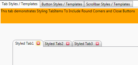
This Style and its associated Templates (which are not all shown here) are enough to change the TabItems from the standard visual representation into ones with round corners and close buttons. The top tabs are the standard un-styled tabs, and the other ones are the ones that have been Styled by yours truly.
The demo app also contains Styles and associated Templates to create a totally new ScrollBar and ScrollViewer control representations, which are shown in the figure below. The ScrollBar is on the left and the ScrollViewer on the right.

In order to do this, there needs to be quite a few Styles and associated Templates. Have a look at how much XAML it took. I have removed the guts of the the Templates as I have not discussed how they work yet. I just wanted to show you what it takes to totally re-Style a standard control. Obviously, some are more complicated than others. A Button control for example is trivial.
<LinearGradientBrush x:Key="VerticalScrollBarBackground"
EndPoint="1,0" StartPoint="0,0">
<GradientStop Color="#E1E1E1" Offset="0"/>
<GradientStop Color="#EDEDED" Offset="0.20"/>
<GradientStop Color="#EDEDED" Offset="0.80"/>
<GradientStop Color="#E3E3E3" Offset="1"/>
</LinearGradientBrush>
<LinearGradientBrush x:Key="HorizontalScrollBarBackground"
EndPoint="0,1" StartPoint="0,0">
<GradientStop Color="#E1E1E1" Offset="0"/>
<GradientStop Color="#EDEDED" Offset="0.20"/>
<GradientStop Color="#EDEDED" Offset="0.80"/>
<GradientStop Color="#E3E3E3" Offset="1"/>
</LinearGradientBrush>
<LinearGradientBrush x:Key="ListBoxBackgroundBrush"
StartPoint="0,0" EndPoint="1,0.001">
<GradientBrush.GradientStops>
<GradientStopCollection>
<GradientStop Color="White" Offset="0.0" />
<GradientStop Color="White" Offset="0.6" />
<GradientStop Color="#DDDDDD" Offset="1.2"/>
</GradientStopCollection>
</GradientBrush.GradientStops>
</LinearGradientBrush>
<LinearGradientBrush x:Key="StandardBrush"
StartPoint="0,0" EndPoint="0,1">
<GradientBrush.GradientStops>
<GradientStopCollection>
<GradientStop Color="#FFF" Offset="0.0"/>
<GradientStop Color="#CCC" Offset="1.0"/>
</GradientStopCollection>
</GradientBrush.GradientStops>
</LinearGradientBrush>
<LinearGradientBrush x:Key="PressedBrush"
StartPoint="0,0" EndPoint="0,1">
<GradientBrush.GradientStops>
<GradientStopCollection>
<GradientStop Color="#BBB" Offset="0.0"/>
<GradientStop Color="#EEE" Offset="0.1"/>
<GradientStop Color="#EEE" Offset="0.9"/>
<GradientStop Color="#FFF" Offset="1.0"/>
</GradientStopCollection>
</GradientBrush.GradientStops>
</LinearGradientBrush>
<SolidColorBrush x:Key="ScrollBarDisabledBackground" Color="#F4F4F4"/>
<SolidColorBrush x:Key="StandardBorderBrush" Color="#888" />
<SolidColorBrush x:Key="StandardBackgroundBrush" Color="#FFF" />
<SolidColorBrush x:Key="HoverBorderBrush" Color="#DDD" />
<SolidColorBrush x:Key="SelectedBackgroundBrush" Color="Gray" />
<SolidColorBrush x:Key="SelectedForegroundBrush" Color="White" />
<SolidColorBrush x:Key="DisabledForegroundBrush" Color="#888" />
<SolidColorBrush x:Key="NormalBrush" Color="#888" />
<SolidColorBrush x:Key="NormalBorderBrush" Color="#888" />
<SolidColorBrush x:Key="HorizontalNormalBrush" Color="#888" />
<SolidColorBrush x:Key="HorizontalNormalBorderBrush" Color="#888" />
<SolidColorBrush x:Key="GlyphBrush" Color="#444" />
<Style x:Key="VerticalScrollBarPageButton" TargetType="{x:Type RepeatButton}">
<Setter Property="OverridesDefaultStyle" Value="true"/>
<Setter Property="Background" Value="Transparent"/>
<Setter Property="Focusable" Value="false"/>
<Setter Property="IsTabStop" Value="false"/>
<Setter Property="Template">
<Setter.Value>
<ControlTemplate TargetType="{x:Type RepeatButton}">
...
...
</ControlTemplate>
</Setter.Value>
</Setter>
</Style>
<Style x:Key="HorizontalScrollBarPageButton" TargetType="{x:Type RepeatButton}">
<Setter Property="OverridesDefaultStyle" Value="true"/>
<Setter Property="Background" Value="Transparent"/>
<Setter Property="Focusable" Value="false"/>
<Setter Property="IsTabStop" Value="false"/>
<Setter Property="Template">
<Setter.Value>
<ControlTemplate TargetType="{x:Type RepeatButton}">
...
...
</ControlTemplate>
</Setter.Value>
</Setter>
</Style>
<Style x:Key="RepeatButtonStyleDown" TargetType="{x:Type RepeatButton}">
<Setter Property="OverridesDefaultStyle" Value="true"/>
<Setter Property="Focusable" Value="false"/>
<Setter Property="IsTabStop" Value="false"/>
<Setter Property="Template">
<Setter.Value>
<ControlTemplate TargetType="{x:Type RepeatButton}">
...
...
</ControlTemplate>
</Setter.Value>
</Setter>
</Style>
<Style x:Key="RepeatButtonStyleUp" TargetType="{x:Type RepeatButton}">
<Setter Property="OverridesDefaultStyle" Value="true"/>
<Setter Property="Focusable" Value="false"/>
<Setter Property="IsTabStop" Value="false"/>
<Setter Property="Template">
<Setter.Value>
<ControlTemplate TargetType="{x:Type RepeatButton}">
...
...
</ControlTemplate>
</Setter.Value>
</Setter>
</Style>
<Style x:Key="ThumbStyle1" TargetType="{x:Type Thumb}">
<Setter Property="OverridesDefaultStyle" Value="true"/>
<Setter Property="IsTabStop" Value="false"/>
<Setter Property="Template">
<Setter.Value>
<ControlTemplate TargetType="{x:Type Thumb}">
...
...
</ControlTemplate>
</Setter.Value>
</Setter>
</Style>
<Style x:Key="ScrollBarStyle1" TargetType="{x:Type ScrollBar}">
<Setter Property="Background"
Value="{StaticResource VerticalScrollBarBackground}"/>
<Setter Property="Stylus.IsPressAndHoldEnabled" Value="false"/>
<Setter Property="Stylus.IsFlicksEnabled" Value="false"/>
<Setter Property="Foreground"
Value="{DynamicResource
{x:Static SystemColors.ControlTextBrushKey}}"/>
<Setter Property="Width"
Value="{DynamicResource
{x:Static SystemParameters.VerticalScrollBarWidthKey}}"/>
<Setter Property="MinWidth"
Value="{DynamicResource
{x:Static SystemParameters.VerticalScrollBarWidthKey}}"/>
<Setter Property="Template">
<Setter.Value>
<ControlTemplate TargetType="{x:Type ScrollBar}">
...
...
</ControlTemplate>
</Setter.Value>
</Setter>
<Style.Triggers>
<Trigger Property="Orientation" Value="Horizontal">
<Setter Property="Width" Value="Auto"/>
<Setter Property="MinWidth" Value="0"/>
<Setter Property="Height" Value="{DynamicResource
{x:Static SystemParameters.HorizontalScrollBarHeightKey}}"/>
<Setter Property="MinHeight"
Value="{DynamicResource
{x:Static SystemParameters.HorizontalScrollBarHeightKey}}"/>
<Setter Property="Background"
Value="{StaticResource HorizontalScrollBarBackground}"/>
<Setter Property="Template">
<Setter.Value>
<ControlTemplate TargetType="{x:Type ScrollBar}">
...
...
</ControlTemplate>
</Setter.Value>
</Setter>
</Trigger>
</Style.Triggers>
</Style>
<Style x:Key="ScrollBarLineButton" TargetType="{x:Type RepeatButton}">
<Setter Property="SnapsToDevicePixels" Value="True"/>
<Setter Property="OverridesDefaultStyle" Value="true"/>
<Setter Property="Focusable" Value="false"/>
<Setter Property="Template">
<Setter.Value>
<ControlTemplate TargetType="{x:Type RepeatButton}">
...
...
</ControlTemplate>
</Setter.Value>
</Setter>
</Style>
<Style x:Key="ScrollBarPageButton" TargetType="{x:Type RepeatButton}">
<Setter Property="SnapsToDevicePixels" Value="True"/>
<Setter Property="OverridesDefaultStyle" Value="true"/>
<Setter Property="IsTabStop" Value="false"/>
<Setter Property="Focusable" Value="false"/>
<Setter Property="Template">
<Setter.Value>
<ControlTemplate TargetType="{x:Type RepeatButton}">
...
...
</ControlTemplate>
</Setter.Value>
</Setter>
</Style>
<Style x:Key="ScrollBarThumb" TargetType="{x:Type Thumb}">
<Setter Property="SnapsToDevicePixels" Value="True"/>
<Setter Property="OverridesDefaultStyle" Value="true"/>
<Setter Property="IsTabStop" Value="false"/>
<Setter Property="Focusable" Value="false"/>
<Setter Property="Template">
<Setter.Value>
<ControlTemplate TargetType="{x:Type Thumb}">
...
...
</ControlTemplate>
</Setter.Value>
</Setter>
</Style>
<ControlTemplate x:Key="VerticalScrollBar"
TargetType="{x:Type ScrollBar}">
...
...
</ControlTemplate>
<Style x:Key="{x:Type ScrollBar}" TargetType="{x:Type ScrollBar}">
<Setter Property="SnapsToDevicePixels" Value="True"/>
<Setter Property="OverridesDefaultStyle" Value="true"/>
<Style.Triggers>
<Trigger Property="Orientation" Value="Horizontal">
<Setter Property="Width" Value="Auto"/>
<Setter Property="Height" Value="18" />
<Setter Property="Template"
Value="{StaticResource HorizontalScrollBar}" />
</Trigger>
<Trigger Property="Orientation" Value="Vertical">
<Setter Property="Width" Value="18"/>
<Setter Property="Height" Value="Auto" />
<Setter Property="Template"
Value="{StaticResource VerticalScrollBar}" />
</Trigger>
</Style.Triggers>
</Style>
<ControlTemplate x:Key="ScrollViewerControlTemplate"
TargetType="{x:Type ScrollViewer}">
...
...
</ControlTemplate>
Now, only a truly, truly crazy person (Josh/Karl, we know where you are) would attempt this by hand. I didn't, and wouldn't. I don't like tools generally, but sometimes you need them. To do this sort of thing manually would drive you nuts. The best way is to fire Expression Blend up and use that to modify your Templates. You still need to know your XAML, but Expression Blend helps out in this area for sure.
There is a fair amount of markup to do this, for sure. But the principle is the same throughout. Within a Style, there is just Style Setters and Triggers, which we have talked about, so these should be clearer now.
The Demo App Organization
Now I just quickly want to talk about the demo app organization for a minute before we go on to Templates. The demo application is organized as follows:
- VariousControlTemplatesWindow.xaml
Contains examples on how to re-style Buttons/Tabs/Scrollbars. Here the last screenshot you haven't seen:
- HierarchicalDataTemplateWindow.xaml
Contains examples on how to re-style hierarchical data; here is a screenshot:
- DemoLauncherWindow.xaml
Contains examples on styling item based data.
- Beatriz Costa Planet ListBox/PlanetsListBoxWindow.xaml
Contains examples of a real neat use of Styles and Templates. This is used with the permission of Beatriz Costa (Microsoft). I could have done this myself, but Bea did such a bang up job, and it does such a great job of illustrating the power of Styles and Templates, I just had to use it here also. So thanks for the permission Bea, I owe you one.
Don't worry, I am going to talk about each of these parts in more detail as we come on to Templates. I just wanted you to know what the demo app actually does.
Every control has a standard look and feel... can you guess what this is? Yes, that's right, it's a Template. But what does it look like? Well, in Expression Blend, you get to see this when you edit a control's Template, as shown in the screenshot below where I am editing a ScrollViewer control.
Now if you look at this and go back and have a look at the large section of XAML code I included, it may become a little clearer. We can see that a ScrollViewer control is actually made up of several elements. This forms its VisualTree. Now, what we have to do to change this is either change parts of this tree, or swap it out entirely. Believe it or not, we can swap out pretty much all of what a control was supposed to look like, as long as a few rules are adhered to, but more on this later. I just wanted you to be able to see why all the XAML that is required to create the Style or Template for a control is required.
I did a reasonably thorough (we can always do better) talk about the ScrollViewer control on my blog some time ago; you can have a look at that right here; also of note is the Standard ControlTemplate Examples MSDN link where you can see what each of the default WPF controls looks like.
Overview
As I just mentioned, we can use a Template to change how a control looks. You will often see Templates used within a Style, but that's OK, we've seen examples of this, and it didn't scare us. In fact, we say bring on the Templates, those Styles were easy man!
It's not quite as easy to nail down exactly what will be within a Template, as it may depend on what sort of Template we are dealing with; there are a fair few different Templates out there.
I think what I'll do is cover some of the basic syntax and then talk about some of the different Templates you may run into. And then, I'll explain the demo app's Templates.
Don't worry too much if I mention things like DataTempate/HierarchicalDataTemplate and you have not got a clue. I will be covering this after the basic syntax of Templates. Got to learn to crawl before you can get totally Fecking lost with WPF, pack it all up, shave your hair off, and become a monk. At least they get wine. Right, I'm off.
Triggers
Style, ControlTemplate, and DataTemplate all have a Triggers property that can contain a set of Triggers. A Trigger sets properties or starts actions such as animation when a property value changes or when an event is raised. We have already seen Triggers within a Style, but what about Templates? Well, in Templates, it is nearly the same. There are a few different types of Triggers. Let's see them, shall we?
Property Triggers
Are used to set a property to a value when a certain condition occurs. This example sets a Border.opacity property to 0.4 when the Button.IsEnabled property is false.
<ControlTemplate
x:Key="bordereredButtonTemplateWithMouseAndPropHiJacking"
TargetType="{x:Type Button}">
<Border x:Name="border" CornerRadius="3"
Background="{TemplateBinding Background}"
BorderBrush="{TemplateBinding Foreground}"
BorderThickness="2" Width="auto"
Visibility="Visible">
....
....
</Border>
<ControlTemplate.Triggers>
<Trigger Property="IsEnabled" Value="false">
<Setter TargetName="border" Property="Opacity" Value="0.4"/>
</Trigger>
</ControlTemplate.Triggers>
</ControlTemplate>
Event Triggers
Work exactly the way they do for Styles, which we outlined above.
MultiTriggers, DataTriggers, and MultiDataTriggers
In addition to Trigger and EventTrigger, there are other types of triggers. MultiTrigger allows you to set property values based on multiple conditions. You use DataTrigger and MultiDataTrigger when the property of your condition is data-bound.
<DataTemplate x:Key="demoItemTemplate" DataType="x:Type local:DemoListItem">
<StackPanel Orientation="Horizontal" Margin="10">
<Path Name="pathSelected" Fill="White"
Stretch="Fill" Stroke="White" Width="15"
Height="20" Data="M0,0 L 0,15 L 7.5,7.5"
Visibility="Hidden"/>
<Border BorderBrush="White"
BorderThickness="4" Margin="5">
<Image Source="Images/DataLogo.png" Width="45" Height="45"/>
</Border>
<StackPanel Orientation="Vertical" VerticalAlignment="Center">
<TextBlock FontFamily="Arial Black" FontSize="20"
FontWeight="Bold"
Width="auto" Height="auto"
Text="{Binding Path=DemoName}" />
<TextBlock FontFamily="Arial" FontSize="10"
FontWeight="Normal"
Width="auto" Height="auto"
Text="{Binding Path=WindowName}" />
</StackPanel>
</StackPanel>
<DataTemplate.Triggers>
<DataTrigger
Binding="{Binding RelativeSource={RelativeSource Mode=FindAncestor,
AncestorType={x:Type ListBoxItem}, AncestorLevel=1},
Path=IsSelected}"
Value="True">
<Setter TargetName="pathSelected"
Property="Visibility" Value="Visible" />
</DataTrigger>
</DataTemplate.Triggers>
</DataTemplate>
</Window.Resources>
As this is a DataTemplate, it's a template for some bound data, so we can use DataTriggers here. So this DataTrigger checks whether the bound object's IsSelected property is true, and if it is, sets the Visibility of another element within the DataTemplate.
And here is an example of a MultiTrigger, which basically uses more than one property in the conditional evaluation before the trigger is run.
<ControlTemplate TargetType="{x:Type TabItem}">
    <Grid SnapsToDevicePixels="true" Margin="0,5,0,0">
        <Border x:Name="Bd" Background="{TemplateBinding Background}"
                BorderBrush="{TemplateBinding BorderBrush}" BorderThickness="1,1,1,0"
                CornerRadius="10,10,0,0" Padding="{TemplateBinding Padding}">
            <ContentPresenter SnapsToDevicePixels="{TemplateBinding SnapsToDevicePixels}"
                HorizontalAlignment="{Binding Path=HorizontalContentAlignment,
                RelativeSource={RelativeSource AncestorType={x:Type ItemsControl}}}"
                x:Name="Content"
                VerticalAlignment="{Binding Path=VerticalContentAlignment,
                RelativeSource={RelativeSource AncestorType={x:Type ItemsControl}}}"
                ContentSource="Header" RecognizesAccessKey="True"/>
        </Border>
    </Grid>
    <ControlTemplate.Triggers>
            <MultiTrigger>
            <MultiTrigger.Conditions>
                <Condition Property="IsSelected" Value="false"/>
                <Condition Property="IsMouseOver" Value="true"/>
            </MultiTrigger.Conditions>
            <Setter Property="BorderBrush" TargetName="Bd"
                    Value="Black"/>
        </MultiTrigger>
        </ControlTemplate.Triggers>
</ControlTemplate>
In this example, the TabItem must have its IsSelected property false, and its IsMouseOver true before the trigger will run and set the BorderBrush of the element called Bd to a Black Brush.
TemplateBinding
Now that we know about databinding (remember Part 5), we know how to bind things to one another. Well, TemplateBinding is just a different strain of Binding, which links the value of a property in a control template to be the value of some other exposed property on the templated control.
Have a look the MSDN page, it's very simple. What we are trying to do is make sure our controls are responsive to the user's demands on the them. For example, if a user sets a BackGround of a control to Blue and we supply a control Template that sets the BackGround to Green, that's not what the user wanted. Surely, there is a better way. Well, there is, we simply use the {TemplateBinding } markup extension to tell the control Template to gets its value from the templated parent control. Something like:
<ControlTemplate x:Key="bordereredButtonTemplateWithMouseAndPropHiJacking"
TargetType="{x:Type Button}">
<Border x:Name="border" CornerRadius="3"
Background="{TemplateBinding Background}"
.....
</Border>
<ControlTemplate.Triggers>
....
....
</ControlTemplate.Triggers>
</ControlTemplate>
The important part is Background="{TemplateBinding Background}"; this is enough to ensure that the control Template uses same value as the templated parent control.
Hi-Jacking Properties
Sometimes you may have a situation where you want to use more than one property from the original source control being templated, but there is not a property for the item you are trying to use. For example, imagine you want to create a Button Template that contains both text and an image. The text is easy, you can use the Button.Content property, but if that is being used for the text, where could we also get a value for the image? We could, of course, use an Attached Property as described in my previous article on Dependency Properties, but we could also look out for any unused properties and hi jack them to be used in the control Template. For example, the Tag property of all controls take object as a value, which makes it very handy.
We can then use this in the binding; for example, have a look at this:
<ControlTemplate x:Key="bordereredButtonTemplateWithMouseAndPropHiJacking"
TargetType="{x:Type Button}">
<Border x:Name="border" CornerRadius="3" Background="{TemplateBinding Background}"
BorderBrush="{TemplateBinding Foreground}"
BorderThickness="2" Width="auto" Visibility="Visible">
<StackPanel Orientation="Horizontal">
<Image Source="{Binding RelativeSource={RelativeSource TemplatedParent},
Path=Tag}" Width="20" Height="20" HorizontalAlignment="Left"
Margin="{TemplateBinding Padding}" />
<ContentPresenter
Margin="{TemplateBinding Padding}"
Content="{TemplateBinding Content}"
Width="auto" Height="auto"/>
</StackPanel>
</Border>
<ControlTemplate.Triggers>
....
....
</ControlTemplate.Triggers>
</ControlTemplate>
Notice that I am actually using both the original control (Button) content for the text (which will be shown within a ContentPresenter, which is capable of showing any single piece of content, the original Button.Context text in this case) and the original control (Button) Tag for the Template's image.
If you are interested in seeing how you could have used an Attached Property in a Template instead of hi-jacking an unused property, have a look at this excellent blog entry by Josh Smith.
Example Templates
OK, so we've done really well, just a bit more. I just want to describe a few different Template types and I will also be going through a rather cool example at the end.
ControlTemplate
ControlTemplate is the most common type of Template which is used to control how a control is rendered and behaves by specifying the visual structure and behavioral aspects of a control.
Here is an extremely simple example that simply replaces a standard Button control's Template with an Ellipse and a ContentPresenter to present the Button.Content.
<ControlTemplate TargetType="Button">
    <Grid>
        <Ellipse Fill="{TemplateBinding Background}"/>
        <ContentPresenter HorizontalAlignment="Center"
                          VerticalAlignment="Center"/>
    </Grid>
</ControlTemplate>
And here is another couple (again for a Button) that uses most of things we talked about, Property Triggers, Property Hi-Jacking (my term, not official one, so don't look it up), and TemplateBinding:
<ControlTemplate x:Key="bordereredButtonTemplate" TargetType="{x:Type Button}">
<Border x:Name="border" CornerRadius="3" Background="Transparent"
BorderBrush="{TemplateBinding Foreground}" BorderThickness="2"
Width="auto" Visibility="Visible">
<ContentPresenter Margin="3"
Content="{TemplateBinding Content}"
Width="auto" Height="auto"/>
</Border>
<ControlTemplate.Triggers>
<Trigger Property="IsEnabled" Value="false">
<Setter TargetName="border"
Property="Opacity" Value="0.4"/>
</Trigger>
</ControlTemplate.Triggers>
</ControlTemplate>
<ControlTemplate x:Key="bordereredButtonTemplateWithMouseEvents"
TargetType="{x:Type Button}">
<Border x:Name="border" CornerRadius="3"
Background="Transparent"
BorderBrush="{TemplateBinding Foreground}"
BorderThickness="2" Width="auto"
Visibility="Visible">
<ContentPresenter Margin="3"
Content="{TemplateBinding Content}"
Width="auto" Height="auto"/>
</Border>
<ControlTemplate.Triggers>
<Trigger Property="IsEnabled" Value="false">
<Setter TargetName="border"
Property="Opacity" Value="0.4"/>
</Trigger>
<Trigger Property="IsMouseOver" Value="true">
<Setter TargetName="border"
Property="Background" Value="Orange"/>
</Trigger>
</ControlTemplate.Triggers>
</ControlTemplate>
<ControlTemplate x:Key="bordereredButtonTemplateWithMouseAndPropHiJacking"
TargetType="{x:Type Button}">
<Border x:Name="border" CornerRadius="3"
Background="{TemplateBinding Background}"
BorderBrush="{TemplateBinding Foreground}"
BorderThickness="2" Width="auto"
Visibility="Visible">
<StackPanel Orientation="Horizontal">
<Image Source="{Binding RelativeSource={RelativeSource TemplatedParent},
Path=Tag}" Width="20"
Height="20" HorizontalAlignment="Left"
Margin="{TemplateBinding Padding}" />
<ContentPresenter
Margin="{TemplateBinding Padding}"
Content="{TemplateBinding Content}"
Width="auto" Height="auto"/>
</StackPanel>
</Border>
<ControlTemplate.Triggers>
<Trigger Property="IsEnabled" Value="false">
<Setter TargetName="border"
Property="Opacity" Value="0.4"/>
</Trigger>
<Trigger Property="IsMouseOver" Value="true">
<Setter TargetName="border"
Property="Background" Value="Orange"/>
</Trigger>
</ControlTemplate.Triggers>
</ControlTemplate>
These control templates are available within the demo app VariousControlTemplatesWindow.xaml file, and look like this:
You can read more about ControlTemplates right here.
DataTemplate
You use a DataTemplate to specify the visualization of your data objects. DataTemplate objects are particularly useful when you are binding an ItemsControl such as a ListBox to an entire collection. Without specific instructions, a ListBox displays the string representation of the objects in a collection. In that case, you can use a DataTemplate to define the appearance of your data objects. The content of your DataTemplate becomes the visual structure of your data objects.
Within the demo app DemoLauncherWindow.xaml file, I add a number of custom objects of type DemoListItem to a ListBox.
The DemoListItem objects look like this:
using System;
using System.Collections.Generic;
using System.Linq;
using System.Text;
using System.Windows;
namespace Styles_And_Templates
{
public class DemoListItem
{
#region Public Properties
public string WindowName { get; set; }
public string DemoName { get; set; }
#endregion
}
}
And in VB.NET:
Imports System
Imports System.Collections.Generic
Imports System.Linq
Imports System.Text
Imports System.Windows
Public Class DemoListItem
#Region "Public Properties"
Private m_WindowName As String
Public Property WindowName() As String
Get
Return m_WindowName
End Get
Set(ByVal value As String)
m_WindowName = value
End Set
End Property
Private m_DemoName As String
Public Property DemoName() As String
Get
Return m_DemoName
End Get
Set(ByVal value As String)
m_DemoName = value
End Set
End Property
#End Region
End Class
So with this knowledge, we can create a DataTemplate in the Window hosting the ListBox that contains these objects. Let's see that, shall we:
<DataTemplate x:Key="demoItemTemplate" DataType="x:Type local:DemoListItem">
<StackPanel Orientation="Horizontal" Margin="10">
<Path Name="pathSelected" Fill="White"
Stretch="Fill" Stroke="White" Width="15"
Height="20" Data="M0,0 L 0,15 L 7.5,7.5"
Visibility="Hidden"/>
<Border BorderBrush="White" BorderThickness="4" Margin="5">
<Image Source="Images/DataLogo.png" Width="45" Height="45"/>
</Border>
<StackPanel Orientation="Vertical" VerticalAlignment="Center">
<TextBlock FontFamily="Arial Black" FontSize="20"
FontWeight="Bold"
Width="auto" Height="auto"
Text="{Binding Path=DemoName}" />
<TextBlock FontFamily="Arial" FontSize="10"
FontWeight="Normal"
Width="auto" Height="auto"
Text="{Binding Path=WindowName}" />
</StackPanel>
</StackPanel>
<DataTemplate.Triggers>
<DataTrigger
Binding="{Binding RelativeSource={RelativeSource Mode=FindAncestor,
AncestorType={x:Type ListBoxItem}, AncestorLevel=1}, Path=IsSelected}"
Value="True">
<Setter TargetName="pathSelected"
Property="Visibility" Value="Visible" />
</DataTrigger>
</DataTemplate.Triggers>
</DataTemplate>
You will notice that this makes use of {Binding } markup extensions in order to pick out the properties of the underlying bound data object to use in the DataTemplate. Also note that this is a Template for a bound data object we need to use DataTriggers.
This results in a ListBox item that looks like this:
You can read more at the Data Templating Overview which can be found right here.
HierarchicalDataTemplate
HierarchichalDataTemplate is really just a DataTemplate that may be used over hierarchical structures like a TreeView or Menu.
I have stolen the example that you will find within the demo app HierarchicalDataTemplateWindow.xaml file from the MSDN documentation. The basic idea is that you have a hierarchical list that you are using as a data source for both a TreeView and a Menu. Then you apply some HierarchichalDataTemplate to get the bound hierarchical list data to be rendered correctly.
Here is the source list in C#:
using System;
using System.Windows;
using System.Windows.Controls;
using System.Windows.Data;
using System.Windows.Documents;
using System.Windows.Media;
using System.Windows.Shapes;
using System.Collections.ObjectModel;
using System.Collections.Generic;
namespace Styles_And_Templates
{
#region Inner data classes
public class League
{
public string Name { get; private set; }
public List<Division> Divisions { get; private set; }
public League(string name)
{
Name = name;
Divisions = new List<Division>();
}
}
public class Division
{
public string Name { get; private set; }
public List<Team> Teams { get; private set; }
public Division(string name)
{
Name = name;
Teams = new List<Team>();
}
}
public class Team
{
public string Name { get; private set; }
public Team(string name)
{
Name = name;
}
}
#endregion
#region LeagueList
public class LeagueList : List<League>
{
public LeagueList()
{
League l;
Division d;
Add(l = new League("League A"));
l.Divisions.Add((d = new Division("Division A")));
d.Teams.Add(new Team("Team I"));
d.Teams.Add(new Team("Team II"));
d.Teams.Add(new Team("Team III"));
d.Teams.Add(new Team("Team IV"));
d.Teams.Add(new Team("Team V"));
l.Divisions.Add((d = new Division("Division B")));
d.Teams.Add(new Team("Team Blue"));
d.Teams.Add(new Team("Team Red"));
d.Teams.Add(new Team("Team Yellow"));
d.Teams.Add(new Team("Team Green"));
d.Teams.Add(new Team("Team Orange"));
l.Divisions.Add((d = new Division("Division C")));
d.Teams.Add(new Team("Team East"));
d.Teams.Add(new Team("Team West"));
d.Teams.Add(new Team("Team North"));
d.Teams.Add(new Team("Team South"));
Add(l = new League("League B"));
l.Divisions.Add((d = new Division("Division A")));
d.Teams.Add(new Team("Team 1"));
d.Teams.Add(new Team("Team 2"));
d.Teams.Add(new Team("Team 3"));
d.Teams.Add(new Team("Team 4"));
d.Teams.Add(new Team("Team 5"));
l.Divisions.Add((d = new Division("Division B")));
d.Teams.Add(new Team("Team Diamond"));
d.Teams.Add(new Team("Team Heart"));
d.Teams.Add(new Team("Team Club"));
d.Teams.Add(new Team("Team Spade"));
l.Divisions.Add((d = new Division("Division C")));
d.Teams.Add(new Team("Team Alpha"));
d.Teams.Add(new Team("Team Beta"));
d.Teams.Add(new Team("Team Gamma"));
d.Teams.Add(new Team("Team Delta"));
d.Teams.Add(new Team("Team Epsilon"));
}
public League this[string name]
{
get
{
foreach (League l in this)
if (l.Name == name)
return l;
return null;
}
}
}
#endregion
}
And in VB.NET:
Imports System
Imports System.Windows
Imports System.Windows.Controls
Imports System.Windows.Data
Imports System.Windows.Documents
Imports System.Windows.Media
Imports System.Windows.Shapes
Imports System.Collections.ObjectModel
Imports System.Collections.Generic
#Region "Inner data classes"
ublic Class League
Private m_Name As String
Public Property Name() As String
Get
Return m_Name
End Get
Private Set(ByVal value As String)
m_Name = value
End Set
End Property
Private m_Divisions As List(Of Division)
Public Property Divisions() As List(Of Division)
Get
Return m_Divisions
End Get
Private Set(ByVal value As List(Of Division))
m_Divisions = value
End Set
End Property
Public Sub New(ByVal newname As String)
Name = newname
Divisions = New List(Of Division)()
End Sub
End Class
Public Class Division
Private m_Name As String
Public Property Name() As String
Get
Return m_Name
End Get
Private Set(ByVal value As String)
m_Name = value
End Set
End Property
Private m_Teams As List(Of Team)
Public Property Teams() As List(Of Team)
Get
Return m_Teams
End Get
Private Set(ByVal value As List(Of Team))
m_Teams = value
End Set
End Property
Public Sub New(ByVal newname As String)
Name = newname
Teams = New List(Of Team)()
End Sub
End Class
Public Class Team
Private m_Name As String
Public Property Name() As String
Get
Return m_Name
End Get
Private Set(ByVal value As String)
m_Name = value
End Set
End Property
Public Sub New(ByVal newname As String)
Name = newname
End Sub
End Class
#End Region
#Region "LeagueList"
Public Class LeagueList
Inherits List(Of League)
Public Sub New()
Dim l As League
Dim d As Division
l = New League("League A")
Add(l)
d = New Division("Division A")
l.Divisions.Add(d)
d.Teams.Add(New Team("Team I"))
d.Teams.Add(New Team("Team II"))
d.Teams.Add(New Team("Team III"))
d.Teams.Add(New Team("Team IV"))
d.Teams.Add(New Team("Team V"))
d = New Division("Division B")
l.Divisions.Add(d)
d.Teams.Add(New Team("Team Blue"))
d.Teams.Add(New Team("Team Red"))
d.Teams.Add(New Team("Team Yellow"))
d.Teams.Add(New Team("Team Green"))
d.Teams.Add(New Team("Team Orange"))
d = New Division("Division C")
l.Divisions.Add(d)
d.Teams.Add(New Team("Team East"))
d.Teams.Add(New Team("Team West"))
d.Teams.Add(New Team("Team North"))
d.Teams.Add(New Team("Team South"))
l = New League("League B")
Add(l)
d = New Division("Division A")
l.Divisions.Add(d)
d.Teams.Add(New Team("Team 1"))
d.Teams.Add(New Team("Team 2"))
d.Teams.Add(New Team("Team 3"))
d.Teams.Add(New Team("Team 4"))
d.Teams.Add(New Team("Team 5"))
d = New Division("Division B")
l.Divisions.Add(d)
d.Teams.Add(New Team("Team Diamond"))
d.Teams.Add(New Team("Team Heart"))
d.Teams.Add(New Team("Team Club"))
d.Teams.Add(New Team("Team Spade"))
d = New Division("Division C")
l.Divisions.Add(d)
d.Teams.Add(New Team("Team Alpha"))
d.Teams.Add(New Team("Team Beta"))
d.Teams.Add(New Team("Team Gamma"))
d.Teams.Add(New Team("Team Delta"))
d.Teams.Add(New Team("Team Epsilon"))
End Sub
Default Public Overloads ReadOnly Property Item(ByVal name As String) As League
Get
For Each l As League In Me
If l.Name = name Then
Return l
End If
Next
Return Nothing
End Get
End Property
End Class
#End Region
And here is the HierarchichalDataTemplate:
<HierarchicalDataTemplate DataType="{x:Type local:League}"
ItemsSource = "{Binding Path=Divisions}">
<TextBlock Text="{Binding Path=Name}" Background="Red"/>
</HierarchicalDataTemplate>
<HierarchicalDataTemplate DataType="{x:Type local:Division}"
ItemsSource = "{Binding Path=Teams}">
<TextBlock Text="{Binding Path=Name}" Background="Green"/>
</HierarchicalDataTemplate>
<DataTemplate DataType="{x:Type local:Team}">
<TextBlock Text="{Binding Path=Name}"
Background="CornflowerBlue"/>
</DataTemplate>
This results in something like this, where each of the underlying bound data objects get its own Template:
You can read more about this right here, and if you want a really cool advanced look at what can be done with the HierarchichalDataTemplate, have a look at Codeproject MVP Karl Shifflett's excellent blog entry right here where Karl uses a HierarchichalDataTemplate to create a simple explorer type treeview (which was actually a reaction to Josh's reaction to my original simple explorer type treeview article).
A Small Demo Discussion (Because it is Cool)
Now for a good while now, I have been reading blogs about WPF, and for databinding, they don't come any better than Beatriz Costa from Microsoft. She really kicks it man. I was really impressed by one of her samples in particular, and I think it really impressed me just how powerful Binding and Templating can be in WPF.
Her original post is The power of Styles and Templates in WPF; I have asked Bea if I could use this in this article. She kindly agreed (she told me I have to buy her a beer.. sounds good to me). So thanks Bea.
First a screenshot.
Now, what would you say if I told you this was a ListBox? Cool huh? To see how it works, let's dissect it a bit.
I'm not going to include all the code here; you can check out my code, or go straight to the source and see Bea's blog.
But I did just want to show you what you can do with a clever Style and Template or two. Let's see the important stuff, the XAML:
<Window x:Class="PlanetsListBox.PlanetsListBoxWindow"
       xmlns="http://schemas.microsoft.com/winfx/2006/xaml/presentation"
       xmlns:x="http://schemas.microsoft.com/winfx/2006/xaml"
       xmlns:local="clr-namespace:PlanetsListBox"
       Title="PlanetsListBox" Height="700" Width="700"
    >
    <Window.Resources>
        <local:SolarSystem x:Key="solarSystem" />
        <local:ConvertOrbit x:Key="convertOrbit" />

        <DataTemplate DataType="{x:Type local:SolarSystemObject}">
            <Canvas Width="20" Height="20" >
                <Ellipse
                    Canvas.Left="{Binding Path=Orbit,
                        Converter={StaticResource convertOrbit},
                        ConverterParameter=-1.707}"
                    Canvas.Top="{Binding Path=Orbit,
                        Converter={StaticResource convertOrbit},
                        ConverterParameter=-0.293}"
                    Width="{Binding Path=Orbit,
                        Converter={StaticResource convertOrbit},
                        ConverterParameter=2}"
                    Height="{Binding Path=Orbit,
                        Converter={StaticResource convertOrbit},
                        ConverterParameter=2}"
                    Stroke="White"
                    StrokeThickness="1"/>
                <Image Source="{Binding Path=Image}"
                               Width="20" Height="20">
                    <Image.ToolTip>
                        <StackPanel Width="250"
                                TextBlock.FontSize="12">
                            <TextBlock FontWeight="Bold"
                                    Text="{Binding Path=Name}" />
                            <StackPanel Orientation="Horizontal">
                                <TextBlock Text="Orbit: " />
                                <TextBlock Text="{Binding Path=Orbit}" />
                                <TextBlock Text=" AU" />
                            </StackPanel>
                            <TextBlock Text="{Binding Path=Details}"
                                TextWrapping="Wrap"/>
                        </StackPanel>
                    </Image.ToolTip>
                </Image>
            </Canvas>
        </DataTemplate>

        <Style TargetType="ListBoxItem">
            <Setter Property="Canvas.Left"
              Value="{Binding Path=Orbit, Converter={StaticResource
                     convertOrbit}, ConverterParameter=0.707}"/>
            <Setter Property="Canvas.Bottom" Value="{Binding Path=Orbit,
                    Converter={StaticResource convertOrbit}, ConverterParameter=0.707}"/>
            <Setter Property="Template">
                <Setter.Value>
                    <ControlTemplate TargetType="{x:Type ListBoxItem}">
                        <Grid>
                            <Ellipse x:Name="selectedPlanet"
                                Margin="-10" StrokeThickness="2"/>
                            <ContentPresenter
                                SnapsToDevicePixels=
                                  "{TemplateBinding SnapsToDevicePixels}"
                                HorizontalAlignment=
                                  "{TemplateBinding HorizontalContentAlignment}"
                                VerticalAlignment=
                                  "{TemplateBinding VerticalContentAlignment}"/>
                        </Grid>
                        <ControlTemplate.Triggers>
                            <Trigger Property="IsSelected" Value="true">
                                <Setter Property="Stroke"
                                  TargetName="selectedPlanet"
                                  Value="Yellow"/>
                            </Trigger>
                        </ControlTemplate.Triggers>
                    </ControlTemplate>
                </Setter.Value>
            </Setter>
        </Style>

        <Style TargetType="ListBox">
            <Setter Property="ItemsPanel">
                <Setter.Value>
                    <ItemsPanelTemplate>
                        <Canvas Width="590" Height="590"
                                   Background="Black" />
                    </ItemsPanelTemplate>
                </Setter.Value>
            </Setter>
        </Style>
    </Window.Resources>

    <Grid HorizontalAlignment="Center"
           VerticalAlignment="Center" ClipToBounds="True">
        <ListBox ItemsSource="{Binding Source={StaticResource solarSystem},
            Path=SolarSystemObjects}" Focusable="False" />
    </Grid>
</Window>
Now there is nothing in here that we have not talked about either in this article or the other five that go with this one. I think it's very impressive.
Great work Bea. Thanks.
Lookless Controls
Now that you have nearly read this article, I want to put something to you. We now know that we can totally change how a control looks using Styles and Templates. We can even imagine a situation where a control designer creates some control, let's say an image picker that has a single button, but we can Style and Template this control any way we want. Which is cool, but there is no guarantee that the person who designs the Styles and Templates knows what the control does, and how it works. Microsoft's view on this is that these are two roles, designer and developer. And neither should care about what the other does.
They should be able to write working controls that a designer can restyle any way they see fit. This is known as lookless controls.
Well, that's fine, but in practice, of course, they both need to know a bit about each other's work.
So in order for a developer to help a designer, the developer can at least expose certain metadata that expresses the developer's intentions for the control. The designer can, of course, ignore this, but the Styleed and Templated control probably won't work correctly. But in theory, if the designer plays fair and follows the next bit of advice, the control should work (providing the developers know what they are doing and actually does their part).
So imagine this.
The developer creates a simple control such as:
Where we have an image and a button to assign a new image. Now the designer knows a few things about WPF and Expression Blend, so decides that the control should look like this:
Now from a Style and Template view point, there is nothing wrong with this. Remember, we can create a Template for a control and make it look how we like. So that's fine. What is not fine is the fact that the control just won't work as the developer coded it to work anymore.
Why not... well, there is no button, so how does a new picture get picked? Well, the answer lies in code; developer code and designer code both have roles to play.
The recommended procedure is as follows:
Firstly, developers must put across their intent for the control by adorning it with some attributes (you can have as many as you need), with the TemplatePartAttribute which tells the designer what he is expected to include within the Template for a control. The other thing the developer must do is to either use an override of OnApplyTemplate() and look for the Template parts that they were expecting the designer to provide and hook up these events within the code behind, or use routed commands.
using System;
using System.Collections.Generic;
using System.Text;
using System.Windows;
using System.Windows.Controls;
using System.Windows.Data;
using System.Windows.Documents;
using System.Windows.Input;
using System.Windows.Media;
using System.Windows.Media.Imaging;
using System.Windows.Navigation;
using System.Windows.Shapes;
namespace UntitledProject1
{
[TemplatePart(Name="PART_PickNew",Type=typeof(Button))]
public partial class UserControl1 : UserControl
{
public UserControl1()
{
InitializeComponent();
}
public override void OnApplyTemplate()
{
base.OnApplyTemplate();
Button PART_PickNew =
this.Template.FindName("PART_PickNew") as Button;
if (PART_PickNew != null)
{
PART_PickNew.Click += new RoutedEventHandler(PART_PickNew_Click);
}
}
void PART_PickNew_Click(object sender, RoutedEventArgs e)
{
}
}
}
So from a developer point of view, all is catered for. Over to the designer part. As long as they actually use a Button and give it a name that matches what the developer coded against (the clue is in TemplatePartAttribute), everything should be fine, and work as expected. A good example is shown here:
<Image Source="C:\Users\sacha\Pictures\BLACK_OR_WHITE.jpg"
    Stretch="UniformToFill" Width="50" Height="50"/>
<Button x:Name="PART_PickNew" Content="Pick New Image"/>
ALWAYS
The code-behind can happily link into the Button's events when the Template gets applied, and the control will work even though it looks totally different, thanks to a cool Template being applied. Groovy.
This is what lookless controls are all about. Give the designer the ability to make it look how they want, but always ensure that it still works as expected.
This could also have been done with Routed UI Commands; in fact, I have written a whole article in the past just on this concept, so if you are interested, that article can be found right here.
But Wait, There Will Be One More Article!!!
The more eagle eyed amongst you may have noticed that this was actually the last in my proposed beginner's series.
But...
There will be one more article after this one, which will be the final episode in this series. This article will cover everything we have learned along the way throughout this beginner's series. I have done the code already, and am really, really proud of it, and can't wait to share it with you all. But for now, we must contain ourselves to the task at hand, learning this little lot.
I'm also planning on one more WPF after this final one. So that's two more in total; then I really must move onto something else. Patterns/Threading/WF/PLINQ/Dynamic Queries/Entity Framework, who knows. We'll see.
References
- Beatriz "The Binding Queen" Costa: Blog
- Bea Costa's: The power of Styles and Templates in WPF (
PLanetListBox) that I've used with her kind permission. Cheers Bea, I will grab you a beer at some point.
Other Good Sources
- Josh Smith: A Guided Tour of WPF - Part 4 (Data templates and triggers)
- Josh Smith: A Guided Tour of WPF - Part 5 (Styles)
- Chaz: Theming in WPF
- MSDN: Style Class
- MSDN: Styling and Templating
- MSDN: How to: Trigger an Animation When Data Changes
History
- 09/03/08: Initial release.


 General
  News
News  Suggestion
  Question
  Bug
Bug  Answer
  Joke
Joke  Praise
  Rant
Rant  Admin
Admin 


 Submit an article or tip


 Thanks a lot.
