Table of Contents
- Part 1 (XAML): Learn about XAML and how it is used in WPF applications.
- Part 2 (Layout): Learn about layout panels and how they are used to construct user interfaces.
- Part 3 (Data binding): Learn how WPF data binding works and how it can be used.
- Part 4 (Data templates and triggers): Learn how data templates and triggers work and how they can be used.
- Part 5 (Styles): Learn about how UIs can be styled in WPF.
Introduction
This is the fourth article in an introductory series about the Windows Presentation Foundation. In the previous article we examined data binding and how it is used to display information in WPF user interfaces. In this article we examine data templating and triggers, and how they are used in the WPF Horse Race demo application (which is available for download at the top of the first article in this series).
Just like the other articles in this series, this article does not cover its subject matter in exhaustive detail. Instead we will examine just enough of the basics so that we can see how those features are put to use in the demo app. If you want to learn more about how data templating and triggers can be used, refer to the External links section for additional information.
Background
So far in this series of articles, we have seen how XAML, layout panels, and data binding are used to create user interfaces that display simple data. Those fundamental building blocks, however, serve as the foundation upon which more powerful and compelling features of WPF depend.
One of those higher-level features allows you to easily describe how an object of any type can be rendered. In other words, it enables you to create a template, in XAML, of visual elements which can be "expanded" at runtime to render a data object. Of course, the feature I'm referring to is known as "data templating".
Data templates are only one type of template in WPF. This article, in fact this entire series of articles, will not examine the other types of templates because the WPF Horse Race demo application does not use them. In case you are interested, there are also control templates, items panel templates, and hierarchical data templates. Refer to the Other templates sub-section in the External links section toward the bottom of this article for links to information about them.
Another feature of WPF covered in this article is called "triggers". Triggers are another fundamental building block in WPF, upon which many parts of the framework depend. They are, in general, a means of conditionally applying values to properties. Triggers are especially useful when you are writing XAML because they provide a means of evaluating properties at runtime and taking certain actions based on their values. In that sense triggers are a gray area somewhere between the declarative world of XAML markup and the imperative world of the code-behind.
The DataTemplate class
All of WPF's templating functionality is based on the FrameworkTemplate class. DataTemplate derives from FrameworkTemplate, as do all other classes used for templating purposes. This familial relationship between the templating classes is largely irrelevant for typical WPF development scenarios because in practice, you will create templates in XAML, and will not use them in a polymorphic manner.
It is far more straightforward and expedient to create a DataTemplate in XAML than it is to create one programmatically. The code for creating templates is actually very cumbersome, while the XAML for creating the same template is clean and simple. It is technically possible to construct data templates programmatically, but even Microsoft does not recommend it.
Without a DataTemplate
Before we dive into the data template used in the WPF Horse Race application let's see how a simple example works. First take a look at a simple class which represents a river:
namespace WPF_Test
{
 public class River
 {
  string name;
  int milesLong;

  public string Name
  {
   get { return name; }
   set { name = value; }
  }

  public int MilesLong
  {
   get { return milesLong; }
   set { milesLong = value; }
  }
 }
}
If we were to display an instance of this class in a ContentControl, the XAML would be something like this:
<StackPanel>
  <StackPanel.Resources>
    <local:River x:Key="theRiver" Name="Colorado River" MilesLong="1450" />
  </StackPanel.Resources>
  <ContentControl Content="{StaticResource theRiver }" />
</StackPanel>
The UI created by that XAML looks like the following:
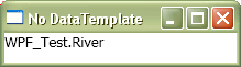
That certainly isn't too impressive. What you see above is what gets displayed as a result of calling ToString() on the River object referenced by the ContentControl. Let's take a moment to examine what is going on here.
The example above creates an instance of the River class, which represents the Colorado River. It also creates a ContentControl which is told to display that River object somehow. The ContentControl examines the River object and tries to figure out how to render it, but since River does not derive from UIElement it has no way of knowing how to do so. Once ContentControl is devoid of options, it ends up calling ToString() on the River object and then displays that text.
With a DataTemplate
Now that we've seen how boring a River object looks in the absence of data templates, it's time to add one into the mix. Here's the same XAML used before, only this time there is a template for the River class:
<StackPanel>
  <StackPanel.Resources>
    <DataTemplate DataType="{x:Type local:River}">
      <Border BorderBrush="Blue" BorderThickness="3" CornerRadius="12">
        <Grid Margin="4">
          <TextBlock>
            <Run Text="The"/>
            <TextBlock Text="{Binding Name}"/>
            <Run Text="is"/>
            <TextBlock Text="{Binding MilesLong}" />
            <Run Text="miles long." />
          </TextBlock>
        </Grid>
      </Border>
    </DataTemplate>

    <local:River x:Key="theRiver" Name="Colorado River" MilesLong="1450" />
  </StackPanel.Resources>

  <ContentControl Content="{StaticResource theRiver}" />
</StackPanel>
This is how that XAML renders:
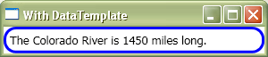
The River object is displayed much more intelligently when a data template is applied. The information held within it is now displayed as part of a sentence, and that sentence is wrapped in a curved blue border. Keep in mind that the rendition of a River object seen above is completely arbitrary. It can be displayed in whatever way is considered appropriate for the application in which it exists.
Triggers
Another feature of WPF often used in conjunction with templates is known as "triggers". In general a trigger is somewhat like an if block in procedural code; it only executes what it contains when some condition evaluates to true.
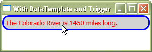
For example, here is a modified version of the XAML seen in the previous section. This time the DataTemplate has a Trigger in it which sets the Border's Background property to 'LightGray' and the TextBlock's Foreground property to 'Red' when the mouse cursor is anywhere over the Border.
<StackPanel>
  <StackPanel.Resources>
    <DataTemplate DataType="{x:Type local:River}">
      <Border x:Name="bdr"
        BorderBrush="Blue" BorderThickness="3" CornerRadius="12"
        >
        <Grid Margin="4">
          <TextBlock x:Name="txt">
            <Run Text="The"/>
            <TextBlock Text="{Binding Name}"/>
            <Run Text="is"/>
            <TextBlock Text="{Binding MilesLong}" />
            <Run Text="miles long." />
          </TextBlock>
        </Grid>
      </Border>

      <DataTemplate.Triggers>
        <Trigger SourceName="bdr" Property="IsMouseOver" Value="True">
         <Setter TargetName="bdr" Property="Background" Value="LightGray"/>
         <Setter TargetName="txt" Property="Foreground" Value="Red"/>
        </Trigger>
      </DataTemplate.Triggers>
    </DataTemplate>

    <local:River x:Key="theRiver" Name="Colorado River" MilesLong="1450" />
  </StackPanel.Resources>

  <ContentControl Content="{StaticResource theRiver}" />
</StackPanel>
When that XAML is used, the UI looks like this when the cursor is over the River visuals:
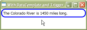
When the cursor is moved away from the River visuals, the background and foreground colors automatically revert to their previous values. Triggers handle all of that functionality for us, as seen below:
There are several kinds of triggers, each has a different way of determining when it should execute. In the remainder of this article, we will only focus on the two types of triggers used in the WPF Horse Race demo application: DataTrigger and MultiDataTrigger.
Triggers can be used in other places outside of templates, such as within Styles and on any FrameworkElement subclass, but this article only shows them being used within a DataTemplate. For more information about triggers, refer to the Triggers sub-section of the External links section toward the bottom of this article.
How the WPF Horse Race uses Data Templates and Triggers
The WPF Horse Race demo application has one custom DataTemplate, which is used to render instances of the RaceHorse class. The template declaration can be found in the RaceHorseDataTemplate.xaml file. The full template XAML is not shown in this article because it is rather lengthy and would serve no purpose being shown in its entirety. Instead we will examine it piecemeal.
The Visuals for a RaceHorse
The visuals elements in the RaceHorse data template can be distilled down to this basic structure:
<Border>
<Grid>
<StackPanel Orientation="Horizontal">
<Rectangle />
<Image />
</StackPanel>
<TextBlock />
</Grid>
</Border>
Here is a visual explanation for how the elements in the template correspond to what you see as a RaceHorse runs a race:
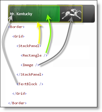
(Note: The yellow rectangle in the image above, which represents the StackPanel, was added just for the sake of clarity. It does not actually appear on screen when the application is running.)
The root Border element defines the boundaries of the RaceHorse's "race pit" (the area in which it runs). The Border contains a Grid panel, which, in turn, contains a StackPanel and a TextBlock. The StackPanel holds the RaceHorse's progress indicator and a picture of a horse. A StackPanel was used to hold those two elements so that as the Rectangle (i.e. the progress indicator) becomes wider, the Image will be moved to the right along with it.
The TextBlock displays the RaceHorse's name. Since the TextBlock is declared beneath the StackPanel (lexically), it will be rendered on top of the StackPanel, with respect to the z-order. This ensures that the horse's name is always visible.
Setting properties on the winner of a race
After the template's visuals are declared, there are also some trigger declarations. One of them is a DataTrigger. A DataTrigger executes its contents when the supplied Binding returns a specific value. Here is the XAML for that trigger:
<DataTrigger Binding="{Binding IsWinner}" Value="True">
<Setter TargetName="progressIndicator"
Property="Fill" Value="{StaticResource WinnerBrush}" />
<Setter TargetName="horseName"
Property="Foreground" Value="Black" />
<Setter TargetName="horseName"
Property="FontWeight" Value="Bold" />
<Setter TargetName="horseName"
Property="HorizontalAlignment" Value="Center" />
</DataTrigger>
That DataTrigger waits for the templated RaceHorse's IsWinner property to change from false to true. When that happens (i.e. the RaceHorse wins a race) all Setters contained within it are executed.
The Setter class provides a way to assign a value to a property. It is especially convenient when used in XAML, but can be used in the code-behind as well. When a RaceHorse wins a race the Setters modify the template's visuals, so that the progress indicator is rendered with a golden brush and its name stands out visually.
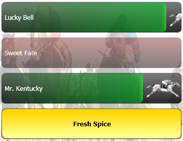
In the screenshot below, the RaceHorse named 'Fresh Spice' won the race:
When the next race starts and Fresh Spice's IsWinner property is set back to false, the properties affected by that trigger will automatically be reverted back to their previous values.
In case you are curious as to how the DataTrigger knows when the IsWinner property value changes, the answer lies in the fact that RaceHorse implements INotifyPropertyChanged. A RaceHorse object's PropertyChanged event is raised when its IsWinner property value changes. The Binding class is aware of the INotifyPropertyChanged interface and is notified when the PropertyChanged event has been raised for the IsWinner property.
Fading Away Losing RaceHorses
When a RaceHorse completes a race but does not finish first, it turns red and then fades away. By "fades away," I mean that the Opacity property of the RaceHorse's Border element is animated down to 60% over three quarters of a second. This article does not cover WPF's support for animation, but it is important to know that animations can be started in response to a trigger being executed.
In order to change the color of and fade away a RaceHorse which lost a race, a trigger must know two pieces of information: whether the RaceHorse finished the race yet, and if it lost the race. This type of "AND" expression can be implemented with a MultiDataTrigger, as seen below:
<MultiDataTrigger>
<MultiDataTrigger.Conditions>
<Condition Binding="{Binding IsFinished}" Value="True" />
<Condition Binding="{Binding IsWinner}" Value="False" />
</MultiDataTrigger.Conditions>
<Setter TargetName="progressIndicator"
Property="Fill" Value="{StaticResource FinishedBrush}" />
<MultiDataTrigger.EnterActions>
</MultiDataTrigger.EnterActions>
<MultiDataTrigger.ExitActions>
</MultiDataTrigger.ExitActions>
</MultiDataTrigger>
External links
DataTemplates
Triggers
Other templates
History
- April 6, 2007 – Created the article.


 General
  News
News  Suggestion
  Question
  Bug
Bug  Answer
  Joke
Joke  Praise
  Rant
Rant  Admin
Admin 


 Submit an article or tip


