Table of contents
- Part 1 (XAML): Learn about XAML and how it is used in WPF applications.
- Part 2 (Layout): Learn about layout panels and how they are used to construct user interfaces.
- Part 3 (Data binding): Learn how WPF data binding works and how it can be used.
- Part 4 (Data templates and triggers): Learn how data templates and triggers work and how they can be used.
- Part 5 (Styles): Learn about how UIs can be styled in WPF.
Introduction
This is the fifth article in an introductory series about the Windows Presentation Foundation. In the previous article we examined data templates and triggers to see how the rendering of data objects can be described in XAML. In this article we examine styles, and how they are used in the WPF Horse Race demo application (which is available for download at the top of the first article in this series).
Just like the other articles in this series, this article does not cover its subject matter in exhaustive detail. Instead we will examine just enough of the basics so that we can see how those features are put to use in the demo app. If you want to learn more about how styles can be used, refer to the External links section for additional information.
Background
WPF borrows many concepts from both the Web and desktop programming worlds. The separation of user interface layout from behavior (i.e. XAML vs. code-behind) is a tip of the hat to ASP.NET. The extensive set of event-driven APIs for detailed control over user interaction is reminiscent of the Windows Forms programming model. WPF can be thought of as a distillation of the best features found in various UI platforms, plus a wide range of new features as well.
One major contribution made to WPF by the world of Web development was the concept of styles. Styling in WPF is somewhat similar to how Cascading Style Sheets (CSS) is used by Web developers. The basic idea of styling in WPF is that you can define a Style object which is applied to a specific type of element in the UI, such as a Button or TextBox. That style can be applied to every instance of the element type, or you can selectively apply it to certain instances. Styling in WPF really just boils down to a convenient way to apply property settings to one or more visual elements.
Style vs. theme
Before we start looking into styles, it is important to draw a distinction between styles and themes. Operating systems have "themes", WPF applications have "styles". Themes are an OS-level concept: such as the blue, green, and silver themes seen in Windows XP, or the Aero theme in Vista. WPF applications automatically detect the current OS theme and use that color scheme wherever possible, and can even programmatically choose which theme to use.
A style exists only within one WPF application, or just one Window in a WPF application, or even just one portion of a Window for that matter. Styles cannot be applied to anything outside of the WPF application in which they exist, nor can they be applied to any WinForms controls hosted within a WPF Window.
For more information about theme support in WPF, refer to the External links section at the end of this article.
The Style class
The entire styling infrastructure in WPF is based on the Style class. It has a relatively small set of public members, which makes it easy to grasp how styling works. Instances of the Style class are almost always created in XAML, but it is possible to create them in code if necessary.
Here are some of the properties of Style we will see in use later:
- Resources – is a
ResourceDictionary where you can put objects used only within the Style, such as brushes, value converters, etc. - Setters – a collection of
Setter and EventSetter objects that apply values to properties, or assign handlers to events. This is the content property of the Style class, which makes it very easy to use in XAML. - TargetType – indicates on what type of element the
Style will be applied, such as TreeView or Button.
The styles created in the WPF Horse Race demo application are very simple. There are other common properties of the Style class which they do not use, such as:
- BasedOn – allows for style inheritance. You can derive one
Style from another Style to create customizations without duplicating the core Style's XAML. - Triggers – just like in the
DataTemplates seen in the previous article in this series, this property contains a collection of triggers that can be used to conditionally apply values to properties.
A Style can be applied to any object which derives from FrameworkElement or FrameworkContentElement, both of which expose a public property named Style.
Without styles
If WPF did not provide a way to stylize elements, you would have to be out of your mind to even consider creating a distinctive, branded look and feel for an application's user interface. To create a visual consistency across all Windows in an application would quickly turn into a maintenance nightmare, especially once changes needed to be made to certain aspects of the visual style.
For example, consider the following XAML:
<Border BorderBrush="Black" BorderThickness="2">
  <StackPanel>
    <TextBlock Background="Tan" Margin="2,4">Bike</TextBlock>
    <TextBlock Background="Tan" Margin="2,4">Car</TextBlock>
    <TextBlock Background="Tan" Margin="2,4">Truck</TextBlock>
  </StackPanel>
</Border>
That simple markup results in something which looks like this:
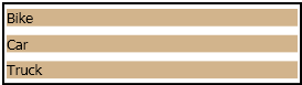
Suppose that the application we are building used to have a rule that TextBlocks must always have a tan background color, but one day a big wig at our imaginary company decides that tan is no longer a good color. Instead, now all TextBlocks should have a light gray background color.
If our application only had the three TextBlocks seen in the snippet above, that wouldn't be too much trouble. All we would have to do is update those three property settings:
<Border BorderBrush="Black" BorderThickness="2" Margin="10">
  <StackPanel>
    <TextBlock Background="LightGray" Margin="2,4">Bike</TextBlock>
    <TextBlock Background="LightGray" Margin="2,4">Car</TextBlock>
    <TextBlock Background="LightGray" Margin="2,4">Truck</TextBlock>
  </StackPanel>
</Border>
But if our application happens to contain hundreds or even thousands of TextBlocks, then we are in trouble. Suddenly we would be wishing that there was an easy way to set every TextBlock's Background property to light gray.
With styles
Fortunately there is an easy way to set properties on any number of elements: "styles". Let's see how a Style can be used to solve the problem described in the previous section. Here's one way to do it:
<Border BorderBrush="Black" BorderThickness="2">
  <StackPanel>
    <StackPanel.Resources>
      <Style x:Key="TxtBlkStyle" TargetType="{x:Type TextBlock}">
        <Setter Property="Background" Value="LightGray" />
        <Setter Property="Margin" Value="2,4" />
      </Style>
    </StackPanel.Resources>
    <TextBlock Style="{StaticResource TxtBlkStyle}">Bike</TextBlock>
    <TextBlock Style="{StaticResource TxtBlkStyle}">Car</TextBlock>
    <TextBlock Style="{StaticResource TxtBlkStyle}">Truck</TextBlock>
  </StackPanel>
</Border>
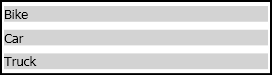
The XAML seen above creates a Style in the StackPanel's Resources collection. That Style targets elements of type TextBlock, and sets their Background and Margin properties. Notice that the Style has a key, 'TxtBlkStyle'. The Style property on each TextBlock is then explicitly set to reference that Style. It results in the following UI:
It turns out that there's an even easier way to accomplish this task. If you do not give a Style a key, then it will automatically be applied to all elements whose type matches the TargetType of the Style. Here's an example:
<Border BorderBrush="Black" BorderThickness="2">
  <StackPanel>
    <StackPanel.Resources>
      <Style TargetType="{x:Type TextBlock}">
        <Setter Property="Background" Value="LightGray" />
        <Setter Property="Margin" Value="2,4" />
      </Style>
    </StackPanel.Resources>
    <TextBlock>Bike</TextBlock>
    <TextBlock>Car</TextBlock>
    <TextBlock>Truck</TextBlock>
  </StackPanel>
</Border>
The solutions seen so far do not really solve the overall problem. If we want the entire application to contain light gray TextBlocks, then we need to move our Style to a higher place in the resource tree, such as the Application's resources (read more about that here and here). This way, all TextBlocks in the app will be able to use the Style we created. Here is an example of this technique:
<Application x:Class="WPF_Test.MyApp"
xmlns="http://schemas.microsoft.com/winfx/2006/xaml/presentation"
xmlns:x="http://schemas.microsoft.com/winfx/2006/xaml"
StartupUri="Window1.xaml"
>
<Application.Resources>
<Style TargetType="{x:Type TextBlock}">
<Setter Property="Background" Value="LightGray" />
<Setter Property="Margin" Value="2,4" />
</Style>
</Application.Resources>
</Application>
<Border BorderBrush="Black" BorderThickness="2">
<StackPanel>
<TextBlock>Bike</TextBlock>
<TextBlock>Car</TextBlock>
<TextBlock>Truck</TextBlock>
</StackPanel>
</Border>
Since the Application's resource collection is the most visible place to put a Style, all TextBlocks in every Window in the app will use that Style. It is possible to override that Style in any Window or anywhere in a Window's element tree, but by default that Style will be used by all TextBlocks in the application.
How the WPF Horse Race uses styles
The WPF Horse Race demo application creates two Styles. One of them is used to affect the Border element in the data template for the RaceHorse class (as seen in the previous article in this series). The other provides common values for properties of TextBlocks in the application's "Command Strip" area, toward the bottom of the Window.
Race pit border style
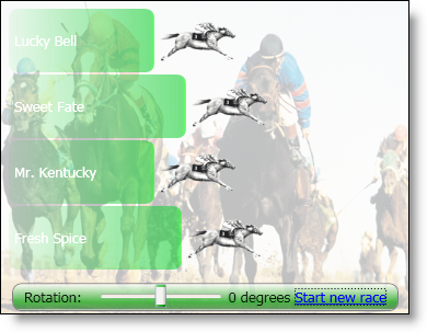
If the RaceHorse data template's root Border element did not have a Style applied to it, the UI would look like this:
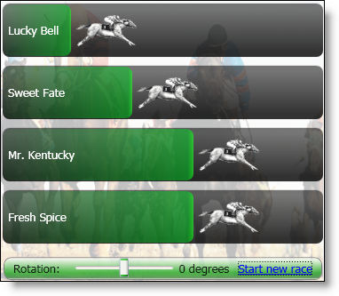
With the Style applied, it looks like this:
In the RacePitBorderStyle.xaml file, you will find a ResourceDictionary which contains a Style whose key is 'RacePitBorderStyle'. That file contains the following XAML:
<ResourceDictionary
xmlns="http://schemas.microsoft.com/winfx/2006/xaml/presentation"
xmlns:x="http://schemas.microsoft.com/winfx/2006/xaml"
>
<Style x:Key="RacePitBorderStyle" TargetType="Border">
<Style.Resources>
<LinearGradientBrush x:Key="BackBrush"
StartPoint="0.5,0" EndPoint="0.5,1"
>
<GradientStop Color="#88000000" Offset="0.1" />
<GradientStop Color="#CC000000" Offset="0.9" />
</LinearGradientBrush>
<LinearGradientBrush x:Key="BorderBrush"
StartPoint="0.5,0" EndPoint="0.5,1"
>
<GradientStop Color="#18000000" Offset="0.1" />
<GradientStop Color="#08000000" Offset="0.9" />
</LinearGradientBrush>
</Style.Resources>
<Setter Property="Background" Value="{StaticResource BackBrush}"/>
<Setter Property="BorderBrush" Value="{StaticResource BorderBrush}"/>
<Setter Property="BorderThickness" Value="1" />
<Setter Property="CornerRadius" Value="8" />
<Setter Property="Margin" Value="2,4" />
</Style>
</ResourceDictionary>
That Style is applied to the root Border element in the RaceHorse data template, as seen below:
<ResourceDictionary
xmlns="http://schemas.microsoft.com/winfx/2006/xaml/presentation"
xmlns:x="http://schemas.microsoft.com/winfx/2006/xaml"
xmlns:local="clr-namespace:WpfHorseRace"
>
<ResourceDictionary.MergedDictionaries>
<ResourceDictionary Source="RacePitBorderStyle.xaml" />
</ResourceDictionary.MergedDictionaries>
<DataTemplate DataType="{x:Type local:RaceHorse}">
<Border x:Name="racePit" Style="{StaticResource RacePitBorderStyle}">
</Border>
</DataTemplate>
</ResourceDictionary>
Command strip text style
The other Style used in the demo application is implicitly applied to its target elements. This Style can be seen in Window1.xaml, in the "Command Strip" section of the XAML.
<StackPanel Orientation="Horizontal">
<StackPanel.Resources>
<Style TargetType="TextBlock">
<Setter Property="VerticalAlignment" Value="Center" />
<Setter Property="Foreground" Value="#EE000000" />
</Style>
</StackPanel.Resources>
<TextBlock>Rotation: </TextBlock>
<Slider ... />
<TextBlock ... />
<TextBlock> degrees</TextBlock>
</StackPanel>
Notice that this Style's TargetType is set to "TextBlock". When the TargetType is set to a type that is part of the WPF framework, you do not have to use the more cumbersome {x:Type TypeName} syntax seen previously in this article. Since the Style seen above does not have a key, it is automatically applied to all TextBlock elements in the StackPanel.
External links
Styles and themes
Styles
Themes
History
- April 12, 2007 - Created the article.


 General
  News
News  Suggestion
  Question
  Bug
Bug  Answer
  Joke
Joke  Praise
  Rant
Rant  Admin
Admin 


 Submit an article or tip


