Contents
Introduction
When it comes to presenting data, there is a lot of emphasis on grids that present data in a single wide column, showing lots of fields horizontally.
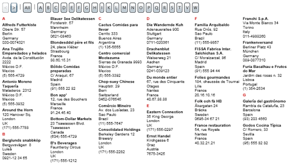
However, some data tend to be presented in narrow columns, such as address lists and book indices. Instead of complex navigation, they have letter buttons, so you can quickly get to everybody whose name starts with "K".
And, now that lots of people use monitors that are much wider then they are high, it makes sense to put the column into a vertical WrapPanel, so it takes all the available monitor width. Less scrolling and less wasted screen real estate.
The solution I came up with has a nice (I think) page transition effect. It supports paging at the data level, to minimize network traffic. Although people have already come up with WrapPanel implementations for Silverlight, I decided to do an improved version for this project (details). I also did a very simple reusable GroupHeader element that makes it easy to insert group headers in the list of records (the red "A", "B", etc., you see in the image above).
Requirements
Installation
- Download the zip file with the source code, and unzip in a directory.
- Open the TallColumns.sln file in Visual Studio.
- The main project within the solution is TallColumns. Project TallColumns2 is a version of TallColumns that uses scroll bars. The other projects are described further below.
How to add the GroupHeader element and the improved WrapPanel to the toolbox
- Build the solution.
- Right click in the toolbox and choose "Choose Items". This opens the "Choose Toolbox Items" window.
- Click the Silverlight tab.
- Click the Browse button, and double click the WrapPanel.dll in the WrapPanel/Bin directory.
- Now, do the same with the GroupHeader.dll in the GroupHeader/Bin directory.
- Click OK to add the controls to the toolbox.
TallColumns Project
If you download the source file and open the solution, you'll find it contains a number of projects.
The TallColumns and TallColumns2 projects contain the actual XAML. TallColumns2 is the same as TallColumns, except that it uses a ScrollViewer to show that the WrapPanel used here can be used with a ScrollViewer.
By way of test data, a list of companies and their addresses is used.
Page.xaml
The Page.xaml file starts with the two Storyboards that create the page transition effect when you move from page to page with the "Next" button, "Previous" button, etc. One blurs the page, and the other makes it visible again. The code actually updates the page contents after the first storyboard has completed but before starting the second storyboard.
After the storyboard definitions comes a horizontal StackPanel with the navigation buttons. The letter buttons sit in their own ItemsControl. The letters are actually loaded from the same database object as the main records. That makes it easy to ensure that if there are no companies starting with "X", there is no "X" button either.
Finally, there is the ItemsControl that shows the actual company records. If you look at its ItemTemplate, you'll see that on top of the TextBlocks for the record fields is a GroupHeader element that at the appropriate time shows the first letter of the company name (how this works). The ItemsControl's ItemsPanel meanwhile specifies that a WrapPanel is being used to show the records (details WrapPanel).
Page.xaml.cs
When you look at Page.xaml.cs, you'll find that all the code that makes the tall columns work is in a separate class TallColumnsManager, defined in the project TallColumnsManager. This to facilitate code reuse.
TallColumnsManager project
The TallColumnsManager class contains all the code needed to manage tall columns. When you look in the TallColumnsManager.cs file, you'll see it is extensively documented.
Db Project
This project acts as the Data Access Layer. It has the Customer class that defines a customer, with company name, address, etc. The CustomerGroupCaption class defines the letters for the letter buttons. And, the CustomerAccess class exposes the methods used by the TallColumnsManager object (passed in via delegate parameters to the TallColumnsManager constructor) to retrieve the data. The methods are well documented in the source file.
Obviously, this project is just a dummy, with the data hard coded (old timers will recognize the Northwind list of customers). However, it would be easy to change the implementation so it retrieves data over the network, minimizing traffic by only retrieving a page load of records instead of all available records. This wouldn't affect the class' interface or the rest of the tall columns code.
WrapPanel Project
Improvements
This WrapPanel has a few improvements compared with the WrapPanel published by lneir:
- Can be used inside a
ScrollViewer. - Allows you to only show complete child elements (leaving out elements at the edges that are partly cutoff).
- Lets you get the number of elements shown within the
WrapPanel. This is useful when you try to create a paged interface with elements of different sizes.
WrapPanel Members
WrapPanel derives from Panel. It adds the following methods and properties to those provided by Panel:
Methods
static WrapPanel GetWrapPanel(string name)
Given the name of a WrapPanel, returns a reference to that WrapPanel. This may be the only way to get a reference to a WrapPanel that is used as the ItemsPanel of an ItemsControl.
Example:
WrapPanel wp = WrapPanel.GetWrapPanel("MainWrapPanel");
Properties
| Name | Type | Description |
Orientation | Orientation | Either Orientation.Horizontal or Orientation.Vertical. |
ShowIncompleteChildren | bool | If true, you may see incomplete child elements at the right or bottom edge of the WrapPanel.
If false, child elements that cannot be completely shown within the WrapPanel are not shown at all.
|
ShownChildren | int | Number of child elements currently shown in the WrapPanel. Only valid after the WrapPanel has loaded (Loaded event has fired). |
GroupHeader Project
This is a very simple element that makes it easy to insert single letter group headers in the list of records shown with an ItemsControl.
Say, you are showing the company name and address of a list of companies, sorted by company name, in an ItemsControl:
<ItemsControl  ...>
    <ItemsControl.ItemTemplate>
        <DataTemplate>
                 <StackPanel Orientation="Vertical" >
                    <TextBlock FontWeight="Bold" Text="{Binding CompanyName}" />
                    <TextBlock Text="{Binding Address}" />
                </StackPanel>
         </DataTemplate>
    </ItemsControl.ItemTemplate>
</ItemsControl>
With the GroupHeader element, you can then insert a TextBlock each time a company name starting with a new letter is reached. The TextBlock would show that letter, like this:
A
Alfreds Futterkiste
Ana Trujillo Emparedados y helados
Antonio Moreno Taquería

B
Berglunds snabbköp
Blauer See Delikatessen
...
The GroupHeader element goes above the TextBlocks with the actual record fields:
<ItemsControl  .....>
    <ItemsControl.ItemTemplate>
        <DataTemplate>
                 <StackPanel Orientation="Vertical" >
                    <my:GroupHeader GroupName="Main" GroupingValue="{Binding CompanyName}">
                        <my:GroupHeader.Template>
                            <ControlTemplate TargetType="my:GroupHeader">
                                <TextBlock x:Name="GroupHeaderText"></TextBlock>
                            </ControlTemplate>
                        </my:GroupHeader.Template>
                    </my:GroupHeader>
                    <TextBlock FontWeight="Bold" Text="{Binding CompanyName}" />
                    <TextBlock Text="{Binding Address}" />
                </StackPanel>
         </DataTemplate>
    </ItemsControl.ItemTemplate>
</ItemsControl>
The GroupHeader has a template containing the TextBlock that will show the letter. Add properties to make it bold, change its color, etc.
Make sure that the TextBlock in the template has the name "GroupHeaderText".
Instead of a TextBlock, you can also use a Button or HyperlinkButton, like this:
<my:GroupHeader GroupName="Main" GroupingValue="{Binding CompanyName}">
    <my:GroupHeader.Template>
        <ControlTemplate TargetType="my:GroupHeader">
            <Button x:Name="GroupHeaderText" Click="LetterButton_Click"></Button>
        </ControlTemplate>
    </my:GroupHeader.Template>
</my:GroupHeader>
Bind the GroupingValue property of the GroupHeader to the record field whose first letter the GroupHeader needs to look at (CompanyName, in this case).
If you have more then one ItemsControl with a GroupHeader in your application, assign a unique name to the GroupName property of each GroupHeader.
When you reload an ItemsControl with a GroupHeader (for example, by assigning a new collection of records to the DataContext of the ItemsControl), use the static GroupHeader.ResetGroup(string groupName) method to reset the group. That way, the last record processed before the reload doesn't upset the group headers after the reload.
For example:
GroupHeader.ResetGroup("Main");
MainItemsControl.DataContext = newCollection;


 General
  News
News  Suggestion
  Question
  Bug
Bug  Answer
  Joke
Joke  Praise
  Rant
Rant  Admin
Admin 


 Submit an article or tip

