Introduction
This article presents a custom ComboBox with popup DataGrid. Instead of a simple list box control, the control shows a popup with fully featured WPF ToolKit DataGrid. You can find several sites and forums that discuss how you can implement custom combobox with DataGrid or ListView popup control. This article shows how such a control can be implemented in Windows application as well as CustomDataGridComboBox column in DataGrid. CustomComboBox control derived from ComboBox with some additional properties. With these properties, you can easily implement DataGrid columns in popup control.
Using WPF Custom ComboBox Control
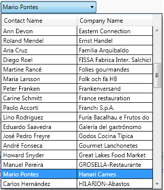
Firstly, we are presenting the usage of the CustComboBox in Windows application. The following XAML code shows the implementation of the control. The control is bounded to some DataSource, with specified DisplayMemberPath. After defining datasource, columns of DataGrid popup are defined as a content of CustComboBox.
<local:CustComboBox Height="23" ItemsSource="
	{Binding Collection}" DisplayMemberPath="Property1"
	IsEditable="True" >

	<toolKit:DataGridTextColumn Header="Header 1"
		Binding="{Binding Property1, Mode=Default}" />
	<toolKit:DataGridTextColumn Header="Header 2"
		Binding="{Binding Property2, Mode=Default}"/>
	<toolKit:DataGridTextColumn Header="Header 3"
		Binding="{Binding Property3, Mode=Default}"/>

</local:CustComboBox>
Except DataGrid columns' definition as Content, the control is the same as the ordinary ComboBox control. All features of the ComboBox are also available in the control.
Implementation of CustComboBox Class
Code-Behind Class Implementation
The CustComboBox is a custom WPF control derived from ComboBox. CustComboBox class is decorated with ContentPropertyAttribute which means the columns of the control can be defined as a content. The class contains the following fields:
partPopupDatagrid – Part name of the popupDataGrid used in XAML part implementationcolumns- Collection of DataGrid columnspopupDataGrid – DataGrid popup control
and readonly Columns property:
[DefaultProperty("Columns")]
[ContentProperty("Columns")]
public class CustComboBox : ComboBox
{
   private const string partPopupDataGrid = "PART_PopupDataGrid";
   private ObservableCollection<datagridtextcolumn /> columns;
   private DataGrid popupDataGrid;

   static CustComboBox()
    {
       DefaultStyleKeyProperty.OverrideMetadata(typeof(CustComboBox),
       	new FrameworkPropertyMetadata(typeof(CustComboBox)));
    }
    [DesignerSerializationVisibility(DesignerSerializationVisibility.Content)]
    public ObservableCollection<datagridtextcolumn /> Columns
    {
       get
        {
         if (this.columns == null)
         {
           this.columns = new ObservableCollection<datagridtextcolumn />();
         }
         return this.columns;
        }
    }
The main part of the code-behind class implementation is virtual member OnApplyTemplate. This method connects popup control with DataGrid and columns. First, find the template part of the DataGrid popup control, define the columns, and implement some events for managing selection in DataGrid popup.
public override void OnApplyTemplate()
    {
       if (popupDataGrid == null)
         {
           popupDataGrid = this.Template.FindName(partPopupDataGrid, this) as DataGrid;
           if (popupDataGrid != null && columns != null)
           {
             for (int i = 0; i < columns.Count; i++)
               popupDataGrid.Columns.Add(columns[i]);

             popupDataGrid.PreviewMouseDown +=
             	new MouseButtonEventHandler(popupDataGrid_PreviewMouseDown);
             popupDataGrid.SelectionChanged +=
             	new SelectionChangedEventHandler(popupDataGrid_SelectionChanged);
           }
        }
        base.OnApplyTemplate();
    }
Code-Behind Class Implementation
Every WPF custom control can be implemented in XAML, where we defined Template and Style of the custom control. The style and template of our control is almost the same as an ordinary ComboBox control, except a ScrollViewer where it replaced is with DataGrid. The following XAML shows part of the implementation:
<Popup x:Name="PART_Popup" AllowsTransparency="true"
	IsOpen="{Binding IsDropDownOpen,
	RelativeSource={RelativeSource TemplatedParent}}"
	Placement="Bottom" PopupAnimation="{DynamicResource
		{x:Static SystemParameters.ComboBoxPopupAnimationKey}}"
		Grid.ColumnSpan="2">
<Microsoft_Windows_Themes:SystemDropShadowChrome x:Name="Shdw"
	MaxHeight="{TemplateBinding MaxDropDownHeight}" MinWidth="{Binding
	ActualWidth, ElementName=Placement}" Color="Transparent">
<Border x:Name="DropDownBorder" Background="{DynamicResource {x:Static
	SystemColors.WindowBrushKey}}" BorderBrush="{DynamicResource {x:Static
	SystemColors.WindowFrameBrushKey}}" BorderThickness="1">

<toolKit:DataGrid x:Name="PART_PopupDataGrid"
	ItemsSource="{TemplateBinding ItemsSource}"
	AutoGenerateColumns="False" IsReadOnly="True"
	IsSynchronizedWithCurrentItem="True"
	SelectionMode="Single" HeadersVisibility="Column"
	SelectedIndex="{TemplateBinding SelectedIndex}"
	DisplayMemberPath="{TemplateBinding DisplayMemberPath}"
	Focusable="False" SelectedItem="{TemplateBinding SelectedItem}"
	SelectedValue="{TemplateBinding SelectedValue}"
	SelectedValuePath="{TemplateBinding SelectedValuePath}"
	RowDetailsVisibilityMode="Collapsed" Tag="{TemplateBinding Tag}"
	MaxHeight="{TemplateBinding MaxDropDownHeight}"
	IsTextSearchEnabled="{TemplateBinding IsTextSearchEnabled}"
	CanUserSortColumns="True">
</toolKit:DataGrid>
</Border>
</Microsoft_Windows_Themes:SystemDropShadowChrome>
</Popup>
Bold code is an implementation of the DataGrid as a popup control. The next phase in the implementation is the selection and closing popup when selecting an item. In code–behind, we implemented SelectionChangedEventHandler and PreviewMouseDown events to control selection and closing popup.
CustComboBox Control as a DataGrid Column Control

The second part of the article presents the control integrated into DataGrid column controls. The new column control DataGridCustComboBoxColumn is an extended control of the DataGridComboBoxColumn. The following code snippet show the implementation:
[DefaultProperty("Columns")]
[ContentProperty("Columns")]
public class CustDataGridComboBoxColumn : DataGridComboBoxColumn
{
private ObservableCollection<datagridtextcolumn /> columns;
private CustComboBox comboBox ;
public CustDataGridComboBoxColumn();
protected override void OnPropertyChanged(DependencyPropertyChangedEventArgs e);
[DesignerSerializationVisibility(DesignerSerializationVisibility.Content)]
public ObservableCollection<datagridtextcolumn /> Columns;
protected override FrameworkElement GenerateEditingElement
(DataGridCell cell, object dataItem);
protected override object PrepareCellForEdit
(FrameworkElement editingElement, RoutedEventArgs editingEventArgs);
protected override bool CommitCellEdit(FrameworkElement editingElement);
}
Similar to the previous implementation, we have Columns as a Content property to setup columns in popup control. To get control to appear in DataGrid, the three methods of the base class were overridden:
GenerateEditingElementPrepareCellForEditCommitCellEdit
Using CustDataGridComboBoxColumn Control
The following code example shows how to define CustDataGridComboBoxColumn into WPF DataGrid.
<toolKit:DataGrid Name="ordersDataGrid" IsSynchronizedWithCurrentItem="
	True" ItemsSource="{Binding Source={StaticResource ordersViewSource}}"
					AutoGenerateColumns="False" RowHeight="25"
					Margin="6,6,6,35">

	<toolKit:DataGrid.Columns>
		<bhCustCtrl:CustDataGridComboBoxColumn x:Name="custComboBoxCol"
		Width="150" Header="Customers"
		SelectedValueBinding="{Binding CustomerID}"
		SelectedValuePath="CustomerID" DisplayMemberPath="ContactName"
		ItemsSource="{Binding Source={StaticResource customerViewSource}}">

			<toolKit:DataGridTextColumn Header="ContactName"
				Binding="{Binding ContactName, Mode=Default}" />
			<toolKit:DataGridTextColumn Header="CompanyName"
				Binding="{Binding CompanyName, Mode=Default}" />

		</bhCustCtrl:CustDataGridComboBoxColumn>

		<bhCustCtrl:CustDataGridComboBoxColumn x:Name="emplComboBoxCol"
		Width="150" Header="Employees"
		SelectedValueBinding="{Binding EmployeeID}"
		SelectedValuePath="EmployeeID" DisplayMemberPath="FirstName"
		ItemsSource="{Binding Source={StaticResource employeeViewSource}}">

			<toolKit:DataGridTextColumn Header="FirstName"
				Binding="{Binding FirstName, Mode=Default}" />
			<toolKit:DataGridTextColumn Header="LastName"
				Binding="{Binding LastName, Mode=Default}" />
		</bhCustCtrl:CustDataGridComboBoxColumn>

		<toolKit:DataGridTextColumn Width="100" Header="
			OrderDate" Binding="{Binding Path=OrderDate}"/>
		<toolKit:DataGridTextColumn Width="100" Header="
			ShipName" Binding="{Binding Path=ShipName}"/>
		<toolKit:DataGridTextColumn Width="100" Header="
			ShipAddress" Binding="{Binding Path=ShipAddress}" />
		<toolKit:DataGridTextColumn Width="100" Header="
			ShipCity" Binding="{Binding Path=ShipCity}" />
	</toolKit:DataGrid.Columns>
</toolKit:DataGrid>
That's all!
About the Demo
The demo application uses the NorthWind database to present some data. You can find it on this site.
History
- 14/10/2009: Initial version
Bahrudin Hrnjica holds a Ph.D. degree in Technical Science/Engineering from University in Bihać.
Besides teaching at University, he is in the software industry for more than two decades, focusing on development technologies e.g. .NET, Visual Studio, Desktop/Web/Cloud solutions.
He works on the development and application of different ML algorithms. In the development of ML-oriented solutions and modeling, he has more than 10 years of experience. His field of interest is also the development of predictive models with the ML.NET and Keras, but also actively develop two ML-based .NET open source projects: GPdotNET-genetic programming tool and ANNdotNET - deep learning tool on .NET platform. He works in multidisciplinary teams with the mission of optimizing and selecting the ML algorithms to build ML models.
He is the author of several books, and many online articles, writes a blog at http://bhrnjica.net, regularly holds lectures at local and regional conferences, User groups and Code Camp gatherings, and is also the founder of the Bihac Developer Meetup Group. Microsoft recognizes his work and awarded him with the prestigious Microsoft MVP title for the first time in 2011, which he still holds today.


 General
  News
News  Suggestion
  Question
  Bug
Bug  Answer
  Joke
Joke  Praise
  Rant
Rant  Admin
Admin 


 Submit an article or tip


