Introduction
The xpButton is a control library of two buttons, viz, xpGlowButton and xpOfficeButton. The GlowButton gives simple 3D look to traditional button control based on colors selected and the OfficeButton uses Scheme based coloring (inherited from xpLabel control) to make the look-like Office 2003 buttons. The color scheme used can be easily customized.
Before going into the study of the code of this snippet, be sure to be clear with control development fundamentals. Also, you can refer to the book; Pro .NET 2.0 Windows Forms and Custom Controls in C# by Matthew McDonald; Apress.
Using the Code
Let's analyze the code now. Each of the two button-types are derived from Base class; ButtonBase, which in turn inherits from System.Windows.Forms.Control.
public enum ButtonStates
{
Normal,
Hover,
Pushed,
Disabled
}
The button states are enumerated and will be used for painting the button according to the state of the button.
public abstract class ButtonBase : Control
{
    protected abstract void PaintNormalState(Graphics g);
    protected abstract void PaintHoverState(Graphics g);
    protected abstract void PaintClickedState(Graphics g);
    protected abstract void PaintDisabledState(Graphics g);
    ...
}
The class is made abstract so that other button controls have the same functionality. The basic properties that are common for both the button controls are:
#region Extended Properties
[Description("Starting color of Gradient"),
Category("Gradient Colors")]
public Color BackColor1
{
    get{ return _bkgcolor1; }
    set
    {
        if( (_bkgcolor1 != value) )
        {
            _bkgcolor1 = value;
            BackColor = value;
            Invalidate();
        }
    }
}

[Description("Ending color of Gradient"),
Category("Gradient Colors")]
public Color BackColor2
{
    get{ return _bkgcolor2; }
    set
    {
        if( (_bkgcolor2 != value) )
        {
            _bkgcolor2 = value;
            Invalidate();
        }
    }
}

protected ButtonStates StateOfButton
{
    get{ return _state; }
    set
    {
        if(value != _state)
        {
            _state = value;
            Invalidate();
        }
    }
}

[Description("Result of dialog to be returned"),
Category("Dialog Result")]
public DialogResult DialogResult
{
    get{ return _dlgResult; }
    set{ _dlgResult = value; }
}

public override string Text
{
    get{ return base.Text; }
    set
    {
        if(value != base.Text)
        {
            base.Text = value;
            Invalidate();
        }
    }
}

#endregion
The BackColor and BackColor1 properties are used for drawing the background of button control in 3D using gradients. Remember, each public property has an associated private member.
The following methods are overridden by the ButtonBase class:
OnEnabledChanged(EventArgs e)OnPaint(PaintEventArgs e)OnClick(EventArgs e)OnMouseMove(MouseEventArgs e)OnMouseLeave(EventArgs e)OnMouseDown(MouseEventArgs e)OnMouseUp(MouseEventArgs e)
The code of Mouse-events, Click and EnableChanged is much expected but the code of OnPaint is worth mentioning.
protected override void OnPaint(PaintEventArgs e)
{
    switch(StateOfButton)
    {
        case ButtonStates.Normal:
            PaintNormalState(e.Graphics);
            break;
        case ButtonStates.Hover:
            PaintHoverState(e.Graphics);
            break;
        case ButtonStates.Pushed:
            PaintClickedState(e.Graphics);
            break;
        case ButtonStates.Disabled:
            PaintDisabledState(e.Graphics);
            break;
    }
    if(this.Focused && StateOfButton != ButtonStates.Disabled)
        PaintFocusRectangle(e.Graphics);
}
As clearly visible, the Paint methods of the particular state of the button control are called based on the current state of the button and the deriving class must override these methods since these are declared as abstract.
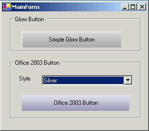
xpGlowButton
It's time for work now, the glow button control is almost ready to use. The code of xpGlowButton goes like this:
public class xpGlowButton : ButtonBase
{
    ...
}
The GlowButton control exposes one more property, i.e., HoverForeColor.
[Description("Fore-color of text when mouse is hovered"),
Category("Draw Extenders")]
public Color HoverForeColor
{
get{ return _hoverTxtColor; }
set
{
if(_hoverTxtColor != value)
_hoverTxtColor = value;
}
}
xpOffice2003Button
The properties exposed by the control are:
public BackColorSchemeType BackColorScheme
{
get{ return _bkgColorScheme; }
set
{
if(value != _bkgColorScheme)
{
_bkgColorScheme = value;
ChangeColorScheme();
Invalidate();
}
}
}
[Description("Starting color of Gradient"),
Category("Gradient Colors")]
public Color DownColor1
{
get{ return _downColor1; }
set
{
if( (_downColor1 != value) )
{
_downColor1 = value;
ChangeColorScheme();
Invalidate();
}
}
}
[Description("Ending color of Gradient"),
Category("Gradient Colors")]
public Color DownColor2
{
get{ return _downColor2; }
set
{
if( (_downColor2 != value) )
{
_downColor2 = value;
ChangeColorScheme();
Invalidate();
}
}
}
[Description("Ending color of Gradient"),
Category("Gradient Colors")]
public Color HoverColor
{
get{ return _hoverColor; }
set
{
if( (_hoverColor != value) )
{
_hoverColor = value;
ChangeColorScheme();
Invalidate();
}
}
}
[Description("Show Shadow for the text")]
public bool ShowShadow
{
get{ return _shadow; }
set
{
_shadow = value;
Invalidate();
}
}
The BackColorScheme gives an option to choose among the Office Blue, Orange, Silver or Green scheme. The ShowShadow can be used to drop shadow of the text of button.
To Do List
- Adding image support to the buttons
- Making the control properties update automatically based on
ColorScheme selected (same as in xpLabel control)
History
- 5th March, 2007: v1.0.2617.23929 First initial release
I: working as software engineer.
My Blog: http://blog.abstractcomputing.in


 Submit an article or tip