|

Death held out a hand. I WANT, he said, A BOOK ABOUT THE DANGEROUS CREATURES OF FOURECKS
Albert looked up and dived for cover, receiving only mild bruising because he had the foresight to curl into a ball.
After a while Death, his voice a little muffled, said: ALBERT, I WOULD BE SO GRATEFUL IF YOU COULD GIVE ME A HAND HERE.
Albert scrambled up and pulled at some of the huge volumes, finally dislodging enough of them for his master to clamber free.

HMM... Death picked up a book at random and read the cover. "DANGEROUS MAMMALS, REPTILES, AMPHIBIANS, BIRDS, FISH, JELLYFISH, INSECTS, SPIDERS, CRUSTACEANS, GRASSES, TREES, MOSSES, AND LICHENS OF TERROR INCOGNITA, " he read. His gaze moved down the spine. VOLUME 29C, he added. OH. PART THREE, I SEE.

He glanced up at the listening shelves. POSSIBLY IT WOULD BE SIMPLER IF I ASKED FOR A LIST OF THE HARMLESS CREATURES OF THE AFORESAID CONTINENT?

They waited.

IT WOULD APPEAR THAT...
"No, wait master. Here it comes."

Albert pointed to something white zigzagging lazily through the air. Finally Death reached up an caught the single sheet of paper.

He read it carefully and then turned it over briefly just in case anything was written on the other side.
"May I?" said Albert. Death handed him the paper.
"'Some of the sheep'"
Terry Pratchett, The Last Continent
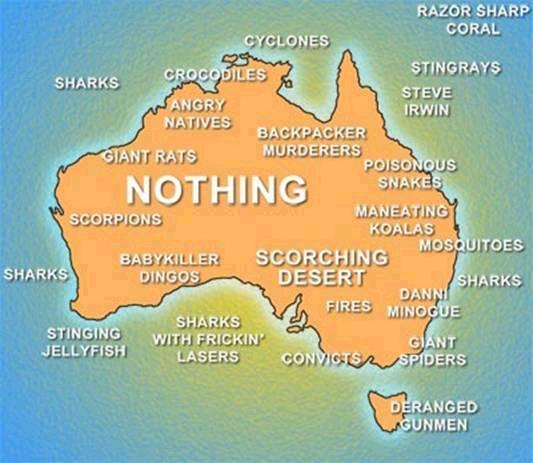
The only reason you don't have more lethal snakes in OZ: they have been eaten by the spiders...
Bad command or file name. Bad, bad command! Sit! Stay! Staaaay...
|
|
|
|
|
Terry nailed it! 
|
|
|
|
|
yep, they're the worst !
|
|
|
|
|
In my opinion the bit at 29-35 s. is the best 
When the song is: "you may... get killed...", the true story "how to become a skeleton" is displayed.
Worth to see!
Very good tourism ad!
|
|
|
|
|
|
I have a range of values (voltage) over time (thousands of minutes, one value per minute). I am trying to chart these. Determining the length of my Y axis is quite a problem for me. If I take a minimum and maximum, and use that as the axis height, one or two zero values result in all the others being scrunched up at the top of the chart. If I remove zeroes, it looks much better, and for a chart, they aren't very important, I'll give all real values in a tabular report.
What I would like to do is determine the average height of the band of data points, sort of the space between the moving average of the low points and that of the heigh points. I figure to do that, I would need a median series, so I could determine a smoothed series of points above and below median, and make my Y axis 's' higher and 's' lower than those.
How do people normally do this?
|
|
|
|
|
|
Yeah, a but much for a simple charting app. Why a low pass, by the way?
|
|
|
|
|
|
I would post a question in the Algorithms forum here on CodeProject.
« I had therefore to remove knowledge, in order to make room for belief » Immanuel Kant
|
|
|
|
|
Can you exclude the zeroes as 'out-of-statistic' or are they just 'the interesting pieces of data in the data set'?
THESE PEOPLE REALLY BOTHER ME!! How can they know what you should do without knowing what you want done?!?!
-- C++ FQA Lite
|
|
|
|
|
It gets quite sweet when I exclude the zeroes. The chart then spreads across the Y axis nicely.
|
|
|
|
|
I see. But what is the physical reason of such zeroes (e.g. spurious measure values, ...) ?
THESE PEOPLE REALLY BOTHER ME!! How can they know what you should do without knowing what you want done?!?!
-- C++ FQA Lite
|
|
|
|
|
Maybe that, maybe power outages. We get zero volts in the house quite frequently.
|
|
|
|
|
Brady Kelly wrote: It gets quite sweet when I exclude the zeroes. The chart then spreads across the Y axis nicely
Sounds like you want an arbitrary axis scale. Assuming you're using Excel, here's a link to a page on how to do that. I've not had occasion to use it, and it's trying to make a Microsoft tool do something that it's not designed to do, which as we all know is fraught with pain.
We can program with only 1's, but if all you've got are zeros, you've got nothing.
|
|
|
|
|
|
Looks like that project has been abandoned for some time.
The difficult we do right away...
...the impossible takes slightly longer.
|
|
|
|
|
|
Doesn't look like it does WPF though. OxyPlot also provides source, and operates on most .NET platforms.
|
|
|
|
|
what are you using to do the charting..?
|
|
|
|
|
OxyPlot. It's really quite good looking at their examples,but documentation is dismal.
|
|
|
|
|
Neat. took a look, but did see any way to implement the low pass filter idea....you could implement outside the livrary by averaging the previous 10 readings (1-10)- or whatever value you like....the greater, the smoother- values to average, then 2-11 etc.
I had a several day temperature test that had the occasional dropout/communication error that resulted in a similar waveform, everything scrunched at the top and spikes to 0. In that volume of air, there is no way it could spike like that, so it was a realistic solution....if your voltages are similar it might be a solution...or it could mask a real problem.....
Ken
|
|
|
|
|
Use either a Venn diagram, a pie chart, or a swim-lanes chart, because those three are, without a doubt, the most incredibly useful and versatile charts that have ever been invented and will ever be invented.
I wanna be a eunuchs developer! Pass me a bread knife!
|
|
|
|
|
What you might want to do is outlyer detection, and just encode those results with some kind of symbol on the chart like a red line or something like that. Or, as others have said, just drop them and leave them as gaps.
Also, you can compute the median and standard deviation for your series, and then just plot everything within a few standard deviations of the median, which should be pretty close to the same thing.
|
|
|
|
|
How do I calculate the median. That would be a straight line - I want a 'median' between lows and highs that moves up and down with the lows and highs. I suppose I could do it point for point and calculate a median curve.
|
|
|
|


 General
  News
News  Suggestion
  Question
  Bug
Bug  Answer
  Joke
Joke  Praise
  Rant
Rant  Admin
Admin 


