Introduction
This article is a hands-on tutorial, how to write a MVVM (Model View ViewModel) design pattern based X11 ribbon command interface application (a little more complex GUI) with XAML using the Roma Widget Set (Xrw). The Roma Widget Set is a zero dependency GUI application framework for X11 (it requires only assemblies of the free Mono standard installation and libraries of the free X11 distribution; it doesn't particularly require GNOME, KDE or commercial libraries) and is implemented entirely in C#.
This article continues the work of Writing a XAML dialog application for X11. As far as i know, this (utilizing the Xrw) is the first attempt to use XAML for X11 application development after the abandonment of Moonlight.
Neither the Roma Widget Set nor the XAML implementation are complete. This sample application is intended as a more complex 'proof of concept' and checks out if and how it is possible bo create MVVM design pattern based X11 application with XAML.
Since this second attempt to use XAML for a X11 application development has been successful, other articles about XAML using the Roma Widget Set on X11 will follow centenly.
Background
The Motivation and the general Concept to use XAML for X11 application development are already explained in the Writing a XAML dialog application for X11 article.
Focus
While the first article demonstrated, that with XAML
- a window containing some controls can be defined and
- click events can be connected to buttons,
this article shall demonstrate that with XAML
- a window containing a ribbon command interface can be defined,
- static window resources (this sample has a resource converter and a ModelView) can be defined,
- a ModelView can be assigned to a control's data context as a static resource,
- a resource converter can be applied to a control's property as a static resource,
- commands can be bound to buttons via the "RelayCommand" approach,
- control properties can be bound to the data context and
- controls can be updated via the
INotifyPropertyChanged interface.
Using the code
The sample application was written with Mono Develop 2.4.1 for Mono 2.8.1 on OPEN SUSE 11.3 Linux 32 bit EN and GNOME desktop. Neither the port to any older nor to any newer version should be a problem. The sample application's solution consists of two projects (the complete sources are provided for download):
- XamlRibbonApp contains the source code of the sample application.
- XamlPreprocessor contains the source code of the XAML preprocessor.
The sample application is also tested with Mono Develop 3.0.6 for Mono 3.0.4 on OPEN SUSE 12.3 Linux 64 bit DE and GNOME desktop, IceWM, TWM und Xfce.
The only difference between the 32 bit and the 64 bit solution is the definition of some X11 specific data types, as already described in the Programming Xlib with Mono develop -Part 1: Low level (proof of concept) article.
The Xlib/X11 window handling is based on the X11Wrapper assembly version 0.7, that defines the function prototypes, structures and types for Xlib/X11 calls to the libX11.so. This assembly has been developed for the Programming Xlib with Mono Develop - Part 1: Low-level (proof of concept) project and has been advanced during the Programming the Roma Widget Set (C# X11) - a zero dependency GUI application framework - Basics project.
The GUI framework is based on the Xrw assembly version 0.7, that defines the widgets/gadgets and its wrapper classes used within the XAML code (that should be as near to the Microsoft® original as reasonable). This assembly has been developed during the Programming the Roma Widget Set (C# X11) - a zero dependency GUI application framework - Basics project.
Advice: To use the class library documentation shortcut (F1) from MonoDevelop, the "mono-tools" package has to be installed.
The image shows the sample application with XrwTheme.GeneralStyle.Gtk2Clearlooks.
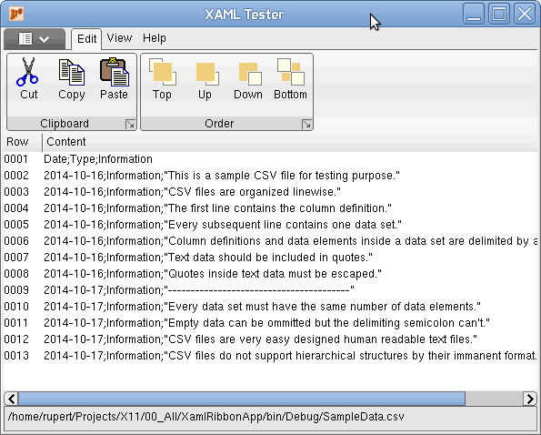
The sample application just opens (via the ribbon's application menu item "Open ...") and displays a CSV file linewise (SampleData.csv is included in the sample application's source).
All RibbonApplicationMenuItems and all RibbonButtons are connected to RelayCommands, most of them just show a message box for demonstration purpose. Different to Click property, that connects to an event delegate that must be contained in the view's code behind file, the Command property connects to a command class instance that must be contained in the current DataContext's code file, which is typically the ViewModel. This leads to a much better MVVM pattern implementation with no code behind (search for "RelayCommand" at code procect or see "Using EventTrigger in XAML for MVVM – No Code Behind" why code behind should be avoided).
The images for all RibbonApplicationMenuItems and all RibbonButtons are taken from the framework resource file (xmlns:properties="clr-namespace:X11.Properties") and converted to image resources via BitmapResourceToImageConverter class.
The Windows version, developed in parrallel to realize XAML code as near to the Microsoft® original as reasonable, takes the images from the application resource file (xmlns:properties="clr-namespace:XamlRibbonApp.Properties") and uses a different implementation of the BitmapResourceToImageConverter class to convert the images to image resources. This approach completely hides the X11/Windows® platform specifics.
Walk through
The Project setup, Application file context (except the theme) and Preporocessor code generation steps are exactly the same as in Writing a XAML dialog application for X11. Please refer to this article, if a new solution shall be created from scratch.
Main view file context
The XAML (MainView.xaml)
First the XAML file with omitted ribbon definition.
<RibbonWindow x:Class="XamlRibbonApp.MainView"
xmlns="http://schemas.microsoft.com/winfx/2006/xaml/presentation"
xmlns:x="http://schemas.microsoft.com/winfx/2006/xaml"
xmlns:src="clr-namespace:XamlRibbonApp"
xmlns:properties="clr-namespace:X11.Properties"
Name="MainWindow" Title="XAML Tester" Height="600" Width="500"
MinWidth="300" MinHeight="250" Icon="XrwIcon16.bmp">
<Window.Resources>
<src:BitmapResourceToImageConverter x:Key="ImageConverter" />
<src:MainWindowViewModel x:Key="MainViewModel" />
</Window.Resources>
<Grid Name="MainGrid" DataContext="{StaticResource MainViewModel}">
<Grid.Resources>
</Grid.Resources>
<Grid.Datacontext>
</Grid.Datacontext>
<Grid.ColumnDefinitions>
<ColumnDefinition Width="1*"/>
</Grid.ColumnDefinitions>
<Grid.RowDefinitions>
<RowDefinition Height="117"/>
<RowDefinition Height="1.0*"/>
<RowDefinition Height="28"/>
</Grid.RowDefinitions>
<Ribbon Name="MainRibbon" Grid.Column="0" Grid.Row="0" Grid.ColumnSpan="2" Margin="0">
...
</Ribbon>
<ListView Name="FileContentListView" Grid.Row="1" ItemsSource="{Binding DocumentRows}" >
<ListView.View>
<GridView>
<GridView.Columns>
<GridViewColumn Header="Row" Width="40" DisplayMemberBinding="{Binding Row}" />
<GridViewColumn Header="Content" DisplayMemberBinding="{Binding Path=Content}" />
</GridView.Columns>
</GridView>
</ListView.View>
</ListView>
<Label Name="StateLine" Content="{Binding CurrentFilePath}" Grid.Column="0" Grid.Row="2"
BorderThickness="1" />
</Grid>
</RibbonWindow>
The complete XAML code is fully Microsoft® compatible.
Compared to Writing a XAML dialog application for X11, only the enhancments and differences will be discussed.
A RibbonWindow is used instead of the Window for the topmost container control. This is to prevent "System.Windows.Data Error: 4 : Cannot find source for binding with reference 'RelativeSource FindAncestor, AncestorType='System.Windows.Controls.Ribbon.RibbonWindow', AncestorLevel='1''. BindingExpression:Path=WindowState; DataItem=null; target element is 'Ribbon' (Name='MainRibbon'); target property is 'NoTarget' (type 'Object')" and "System.Windows.Data Error: 4 : Cannot find source for binding with reference 'RelativeSource FindAncestor, AncestorType='System.Windows.Controls.Ribbon.RibbonWindow', AncestorLevel='1''. BindingExpression:Path=IsActive; DataItem=null; target element is 'Ribbon' (Name='MainRibbon'); target property is 'NoTarget' (type 'Object')" errors.
- The
xmlns:properties attribute defines the namespace of local resource properties. (Microsoft .NET projects include Resources.resx file(s) to hold language dependent resources like strings and images/icons. Xrw fakes this technique through simply using C# files.) This attribute is recommended, or mandatory if any attribute values use the prrefix properties: as reference. The syntax of the attribute value must be clr-namespace:<namespace name>. The namespace, defined this way, can be referenced by attribute values via the prefix properties:. - The
MinWidth attribute defines the minimum width constraint. This attribute is optional. Positive integers are interpreted as width in pixel. The Microsoft® original WPF ribbon control from .NET 4.5 disappears on a main window width below 295. Therfore the MinWidth is set to 300. - The
MinHeight attribute defines the minimum height constraint. This attribute is optional. Positive integers are interpreted as height in pixel. - The
Window.Resources node is evaluated now and defines static resources, associated to the Window class instance. This node is optional. The syntax of the node must be <namespace name>:<class name> x:Key="<alias name>". Static resources, defined here, are created during the window class instanciation and bound to the window class instance's lifetime. Due to the search algorithm for static resources (that traverses down the control hierarchy), the window class instance and all it's child control instances can reference a resource defined here by it's <alias name>.
It is useful to define static resources associated to the window class instance, because they can be referenced multiple times (but must be loaded into memory only once) and can be referenced fom every child control instance. If the application supports multiple windows or the static resource shold be bound to the application class instance's lifetime rather than to one window class instance's lifetime, it might be even better to define application wide static resources inside the App.xaml's Application.Resources node, that is evaluated now as well. In this case, due to the search algorithm for static resources, all window class instances and all their child control instances can reference a resource defined here by it's <alias name>.
The Grid is the root layout manager widget of the window. There are no enhancements over the grid usage, already discussed in Writing a XAML dialog application for X11.
The Ribbon will be discussed later.
The ListView will be defined by:
- The
Name attribute defines the class instance name, that can be used to identify the class instance uniquely. This attribute is is recommended, or mandatory if this class instance has to be accessible through C# code. - The
Grid.Column attribute defines the zero-based column index, the control has to be positioned inside a grid. The default value is 0. This attribute is recommended for a grid child, but mandatory for controls positioned not on column 0 inside a grid. The index must not exceed the available grid rows. - The
Grid.Row attribute defines the zero-based row index, the control has to be positioned inside a grid. The default value is 0. This attribute is recommended for a grid child, but mandatory for controls positioned not on row 0 inside a grid. The index must not exceed the available grid rows. - The
ItemsSource attribute defines the data source, the control gets the items to display from. The data source must implement System.Collections.IEnumerable. This attribute is optional in general, but required to bind data to display. - The
ListView.View node provides access to the child object, that defines how the data to display are styled and organized in the ListView. This node is mandatory. It must contain a node, that defines the child control. Currently only the GridView node is supported as child.
The GridView will be defined by:
- The
GridView.Columns node joins the column definitions. This node is mandatory.
- The GridColumn node defines one grid view column. This node is mandatory, at least once.
- The Header attribute defines the column header display text. This attribute is optional.
- The Width attribute defines the grid column width. This attribute is optional. Positive integers are interpreted as width in pixel and overrule any automatic width calculation. Omitted width attribute leads to automatic width calculation.
- The DisplayMemberBinding attribute associates the property name of any assigned ItemsSource's element value to be displayed in this column. This attribute is optional in general, but required to display values.
Back to the Ribbon now. This is the XAML file extraxt with the ribbon definition. (The second ribbon group of the first ribbon tab and the second ribbon tab are omitted, they use the same techniques as the first ribbon tab's first group.)
<Ribbon Name="MainRibbon" Grid.Column="0" Grid.Row="0">
    <Ribbon.ApplicationMenu>
        <RibbonApplicationMenu>
            <RibbonApplicationMenuItem Name="AppMenuItem0" Header="New"
                Command="{Binding RibbonAppMenu_FileNew_Command}" CommandParameter="null"
                ImageSource="{Binding Source={x:Static properties:Resources.IMAGE_RIBBON_NEW_32_WIN},
                              Converter={StaticResource ImageConverter}}" />
            <RibbonApplicationMenuItem Name="AppMenuItem1" Header="Open ..."
                Command="{Binding RibbonAppMenu_FileOpen_Command}" CommandParameter="null"
                ImageSource="{Binding Source={x:Static properties:Resources.IMAGE_RIBBON_OPEN_32_WIN},
                                              Converter={StaticResource ImageConverter}}" />
            <RibbonSeparator />
            <RibbonApplicationMenuItem Name="AppMenuItem2" Header="Save"
                Command="{Binding RibbonAppMenu_FileSave_Command}" CommandParameter="null"
                ImageSource="{Binding Source={x:Static properties:Resources.IMAGE_RIBBON_SAVE_32_WIN},
                                              Converter={StaticResource ImageConverter}}" />
            <RibbonApplicationMenuItem Name="AppMenuItem3" Header="Save as ..."
                Command="{Binding RibbonAppMenu_FileSaveAs_Command}" CommandParameter="null"
                ImageSource="{Binding Source={x:Static properties:Resources.IMAGE_RIBBON_SAVEAS_32_WIN},
                                              Converter={StaticResource ImageConverter}}" />
            <RibbonSeparator />
            <RibbonApplicationMenuItem Name="AppMenuItem4" Header="Options"
                Command="{Binding RibbonAppMenu_Options_Command}" CommandParameter="null"
                ImageSource="{Binding Source={x:Static properties:Resources.IMAGE_RIBBON_OPTIONS_32_WIN},
                                              Converter={StaticResource ImageConverter}}" />
            <RibbonApplicationMenuItem Name="AppMenuItem5" Header="Close"
                Command="{Binding RibbonAppMenu_Close_Command}" CommandParameter="null"
                ImageSource="{Binding Source={x:Static properties:Resources.IMAGE_RIBBON_CLOSE_32_WIN},
                                              Converter={StaticResource ImageConverter}}" />
            <RibbonSeparator />
            <RibbonApplicationMenuItem Name="AppMenuItem6" Header="Exit"
                Command="{Binding RibbonAppMenu_Exit_Command}" CommandParameter="null"
                ImageSource="{Binding Source={x:Static properties:Resources.IMAGE_RIBBON_EXIT_32_WIN},
                                              Converter={StaticResource ImageConverter}}" />
        </RibbonApplicationMenu>
    </Ribbon.ApplicationMenu>
    <RibbonTab Name="RibbonTabEdit" Header="Edit">
        <RibbonGroup Name="RibbonGroupClipboard" Header="Clipboard" >
            <RibbonButton Name="RibbonButtonClipboardCut" Label="Cut"
               Command="{Binding RibbonTabEdit_ClipboardCut_Command}"
               LargeImageSource="{Binding Source={x:Static properties:Resources.IMAGE_CUT_32_WIN},
                                                  Converter={StaticResource ImageConverter}}"
               SmallImageSource="{Binding Source={x:Static properties:Resources.IMAGE_CUT_16_WIN},
                                                  Converter={StaticResource ImageConverter}}" />
            <RibbonButton Name="RibbonButtonClipboardCopy" Label="Copy"
                Command="{Binding RibbonTabEdit_ClipboardCopy_Command}"
                LargeImageSource="{Binding Source={x:Static properties:Resources.IMAGE_COPY_32_WIN},
                                                   Converter={StaticResource ImageConverter}}"
                SmallImageSource="{Binding Source={x:Static properties:Resources.IMAGE_COPY_16_WIN},
                                                   Converter={StaticResource ImageConverter}}" />
            <RibbonButton Name="RibbonButtonClipboardPaste" Label="Paste"
                Command="{Binding RibbonTabEdit_ClipboardPaste_Command}"
                LargeImageSource="{Binding Source={x:Static properties:Resources.IMAGE_PASTE_32_WIN},
                                                   Converter={StaticResource ImageConverter}}"
                SmallImageSource="{Binding Source={x:Static properties:Resources.IMAGE_PASTE_16_WIN},
                                                   Converter={StaticResource ImageConverter}}" />
        </RibbonGroup>
        <RibbonGroup Name="RibbonGroupOrder" Header="Order">
            ...
        </RibbonGroup>
    </RibbonTab>
    <RibbonTab Name="RibbonTabView" Header="View">
        ...
    </RibbonTab>
    <RibbonTab Name="RibbonTabHelp" Header="Help">
        <RibbonGroup Name="RibbonGroupHelp" Header="Help">
            <RibbonSplitButton Name="RibbonButtonHelp" Label="Help"
                LargeImageSource="{Binding Source={x:Static properties:Resources.IMAGE_QUESTION_32},
                                                   Converter={StaticResource ImageConverter}}"
                SmallImageSource="{Binding Source={x:Static properties:Resources.IMAGE_QUESTION_16},
                                                   Converter={StaticResource ImageConverter}}" >
                <RibbonMenuItem Header="Local Help"
                    Command="{Binding RibbonTabHelp_LocalHelp_Command}"
                    ImageSource="{Binding Source={x:Static properties:Resources.IMAGE_QUESTION_16},
                                                  Converter={StaticResource ImageConverter}}"/>
                <RibbonMenuItem Header="Online Help"
                    Command="{Binding RibbonTabHelp_OnlineHelp_Command}"
                    ImageSource="{Binding Source={x:Static properties:Resources.IMAGE_QUESTION_16},
                                                  Converter={StaticResource ImageConverter}}"/>
            </RibbonSplitButton>
            <RibbonButton Name="RibbonButtonAbout" Label="About"
                    Command="{Binding RibbonTabHelp_About_Command}"
                    LargeImageSource="{Binding Source={x:Static properties:Resources.IMAGE_INFO_32},
                                                       Converter={StaticResource ImageConverter}}"
                    SmallImageSource="{Binding Source={x:Static properties:Resources.IMAGE_INFO_16},
                                                       Converter={StaticResource ImageConverter}}" />
        </RibbonGroup>
    </RibbonTab>
</Ribbon>
The complete XAML code is fully Microsoft® compatible.
The Ribbon will be defined by:
- The
Name attribute defines the class instance name, that can be used to identify the class instance uniquely. This attribute is is recommended, or mandatory if this class instance has to be accessible through C# code. - The
Grid.Column attribute defines the zero-based column index, the control has to be positioned inside a grid. The default value is 0. This attribute is recommended for a grid child, but mandatory for controls positioned not on column 0 inside a grid. The index must not exceed the available grid rows. - The
Grid.Row attribute defines the zero-based row index, the control has to be positioned inside a grid. The default value is 0. This attribute is recommended for a grid child, but mandatory for controls positioned not on row 0 inside a grid. The index must not exceed the available grid rows. - The
Ribbon.ApplicationMenu node provides access to the child object, that defines the application menu. This node is optional in general, but required to display the application menu. It must contain a node, that defines the application menu. Only the RibbonApplicationMenu node is supported as child.
- The RibbonApplicationMenu node defines the application menu. This node is mandatory. It must contain nodes, that define the menu entries. - The
RibbonTab node defines a ribbon tab and contains nodes, that define the child controls. Currently only the RibbonGroup node is supported as child.
The RibbonApplicationMenu control contains RibbonApplicationMenuItem controls as children and they will be defined by:
- The
Name attribute defines the class instance name, that can be used to identify the class instance uniquely. This attribute is is recommended, or mandatory if this class instance has to be accessible through C# code. - The
Header attribute defines the text to display. This attribute is optional. - The
Command attribute defines the "RelayCommand" to execute. This attribute is optional. The advantage of Command over Click is, that the action code can be located within the ModelView code instead of the View's code behind. - The
ImageSource attribute defines the icon to display. This attribute is optional. The syntax of the attribute must be either <relative image file URI> or {Binding Source={x:Static <namespace name>:<resource name>} Converter={StaticResource <converter class alias name>}} for static resources, local to this node, and {Binding Source={StaticResource <resource alias name>} Converter={StaticResource <converter class alias name>}} for static resources, that can be referenced. The Converter is optional.
The {Binding ... } syntax provides the possibility to use precompiled resources instead of image files and therefore also to avoid a plenty of image files to deliver besides the assembly.
The RibbonApplicationMenu control contains RibbonSeparator controls as children. The Microsoft® implementation will treat this node absolutely independend, while the X11/Xrw implementation modifies the previous RibbonApplicationMenuItem to display a separator. Hence separators can't occure without previous RibbonApplicationMenuItem and can't occure in immediate succession.
The RibbonTab control contains RibbonGroup controls as children and they will be defined by:
- The
Name attribute defines the class instance name, that can be used to identify the class instance uniquely. This attribute is is recommended, or mandatory if this class instance has to be accessible through C# code. - The
Header attribute defines the text to display. This attribute is optional. - The
RibbonButton node defines one ribbon button as child control. This node is optional. - The
RibbonSplitButton node defines one ribbon split button as child control. This node is optional.
The RibbonGroup control contains RibbonButton controls as children and they will be defined by:
- The
Name attribute defines the class instance name, that can be used to identify the class instance uniquely. This attribute is is recommended, or mandatory if this class instance has to be accessible through C# code. - The
Label attribute defines the text to display. This attribute is optional. - The
Command attribute defines the "RelayCommand" to execute. This attribute is optional. The advantage of Command over Click is, that the action code is located within the ModelView code instead of the View's code behind. - The
LargeImageSource attribute defines the large icon to display for a size definition ImageSize="Large" and the SmallImageSource attribute defines the small icon to display for a size definition ImageSize="Small". These attributes are optional. The syntax of the attributes must be either <relative image file URI> or {Binding Source={x:Static <namespace name>:<resource name>} Converter={StaticResource <converter class alias name>}} for static resources, local to this node, and {Binding Source={StaticResource <resource alias name>} Converter={StaticResource <converter class alias name>}} for static resources, that can be referenced. The Converter is optional.
The RibbonGroup control contains RibbonSplitButton controls as children and they will be defined by:
- The
Name attribute defines the class instance name, that can be used to identify the class instance uniquely. This attribute is is recommended, or mandatory if this class instance has to be accessible through C# code. - The
Label attribute defines the text to display. This attribute is optional. - The
LargeImageSource attribute defines the large icon to display for a size definition ImageSize="Large" and the SmallImageSource attribute defines the small icon to display for a size definition ImageSize="Small". These attributes are optional. The syntax of the attributes must be either <relative image file URI> or {Binding Source={x:Static <namespace name>:<resource name>} Converter={StaticResource <converter class alias name>}} for static resources, local to this node, and {Binding Source={StaticResource <resource alias name>}} for static resources, that can be referenced. - The
RibbonMenuItem node defines one menu item for the ribbon split button. This node is mandatory, at least once. Currently only the RibbonMenuItem node is supported as child.
- The Header attribute defines the text to display. This attribute is optional.
- The Command attribute defines the "RelayCommand" to execute. This attribute is optional. The advantage of Command over Click is, that the action code is located within the ModelView code instead of the View's code behind.
- The ImageSource attribute defines the icon to display. This attribute is optional. The syntax of the attribute must be either <relative image file URI> or {Binding Source={x:Static <namespace name>:<resource name>} Converter={StaticResource <converter class alias name>}} for static resources, local to this node, and {Binding Source={StaticResource <resource alias name>} Converter={StaticResource <converter class alias name>}} for static resources, that can be referenced. The Converter is optional.
If LargeImageSource attribute is defined for a RibbonButton or RibbonSplitButton, it will be displayed with ImageSize="Large" by default (no matther whether SmallImageSource attribute is defined).
If LargeImageSource attribute is omitted and SmallImageSource attribute is defined for a RibbonButton or RibbonSplitButton, it will be displayed with ImageSize="Small" and IsLabelVisible="True" by default.
If neither LargeImageSource attribute nor SmallImageSource attribute is defined for a RibbonButton or RibbonSplitButton, the Label attribute is no longer optional but mandatory and the RibbonButton or RibbonSplitButton will be displayed with label only.
The default size adoption policy for RibbonButton and RibbonSplitButton is, e. g. for a four button RibbonGroup with LargeImageSource attribute and SmallImageSource attribute defined for all RibbonButtons and RibbonSplitButtons, equivalent to:
<RibbonGroup.GroupSizeDefinitions>
    <RibbonGroupSizeDefinition>
        <RibbonControlSizeDefinition ImageSize="Large" IsLabelVisible="True"/>
        <RibbonControlSizeDefinition ImageSize="Large" IsLabelVisible="True"/>
        <RibbonControlSizeDefinition ImageSize="Large" IsLabelVisible="True"/>
        <RibbonControlSizeDefinition ImageSize="Large" IsLabelVisible="True"/>
    </RibbonGroupSizeDefinition>
    <RibbonGroupSizeDefinition>
        <RibbonControlSizeDefinition ImageSize="Large" IsLabelVisible="True"/>
        <RibbonControlSizeDefinition ImageSize="Small" IsLabelVisible="True"/>
        <RibbonControlSizeDefinition ImageSize="Small" IsLabelVisible="True"/>
        <RibbonControlSizeDefinition ImageSize="Small" IsLabelVisible="True"/>
    </RibbonGroupSizeDefinition>
    <RibbonGroupSizeDefinition>
        <RibbonControlSizeDefinition ImageSize="Large" IsLabelVisible="True"/>
        <RibbonControlSizeDefinition ImageSize="Small" IsLabelVisible="False"/>
        <RibbonControlSizeDefinition ImageSize="Small" IsLabelVisible="False"/>
        <RibbonControlSizeDefinition ImageSize="Small" IsLabelVisible="False"/>
    </RibbonGroupSizeDefinition>
    <RibbonGroupSizeDefinition IsCollapsed="True"/>
</RibbonGroup.GroupSizeDefinitions>
Limitations of the XAML syntax
X11/Xrw implementation:
- Currently only the
GridView node is supported as child for ListView.Views. - Currently only the
RibbonGroup node is supported as child for RibbonTabs. - Currently only the
RibbonMenuItem node is supported as child for RibbonSplitButtons. - Curently the
RibbonGroup control must contain at least one RibbonButton or RibbonSplitButton controls. Other child nodes are not supported. - Currently
RibbonGroup.GroupSizeDefinitions node is not supported.
Microsoft® original implementation:
- The
RibbonDialogLauncher for RibbonGroup has been removed from the System.Windows.Controls.Ribbon (ribbon for WPF .NET 4.5) to avoid potentially patent infringing. Strangely it is still contained in the up-to-date download for Microsoft.Windows.Controls.Ribbon (ribbon for WPF October 2010 .NET 4.0) and Office 2013. - The WPF ribbon control from .NET 4.5 disappears on a main window width below 295.
Connection of RelayCommands
To connect a "RelayCommand" several requirements must be met.
- The control or one of the parent controls must have set the
DataContext attribute, e. g.: DataContext="{StaticResource MainViewModel}" - The control must bind the
Command attribute to a property of the class, that is set as data context, e. g.: Command="{Binding RibbonTabHelp_LocalHelp_Command}" - The class, that is set as data context, must provide a property to access the "RelayCommand", e. g.:
private RelayCommand _ribbonTabHelp_LocalHelp_Command = null;
...
public System.Windows.Input.ICommand RibbonTabHelp_LocalHelp_Command
{ get { return _ribbonTabHelp_LocalHelp_Command; } }
- The "RelayCommand" must have an "Action" and a "CanAction" callback associated, e. g.:
_ribbonTabHelp_LocalHelp_Command  = new RelayCommand(RibbonTabHelp_LocalHelp_Action,
                                                     RibbonTabHelp_LocalHelp_CanAction);
- The Action and a CanAction callbacks must be implemented, e. g.:
private void RibbonTabHelp_LocalHelp_Action(object o)
{
MessageBox.Show("To do: Fill the '" + CLASS_NAME + ".RibbonTabHelp_LocalHelp_Action' " +
"stub with meaningful code!", "Unfinished",
MessageBoxButton.OKCancel, MessageBoxImage.Information);
}
private bool RibbonTabHelp_LocalHelp_CanAction(object o)
{
return true;
}
The code behind (MainView.xaml.cs)
The corresponding C# code file of the main view is MainView.xaml.cs. It is almost empty.
using System;
using X11;
using Xrw;
using XrwXAML;
namespace XamlRibbonApp
{
public partial class MainView : XrwXAML.RibbonWindow, IView
{
public MainView ()
: base (-1, -1)
{
InitializeComponent ();
}
}
}
Main view model file context
The MainWindowViewModel.cs file contains all "RelayCommands" connected to application menu items and ribbon buttons. Most of them are just stubs. Only two of them are implemented to show how to call the OpenFileDialog and SaveFileDialog.
private void RibbonAppMenu_FileOpen_Action(object o)
{
OpenFileDialog ofd = new OpenFileDialog ();
ofd.Filter = "comma separated values CSV|*.csv";
ofd.FilterIndex = 0;
ofd.InitialDirectory = (new System.IO.FileInfo (
System.Reflection.Assembly.GetExecutingAssembly().Location)).Directory.FullName;
if (ofd.ShowDialog (Application.Current.MainWindow) == true)
{
int row = 1;
string line;
DocumentRows.Clear();
CurrentFilePath = ofd.FileName;
System.IO.StreamReader file = new System.IO.StreamReader(CurrentFilePath);
while ((line = file.ReadLine()) != null)
{
DocumentRows.Add (new DocumentLine (string.Format("{0:0000}", row), line));
row++;
}
file.Close();
}
}
private void RibbonAppMenu_FileSaveAs_Action(object o)
{
SaveFileDialog sfd = new SaveFileDialog ();
if (sfd.ShowDialog (Application.Current.MainWindow) == true)
{
CurrentFilePath = sfd.FileName;
}
}
Furthermore the RibbonAppMenu_FileOpen_Action() callback updates the MVVM Model behind the ViewModel via DocumentRows.Clear() and DocumentRows.Add(...).
The DocumentRows is a property of the ViewModel class:
public ObservableCollection<DocumentLine> DocumentRows
{
get
{
if (_model != null)
return _model.DocumentContent;
else
{
SimpleLog.LogLine(TraceEventType.Error, CLASS_NAME +
"DocumentRows.get (): Missing the model, connected to the view-model.");
return new ObservableCollection<DocumentLine>();
}
}
set
{
if (_model != null)
{
_model.DocumentContent = value;
RaisePropertyChanged("DocumentRows");
}
else
SimpleLog.LogLine(TraceEventType.Error, CLASS_NAME +
"DocumentRows.set (): Missing the model, connected to the view-model.");
}
}
The realization of the document lines as ObservableCollection<DocumentLine> provide the implementation of INotifyCollectionChanged and INotifyPropertyChanged. And the DocumentRows property is not only a convenient access to the document content, but also connected to the ListView's item source via XAML: ItemsSource="{Binding DocumentRows}".
Thereby changes to the document content are automatically updating the view.
The CurrentFilePath is another property of the ViewModel class:
public string CurrentFilePath
{
get
{
if (_model != null)
return _model.DocumentFilePath;
else
{
SimpleLog.LogLine(TraceEventType.Error, CLASS_NAME +
"CurrentFilePath.get (): Missing the model, connected to the view-model.");
return "";
}
}
set
{
if (_model != null)
{
_model.DocumentFilePath = value;
RaisePropertyChanged("CurrentFilePath");
}
else
SimpleLog.LogLine(TraceEventType.Error, CLASS_NAME +
"CurrentFilePath.set (): Missing the model, connected to the view-model.");
}
}
Since the MVVM ViewModel implements INotifyPropertyChanged and the CurrentFilePath property calls RaisePropertyChanged, the Label "StateLine" is notified about changes because it's Content property is connected to CurrentFilePath via XAML: Content="{Binding CurrentFilePath}"
There are two Code Project articles, i recommend to read in relation to clean MVVM implementation:
Points of Interest
Even if i have been sceptical about XAML (yet another new Microsoft® technology, yet another new paradigm after the document-view paradigm and the model-view-controller paradigm, all controls are new) i have to admit that
- XAML saves a lot of GUI coding!!! and
- parallel development for Linux/Unix (X11) and Windows can be so easy!!!
Because writing a XAML ribbon application for X11 has been successfull, this will not be the last article about XAML programming for X11.
Since 23. November 2014 the article Writing a XAML application for X11 with massive data binding and zero code continues the XAML topic.
Since 02. February 2015 the article Writing a XAML calculator application for X11 continues the XAML topic.
History
This is the first version from 29. October 2014.
This is a reviewd version from 23. November 2014.
I am currently the CEO of Symbioworld GmbH and as such responsible for personnel management, information security, data protection and certifications. Furthermore, as a senior programmer, I am responsible for the automatic layout engine, the simulation (Activity Based Costing), the automatic creation of Word/RTF reports and the data transformation in complex migration projects.
The main focus of my work as a programmer is the development of Microsoft Azure Services using C# and Visual Studio.
Privately, I am interested in C++ and Linux in addition to C#. I like the approach of open source software and like to support OSS with own contributions.


 General
  News
News  Suggestion
  Question
  Bug
Bug  Answer
  Joke
Joke  Praise
  Rant
Rant  Admin
Admin 


 Submit an article or tip


