Introduction
In this article, I’ll describe the Accordion user control I built using the jTemplates plug-in for jQuery. jTemplates is a template engine written as a jQuery plug-in. JTemplates is very effective in rendering HTML on the client side. A short introduction to jTemplates can be found in my previous article here.
There are a lot of Accordion plug-ins already available on the web. What’s so different about this one? The main difference is that you have total control on what is rendered on the client side. You can basically indicate what will be in the control’s top and bottom and what will be in each item’s header and content.
Source code
The source code contains the Accordion user control and the web application that shows a few ways of using it.
Using the code
Below is a sample usage of the Accordion user control:
<JQuery:Accordion ID="acTest3"
   ActionElementCssClass="AccordionActionItem"
   ExpandableElementCssClass="AccordionItemContainer"
   Width="200"
   runat="server">
   <JTemplate>
       {#foreach $T as record}
         <div class="AccordionActionItem">
         <label>{$T.record.Title}</label>
         </div>
         <div class="AccordionItemContainer" style="height:150px;">
         {#foreach $T.record.Items as item}
             <div>
                 <label>{$T.item.Name}</label>
             </div>
         {#/for}
         </div>
       {#/for}
   </JTemplate>
</JQuery:Accordion>
There are two ways to use the control: in static mode and in dynamic mode. In static mode, you simply write the HTML that needs to be outputted for the accordion, and at page load, the control is automatically does the initialization. In this mode, no special jtemplates tags need to be used.
In dynamic mode, there are two things that need to be done. The control’s data source needs to be initialized at some point, ether server side or client side. The template needs to contain jtemplates special tags that would render the accordion items for each item in the data source (see the above example).
Certain rules need to be followed in order for all this to work. For each item, there should be an element with the class that will match the ActionElementCssClass property value. This element can be contained by other elements. However, this element’s top container must be followed by an element with the class matching the ExpandableElementCssClass value. Below are a few valid examples for the case when ActionElementCssClass="AccordionActionItem" and ExpandableElementCssClass="AccordionItemContainer".
-
<div><!—this is the action element top container for item 1 -->
      <label class=" AccordionActionItem">Item 1</label>
</div>
<div class=" AccordionItemContainer">…..</div>
<!—this is the item container element -->

<div><!—this is the action element top container for item 2 -->
      <label class=" AccordionActionItem">Item 2</label>
</div>
<div class=" AccordionItemContainer">…..</div>
<!—this is the item container element -->
-
<div class=" AccordionActionItem">Item 1</div>
<!—this is the action element top container for item 1 -->

<div class=" AccordionItemContainer">…..</div>
<!—this is the item container element -->

<div  class=" AccordionActionItem">Item 2</div>
<!—this is the action element top container for item 2 -->

<div class=" AccordionItemContainer">…..</div>
<!—this is the item container element -->
Let’s go over the other properties provided by the control.
ActionElementContainerExpandedCssClass – if the property is set, then this CSS class will be applied to the top container of the action element when the item is expanded.ActionElementContainerNotExpandedCssClass – if the property is set, then this CSS class will be applied to the top container of the action element when the item is closed.ActionElementContainerMouseOverCssClass – if the property is set, then this CSS class will be applied to the top container of the action element when the mouse goes over the item.ExpandedByDefault –indicates if the first item in the list should be expanded by default.BeforeItemOpenClientMethod – if the property is set, then the JavaScript method with the corresponding name will be called before an item is opened. This method and the ones described below should have the following signature: function (index, dataItem, actionElement, itemContainerElement)
index – element indexdataItem – data item corresponding to the accordion itemactionElement – action elementitemContainerElement – item container element
BeforeItemCloseClientMethod – if the property is set, then the JavaScript method with the corresponding name will be called before an item is closed.AfterItemOpenClientMethod – if the property is set, then the JavaScript method with the corresponding name will be called after an item is opened.AfterItemCloseClientMethod – if the property is set, then the JavaScript method with the corresponding name will be called after an item is closed.
The control supports client side loading and template updates. An example of client side loading is shown below:
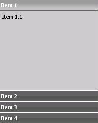
var    dataSource = [
    {
        Title : "Item 1",
        Items : [{Name : "Item 1.1"}]
    },
    {
        Title : "Item 2",
        Items : [{Name : "Item 2.1"}, {Name : "Item 2.2"}]
    },
    {
        Title : "Item 3",
        Items : [{Name : "Item 3.1"}, {Name : "Item 3.2"}]
    },
    {
        Title : "Item 4",
        Items : [{Name : "Item 4.1"}, {Name : "Item 4.2"}]
    }
];

acTest4.dataBind(dataSource);
where “acTest4” is equal to the ClientID property of the control.
Conclusion
Mixing jQuery plug-ins with jTemplates or other template engines could bring amazing results. We definitely will see this technique evolving in the coming years. The question is if jTemplates will still be used in the future by .NET developers since Microsoft is introducing, in ASP.NET 4, its own client-side rendering features.
This member has not yet provided a Biography. Assume it's interesting and varied, and probably something to do with programming.


 General
  News
News  Suggestion
  Question
  Bug
Bug  Answer
  Joke
Joke  Praise
  Rant
Rant  Admin
Admin 


 Submit an article or tip

