Rotating WPF Content in 3D Space
4.92/5 (69 votes)
Introducing ContentControl3D: a control that makes it easy to incorporate 3D flips into any WPF user interface.

Introduction
This article introduces and examines ContentControl3D; a Windows Presentation Foundation (WPF) control that makes it easy to add animated 3-dimensional (3D) rotations to any user interface. ContentControl3D can host any UI content on its front and back sides, and provides numerous ways to configure the animated rotations between the two sides. In addition to reviewing how to use the control, we will also see how certain aspects of it were implemented. ContentControl3D is part of the Thriple project on CodePlex.com.
The Good, the Bad, and the Practical
WPF offers powerful support for creating 3D user interfaces. If you are knowledgeable about 3D programming concepts, vector mathematics, and have come to grips with the complex WPF 3D object model, the sky is the limit. That’s the good news.
The bad news, however, is that most developers are not 3D experts, and don't have the time, inclination, etc. to climb the rather formidable learning curve. Most of us are far too busy trying to meet our deadlines to experiment with the relatively low-level programming model that WPF exposes for creating and manipulating abstractions of entities in 3D space.
This is a rather unfortunate situation. The WPF platform offers so much potential for incorporating 3D into user interfaces, but the programming model is too complicated and low-level to make it practical for most developers to leverage it. This is precisely the reason why I decided to create ContentControl3D.
ContentControl3D lowers the barrier to entry for WPF 3D programming. You can use this control in your applications, even purely from XAML, almost as easily as the standard ContentControl that comes with WPF. All of the complexities around using the 3D programming model are encapsulated in ContentControl3D, so you don't have to know anything about 3D programming to make use of it in your applications.
Why Use 3D?
At this point, you might be wondering why you should consider using 3D in your applications. It’s certainly not necessary. If used in poor taste it can lead to confusing and tacky user interfaces. However, there are ways that you can tastefully incorporate 3D into a user interface, such that it improves the user experience.
The most common and compelling reason to use ContentControl3D is space conservation. Many applications have a lot of data visualization and input screens to show to the user. The physical size of an application’s user interface is constrained by the size of the user’s monitor(s), or whatever size the application’s windows happen to be. This often creates contention for screen real estate amongst various pieces of a UI.
In addition to the layout problem, there is also the problem of presenting the user with too much information at once. If you try to cram as much “stuff” into a user interface as possible, the user might become confused and frustrated when trying to find what he or she is looking for. It is usually better to present as little information as necessary at all times, and disclose more detailed information upon request.
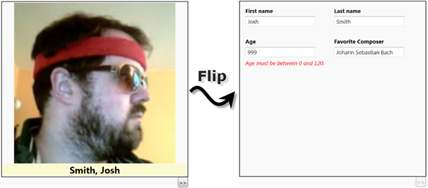
The problems caused by contention for screen real estate, and the cognitive dissonance created by information overload, can be mitigated by placing certain parts of a user interface on the back side of a ContentControl3D. When the user has a need to view details about something, or enter into edit mode, etc. the ContentControl3D can smoothly flip over to show that to the user. When the user no longer needs to view that piece of the user interface, the control can flip over to the front side and hide the unnecessary details. The image below, which contains two screenshots from the ‘Binding to a ViewModel’ demo application, shows this idea put to use.

The Thriple Project
ContentControl3D is part of my CodePlex project, called Thriple. You can download the latest source code and demo apps from that site. Here are some links to pages of the Thriple project:
- Home – landing page with introductory material
- Source Code – download the latest source code of the Thriple library and sample projects
- Discussions – ask a question or read what others have asked about Thriple
- Releases – read about system requirements and known issues
The ContentControl3D API
The interesting public members of ContentControl3D, and some related enumerations, are seen in the following diagram:

The number of public members exposed by ContentControl3D is not very large. The overarching design principle was to make this control very easy to understand and use, yet still have it be powerful and flexible enough to support, what I assume to be, the most common use cases. Every member of the control’s public interface was implemented to satisfy the requirements of one or more demo application; all of which are included in the source code package on CodePlex. You can learn more about these features, and how to use them, by looking at the samples and their XAML or C# files. As such, this article does not review every public member of the control.
Simple Usage – Direct Content
There are a few ways to put content onto both sides of ContentControl3D. The simplest technique is to directly add UI elements to the Content and BackContent properties. Since both of those properties are of type Object, you could assign them data objects instead of UI elements, but let’s start off with the easiest use case first. Here’s an example:
<thriple:ContentControl3D
  xmlns:thriple="http://thriple.codeplex.com/"
  Background="LightBlue"
  BorderBrush="Black"
  BorderThickness="2"
  MaxWidth="200" MaxHeight="200"
  >
  <thriple:ContentControl3D.Content>
    <Button
      Content="Front Side"
      Command="thriple:ContentControl3D.RotateCommand"
      Width="100" Height="100"
      />
  </thriple:ContentControl3D.Content>
  <thriple:ContentControl3D.BackContent>
    <Button
      Content="Back Side"
      Command="thriple:ContentControl3D.RotateCommand"
      Width="100" Height="100"
      />
  </thriple:ContentControl3D.BackContent>
</thriple:ContentControl3D>
Running this simple example results in a user interface that contains a “Front Side” button that, when clicked, flips over to reveal the “Back Side” button. The following series of screenshots depicts this.

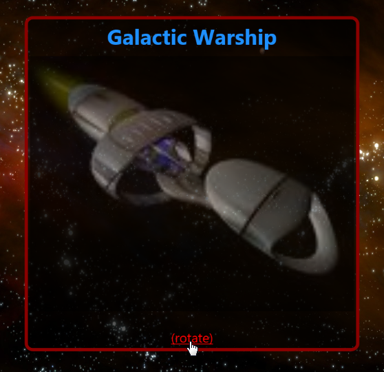
It is important to notice in the XAML above that the Button controls have their Command property set to reference the static RotateCommand object, which is exposed by the ContentControl3D class. That is the command you should use from XAML to cause the control to flip over. The UI element that you happen to use to execute that command, and where it is located in the UI, is up to you. For example, the ‘Content Templates’ sample uses the Hyperlink element to execute the RotateCommand, as seen below:

Advanced Usage – Content Templates
As mentioned at the end of the previous section, there is a sample application called ‘Content Templates.’ That is an example of how to supply ContentControl3D with UI elements to display on both the front and back sides, via the use of DataTemplates. Since the standard ContentControl in WPF exposes Content and ContentTemplate properties, ContentControl3D follows suit and exposes BackContent and BackContentTemplate properties. Those two properties can be used in the exact same way that you use Content and ContentTemplate, respectively. In case you are wondering, I did not add a BackContentTemplateSelector property, which would be equivalent to the ContentTemplateSelector property of ContentControl, because I had no need for it when writing the sample applications.
The following XAML shows how to create the same UI that we saw in the previous section, only this time a DataTemplate is used to provide an explanation for what to show on both sides of the control.
<thriple:ContentControl3D
  xmlns:thriple="http://thriple.codeplex.com/"
  Background="LightBlue"
  BorderBrush="Black"
  BorderThickness="2"
  MaxWidth="200" MaxHeight="200"

  Content="Front Side"
  BackContent="Back Side"
  ContentTemplate="{DynamicResource ButtonTemplate}"
  BackContentTemplate="{DynamicResource ButtonTemplate}"
  >
  <thriple:ContentControl3D.Resources>
    <DataTemplate x:Key="ButtonTemplate">
      <Button
        Content="{Binding}"
        Command="thriple:ContentControl3D.RotateCommand"
        Width="100" Height="100"
        />
    </DataTemplate>
  </thriple:ContentControl3D.Resources>
</thriple:ContentControl3D>
In this example, both sides are rendered by the same DataTemplate. You are free to assign different templates to each side, if necessary. It is also possible to use one DataTemplate that renders each side differently, by triggering against the IsOnFrontSide attached property. This technique is used in several of the sample applications, such as the ‘Content Templates’ sample. The following XAML snippet comes from a DataTemplate in that sample:
<!--
Show a different spaceship on the back side of the surface.
-->
<Trigger Property="thriple:ContentControl3D.IsOnFrontSide" Value="False">
  <Setter TargetName="grid" Property="Background">
    <Setter.Value>
      <ImageBrush
        ImageSource="Images/Spaceship2.jpg"
        Stretch="Uniform"
        Opacity="0.5"
        />
    </Setter.Value>
  </Setter>
</Trigger>
Rotation Easing Modes
As mentioned earlier in this article, ContentControl3D can be used to create a simple and intuitive way to conserve screen real estate and prevent the user from looking at too much information. That, in and of itself, is a compelling reason to use the control. However, it has more to offer than just the ability to rotate in 3D space. It can rotate with style!
The Thriple library contains a class called EasingDoubleAnimation. That class derives from the standard DoubleAnimation class, and adds in the ability to use one of Robert Penner’s easing equations to create a more “natural” animation between two double values. If you aren't familiar with the Penner equations, I suggest you check it out here.
ContentControl3D uses EasingDoubleAnimation to rotate the 3D surface. If you set the EasingMode property to something other than the default value of ‘None’, an easing equation is used to “guide” the surface during the animation. The RotationEasingMode enumeration values have friendly names that I made up, like ‘Slap’ and ‘RoundhouseKick’. Those values then map to more obscure easing equation names from Penner’s work, such as ‘QuadEaseOut’ and ‘QuartEaseInOut’, respectively.
Using an easing mode for the rotation can add some extra character and energy to a user interface. Like all snazzy things, it should be used judiciously, not superfluously. You can test out the various easing modes by opening the ‘Easing Modes’ sample, or the ‘Property Explorer’ sample in the ContentControl3D_Demo project.
ContentControl3D Internals
This section discusses how some aspects of ContentControl3D work, so feel free to skip this section if you aren't interested in the implementation details.
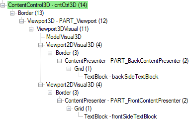
The ContentControl3D class derives from ContentControl. It has a control template which, when expanded into live UI elements, looks like this in Mole:

The descendant elements of the two ContentPresenters are whatever elements you happen to assign to the Content and BackContent dependency properties, or whatever elements are generated via DataTemplates. As you can see, the visual tree is not too large, and consists mostly of WPF 3D elements. The objects shown on each side of the ContentControl3D are hosted in Viewport2DVisual3D elements, which are WPF’s way of hosting interactive 2D elements in 3D space. Let’s take a look at the declaration of the Viewport2DVisual3D that contains the back side content, from the control template:
<Viewport2DVisual3D>
  <Viewport2DVisual3D.Geometry>
    <MeshGeometry3D
     TriangleIndices="0,1,2 2,3,0"
     TextureCoordinates="0,1 1,1 1,0 0,0"
     Positions="-1,-1,0 1,-1,0 1,1,0 -1,1,0"
     />
  </Viewport2DVisual3D.Geometry>

  <Viewport2DVisual3D.Transform>
    <RotateTransform3D>
      <RotateTransform3D.Rotation>
        <AxisAngleRotation3D Angle="180" />
      </RotateTransform3D.Rotation>
    </RotateTransform3D>
  </Viewport2DVisual3D.Transform>

  <Viewport2DVisual3D.Material>
    <DiffuseMaterial
      Viewport2DVisual3D.IsVisualHostMaterial="True"
      Brush="White"
      />
  </Viewport2DVisual3D.Material>

  <Viewport2DVisual3D.Visual>
    <Border BorderBrush="Transparent" BorderThickness="1">
      <ContentPresenter
        x:Name="PART_BackContentPresenter"
        Content="{TemplateBinding BackContent,
          Converter={StaticResource ContentConv},
          ConverterParameter=BACK}"
        ContentTemplate="{TemplateBinding BackContentTemplate}"
        />
    </Border>
  </Viewport2DVisual3D.Visual>
</Viewport2DVisual3D>
One important point to notice is that the back side is initialized to be rotated by 180 degrees on the Y axis, due to the AxisAngleRotation3D. The Viewport2DVisual3D for the front side has an AxisAngleRotation3D too, but its Angle is initialized to 0. This means that the two sides of the 3D surface begin life “facing away” from each other, back to back. All subsequent rotations of the two sides cause the Angle of their AxisAngleRotation3D to change by 180. Here is an abridged version of the method in ContentControl3D that rotates the surface:
public void Rotate()
{
 if (this.IsRotating)
  return;

 // Avoid trying to animate a null or frozen instance.
 if (_viewport.Camera == null || _viewport.Camera.IsFrozen)
  _viewport.Camera = this.CreateCamera();

 PerspectiveCamera camera = _viewport.Camera as PerspectiveCamera;

 // Create the animations.
 DoubleAnimation frontAnimation, backAnimation;
 this.PrepareForRotation(out frontAnimation, out backAnimation);
 Point3DAnimation cameraZoomAnim = this.CreateCameraAnimation();

 // Start the animations.
 _frontRotation.BeginAnimation(AxisAngleRotation3D.AngleProperty, frontAnimation);
 _backRotation.BeginAnimation(AxisAngleRotation3D.AngleProperty, backAnimation);
 camera.BeginAnimation(PerspectiveCamera.PositionProperty, cameraZoomAnim);

 this.IsRotating = true;
}
When the rotation animation completes, this method is executed:
void OnRotationCompleted(object sender, EventArgs e)
{
 AnimationClock clock = sender as AnimationClock;
 clock.Completed -= this.OnRotationCompleted;

 this.IsRotating = false;
 this.IsFrontInView = !this.IsFrontInView;

 if (_isRotationPending)
 {
  // The BringFrontSideIntoView/BringBackSideIntoView
  // method was called during a rotation, and the
  // appropriate side is not in view, so rotate again.
  _isRotationPending = false;
  this.Rotate();
 }
 else
 {
  CommandManager.InvalidateRequerySuggested();
 }
}
Note that the IsRotating dependency property is set to true when the rotation begins and false when it ends (which makes sense!), but the IsFrontInView dependency property only changes state after the animation completes. This is useful information to know when writing triggers that target those properties.
Wrapping Up
ContentControl3D makes it very easy to add 3D into your WPF applications. When used properly, it can make an otherwise crowded, confusing, dull user interface much more clean and engaging. Be sure to explore the sample projects included in Thriple to learn about all of the features available in the control, and how to use them.
You can download the latest Thriple source code from here.
Revision History
- March 22, 2009 – Published the article
