
WPF ScrollViewer Scrollbar Color
5.00/5 (2 votes)
Simplest way to change the ugly default scrollbar appearance in a ScrollViewer
Introduction
The default appearance of the scrollbars in the WPF ScrollViewer is ugly and gray, and often appears too large and obtrusive when used within a smaller control or dialog. There are several articles on how to re-style the scrollbars, but all of them seem to require vast quantities of code, and I hate to pollute my code base like that for such a seemingly-trivial task.
By changing the Opacity of the scrollbars, which is a relatively small style change, one can make the scrollbars blend in with the overall background color of the controls on the window. And because there is no text in a scrollbar, its appearance does not resemble a "disabled" control. The thickness of the scrollbars can also be changed in the same code fragment. You can create a few styles to match your particular circumstances - for example, you probably want thinner scrollbars only within smaller controls, because they are more fiddly to click.
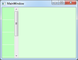
Before:

After:

Using the Code
Style used in the above picture. Relevant changes are shown in bold.
  <Style x:Key="SemiTransparentThinScrollViewer" TargetType="{x:Type ScrollViewer}">
    <Setter Property="OverridesDefaultStyle" Value="True"/>
    <Setter Property="Template">
      <Setter.Value>
        <ControlTemplate TargetType="{x:Type ScrollViewer}">
          <Grid>
            <Grid.ColumnDefinitions>
              <ColumnDefinition/>
              <ColumnDefinition Width="Auto"/>
            </Grid.ColumnDefinitions>
            <Grid.RowDefinitions>
              <RowDefinition/>
              <RowDefinition Height="Auto"/>
            </Grid.RowDefinitions>

            <ScrollContentPresenter Grid.Column="0"/>

            <ScrollBar Grid.Column="1"
                       Opacity="0.5"
                       Name="PART_VerticalScrollBar"
                       Value="{TemplateBinding VerticalOffset}"
                       Maximum="{TemplateBinding ScrollableHeight}"
                       ViewportSize="{TemplateBinding ViewportHeight}"
                       Width="10"
                       MinWidth="10"
                       Visibility="{TemplateBinding ComputedVerticalScrollBarVisibility}"/>

            <ScrollBar Name="PART_HorizontalScrollBar"
                       Opacity="0.5"
                       Orientation="Horizontal"
                       Grid.Row="1"
                       Grid.Column="0"
                       Height="10"
                       MinHeight="10"
                       Value="{TemplateBinding HorizontalOffset}"
                       Maximum="{TemplateBinding ScrollableWidth}"
                       ViewportSize="{TemplateBinding ViewportWidth}"
                       Visibility="{TemplateBinding ComputedHorizontalScrollBarVisibility}"/>
          </Grid>
        </ControlTemplate>
      </Setter.Value>
    </Setter>
  </Style>
Here are some more examples showing different color saturations and how transparency can help blend in with the background color:
Before:

After:

Before:
After:

Here is the complete XAML source code for the blue window, above:
<Window x:Class="EZScrollViewer.MainWindow"
        xmlns="http://schemas.microsoft.com/winfx/2006/xaml/presentation"
        xmlns:x="http://schemas.microsoft.com/winfx/2006/xaml"
        Title="MainWindow" Height="250" Width="325" >
  <Window.Resources>
    <Style  TargetType="{x:Type ScrollViewer}">
      <Setter Property="OverridesDefaultStyle" Value="True"/>
      <Setter Property="Template">
        <Setter.Value>
          <ControlTemplate TargetType="{x:Type ScrollViewer}">
            <Grid>
              <Grid.ColumnDefinitions>
                <ColumnDefinition/>
                <ColumnDefinition Width="Auto"/>
              </Grid.ColumnDefinitions>
              <Grid.RowDefinitions>
                <RowDefinition/>
                <RowDefinition Height="Auto"/>
              </Grid.RowDefinitions>
              <ScrollContentPresenter Grid.Column="0"/>
              <ScrollBar Grid.Column="1"
                       Opacity="0.5"
                       Name="PART_VerticalScrollBar"
                       Value="{TemplateBinding VerticalOffset}"
                       Maximum="{TemplateBinding ScrollableHeight}"
                       ViewportSize="{TemplateBinding ViewportHeight}"
                       Width="10"
                       MinWidth="10"
                       Visibility="{TemplateBinding ComputedVerticalScrollBarVisibility}"/>

              <ScrollBar Name="PART_HorizontalScrollBar"
                       Opacity="0.5"
                       Orientation="Horizontal"
                       Grid.Row="1"
                       Grid.Column="0"
                       Height="10"
                       MinHeight="10"
                       Value="{TemplateBinding HorizontalOffset}"
                       Maximum="{TemplateBinding ScrollableWidth}"
                       ViewportSize="{TemplateBinding ViewportWidth}"
                       Visibility="{TemplateBinding ComputedHorizontalScrollBarVisibility}"/>
            </Grid>
          </ControlTemplate>
        </Setter.Value>
      </Setter>
    </Style>

  </Window.Resources>
    <Grid Background="Blue">
    <Grid.ColumnDefinitions>
      <ColumnDefinition Width="Auto" />
      <ColumnDefinition Width="*" />
    </Grid.ColumnDefinitions>
      <ScrollViewer >
      <StackPanel Orientation="Vertical" Opacity="1.0">
        <Rectangle Fill="#FF9999FF" Width="50" Height="50"
                   HorizontalAlignment="Left" Margin="1,1,1,1"></Rectangle>
        <Rectangle Fill="#FF9999FF" Width="50" Height="50"
                   HorizontalAlignment="Left" Margin="1,1,1,1"></Rectangle>
        <Rectangle Fill="#FF9999FF" Width="50" Height="50"
                   HorizontalAlignment="Left" Margin="1,1,1,1"></Rectangle>
        <Rectangle Fill="#FF9999FF" Width="50" Height="50"
                   HorizontalAlignment="Left" Margin="1,1,1,1"></Rectangle>
        <Rectangle Fill="#FF9999FF" Width="50" Height="50"
                   HorizontalAlignment="Left" Margin="1,1,1,1"></Rectangle>
        <Rectangle Fill="#FF9999FF" Width="50" Height="50"
                   HorizontalAlignment="Left" Margin="1,1,1,1"></Rectangle>
        <Rectangle Fill="#FF9999FF" Width="50" Height="50"
                   HorizontalAlignment="Left" Margin="1,1,1,1"></Rectangle>
    </StackPanel>
    </ScrollViewer>
  </Grid>
</Window>
Points of Interest
I admit that even the above code seems bemusing and far too much effort for such a trivial change to the GUI, especially for beginners who already have enough to take in just learning WPF basics. But once you see how the scrollbars are constructed internally, it starts to make sense, and we are lucky that we can restyle them at all. I would welcome simplifications here if you have any tips.
The WPF slider control's appearance is equally bemusing to alter, and I can provide a style for that too, if anyone is interested. It uses the same idea of changing the opacity within its target style.