
Create Attractive Button Step by Step
4.67/5 (2 votes)
Create an attractive Button using CSS3 -Step by Step
In this trick, we are going to create an attractive Button and give it a feel like a 3D button.
Let's Start
HTML Document Structure
<div class="box">
	<a href="#" class="red">Click Here</a>
</div>
Here I create a div container having a link (named: Click Here).
CSS
.box
{
background-color:#e1e1e6;
width:400px;
height:100px;
border:1px solid black;
border-radius:5px;
}
Here I set .box background color, etc. This step is not so important. I only created a box here inside which I have to create a button.
Preview
CSS
.red
{
position:relative;
top:36px;
left:35%;
text-decoration:none;
color:#fff;
background:#cb2727;
text-align:center;
padding:20px 30px;
width:115px;
border-radius:5px;
border:solid 1px #ec3838;
transition: all 0.1s;
-webkit-box-shadow: 0px 9px 0px #a81515;/*for opera and safari*/
-moz-box-shadow: 0px 9px 0px #a81515;/*for mozilla*/
-o-box-shadow: 0px 9px 0px #a81515;/*for opera*/
-ms-box-shadow: 0px 9px 0px #a81515;/*for I.E.*/ }
Firstly, I set Position of button inside my div container (.box).
I set text-decoration to none so that link underline is removed. After that, I adjusted color and background-color. Then, I set text-align and padding. The important step here is transition and box-shadow.
- CSS3 transitions are effects that let an element gradually change from one style to another.
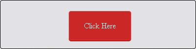
Preview

CSS
.red:active
{
-webkit-box-shadow: 0px 2px 0px #a81515;
-moz-box-shadow: 0px 2px 0px #a81515;
-o-box-shadow: 0px 2px 0px #a81515;
-ms-box-shadow: 0px 2px 0px #a81515;
position:relative;
top:43px;
}
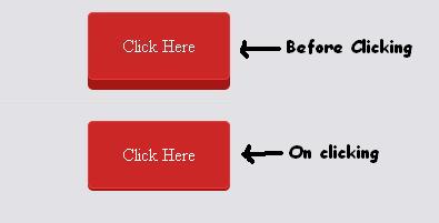
The :active selector is used to select and style the active link. A link becomes active when you click on it.
The main trick behind this button’s working is that decrease box-shadow and move the position slightly down so that appears pressing down.
Preview
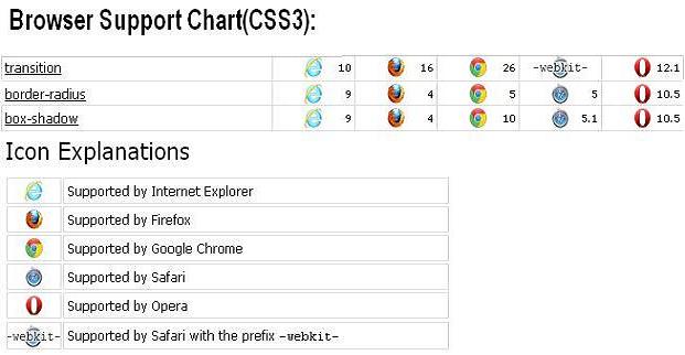
Browser Support
How It Looks During Clicking
That's all. Hope you like it.
Thanks.