
Angular Control to Graphic Representation for Processes and Events
An Angular control that displays processes, states and events on timeline
Introduction
Sometimes, we need to see that a device state changes on the time scale, with an option of zoom in/zoom out, to get a total overview and zoom in to the short time span when necessary. The presented control(s) can be used for this purpose. You can try it live here (PC only, not sure how long it will be there).
Background
Let's assume we have an array of device state structures defined as follows (in JSON):
[
 {"State": "Active", "Start"     : new Date(2022, 9, 28, 8, 0, 0).getTime()},
 {"State": "Error", "Start"      : new Date(2022, 9, 28, 8, 3, 0).getTime()},
 {"State": "Ready", "Start"      : new Date(2022, 9, 28, 8, 9, 0).getTime()},
 {"State": "Service", "Start"    : new Date(2022, 9, 28, 8, 21, 0).getTime()},
 {"State": "Active", "Start"     : new Date(2022, 9, 28, 8, 40, 0).getTime()},
 {"State": "Ready", "Start"      : new Date(2022, 9, 28, 8, 57, 0).getTime()},
 {"State": "Standby", "Start"    : new Date(2022, 9, 28, 9, 15, 0).getTime()},
 {"State": "Maintenance", "Start": new Date(2022, 9, 28, 9, 35, 0).getTime()},
 {"State": "Ready", "Start"      : new Date(2022, 9, 30, 2, 30, 0).getTime(),
                    "Duration": 30000
];
Here, we have a few objects with the set of fields - Start, State, and Duration (optional).
Each item may have the Duration property set, but here I only filled the last one - other items duration could be calculated as a difference between the current and next item.Start property.
Then we will use State to display text and also as a CSS class to paint the timespan rectangle, so the field's content should fit CSS class name limitations (not to be empty, not contain spaces and other special characters). Duration is a numeric field, containing the timespan length in milliseconds, and Start is a number, storing the Unix time (milliseconds starting from 01.01.1970).
Options to Display
Depending on one's needs, the timepoints could be displayed in different ways
- as a span:

- or as a point:
Probably, it's also worth having time markers:

and then combine everything together:
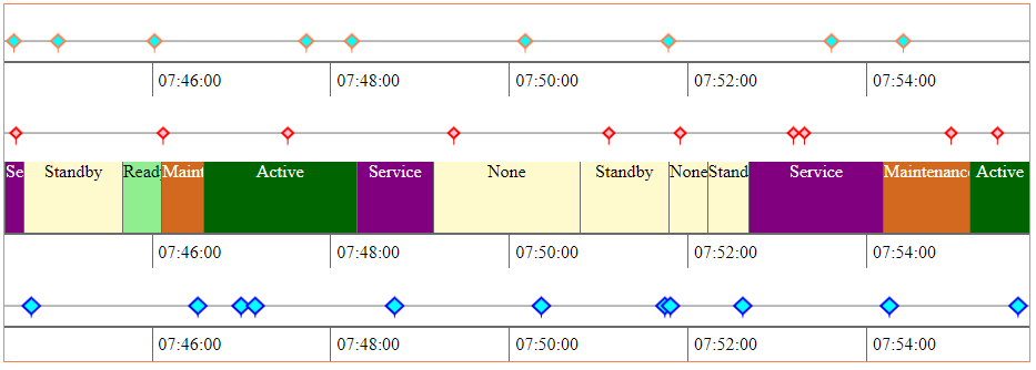
And it would be nice to have an option of scrolling all together with the mouse to change scale, or drag left/right to see the next/previous state.
And what if I need the time spans only, without any points? Or only points ? And shall I have a scale per each span or points series?
To answer these questions, we can have three different controls that could be combined together, and just pass the series data with the extra info (Start points + legend definitions). And wrap them into 4th control to manage the three controls above.
Use the Code
First, we need to copy the src\time-line folder to your project.
Then add a reference to the TimeLineModule to one or more of your project's module(s) which are going to use the component, for example (src\app\app.module.ts):
import { BrowserModule } from '@angular/platform-browser';
import { NgModule } from '@angular/core';
import { AppRoutingModule } from './app-routing.module';
import { AppComponent } from './app.component';
import { TimeLineModule } from 'src/time-line/time-line.module';

@NgModule({
  declarations: [
    AppComponent
  ],

  imports: [
    BrowserModule,
    AppRoutingModule,
    TimeLineModule
  ],
  providers: [],
  bootstrap: [AppComponent]
})

export class AppModule { }
Then add the component selector to your HTML component's .html file and pass items to be drawn:
<app-time-line-container [Series]="Series"></app-time-line-container>
The <app-time-line-container> is the Angular selector for the "wrapper" control, which is going to handle all the other controls mentioned above.
Then we need to provide the data to be displayed, here is an example of how to fill it:
  createSeries (): void {

    this.Series = [];

    this.Series.push ({
      "type":'time-point',
      "items": this.createDummyModel(1000),
      "legend": {
        "borderColor": "coral",
        "fillColor": "aqua",
        "pointSize": 11
      }
    });

    this.Series.push ({ "type":'time-scale'});

    this.Series.push ({
      "type":'time-point',
      "items": this.createDummyModel(1000),
      "legend": {
        "borderColor": "red",
        "fillColor": "pink",
        "pointSize": 9
      }
    });

    this.Series.push ({ "type":'time-span', "items":  this.createDummyModel(1000) });

    this.Series.push ({ "type":'time-scale'});

    this.Series.push ({
      "type":'time-point',
      "items": this.createDummyModel(1000),
      "legend": {
        "borderColor": "blue",
        "fillColor": "aqua",
        "pointSize": 13
      }
    });

    this.Series.push ({ "type":'time-scale'});
  }
'time-span' does not require any extra settings, 'time-scale' can define an approximate number of time marks per entire scale (but it will change dynamically), and 'time-point' requires some point draw parameters, which are quite obvious. For points and scales, we should also provide the items, they are created in the method createDummyModel. Please look at the source code (\src\app\app.component.ts) for more details.
Implementation Details
There are three types of controls, intended for different tasks.
Time Span
To display the time span, there is time-line-span component (located in the src\time-line\time-line-span folder), which consists of div element to which we add child div nodes to represent the time span. Since it is an HTML div, it can be styled using the usual Angular CSS approach - each child div gets the class from the item.State member, so it must fit the HTML class name limitations. It is probably possible to add extra properties to add extra information. But please be careful with the horizontal borders and margins - they may change the item width, so they won't fit the time scale exactly.
Please note the encapsulation member on the component declaration - it is necessary to fix the dynamically created elements CSS issue, as described here:
@Component({
  ...
  encapsulation: ViewEncapsulation.None,
})
Time Point
Time point can be represented by the time-line-point component (located in the src\time-line\time-line-point folder). This component consists of the HTML canvas control, where we draw the points. It can also show the selected item info in the floating div, which could also be styled with class .tooltip (see in the src\time-line\time-line-point\time-line-point.component.css).
Time Scale
The time-line-scale component is used to show the time marks and uses the same approach as time-line span (adding child div elements to the main container); also can be styled with the classes, defined in its CSS file (src\time-line\time-line-scale\time-line-scale.component.css). The scale automatically selects the most suitable inter-marks interval, taking into account a various number of hours in the day (due to DST) and days in a month. Please note - the time is represented in a fixed format, defined in the control itself - please look for the timeFormat member in the .ts file. The DatePipe is created with 'en-US' locale, so it takes into account the DST settings in the 'en-US' locale, despite the data Start member stores the UTC time as milliseconds.
The Container
And, in the end, there is a container component (src\time-line\time-line-container\time-line-container.component.ts) that wraps all the above types, receives the array of series, and creates the relevant control for each of them. It also handles the mouse wheel and drag events to change the scale or drag the time line. This container is also Angular provider for the GraphDateScale object (service in Angular terms), which is shared by all child components to synchronize the scale changes. Because the time-line-container is a provider, we can create a few instances of this component on the same page, and each of them will have its own GraphDateScale, so they will work independently.
The project source code zip is also attached to this article.
Next Steps
Currently, it is more similar to a set of building blocks, that can be used to build more complex controls, customized for one's needs. Probably, it is possible to add more properties to set the draw object properties, legend, text, fonts, and sizes depending on requirements, time, and desire. :)
Here is a link to GitHub: https://github.com/olegx100/timelinejs/ where the project is hosted - probably there will be updates, as far as it will be necessary for the project needs.
History
- 12th January, 2023: Initial version