
Metrobutton
4.89/5 (22 votes)
Metrobutton
1. Introduction
During a recent project, we decided to use a Metro-like design for our application. For this, we needed a button that is similar to the Win8 launch screen, but also a button that was a bit more versatile than just being a graphic button.
2. Requirements
We decided that our button:
- Should be square and have the general appearance as shown in Fig. 1.
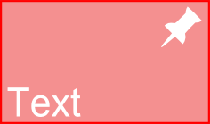 Fig. 1
 - Will have 3 states:
Up: This is the normal stateDown: When the button is pressedDisabled: When the button is inactive
- Will have the ability to act as a momentary button or a latching (toggle) button
- Will raise the
ToggleStateChangedevent when the button is a toggle button and the state changes fromUptoDownorDowntoUp - Support tap & hold functionality whereby when the user taps and holds the button, after the
TapHoldInterval, theHoldevent is raised - Will have an appearance property for 5 states:
AppearanceUp: The appearance when the button is theUpstateAppearanceUpMouseOver: The appearance when the button is theUpstate and the mouse is over the buttonAppearanceDown: The appearance when the button is theDown(pressed) stateAppearanceDownMouseOver: The appearance when the button is theDown(pressed) state and the mouse is over the buttonAppearanceDisabled: The appearance when the button is theDisabledstate
- The appearance property will have the following sub-properties:
BackColorBorderColorBorderThicknessFontForeColorImage
- Will provide control over where the image and the text is placed. The text position and image position can independently be set to the nine positions as shown in Fig. 2. The options are:
TopLeft,TopCenter,TopRightMiddleLeft,MiddleCenter,MiddleRightBottomLeft,BottomCenter,BottomRight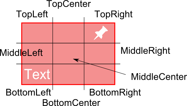 Fig. 2
- Raise the
Clickevent when the button is pressed - Will support an alternate size (smaller or larger) when the mouse is over the button as shown in fig. 3.

 Fig. 3
3. Implementation
3.1. Class Hierarchy
The button is derived from Control class to inherit all control behaviour.
3.2. Properties
The setters of all properties that influence general appearance call the Invalidate method so that the control can be redrawn to reflect the new appearance.
3.2.1. Appearance Properties
The appearance property is a class that encapsulates the appearance properties. The class supports the INotifyPropertyChanged interface by deriving from the ObservableObject class. The NotifyPropertyChanged event is raised when any of the properties change so that the form designer can respond to these changes and repaint the control.
  [Serializable]
  [TypeConverter(typeof(MetroButtonAppearanceConverter))]
  public class MetroButtonAppearance :
    ObservableObject
  {
    public Color BackColor
    {
      get { return backColor; }
      set
      {
        backColor = value;
        OnPropertyChanged("BackColor");

        UseAppearance = true;
      }
    }
    public Color BorderColor
    {
      get { return borderColor; }
      set
      {
        borderColor = value;
        OnPropertyChanged("BorderColor");

        UseAppearance = true;
      }
    }
    public int BorderThickness
    {
      get { return borderThickness; }
      set
      {
        borderThickness = value;
        OnPropertyChanged("BorderThickness");

        UseAppearance = true;
      }
    }
    public Color ForeColor
    {
      get { return foreColor; }
      set
      {
        foreColor = value;
        OnPropertyChanged("ForeColor");

        UseAppearance = true;
      }
    }
    public Font Font
    {
      get { return font; }
      set
      {
        font = value;
        OnPropertyChanged("Font");

        UseAppearance = true;
      }
    }
    public Image Image
    {
      get { return image; }
      set
      {
        image = value;
        OnPropertyChanged("Image");

        UseAppearance = true;
      }
    }
    public bool UseAppearance
    {
      get { return useAppearance; }
      set
      {
        useAppearance = value;
        OnPropertyChanged("UseAppearance");
      }
    }

    private Color backColor;
    private Color borderColor;
    private int borderThickness;
    private Color foreColor;
    private Font font = new Font("Microsoft Sans Serif", 9F, FontStyle.Regular, GraphicsUnit.Point, 0);
    private Image image;
    private bool useAppearance;
  }
The button has the 5 appearance properties as mentioned above. These properties are marked with the [DesignerSerializationVisibility(DesignerSerializationVisibility.Content)] attribute so that the designer serializes the appearance’s design time values to its constituent properties (‘Content’) in the form’s InitializeComponent method.
    [DesignerSerializationVisibility(DesignerSerializationVisibility.Content)]
    public MetroButtonAppearance AppearanceDisabled
    {
      get { return appearanceDisabled; }
      set
      {
        Guard.ArgumentNotNull(value, "value");

        appearanceDisabled.PropertyChanged -= AppearanceChanged;
        appearanceDisabled = value;
        appearanceDisabled.PropertyChanged += AppearanceChanged;

        Invalidate();
      }
    }
In the Appearance properties’ setters, we need to unhook the old Appearance instance variable PropertyChanged event to release all references to it and then hook the new instance to the AppearanceChanged event handler so that when any appearance property is changed, the AppearanceChanged handler can Invalidate the control in order to repaint it.
    private void AppearanceChanged(object sender, PropertyChangedEventArgs e)
    {
      Invalidate();
    }
In the constructor, we hook the initial Appearance variables’ PropertyChanged event to the AppearanceChanged handler.
      appearanceDisabled.PropertyChanged += AppearanceChanged;
      appearanceUp.PropertyChanged += AppearanceChanged;
      appearanceUpMouseOver.PropertyChanged += AppearanceChanged;
      appearanceDown.PropertyChanged += AppearanceChanged;
      appearanceDownMouseOver.PropertyChanged += AppearanceChanged;
3.2.2. ImagePosition
The ImagePosition property defines in which position the image element will be placed on the button.
3.2.3. ImagePadding
The ImagePadding property can be used to offset the calculated image position to achieve fine-grained control over position. The image alignment is calculated based on the image Width & Height and ImagePosition. Image is aligned left if in the left column. Image is aligned centred if in the centre column. Image is aligned right if in the right column. Same for vertical alignment. This is shown in Fig. 4. ImagePadding is then used to offset the image from that position. ImagePadding is useful to give the image some space around it. Of course that can be done in the bitmap editor, but having the power to tweak it in the form designer means you don’t have to round-trip to the bitmap editor all the time.


3.2.4. IsTapHoldEnabled
Gets or sets whether the button will fire the Hold event.
3.2.5. IsToggle
The IsToggle property defines whether the button is in momentary push mode or toggle mode.
3.2.6. IsDown
The IsDown property gets and set whether the button is in the up (false) or down (true) state.
3.2.7. MouseOverSize
Get or sets the size of the button when the mouse is over the button.
3.2.8. MouseOverAnchorPosition
Get or sets the anchor position for resizing when the button changes size when the mouse is over it. This is illustrated in Fig. 5. Any one the 9 LayoutPositions can be used as the anchor position.

3.2.9. TapHoldInterval
Gets and set the timeout in msec after which the Hold event is fired.
3.2.10. TextPosition
The TextPosition property defines in which position the text element will be placed on the button. The options and behaviour are the same as for ImagePosition.
3.2.1. TextPadding
Offsets the Text exactly like the image.
3.3. Element Positioning
In the drawing methods, the positioning of elements (text & image) is handled by the GetTextBounds and GetElementBounds methods. Firstly, the GetElementBounds method will, for a particular LayoutPosition, Padding and element size, calculate the location where that element should be painted. The bounds that GetElementBounds returns is shown in Fig. 6.

The GetTextBounds method determines the size of the text given the font and text string and then calculates the position by using GetElementBounds.
3.4. Painting the Control
We want to be in control over how the control is painted, so we override the OnPaint event. The appearance that we will use to paint the control depends on the control’s state and whether the mouse is over the control or not. Once we have determined which of the 5 appearances we must use, we paint the:
BackgroundBorderTextImage
in that sequence to achieve that Z-order. The painting of these elements have been moved to individual methods to keep methods simple.
    protected override void OnPaint(PaintEventArgs e)
    {
      Graphics gfx = e.Graphics;

      MetroButtonAppearance appearanceToUse = DetermineAppearance();

      DrawBackground(gfx, appearanceToUse);
      DrawBorder(gfx, appearanceToUse);
      DrawText(gfx, appearanceToUse);
      DrawImage(gfx, appearanceToUse);
    }
The DetermineAppearance method evaluates button state and mouse-over and returns the correct appearance property object to use for painting. The Up state is the default state and AppearanceUp is the default appearance that is used if the other appearance properties have not been modified. This was done in order to remove the need to define all 5 states’ Appearance properties. Instead, we only need to define the Appearance properties of the states we intend using. This is achieved by the Appearance property having the UseAppearance property which is default false, but changes to true as soon as an Appearance property is modified. The DetermineAppearance evaluates the UseAppearance to determine whether to use an Appearance or not. The DetermineAppearance method is shown below:
    private MetroButtonAppearance DetermineAppearance()
    {
      MetroButtonAppearance appearanceToUse = AppearanceUp;

      if (Enabled == true)
      {
        #region Enabled == true
        if (IsDown == true)
        {
          #region IsDown == true
          if (AppearanceDown.UseAppearance == true)
            appearanceToUse = AppearanceDown;
          if ((isUnderMouse == true) && (AppearanceDownMouseOver.UseAppearance == true))
            appearanceToUse = AppearanceDownMouseOver;
          if ((isMouseButtonDown == true) && (AppearanceDown.UseAppearance == true))
            appearanceToUse = AppearanceDown;
          #endregion
        }
        else
        {
          #region IsDown == false
          if (AppearanceUp.UseAppearance == true)
            appearanceToUse = AppearanceUp;
          if ((isUnderMouse == true) && (AppearanceUpMouseOver.UseAppearance == true))
            appearanceToUse = AppearanceUpMouseOver;
          if ((isMouseButtonDown == true) && (AppearanceUp.UseAppearance == true))
            appearanceToUse = AppearanceUp;
          #endregion
        }
        #endregion
      }
      else
      {
        #region Enabled == false
        if (AppearanceDisabled.UseAppearance == true)
          appearanceToUse = AppearanceDisabled;
        #endregion
      }

      return appearanceToUse;
    }
The appearanceToUse defaults to AppearanceUp. From here, we determine if an alternative appearance is to be used. If Enabled == false, we use AppearanceDisabled. If Enabled == true, we need to evaluate button state and mouse over to determine appearance.
3.5. Mouse Events
Firstly, we override the OnClick event dispatcher method in order to disable the default Click event behaviour.
protected override void OnClick(EventArgs e)
{
  // intentionally left blank
}
3.5.1. MouseOver
We implement the MouseEnter and MouseLeave event handlers to manage the MouseOver functionality.
3.5.2. MouseEnter
This event is fired when the mouse moves from outside to inside the control. We set the isMouseOverControl flag so that the DetemineAppearance method can use it to evaluate the appropriate appearance to use.
    private void MetroButton_MouseEnter(object sender, EventArgs e)
    {
      isMouseOverControl = true;

      if (mouseOverSize != Size.Empty)
      {
        normalSize = Size;
        normalLocation = Location;

        Rectangle bounds = GetMouseOverBounds();

        Location = new Point(bounds.Left, bounds.Top);
        Size = new Size(bounds.Width, bounds.Height);

        childIndex = Parent.Controls.GetChildIndex(this);
        Parent.Controls.SetChildIndex(this, 0);
      }

      Invalidate();
    }
If the MouseOverSize is set to a non-empty Size, we save the current button size and location and determine the bounds of the button given its current location and size, its MouseOverSize and the MouseOverAnchorPosition. The GetMouseOverBounds method calculates this for us. We are able to set the mouse over size so that it overlaps adjacent controls, e.g., other buttons. However, the Z-order of the buttons depend on the order we added the buttons to the form. This causes a button with a large MouseOverSize to potentially expand underneath an adjacent control. To fix this, we need to move the button topmost in the Z-order. These lines achieve this:
        childIndex = Parent.Controls.GetChildIndex(this);
        Parent.Controls.SetChildIndex(this, 0);
Lastly, the control is invalidated so that it can repaint with the new appearance and/or size.
3.5.3. MouseLeave
    private void MetroButton_MouseLeave(object sender, EventArgs e)
    {
      isMouseOverControl = false;
      holdTimer.Stop();

      if (mouseOverSize != Size.Empty)
      {
        Parent.Controls.SetChildIndex(this, childIndex);
        Size = normalSize;
        Location = normalLocation;
      }

      Invalidate();
    }
This event is fired when the mouse moves from inside to outside the control if no mouse button was pressed on the control.
We reset the isMouseOverControl flag so that the DetemineAppearance method can use it to evaluate the appropriate appearance to use.
We also restore the original button Size & Location if required.
3.5.4. MouseMove
The MouseMove event is fired when the mouse moves over the control.
    private void MetroButton_MouseMove(object sender, MouseEventArgs e)
    {
      if (IsHit(e.X, e.Y) == false)
      {
        holdTimer.Stop();

        return;
      }
    }
If we click & hold the mouse button on the button, the tap-hold timer starts. While the mouse button is down, move the mouse outside the control, we don’t want the Hold event firing when the timer times out. Therefore, we stop the timer.
3.5.5. MouseDown
The MouseDown event is fired when a mouse button is pressed on the button.
    private void MetroButton_MouseDown(object sender, MouseEventArgs e)
    {
      if (e.Button != System.Windows.Forms.MouseButtons.Left)
        return;

      isMouseButtonDown = true;
      isHeld = false;

      if (IsToggle == false)
        IsDown = true;

      if (IsTapHoldEnabled)
        holdTimer.Start();

      Capture = true;

      Invalidate();
    }
We ignore all buttons except the Left button. Next, we set some flags to help us with the behaviour. If the button is a toggle button, it is only toggled on MouseUp. If tap-hold is enabled, we start the tap-hold timer.
3.5.6. MouseUp
The MouseUp event is fired when a mouse button is released after it was pressed on the button. Even if the mouse is not on the button anymore.
    private void MetroButton_MouseUp(object sender, MouseEventArgs e)
    {
      holdTimer.Stop();

      if (e.Button != System.Windows.Forms.MouseButtons.Left)
        return;
      if (isMouseButtonDown == false)
        return;

      if (IsHit(e.X, e.Y) == false)
        isMouseOverControl = false;

      isMouseButtonDown = false;

      if (isHeld == false)
      {
        if (IsToggle)
        {
          IsDown = !IsDown;
          OnToggleStateChanged();
        }
        else
          IsDown = false;

        base.OnClick(new EventArgs());
      }

      Invalidate();
    }
Firstly, we stop the tap-hold timer and ignore mouse buttons except left button.
Next, we check that if the mouse is outside the button, we reset the isMouseOverControl flag.
When we release the mouse button and the tap-hold event did not fire (isHeld == false), we need to toggle the IsDown state if it is a toggle button or set IsDown to false if a momentary button. In the case of a toggle button changing state, we also fire the ToggleStateChanged event. In both cases, toggle and momentary, the Click event is fired.
3.6. Tap-Hold
To implement the Hold event, when the time expires, we set the isHeld flag to control MouseUp behaviour and fire the Hold event.
4. Conclusion
By combining the MouseOverSize and 5 appearance properties, many interesting and visually stunning buttons can be created. See the demo for examples.