
C# Custom Control Featuring a Collapsible Panel
4.74/5 (31 votes)
A custom control in C# representing a collapsible panel with design time support
Introduction
Having worked with ASP.NET AJAX CollapsiblePanel control extender and finding it practical to fit more content into a relatively small part of a web page or screen real estate, I thought it would be good to have such control for WinForm applications since VS 2005 and VS 2008 toolboxes do not offer such a control.
Background
CollapsiblePanel AJAX web control extender is a cool web control. But unfortunately, there is no such control in VS 2005 or VS 2008 standard toolbox, so I have decided to create one and share it with the community.
Using the Control at Design Time
Using the control at design time is very simple. Basically it behaves the same way as a normal Panel except that it can be expanded and collapsed.
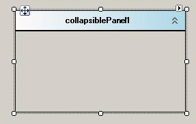
After adding the Control to the toolbox, drag it on the design surface of your form and you'll get:
The control shows a smart tag when clicked it opens a window showing panel's new features and properties that we can use to customize the panel.

Control at Runtime
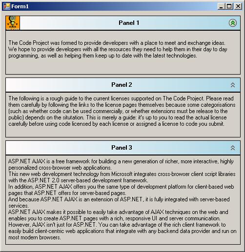
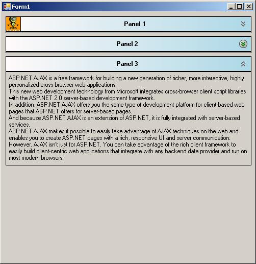
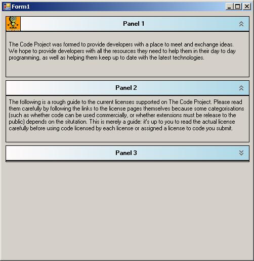
Here are a couple of images showing the control at runtime:
When a mouse hovers over the expand/Collapse image, the image gets highlighted to show that the operation can be triggered.
Some panels are collapsed.
Collapsed panels are expanded again.
Using the Code
This sample shows how to instantiate a CollapsiblePanel and use it.
this.collapsiblePanel1 = new OVT.CustomControls.CollapsiblePanel();
//
// collapsiblePanel1
//
            this.collapsiblePanel1.BackColor = System.Drawing.Color.Transparent;
            this.collapsiblePanel1.HeaderCornersRadius = 5;
            this.collapsiblePanel1.HeaderFont =
		new System.Drawing.Font("Microsoft Sans Serif",
			8.25F, System.Drawing.FontStyle.Bold);
            this.collapsiblePanel1.HeaderImage = null;
            this.collapsiblePanel1.HeaderText = "My Collapsible panel\'s header";
            this.collapsiblePanel1.HeaderTextColor = System.Drawing.Color.Black;
            this.collapsiblePanel1.Location = new System.Drawing.Point(88, 50);
            this.collapsiblePanel1.Name = "collapsiblePanel1";
            this.collapsiblePanel1.RoundedCorners = true;
            this.collapsiblePanel1.Size = new System.Drawing.Size(316, 204);
            this.collapsiblePanel1.TabIndex = 0;
            this.collapsiblePanel1.UseAnimation = true;
// Form1
//
this.AutoScaleDimensions = new System.Drawing.SizeF(6F, 13F);
this.AutoScaleMode = System.Windows.Forms.AutoScaleMode.Font;
this.ClientSize = new System.Drawing.Size(571, 353);
this.Controls.Add(this.collapsiblePanel1);
this.Name = "Form1";
this.Text = "Form1";
this.ResumeLayout(false);
Explaining the Code
CollapsiblePanel derives simply from System.Windows.Forms.Panel class.
I have added a child panel that I have used to render the panel's header, but most importantly to host two PictureImage controls, one on the Top right corner that will be used to show Expand/Collapse buttons, and another at the Top left that will host any image that is specified by the developer.
The most important part of the code lays in the OnPaint method where custom control rendering takes place. This method was overridden so that custom painting takes place.
protected override void OnPaint(PaintEventArgs e)
{
    base.OnPaint(e);
    DrawHeaderPanel(e);
}
private void DrawHeaderPanel(PaintEventArgs e)
{
    Rectangle headerRect = pnlHeader.ClientRectangle;
// if header rectangle is empty then escape painting.
if (headerRect.Width * headerRect.Height == 0)
    return;
LinearGradientBrush headerBrush = new LinearGradientBrush(
    headerRect, Color.Snow, Color.LightBlue, LinearGradientMode.Horizontal);

if (!roundedCorners)
{// Fill a regular rectangle.
    e.Graphics.FillRectangle(headerBrush, headerRect);
    if (showHeaderSeparator)
    {
        e.Graphics.DrawRectangle(new Pen(headerTextColor), headerRect);
    }
}
else
// Fill rounded rectanlge
DrawHeaderCorners(e.Graphics, headerBrush, headerRect.X,
	headerRect.Y, headerRect.Width, headerRect.Height, headerCornersRadius);

        // Draw header separator
if (showHeaderSeparator)
{
    Point start = new Point(pnlHeader.Location.X,
	pnlHeader.Location.Y+ pnlHeader.Height);
    Point end = new Point(pnlHeader.Location.X+
	pnlHeader.Width, pnlHeader.Location.Y+ pnlHeader.Height);
    e.Graphics.DrawLine(new Pen(headerTextColor, 2), start, end);
    // Draw rectangle lines for the rest of the control.
    Rectangle bodyRect = this.ClientRectangle;
    bodyRect.Y += this.pnlHeader.Height;
    bodyRect.Height -= (this.pnlHeader.Height+1);
    bodyRect.Width -= 1;
    e.Graphics.DrawRectangle(new Pen(headerTextColor), bodyRect);
}

int headerRectHeight = pnlHeader.Height;
// Draw header image.
if (headerImage != null)
{
    pictureBoxImage.Image = headerImage;
    pictureBoxImage.Visible = true;
}
else
{
    pictureBoxImage.Image = null;
    pictureBoxImage.Visible = false;
}

// Calculate header string position.
if (!String.IsNullOrEmpty(headerText))
{
    useToolTip = false;
    int delta = pictureBoxExpandCollapse.Width+5;
    int offset = 0;
    if (headerImage != null)
    {
        offset = headerRectHeight;
    }
    PointF headerTextPosition = new PointF();
    Size headerTextSize = TextRenderer.MeasureText(headerText, headerFont);
    if (headerTextAutoEllipsis)
    {
//If using autoEllipsis then manage to show tooltip containing the complete text.
                    if (headerTextSize.Width >= headerRect.Width - (delta+offset))
                    {
                        RectangleF rectLayout =
                            new RectangleF((float)headerRect.X + offset,
                            (float)(headerRect.Height - headerTextSize.Height) / 2,
                            (float)headerRect.Width - delta,
                            (float)headerTextSize.Height);
                        StringFormat format = new StringFormat();
                        format.Trimming = StringTrimming.EllipsisWord;
                        e.Graphics.DrawString(headerText, headerFont,
			new SolidBrush(headerTextColor),
                            rectLayout, format);

                        toolTipRectangle = rectLayout;
                        useToolTip = true;
                    }
                    else
                    {
                        headerTextPosition.X =
			(offset + headerRect.Width - headerTextSize.Width) / 2;
                        headerTextPosition.Y =
			(headerRect.Height - headerTextSize.Height) / 2;
                        e.Graphics.DrawString(headerText, headerFont,
				new SolidBrush(headerTextColor),
                            headerTextPosition);
                    }
                }
                else
                {
                    headerTextPosition.X = (offset + headerRect.Width -
			headerTextSize.Width) / 2;
                    headerTextPosition.Y = (headerRect.Height -
			headerTextSize.Height) / 2;
                    e.Graphics.DrawString(headerText, headerFont,
			new SolidBrush(headerTextColor),
                        headerTextPosition);
                }
            }
        }
To draw a rectangle with corners, we use a GraphicPath object as follows:
public void DrawHeaderCorners(Graphics g, Brush brush, float x,
		float y, float width, float height, float radius)
        {
            GraphicsPath gp = new GraphicsPath();

            gp.AddLine(x + radius, y, x + width - (radius * 2), y); // Line
            gp.AddArc(x + width - (radius * 2), y,
		radius * 2, radius * 2, 270, 90); // Corner
            gp.AddLine(x + width, y + radius, x + width, y + height ); // Line
            gp.AddLine(x + width , y + height, x , y + height); // Line
            gp.AddLine(x, y + height , x, y + radius); // Line
            gp.AddArc(x, y, radius * 2, radius * 2, 180, 90); // Corner
            gp.CloseFigure();
            g.FillPath(brush, gp);
            if (showHeaderSeparator)
            {
                g.DrawPath(new Pen(headerTextColor), gp);
            }
            gp.Dispose();
        }
Expanding or collapsing the panel is very simple when not using animation. All it takes is the set the panel's height to be the same as the header panel as in this code taken from ExpandOrCollapse() method:
if (!useAnimation)
            {
                if (collapse)
                {
                    originalHight = this.Height;
                    this.Height = pnlHeader.Height + 3;
                    pictureBoxExpandCollapse.Image = Resources.expand;
                }
                else
                {
                    this.Height = originalHight;
                    pictureBoxExpandCollapse.Image = Resources.collapse;
                }
            }
Now if the animation is used for Expand/Collapse operation, a timer will be used to control Expand/Collapse speed.
else
            {
                // Keep original height only in case of a collapse operation.
                if(collapse)
                    originalHight = this.Height;

                timerAnimation.Enabled = true;
                timerAnimation.Start();
            }
private void timerAnimation_Tick(object sender, EventArgs e)
{
    if (collapse)
    {
        if (this.Height <= pnlHeader.Height + 3)
        {
            timerAnimation.Stop();
            timerAnimation.Enabled = false;
            pictureBoxExpandCollapse.Image = Resources.expand;
        }
        else
        {
            int newHight = this.Height - 20;
            if (newHight <= pnlHeader.Height + 3)
                newHight = pnlHeader.Height + 3;
            this.Height = newHight;
        }
    }
    else
    {
        if (this.Height >=  originalHight)
        {
            timerAnimation.Stop();
            timerAnimation.Enabled = false;
            pictureBoxExpandCollapse.Image = Resources.collapse;
        }
        else
        {
            int newHeight = this.Height + 20;
            if (newHeight >= originalHight)
                newHeight = originalHight;
            this.Height = newHeight;
        }
    }
}
Points of Interest
Coding this custom control was pretty simple. All that it takes is to know how to play with graphics and draw items.
History
- First version published on 19/01/2010