
Dazzling Dashboards and Business Intelligence with Azure Synapse Analytics Part 3: Creating Management-Ready Dashboards with Power BI
5.00/5 (1 vote)
In this article we'll take a closer look at this data.
In the first article of this series, we explored how Azure Synapse Analytics combines all the tools business intelligence specialists and data scientists need to analyze data and create visualizations. In the second article, we imported our dataset, created a workspace, ran queries, and built a notebook to view and transform our data.
Now that we have a taste of Azure Synapse Analytics’ power to explore and analyze data, it’s time to dig deeper and visualize our data more clearly and effectively. Let’s make some dashboards using Power BI. Our fictional management team can use these dashboards to gain insight into the company’s revenue and best and worst-performing stores, products, channels, and promotions, leveraging this information to boost sales.
Setting up Power BI
Let’s start by signing up for Power BI. We need to sign up using the same Azure account we have used so far for this project. The account must use a non-personal email address, which means it cannot end in a domain such as outlook.com or hotmail.com or a telecommunications provider domain.
To sign up as an individual, refer to Self-Service Signup for instructions or check out this guide for Getting Started with Power BI.


When logged in, we should see a dashboard like the following. We need a Premium account to create a workspace and connect Azure Synapse Analytics to Power BI. Fortunately, Power BI offers a free 60-day Premium trial.

In the Power BI dashboard, we expand the Workspaces tab and click Create a workspace. Next, we write a Workspace name and Description, then click Save.


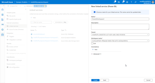
Now, we can connect our Azure Synapse Analytics workspace to our new Power BI workspace. Back in Azure Synapse Studio, we open the Manage tab and select Linked Services, then click New and click Connect to Power BI.

Synapse Studio should automatically recognize the Power BI workspace we created in the previous step. It should be available in the dropdown menu, so we’ll choose the workspace and click Create.
We need to publish the linked service to complete the setup, so click Publish at the top to publish the Power BI workspace. Then, we can access the Power BI workspace from the Develop tab.


Now, we create a Power BI dataset to use data from our Azure Synapse workspace. To do this, we select Power BI datasets in the list, click + New Power BI dataset, then click Start.


We then select our dedicated SQL pool as the data source and click Continue.

Now, we will be able to download a .pbids file that opens and connects to the Azure Synapse workspace from Power BI Desktop. If you haven’t already installed Power BI Desktop, download and install it for free.


Working with Synapse Data
We now open the .pbids file to connect Power BI Desktop to the Synapse dataset so we can analyze and visualize the data. We'll need to select and sign in using the Microsoft account option because we are connecting to Azure.


If the Microsoft account option does not connect properly, we can also use the Database login with the SQL credentials we created earlier, like this:

Now, we should be connected and see our database and tables in the workspace. We select all the tables, click Load, then choose Import to bring the data into Power BI.


After the data finishes importing, we may want to save our progress to a .pbix file to open later.
Analyzing and Answering Business Questions
Our setup is now complete. We are ready to answer some of our key business questions about the Contoso dataset in Power BI. Let’s go through each question and create a dazzling visualization.
What Are Our Total Revenue and Gross Profit?
The most fundamental information for any business is how much money the company is making versus spending. We can use the FactSales table’s data to answer this question.
Let’s create a new field in Power BI that calculates the difference between the total sales and the total costs to figure out the total profit. To make this field, we click on the FactSales table on the right. We’ll select the New measure button in the top menu, type the following formula to define the new measure, and finish by clicking the checkmark:
Profit = SUM(FactSales[SalesAmount]) - SUM(FactSales[TotalCost])


Now, we can select SalesAmount, TotalCost, and Profit in the Fields window to create a chart to answer our question for the entire Contoso business data.

We deselect the chart and start a new visualization by selecting the following fields: DateKey, SalesAmount, TotalCost, and Profit. Power BI then creates a table visual based on the date of the sales.
We can then expand the chart and click the X icon next to the Day and Month options in the Visualizations window to see a numeric data breakdown. This visualization reveals that the business’ second and fourth quarters are generally more profitable. This information will help predict future business estimates.


Which Stores Are Performing Best?
Next, let’s create a new page to discover the best-performing stores by pressing the + button next to Page 1.
This time, we select the StoreKey and Profit fields under the FactSales table. Then, Power BI should create a clustered column chart. From our data, we can identify that a small group of stores generates most of the company’s profit.

It would be clearer to show these stores by their name. So, we’ll create a new column in FactSales for the store name. We click New column and type the following formula to define the column:
StoreName = LOOKUPVALUE(DimStore[StoreName],DimStore[StoreKey],FactSales[StoreKey],"Unknown")


Now we can create a new chart by selecting StoreName and Profit to learn which stores generate the most profit by their name. From this visualization, we understand that the Contoso Catalog Store is critical to the business, followed by the online stores and resellers. Based on this information, our business’ marketing department may choose to expand catalog distribution or invest more effort reaching out to resellers to boost that channel.

Which Products Are Selling the Most or Least?
Let’s create another page to explore sales by product next.
First, we create a new column similar to the one in the FactSales table, this time mapping the sales to the product name, like this:
ProductName = LOOKUPVALUE(DimProduct[ProductName],DimProduct[ProductKey],FactSales[ProductKey],"Unknown")

Then, we create a Clustered Column Chart with ProductName and SalesQuantity. Here we learn that, in terms of quantity, the Contoso In-Line Coupler E180 in both Silver and Black are the most sold items. By scrolling to the far right, we also see that the Litware Washer & Dryer 27in and Contoso Washer & Dryer 27in are among the least-sold items. Our business’ purchasing department may choose to stock up on the couplers and drop the washers and dryers from the catalog based on this information.


How Much Revenue Is Each Channel Generating?
Next, let’s analyze the sales channels to determine how much each channel (store, online, catalog, or reseller) contributes to the business as a whole.
Just as before, we’ll create a new column to map to the channel. We can do this by setting the new channel value to the following:
Channel = LOOKUPVALUE(DimChannel[ChannelName],DimChannel[ChannelKey],FactSales[channelKey],"Unknown")

We create the fourth page and select the Channel and Profit fields to add a new chart. The chart defaults to a table view, so switch to a Pie Chart under the Visualization options to visually represent the sales channel business impact.
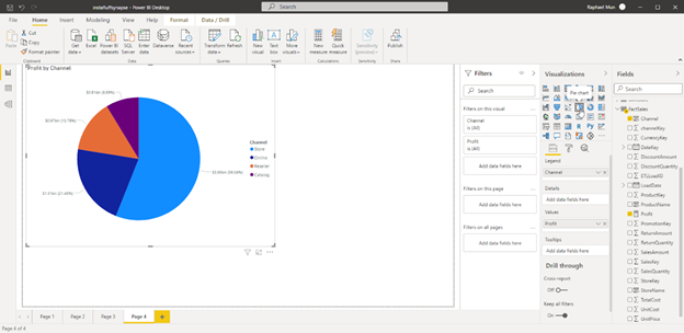
While our second chart shows that the top-performing stores are catalog, online, and resellers, this chart tells a different story. It reveals that physical Contoso stores account for more than half of the total profit, and we should not overlook them.
Information like this is critical to executives making impactful decisions about the future of their company. In this case, instead of investing more in the catalog, online shops, and resellers based on sales, the company’s managers may choose to expand their physical stores into more cities to boost profits.
Which Promotions Were the Most Effective?
To complete our data-driven business analysis, let’s answer one more question using our data and visualization tools: Which promotions were the most effective?
We create the fifth page and add one additional column that maps sales by their PromotionKey to the name of the Promotion. We use the following:
Promotion = LOOKUPVALUE(DimPromotion[PromotionName],DimPromotion[PromotionKey],FactSales[PromotionKey],"Unknown")

Then, we select the Promotion field and the Profit field to generate a bar chart like this:

You may notice that the top promotion is No Discount. We should ignore that in this chart since we’re only interested in comparing promotions. We easily hide this category by adding a Filter to the Promotions field. Then, select all but the No Discount option under Filters > Promotion. This change immediately reflects in the chart so we can compare the different promotions.


From these charts, it appears that the Back-to-School promotion is a big business profit driver in North America but not necessarily in Europe. The marketing department may need to investigate that information more to understand the reason. Still, for now, it may be a good idea for Contoso to continue running their promotions in North America, especially as we approach a new school year.
Publishing the Results
After finishing our brief deep-dive into the Contoso data, we are ready to publish our findings and share them with team members. To do this, we click the Publish button and select My workspace to publish these pages of charts to Power BI.


After a few moments, Power BI publishes the report. We can now open and view it in Power BI. Our report should look something like this:

We can take various actions inside Power BI to share the report. We can export the report to PowerPoint, PDF, or Excel, share the workspace with others, and chat about the results in Microsoft Teams. Those viewing the report can also comment on each section directly.
What’s Next?
During this article series, we learned that we can seamlessly integrate all our tools into Azure Synapse Analytics. This all-in-one data hub helps accelerate our ability to ingest, explore, and experiment with our data then analyze the results. Power BI’s valuable and beautiful visualizations help share mission-critical information with our company’s team members and executives.
We only explored one small scenario that Azure Synapse Analytics can handle. Hopefully, this brief look will get you started on your journey to an improved data workflow.
To learn more about Azure Synapse Analytics tools and integrations — and how they can help you make the most of your data — register to view the Hands-on Training Series for Azure Synapse Analytics.
You can also check out some of these resources on using Azure Synapse Analytics and Power BI: