
Industrial Controls 2
4.92/5 (131 votes)
A library of controls with a custon renderer for use in the controls processes panel display
Introduction
In my previous article, I created the first version of this library with basic controls and functionalities. Now, I thought of adding more controls to the library in order to be able to use it in the creation of form to control process or for several reasons.
To compile this demo, you need .NET 2.0. which is available here. The project is developed with SharpDevelop, a free IDE per .NET, but it is possible to use the VCS 2008 express edition.
Controls Description
In this version of the library, I include these types of controls:
- Visualization controls:
- Leds
- Display
- Meters
- Commands controls:
- Buttons
- Knobs
All controls are derived from LBSoft.IndustrialCtrls.Base.LBIndustrialCtrlBase, and have a category where you can edit the properties, as well as those by default. Normally all the classes have a default renderer class that are used to draw all parties, but it is possible to set a custom renderer to draw a single part, or the entire control.
Library Namespaces
LBSoft.IndustrialCtrls.Base
In this namespace, there are the base classes to create all the controls and the renderers in the library. The base classes are:
LBIndustrialCtrlBaseis the base class for the controlsLBRendererBaseis the base class for the renderers
LBIndustrialCtrlBase
This class is derived from UserControl. This class contains various virtual methods and properties to manage the data and the events in the control. The virtual methods in the class are:
IRenderer CreateDefaultRenderer()- This method is called from the constructor to create the default renderer af the control.void CalculateDimensions()- This method is called from the constructor to update the data in the associated renderer class or the default renderer.
The properties of the class are:
IRenderer DefaultRenderer- Get the default renderer of the controlIRenderer Renderer- Get or set the custom renderer of the control
LBRendererBase
This class is the base class for the renderers and implements the ILBRenderer interface. This class contains various virtual methods and properties to draw the control. The virtual methods in the class are:
void Draw( Graphics gr )- This method is called when the paint message requires the control redraw.void Update()- This method is called from theCalculateDimensions()method of the control to update the drawing data in the renderer.
The properties of the class are:
object Control- Get or set the control associated to the renderer
LBSoft.IndustrialCtrls.Leds
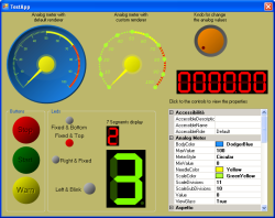
In this namespace, there are the controls that simulate a led for the visualization of a state and a 7 segments display to view a value.
LBLed

For this class, you can set the following properties at design time:
Led Properties
LedColor- Color of the led. The code modifies the color to simulate the dark side.LedSize- Size of the led. You can set different width and height to change the appearance of control.Style- Style of the led. The type of this property isLedStyleand the available values are:CircularRectangular
State- State of the led. The type of this property isLedStateand the available values are:OffOnBlink
LabelPosition- Position of the label of the control. The type of this property isLedLabelPositionand the available values are:LeftTopRightBottom
Label- Text of the label of the controlBlinkInterval- Interval in milliseconds for the blink state change
There are two properties that are not visible at the design time, and are:
BlinkIsOn- Flag for the current state of the blink state
LB7SegmentDisplay

For this class, you can set the following properties at a design time:
Display Properties
ShowDP- Show or hide the point of the displayValue- Set the value of the display
To change the colors of the controls, use the BackColor and the ForeColor properties.
LBSoft.IndustrialCtrls.Meters
In this namespace, there are the controls that simulate meters (analog or digital) to view a value
LBDigitalMeter

For this class, you can set the following properties at design time:
Digital Meter Properties
Signed- Set the sign of the display. If it is set totrue, the display views signed valuesFormat- Set the format of the value to display. An example of this format is0000.00. In this mode, the display value is like the image.Value- Set the value of the meter.
Like the LB7SegmentDisplay, to change the colors of the controls, use the BackColor and the ForeColor properties.
LBAnalogMeter

For this class, you can set the following properties at design time:
Analog Meter Properties:
MeterStyle- Style of the control. The type of this property isAnalogMeterStyleand the available values are:Circular
BodyColor- Color of the body of the controlNeedleColor- Color of the needle of the controlScaleColor- Color of the thicks of the control scaleScaleDivisions- Number of main division of the scaleScaleSubDivisions- Number of the sub-division between a main division to another of the scaleViewGlass- Flag for the visualization of the glass effectValue- Current value of the controlMinValue- Minimum value of the controlMaxValue- Maximum value of the control
There are two properties that are not visible at design time, and are:
Thresholds- Collection ofLBMeterThresholdobjects.
The class LBMeterThreshold is used to draw the threshold in the meters control, for viewing when the measure has a critical value. This class has the following properties:
Color- Color of the thresholdStartValue- Value from the threshold startEndValue- Value to the threshold end
This is an example of how to set the threshold in the meters controls:
	...

	public void SetThresholds()
	{
		LBMeterThreshold threshold = new LBMeterThreshold();
		threshold.Color = Color.Yellow;
		threshold.StartValue = 50;
		threshold.EndValue = 70;
		this.lbAnalogMeter1.Thresholds.Add ( threshold );

		threshold = new LBMeterThreshold();
		threshold.Color = Color.Red;
		threshold.StartValue = 70;
		threshold.EndValue = 100;
		this.lbAnalogMeter1.Thresholds.Add ( threshold );
	}

	...
LBSoft.IndustrialCtrls.Buttons

In this namespace, there are the controls that simulate a button to send a command. At the moment, there is only the class LBButton.For this class, you can set the following properties at design time:
Button Properties
Style- Style of the control. The type of this property isButtonStyleand the available values are:CircularRectangularElliptical
ButtonColor- Color of the buttonLabel- Label of the buttonState- State of the button. The type of this property isButtonStateand the available values are:NormalPressed
RepeatState- Repeat state of the button. With this state set totrue, the button sends an event every interval set to the repeat propertiesStartRepeatInterval- The first repeat interval in millisecondsRepeatInterval- The repeat interval in milliseconds
Events
This control, when the state changes, fires up an event to inform the connected class. This event is:
ButtonChangeState ( object sender, LBButtonEventArgs e );
The property State of the event arguments is the current state of the button.
LBSoft.IndustrialCtrls.Knobs

In this namespace, there are the controls that simulate knob to change a value (like a slider). At the moment, there is only the class LBKnob. For this class, you can set the following properties at design time.
Knob Properties
Style- Style of the control. The type of this property isKnobStyleand the available values are:Circular
KnobColor- Color of the knobScaleColor- Color of the scale of the knobIndicatorColor- Color of the indicator of the current valueIndicatorOffset- Offset of the indicator behind the edge of the knobMinValue- Minimum value of the knobMaxValue- Maximum value of the knobStepValue- Step value when the keyboard is usedValue- Current value of the knob
Like the previous controls, there are properties that are not visible at design time:
KnobCenter- Center point of the control.
Events
This control, when the state changes, fires up an event to inform the connected class. This event is:
KnobChangeValue ( object sender, LBKnobEventArgs e );
The property Value of the event arguments is the current value of the knob.
LBSoft.IndustrialCtrls.Utils
In this namespace, there are two classes with only static members for common use:
LBColorManager- Class for handling colorsLBMath- Class for mathematical functions used in the library
Renderers Description
Now is the time to explain how to create the custom renderers. Any control has a base renderer class, the default renderer. All the default renderer classes are derived from LBRendererBase. All the methods for drawing a part of the control in the renderer class are virtual and if you want to change the aspect of the control, it is possible to override one or all methods. The schema of the renderers classes is this:

The renderers available for the controls are:
LBLedRenderer- This class allows you to be able to redesign the appearance of controlLBLedand has the following methods:DrawBackground- Method to draw a control backgroundDrawLed- Method to draw the ledDrawLabel- Method to draw the label of the controlLB7SegmentDisplayRenderer- This class allows you to be able to redesign the appearance of controlLB7SegmentDisplayand has the following methods:DrawBackground- Method to draw a control backgroundDrawOffSegments- Method to draw the off segmentsDrawValue- Method to draw the value of the controlLBDigitalMeterRenderer- This class allows you to be able to redesign the appearance of controlLBDigitalMeterRendererand has the following methods:DrawBackground- Method to draw a control backgroundDrawBorder- Method to draw the border of the control (Not yet implemented)LBAnalogMeterRenderer- This class allows you to be able to redesign the appearance of controlLBAnalogMeterand has the following methods:DrawBackground- Method to draw a control backgroundDrawBody- Method to draw the body of the analog meterDrawThresholds- Method to draw the thresholds sectionsDrawDivisions- Method to draw the scaleDrawUM- Method to draw the label of the unit (not yet implemented)DrawValue- Method to draw the label of the current value (not yet implemented)DrawNeedle- Method to draw the needleDrawNeedleCover- Method to draw the needle coverDrawGlass- Method to draw the glass effect
LBButtonRenderer- This class allows you to be able to redesign the appearance of controlLBButtonand has the following methods:DrawBackground- Method to draw a control backgroundDrawBody- Method to draw the body of the controlDrawText- Method to draw the label of the control
LBKnobRenderer- This class allows you to be able to redesign the appearance of controlLBKnoband has the following methods:DrawBackground- Method to draw a control backgroundDrawScale- Method to draw the scale of the knobDrawKnob- Method to draw the body of the knobDrawKnobIndicator- Method to draw the indicator of the current value
To create a custom renderer, you follow these steps:
- Create a class derived from a base class renderer (Example:
LBLedRenderer) - Override one or all methods (Example:
DrawLed) - Create an instance of the custom renderer in the main form
- Set the renderer to the control with the property
Renderer
Example:
namespace TestApp
{
	///
	/// Class for custom renderer
	///
	public class LBCustomLedRenderer : LBLedRenderer
	{
		///
		/// Draw a rectangular led
		///
		public virtual bool DrawLed( Graphics Gr, RectangleF rc )
		{
			if ( this.Led == null )
				return false;

			Color c = this.Led.LedColor;
			SolidBrush br = new SolidBrush ( c );
			Pen pen = new Pen ( c );

			Gr.DrawRectangle ( pen, rc );
			Gr.FillRectangle ( br, rc );

			br.Dispose();
			pen.Dispose();

			return true;
		}
	}

	public partial class MainForm : Form
	{
		private LBCustomLedRenderer myRenderer = null;

		public MainForm()
		{
			InitializeComponent();

			this.myRenderer = new LBCustomLedRenderer();
			this.lbLed1.Renderer = this.myRenderer;
		}

		...
	}
}
Conclusion
Like the first version of the library, many features have yet to be implemented, and I hope to do so soon. Any suggestions/comments/feedback are highly appreciated.
For this article, I use the code and the idea of the following articles:History
- 1.0 (09 Apr 2008)
- Initial release
- 2.0 (02 May 2009)
- Created a base class
LBIndustrialCtrlBaseto derive all the controls classes. - Created a base class
LBRendererBaseto derive all the renderers classes. This class has aILBRendererinterface. - Inserted two new controls:
LB7SegmentDisplayLBDigitalMeter
- Rewrote all the controls and renderers classes to use the base classes
- Defined a new state '
Rectangular' for the led - Defined new states '
Rectangular' ad 'Elliptical' for the button
- Created a base class
- 2.1 (21 Feb 2010)
- Inserted new features for the button controls. Now it is possible to get a repetition event when the button is pressed.
- Corrected the off color of the
LB7SegmentDisplayfor a better visualization