XPlorerBar: A WPF Windows XP Style Explorer Bar Control
4.95/5 (163 votes)
A fully customizable WPF implementation of the left side pane that was introduced in Windows XP's Explorer.
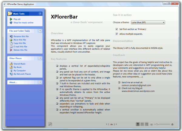
Table of Contents
- Introduction
- What's New in v1.1
- What the Demo Application Looks Like
- Design Goals
- Functional Requirements
- Using the Code
- Identifying XPlorerBar Elements
- Accessing XPlorerBar Elements
- Adding an XPlorerBar to your Application
- Registering and Applying a Custom Theme
- Using XPlorerSection Template Parts
- Building an XPlorerBar with Bindings
- Themes
- Project Structure
- Documentation
- Tools
- Feedback
- Future Work
- History
Introduction
XPlorerBar is a WPF implementation of the left side pane that was introduced in Windows XP's explorer. It provides a visually attractive and versatile way to present a grouped list of options while making effective use of screen space; common usage scenarios would include providing access to multiple areas of an application or presenting multiple pages of information.
Although there are many versions of this control for Windows Forms, its implementation for WPF is rather rare and, most of the time, paying. So, as I was looking for a good idea to deepen my learning WPF, I decided to write one myself as a learning exercise.
To see the XPlorerBar in action, download the demo executable and give it a try!
What's New in v1.1
- Added the Blend theme to the built-in themes of the library.
- Added a completely new class for theme management which allows to apply themes to any
FrameworkElementobject (for more information, see Registering and Applying a Custom Theme). - Updated the
XPlorerBarclass so that it is bindable (for more information see Building an XPlorerBar with Bindings).
What the Demo Application Looks Like
The demo application, which can be downloaded at the top of this article, allows:
- the modification of several parameters of the
XPlorerBarlocated on the left [A], - to click on the header of a section to expand/collapse it [B],
- to click on any item in a section [C].

Design Goals
Ease of use - The naming of components, methods, properties and events is consistent with the framework naming rules.
Fully customizable - All the elements (brushes, controls, geometries, animations duration, ...) are fully customizable: merge with the XPlorerBar.Generic.xaml dictionary and redefine the styles and/or templates of the items you want to customize.
Accurate look & feel - Colors and sizes of all the elements match exactly (thanks to the GIMP [^]) with the real Windows themes: 7 built-in themes are included for Vista, XP and NT.
Fully documented - As I would like this project to be helpful to the devs, the source code is highly commented and the library's API is provided as an MSDN style documentation file.
Functional Requirements
- Req 01 - An
XPlorerBarhosts a vertical stack of sections, calledXPlorerSection. - Req 02 - A vertical scrollbar is automatically added when all the sections cannot be fully displayed (remark : the horizontal scrollbar is never displayed).
- Req 03 - An
XPlorerSectioncontains a fixed header and an expandable/collapsible content. - Req 04 - An
XPlorerSectionheader can host a large icon and its associated text. If the text cannot be fully displayed, it is cropped to the header width and an ellipsis is added to indicate that cropping has occurred. - Req 05 -
XPlorerSectioncontents can be expanded or collapsed by clicking on their headers. - Req 06 - Each
XPlorerSectionuses animations when its content is being expanded (fade in and slide down) or collapsed (fade out and slide up). Remark: animation durations have to be customizable by the user. - Req 07 - Even if an
XPlorerSectioncan host any sort of content, anXPlorerItemcomponent is provided to easily display a text with its small icon, add hot tracking and a 'Click' event to the command. - Req 08 - If an
XPlorerItemcannot be fully displayed, its text is wrapped to the header width and ends on the next line. - Req 09 - An
XPlorerSectioncan be designated as 'Primary' to be displayed differently than 'normal' sections. - Req 10 - Most of the
XPlorerBarelements (brushes, controls, geometries, ...) have to be easily accessible to the user. - Req 11 - The user can apply any (built-in or custom) theme to the
XPlorerBar. - Req 12 - If no specific theme is applied to the
XPlorerBar, it automatically obtains its colors from the active Windows theme.
Using the Code
The XPlorerBar control and its associated elements are located in the ZonaTools.XPlorerBar namespace. Make sure you add a reference to the compiled library ZonaTools.XPlorerBar.dll before using it.
Identifying XPlorerBar Elements
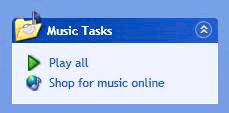
The image below identifies key parts of XPlorerBar control:

XPlorerSection[Primary]Header[Hover]ForegroundBrushXPlorerSection[Primary]HeaderBackgroundBrush- Key parts of an
XPlorerSectionbutton are:XPlorerSection[Primary]HeaderButtonBackgroundBrushXPlorerSection[Primary]HeaderButton[Hover]ForegroundBrushXPlorerSection[Primary]HeaderButtonBorderBrushXPlorerSectionHeaderExpandArrowsXPlorerSectionHeaderCollapseArrows
XPlorerBarBackgroundBrushXPlorerSection[Primary]Content[Hover]ForegroundBrushXPlorerSection[Primary]ContentBackgroundBrushXPlorerSection[Primary]ContentBorderBrush
Remark: the words inside of square brackets are optional:
- 'Primary' is set when the
XPlorerSectionis set as 'Primary' (e.g.XPlorerSectionPrimaryContentBorderBrush). - 'Hover' is set when the mouse is over an element (e.g.
XPlorerSectionHeaderHoverForegroundBrush).
Accessing XPlorerBar Elements
All the above elements can be reused in your own templates.
The sample code below shows how to assign the background brush of the active XPlorerBar theme to the Background property of an element:
xmlns:xpbar="clr-namespace:ZonaTools.XPlorerBar;assembly=ZonaTools.XPlorerBar"
...
<Setter Property="Background"
   Value=
   "{DynamicResource
	{x:Static xpbar:XPlorerResourceKeys.XPlorerBarBackgroundBrushKey}}"/>
Remark 1: The role of the XPlorerResourceKeys class is explained later in this article.
Remark 2: The name of the static ComponentResourceKey to use when accessing an XPlorerBar element is simply the element name (as shown above) with the Key suffix.
Adding an XPlorerBar to your Application
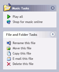
This sample shows how to create an XPlorerBar with two XPlorerSection and a few XPlorerItem. The first XPlorerSection is set as 'Primary' and the XPlorerBar theme is set to the silver Windows XP theme:
xmlns:xpbar="clr-namespace:ZonaTools.XPlorerBar;assembly=ZonaTools.XPlorerBar"
...
<!-- XPlorerBar -->
<xpbar:XPlorerBar x:Name="ZT_XPlorerBar"
                  xpbar:ThemeManager.Theme="LunaSilver"
                  AllowMultipleExpands="True">

  <!-- Music Tasks -->
  <xpbar:XPlorerSection Header="Music Tasks"
                        HeaderImage="/Images/MyMusic32.png"
                        IsExpanded="True" IsPrimary="True">
    <StackPanel Orientation="Vertical">
      <xpbar:XPlorerItem ItemText="Play all"
                         ItemImage="/Images/PlayAll16.png"
                         Click="XPlorerItem_Click" />

      <xpbar:XPlorerItem ItemText="Shop for music online"
                         ItemImage="/Images/MusicOnLine16.png"
                         Click="XPlorerItem_Click" />
    </StackPanel>
  </xpbar:XPlorerSection>

  <!-- File and Folder Tasks -->
  <xpbar:XPlorerSection Header="File and Folder Tasks"
                        IsExpanded="True" IsPrimary="False">
    <StackPanel Orientation="Vertical">

      <xpbar:XPlorerItem ItemText="Rename this file"
                         ItemImage="/Images/Rename16.png"
                         Click="XPlorerItem_Click" />
      <xpbar:XPlorerItem ItemText="Move this file"
                         ItemImage="/Images/Move16.png"
                         Click="XPlorerItem_Click" />
      <xpbar:XPlorerItem ItemText="Copy this file"
                         ItemImage="/Images/Copy16.png"
                         Click="XPlorerItem_Click" />
      <xpbar:XPlorerItem ItemText="E-mail this file"
                         ItemImage="/Images/MailFile16.png"
                         Click="XPlorerItem_Click" />
      <xpbar:XPlorerItem ItemText="Delete this file"
                         ItemImage="/Images/Delete16.png"
                         Click="XPlorerItem_Click" />
    </StackPanel>

  </xpbar:XPlorerSection>
</xpbar:XPlorerBar>
In the code-behind file, the Click event is handled as follows:
private void XPlorerItem_Click(object sender, RoutedEventArgs e)
{
    MessageBox.Show(
        string.Format("You clicked the '{0}' item.",
        ((XPlorerItem)e.OriginalSource).ItemText));
}
The result is shown below:
Registering and Applying a Custom Theme
To extend the visual appearance of your XPlorerBar, you can create your own theme dictionaries.
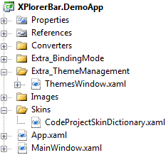
The procedure for creating a new theme dictionary is quite simple: in most cases, you will merge with the XPlorerBar.Generic.xaml dictionary, override one or more elements (brushes, geometries, styles, templates, ...) and add it to your project, as shown below:
Then, you need to create your Theme object as follows:
Theme codeProjectTheme = new Theme(
    "CodeProject theme",
    "ZonaTools.XPlorerBar.DemoApp;component/Skins/CodeProjectSkinDictionary.xaml");
And finally, your new theme has to be registered for XPlorerBar objects as shown below:
ThemeManager.RegisterTheme(codeProjectTheme, typeof(XPlorerBar));
You can now use your theme whenever you want by setting (in XAML) the ThemeManager.Theme to the registered name of your theme...
ThemeManager.Theme = "CodeProject theme"
... or, in the code-behind file:
ZT_XPlorerBar.SetValue(ThemeManager.ThemeProperty, "CodeProject theme");
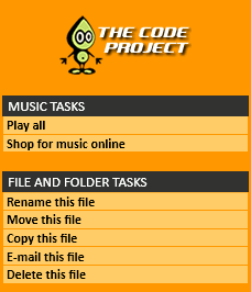
With your custom theme applied, the preceding example becomes:
Remark: As you have seen earlier, the themes can now be applied to any FrameworkElement object. To do so, all you have to do is to register the desired theme to the type of object you want to see themed and apply it to the proper instance. An example is provided in the Extra_ThemeManagement folder: to run this example, modify the App.xaml file of the XPlorerBar.DemoApp project as follows:
StartupUri = "Extra_ThemeManagement/ThemesWindow.xaml"
Using XPlorerSection Template Parts
As you have seen so far, it's really simple to "tune" an existing theme, register it in the ThemeManager and use it in your application. But what if you want to completely redefine an element like an XPlorerSection? How will you restyle the control without modifying or replacing expected behavior?
The answer to the last question is: With Template Parts' help.
The Template Parts allow the configuration of all the binding expressions in the initialization code of the control itself and, this way, the template doesn't need to specify these details anymore. All you have to do then, is to focus on the appearance of your control.
As you have already seen, an XPlorerSection is made up of a header and a content or, from the visual tree point of view, of a ToggleButton and an XPandableDecorator. Two Template Parts are defined in the XPlorerSection class:
- The first one, called
PART_HeaderSite(on theToggleButton), keeps theToggleButton.IsCheckeddependency property synchronized with theXPlorerSection.IsExpandeddependency property. - The second one, called
PART_ContentSite(on theXPandableDecorator), does the same between theXPandableDecoratorand theXPlorerSection.
The sample code below shows how the two Template Parts are used in an XPlorerSection control template:
...
<StackPanel Orientation="Vertical">
  <!-- Header -->
  <ToggleButton x:Name="Part_HeaderSite"
                Content="{TemplateBinding Header}"
                Style="{StaticResource HeaderStyle}"/>
  <!-- Content -->

  <xpbar:XPandableDecorator x:Name="PART_ContentSite">
    <Border Background="{TemplateBinding Background}"
            CornerRadius="0,0,4,4">
      <ContentPresenter Margin="{TemplateBinding Padding}"/>
    </Border>
  </xpbar:XPandableDecorator>
</StackPanel>

...
Remark: if you want to see how the two Template Parts are defined, have a look at the OnApplyTemplate method of the XPlorerSection class.
Building an XPlorerBar with Bindings
One of the major new features of the library is that the XPlorerBar is now bindable. Indeed, it's now possible to build dynamically an XPlorerBar with bindings to a data source as an XML file or a collection of observable objects. An example is provided in the Extra_BindingMode folder: to run this example, modify the App.xaml of the XPlorerBar.DemoApp project as follows:
StartupUri = "Extra_BindingMode/BindingsWindow.xaml"
In this example, the data source is an XML file (XPlorerBarXMLFile.xml) presented as shown below:
<?xml version="1.0" encoding="utf-8"?>
<XPlorerBarData>
    <!-- Music Tasks -->
    <XPlorerSectionData Header="Music Tasks"
	HeaderImage="/Images/MyMusic32.png" IsPrimary="True">
        <XPlorerItemData ItemText="Play all" ItemImage="/Images/PlayAll16.png"/>
        <XPlorerItemData ItemText="Shop for music online"
		ItemImage="/Images/MusicOnLine16.png"/>
    </XPlorerSectionData>
    ...
The Window.Resources part of the BindingsWindow.xaml file contains the XML data provider and the data templates used to retrieve and organize the data from the XML file:
...
<!-- Data provider -->
<XmlDataProvider x:Key="ZT_XPlorerBarData"
	Source="XPlorerBarXMLFile.xml" XPath="XPlorerBarData"/>

<!-- Data templates -->
<DataTemplate x:Key="itemTemplate">
    <xpbar:XPlorerItem ItemText="{Binding XPath=@ItemText}"
			ItemImage="{Binding XPath=@ItemImage}"
                       Click="XPlorerItem_Click"/>
</DataTemplate>
<HierarchicalDataTemplate x:Key="sectionTemplate" DataType="XPlorerSectionData">
    <xpbar:XPlorerSection Header="{Binding XPath=@Header}"
			HeaderImage="{Binding XPath=@HeaderImage}"
                          IsExpanded="True" IsPrimary="{Binding XPath=@IsPrimary}">
        <xpbar:XPlorerSection.Content>
            <ItemsControl ItemsSource="{Binding XPath=./XPlorerItemData}"
				ItemTemplate="{StaticResource itemTemplate}"/>
        </xpbar:XPlorerSection.Content>
    </xpbar:XPlorerSection>
</HierarchicalDataTemplate>
...
Finally, the XPlorerBar is declared as follows:
<!-- XPlorerBar -->
<xpbar:XPlorerBar x:Name="ZT_XPlorerBar" xpbar:ThemeManager.Theme="LunaBlue"
                  VerticalAlignment="Stretch" Width="Auto" AllowMultipleExpands="False"
                  ItemsSource="{Binding Source={StaticResource ZT_XPlorerBarData},
		XPath=XPlorerSectionData}"
                  ItemTemplate="{StaticResource sectionTemplate}"/>
The result is shown below:
Themes
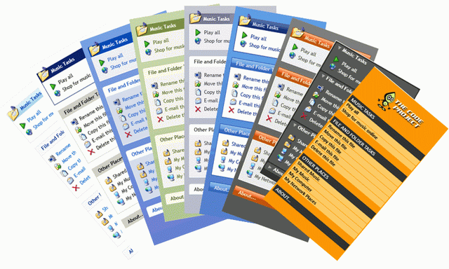
9 themes are provided with this project :
- 8 are built-in themes (provided with the ZonaTools.XPlorerBar.dll library),
- 1 is a custom theme provided as an example with the demo application.
Enumerated from left to right:
| Theme | File | Registered name | |
| -- Built-in themes -- | |||
| Windows Vista theme | themes/Aero.NormalColor.xaml | Aero |
|
| Windows Classic theme | themes/Classic.xaml | Classic |
|
| Default Windows XP theme | themes/Luna.NormalColor.xaml | LunaBlue |
|
| Olive green Windows XP theme | themes/Luna.Homestead.xaml | LunaOliveGreen |
|
| Silver Windows XP theme | themes/Luna.Metallic.xaml | LunaSilver |
|
| Windows XP Media Center Edition theme | themes/Royale.NormalColor.xaml | Royale |
|
| Zune Windows XP theme | themes/Zune.NormalColor.xaml | Zune |
|
| Expression Blend theme | themes/BlendDictionary.xaml | Blend |
|
| -- Custom theme -- | |||
| Code Project theme | skins/CodeProjectSkinDictionary.xaml | CodeProject theme |
|
Remark: The first seven built-in themes enable your XPlorerBar to adapt to the current operating system theme (only if no specific theme is applied to the XPlorerBar or if the ThemeManager.Theme is set to Default).
Project Structure
Here is the library project structure, as seen in Visual Studio's Solution Explorer:
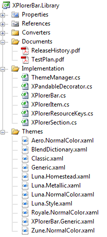
The role of the library classes is explained below:
- ThemeManager.cs - The
ThemeManagerstatic class is used for new themes registration and current theme switching. - XPandableDecorator.cs - The
XPandableDecoratorclass defines the animations used to expand or collapse its content. Inspired by Kevin Moore's Reveal control (from its Bag-o-Tricks [^]), this control has then been adapted to support theming and skinning. - XPlorerBar.cs - The
XPlorerBarclass implements the features and the behavior of anXPlorerBarcontrol. AnXPlorerBarcan only containXPlorerSection. - XPlorerItem.cs - The
XPlorerItemclass implements the features and the behavior of anyXPlorerItemnested in anXPlorerSection. AnXPlorerItemcan contain a text and/or a small icon. - XPlorerResourceKeys.cs - The
XPlorerResourceKeysstatic class defines a staticComponentResourceKeyname for each resource we plan to share with another assembly. - XPlorerSection.cs - The
XPlorerSectionclass implements the features and the behavior of any section of anXPlorerBar. AnXPlorerSectioncan contain any sort of content as well in its header as in its content. However, two properties allow to easily set its header text and its header large icon.
The Documents folder, reminds you the history of the current release and gives you an overview of the tests executed on the library.
The goal of this quick presentation of the role of the main classes of the ZonaTools.XPlorerBar library is to give you a guide to easily navigate in the source code.
The API's documentation will give you more details on the members of each class of the library.
Finally, the many comments in the source code should give you the keys to quickly understand what is done.
Documentation
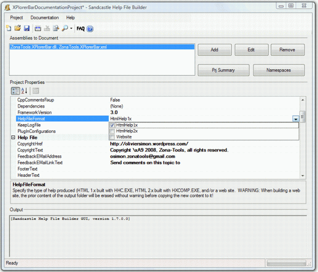
The API's documentation was generated with Sandcastle [^] used in combination with Sandcastle Help File Builder [^] (SHFB).
The SHFB project (XPlorerBarDocumentationProject.shfb in the XPlorerBar.Documentation folder) is set to generate a MSDN-like document as an HTML Help 1 file (*.chm).
The documentation project also permits the generation of the documentation as an HTML Help 2 file (*.hxs) or as a Web site (all you need to do is change the 'HelpFileFormat' parameter as shown below and rebuild).
Tools
The project was developed with the following tools:
- Visual C# 2008 Express Edition SP1 [^]
- SandCastle [^]
- SandCastle Help File Builder [^]
- GIMP v2.4.7 [^]
- Bob Builder v1.0.0.42 [^]
Feedback
This is my first article on The Code Project. So, please let me know what you think.
I hope you'll find this article helpful and instructive. However, if my approach is totally wrong also feel free to let me know.
I definitely want to hear what the community thinks.
Future Work
- Add Visual Studio 2008 designer support
- Add XBAP support
- Add right-to-left layout capabilities
- Create installer (MSI) package
History
- November 5, 2008 - v1.0
- Initial release
- December 8, 2008 - v1.1
- Added the Blend theme to the built-in themes of the library.
- Added a completely new class for theme management which allows to apply themes to any
FrameworkElementobject. This class replaces the previousThemeManagerclass. - Removed the now useless
ThemeDictionaryclass. - Updated the
XPlorerBarclass so that anXPlorerBarcan now be built dynamically with bindings to a data source. - Renamed the
ExpandableDecoratorclass inXPandableDecorator.
