
Seven-Segment and Sixteen-Segment Controls for WPF
4.82/5 (14 votes)
User controls which allow displaying symbols using 7 and 16 segments
Introduction
Seven and sixteen segment indicators are controls for Windows WPF applications. Each component is split by some figures (shapes) with nearly the same form and size. Different combinations of colorized segments allow visualizing digital information such as temperature, time, different calculations and other characters. There are lot of similar controls or ways to create similar labels for .NET applications, but without full customization. I have tried to put together as many design configuration possibilities as possible in a single component.
Background
Mostly, segment controls in this application derive from the one base UserControl named SegmentBase. From it derive such controls as SevenSegments and SixteenSegments, which are responsible for displaying single character with segments. There is additional base component SegmentsStackBase deriving from SegmentBase, it contains properties to display sequence of segment controls. From this control come SevenSegmentsStack, which presents list of SevenSegments components, and SixteenSegmentsStack, which presents list of SixteenSegments components.
Each segment has a corresponding number. Using these numbers, you can apply properties or make other actions with it. Segment numbers are assigned according to the enumerations.
public enum SevenSegmentsNumbers
{
    Top= 0,
    RightTop = 1,
...
}

public enum SixteenSegmentsNumbers
{
    LeftHorizTop = 0,
    RightHorizTop = 1,
...
}


Properties of Controls

Segment components have the following dependency properties to configure visual appearance:
FillBrush: gets/setsBrushfor not selected segmentsSelectedFillBrush: gets/setsBrushfor selected segmentsPenColor: gets/setsColorof pen border for not selected segmentsSelectedPenColor: gets/setsColorof pen border for selected segmentsGapWidth: gets/sets gap in pixels between segmentsRoundedCorners: shows/hides roundness for corners of segmentsTiltAngle: gets/sets tilt angle in degrees relatively of Y-axisShowDot: shows/hides additional dot segmentShowColon: shows/hides additional colon segmentsOnDot: activates/deactivates dot segmentOnColon: activates/deactivates colon segmentVertSegDivider: gets/sets proportional width of vertical segments (proportional divider number)HorizSegDivider: gets/sets proportional height of horizontal segments (proportional divider number)SelectedSegments: gets/sets a list of selected segments set by userSegmentsBrush: gets/sets list of different brushes for particular segments
SevenSegmentsStack and SixteenSegmentsStack have an additional dependency property:
ElementsCount: number of segment elements to show
Using the Code
As it has been written above, there are main user controls SevenSegments and SixteenSegments to create segmented labels. Segments are PathGeometry shapes drawn in the OnRender function. Each path figure is combined in the single class GeometryWithSegm. It contains corresponding segment number, drawn segment shape and a Boolean property to mark figure as selected.
public class GeometryWithSegm
{
         public PathGeometry Geometry { get; set; }
         public int SegmentNumber { get; set; }
         public bool IsSelected { get; set; }
}
...
To draw a whole figure of segments, a list of GeometryWithSegm classes List <geometrywithsegm> GeometryFigures</geometrywithsegm><geometrywithsegm> has been used.
protected override void OnRender(DrawingContext drawingContext)
{
…
         GeometryFigures = new List<GeometryWithSegm>();
         GeometryFigures.Add(new GeometryWithSegm(TopSegement(), Segments.Top));
…
         foreach (var entry in GeometryFigures)
         {
         Pen figurePen = new Pen(new SolidColorBrush
                    (entry.IsSelected ? SelectedPenColor :PenColor), PenThickness);

         drawingContext.DrawGeometry(entry.IsSelected ? SelectedFillBrush : FillBrush,
         figurePen, entry.Geometry);
         }
…
}
...
Path geometries contain some geometric shapes, PathFigure. In turn, each PathFigure consists of lines and Bezier curves connected with each other.
protected PathGeometry TopSegement()
{
    TopSegmPoints = GetTopSegmPoints();
    Point startPoint = TopSegmPoints[0];
    LineSegment line0 = new LineSegment(TopSegmPoints[0], true);
...
    // The left Bezier curve for rounded corners
    var pointsBezierLeft= new PointCollection
    {
        TopSegmPoints[1], TopSegmPoints[2], TopSegmPoints[3]
    };
...
    PathGeometry pathGeometry = new PathGeometry();
    PathFigure pathFigure = new PathFigure();
    pathFigure.StartPoint = startPoint;
    pathFigure.IsClosed = true;
    pathGeometry.Figures.Add(pathFigure);
    pathFigure.Segments.Add(line0);
...
    return pathGeometry;
}
Points for each line and Bezier curve are calculated in separate functions.
protected PointCollection GetTopSegmPoints()
{
    PointCollection points = new PointCollection();
    var topLeftX = LeftTopSegmPoints[1].X + HorizSegSmallPartW;
...
    // three left points, starting from the bottom point
    points.Add(new Point(LeftTopSegmPoints[2].X + GapW, HorizSegH + startPointThickness));
    points.Add(new Point(LeftTopSegmPoints[1].X +
               GapShift(), HorizSegSmallPartH + startPointThickness));
    points.Add(new Point(topLeftX, startPointThickness));
...
    return points;
}
Some of the shapes coordinates required additional calculation to draw inclination. Simple trigonometric equation has been used according to an angle: tan(alpha) = a/b.
/// <summary>
/// Returns X-coord by the angle and height
/// </summary>
/// <param name="y">Y-coordinate to calculate height</param>
protected double XByAngle(double y)
{
    var h = figureStartPointY - y;
    return (TanAngle() * h);
}

/// <summary>
/// Returns tangent of the tilt angle in degrees
/// </summary>
protected double TanAngle()
{
    return Math.Tan(TiltAngle * (Math.PI / 180.0));
}
Segments are marked as selected corresponding to the required value in the special function. You can extend this function to apply not supported values.
protected virtual void ValueSegmentsSelection()
{
    int tempValue;
    if (int.TryParse(Value, out tempValue))
    {
         switch (tempValue)
         {
            case 0:
                 SelectSegments((int) SevenSegmentsNumbers.LeftTop, (int)SevenSegmentsNumbers.Top,
                 (int)SevenSegmentsNumbers.RightTop, (int)SevenSegmentsNumbers.RightBottom,
                 (int)SevenSegmentsNumbers.Bottom, (int)SevenSegmentsNumbers.LeftBottom);
                 break;
…
}
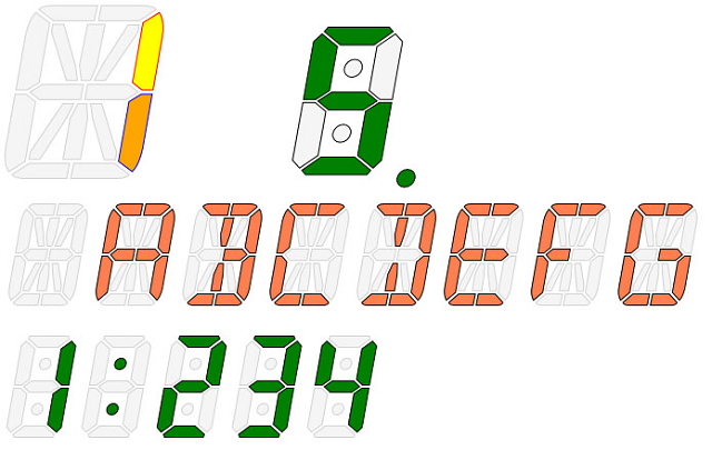
For this moment, seven segment controls support only numeric values, sixteen segment controls support numeric values and capital letters.
Also, there is a possibility to select segments without modifying control’s internal implementation through the use of dependency property SelectedSegments.
int[] segments =
{
    (int) SegmentsControls.SixteenSegmentsNumbers.LeftMiddle,
    (int) SegmentsControls.SixteenSegmentsNumbers.RightBottomDiagonal
};

MySegments.ClearSegments();
MySegments.SelectedSegments = segments.ToList();
To apply different colors for particular segments outside control’s realization, it’s possible to use dependency property SegmentsBrush.
Tuple<int, Brush, Color>[] brushes =
{
    new Tuple<int, Brush, Color>(
    (int)SegmentsControls.SixteenSegmentsNumbers.RightVertTop,
    new SolidColorBrush(Colors.Yellow),
    Colors.Red),
...
};

MySegments.ClearSegments();
MySegments.SegmentsBrush = brushes.ToList();
Stack of Segment Controls
Creation of stack of segment controls is also based on the base control SegmentBase. SevenSegmentsStack and SixteenSegmentsStack contain simple ItemsControl with items of segment controls.
<ItemsControl  x:Name="SegmentsArray" >
    <ItemsControl.ItemsPanel>
        <ItemsPanelTemplate>
            <segm:ArrangedPanel />
        </ItemsPanelTemplate>
    </ItemsControl.ItemsPanel>

    <ItemsControl.ItemTemplate>
        <DataTemplate>
            <segm:ArrangedPanel >
                <segm:SevenSegments Value="{Binding Item}"
                                    ShowDot="{Binding ShowDot}"
                                    OnDot="{Binding OnDot}"
…
                                    Margin="5,0,0,0"/>
            </segm:ArrangedPanel>
        </DataTemplate>
    </ItemsControl.ItemTemplate>
</ItemsControl>
An ItemsControl is bound with required list of items.
private ObservableCollection<CharItem> ValueChars;
…
ValueChars = GetCharsArray();
SegmentsArray.ItemsSource = ValueChars;
In order to apply dots or colons for these controls, it's required to set true for properties ShowDot or ShowColon and set proper property Value (for example 1:23.4).
History
- 14th February, 2019 -- Original version posted
- 27th March, 2019 -- Some minor changes according to the comments below (i.e. changed indexing for 16 segments and colors of unused segments)