Programming Windows 10: UWP Focus (3 of N)
Nov 26, 2017
15 min read
C#
Beginner
Intermediate
Windows
Visual-Studio
VS2013
UWP
Win10
by raddevus
Contributor
Introduction
This continues my series of articles which are attempting to investigate the reality of developing apps for the Windows 10 Desktop under the UWP paradigm. You can read the two following articles where this series began:
Plans Change
My idea for this chapter is was to write an app that has a number of features so we can begin to see what it is like to actually face the challenges of creating a UWA. However, as you read on into the background of this article, you will see I fell down a UWP rabbit-hole as I had to face the challenge of resolving how to get graphic assets set up properly in an attempt to make the app look professional.
Daily Journal Basics
This app will be a daily journal type of app which will save your daily entries in RTF (Rich Text Format). The Windows controls which are available to us in UWA development make creating and saving RTF files quite easy. I’ve written a WinForm app like this in the past so I have an idea of what it will look like and how it will work.
Here is a list of requirements and a snapshot of the original app (which isn’t great looking but is a good utility I use almost daily).
Requirements List
- Allow user to create date-based entries without requiring her to supply a filename every time she saves a new journal entry.
- Name files according to the date they were created.
- Allow user to create multiple entries for one day.
- List entries by month so for each month, the user can see all entries which have been created.

DailyJournal Features
- When the user opens the app, it defaults to the current date and opens a blank entry on the right.
- The user can begin typing notes, adding web links, etc.
- The user can create multiple entries which appear on the right as additional tabs. When the user creates a new entry, the current entry is auto-saved. The user never has to supply a file name.
- The entries are tallied up and the list control at the bottom left shows the dates which contain entries and how many.
- If the user clicks any one of those date entries in the list box, the entries are loaded on the right so the user may read through them.
- Changing the month to another loads the entries for that month.
Background
That was my hope for this article, but as I began digging in, I determined that it was more important to first get us an icon that would show up on taskbar so we can easily identify our running app. That's when I fell down the UWP rabbit-hole.
NOTE: IMO, I spent way too much time writing this article for the probable low response it will get but it may be valuable to others to see the range of things that devs have to deal with. I hope you find it somewhat interesting, at least.
Rabbit-Hole Article
I apologize that this article seems to depart from the app I mentioned that I want to write*. I myself was extremely frustrated and stopped writing this article numerous times over the past few days, but I'm including it because it is the reality of developing apps under the UWP paradigm.
*Author's Promise: Chapter 4 will return to building the DailyJournal app and once you read this article, you will have an effective method of creating graphic assets for the project so I won't have to explain it in the future.
The Reason I Decided To Write This Article
I am a software developer first so the thing I am most interested in is designing and writing code. However, the entire point of writing code is to create a solution that is useful and since I am also a pragmatist, I like to only write code when it is creates something useful.
Apps Have To Look Good
However, people generally won’t even try an app if it doesn’t look very good so even though I’m not a graphic designer I still know that making an app look nice is important. The problem is that you can spend far too much time messing around with graphics programs. So, I will try not to focus on this stuff too much but again I do want to touch upon everything you’re going to have to do to create the most professional app possible under the UWP umbrella.
Royalty-Free Art : One-time Purchase
Because I'm a software developer and not a graphic artist, I don't create great looking graphics. Fortunately, there is a great site (recently purchased by Adobe) where you can get very good royalty-free graphics for a one-time low cost: http://fotolia.com^.
You can purchase the images in various formats and resolutions so that the purchase of the icon set that I will use for the DailyJournal app only cost $3.00USD. You don't have to subscribe, you can purchase credits and then buy individual images.
I will use the icon set for logos, icons, etc. If you do a lot of searching on that site, you can get some really nice royalty-free graphics there for a one-time low price.
Creating the New Project: DailyJournal
The first thing I did was create a new blank UWA named DailyJournal.
You can download the source code at the top of the article which will contain the project with the final app icon.

Learning About Setting Up Graphic Assets
The definitive guide on UWP graphic assets is provided by Microsoft here.
It’s actually not a bad read, but it is quite long and so I will attempt to summarize as guidance for what we’ll do to get our app set up.
Why Are Graphic Assets So Complicated Under UWP?
Understanding what the original UWP architects were attempting to solve helps us to understand why the Asset system seems to be so complex.
UWP Architects Take Large BiteThe UWP architects were attempting to create an Asset system which solves everything for everyone on all platforms (which is always extremely difficult).
What Were UWP Architects Attempting To Solve?
- Provide sizes that will look good on every size device (Phone, Microsoft Surface, Laptop, Desktop).
- Ensure that icons include an overlay area which can be utilized by the OS to provide additional clues about how the app will be used.
- Make sure icons provide contrast so they can be seen easily on various platforms (Phone, Surface, Laptop, etc).
WinForm Development Assets Mostly Simpler
In the past (WinForm development), you simply created an icon which was a certain size like 32 (pixels) by 32. You made it look as good as you could and you were done. You didn’t have to think too much about how the system might use the icon other than providing some additional sizes so it looked good at different resolutions. Yes, there were still annoying things under that system too -- but we've had over 20 years to get used to them. :)
UWP Dev : Many More Responsibilities
Under UWP (Universal Windows Platform) the developer has many more responsibilities to keep in mind because icons and logos are used in specific ways on Windows 10 and in the Windows store and the graphics must work well any size or type of device. One of the main things that becomes apparent under UWP is that the icon is not only used for you to display your icon image. It is additionally used by Windows 10 at times to display information overlayed on the icon. All of these reasons are why UWP requires so many different icon and logo sizes. It’s quite overwhelming for any of us software developers, because we aren’t graphic designers and we’re probably not as interested in tweaking graphics pixel by pixel.
Drives Me Kind Of Crazy
Personally, it drives me crazy because I’m far more interested in getting to the code. Under WinForms Windows developers were able to live in a smaller world and didn’t have to recognize every device in the known universe. This is one the challenges we will have to face going forward if UWP survives.
Taskbar Icon
That’s a lot of background information and this has been a challenge for me to stay focused on this so let’s move through this by first simply getting an icon that will appear on our taskbar.
We can fix the splash screen later after we get our app’s UI looking better since generally the splash screen might be a snapshot of the running app.
Examining the Assets Folder
Let’s take a quick look at the list of images which are automatically added to the project by the template.

Taskbar Icon Discovery
I went through and altered each image until I saw that the taskbar icon was altered.
The file you have to change to get an altered icon is Square44x44Logo.targetsize-24_altform-unplated.png.
These are called target-based assets and I’m assuming that is because they target a specific size.
This is the image which is used for the taskbar icon:

<WindowsKey>-Tab (or Alt-Tab) Icon
It is also used when you do a <WindowsKey>-Tab (or Alt-Tab) (to display the list of running apps):

Windows 10 Snap Assist
This icon is also used when you snap one application (use snap-assist) to one side of the screen and the OS (Operating System) provides a list of apps which are running to allow you to choose another one to snap to the other side of the screen:

GIMP : GNU Image Manipulation Program
I use the Open Source application, GIMP, to easily alter the image. You can get the application for free at: https://www.gimp.org/^. It's about 80MB download and not too bad of an install. It actually has an amazing number of features for a free graphic design / photo-edit app which rivals Adobe Photoshop.
Here’s the icon I’m using for my app:

Access Assets From File Explorer
We are going to access the image files directly from File Explorer. If you ever wonder where the files for your current project are, you can easily get the file path by choosing your project in Solution Explorer. When you select the project, you’ll see the Project Folder (path) displayed in the Properties window.

You can click on the path on the right, select it all and paste it to your File Explorer window to get to the project path quickly. The folders you see in Solution Explorer will be available under that path.
You can see a partial listing of folders and files in the next image which includes the Assets folder:

Here are the steps that I take to alter the file to create our icon.
Step 1
Start up GIMP and open Square44x44Logo.targetsize-24_altform-unplated.png from the Assets folder:

Step 2
Open up my icon file which I purchased from Fotolia.com in a separate GIMP window.
Step 3
Copy the icon I want to represent my app.

Step 4
Switch over to the GIMP window which has Square44x44Logo.targetsize-24_altform-unplated.png open and paste my icon in as a new layer.

Pasting the icon in will overlay the original X icon layer and the new image will be improperly sized so we’ll need to resize it.

Just that small corner shown is the actual size of the icon viewable space. The layer we pasted in is too large and it doesn’t all show up. More challenges with creating proper icons for UWP.
Step 5
Choose the GIMP Resize tool to resize our layer.

When you click the layer (in the window on the right, after selecting the resize tool) it will activate GIMP’s resize window where you can enter the size (width and height) you want to set the layer to be.

Resize Image Proportionally
We want it to resize proportionally so click the broken chain so it links the Width and Height settings (to size proportionally).
Step 6
Set the Width to 24 (our max width) and tab into the Height field. When you do, the Height value will be calculated proportionately.
Alert! Isn't this odd that even though the template named this icon 44x44 as part of the name, the icon is actually 24x24? Of course, the icon file name does contain targetsize-24 (Square44x44Logo.targetsize-24_altform-unplated.png), but it still all feels kind of terrible.

Step 7
Click the [Scale] button and the layer will be scaled down to the size.

You can see the icon is now the correct width (fits within the original size set by the icon template provided for us). However, there are a couple of issues:
- It isn’t centered properly.
- It has some white background that we won’t want in our icon -- we want to have an invisible background instead so that the icon will always look correct no matter what background color it is sitting on.
Step 8
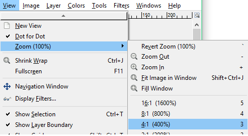
Click the View...menu item and float over the [Zoom (100%)] menu item which appears, another submenu will appear and we want to zoom in on the image up to 400% so choose the appropriate menu item.
Blotting White Background Needs Transparency
Now you can see that our icon has the blotting white background with it:

GIMP Magic Wand: Select By Color
Step 9
Select the Magic Wand tool in GIMP so we can magically delete all the white background.

Step 10
Click the white space around the icon and it will become selected and blinking to let you know it is actively selected.

Step 11
Click the [Delete] button and the white background will be removed and the area will become transparent.

Delete Any Other White Areas
There may be some more white area around the icon -- in mine, you can see I still have white at the top and bottom. I’ll take the same steps to remove those white areas.
I just keep clicking areas of color and pressing the [Delete] key until it looks clean.
Of course, you can still see the [X] box (no pun intended) in the background. I’m leaving that layer there for now so we can use it to align our new icon. After that, we’ll delete that layer.
Step 12
Select the Move tool in GIMP so we can drag our layer around.

Step 13
Grab the icon layer (click and drag) and adjust it so it is centered over the [X] box in the background. This will ensure that the icon appears in the correct location when it appears on your taskbar and other places we previously mentioned.

That’s close enough for our purposes.
Now, we just need to get rid of that [X] box background.
Step 14
Bring up the Layers window in GIMP and select the layer which contains the [X] box background.

Step 15
Once it’s selected, you can click the [Trashcan] icon and the layer will be deleted from the image.

Step 16
It’s finally time to save the changes back to our original file. To do that, go to the GIMP [File...] menu and select [Export to Square44x44Logo.targetsize-24_altform-unplated.png].

Finally, that is it.
Because we altered the image that our project uses directly, we can now (finally) go back to Visual Studio and run the app and we will now have an icon show up on that taskbar.
Go ahead and run the app so you can take a look at it.

Tweaking the Icon In Visual Studio
You find that you still need some tweaks to your icon. You can double-click the icon in Solution Explorer and an icon editor will be activated. Go ahead and double-click your new icon (filename) in Solution Explorer and you’ll see something like the following:

As you can see, this is an extreme zoomed up view because this is a pixel editor. You can make changes to individual pixels in this view but unless you are a Graphic Designer or have a lot of experience with this type of thing, it’s probably going to be difficult for you. It is nice for those times when you just need to edit a pixel or two.
Conclusion
Are you annoyed with all this graphic design work? I am too. However, it is a necessary annoyance if we decide to create professional apps.
Altered SplashScreen
If you download the associated source code, you will see that while I was examining the assets, I altered the splash screen as a test.
If you've read this article, then at least you have a working method for altering image assets as we move forward.
Next Article: Chapter 4
In Chapter 4, we will return to my first idea of creating the DailyJournal and its features. We will add at least three new Windows Controls (RichEditBox, DatePicker, and ListView) and learn about their XAML and see some actual functional code.
Graphic Assets License Disclaimer
While you can use any of the code in this article and you can build and use the associated app, please understand that you do not own the license to reuse the associated graphic assets. I do own that license since I purchased it from Fotolia.com but that license does not extend to anyone else. If you want to use the icons, you would need to purchase your own license.
History
- 11-26-2017 - Published article
License
This article, along with any associated source code and files, is licensed under The Code Project Open License (CPOL)