Box-shadows.css
A cross-browser collection of CSS box-shadow:
- + Generator the file box-shadows.min.css
- + Box-shadow CSS Generator
_________________________
Release 1.0.3
Try, experiment, use whatever you want and how you want!
box-shadows.css is a collection of simple and pleasant shadows for you to use in your projects. Great for tables, homepages content, containers, navigation and other blocks in your website.
See Repository on GitHub.
Table of Contents
Surely, some of you noticed that different sites use almost identical shadows in blocks, navigation bars and other containers, plus — minus in the opacity. I analyzed a number of popular sites, both and foreign ones, and tried to collect the most approximate parameters in one large collection, or library. To whom it is more convenient. I hope some will come in handy. The main goal of the project is to make it easier for novice web designers and developers to create a pleasant and modern design. Maybe experienced designers will learn something interesting from this development.
The library will be convenient for those who have not yet fully delved into the layout, but want to create beautiful shadows on buttons, blocks, etc. Thus, you can simplify the work with blocks and shorten the time for selecting CSS shadows in the generator.
Box-shadows.css
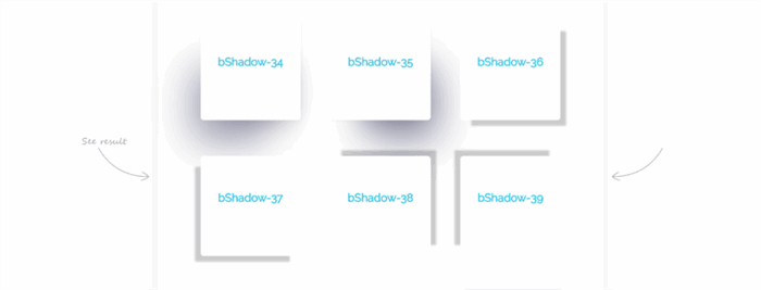
Box-shadows.css is a collection of simple and nice CSS shadows for your projects. In the role of primary use, a simple .bShadow class. Now the collection includes more than 50 actual shadows with the number, as well as three separate classes .bShadow, .bShadow-light and .bShadow-inset. They are great for use in tables, for keeping home pages, containers, navigation and other blocks of your site.
Stopping a number of questions, I will immediately explain why numbers are used, not names or classes like bShadow-01040–00.
The collection does not use stand-alone names, as it is done in animate.css, as for this project it is a little unacceptable. The shadow of the blocks increases with increasing, with different deviations, and due to the sequence of numbers, it is possible to choose the optimal variant for yourself, not learning the individual names. This greatly simplifies the work with the collection.
1. Include the stylesheet on your document's <head>
<head>
<link rel="stylesheet" href="/box-shadows.css">
<!--
<link rel="stylesheet" href="/box-shadows.min.css">
</head>
2. Add the class
Add the class .bShadow to the block you want to use:
<div class="bShadow"></div>
3. Add the class number
Finally, you need to add an additional class to the existing .bShadow- with the number or use one of the classes separately, without class .bShadow. For example:
<div class="bShadow bShadow-1"></div>
<!--
<div class="bShadow-1"></div>
- Now the collection consists of 53 variants of shadows with the number, as well as three independent classes:
.bShadow, .bShadow-light and .bShadow-inset. - You can use the generator to create your own minimal file and reduce the load on the site.
The collection has a number of other possibilities, for example, the use of hover effects, with a smooth switching between shadows.
4. Hover Effect
Add the class h to the element .bShadow- to create an hover effect. For example:
<div class="bShadow-38 bShadow-1h"></div>
5. Animation on CSS Transform
Class .bShadow uses a smooth default animation in .2s transition: transform 0.2s ease-in-out, and also includes a property that warns the browser about the upcoming shadow transformation and position will-change: transform, box-shadow;.
Use this to make a beautiful animation of your blocks. For example:
.transform-translateY-5:hover {
  -webkit-transform: translateY(-5px) translateZ(0);
  transform: translateY(-5px) translateZ(0);
}
<div class="bShadow transform-translateY-5 bShadow-1h">bShadow</div>
6. Adding the INSET Parameter
To add a parameter, just insert the script on the HTML page and specify in it the classes for which you want to apply it.
Full example, for .bShadow-1. A point in front of the class is required!
[].forEach.call(document.querySelectorAll('.bShadow-1'), function(node) {
  var bsh = getComputedStyle(node).boxShadow;
  node.style.boxShadow = "inset " + bsh;
});
Shadow Selection
The site provides a viewing function in which you can specify the background color and container of your site, for further selection of shadows. Selection of shadows and classes is carried out with the help of options or pointing to blocks. The result is displayed as a shadow of the main site container.
Generator min.css File
The site also has a box-shadows.min.css file generator with an instruction that allows the user to create her/his own file consisting only of the selected classes. This will help reduce the load on the site if your project uses less than two or three shadows.

If you do not want to connect the entire library to your site, you can generate your own file min.css from the selected classes.
- Go to the site
- Click the button "show in blocks" and follow the instruction
- Finally click the "download" button and connect the downloaded file to your site. It's great!
Generator css box-shadow
You can use the classic css box-shadow generator to supplement the collection with your own styles. By clicking the “Save and add next” button, you can create an infinite number of classes. The first generated and subsequent classes are assigned a sequence number that is not in the collection. You can copy the received styles and paste into the root css or the box-shadows.min.css file created on the site.
Now the development is at the development stage and a set of 200 stars on GitHub, to get a link to cdnjs. I wish you pleasant enjoyment and creative success. If you have any suggestions, comments or suggestions for improving the project, write in the comments.
Usage
To use box-shadows.css in your website, simply add the stylesheet into your document's <head>. Add the class .bShadow to an element, along with any of the .bShadow- with number or singly, addhover effect and JavaScript for create property inset. Optional. Download the entire library or create your own smaller one, using the CSS file generator. If you do not have enough classes, you can create them yourself in the generator and add them to the downloaded file. That's all! You've got a CSS block with shadow.
Try, experiment, use whatever you want and how you want!
If you have any suggestions, or you find an error, please leave a comment below.
This member has not yet provided a Biography. Assume it's interesting and varied, and probably something to do with programming.


 General
  News
News  Suggestion
  Question
  Bug
Bug  Answer
  Joke
Joke  Praise
  Rant
Rant  Admin
Admin 


 Submit an article or tip


