In this article, we will explore Templates in WPF. I will explain the importance and types of templates in detail.
Introduction
Each control has its own default template associated with it. Using styles, you can only modify the default template associated. WPF enables you to change the look and feel of the controls and this can be achieved by using templates.
There are four types of templates:
ControlTemplateDataTemplateItemsPanelTemplateHeirarchialDataTemplate
Control Template
Control Template enables you to customize the default appearance and behavior of the control. This can be achieved by setting the dependency property "Template" to an instance of Control Template.
Example
Let’s create a control template for a button.
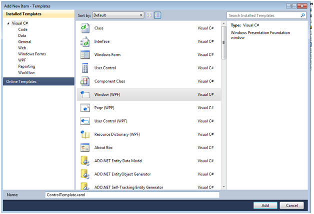
- Create a new Project "
Templates" and add an XAML file ControlTemplate.xaml.
- Place a button in it:
<Grid>
    <Button Margin="50" Foreground="Black" Content="Custom" ></Button>
</Grid>
- Add
Button.Template tag and create ControlTemplate within it as shown in the below sample code.
<Button Margin="50" Foreground="Black" Content="Custom" >
           <Button.Template>
               <ControlTemplate TargetType="{x:Type Button}">
                   <Grid>
                       <Ellipse Width="210" Height="110"
                       Fill="Black"/>
                       <Ellipse Width="200" Height="100"
                       Name="Button" Fill="Brown" />
                       <ContentPresenter HorizontalAlignment="Center"
                                     VerticalAlignment="Center"/>
                   </Grid>
               </ControlTemplate>
           </Button.Template>
       </Button>
As soon as you create a ControlTemplate, the button will replace its default template with the template created by you.

Data Template
Data Template enables you to customize the appearance of data objects. It is beneficial when a collection of objects is bound with ItemControls like ListView, ListBox, ComboBox.
To understand the importance of Data Templates, let’s see what happens when a ListBox is created without Data Template.
Steps - ListBox without DataTemplate
<Grid>
    <ListBox Name="dataTemplate" ></ListBox>
</Grid>
- Add the new XAML file DataTemplate.xaml and place a
Listbox Control in it.
- Create a class "
Book" as shown below:
public class Book
          	{
       		  public string CoverImage { get; set; }
       		  public string Name { get; set; }
       		  public string Author { get; set; }
   	        }
- Create a collection of instance of class
Book and bind the collection with the ListBox as shown below:
public partial class DataTemplate : Window
{
public DataTemplate()
{
InitializeComponent();
List<'Book> bookList = new List<Book>();
bookList.Add(new Book()
{
CoverImage = @"images\ComputerNetworking6E.jpg",
Name = "Computer Networking",
Author = "James F. Kurose"
});
bookList.Add(new Book()
{
CoverImage = @"images\software-engineering-oup.jpg",
Name = "Software Engineering",
Author = "Deepak Jain"
});
bookList.Add(new Book()
{
CoverImage = @"images\MyCoverImage.jpg",
Name = "HTML 5",
Author = "Adam McDaniel"
});
bookList.Add(new Book()
{
CoverImage = @"images\9780134133164.jpg",
Name = "Visual Studio 2015",
Author = "Lars Powers"
});
//Bind it with the ListBox
this.dataTemplate.ItemsSource = bookList;
}
}
Output
The default template of the data object is Textblock. So if we bind the objects to it without data template, ToString() method is called on it and the data is shown as string.
Now let’s see what happens with data template.
Additional Step - ListBox with DataTemplate
Add ListBox.ItemTemplate tag and create the Data Tempalte within it as shown below:
<ListBox Name="dataTemplate" >
           <ListBox.ItemTemplate>
               <DataTemplate>
                   <StackPanel Orientation="Horizontal"
                   VerticalAlignment="Center">
                       <Image Source="{Binding CoverImage}"
                       Height="200" Width="150"></Image>
                       <StackPanel Orientation="Vertical"
                       VerticalAlignment="Center">
                           <TextBlock Text="{Binding Name}"
                           FontSize="16"></TextBlock>
                           <TextBlock Text="{Binding Author}"
                           FontSize="16"></TextBlock>
                       </StackPanel>
                   </StackPanel>
               </DataTemplate>
           </ListBox.ItemTemplate>
   </ListBox>
Output
For proper pictorial presentation of data objects, we should create ItemsControl with DataTemplate but what if we need to customize the default layout of items. In that case, ItemsPanelTemplate comes into the picture.
ItemsPanelTemplate
ItemsPanelTemplate enables you to customize the panel that defines the layout of items of ItemControls like ListBox, ListView. Every ItemControl has its default panel.
For example: Default panel for ListBox is VirtualizingStackPanel.
To understand it in more detail, let's customize the layout of ListBox in the above example. Listbox rendered all the items vertically aligned one after the other, each item occupying the whole row. This layout can be customized as below.
Add ListBox.ItemsPanel tag and create ItemsPanelTemplate within it.
<ListBox.ItemsPanel>
                   <ItemsPanelTemplate>
                       <UniformGrid Columns="3" />
                   </ItemsPanelTemplate>
</ListBox.ItemsPanel>
Output
It’s clear now, that the template of ItemControls like ListBox & ListView can be customized using DataTemplate and ItemsPanelTemplate. WPF also provides an ItemControl called TreeView which is hierarchical in nature. DataTemplate and ItemPanelTemplate are of no use in this case.
HierarchialDataTemplate
HierarchialDataTemplate enables you to customize the template of Parent TreeViewItems as well as their Child TreeViewItems.
Let’s take an example to understand it in more detail:
- Create a
Child class and declare a string type property "Title" as below:
public class Child
 {
        public Child(string title)
        {
            Title = title;
        }

        public string Title { get; set; }
}
- Create a
Parent class and declare a string type property "Title" and a List of type Child class "ChildItems" as shown below:
public class Parent
{
        public Parent(string title)
        {
                 Title = title;
                 ChildItems = new List<Child>();
         }

        public string Title { get; set; }
        public List<Child> ChildItems { get; set; }
  }
- Now create a dummy Hierarchical collection:
var parent1 = new Parent("Parent #1")
         {
             ChildItems =
            {
                   new Child("Child Item #1.1"),
                   new Child("Child Item #1.2"),
                   new Child("Child Item #1.3")

            }
         };
var parent2 = new Parent("Parent #2")
       {
           ChildItems =
           {
               new Child("Child Item #2.1"),
               new Child("Child Item #2.2"),
               new Child("Child Item #2.3")

           }
       };
       this.treeView.Items.Clear();
       List<Parent> parent = new List<Parent>();
       parent.Add(parent1);
       parent.Add(parent2);
- Add a
TreeView and create a HierarchialDataTemplate for it:
<Grid>
       <TreeView Name="treeView">
           <TreeView.ItemTemplate>
               <HierarchicalDataTemplate ItemsSource="{Binding ChildItems}">
                   <StackPanel Orientation="Horizontal">
                       <Rectangle Height="10" Width="10"
                       Fill="Red"></Rectangle>
                       <TextBlock  Text="{Binding Title}"></TextBlock>
                   </StackPanel>
               </HierarchicalDataTemplate>
           </TreeView.ItemTemplate>
       </TreeView>
   </Grid>
- Bind the hierarchical collection parent to the
TreeView:
this.treeView.ItemsSource = parent;
Output
The Template has changed the look and feel of parent as well as their child items.
Conclusion
There is a lot we can do using these templates. I have taken very simple examples to make you understand the basics of all the four types of templates. I hope this helps. Thank you for reading.
Working as Engineer Analyst in Magic software Pvt. Ltd. with 6+ years of experience in .NET WPF


 General
  News
News  Suggestion
  Question
  Bug
Bug  Answer
  Joke
Joke  Praise
  Rant
Rant  Admin
Admin 


 Submit an article or tip


