Contents
Introduction
This article examines the use and implementation of a WPF custom control that is used to display and edit networks, graphs and flow-charts. NetworkView, as I have called it, was inspired by and has many similarities to standard WPF controls such as ItemsControl and TreeView. The article and the sample code show how to use the control from XAML and from C# code.
This article is arranged in two main parts.
Part 1 examines NetworkView usage with walkthroughs of the two sample projects. This part and the reference section are enough if you just want to use NetworkView.
Part 2 goes into detail on the implementation. This will be useful if you want to make your own modifications to NetworkView or if you want to understand my approach to developing a complex WPF custom control.
At the end of the article is a reference section that describes the public properties, methods and commands exposed by NetworkView.
In previous articles I have covered a number of WPF techniques: use of adorners, zooming and panning, binding to UI element positions and most recently drag-selection of multiple items. NetworkView and the sample applications make use of all these techniques. I won't be covering these techniques in detail here. Instead, where appropriate, I'll refer back to previous articles.
NetworkView is intended to be backed with an application-specific view-model. It is possible, though I don't recommend it, to use NetworkView programmatically or in XAML without a view-model. This is similar to other WPF controls such as TreeView where you can also get by without a view-model. Using a view-model is the way it is intended to be used, so this is what we will be looking at. The simple sample uses a simple view-model while the advanced sample extends the view-model and adds new features. Josh Smith has a great article that shows how a view-model can improve your experience with the WPF TreeView.
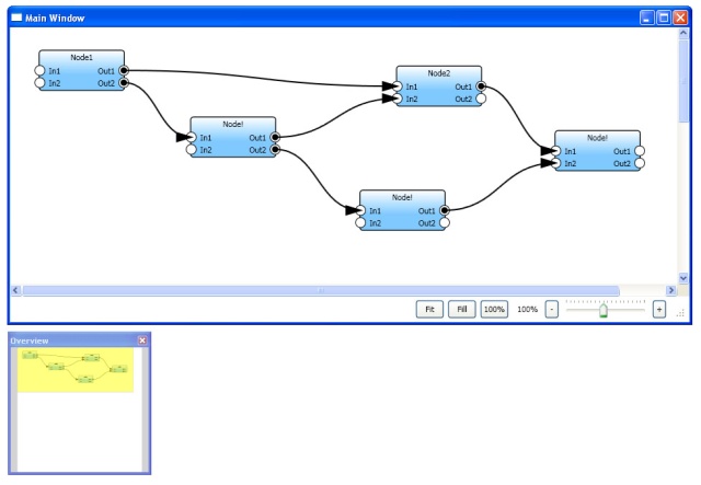
This screenshot shows a simple graph created in the advanced sample. The main window shows a viewport onto the graph and beneath it the overview window shows the entire canvas.
I am going to assume that you already know C# and have at least a basic knowledge of using WPF and XAML. An understanding of MVVM, WPF styles, control templates and data-templates will also help, although I'll do my best to fill in some of the details along the way and provide links to learning resources.
Josh Smith's Guided Tour of WPF and Sacha Barber's WPF: A Beginner's Guide are a good place to start if you want a WPF primer. Christian Mosers WPF Tutorial.net is full of interesting snippets of WPF information and has some great diagrams that can help explain WPF concepts.
Josh Smith also has an article on MVVM and if you already know a bit of WPF and MVVM I can recommend reading Gary Hall's book, I just read it and found that it has helped progress my MVVM knowledge and experience.
I created the NetworkView control for a hobby project that required graph editing. I had hardly used WPF previously and so wanted to use it for the learning experience. I thought that using WPF would be easier than attempting it in Windows Forms. In many ways it was easier, although it took me much longer than I anticipated to get WPF right in my head and that was mostly about coming to understand the WPF design philosophy.
As I climbed the learning curve I realised that WPF is complicated, and at times makes your head want to explode, but much of it makes good sense. WPF is a complex and powerful beast and in my view still needs many refinements, but so far it is the best way to develop a UI that I have tried.
My first attempt at NetworkView was accomplished by hacking together a combination of a UserControl and various custom UI elements derived from FrameworkElement. The code for this article is my second attempt at NetworkView although development of it has been in progress for sometime and has been through much evolution, refactoring and improvement.
The purpose of NetworkView is to visualize and edit graphs, flow-charts and networks. It almost goes without saying that you should be able to add and delete nodes, move nodes about, create connections between nodes and more. I wanted it to have high reusability and be customizable in the same manner as other WPF controls. This includes use of data-binding, data-templates and styling to customize a the network's content. The goal for the NetworkView API was to be recognizably similar to standard WPF controls. However it is different in several key ways, but wherever possible it follows established conventions.
To keep things simple I have not attempted to implement any kind of UI virtualisation. Unfortunately this probably does limit the size of the networks that can be loaded into the control.
This section introduces the main concepts and components.
A network is a collection of nodes and connections:

The nodes are the primary components:
Nodes are linked to each other by connections:
Connectors are anchor points on nodes to which connections can be attached.
A node may have one or more connectors. Each connection has two end-points each of which may be anchored to a connector. However when the user is dragging out a new connection only one of the end-points is anchored to a connector and the other is fixed to the mouse cursor's current position.
NetworkView itself places no constraints on the directionality of connections, however it does label the ends of a connection as source and destination, but the meanings of these labels are defined by the application.
In both sample projects the source and destination labels have the following meaning:
Nodes, connectors and connections are all fully skinnable using styles, control-templates and data-templates. In fact there is no default graphical representation for any of them as this is something that is entirely application-specific.
This section gives a summary of the sample projects in the solution. Extract NetworkViewSampleCode.zip and open NetworkViewSampleCode.2008.sln in Visual Studio (I am still using VS 2008, but for VS 2010 you can use NetworkViewSampleCode.2010.sln). NetworkView, both of the sample applications and all supporting code are in this solution.
This is a good point for you to build and run both SimpleSample and AdvancedSample. Both sample applications launch a Readme! window that gives instructions on the features and input bindings.
Here is the summary (in alphabetical order) of the projects:
| AdornedControl | Contains AdornedControl that was examined in my article on adorners. The advanced sample uses this control to display the delete connection and delete node mouse-hover buttons. |
| AdvancedNetworkModel | The view-model used by AdvancedSample. |
| AdvancedSample | The advanced sample application. Builds on the features introduced in the simple sample and adds more features and improved visuals. |
| NetworkUI | Contains NetworkView and supporting UI element classes. |
| SimpleNetworkModel | The view-model used by SimpleSample. |
| SimpleSample | The simple sample application. This demonstrates use of NetworkView with only basic features and visuals. |
| Utils | Utility classes and methods used by the other projects. |
| ZoomAndPan | Contains ZoomAndPanControl that was examined in my zooming and panning article. This is used by AdvancedSample to add zooming and panning features to NetworkView. |
Overview of the Main UI Elements
This section is an overview of the main classes from the NetworkUI project (with some help from StarUML).
| NetworkView is the main class that you include directly in your XAML. It derives from Control.
Nodes and Connections specify collections of nodes and connections to be displayed in the network. These are analogous to the Items property of ItemsControl.
NodesSource and ConnectionsSource specify the data-source (aka the view-model) that is used to populate Nodes and Connections. These are analogous to the ItemsSource property of ItemsControl.
NetworkView has other properties, methods, events and commands that we will look at over the course of this article. For a full list see the reference section at the end of the article.
|
| NodeItem is the UI element that represents a node in the visual-tree. It derives from ListBoxItem and the collection of nodes is presented by a ListBox that is embedded in NetworkView's visual-tree.
Ultimately ListBoxItem derives from ContentControl and this gives NodeItem the ability to host application-defined visual content.
NodeItem has properties X and Y that are used to position the node within the Canvas that hosts the nodes. The ZIndex property is used to set the front-to-back ordering of nodes.
|
| ConnectorItem is the UI element that represents a connector in the visual-tree. It derives from ContentControl and can also host application-defined visual content.
The primary purpose of ConnectorItem is to identify a connector within a node's visual-tree and allow the application's view-model to retrieve (via data-binding) the position of that connector, or as I call it the connector hotspot. ConnectorItem transforms its center point to the coordinate system of the parent NetworkView and the value is then used by the application's view-model as the end-point of a connection.
ConnectorItem is also used to define the look of a connector.
|
This part of the article examines the two sample applications.
SimpleSample demonstrates a simple flow-chart or data-flow diagram. A view-model supplies data to NetworkView and the UI is generated using styles and data-templates. Each node is limited to four connectors, one on each edge of the node. New nodes are created via the context menu. New connections are created by dragging a connection between two connectors. The user can drag existing nodes to move them around and can also delete them. The visuals for nodes, connectors and connections are deliberately simple.
AdvancedSample uses a more sophisticated view-model, adds features and has more impressive visuals. There are now two types of connector: input and output. Each node can have an arbitary number of connectors. The user can now delete connections. I make use of adorners to display a delete connection and delete node button when the user hovers the mouse over a connection or node. Zooming and panning features allow us to easily navigate a network that is larger than the visible area.
If you haven't already, open NetworkViewSampleCode.sln, ensure that SimpleSample is set as the Startup Project then build and run the application. Take some time to explore the application.
This walkthrough is the first example of using NetworkView. After a quick look at the view-model we will look at how to data-bind the view-model to NetworkView in XAML. After the XAML we will turn to the code where we will see how nodes are created and deleted. Then we will look at how connections are created.
Here is an example simple sample network:
It is most noticeable that the visuals are simple. In addition each node has only four connectors, no more and no less. When creating connections no restrictions are placed on which connector can be connected to which a connections can be created between any two connectors.
View-model
This diagram shows the view-model classes from the SimpleNetworkModel project:
| |
NetworkViewModel | | A container for nodes and connections. | NodeViewModel | | A named node in the network and a container for the node's connectors.
The Name property gets/sets the name of the node.
We will see shortly that X and Y are data-bound to the X and Y of NodeItem and therefore position the node within the NetworkView.
IsSelected is data-bound to the IsSelected property that NodeItem inherits from ListBoxItem. This allows us to programmatically control and determine the selection state of nodes.
Connectors is the collection of connectors that specifies the node's connection anchor points. Although this is a collection of connectors it must always contain only four connectors. This is a limitation placed on the view-model in order to simplify the node's data-template.
AttachedConnections retrieves a collection of the connections that are currently attached to the node.
| ConnectorViewModel | | An anchor point on a node for attaching a connection.
ParentNode references the node that owns the connector.
AttachedConnection references the connection, if any, that is currently attached (or anchored) to the connector.
Hotspot is the position of the connector, also known as the connector hotspot. This value is computed by ConnectorItem and then pushed through to the view-model via data-binding.
| ConnectionViewModel | | A connection between two nodes (and two connectors).
SourceConnector and DestConnector reference the connectors at the end-points of the connection. That is to say they are the source and destination of the connection.
A connection continuously monitors its source and destination connectors in order to keep SourceConnectorHotspot and DestConnectorHotspot synchronized with the current connector hotspot for each.
|
|
You may notice the ImpObservableCollection class that I use in the view-model. This is my own improved version of ObservableCollection that adds some convenience functions and events. Although it isn't required by NetworkView and you may use any collection that is derived from INotifyCollectionChanged.
Referencing the NetworkView Assembly
As with any custom control the assembly that contains the control must be imported into the XAML file. Expand the SimpleSample project in the Solution Explorer and open MainWindow.xaml. Near the start of this file the NetworkUI namespace is imported:
<Window x:Class="SampleCode.MainWindow"
    ...
    xmlns:NetworkUI="clr-namespace:NetworkUI;assembly=NetworkUI"
    ...
    >
    <-- ... -->
</Window>
The project must also reference the NetworkUI project:
Main Window View-model
The main window's view-model is instantiated in the XAML:
<Window.DataContext>
    <local:MainWindowViewModel />
</Window.DataContext>
Most of my classes live in a file that has the same name. So you can find MainWindowViewModel in MainWindowViewModel.cs. MainWindowViewModel has an instance of NetworkViewModel. In both sample projects, the constructor for MainWindowViewModel calls PopulateWithTestData which populates the network with a small example data set.
Of course there are other ways to instance a view-model and they might be more appropriate in other circumstances. However for this article I thought it was simplest to instance the view-model in the XAML and assign it directly to the main window's DataContext.
The view-model is linked to the NetworkView using a data-binding:
<NetworkUI:NetworkView
        x:Name="networkControl"
        ...
        NodesSource="{Binding Network.Nodes}"
        ConnectionsSource="{Binding Network.Connections}"
        ...
        />
The relationship between NetworkView and the view-model is illustrated by this diagram (thanks to Cacoo):
The NetworkView is wrapped in a ScrollViewer which can be see in the following diagram of the main window's visual-tree (thanks to the VS 2010 visualizer):
Node Style
The NodeItem style data-binds it to NodeViewModel:
<Style TargetType="{x:Type NetworkUI:NodeItem}">
    <Setter
        Property="X"
        Value="{Binding X}"
        />
    <Setter
        Property="Y"
        Value="{Binding Y}"
        />
    <Setter
        Property="IsSelected"
        Value="{Binding IsSelected}"
        />
</Style>
The data-bindings for X, Y and IsSelected allow us to control, via the view-model, the position and selection state for each node. Due to the data-binding changes to the view-model automatically update the UI. For this to work of course the view-model classes must implement INotifyPropertyChanged.
Node DataTemplate
The NodeViewModel data-template defines the size, look and layout of each node:
<DataTemplate
DataType="{x:Type NetworkModel:NodeViewModel}"
>
<Grid
Width="120"
Height="60"
>
<Rectangle
Stroke="Black"
Fill="White"
RadiusX="4"
RadiusY="4"
/>
<Grid
Margin="-8"
>
<Grid.ColumnDefinitions>
<ColumnDefinition Width="Auto" />
<ColumnDefinition Width="*" MinWidth="10" />
<ColumnDefinition Width="Auto" />
</Grid.ColumnDefinitions>
<Grid.RowDefinitions>
<RowDefinition Height="Auto" />
<RowDefinition Height="*" />
<RowDefinition Height="Auto" />
</Grid.RowDefinitions>
<TextBlock
Grid.Column="1"
Grid.Row="1"
Text="{Binding Name}"
HorizontalAlignment="Center"
VerticalAlignment="Center"
/>
</Grid>
</Grid>
</DataTemplate>
The visual-tree for a node is composed of a rectangle overlaid with a 3 x 3 grid. This grid presents the node's name and its four connectors. One connector is placed on each edge of the rectangle. The reason the grid's margin is negative is purely aesthetic, it makes the connectors at the edge nicely overlap with the node's border.
ConnectorItem identifies each of the four connector within the node's visual-tree. As an example here is the first connector:
<NetworkUI:ConnectorItem
    Grid.Row="0"
    Grid.Column="1"
    DataContext="{Binding Connectors[0]}"
    />
The DataContext data-binding uses the array index notation to bind to the first element in the Connectors collection. The other three connectors, that I have not shown, are data-bound to the other three elements in the collection.
This diagram shows a node's visual-tree within the parent NetworkView's visual-tree:
Connector Style
The ConnectorItem style data-binds the connector hotspot to the view-model and defines a control-template:
<Style
TargetType="{x:Type NetworkUI:ConnectorItem}"
>
<Setter
Property="Hotspot"
Value="{Binding Hotspot, Mode=OneWayToSource}"
/>
<Setter Property="Template">
<Setter.Value>
<ControlTemplate
TargetType="{x:Type NetworkUI:ConnectorItem}"
>
<Rectangle
Stroke="Black"
Fill="White"
Cursor="Hand"
Width="12"
Height="12"
RadiusX="1"
RadiusY="1"
/>
</ControlTemplate>
</Setter.Value>
</Setter>
</Style>
As this diagram shows a connector's visual tree is quite simple:
The Hotspot data-binding pushes the connector hotspot value, computed by ConnectorItem, to the view-model. As discussed in my article binding to the position of a UI element setting Mode to OneWayToSource pushes the value from the UI to the view-model rather than the more usual other way around.
This diagram illustrates the Hotspot data-binding:
Connection DataTemplate
The ConnectionViewModel data-template visually represents a connection as a directed arrow:
<DataTemplate
DataType="{x:Type NetworkModel:ConnectionViewModel}"
>
<local:Arrow
Stroke="Black"
StrokeThickness="2"
Fill="Black"
Start="{Binding SourceConnectorHotspot}"
End="{Binding DestConnectorHotspot}"
IsHitTestVisible="False"
/>
</DataTemplate>
The Arrow class derives from Shape and is a simple application-specific visual. If you want to start with something simpler use a standard WPF Line:
<Line
    Stroke="Black"
    X1="{Binding SourceConnectorHotspot.X}"
    Y1="{Binding SourceConnectorHotspot.Y}"
    X2="{Binding DestConnectorHotspot.X}"
    Y2="{Binding DestConnectorHotspot.Y}"
    />
I am not going into detail on the Arrow class though I should mention a great blog post by Charles Petzold that helped me figure out how to make arrows in WPF.
This diagram indicates how the view-model provides the arrow's start- and end-points:
In order to keep its SourceConnectorHotspot or DestConnectorHotspot properties up-to-date ConnectionViewModel monitors each of its source and destination connectors for changes to the connector hotspot. It does this by handling ConnectorViewModel's HotspotUpdated event.
Note that the Arrow has its IsHitTestVisible property set to False. Making the arrow invisible to hit-testing means that where the connection overlaps with the underlying connector it doesn't interfere with the user being able to drag out a new connection.
As we have now covered the main aspects of the synchronization between connectors and the end-points of connections I present the following diagram as a summary:
The Code
We are finished looking at the XAML and now it is time to move on to the code.
As I am following good MVVM principles you will see that there is not much code in MainWindow.xaml.cs. The event- and command-handlers here delegate the work to the view-model.
The view-model is accessed via the ViewModel property:
public MainWindowViewModel ViewModel
{
get
{
return (MainWindowViewModel)this.DataContext;
}
}
Deleting Nodes
The DeleteSelectedNodes command is executed when the user presses the delete key and when one or more nodes are selected.
The command is forwarded to the view-model:
private void DeleteSelectedNodes_Executed(object sender, ExecutedRoutedEventArgs e)
{
    this.ViewModel.DeleteSelectedNodes();
}
The view-model enumerates all nodes and deletes the selected ones:
public void DeleteSelectedNodes()
{
var nodesCopy = this.Network.Nodes.ToArray();
foreach (var node in nodesCopy)
{
if (node.IsSelected)
{
DeleteNode(node);
}
}
}
It is functions like this where we need to know the selection state of each node and this is the reason for the IsSelected data-binding in the NodeItem style.
Deleting the node doesn't just mean removing it from the network, all connections attached to the node are also removed:
public void DeleteNode(NodeViewModel node)
{
this.Network.Connections.RemoveRange(node.AttachedConnections);
this.Network.Nodes.Remove(node);
}
Creating New Nodes
The context menu's Create Node invokes the CreateNode command.
Again the command is forwarded to the view-model:
private void CreateNode_Executed(object sender, ExecutedRoutedEventArgs e)
{
    Point newNodeLocation = Mouse.GetPosition(networkControl);
    this.ViewModel.CreateNode("New Node!", newNodeLocation);
}
In this case the command-handler does a small amount of work to determine the mouse cursor position which it passes to the view-model:
public NodeViewModel CreateNode(string name, Point nodeLocation)
{
var node = new NodeViewModel(name);
node.X = nodeLocation.X;
node.Y = nodeLocation.Y;
node.Connectors.Add(new ConnectorViewModel());
node.Connectors.Add(new ConnectorViewModel());
node.Connectors.Add(new ConnectorViewModel());
node.Connectors.Add(new ConnectorViewModel());
this.Network.Nodes.Add(node);
return node;
}
Connection Dragging Events
Adding and deleting nodes is fairly simple stuff. Allowing the user to create connections between nodes is a little more complicated.
These are the events that must be handled to implement connection creation and dragging:
<NetworkUI:NetworkView
    ...
    ConnectionDragStarted="networkControl_ConnectionDragStarted"
    ConnectionDragging="networkControl_ConnectionDragging"
    ConnectionDragCompleted="networkControl_ConnectionDragCompleted"
    />
NetworkView doesn't understand the structure of the view-model so it must delegate to the application at significant times, via these events, to allow the view-model to construct and transform itself as appropriate.
To create a new connection the user drags out a connector. This raises the ConnectionDragStarted event which prompts the application to create and add a new connection to its view-model. In the simple sample the source of the connection is set to the dragged out connector.
The ConnectionDragging event is periodically raised during the drag operation which prompts the application to update the destination end of the connection.
The drag operation ends when the user has dropped the destination end of the connection either on another connector or in empty space. In either case the ConnectionDragCompleted event is raised which prompts the application to finalize the new connection or to cancel it. When a connection is finalized it has its destination end anchored to the dropped on connector.
ConnectionDragStarted
networkControl_ConnectionDragStarted does a small amount of work before forwarding to the view-model:
private void networkControl_ConnectionDragStarted(object sender, ConnectionDragStartedEventArgs e)
{
var draggedOutConnector = (ConnectorViewModel)e.ConnectorDraggedOut;
var curDragPoint = Mouse.GetPosition(networkControl);
var connection = this.ViewModel.ConnectionDragStarted(draggedOutConnector, curDragPoint);
e.Connection = connection;
}
The dragged out connector and the current mouse position are passed to ConnectionDragStarted which starts by removing any existing connection that is already attached to the dragged out connector:
public ConnectionViewModel ConnectionDragStarted(ConnectorViewModel draggedOutConnector, Point curDragPoint)
{
if (draggedOutConnector.AttachedConnection != null)
{
this.Network.Connections.Remove(draggedOutConnector.AttachedConnection);
}
}
Next an instance of ConnectionViewModel is created and the source connector is anchored to the dragged out connector:
public ConnectionViewModel ConnectionDragStarted(ConnectorViewModel draggedOutConnector, Point curDragPoint)
{
var connection = new ConnectionViewModel();
connection.SourceConnector = draggedOutConnector;
}
Within ConnectionViewModel's setter for SourceConnector (and similarly for DestConnector) some important work is done and a quick digression is warranted to look at that:
public ConnectorViewModel SourceConnector
{
get
{
return sourceConnector;
}
set
{
if (sourceConnector == value)
{
return;
}
if (sourceConnector != null)
{
Trace.Assert(sourceConnector.AttachedConnection == this);
sourceConnector.AttachedConnection = null;
sourceConnector.HotspotUpdated -= new EventHandler<eventargs>(sourceConnector_HotspotUpdated);
}
sourceConnector = value;
if (sourceConnector != null)
{
Trace.Assert(sourceConnector.AttachedConnection == null);
sourceConnector.AttachedConnection = this;
sourceConnector.HotspotUpdated += new EventHandler<eventargs>(sourceConnector_HotspotUpdated);
this.SourceConnectorHotspot = sourceConnector.Hotspot;
}
OnPropertyChanged("SourceConnector");
}
}
Note that the connector hotspot value is copied from the source connector's Hotspot property to the connection's SourceConnectorHotspot property. Recall from the connection data-template that this property is data-bound to the start of the Arrow UI element. The HotspotUpdated event is hooked by the connection so that it can keep SourceConnectorHotspot synchronized with the connector hotspot.
Now returning to ConnectionDragStarted the source connector is set but there is not yet any destination connector and there won't be one until the user has finished dragging the connection. As DestConnector is not yet DestConnectorHotspot is also not set and it must be set to the current mouse position:
public ConnectionViewModel ConnectionDragStarted(ConnectorViewModel draggedOutConnector, Point curDragPoint)
{
connection.DestConnectorHotspot = curDragPoint;
}
Lastly the new connection is added to the view-model and the connection object returned to the main window's view code:
public ConnectionViewModel ConnectionDragStarted(ConnectorViewModel draggedOutConnector, Point curDragPoint)
{
this.Network.Connections.Add(connection);
return connection;
}
The connection object is returned via the ConnectionDragStarted event arguments and NetworkView keeps track of this object while the drag operation is in progress.
At this point a new connection has been created and added to the view-model. The connection is anchored on the source end to the dragged out connector and the destination end is set to the current mouse position.
ConnectionDragging
networkControl_ConnectionDragging is called periodically during the drag operation. It forwards to ConnectionDragging which simply keeps the destination end of the connection fixed to the current mouse position:
public void ConnectionDragging(ConnectionViewModel connection, Point curDragPoint)
{
connection.DestConnectorHotspot = curDragPoint;
}
ConnectionDragCompleted
networkControl_ConnectionDragCompleted forwards to ConnectionDragCompleted which first checks if the drag operation was cancelled. If so the new connection is removed from the view-model and nothing more needs to be done:
public void ConnectionDragCompleted(ConnectionViewModel newConnection,
ConnectorViewModel connectorDraggedOut, ConnectorViewModel connectorDraggedOver)
{
if (connectorDraggedOver == null)
{
this.Network.Connections.Remove(newConnection);
return;
}
}
Provided the connection has not been cancelled, the method continues and removes any existing connection that is already attached to the destination connector:
public void ConnectionDragCompleted(ConnectionViewModel newConnection,
ConnectorViewModel connectorDraggedOut, ConnectorViewModel connectorDraggedOver)
{
var existingConnection = connectorDraggedOver.AttachedConnection;
if (existingConnection != null)
{
this.Network.Connections.Remove(existingConnection);
}
}
Lastly the connection is completed by anchoring its destination end to the dropped on connector and from now DestConnectorHotspot is automatically synchronized with the destination connector hotspot:
public void ConnectionDragCompleted(ConnectionViewModel newConnection,
ConnectorViewModel connectorDraggedOut, ConnectorViewModel connectorDraggedOver)
{
newConnection.DestConnector = connectorDraggedOver;
}
We are now at the end of the simple sample walkthrough. We have covered the most important aspects of NetworkView usage, however there is still quite a bit that has been glossed over or not examined at all. This walkthrough should be the starting point for your own examination of the code. There is no better way to understand code than by setting breakpoints at key locations and actually stepping through it.
You should now set AdvancedSample as the Startup Project in NetworkViewSampleCode.sln. If you haven't already done so, build and run the application and take a few minutes to explore it.
The screenshot from the start of this article shows the advanced sample in action:
It is immediately noticeable that the styles and templates are more interesting and visually complex. The advanced sample makes use of controls and techniques that I developed for earlier articles. In fact those articles were developed along the way to this article rather than the other way around.
The main changes to the advanced sample can be summarized as follows:
- The view-model is now a kind of data-flow diagram and each node has input and output connectors.
- Certain restrictions are now applied to the creation of new connections. For example inputs can only be connected to outputs and vice-versa. Attempting to connect an input to an input or an output to an output results in a bad connection feedback icon being displayed.
- Nodes now have an arbitrary rather than a fixed number of connectors.
- Connections can now be explicitly deleted. Hover the mouse over a connector and a button appears that can be clicked to delete the connection. I also use the same sort of mouse hover button as an alternate method of deleting nodes.
- Zooming and panning features and the new overview window are implemented using ZoomAndPanControl.
- A single view-model is shared between both the main window and the overview window.
- Some styles and data-templates are shared between the main window and the overview window using a resource dictionary.
View-model
This diagram shows the view-model classes from the AdvancedNetworkModel project. As they are very similar to the simple sample I'll only mention the differences.
| |
NodeViewModel | Instead of having just a single collection of connectors, NodeViewModel now has InputConnectors and OutputConnectors, which are separate collections to contain the input and output connectors.
ZIndex specifies the node's position in the z-order. This can be used to bring a node to the front of all other nodes by giving the node the highest z-index. However ZIndex isn't actually used in the advanced sample and I have only included it as an example because I am sure it will be useful to some who are reading.
Size is computed in response to the SizeChanged event for a node and the view pushes the value into the view-model. In the advanced sample the size of a node is used so that newly created nodes can be centered.
| ConnectorViewModel | Connectors now have a name that is displayed in the UI.
The advanced sample allows multiple connections to be anchored to a single connector and AttachedConnections is a collection of these.
| ConnectionViewModel | Points is the collection of points (or what I like to call connection points) that are the control points of the bezier curve that represents a connection in the advanced sample.
Connection points are computed whenever SourceConnectorHotspot or DestConnectorHotspot have changed.
|
|
Shared Resource Dictionary
Shared styles and data-templates are contained within a shared resource dictionary that is merged into the main window's resources:
<Window.Resources>
<ResourceDictionary>
<ResourceDictionary.MergedDictionaries>
<ResourceDictionary
Source="SharedVisualTemplates.xaml"
/>
</ResourceDictionary.MergedDictionaries>
</ResourceDictionary>
<Window.Resources>
Let's look at some of the definitions in SharedVisualTemplates.xaml.
NodeItem Style
The shared NodeItem style is almost the same as in the simple sample so I won't reproduce it here. The only addition is the new data-binding for ZIndex that, as mentioned above, is included as an example but not actually used in this sample.
Connector Data-Templates
The advanced sample introduces different connector types and so it has different data-templates for each type. Input and output connectors are oriented to the left and right sides of the node respectively and therefore are arranged quite differently.
The data-template for an input connector displays its name on right of the connector visual:
<DataTemplate
x:Key="inputConnectorTemplate"
>
<Grid
Margin="0,2,0,0"
>
<Grid.ColumnDefinitions>
<ColumnDefinition Width="Auto" />
<ColumnDefinition Width="*" />
</Grid.ColumnDefinitions>
<NetworkUI:ConnectorItem
Grid.Column="0"
Width="15"
Height="15"
Cursor="Hand"
/>
<TextBlock
Grid.Column="1"
Margin="5,0,0,0"
Text="{Binding Name}"
VerticalAlignment="Center"
/>
</Grid>
</DataTemplate>
The data-template for an output connector looks pretty similar but is around the other way with the name displayed on the left of the connector visual. Looking at the output connector data-template you will notice that a black dot is displayed within the connector when a connection is attached. This is for asthetic reasons as I think it makes the connection look better. This black dot could easily be a part of the arrow visual but that doesn't work very well. Connections in the advanced sample need to handle mouse input (in order to display the delete connection mouse hover button) and this means that if we render part of the connection (eg if the black dot were part of the connection) over the underlying connector it interfers with the user's ability to drag out a new connection. For this reason the black dot is a part of the connector rather than the connection.
Now we will continue looking at MainWindow.xaml. The styles and data-templates here are for the interactive graph components in the main window. Similar styles and data-templates can be found in OverviewWindow.xaml that implement non-interactive graph components as you can't interact with the graph in the overview window.
NetworkView Definition
Looking at NetworkView in the advanced sample's XAML you can see that it is not just wrapped in a ScrollViewer, as in the simple sample, it is now wrapped in a ScrollViewer, a ZoomAndPanControl and an AdornerDecorator.
Here is an overview:
<ScrollViewer
    ...
    >

    <ZoomAndPan:ZoomAndPanControl
        ...
        >
        <AdornerDecorator>
            <Grid
                ...
                >

                <NetworkUI:NetworkView
                    ...
                    />

                <Canvas
                    x:Name="dragZoomCanvas"
                    ...
                    >
                    <Border
                        ...
                        />
                </Canvas>

            </Grid>
        </AdornerDecorator>
    </ZoomAndPan:ZoomAndPanControl>
</ScrollViewer>
This diagram illustrates the main window's visual-tree:
ZoomAndPanControl is from my earlier article and I won't be going into detail on it here. Suffice to say that it gives the ability to zoom and pan the NetworkView.
AdornerDecorator creates a new adorner layer underneath the ZoomAndPanControl in the visual-tree. Adorners are used to display the delete connection and delete node mouse-hover buttons and also the feedback icons. Without the AdornerDecorator then the adorners would be displayed within the default adorner layer that is above the ZoomAndPanControl in the visual-tree. If this adorner layer were used instead of the explicitly defined one it would mean that the adorners would not be subject to the scale and offset transformations that are applied by the ZoomAndPanControl (via its render transform) and therefore would not appear at the same zoom level as the rest of ZoomAndPanControl's content.
dragZoomCanvas (after the NetworkView) is used to render the zoom rectangle that allows the user to drag out a rectangle to zoom to. This technique was described in the ZoomAndPanControl article.
NodeViewModel Data-Template
The NodeViewModel data-template is similar to the simple sample version, but the use of AdornedControl and the presentation of a node's arbitrary number of connectors makes it more complicated.
Here is an overview:
<DataTemplate
DataType="{x:Type NetworkModel:NodeViewModel}"
>
<ac:AdornedControl
...
IsMouseOverShowEnabled="{Binding ElementName=networkControl, Path=IsNotDragging}"
>
<ac:AdornedControl.AdornerContent>
</ac:AdornedControl.AdornerContent>
</ac:AdornedControl>
</DataTemplate>
Using an adorner for a delete node mouse-hover button was the reason for my first Code Project article. Note that IsMouseOverShowEnabled is data-bound to NetworkView's IsNotDragging property. This ensures that the mouse-hover button is never displayed while a node or connection is being dragged.
Besides the use of the adorner and the presentation of connections, the visuals for a node are similar to the simple sample:
<Grid
MinWidth="120"
Margin="10,6,10,6"
SizeChanged="Node_SizeChanged"
>
<Rectangle
Stroke="{StaticResource nodeBorderBrush}"
StrokeThickness="1.3"
RadiusX="4"
RadiusY="4"
Fill="{StaticResource nodeFillBrush}"
/>
<Grid
Margin="-6,4,-6,4"
>
<Grid.ColumnDefinitions>
<ColumnDefinition Width="Auto" />
<ColumnDefinition Width="*" MinWidth="10" />
<ColumnDefinition Width="Auto" />
</Grid.ColumnDefinitions>
<Grid.RowDefinitions>
<RowDefinition Height="Auto" />
<RowDefinition Height="2" />
<RowDefinition Height="Auto" />
</Grid.RowDefinitions>
<TextBlock
Grid.Column="0"
Grid.ColumnSpan="3"
Grid.Row="0"
Text="{Binding Name}"
HorizontalAlignment="Center"
VerticalAlignment="Center"
/>
</Grid>
</Grid>
Handling the SizeChanged event for a node means that the actual size of the node can be stored in the view-model. Having access to the size means that when nodes are created they can be centered on the mouse position.
As nodes now have an arbitrary number of input and output connectors, both types of connector are presented using ItemsControl:
<ItemsControl
Grid.Column="0"
Grid.Row="2"
ItemsSource="{Binding InputConnectors}"
ItemTemplate="{StaticResource inputConnectorTemplate}"
/>
<ItemsControl
Grid.Column="2"
Grid.Row="2"
ItemsSource="{Binding OutputConnectors}"
ItemTemplate="{StaticResource outputConnectorTemplate}"
/>
The ItemsSource for each ItemsControl is data-bound to the InputConnectors and OutputConnectors properties of the node's view-model. The input connectors are placed in column 0 of the grid on the left side of the node and the output connectors in column 2 on the right side.
This diagram shows the visual-tree of a node and its connections within the parent NetworkView's visual-tree.
Delete Node Mouse-Hover Button
The delete node button is the content of the node's adorner. When the user hovers the mouse over a node the button appears above the node and to the right.
The XAML definition is essentially simple. It is a customized button placed in a Canvas and there is a Line that connects the button to the node:
<Canvas
x:Name="nodeAdornerCanvas"
HorizontalAlignment="Right"
VerticalAlignment="Top"
Width="30"
Height="30"
>
<Line
X1="0"
Y1="30"
X2="15"
Y2="15"
Stroke="Black"
StrokeThickness="1"
/>
<Button
x:Name="deleteNodeButton"
Canvas.Left="10"
Canvas.Top="0"
Width="20"
Height="20"
Cursor="Hand"
Focusable="False"
Command="{StaticResource Commands.DeleteNode}"
CommandParameter="{Binding}"
Template="{StaticResource deleteButtonTemplate}"
/>
</Canvas>
The control-template for the button is defined earlier in the XAML. Clicking the button invokes the DeleteNode command and the notation:
CommandParameter="{Binding}"
data-binds the button's DataContext to the CommandParameter and so the current node's view-model specifies the node to delete.
ConnectorItem Style
The ConnectorItem style is very much the same as it was in the simple sample so I won't reproduce it here. The only difference is that connnections are now visually represented with an Ellipse instead of a Rectangle. There is also a corresponding style defined in OverviewWindow.xaml. This style is not shared between the main window and overview window because it is only necessary to have the Hotspot data-binding in MainWindow.xaml as only one of the two views needs to actually push the computed connector hotspot to the view-model.
ConnectionViewModel Data-template
The ConnectionViewModel data-template is similar to the simple sample but a bit more complicated due to the implementation of the delete connection mouse-hover button. This works in the same way as the delete node button and they even share the same control-template.
I'll first present the simpler non-interactive data-template from OverviewWindow.xaml:
<DataTemplate
DataType="{x:Type NetworkModel:ConnectionViewModel}"
>
<local:CurvedArrow
Stroke="{StaticResource connectionBrush}"
StrokeThickness="2"
Fill="{StaticResource connectionBrush}"
Points="{Binding Points}"
/>
</DataTemplate>
The advanced sample uses bezier curves to visually represents connections and the Points property supplies the curve's control points. As with Arrow in the simple sample I won't be discussing the CurvedArrow class. Look at the ComputeConnectionPoints method to see how the connection points are computed.
Now back to MainWindow.xaml to look at the interactive and more complicated ConnectionViewModel data-template.
Here is an overview:
<DataTemplate
DataType="{x:Type NetworkModel:ConnectionViewModel}"
>
<ac:AdornedControl
...
>
<local:CurvedArrow
...
/>
<ac:AdornedControl.AdornerContent>
</ac:AdornedControl.AdornerContent>
</ac:AdornedControl>
</DataTemplate>
The adorner content is much the same as for the delete node button discussed earlier. Clicking the delete connection button invokes the DeleteConnection command and the current connection's view-model, which specifies the connection to delete, is passed in as the command parameter.
Deleting Nodes and Connections
In the simple sample the delete key was used to delete selected nodes. In addition to this now there is the delete node button that invokes the DeleteNode command. The node to delete is specified by the command parameter and is forwarded to the view-model:
private void DeleteNode_Executed(object sender, ExecutedRoutedEventArgs e)
{
    var node = (NodeViewModel)e.Parameter;
    this.ViewModel.DeleteNode(node);
}
The DeleteNode method is the same as we have already seen in the simple sample. As the code for deleting connections is very similar to the above code for deleting nodes I won't cover it.
Connection Dragging Events
It's time to look at the code for creation and dragging of connections. Looking at the XAML we see some of the same events that were used in the simple sample but there is also a new event called QueryConnectionFeedback:
<NetworkUI:NetworkView
    ...

    ConnectionDragStarted="networkControl_ConnectionDragStarted"
    QueryConnectionFeedback="networkControl_QueryConnectionFeedback"
    ConnectionDragging="networkControl_ConnectionDragging"
    ConnectionDragCompleted="networkControl_ConnectionDragCompleted"

    ...
    />
We have already looked at ConnectionDragStarted, ConnectionDragging and ConnectionDragCompleted in the the simple sample, but they are a bit different now so we need to return to them again now. QueryConnectionFeedback is completely new in the advanced sample and allows the application to provide feedback on whether a proposed connection between two connectors is valid or not.
ConnectionDragStarted
This is called when the user starts to drag out a new connection. In the simple sample this method begins with the removal of any existing connection. This isn't needed now because in the advanced sample multiple connections are allowed to be anchored to a single connector. Notice also the new if statement in the middle of the method:
public ConnectionViewModel ConnectionDragStarted(ConnectorViewModel draggedOutConnector, Point curDragPoint)
{
var connection = new ConnectionViewModel();
if (draggedOutConnector.Type == ConnectorType.Output)
{
connection.SourceConnector = draggedOutConnector;
connection.DestConnectorHotspot = curDragPoint;
}
else
{
connection.DestConnector = draggedOutConnector;
connection.SourceConnectorHotspot = curDragPoint;
}
this.Network.Connections.Add(connection);
return connection;
}
The if statement is there to handle the two new types of connector: input and output. Either type of connector can be dragged out to create a new connection which must be configured differently depending on the connector's type. The simple sample assumed that the dragged out connector is always the source connector and that the dropped on connector is always the destination connector. In the advanced sample, regardless of which connector is dragged out, the output connector is treated as the source connector and the input connector as the destination connector. The if statement takes this into account and sets either the SourceConnector or DestConnector as appropriate.
ConnectionDragging
This is called while dragging is in progress and is also similar to the simple sample. Here we see another if statement that sets either DestConnectorHotspot or SourceConnectorHotspot based on which end of the connection, source or destination, is being dragged:
public void ConnectionDragging(Point curDragPoint, ConnectionViewModel connection)
{
    if (connection.DestConnector == null)
    {
        connection.DestConnectorHotspot = curDragPoint;
    }
    else
    {
        connection.SourceConnectorHotspot = curDragPoint;
    }
}
ConnectionDragCompleted
This is called when connection dragging has completed. Again similar to the simple sample but with some changes. The first difference is that it checks whether the proposed connection is invalid and if so aborts the creation of the new connection:
public void ConnectionDragCompleted(ConnectionViewModel newConnection,
ConnectorViewModel connectorDraggedOut, ConnectorViewModel connectorDraggedOver)
{
bool connectionOk = connectorDraggedOut.ParentNode != connectorDraggedOver.ParentNode &&
connectorDraggedOut.Type != connectorDraggedOver.Type;
if (!connectionOk)
{
this.Network.Connections.Remove(newConnection);
return;
}
}
Then it checks for and removes any existing connection between the two connectors:
public void ConnectionDragCompleted(ConnectionViewModel newConnection,
ConnectorViewModel connectorDraggedOut, ConnectorViewModel connectorDraggedOver)
{
var existingConnection = FindConnection(connectorDraggedOut, connectorDraggedOver);
if (existingConnection != null)
{
this.Network.Connections.Remove(existingConnection);
}
}
Although the advanced sample allows multiple connections to be attached to a single connector, it does not allow multiple connections to exist between the same two connectors. So we must search for and remove any such connection. FindConnection is the method that finds such a connection.
Lastly the new connection is anchored to the dropped on connector. Here we see an if statement that sets either DestConnector or SourceConnector depending on the circumstances:
public void ConnectionDragCompleted(ConnectionViewModel newConnection,
ConnectorViewModel connectorDraggedOut, ConnectorViewModel connectorDraggedOver)
{
if (newConnection.DestConnector == null)
{
newConnection.DestConnector = connectorDraggedOver;
}
else
{
newConnection.SourceConnector = connectorDraggedOver;
}
}
Connection Feedback Icons
As we are about to look at the QueryConnectionFeedback event this is a good time to briefly jump back to the XAML and look at a data-template that defines the UI for one of the feedback objects. The ConnectionBadIndicator data-template displays a red cross to indicate that a proposed connection is invalid:
<DataTemplate DataType="{x:Type local:ConnectionBadIndicator}">
    <Grid
        Width="80"
        >
        <Image
            Width="32"
            Height="32"
            Source="Resources/block_16.png"
            HorizontalAlignment="Right"
            />
    </Grid>
</DataTemplate>
There is also a ConnectionOkIndicator data-template that is much the same, but instead displays a green tick to indicate that a proposed connection is valid.
QueryConnectionFeedback
This allows the application to provide feedback on the validity of a proposed connection. The event-handler does a small bit of work before and after delegating to the view-model:
private void networkControl_QueryConnectionFeedback(object sender, QueryConnectionFeedbackEventArgs e)
{
var draggedOutConnector = (ConnectorViewModel)e.ConnectorDraggedOut;
var draggedOverConnector= (ConnectorViewModel)e.DraggedOverConnector;
object feedbackIndicator = null;
bool connectionOk = true;
this.ViewModel.QueryConnnectionFeedback(draggedOutConnector,
draggedOverConnector, out feedbackIndicator, out connectionOk);
e.FeedbackIndicator = feedbackIndicator;
e.ConnectionOk = connectionOk;
}
The application returns a feedback object via the event arguments that the NetworkView will display as the content of a feedback icon adorner. The usual WPF data-templates look up rules apply and the ConnectionOkIndicator and ConnectionBadIndicator data-templates generate the UI for the feedback icon. The view code also sets ConnectionOk in the event arguments to the value returned (either true or false) by the view-model to indicate the validity of connection.
QueryConnnectionFeedback in the view-model determines the validity of the new connection, creates an appropriate feedback object and returns (via the output parameter connectionOk) true or false to either allow or disallow the connection:
public void QueryConnnectionFeedback(ConnectorViewModel draggedOutConnector,
ConnectorViewModel draggedOverConnector, out object feedbackIndicator, out bool connectionOk)
{
if (draggedOutConnector == draggedOverConnector)
{
feedbackIndicator = new ConnectionBadIndicator();
connectionOk = false;
}
else
{
var sourceConnector = draggedOutConnector;
var destConnector = draggedOverConnector;
connectionOk = sourceConnector.ParentNode != destConnector.ParentNode &&
sourceConnector.Type != destConnector.Type;
if (connectionOk)
{
feedbackIndicator = new ConnectionOkIndicator();
}
else
{
feedbackIndicator = new ConnectionBadIndicator();
}
}
}
This concludes the walkthrough of the sample projects. As with the simple sample I haven't covered everything and this walkthrough should serve as a starting point for your own examination and understanding of the code. Now we move onto Part 2 to delve into the NetworkView implementation. If you are not interested in the gory details then jump straight to the Conclusion or to the NetworkView Reference.
This part of the article explains the implementation of NetworkView and some of the decisions that I made while creating it.
Internally the control is complicated, it is certainly my most complicated control to date, but although the control is quite complicated now, in the early days it was even more complicated! As I learnt more about WPF I was able to simplify various parts of NetworkView.
At the start of this article we looked at some simple class diagrams of the main classes in the NetworkUI project. The following diagram expands on the original class diagrams and shows the relationships between the main classes. Solid lines indicate inheritance and dashed lines indicate usage. Note that some of the classes and members in this diagram use the internal keyword and are only accessible within the NetworkUI assembly.
| NodeItemsControl is a new class that we haven't seen yet. It is responsible for managing and presenting nodes in the UI. It is derived from ListBox which is ultimately derived from ItemsControl.
Note that there is no class called ConnectionItemsControl. Connections have no special presentation requirements and as such are simply managed and presented by a plain old ItemsControl.
|
The default styles for NetworkView and related classes are found in Themes/Generic.xaml. This is where WPF looks for a control's default styles. For more information on this file you should read Microsoft's Control Authoring Overview.
For WPF to find the default styles the following code must be added to Properties\AssemblyInfo.cs:
[assembly: ThemeInfo(
    ResourceDictionaryLocation.None,
    ResourceDictionaryLocation.SourceAssembly
)]
We must also implement a static constructor for each custom control class and override the metadata for the control's default style key. NetworkView, NodeItem and ConnectorItem each have a static constructor. As an example look at NetworkView's static constructor:
static NetworkView()
{
DefaultStyleKeyProperty.OverrideMetadata(typeof(NetworkView),
new FrameworkPropertyMetadata(typeof(NetworkView)));
}
With the correct setup in place WPF automatically applies the default styles to our custom controls.
NetworkView is obviously the most important class. It presents the network and is the root of the visual-tree that contains the nodes, connectors and connections.
public partial class NetworkView : Control
{
}
Note the use of the partial keyword. The definition of NetworkView is split across multiple source files. The main code file is NetworkView.cs. The remainder of the code for NetworkView is grouped by purpose and split across NetworkView_NodeDragging.cs, NetworkView_ConnectionDragging.cs and NetworkView_DragSelection.cs. The purpose of each can be inferred from the file name.
NetworkView is derived from Control, the base class for all WPF controls, so that that it can have a control-template. This allows a XAML UI or skin to be defined for the control and means it can be restyled by the application.
Although NetworkView only derives from Control, conceptually it is a container control. By that I mean that it is a control that contains a collection of other UI elements. Normally WPF container controls such as TreeView and ListBox derive from ItemsControl which is the most basic control for presenting a collection. I did consider deriving NetworkView from ItemsControl, however I decided against this because NetworkView is actually a control that presents two distinct collections of UI items: nodes and connections and this means that it does not map well to ItemsControl. Instead NetworkView delegates item management to two separate sub-controls in the visual-tree. One of these is an instance of NodeItemsControl, an implementation of ItemsControl that meets the special needs of NodeItem. The other is an instance of a regular ItemsControl because connections are each simply represented by a ContentPresenter and as there is no special need for a ConnectionItem class there is also no special need for a ConnectionItemsControl class.
NetworkView's default style defines its control-template and visual-tree:
<Style
TargetType="{x:Type local:NetworkView}"
>
<Setter
Property="Template"
>
<Setter.Value>
<ControlTemplate
TargetType="{x:Type local:NetworkView}"
>
</ControlTemplate>
</Setter.Value>
</Setter>
</Style>
The control-template consists of multiple named parts wrapped in a Border:
<Border
...
>
<Grid>
<local:NodeItemsControl
x:Name="PART_NodeItemsControl"
...
/>
<ItemsControl
x:Name="PART_ConnectionItemsControl"
...
>
</ItemsControl>
<Canvas
x:Name="PART_DragSelectionCanvas"
...
>
</Canvas>
</Grid>
</Border>
This diagram shows the named parts within NetworkView's visual-tree:
The Grid that sits between the named parts and the Border allows the visuals for the nodes, connections and the drag selection Canvas to occupy the same space on the screen, each layered on top of one another.
In OnApplyTemplate the named parts are extracted from the visual-tree and cached:
public override void OnApplyTemplate()
{
base.OnApplyTemplate();
this.nodeItemsControl = (NodeItemsControl)this.Template.FindName("PART_NodeItemsControl", this);
this.connectionItemsControl = (ItemsControl)this.Template.FindName("PART_ConnectionItemsControl", this);
this.dragSelectionCanvas = (FrameworkElement)this.Template.FindName("PART_DragSelectionCanvas", this);
this.dragSelectionBorder = (FrameworkElement)this.Template.FindName("PART_DragSelectionBorder", this);
}
OnApplyTemplate is called after the visual-tree is built and it is the best place to perform visual-tree dependent initialization.
The definition of the Border includes several template-bindings. Template-bindings forward properties set on the templated control, in this case NetworkView, through to controls in the visual-tree:
<Border
BorderBrush="{TemplateBinding BorderBrush}"
BorderThickness="{TemplateBinding BorderThickness}"
Background="{TemplateBinding Background}"
>
<Grid>
</Grid>
</Border>
This diagram illustrates the visual-tree relationship between NetworkView and the Border and the template-binding that links their BorderBrush properties:
Data-binding support for Nodes and Connections
We have already looked at how data-binding is used to populate NetworkView with nodes and connections. Now we will examine how NetworkView keeps NodesSource and ConnectionsSource synchronized with Nodes and Connections. A mechanism similar to that used by ItemsControl is employed. NodeSource and ConnectionsSource correspond to ItemsSource and Nodes and Connections correspond to Items. As an example I will only discuss NodesSource and Nodes. The same relationship applies to ConnectionsSource and Connections and what I say mostly applies to both node and connections.
When the source node collection implements INotifyCollectionChanged the CollectionChanged event is handled and changes are propagated from NodesSource to Nodes.
A template-binding links the Nodes property to the ItemsSource property of NodeItemsControl:
<local:NodeItemsControl
    x:Name="PART_NodeItemsControl"
    ItemsSource="{TemplateBinding Nodes}"
    ...
    />
This diagram illustrates the relationship between the view-model, NetworkView and NodeItemsControl:
The NodeSource property is implemented as a regular dependency property of type IEnumerable:
public static readonly DependencyProperty NodesSourceProperty =
DependencyProperty.Register("NodesSource", typeof(IEnumerable), typeof(NetworkView),
new FrameworkPropertyMetadata(NodesSource_PropertyChanged));
public IEnumerable NodesSource
{
get
{
return (IEnumerable)GetValue(NodesSourceProperty);
}
set
{
SetValue(NodesSourceProperty, value);
}
}
When the property is set the property changed event-handler is invoked which starts by clearing the existing Nodes collection:
private static void NodesSource_PropertyChanged(DependencyObject d, DependencyPropertyChangedEventArgs e)
{
NetworkView c = (NetworkView)d;
c.Nodes.Clear();
}
Next it unhooks the CollectionChanged event from the old value:
private static void NodesSource_PropertyChanged(DependencyObject d, DependencyPropertyChangedEventArgs e)
{
if (e.OldValue != null)
{
var notifyCollectionChanged = e.OldValue as INotifyCollectionChanged;
if (notifyCollectionChanged != null)
{
notifyCollectionChanged.CollectionChanged -=
new NotifyCollectionChangedEventHandler(c.NodesSource_CollectionChanged);
}
}
}
Then it enumerates the new collection adding each object to Nodes and lastly it hooks the CollectionChanged event so that future changes to the source collection are monitored:
private static void NodesSource_PropertyChanged(DependencyObject d, DependencyPropertyChangedEventArgs e)
{
if (e.NewValue != null)
{
var enumerable = e.NewValue as IEnumerable;
if (enumerable != null)
{
foreach (object obj in enumerable)
{
c.Nodes.Add(obj);
}
}
var notifyCollectionChanged = e.NewValue as INotifyCollectionChanged;
if (notifyCollectionChanged != null)
{
notifyCollectionChanged.CollectionChanged +=
new NotifyCollectionChangedEventHandler(c.NodesSource_CollectionChanged);
}
}
}
The Nodes and Connections properties are collections of plain old .Net objects. This is because NetworkView, like any decent custom control, makes no assumptions about what classes the application is using as its view-model.
The CollectionChanged event-handler propagates changes from NodesSource to Nodes:
private void NodesSource_CollectionChanged(object sender, NotifyCollectionChangedEventArgs e)
{
if (e.Action == NotifyCollectionChangedAction.Reset)
{
Nodes.Clear();
}
else
{
if (e.OldItems != null)
{
foreach (object obj in e.OldItems)
{
Nodes.Remove(obj);
}
}
if (e.NewItems != null)
{
foreach (object obj in e.NewItems)
{
Nodes.Add(obj);
}
}
}
}
The Nodes property is implemented as a read-only dependency property and ss such is defined a bit differently to NodesSource:
private static readonly DependencyPropertyKey NodesPropertyKey =
DependencyProperty.RegisterReadOnly("Nodes",
typeof(ImpObservableCollection<object>), typeof(NetworkView),
new FrameworkPropertyMetadata());
public static readonly DependencyProperty NodesProperty = NodesPropertyKey.DependencyProperty;
public ImpObservableCollection<object> Nodes
{
get
{
return (ImpObservableCollection<object>)GetValue(NodesProperty);
}
private set
{
SetValue(NodesPropertyKey, value);
}
}
A read-only dependency property is created by calling RegisterReadOnly instead of the more usual Register method. You can see by the private set accessor above that Nodes is only read-only to external code and it can still be set internally to the class. It has to be this way of course, otherwise we couldn't initialize it in the constructor:
public NetworkView()
{
this.Nodes = new ImpObservableCollection<object>();
...
}
I have discussed how changes are propagated from NodesSource to Nodes and how Nodes is template-bound to NodeItemsControl's ItemsSource. Much of the same explanation also applies to the synchronization of ConnectionsSource and Connections.
One big difference though is that there is no specific UI element for a connection and this means that connections can be presented with a standard ItemsControl. It wasn't always this way though and there did used to be a ConnectionItem class with its own specialized ConnectionItemsControl class. After refactoring and simplification these classes became unecessary and I removed them.
So why did ConnectionItem exist in the first place? Well, back in the days before my article on data-binding to a UI element position, ConnectionItem was responsible for searching the visual-tree for each of its source and destination connectors and then computing their connector hotspots. The new solution that I embraced allowed each connector to compute its own connector hotspot that was transferred to the view-model by data-binding. This meant that ConnectionItem's purpose had evaporated.
After the removal of ConnectionItem ohere was no need for a derived version of ItemsControl and ConnectionItemsControl was replaced with the plain old ItemsControl that we now see in NetworkView's control-template:
<ItemsControl
x:Name="PART_ConnectionItemsControl"
ItemsSource="{TemplateBinding Connections}"
ItemTemplate="{TemplateBinding ConnectionItemTemplate}"
ItemTemplateSelector="{TemplateBinding ConnectionItemTemplateSelector}"
ItemContainerStyle="{TemplateBinding ConnectionItemContainerStyle}"
>
<ItemsControl.ItemsPanel>
<ItemsPanelTemplate>
<Canvas />
</ItemsPanelTemplate>
</ItemsControl.ItemsPanel>
</ItemsControl>
The NodeItem UI element derives from ListBoxItem:
public class NodeItem : ListBoxItem
{
}
As ListBoxItem derives from ContentControl it has the ability to host arbitrary user content.
NodeItemsControl is a specialized version of ItemsControl that is customized for nodes and derives from ListBox:
public class NodeItemsControl : ListBox
{
}
I have used ListBoxItem and ListBox as base-classes to reuse the item selection logic that they conveniently provide. And as ListBox derives from ItemsControl it gives NodeItemsControl the ability to host a collection of UI elements. There is a lot I could say about ItemsControl, but I think that Dr WPF is probably the best place to learn about it.
We have already seen a partial XAML snippet of NodeItemsControl, here is the full version:
<local:NodeItemsControl
x:Name="PART_NodeItemsControl"
ItemsSource="{TemplateBinding Nodes}"
SelectionMode="Extended"
Style="{StaticResource noScrollViewerListBoxStyle}"
ItemTemplate="{TemplateBinding NodeItemTemplate}"
ItemTemplateSelector="{TemplateBinding Path=NodeItemTemplateSelector}"
ItemContainerStyle="{TemplateBinding NodeItemContainerStyle}"
/>
Template-bindings link the NetworkView properties, NodeItemTemplate, NodeItemTemplateSelector and NodeItemContainerStyle, to the NodeItemsControl properties: ItemTemplate, ItemTemplateSelector and ItemContainerStyle. Similar template-bindings also link the NetworkView properties, ConnectionItemTemplate, ConnectionItemTemplateSelector and ConnectionItemContainerStyle, to appropriate properties of the ItemsControl for connections.
NodeItemTemplate and ConnectionItemTemplate allow the application to explicitly provide data-templates that generate the UI for nodes and connections. When no data-template is explicitly specified the usual WPF rules apply for finding and instantiating a data-template.
NodeItemsControl's style is set to a resource called noScrollViewerListBoxStyle:
<Style
x:Key="noScrollViewerListBoxStyle"
TargetType="ListBox"
>
<Setter
Property="Template"
>
<Setter.Value>
<ControlTemplate
TargetType="ListBox"
>
<Canvas
IsItemsHost="True"
/>
</ControlTemplate>
</Setter.Value>
</Setter>
</Style>
I had to replace NodeItemsControl's default style to remove the scrollbars that normally come with a ListBox. Deriving from ListBox provides some convenient selection logic, but I didn't want its default ScrollViewer as it would mean writing some complicated code to keep the viewports for the nodes and connections controls synchronized. This would not have been possible anyway because connections are presented by a regular ItemsControl which doesn't have a built-in ScrollViewer and so it doesn't even have the concept of a viewport. What I really wanted was to be able to wrap the entire NetworkView control with a single ScrollViewer and also my own ZoomAndPanControl. Hence I decided that it is up to the application to do this and replaced the style with one that doesn't include a ScrollViewer.
Note the use of a Canvas as the items host in the style. In fact I have used Canvas to host both nodes and connections. This limits the potential of NetworkView as ideally the application would be able to plug-in its own custom type of panel in the same way that ItemsPanel allows this for ItemsControl. It would be useful to add this feature in the future to allow the use of panels that perform custom graph layout. Unfortunately I haven't had the time to implement this, let alone test and document it.
Here is an overview of NodeItem's default style:
<Style
TargetType="{x:Type local:NodeItem}"
>
<Setter Property="Template">
<Setter.Value>
<ControlTemplate
TargetType="{x:Type local:NodeItem}"
>
<ControlTemplate.Triggers>
</ControlTemplate.Triggers>
</ControlTemplate>
</Setter.Value>
</Setter>
</Style>
The first Setter data-binds the parent NetworkView so that it can be accessed by the NodeItem:
<Setter
Property="ParentNetworkView"
Value="{Binding RelativeSource={RelativeSource FindAncestor, AncestorType={x:Type local:NetworkView}}, Path=.}"
/>
The combination of RelativeSource and FindAncestor in the data-binding searches up the visual-tree to find the parent NetworkView (or ancestor as it is called in WPF) and assigns it to the ParentNetworkView property. NodeItem needs to access its parent so that, when it is clicked it can focus the NetworkView and modify its selection. There are also other reasons, including bringing a clicked node to the front of other nodes and determining the NetworkView relative mouse position. It should be noted that ParentNetworkView is internal as it is only intended to be used within the NetworkUI project.
Originally I had tried the naive solution of writing code to manually search up the visual-tree. Then I discovered the more elegant data-binding solution which made the manual visual-tree search redundant and reduced the amount of code required.
The next three setters are for the Canvas attached properties. These position the node and set its z-order within the canvas:
<Setter
Property="Canvas.Left"
Value="{Binding X, RelativeSource={RelativeSource Self}, Mode=TwoWay}"
/>
<Setter
Property="Canvas.Top"
Value="{Binding Y, RelativeSource={RelativeSource Self}, Mode=TwoWay}"
/>
<Setter
Property="Canvas.ZIndex"
Value="{Binding ZIndex, RelativeSource={RelativeSource Self}, Mode=TwoWay}"
/>
RelativeSource Self sets the source of the data-binding as the UI element that the style is applied to. Without this the UI element's DataContext (or you could also say its view-model) would be the source of the data-binding. Look here for another example of RelativeSource Self usage.
The next few setters aren't that interesting, but I'll show them for completeness. They set default values for the background and border:
<Setter
Property="Background"
Value="Transparent"
/>
<Setter
Property="BorderBrush"
Value="Transparent"
/>
<Setter
Property="BorderThickness"
Value="1"
/>
The final setter is for the control-template. It is simple really, although it could be simpler. The following example shows an even simpler version using only a ContentPresenter:
<ControlTemplate
TargetType="{x:Type local:NodeItem}"
>
<ContentPresenter />
</ControlTemplate>
The actual version is more complicated because it redefines the selection border for a node:
<ControlTemplate
TargetType="{x:Type local:NodeItem}"
>
<Grid>
<Border
x:Name="selectionBorder"
Background="{TemplateBinding Background}"
BorderBrush="{TemplateBinding BorderBrush}"
BorderThickness="{TemplateBinding BorderThickness}"
Margin="{TemplateBinding Margin}"
Padding="{TemplateBinding Padding}"
CornerRadius="2"
>
<ContentPresenter />
</Border>
</Grid>
<ControlTemplate.Triggers>
The ContentPresenter displays the node's application-defined visuals and is wrapped by a Border that implements the selection border. I decided to redefine the selection border because I wasn't happy with the look or shape of ListBoxItem's default selection border. The application is able to redefine the NodeItem style and control-template in order to create a custom node selection border. This would be useful for an application that has unusually shaped nodes, such as diamonds, circles and triangles.
By default the selection border is transparent. Control-template triggers are used to make the selection border visible when a node is selected:
<ControlTemplate.Triggers>
<Trigger
Property="IsSelected"
Value="True"
>
<Setter
TargetName="selectionBorder"
Property="BorderBrush"
Value="{StaticResource selectionBorderColor}"
/>
</Trigger>
<Trigger
Property="IsSelected"
Value="True"
>
<Setter
TargetName="selectionBorder"
Property="Background"
Value="{StaticResource selectionBorderBackgroundColor}"
/>
</Trigger>
</ControlTemplate.Triggers>
ConnectorItem is the UI element that represents a connector and derives from ContentControl:
public class ConnectorItem : ContentControl
{
}
Depending on the application, the UI for a connector is specified by a data-templates or alternately, as I do in the sample applications, by redefining the ConnectorItem style and creating a custom control-template.
The default style for ConnectorItem sets up some data-bindings and the control-template:
<Style
TargetType="{x:Type local:ConnectorItem}"
>
<Setter
Property="ParentNetworkView"
Value="{Binding RelativeSource={RelativeSource FindAncestor, AncestorType={x:Type local:NetworkView}}, Path=.}"
/>
<Setter
Property="ParentNodeItem"
Value="{Binding RelativeSource={RelativeSource FindAncestor, AncestorType={x:Type local:NodeItem}}, Path=.}"
/>
<Setter Property="Template">
<Setter.Value>
<ControlTemplate
TargetType="{x:Type local:ConnectorItem}"
>
<ContentPresenter />
</ControlTemplate>
</Setter.Value>
</Setter>
</Style>
The control-template is simple and is composed of a single ContentPresenter that displays the application-defined connector visuals.
Here we see again the same kind of FindAncestor data-binding used by the NodeItem style. In this case both the parent NetworkView and the parent NodeItem are data-bound. When ConnectorItem is clicked it focuses the parent NetworkView and uses the parent NodeItem to execute selection logic.
The parent NetworkView is also required for computing the connector hotspot which I discuss next.
The connector hotspot is the automatically computed center point of the connector in coordinates that are relative to the parent NetworkView. When the layout of the visual-tree changes ConnectorItem uses TransformToAncestor to transform the connector's local center point to the coordinate system of the NetworkView higher up in the visual-tree.
The view-model uses the connector hotspot to position the end-points of connections. I covered this technique in my article A Simple Technique for Data-binding to the Position of a UI Element in WPF. I'll cover it again briefly here.
LayoutUpdated is handled as a notification that the layout of the visual-tree has changed:
public ConnectorItem()
{
this.LayoutUpdated += new EventHandler(ConnectorItem_LayoutUpdated);
}
The event-handler calls UpdateHotspot which does the work:
private void UpdateHotspot()
{
if (this.ParentNetworkView == null)
{
return;
}
if (this.ParentNetworkView.IsAncestorOf(this))
{
this.ParentNetworkView = null;
}
var centerPoint = new Point(this.ActualWidth / 2, this.ActualHeight / 2);
this.Hotspot = this.TransformToAncestor(this.ParentNetworkView).Transform(centerPoint);
}
The center point of the connector is transformed to the coordinate system of the parent NetworkView and assigned to the Hotspot dependency property. Recall from the walkthroughs that Hotspot is data-bound to the view-model using the OneWayToSource mode. The data-binding engine automatically pushes the connector hotspot value, whenever it has been re-computed, to the view-model.
There is another situation where the connector hotspot should be recomputed: when the parent NetworkView has changed. For this reason ParentNetworkView_PropertyChanged also makes a call to UpdateHotspot. In practice, though, this may not be necessary. LayoutUpdated seems to always be raised after ParentNetworkView_PropertyChanged. In the sample applications ParentNetworkView_PropertyChanged is called only once per connector because each connector (and its parent node) are only added to the single NetworkView. However if you make an application where a node is removed from one NetworkView and added to another, the parent will then be changed and the call to UpdateHotspot from ParentNetworkView_PropertyChanged could well be necessary, although I have never tested this.
I have already described a technique for selection and dragging my last article Simple Drag Selection in WPF, so my coverage here will be brief.
NodeItem handles its own mouse input and raises appropriate events that are handled by the parent NetworkView. NetworkView translates these events to node dragging events that may be handled by the application.
OnMouseDown brings the node to the front of the z-order (look at the BringToFront method to see how this works), it executes selection logic, it captures the mouse and it sets variables to track the state of the dragging operation. The selection logic used here is based on the Windows Explorer selection rules.
OnMouseMove triggers the node dragging operation, but only after the mouse has already been dragged further than the threshold distance. When dragging commences the NodeDragStarted event is raised. While dragging is in progress a different code path is executed by OnMouseMouse that periodically raises the NodeDragging event. The event is handled by NetworkView which updates the position of all selected nodes.
OnMouseUp finalizes the dragging operation, releases the mouse capture and raises NodeDragCompleted.
The user drags out a connector to create a new connection that is anchored to that connector. During connection dragging the other end of the connection is fixed to the position of the mouse and we have already seen how the sample applications do this by responding to the ConnectionDragging event.
I have touched on this topic in an my article on data-binding to a UI element position. In that article I discussed how to bind the end-points of a connection to the positions of other UI elements. NetworkView uses this same technique and it requires cooperation from the application's view-model. The application uses events and data-binding to keep the end-points of the connection synchronized with the connector hotspot of the source and destination connectors and while a connection is being dragged one end is anchored to a connector and the other is fixed to the current mouse position.
The dragging out of a new connection is similar in many ways to the node dragging code and it is the mouse event-handlers that do the work. As a connector is actually part of a node clicking on it executes the same selection logic and you can see that both OnMouseDown and OnMouseUp delegate to the parent NodeItem to execute this logic.
In the same way that NodeItem raises NodeDragStarted, NodeDragging and NodeDragCompleted, ConnectorItem has its own events: ConnectorDragStarted, ConnectorDragging and ConnectorDragCompleted. NetworkView handles the connector dragging events and translates them into the connection dragging events for the application to handle: ConnectionDragStarted, ConnectionDragging and ConnectionDragCompleted.
NetworkView also periodically raises QueryConnectionFeedback so that the application may provide feedback on the validity of a proposed connection. In response the application can create a feedback object that is displayed as the content of a feedback icon adorner.
We have now reached the end of the implementation section. I have skipped over a lot of the code but have hopefully addressed the most salient points. There is a lot more code there for you to look at which is well commented to aid your understanding.
This article has examined NetworkView which is a reusable WPF custom control that I have created for visualizing and editing graphs, networks and flow-charts.
NetworkView was developed for use in my own hobby projects and it has proven to be a very useful control. The code, the article and ultimately the techniques will hopefully prove useful to others, if not directly then at least in the knowledge that they take away.
Thanks for making it to the end of the article! I'm going on a long holiday now
- 16/04/2011 - First published.
NetworkView Dependency Properties
Nodes | The collection of nodes that appears in network.
NodeItem objects that are added to this collection are directly populated into the visual-tree. Alternatively this collection may contain view-model objects and in this case NodeItem objects are generated to wrap the view-model objects before being populated into the visual-tree.
Similar to the Items property of ItemsControl.
|
Connections | The collection of connections that appears in network.
UI elements that are added to this collection are directly populated into the visual-tree. Alternatively this collection may contain view-model objects and in this case ContentControls are generated to wrap the view-model objects before being placed in the visual-tree.
Similar to the Items property of ItemsControl.
|
NodesSource | Specifies a data-source that is used to populate the Nodes collection. This property is used to data-bind a view-model collection of nodes to NetworkView.
Similar to the ItemsSource property of ItemsControl.
|
ConnectionsSource | Specifies a data-source that is used to populate the Connections collection. This property is used to data-bind a view-model collection of connections to NetworkView.
Similar to the ItemsSource property of ItemsControl.
|
IsClearSelectionOnEmptySpaceClickEnabled | Set to true to make clicking in empty space clear the current selection.
Is true by default.
|
EnableConnectionDragging | Set to true to enable drag out of connectors to create new connections.
This is a read-only property.
Is true by default.
|
IsDraggingConnection | Set to true when the user is currently dragging a connection.
This is a read-only property.
|
IsNotDraggingConnection | Set to true when the user is not currently dragging a connection.
This is a read-only property.
|
EnableNodeDragging | Set to true to enable dragging of nodes.
This is a read-only property.
Is true by default.
|
IsDraggingNode | Set to true when the user is currently dragging a node.
This is a read-only property.
|
IsNotDraggingNode | Set to true when the user is not currently dragging a node.
This is a read-only property.
|
IsDragging | Set to true when the user is currently dragging either a connection or a node.
This is a read-only property.
|
IsNotDragging | Set to true when the user is not currently dragging either a connection or a node.
This is a read-only property.
|
NodeItemTemplate | Get/set the data-template used to display each node.
Similar to the ItemTemplate property of ItemsControl.
|
NodeItemTemplateSelector | Get/set the custom logic for choosing a template used to display each node.
Similar to the ItemTemplateSelector property of ItemsControl.
|
NodeItemContainerStyle | Get/sets Style that is applied to the container element (the NodeItem) generated for each node.
Similar to the ItemContainerStyle property of ItemsControl.
|
ConnectionItemTemplate | Get/set the data-template used to display each connection.
Similar to the ItemTemplate property of ItemsControl.
|
ConnectionItemTemplateSelector | Get/set the custom logic for choosing a template used to display each connection.
Similar to the ItemTemplateSelector property of ItemsControl.
|
ConnectionItemContainerStyle | Get/sets Style that is applied to the container element generated for each connection.
Similar to the ItemContainerStyle property of ItemsControl.
|
NetworkView CLR Properties
SelectedNode | Get/set the first node in the current selection or null if the selection is empty.
Similar to the SelectedItem property of ListBox.
|
SelectedNodes | Returns a collection of the currently selected nodes.
Similar to the SelectedItems property of ListBox.
|
NetworkView Routed Events
NodeDragStarted | Occurs when the user starts to drag a node.
|
NodeDragging | Occurs periodically while the user is dragging a node.
|
NodeDragCompleted | Occurs when the user has finished dragging a node.
|
ConnectionDragStarted | Occurs when the user drags out a connector to create a connection. Application code should instance and initialize the new connection and add it to the view-model.
|
QueryConnectionFeedback | Occurs when the user drags the end of the new connection over a connector. Application code can check the validity of the connection between the dragged out connector and the dragged over connector and provide feedback to the user.
|
ConnectionDragging | Occurs periodically while the user is dragging a connection.
|
ConnectionDragCompleted | Occurs when the the user has finished dragging a connection. The event argument either specifies the dragged over connector to indicate the connector that the connection should be attached to, or it specifies null to indicate that creation of the connection has been cancelled. Application code should perform validity checks and finalize creation of the new connection.
|
NetworkView CLR Events
SelectionChanged | Occurs when the collection of selected nodes has changed.
|
NetworkView Commands
SelectAllCommand | Causes all nodes to be selected.
|
SelectNoneCommand | Causes the node selection to be cleared.
|
InvertSelectionCommand | Causes the node selection to be inverted. The selection state of each node is toggled.
|
CancelConnectionDraggingCommand | Causes connection dragging, if in progress, to be cancelled.
|
NetworkView Methods
void BringSelectedNodesIntoView() | Brings all selected nodes into view (if it is possible for the nodes to fit within the viewport).
|
void BringNodesIntoView(ICollection nodes) | Brings specified nodes into view (if it is possible for the nodes to fit within the viewport).
|
void SelectAll() | Same as SelectAllCommand.
|
void SelectNone() | Same as SelectNoneCommand.
|
void InvertSelection() | Same as InvertSelectionCommand.
|
void CancelConnectionDragging() | Same as CancelConnectionDraggingCommand.
|
NodeItem Dependency Properties
X | The X coordinate of the node within the network.
|
Y | The Y coordinate of the node within the network.
|
ZIndex | The Z order index of the node.
|
ConnectorItem Dependency Properties
Hotspot | The connector hotspot. This is computed automatically as the center point of the connector transformed to the parent NetworkView's coordinate system.
An application should data-bind this in XAML so that the value is pushed through to the view-model for use by application-specific code.
|
Software craftsman | Author | Writing rapidfullstackdevelopment.com - Posting about how to survive and flourish as a software developer
Follow on Twitter for news and updates: https://twitter.com/codecapers
I'm writing a new book: Rapid Fullstack Development. Learn from my years of experience and become a better developer.
My second book, Bootstrapping Microservices, is a practical and project-based guide to building distributed applications with microservices.
My first book Data Wrangling with JavaScript is a comprehensive overview of working with data in JavaScript.
Data-Forge Notebook is my notebook-style application for data transformation, analysis and transformation in JavaScript.
I have a long history in software development with many years in apps, web apps, backends, serious games, simulations and VR. Making technology work for business is what I do: building bespoke software solutions that span multiple platforms.
I have years of experience managing development teams, preparing technical strategies and creation of software products. I can explain complicated technology to senior management. I have delivered cutting-edge products in fast-paced and high-pressure environments. I know how to focus and prioritize to get the important things done.
Author
- Rapid Fullstack Development
- Bootstrapping Microservices
- Data Wrangling with JavaScript
Creator of Market Wizard
- https://www.market-wizard.com.au/
Creator of Data-Forge and Data-Forge Notebook
- http://www.data-forge-js.com
- http://www.data-forge-notebook.com
Web
- www.codecapers.com.au
Open source
- https://github.com/ashleydavis
- https://github.com/data-forge
- https://github.com/data-forge-notebook
Skills
- Quickly building MVPs for startups
- Understanding how to get the most out of technology for business
- Developing technical strategies
- Management and coaching of teams & projects
- Microservices, devops, mobile and fullstack software development


 General
  News
News  Suggestion
  Question
  Bug
Bug  Answer
  Joke
Joke  Praise
  Rant
Rant  Admin
Admin 


 Submit an article or tip


