In this article, we will see using ASP.NET, HTML5 and jQuery how to draw our charts like Line, Bar, Pie, Donut and Bubble Chart.
Introduction
In my previous article, Web Painting Tool Using HTML 5 CANVAS in ASP.NET, I explained how to create a simple Web Painting tool using HTML5 and jQuery. I used the program with the help of few reference websites to draw a simple Chart using HTML5 and jQuery.
There might be some question about why we need to draw our own Chart as there are lots of free and third party Charts available.
The answer to this question is that even if there are lots of free Chart controls available, sometimes all the chart controls will not fulfill our requirement.
For example, if we want to add our own watermarks to our Chart, if we want to display our own alert Status Image Display, or if we want to add our Company Logo to Chart, etc.
It will be hard to find the Chart controls with all other extra requirement. The Customization will not be possible with other Chart controls. Think if we draw and design our own Chart controls and use that in our projects. There are no limitations to add all our features to draw and design our own Chart. Here, the limitation is up to our imagination.
For this reason, I thought of drawing a Chart with the below features using ASP.NET, HTML5 and jQuery.
In the source code zip file, you can find both Visual Studio 2010 and Visual Studio 2013 solutions .You can use any solution as per your Visual Studio version.
In this article, we will see how to draw the following charts using HTML5 and jQuery:
- Line Chart
- Bar Chart
- Line & Bar Chart
- Pie Chart
- Donut Chart
- Bubble Chart
MY BAR Chart Features
All the below features will be used for all chart types. We can see one by one in the code part.

Chart Source Data
The plot data from a database / Data Table / List / XML file or any source depending on your requirements. The only thing you need to do is get the data from your source and bind the result to a Dropdown List (with the value and text. Here, the value will be an integer for plotting the value and the text will be displayed in the label.)
Chart Number of Category
Here, I have limited the Chart Category display from a minimum of 1 to a maximum of 12. This means here dynamically, we can load the plots category depending on the data source. But limited, since the display plots value is within 12 plots. (But the user can redesign the code easily depending on requirements.)
Chart Title Text
The user can add their own Chart Title and dynamically change the titles if required. Here in my example, I will draw the Title TextBox text at the bottom of the Bar Chart. (The user can redesign and customize this depending on requirements.)
Chart Water Mark Text
In some cases, we need to add our company name as a Water Mark to our Bar Chart. Here in my example, I will draw the Water Mark TextBox text at the center of the Bar Chart. (The user can redesign and customize this depending on requirements.)
Chart Company LOGO
The user can add their own company logo to the Chart. (Here for the sample, I have added my own image as a log at the top-right corner. (The user can redesign and customize this depending on his requirements if needed.).
Chart Alert Image
Chart Alert Image Display: You can see from the article the first Image has Labels, I have displayed the Bar Chart label Text and Alert Image. If the “Alert On” radio button is checked, I will display the Alert Image. If the “Alert Off” radio button is clicked, then the Alert Image will not be displayed.
What Is the Use of an Alert Image?
Let's consider a real project. For example, we need to display a Pie Chart for a manufacturing factory with production results Good and Bad. For example, if the production result for each quality value is above 300, then we need to display the Alert Green image and if the quality value is below 300, then we need to display the Red image with label bars.
This Alert Image will be easy to identify each quality result as good or bad. (Here for a sample, I have used two quality check and displayed using Green and Red images, but users can customize depending on requirements and add your own image and logic.)
Chart Color Theme
The user can select any one Color Theme for the Chart as Green Theme or Blue Theme.
Legend Display
User can enable or disable the display of Legend for the Chart using the check box. If the “Show Legend“ Checkbox is checked, then the chart will be displayed with label and alert image. If not checked, then the legend will not be displayed in the chart.
Save Chart as Image
The user can save the chart as an image.
Using the Code
Step 1: Create New ASP.NET Web Project
Click Start Program, then open Visual Studio 2013 or Visual Studio 2010 (depending on your installed version), select either one. Click "File" -> "New" -> "Project...", then select ASP.NET WEB Project then click Create.
Step 2: Add Canvas Tag to Your Webform
Add a new Webform and add a Canvas ELEMENT within the Section Tag.
<SECTION style="border-style: solid; border-width: 2px; width: 800px;">
<CANVAS HEIGHT="600px" WIDTH="800px" ID="canvas">
Your browser is not supporting HTML5 Canvas .Upgrade Browser to
view this program or check with Chrome or in Firefox.
</CANVAS>
</SECTION>
Step 3: Script to Draw Chart in Step by Step
- Script Global variable: First, add the global variable which needs to be used to draw chart inside script tag.
I have commented the line before for each variable about its use. Here, ChartWidth and chartHeight variable will be used to store and draw the Chart width and height depend on the Canvas size.
var alertCheckValue = 300;
var pirChartColor = ["#6CBB3C", "#F87217", "#EAC117",
"#EDDA74", "#CD7F32", "#CCFB5D", "#FDD017",
"#9DC209", "#E67451", "#728C00", "#617C58",
"#64E986"];
var lineColor = "#3090C7";
var lineOuterCircleColor = "#6CBB3C";
var lineInnerCircleColor = "#FFFFFF";
var canvas;
var chartCTX;
var xSpace = 80;
var ySpace = 80;
var chartWidth, chartHeight;
var legendWidth, legendHeight;
var minDataVal, maxDataVal, noOfPlots;
var greenImage = new Image();
var redImage = new Image();
var imagesize = 20;
var maxValdivValue;
var fotnColor = "#000000";
var axisfontSize = 10;
var LogoImage = new Image();
var LogoImgWidth = 120;
var LogoImgHeight = 70;
rect = {};
rectInner = {};
“Note: I have used the Master pages so in script before each control, I will use the ContentPlaceHolderID.
For example, my green color theme radio button id is rdoColorGreen. But for jQuery, it will be used like this cphBody_rdoColorGreen.
For example, if we use master page, then we add ContentPlaceHolderID like this in script.
if ($('#cphBody_rdoColorGreen:checked').val() == "rdoColorGreen") {
}
If we have not used the master page and we draw chat in our webform without including the master page, then we need to remove the contentploceholder id like this:
if ($('# rdoColorGreen:checked').val() == "rdoColorGreen") {
}
- Chart Color Theme: In this method, depending on the user color selection checked from the radio button, I will select the Color Array to fill the color for each plots. This is a common function which can be used to draw any chart like Line, bar, Pie, Donut, etc.
function ChangeChartColor() {
if ($('#cphBody_rdoColorGreen:checked').val() == "rdoColorGreen") {
pirChartColor = ["#6CBB3C", "#F87217", "#EAC117",
"#EDDA74", "#CD7F32", "#CCFB5D", "#FDD017",
"#9DC209", "#E67451", "#728C00", "#617C58",
"#64E986"];
lineColor = "#3090C7";
lineOuterCircleColor = "#6CBB3C";
}
else {
pirChartColor = ["#3090C7", "#BDEDFF", "#78C7C7",
"#736AFF", "#7FFFD4", "#3EA99F", "#EBF4FA",
"#F9B7FF", "#8BB381", "#BDEDFF", "#B048B5",
"#4E387E"];
lineColor = "#F87217";
lineOuterCircleColor = "#F70D1A ";
}
}
- Chart Color Theme: This method will be used to get the
X and Y Point to draw our chart. This is a common function which can be used to draw any chart like Line, bar, Pie, Donut, etc.
function getXPlotvalue(val) {
return (Math.round((chartWidth - xSpace) / noOfPlots)) * val +
(xSpace * 1.5)-24;
}
function getYPlotVale(val) {
return chartHeight - (((chartHeight - xSpace) / maxDataVal) * val);
}
- Draw legend: This method will be used to draw the legend for the chart. In this method, I will draw label with color and add label text and Alert Image inside the label. This is a common function which can be used to draw any chart like Line, bar, Pie, Donut, etc. (In Line chart, I don’t use this Legend as line chart is not required for the Label display.)
function drawLengends() {
ctx.fillStyle = "#7F462C";
ctx.fillRect(rect.startX, rect.startY, rect.w, rect.h);
ctx.fillStyle = "#FFFFFF";
rectInner.startX = rect.startX + 1;
rectInner.startY = rect.startY + 1;
rectInner.w = rect.w - 2;
rectInner.h = rect.h - 2;
ctx.fillRect(rectInner.startX, rectInner.startY, rectInner.w, rectInner.h);
labelBarX = rectInner.startX + 4;
labelBarY = rectInner.startY + 4;
labelBarWidth = rectInner.w - 10;
labelBarHeight = (rectInner.h / noOfPlots) - 5;
colorval = 0;
$('#cphBody_DropDownList1 option').each(function () {
ctx.fillStyle = pirChartColor[colorval];
ctx.fillRect(labelBarX, labelBarY, labelBarWidth, labelBarHeight);
if ($('#cphBody_rdoAlaramOn:checked').val() == "rdoAlaramOn") {
if (parseInt($(this).val()) >= alertCheckValue) {
ctx.drawImage(greenImage, labelBarX, labelBarY +
(labelBarHeight / 3) - 4, imagesize, imagesize);
}
else {
ctx.drawImage(redImage, labelBarX, labelBarY +
(labelBarHeight / 3) - 4, imagesize, imagesize);
}
}
ctx.fillStyle = "#000000";
ctx.font = '10pt Calibri';
ctx.fillText($(this).text(), labelBarX +
imagesize + 2, labelBarY + (labelBarHeight / 2));
labelBarY = labelBarY + labelBarHeight + 4;
colorval = colorval + 1;
});
}
- Draw Chart: This is the main method. In button Draw Chart Image button clicks, I will call this method first, from this method, I will call other methods as per requirement.
In this method, I have explained in the comment before each code. This method has five main code parts as we can see here. In the comments, I have explained using steps at each part.
- First, we calculate and store all necessary variables like Item Maximum Value, Item total Count, Chart Width, Chart Height, legend Width, Legend height, etc.
- Draw legend.
- Add Chart Title and Logo to chart.
- Draw X-Axis Line with Plot text.
- Draw Y- Axis Line with Y-Axis plot value.
- Draw Bar Chart method (Next, we call the method which needs to be drawn as our chart. For each chart, I have created a separate method. For example, to draw the Bar Chart, I will call the “
drawBarChart()” method, to draw line chart, I will call the “drawLineChart()” method, etc. - Draw the Water Mark text for the chart.
function drawChart() {
ChangeChartColor();
greenImage.src = '../images/Green.png';
redImage.src = '../images/Red.png';
LogoImage.src = '../images/shanu.jpg';
minDataVal = $('#cphBody_hidListMin').val();
maxDataVal = $('#cphBody_hidListMax').val();
noOfPlots = $("#cphBody_DropDownList1 option").length;
maxValdivValue = Math.round((maxDataVal / noOfPlots));
canvas = document.getElementById("canvas");
ctx = canvas.getContext("2d");
ctx.globalAlpha = 1;
ctx.fillStyle = "#000000";
ctx.strokeStyle = '#000000';
ctx.clearRect(0, 0, canvas.width, canvas.height);
chartWidth = canvas.width - xSpace;
chartHeight = canvas.height - ySpace;
if ($('#cphBody_chkLegend:checked').val() == "on") {
chartWidth = canvas.width - ((canvas.width / 3) - (xSpace / 2));
chartHeight = canvas.height - ySpace - 10;
legendWidth = canvas.width - ((canvas.width / 3) - xSpace);
legendHeight = ySpace;
rect.startX = legendWidth;
rect.startY = legendHeight;
rect.w = canvas.width / 3 - xSpace - 10;
rect.h = canvas.height - ySpace - 10;
drawLengends();
}
var chartMidPosition = chartWidth / 2 - 60;
var logoXVal = canvas.width - LogoImgWidth - 10;
var logolYVal = 0;
ctx.globalAlpha = 0.6;
ctx.drawImage(LogoImage, logoXVal, logolYVal, LogoImgWidth, LogoImgHeight);
ctx.globalAlpha = 1;
ctx.font = '22pt Calibri';
ctx.fillStyle = "#15317E";
ctx.fillText($('#cphBody_txtTitle').val(),
chartMidPosition, chartHeight + 60);
ctx.fillStyle = "#000000";
ctx.font = '10pt Calibri';
ctx.beginPath();
ctx.moveTo(xSpace, ySpace);
ctx.lineTo(xSpace, chartHeight);
ctx.lineTo(chartWidth, chartHeight);
ctx.stroke();
var vAxisPoints = 0;
var max = maxDataVal;
max += 10 - max % 10;
for (var i = 0; i <= maxDataVal; i += maxValdivValue) {
ctx.fillStyle = fotnColor;
ctx.font = axisfontSize + 'pt Calibri';
ctx.fillText(i, xSpace - 40, getYPlotVale(i));
ctx.beginPath();
ctx.moveTo(xSpace, getYPlotVale(i));
ctx.lineTo(xSpace - 10, getYPlotVale(i));
ctx.stroke();
vAxisPoints = vAxisPoints + maxValdivValue;
}
drawBarChart();
drawLineChart();
ctx.globalAlpha = 0.1;
ctx.font = '86pt Calibri';
ctx.fillStyle = "#000000";
ctx.fillText($('#cphBody_txtWatermark').val(),
chartMidPosition - 40, chartHeight / 2);
ctx.font = '10pt Calibri';
ctx.globalAlpha = 1;
}
Here, we see the entire method one by one which will be used to draw chart.
Draw Bar Chart: In this method, I will calculate all the data with plot x and y point and draw the rectangle one by one to draw the bar chart.
function drawBarChart() {
var XvalPosition = xSpace;
widthcalculation = parseInt(((parseInt(chartWidth) - 100) / noOfPlots));
colorval = 0;
$('#cphBody_DropDownList1 option').each(function () {
XvalPosition = XvalPosition + widthcalculation;
ctx.moveTo(XvalPosition, chartHeight);
ctx.lineTo(XvalPosition, chartHeight + 15);
ctx.stroke();
ctx.fillStyle = "#000000";
ctx.font = '10pt Calibri';
ctx.fillText('Bar' + parseInt(colorval + 1),
XvalPosition - 28, chartHeight + 24);
var barRatio = parseInt($(this).val()) / maxDataVal;
var barfillHeight = parseInt(barRatio * (parseInt(chartHeight - xSpace)));
ctx.fillRect(XvalPosition - widthcalculation - 1,
chartHeight - 1, widthcalculation + 2, -barfillHeight);
ctx.fillStyle = pirChartColor[colorval];
ctx.fillRect(XvalPosition - widthcalculation,
chartHeight, widthcalculation, -barfillHeight);
ctx.fillStyle = pirChartColor[colorval];
colorval = colorval + 1;
});
}
Draw Line Chart: In this method, I will calculate all the data with plot x and y point and draw the line with Dot and Item text to be drawn for each line point.
function drawLineChart() {
ctx.lineWidth = 3;
var value = $('select#cphBody_DropDownList1 option:selected').val();
ctx.beginPath();
ctx.fillStyle = "#FFFFFF";
ctx.strokeStyle = '#FFFFFF';
ctx.moveTo(getXPlotvalue(0), getYPlotVale(value));
ctx.fillStyle = "#000000";
ctx.font = '12pt Calibri';
ctx.fillText(value, getXPlotvalue(0), getYPlotVale(value) - 12);
var ival = 0;
$('#cphBody_DropDownList1 option').each(function () {
if (ival > 0) {
ctx.lineTo(getXPlotvalue(ival), getYPlotVale($(this).val()));
ctx.stroke();
ctx.fillStyle = "#000000";
ctx.font = '12pt Calibri';
ctx.fillText($(this).val(), getXPlotvalue(ival),
getYPlotVale($(this).val()) - 16);
}
ival = ival + 1;
ctx.fillStyle = lineColor;
ctx.strokeStyle = lineColor;
});
ival = 0;
$('#cphBody_DropDownList1 option').each(function () {
ctx.fillStyle = lineOuterCircleColor;
ctx.strokeStyle = lineOuterCircleColor;
ctx.beginPath();
ctx.arc(getXPlotvalue(ival), getYPlotVale($(this).val()),
7, 0, Math.PI * 2, true);
ctx.fill();
ctx.fillStyle = lineInnerCircleColor;
ctx.strokeStyle = lineInnerCircleColor;
ctx.beginPath();
ctx.arc(getXPlotvalue(ival), getYPlotVale($(this).val()),
4, 0, Math.PI * 2, true);
ctx.fill();
ival = ival + 1;
});
ctx.lineWidth = 1;
}
Draw Pie Chart: same like the bar chart, here I will calculate for all the points and draw the pie chart using “arc” method.
function drawPieChart() {
var lastend = 0;
var XvalPosition = xSpace;
chartWidth = (canvas.width / 2) - xSpace;
chartHeight = (canvas.height / 2) - (xSpace / 2);
widthcalculation = parseInt(((parseInt(chartWidth) - 100) / noOfPlots));
var XLineStartPosition = xSpace;
var yLineStartPosition = xSpace;
var yLineHeight = chartHeight;
var xLineWidth = chartWidth;
colorval = 0;
var chartTotalResult = getChartTotal();
$('#cphBody_DropDownList1 option').each(function () {
ctx.fillStyle = pirChartColor[colorval];
ctx.beginPath();
ctx.moveTo(chartWidth, chartHeight);
ctx.arc(chartWidth, chartHeight + 6, chartHeight, lastend, lastend +
(Math.PI * 2 * (parseInt($(this).val()) / chartTotalResult)), false);
ctx.lineTo(chartWidth, chartHeight);
ctx.fill();
lastend += Math.PI * 2 * (parseInt($(this).val()) / chartTotalResult);
colorval = colorval + 1;
});
}
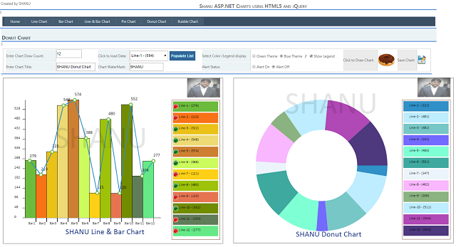
Draw Donut Chart: same like the pie chart. Here, I will calculate for all the points and draw the pie chart using “arc” method. For the Donut chart to draw donut shape, we use the “donutoutcircle” and “donutInnsercircle” value. Here, I will check for the Chart width and height. I will draw the donut chart size.
function drawDonutChart() {
var lastend = 0;
var XvalPosition = xSpace;
chartWidth = (canvas.width / 2) - xSpace;
chartHeight = (canvas.height / 2) - (xSpace / 2);
widthcalculation = parseInt(((parseInt(chartWidth) - 100) / noOfPlots));
var donutOutercircle = chartHeight / 2;
var donutinnersircle = (chartWidth / 2) + xSpace;
colorval = 0;
var chartTotalResult = getChartTotal();
var legend1 = 0;
$('#cphBody_DropDownList1 option').each(function () {
ctx.fillStyle = pirChartColor[colorval];
legend1 += (Math.PI * 2 * (parseInt($(this).val()) / chartTotalResult));
ctx.beginPath();
ctx.moveTo(chartWidth, chartWidth);
ctx.arc(chartWidth, chartWidth, donutOutercircle,
lastend, legend1, false);
ctx.arc(chartWidth, chartWidth, donutinnersircle,
legend1, lastend, true);
ctx.fill();
lastend += Math.PI * 2 * (parseInt($(this).val()) / chartTotalResult);
colorval = colorval + 1;
});
}
Draw Bubble Chart: same like the line chart, we draw the Bubble chart, but here use the "arc” method to draw our circle for each item.
function drawBubbleChart() {
ctx.globalAlpha = 0.8;
var bubbleSize = 40;
ival = 0;
$('#cphBody_DropDownList1 option').each(function () {
ctx.fillStyle = pirChartColor[ival];
ctx.strokeStyle = pirChartColor[ival];
ctx.beginPath();
ctx.arc(getXPlotvalue(ival) + 14, getYPlotVale($(this).val()),
bubbleSize, bubbleSize, Math.PI * 2, true);
ctx.fill();
ival = ival + 1;
});
ctx.lineWidth = 1;
}
- Save Chart: In the
Save method, first I will check for the browser version. If the browser is not IE, that means Chrome or Firefox, then using the “canvas.toDataURL” method, I will save the image. Because this method will not work in Internet Explorer’, for “Internet Explorer”, then using the Ajax post method, I will save the image.
function ShanuSaveImage() {
var m = confirm("Are you sure to Save ");
if (m) {
if (navigator.appName == 'Microsoft Internet Explorer') {
var image_NEW = document.getElementById
("canvas").toDataURL("image/png");
image_NEW = image_NEW.replace('data:image/png;base64,', '');
$.ajax({
type: 'POST',
contentType: 'application/json; charset=utf-8',
url: '/shanuHTML5PIEChart.aspx/SaveImage',
data: '{ "imageData" : "' + image_NEW + '" }',
async: false,
success: function (msg) {
alert(msg.d);
},
error: function () {
alert("Pie Chart Not Saved");
}
});
}
else {
var canvas = document.getElementById("canvas");
document.location.href = canvas.toDataURL("image/png").replace
("image/png", "image/octet-stream");
var ImageSave = document.createElement('a');
ImageSave.download = "shanuPIEImage.png";
ImageSave.href = canvas.toDataURL("image/png").replace
("image/png", "image/octet-stream");
ImageSave.click();
alert("Image Saved");
}
}
}
- Bind Dropdown List Data from DataTable: In the page Load and in Button Click, I will call the “
BindDropDownList()” method to populate the PIE Chart values in DataTable and bind the final result to the Dropdown List.
Here for simple example, I have used the DataTable to populate data and bind the result to dropdown list.
You can write your own code to bind the result to Dropdown list. Even you can change the source from Dropdown List to any control as per your requirements.
This Dropdown list items will be got in JavaScript and using the values, the pie chart will be created dynamically.
protected void Page_Load(object sender, EventArgs e)
        {
            BindDropDownList();
        }

        protected void Button1_Click(object sender, EventArgs e)
        {
            BindDropDownList();
        }

        private void BindDropDownList()
        {
            DataTable dt = new DataTable();
            dt.Clear();
            dt.Rows.Clear();
            dt.Columns.Add("Names");
            dt.Columns.Add("Frequency");
            dt.Columns["Frequency"].DataType = Type.GetType("System.Int32");
            Random random = new Random();
                for (int i = 1; i <=Convert.ToInt32(txtChartCount.Text.Trim()); i++)
                {
                    DataRow row = dt.NewRow();
                    Int32 value = random.Next(100, 600);
                    row["Names"] = "Bar-" + i.ToString() + " - (" + value+") ";
                    row["Frequency"] = value;
                    dt.Rows.Add(row);
                }

                DropDownList1.DataSource = dt;
                DropDownList1.DataTextField = "Names";
                DropDownList1.DataValueField = "Frequency";
                DropDownList1.DataBind();
        }
Tested Browsers
Output
Line Chart
Bubble Chart
Donut Chart
Points of Interest
We can use the same logic to create Winform version Chart Controls. For example, you can see my Pareto Chart control which was created for Windows form version.
Working with HTML5 is really fun. I hope you enjoyed reading my article. I will be happy if someone benefits from my article.
History
- 2nd April, 2015: Initial version


 General
  News
News  Suggestion
  Question
  Bug
Bug  Answer
  Joke
Joke  Praise
  Rant
Rant  Admin
Admin 


