Introduction
This example demonstrates the opportunities of the features of the Windows Presentation Foundation 4.0 and Microsoft C# 4.0. For example, the solution shows the possibility to use an optional parameter in a factory pattern. It shows the opportunity to use styles and control templates by loading an external file. It also shows a way to use commands in binding in WPF.
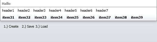
The solution is a simple navigation control shown in the figure. But it uses all the new features of WPF 4 and C# 4.
Background
I saw a new WPF project, written by a developer beginner. But it was written in the old style with events and no interfaces, no data transportation objects, no business objects and no context objects. I talked to him and explained the difference between Windows Forms development and WPF development. This example is the result of this conversation.
Using the Code
This code demonstrates a lot of new C# 4 and WPF 4 features. I will explain how to use this solution and I will also explain how I used these features in this solution and why.
Interfaces
In this solution, I used a lot of interfaces. The question is why. An interface is the best way to communicate between different projects / DLLs. You can also use an interface for the MVP pattern. If you work with a lot of projects in a big solution, like webstore solution, you have to check the dependency between the projects.
Example: If you use the MVP pattern, you can implement an interface from a child layer "infrastructure project" to cast the UserControl in this interface. After that, you can use this interface as a method parameter for another child layer "data project". This will prevent dependencies between different projects. In the current solution, you can use this pattern in the "NavigationContext" class in the "OpenForm" RoutedEvent to cast the sender.
You can see a simple webcast here.
Commands
Commands are a really great functionality of WPF. It is not a new feature of WPF 4 but it helps to resolve a lot of problems. Commands give you the opportunity to write code in a part of the solution where you have the information or the context to run a method. At runtime, you can register this command and you can determine whether the command can be executed or not. Also you can define the scope of the command by adding the command to a specific CommandBinding. You will find an example in the "NavigationHost" class, realized with the method "RegisterCommands".
private void RegisterCommands()
{
    Application.Current.MainWindow.CommandBindings.Clear();
    CommandBinding openCB =
	new CommandBinding(NavigationHelper.OpenMenu, Context.OpenMenu);
    Application.Current.MainWindow.CommandBindings.Add(openCB);
    CommandBinding openForm =
	new CommandBinding(NavigationHelper.OpenForm, Context.OpenForm);
    Application.Current.MainWindow.CommandBindings.Add(openForm);
}
Example: In this solution, I used a static command to popup a MessageBox. You can use this code to open a window. If you extend this command, you can add a "CanExecute" handler to decide whether the command can be executed or not.
You can see more about commands at this link.
Factory Pattern
I also used a simple factory pattern in this solution. If you don't have the serialized "repository.xml" file in your bin directory, you can create a serialized XML file for a sample navigation structure. I use this pattern to create a small navigation structure and I don't like to fill empty objects in the presentation layer.
You will find this pattern in the "NavigationFactory" class. And I use this pattern in the "NavigationHost" class with the method LoadRepository to generate a menu structure.
public static NavigationItem CreateNavigationEntry
(Guid parentGUID, string title = "title",
	string description = "description", string tooltip = "tooltip")
{
    NavigationItem repository = new NavigationItem
    {
        GUID = Guid.NewGuid(),
        Title = title,
        Description = description,
        ToolTip = tooltip,
        Type = NavigationType.NavigationEntry,
        ParentGUID = parentGUID,
    };

    return repository;
}
Serialization
Serialization is a good way to create XML files. It is really simple and easy to create a class which is able to be serialized. The only thing you have to do is write a "[Serializeable]" attribute above the classname.
[Serializable()]
public class NavigationRepository : INavigationRepository
{
    {
        private List<NavigationItem> _items;
        public List<NavigationItem> Items
        {
            get
            {return _items;}
            set
            {_items = value;}
        }
    }
}
To serialize the file to your hd, you have to run the following code:
NavigationRepository repository = NavigationFactory.CreateNavigationRepository();
repository.Items.Clear();

foreach (NavigationItem item in cache.GlobalItems)
{
    repository.Items.Add(item);
}

XmlSerializer ser = new XmlSerializer(typeof(NavigationRepository));
FileStream str = new FileStream(path, FileMode.Create);
ser.Serialize(str, repository);
str.Close();
str.Dispose();
Control Templates
I realized two ways to define "Control Templates" and "Styles" in this solution. The first way was to use the general file "Generic.xaml" which was generated by Visual Studio to define a control template for a control (not a user control). The following code is defined in the "Generic.xaml" file. It is a simple resource dictionary. It will be loaded automatically.
<style targettype="{x:Type local:NavigationTitle}">
    <Setter Property="Title" Value="asdf"/>
    <Setter Property="TitleBrush" Value="Gray" />
    <Setter Property="FontWeight" Value="Bold"/>
    <Setter Property="BorderBrush" Value="Gray"/>
    <Setter Property="BorderThickness" Value="0,0,0,1"/>
    <Setter Property="Template">
        <Setter.Value>
            <ControlTemplate TargetType="{x:Type local:NavigationTitle}">
                <Border Background="{TemplateBinding Background}"
                        BorderBrush="{TemplateBinding BorderBrush}"
                        BorderThickness="{TemplateBinding BorderThickness}"
                        SnapsToDevicePixels="True">
                   <Grid SnapsToDevicePixels="True">
                        <Grid.RowDefinitions>
                            <RowDefinition Height="Auto"/>
                        </Grid.RowDefinitions>
                        <Grid.ColumnDefinitions>
                            <ColumnDefinition Width="*" />
                        </Grid.ColumnDefinitions>
                        <Label x:Name="_internalTitleLabel"
                        Content="{TemplateBinding Title}"
				Foreground="{TemplateBinding TitleBrush}"
                               Grid.Column="0" Grid.Row="0"
                               SnapsToDevicePixels="True"
				FontWeight="{TemplateBinding FontWeight}"/>
                    </Grid>
                </Border>
            </ControlTemplate>
        </Setter.Value>
    </Setter>
</style>
The second way is to load a "ResourceDictionary" after you loaded the application and add this file to the "Application.Resources.MergedDictionaries". In the following XAML code, you see simple style definitions which you can change by your own ideas.
<LinearGradientBrush x:Key="BackgroundColor" StartPoint="0,0" EndPoint="0,1">
<GradientStopCollection>
<GradientStop Color="#EAECEF" Offset="0"/>
<GradientStop Color="#DADEE3" Offset="1"/>
</GradientStopCollection>
</LinearGradientBrush>
<LinearGradientBrush x:Key="MenuColor" StartPoint="0,0" EndPoint="0,1">
<GradientStopCollection>
<GradientStop Color="#FFFFFF" Offset="0"/>
<GradientStop Color="#FFFFFF" Offset="0.7"/>
<GradientStop Color="#EAEDF1" Offset="1"/>
</GradientStopCollection>
</LinearGradientBrush>
<Style TargetType="{x:Type Button}">
<Setter Property="Padding" Value="3,1,3,1"/>
<Setter Property="Background" Value="Transparent"/>
<Setter Property="BorderBrush" Value="Transparent"/>
<Setter Property="BorderThickness" Value="1"/>
<Setter Property="Margin" Value="2"/>
<Setter Property="LayoutTransform">
<Setter.Value>
<ScaleTransform/>
</Setter.Value>
</Setter>
<Setter Property="Template">
<Setter.Value>
<ControlTemplate TargetType="{x:Type Button}">
<Border x:Name="Border" Background="{TemplateBinding Background}"
BorderBrush="{TemplateBinding BorderBrush}"
BorderThickness="{TemplateBinding BorderThickness}"
Padding="3,1,3,1">
<Grid x:Name="Grid">
<Grid.RowDefinitions>
<RowDefinition Height="Auto"/>
<RowDefinition Height="Auto"/>
</Grid.RowDefinitions>
<ContentPresenter Grid.Row="0" Margin="1"
HorizontalAlignment="{TemplateBinding HorizontalContentAlignment}"
VerticalAlignment="{TemplateBinding VerticalContentAlignment}"
RecognizesAccessKey="True" SnapsToDevicePixels="True" >
</ContentPresenter>
</Grid>
</Border>
<ControlTemplate.Triggers>
<Trigger Property="IsKeyboardFocused" Value="true">
<Setter Property="BorderBrush" Value="{DynamicResource WhiteBrush}"
TargetName="Border"/>
</Trigger>
<Trigger Property="IsMouseOver" Value="true">
<Setter Property="Background"
Value="{DynamicResource BackgroundColor}"
TargetName="Border"/>
<Setter Property="BorderBrush" Value="Silver"
TargetName="Border"/>
<Setter Property="BorderThickness" Value="1"
TargetName="Border"/>
</Trigger>
<Trigger Property="IsPressed" Value="true">
<Setter Property="Background"
Value="{DynamicResource BackgroundColor}"
TargetName="Border"/>
<Setter Property="BorderBrush" Value="Transparent"
TargetName="Border"/>
</Trigger>
<Trigger Property="IsEnabled" Value="true"/>
<Trigger Property="IsEnabled" Value="false">
<Setter Property="Background"
Value="{DynamicResource BackgroundColor}"
TargetName="Border"/>
<Setter Property="BorderBrush" Value="White" TargetName="Border"/>
<Setter Property="Foreground" Value="Gray"/>
</Trigger>
</ControlTemplate.Triggers>
</ControlTemplate>
</Setter.Value>
</Setter>
</Style>
You can load this file in your application with the following code. I placed this code snippet in the "Load Event" of the application main form.
ResourceDictionary dictionary = new ResourceDictionary();
dictionary.Source = new Uri("/MenuStyle.xaml", riKind.RelativeOrAbsolute);
Application.Current.Resources.MergedDictionaries.Add(dictionary);
Points of Interest
But the big point of interest in this solution is the structure and pattern of this simple and small navigation example.

Here you can see how I used only one project in a Visual Studio solution. I think it is the best way to maintain this control. But there are some helping points I want to mention. If you use this control in a big solution with more than 2 or 3 projects, you should extract the interfaces to an infrastructure or a data project to get a simple way to cast the objects. You should also implement parts of the "Repository" folder and the "Pattern" folder to a global data project.
In the "MainWindow" class, you can see how I load the "MenuStyle.XAML" resource file into the application "MergedDictionaries" to use the style. With this solution, you have the opportunity to style and theme the application by your own way and after you compiled the project. In order to use this functionality for the controls, I didn't develop usercontrols. I developed controls with a resource dictionary which is shown in the "Themes" folder. You can also deploy this "generic.xaml" file to the "bin" output directory of your solution.
Help
In order to see the final menu structure, as shown in the figure, you should select the buttons:
- "
create" - This will create the menu structure, then - "
save" - This will save the menu structure in a serialized XML file in the bin folder of the solution, and after all - "
load" - This loads the menu structure from the file.
I think the final solution is an example serialized XML file...
This member has not yet provided a Biography. Assume it's interesting and varied, and probably something to do with programming.


 General
  News
News  Suggestion
  Question
  Bug
Bug  Answer
  Joke
Joke  Praise
  Rant
Rant  Admin
Admin 


 Submit an article or tip

