Introduction
This article describes a way of arranging tab panel elements in a single line, providing the ability to fit elements if there is not enough room as well as to fill extra space. Line layout of elements is well known to all WPF developers. There is a fundamental panel which allows reaching this goal. And this is StackPanel. But this panel has restrictions making this option not suitable in some cases. StackPanel is not able to fill extra space. It measures all elements and provides only the required space for arrangement. If the space available for StackPanel is larger than the space required for its child elements then this space remains empty. Also when there is not enough space to arrange all child elements, StackPanel can provide only scrolling or trimming rather than any kind of stretching of elements. So if you are interested in line layout with the possibility for flexible elements arrangement, welcome under the hood.
Background
The first time I faced the problem of stacking elements into a single line was when I developed a custom TabControl. The obvious decision was to use StackPanel for tab headers arrangement since it provides the desired behavior of stacking tab headers into a single line. However, I realized my mistake when TabControl turned out to be too small to arrange all tab items. As I said earlier, before StackPanel arranges children it measures them and provides only the required space. There are no shrink/expand operations to handle insufficient/extra space. In case of space insufficiency by default TabControl wraps elements across several lines. However there are a lot of examples of the desired behavior. Browsers for example can shrink tab items if there is not enough space. Visual Studio can hide document tab items if there is overflow (user can reopen document from dropdown menu).
FlexStackPanel
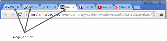
In case of browsers, the desired behavior could be achieved using Grid. For every tab item, one column is reserved with star-based width. This will allow shrinking all tab items if there is no free room. However it will look ugly when one or a couple of tab items fill the entire area. So restricting the maximum width of a tab item is a good idea. But there is one minor problem: in browsers all tabs have the same width. They always have the same width, independently of whether they are shrunken or not:
But what can be done if a tab item’s size is irregular? A workaround using Grid doesn’t help in this case. A good illustration of the desired behavior could be found in Visual Studio (2010 for example), where several tool windows could be grouped together in a single tab control:

Here the “Solution Explorer” tab is the biggest one and it is the first candidate to be shrunk:
“Class View” goes next and is shrunken along with “Solution Explorer” because at this step they have the same width and there are smaller tab items:
And on its final step all tab items are reduced together sharing the same size:
So this is the behavior I want to have.
FlexStackPanel has four modes which are described by the StretchDirection dependency property with the following values: None, DownOnly, UpOnly, and Both. So now I’m going to talk about all of them.
None
From its name you could guess, that FlexStackPanel in this mode does nothing to handle insufficient/extra size. And mostly it is true. In this mode the panel behaves like the default StackPanel. It measures every child element and reserves the precise amount of space it requires. Yet there is one difference compared to StackPanel: Overflow feature. When there is not enough space to arrange all child elements, FlexStackPanel hides children starting from the right border until there is no space to arrange the rest of the elements. In addition, the panel marks every overflowing child with a “True” value of the FlexStackPanel.IsOverflowed attached property. This allows handling such overflowing elements putting it into a dropdown list for example (this will be covered later). Visual Studio behaves exactly the same way for document tabs.
DownOnly
In this mode, FlexStackPanel is allowed only to reduce its child elements, when there is no space. And this process is selective: the first element to shrink is the largest one. If there are several elements with the same size then all of them will be reduced proportionally to fit into the available space. As long as the panel in this mode is only allowed to shrink elements, nothing will happen if there is more space than required by the elements.
UpOnly
This mode differs from the previous one only in the direction of stretching the content. It is allowed to expand elements if there is extra space. Otherwise, it behaves like the None mode, hiding elements if they overflow existing space. Like the previous mode the process of expanding is selective. The first element to be expanded is the smallest one. FlexStackPanel expands this element (or several elements, if necessary) until its size becomes equal to the next smallest element.
Both
In this mode the space of the panel is simply shared by all elements. All items will have the same size, whether or not there is extra space or space insufficiency. It is like a Grid panel with all columns of star-based size. Min/max constraints set on the elements is the only condition that affects the element size.
Behavior
As you may have already guessed by now, the panel has the ability to shrink and/or expand elements. Now let’s look into the reasons why this process is selective and iterative. Consider the following example:
There are five tab items, and they claim to have the following sizes (size refers to the tab item width, because in this case panel orientation is horizontal): 10, 20, 20, 40, and 30 units. So the required space to arrange these items is the sum of their sizes – 120 units. But the panel is only 110 units in width. Hence, the panel is 10 units short and something has to be done. And this “something” depends on the panel’s mode (StretchDirection property). If it is None then the panel starts hiding elements starting from the right border. So the last tab will be hidden and everything will be OK. The process of hiding is actually arranging the elements to an empty rectangle. If the mode is DownOnly then the panel looks for the largest element(s) and starts shrinking it (them). The largest element is the tab item width size of 40 units, so it will be shrunken. The process of shrinking lasts until the elements fit or the element being shrunken is not the largest anymore. In this example we need to reduce the elements by 10 units (120-110) so the largest one goes to a size of 30 (40-10). And the process stops because of the first condition. If the space given to the panel is 100 units then the first condition is not satisfied but the next one is - element being shrunk is not the largest anymore. Instead of it we have now two largest tab items with the same sizes of 30 units. The panel has to compensate 10 units (110-100) and these two elements will be reduced proportionally until one of the conditions is satisfied. The result will be as follows: 10, 20, 20, 25, 25, and the total sum is 100 units, so the first condition is met. That is why the process is selective and iterative. On each iteration the panel selects the largest elements and reduces them until any of the conditions are met.
In a reversed situation, when there is extra space and mode of the panel is UpOnly the process of expanding elements is very similar, except that the panel selects the smallest element(s) and expands it (them) until entire space is filled (the first condition) or the element processed is not the smallest anymore (the second condition).
The process does not seem difficult, but there is one restriction: min/max constraints. In the example above, if there was min constraint on the largest element (40) of 35 units, then we wouldn’t be able to shrink it to a lower value. So it would maintain the size of 35 units, while the elements without size constraints would be shrunken to compensate the lack of space.
Demo application
In the sample application I will show how to use a FlexStackPanel for creating a flexible TabControl. The sample application has twp TabControls, the first one shows the behavior of Visual Studio tool Windows tab group, and the second has the behavior of document windows tab group. The latter TabControl is more interesting because it demonstrates the Overflow feature and the way of selecting overflowed tab items through a dropdown menu.
To enable FlexStackPanel to be used as a host panel for tab items you have to create a control template:
<Style TargetType="TabControl">
<Setter Property="Template">
<Setter.Value>
<ControlTemplate TargetType="TabControl">
<Grid Background="#FF334667">
<Grid.RowDefinitions>
<RowDefinition Height="Auto" />
<RowDefinition Height="*"/>
<RowDefinition Height="Auto" />
</Grid.RowDefinitions>
<Grid.ColumnDefinitions>
<ColumnDefinition Width="*" />
<ColumnDefinition Width="Auto" />
</Grid.ColumnDefinitions>
<xmp:FlexStackPanel x:Name="TabHeaderPanel" Orientation="Horizontal" IsItemsHost="True"/>
<Border Grid.Row="1" Grid.ColumnSpan="2" Background="White">
<ContentPresenter ContentSource="SelectedContent" />
</Border>
<ToggleButton Grid.Column="1"
xme:FrameworkElementExtension.ContextMenuPlacementTarget=
"{Binding RelativeSource={RelativeSource Self}}"
ContextMenuService.IsEnabled="False"
IsChecked="{Binding Path=ContextMenu.IsOpen,
RelativeSource={RelativeSource Self}, Mode=TwoWay}"
x:Name="PART_MenuButton"
Style="{StaticResource ToggleMenuButton}"
Visibility="Collapsed">
<Path x:Name="MenuIcon"
Stroke="{Binding Path=Foreground, ElementName=PART_MenuButton}"
VerticalAlignment="Center" HorizontalAlignment="Center"
StrokeThickness="0"
Fill="{Binding Path=Foreground, ElementName=PART_MenuButton}"
Data="{StaticResource OverflowMenuIconGeometry}" />
<ToggleButton.Resources>
<CollectionViewSource x:Key="ViewSource"
Source="{Binding Path=ItemsSource,
RelativeSource={RelativeSource TemplatedParent}}">
<CollectionViewSource.SortDescriptions>
<scm:SortDescription/>
</CollectionViewSource.SortDescriptions>
</CollectionViewSource>
</ToggleButton.Resources>
<ToggleButton.ContextMenu>
<ContextMenu Placement="Bottom"
ItemsSource="{Binding Source={StaticResource ViewSource}}"
Style="{StaticResource ContextMenuBase}">
<ContextMenu.ItemContainerStyle>
<Style TargetType="MenuItem" BasedOn="{StaticResource MenuItemBase}">
<Setter Property="Header" Value="{Binding}" />
<Setter Property="Command" Value="{x:Static a:MainWindow.ActivateDocument}" />
<Setter Property="CommandParameter"
Value="{Binding Path=Header, RelativeSource={RelativeSource Self}}" />
</Style>
</ContextMenu.ItemContainerStyle>
</ContextMenu>
</ToggleButton.ContextMenu>
</ToggleButton>
</Grid>
<ControlTemplate.Triggers>
<Trigger Property="TabStripPlacement" Value="Bottom">
<Setter Property="Grid.Row" Value="2" TargetName="TabHeaderPanel"/>
</Trigger>
<DataTrigger Binding="{Binding Path=HasOverflowedChildren, ElementName=TabHeaderPanel}"
Value="false">
<Setter Property="Data" TargetName="MenuIcon" Value="{StaticResource MenuIconGeometry}"/>
</DataTrigger>
<Trigger Property="StretchDirection" SourceName="TabHeaderPanel" Value="None">
<Setter TargetName="PART_MenuButton" Property="Visibility" Value="Visible" />
</Trigger>
<Trigger Property="StretchDirection" SourceName="TabHeaderPanel" Value="UpOnly">
<Setter TargetName="PART_MenuButton" Property="Visibility" Value="Visible" />
</Trigger>
</ControlTemplate.Triggers>
</ControlTemplate>
</Setter.Value>
</Setter>
</Style>
The most interesting part here is the dropdown menu. ToggleButton is used as a trigger for menu opening and ContextMenu is used for the document items selection. ContextMenuService is disabled on the toggle button, so the menu cannot be opened with right click. Instead of it, the ToggleButton.IsChecked property is bound to the ContextMenu.IsOpen property, so left click on the button will open the context menu. However there is one problem: the PlacementTarget property of the ContextMenu won’t be set and the menu will be opened at the TopLeft corner of the screen. Also commands from the menu items won’t reach their destination (MainWindow) and items will be disabled. So PlacementTarget has to be set explicitly, but this cannot be accomplished using binding, since ToggleButton and ContextMenu are on different visual trees. The helper class is written to work around this issue:
public static class FrameworkElementExtension
{
  #region Static Fields

  public static readonly DependencyProperty ContextMenuPlacementTargetProperty =
    DependencyProperty.RegisterAttached
      ("ContextMenuPlacementTarget", typeof(FrameworkElement),
        typeof(FrameworkElementExtension),
        new PropertyMetadata(default(FrameworkElement),
          OnContextMenuPlacementTargetPropertyChanged));

  #endregion

  #region Methods

  public static FrameworkElement GetContextMenuPlacementTarget(UIElement element)
  {
    return (FrameworkElement)element.GetValue(ContextMenuPlacementTargetProperty);
  }

  public static void SetContextMenuPlacementTarget(UIElement element, FrameworkElement value)
  {
    element.SetValue(ContextMenuPlacementTargetProperty, value);
  }

  private static void OnContextMenuChanged(object sender, EventArgs eventArgs)
  {
    UpdateContextMenuPlacementTarget((FrameworkElement)sender);
  }

  private static void OnContextMenuPlacementTargetPropertyChanged(DependencyObject d,
                                                                  DependencyPropertyChangedEventArgs e)
  {
    var frameworkElement = (FrameworkElement)d;
    var contextMenuPropertyDesc = DependencyPropertyDescriptor.
      FromProperty(FrameworkElement.ContextMenuProperty, frameworkElement.GetType());

    if (e.OldValue != null)
      contextMenuPropertyDesc.RemoveValueChanged(frameworkElement, OnContextMenuChanged);

    if (e.NewValue != null)
    {
      contextMenuPropertyDesc.AddValueChanged(frameworkElement, OnContextMenuChanged);
      UpdateContextMenuPlacementTarget(frameworkElement);
    }
  }

  private static void UpdateContextMenuPlacementTarget(FrameworkElement frameworkElement)
  {
    if (frameworkElement.ContextMenu != null)
      frameworkElement.ContextMenu.PlacementTarget = GetContextMenuPlacementTarget(frameworkElement);
  }

  #endregion
}
This class introduces an attached property ContextMenuPlacementTarget. When this property is set on any framework element this extension observes changes to the ContextMenu property of this element, and if such a change occurs, the extension forces the PlacementTarget property of the context menu to be assigned to the value of the ContextMenuPlacementTarget attached property of that element. This solution might not be the best, and could be changed with the implementation of the custom control (DropDownButton for example) or with a different workaround. But I decided to choose this one to show yet another way to solve the problem.
The next thing about the dropdown menu is its content. In the sample application tab items for TabControl are not added explicitly. ItemsSource is used instead. An ObservableCollection of strings is used here to define the ItemsSource for the TabControl and tab items are generated by the ItemContainerGenerator of that TabControl. This gives us the ability to use that source for the ContextMenu as well. Therefore changes to ObservableCollection will be immediately reflected both on the tab control and the dropdown menu. To use that source on the ContextMenu you could easily write something like this:
<ContextMenu ItemsSource="{Binding Path=ItemsSource, RelativeSource={RelativeSource TemplatedParent}}" />
and everything would work great. However in the previous control template you could notice that items source is set in a different way. The reason lies in the Overflow feature. Assume we have four tab items: Doc1, Doc2, Doc3, and Doc4. If the TabControl does not have enough space to show all of them then some would be hidden (Doc4 for example). But what if you want to select Doc4 from the dropdown menu? TabControl has to show that tab item, so one of the possible solutions is to move that tab item to the first place in the collection: Doc4, Doc1, Doc2, Doc3. And everything seems OK until you open the DropDown menu once again. You will see that the order of menu items now changes, it is not sorted by name. The reason is that we are using the same source for both the TabControl and the DropDown menu. But the desirable behavior is to have items in the menu sorted by name to provide better search of the required document. That is why the control template uses an intermediate collection. And this collection is CollectionViewSource placed as a resource of the ToggleButton. Actually it is not a collection itself rather than a view of the collection provided as its source. With the help of that view you are able to provide sorting ability to the client of the source collection, and the client of collection in our case is the dropdown menu:
<CollectionViewSource x:Key="ViewSource"
                      Source="{Binding Path=ItemsSource,
                                       RelativeSource={RelativeSource TemplatedParent}}">
  <CollectionViewSource.SortDescriptions>
    <scm:SortDescription/>
  </CollectionViewSource.SortDescriptions>
</CollectionViewSource>
To provide sorting ability you can define SortDescription. In the sample application simple strings are used to describe TabItem. If you want to use a custom data type for items, like this:
public class Document
{
  public string Name { get; set; }
}
then you can specify a key for sorting within the collection and SortDescription will look like:
<CollectionViewSource x:Key="ViewSource"
                      Source="{Binding Path=ItemsSource,
                                       RelativeSource={RelativeSource TemplatedParent}}">
  <CollectionViewSource.SortDescriptions>
    <scm:SortDescription PropertyName="Name"/>
  </CollectionViewSource.SortDescriptions>
</CollectionViewSource>
Now we have a flexible TabControl with a dropdown menu, but one problem still remains. We have to handle a particular case when the selected tab item becomes hidden. If the selected tab item becomes hidden because of overflow we have to do something to make it visible. The possible solution is to move the selected item to the first place within the collection. To solve this problem FlexStackPanel provides an attached property IsOverflowed, which is set by the panel for every overflowing element. So if the selected tab item overflows we can detect this and perform the following steps:
static class OverflowTabHeaderObserver
{
  public static readonly DependencyProperty EnableTrackingProperty =
    DependencyProperty.RegisterAttached("EnableTracking",
    typeof (bool), typeof (OverflowTabHeaderObserver),
    new PropertyMetadata(false, OnEnableTrackingPropertyChanged));

  private static readonly DependencyPropertyDescriptor isOverflowedDesc =
    DependencyPropertyDescriptor.FromProperty(
    FlexStackPanel.IsOverflowedProperty, typeof(TabItem));

  private static void OnEnableTrackingPropertyChanged(DependencyObject depObj,
                                                      DependencyPropertyChangedEventArgs args)
  {
    var tabItem = (TabItem) depObj;

    if ((bool)args.OldValue)
      isOverflowedDesc.RemoveValueChanged(tabItem, OnTabItemOverflowChanged);

    if ((bool)args.NewValue)
      isOverflowedDesc.AddValueChanged(tabItem, OnTabItemOverflowChanged);
  }

  private static void OnTabItemOverflowChanged(object sender, EventArgs e)
  {
    EnsureActiveTabVisible(((TabItem)sender).VisualAncestors().OfType<TabControl>().First());
  }

  public static void EnsureActiveTabVisible(TabControl tabControl)
  {
    if (tabControl.ItemsSource == null)
      return;

    var ilist = (IList)tabControl.ItemsSource;

    var containerGenerator = tabControl.ItemContainerGenerator;
    var tabHeader = (TabItem)containerGenerator.ContainerFromItem(tabControl.SelectedItem);

    if (!FlexStackPanel.GetIsOverflowed(tabHeader) || !tabHeader.IsSelected) return;

    var item = containerGenerator.ItemFromContainer(tabHeader);
    ilist.Remove(item);
    ilist.Insert(0, item);

    tabControl.SelectedIndex = 0;
    UpdateFirstItem(tabControl);
  }

  private static void UpdateFirstItem(TabControl tabControl)
  {
    var ilist = (IList) tabControl.ItemsSource;

    if (ilist.Count == 0)
      return;

    var containerGenerator = tabControl.ItemContainerGenerator;

    var tabItems = ilist.OfType<object>()
                        .Select(containerGenerator.ContainerFromItem)
                        .OfType<TabItem>()
                        .ToList();
    foreach (var t in tabItems)
      FlexStackPanel.SetShrinkOnOverflow(t, false);

    FlexStackPanel.SetShrinkOnOverflow(tabItems.First(), true);
  }

  public static void SetEnableTracking(UIElement element, bool value)
  {
    element.SetValue(EnableTrackingProperty, value);
  }

  public static bool GetEnableTracking(UIElement element)
  {
    return (bool) element.GetValue(EnableTrackingProperty);
  }
}
Here is the helper class with the EnableTracking attached property. Once this property is set for a tab item, the helper class begins observing changes to the FlexStackPanel.IsOverflowed attached property on that tab item. And if the selected tab item becomes hidden this helper class moves that item to the first position within the collection. Also if the user selects a tab item from the dropdown menu which is currently hidden it is a good reason to call the static method of the helper class EnsureActiveTabVisible to do the job. If the tab control has not enough space to show a single tab item then this helper class uses the last resort: the FlexStackPanel.ShrinkOnOverflow attached property. This property overrides the behavior of the panel, restricting hiding elements which have a "True" value of that property. With this property you could be sure that every time, regardless of conditions, there will be at least one tab item visible. Inquisitive minds could have noticed some peculiarities in the MeasureOverride method of the FlexStackPanel. There is a loop of three iterations of the measurement process to handle this particular case. The FlexStackPanel.IsOverflowed attached property is set for elements directly from the MeasureOverride method, therefore when a client catches that change during the measure step and changes any property that affects the measurement process, the measurement becomes invalid (or dirty). In our case the property which influences the measuring process is ShrinkOnOverflow which is changed by the helper whenever the last visible tab item attempts to become hidden. Without these measurement iterations we would have a dirty measurement during this attempt. As a result we would see a blinking tab item while collapsing the tab control.
Below is the screenshot of the final application:
By dragging GridSplitter you can observe the behavior of FlexStackPanel. If there is lack of space and the panel's mode is set to None or UpOnly, then you will see how tab items disappear on the right border. For Both and DownOnly modes, all tab items will be visible but will have reduced size. If the window's width is large enough to show all tab items and there is some extra space then tab items will be expanded in Both and UpOnly modes, and will remain unaltered in None and DownOnly modes.
This member has not yet provided a Biography. Assume it's interesting and varied, and probably something to do with programming.


 General
  News
News  Suggestion
  Question
  Bug
Bug  Answer
  Joke
Joke  Praise
  Rant
Rant  Admin
Admin 


 Submit an article or tip


 (I'm running on a 32bit processor)
