1. Introduction
Tutorial overview
This article is the third part of a tutorial explaining how to build a full featured DataGrid using Silverlight and the GOA Toolkit.
In the first part of this tutorial, we saw way of creating a read-only grid's body. In the second part, we focused on the implementation of editing and validation features. In this third part, we will turn our attention to the headers of the grid.
All along this article, we will assume that you have completed reading the first and second parts of the tutorial. If it is not the case, we strongly advise to do so. You can access them here:
Get Started
This tutorial was written using the GOA Toolkit 2009 Vol1 build 289. If you have already implemented the first and the second steps of the tutorial before this article was released, you may need to upgrade. Check that you are working with GOA Toolkit 2009 Vol1 build 289 or after.
Be sure to have installed this release or a more recent one on your computer (www.netikatech.com/downloads)
Goals
During the two previous tutorials, we built the body part of the grid. The grid body that we have built has all the basic features of a data grid (cell, navigation, cell editing ...). Some advanced features have been implemented (virtual mode, DataTemplate ...). Nevertheless, our data grid will not be useful until we are able to link headers to the cells it displays.
This is the purpose of this third tutorial.
As our grid can display hierarchical data (nodes and children), we must be able to link the headers to any level of the grid. We will implement that in two different ways:
- By allowing to display the headers inside the grid at the top of each children collection,
- and by allowing displaying the headers at the top of the grid.
In the first case, the grid will have the following look:
In the second case, the headers will be displayed at the top of the grid.

We will also allow implement all the alternatives in-between:
- Display some of the headers inside the grid body and others outside.
- Display top headers only according to some predefined conditions or rules
- ...
When hierarchical data is displayed, the user may sometimes find the display confusing. He may have trouble understanding the different levels of the hierarchy. To make hierarchical data more readable, we will allow our grid to display a title at the top of each level. If you watch the two pictures above, you can see the "Countries", "Regions", and "Persons" titles displayed at the top of the headers. Headers and titles are not mandatory. We will be able to choose to display them or not. We will also be able to display the titles but not the headers, or the opposite.
We will also implement the features needed to allow the user to resize the headers.
Out of scoop
We will not discuss the possibility of sorting the data of the grid by clicking on a row header. This feature is more data related than headers related. It is not difficult to add a visual state that displays an up arrow or a down arrow in a header when the user clicks on it. What is more difficult is to apply the corresponding sorting rule to the underlying data. This could be the subject of another tutorial.
2. Preparing the grid
Refactoring the display of the grid
Our data grid is able to display a large amount of complex hierarchical data. We must ensure that the data is presented in the most readable way to the user. Adding headers inside the grid body will add a level of complexity. Therefore, before starting the implementation of the headers, let's make some changes in the way the rows are displayed in order to make the gird more attractive.
Alternate rows color
When setting the AlternateType property of our grid body to the "Items" value, the background of one row out of two is displayed using an alternate color.
The purpose of this feature is to make the grid more readable. Nevertheless, the alternate colors are too bright and it makes it difficult to read the grid.
In the latest releases of the GOA Toolkit, the brushes and the colors definitions defined at the top of the generic.xaml file of the GOAOpen project have been modified to make alternate colors more sober. Let's modify our generic.xaml file in the same way.
At the top of the generic.xaml file of the GOAOpen project, select the colors definition section. It is the section of the file between the color "tag":
and the Standard Silverlight Controls "tag":
Let's replace this section with the following one:
<SolidColorBrush x:Key="DefaultForeground" Color="#FF526168"/>
<Color x:Key="DefaultForegroundColor">#FF526168</Color>
<LinearGradientBrush x:Key="DefaultFocus"
EndPoint="1,1" StartPoint="0,0">
<GradientStop Color="#FF262B2D" Offset="0"/>
<GradientStop Color="#FF262B2D" Offset="1"/>
</LinearGradientBrush>
<SolidColorBrush x:Key="DefaultShadow" Color="#33272B2D"/>
<SolidColorBrush x:Key="DefaultDisabled" Color="#FFE8E9EA"/>
<SolidColorBrush x:Key="DefaultScrollBackground" Color="#FFD0E0E6"/>
<SolidColorBrush x:Key="DefaultControlBackground" Color="#FFF0F6F7"/>
<LinearGradientBrush x:Key="DefaultStroke"
EndPoint="1,1" StartPoint="0,0">
<GradientStop Color="#FF8096A1" Offset="0"/>
<GradientStop Color="#FF8096A1" Offset="1"/>
</LinearGradientBrush>
<SolidColorBrush x:Key="DefaultAlternativeBackground" Color="#FFE2ECF1"/>
<SolidColorBrush x:Key="DefaultListControlStroke" Color="#FF99B0BB" />
<LinearGradientBrush x:Key="DefaultBackground"
EndPoint="0.5,1" StartPoint="0.5,0">
<GradientStop Color="#FF81A4BB" Offset="0"/>
<GradientStop Color="#FFD9EBF7" Offset="1"/>
</LinearGradientBrush>
<LinearGradientBrush x:Key="DefaultBackgroundHorizontal"
EndPoint="0,0" StartPoint="1,0">
<GradientStop Color="#FF81A4BB" Offset="0"/>
<GradientStop Color="#FFD9EBF7" Offset="1"/>
</LinearGradientBrush>
<LinearGradientBrush x:Key="DefaultDownColor"
EndPoint="0.5,1" StartPoint="0.5,0">
<GradientStop Color="#FFFF9700"/>
<GradientStop Color="#FFFDCE28" Offset="1"/>
</LinearGradientBrush>
<LinearGradientBrush x:Key="DefaultDownColorHorizontal"
EndPoint="0,0" StartPoint="1,0">
<GradientStop Color="#FFFF9700"/>
<GradientStop Color="#FFFDCE28" Offset="1"/>
</LinearGradientBrush>
<LinearGradientBrush x:Key="DefaultReflectVertical"
EndPoint="0,1" StartPoint="0,0">
<GradientStop Color="#CCFFFEED" Offset="0"/>
<GradientStop Color="#33FFFFFF" Offset="1"/>
</LinearGradientBrush>
<LinearGradientBrush x:Key="DefaultReflectHorizontal"
EndPoint="1,0" StartPoint="0,0">
<GradientStop Color="#CCFFFEED" Offset="0"/>
<GradientStop Color="#33FFFFFF" Offset="1"/>
</LinearGradientBrush>
<LinearGradientBrush x:Key="DefaultDarkGradientBottomVertical"
EndPoint="0,1" StartPoint="0,0">
<GradientStop Color="#00044164" Offset="0"/>
<GradientStop Color="#4C044164" Offset="1"/>
</LinearGradientBrush>
<LinearGradientBrush x:Key="DefaultDarkGradientBottomHorizontal"
EndPoint="1,0" StartPoint="0,0">
<GradientStop Color="#00044164" Offset="0"/>
<GradientStop Color="#4C044164" Offset="1"/>
</LinearGradientBrush>
<LinearGradientBrush x:Key="DefaultToolBarBackgroundBrush"
EndPoint="0,1" StartPoint="0,0">
<GradientStop Color="#FFA8C1D2" Offset="0.3"/>
<GradientStop Color="#FFCAE0EE" Offset="1"/>
<GradientStop Color="#FFB3CEE0" Offset="0"/>
</LinearGradientBrush>
Extended parent node backcolor
When we built the Container_RowNodeStyle style (the style used by our rows when the grid displays hierarchical data), we have used the existing Container_NodeStyle style of the GoaOpen project and we have enhanced it a little bit in order that it fits our needs. The result style displays the background of the nodes in a different way when they are extended and collapsed.
We will remove this behavior because it adds confusion when it is used in a complex control like a gird.
Let's also increase the Indentation default value to 30 and change the margins of ValidElement and the FocusElement to make them more readable.
Locate the Container_RowNodeStyle style at the end of the generic.xaml file and replace the style with this one:
<Style x:Key="Container_RowNodeStyle" TargetType="o:HandyListItem">
<Setter Property="HorizontalAlignment" Value="Left" />
<Setter Property="HorizontalContentAlignment" Value="Stretch" />
<Setter Property="VerticalContentAlignment" Value="Center" />
<Setter Property="Cursor" Value="Arrow" />
<Setter Property="Padding" Value="0" />
<Setter Property="Margin" Value="0"/>
<Setter Property="Foreground" Value="{StaticResource DefaultForeground}"/>
<Setter Property="Background" Value="{StaticResource DefaultControlBackground}" />
<Setter Property="FontSize" Value="11" />
<Setter Property="Indentation" Value="10" />
<Setter Property="IsTabStop" Value="True" />
<Setter Property="IsKeyActivable" Value="True"/>
<Setter Property="ItemUnpressDropDownBehavior" Value="CloseAll" />
<Setter Property="BorderBrush" Value="{StaticResource DefaultListControlStroke}"/>
<Setter Property="BorderThickness" Value="1"/>
<Setter Property="Indentation" Value="30"/>
<Setter Property="Template">
<Setter.Value>
<ControlTemplate TargetType="o:HandyListItem">
<Grid x:Name="LayoutRoot">
<vsm:VisualStateManager.VisualStateGroups>
<vsm:VisualStateGroup x:Name="CommonStates">
<vsm:VisualState x:Name="Normal"/>
<vsm:VisualState x:Name="Disabled">
<Storyboard>
<DoubleAnimation
Duration="0"
Storyboard.TargetName="ELEMENT_ContentPresenter"
Storyboard.TargetProperty="Opacity"
To="0.6"/>
<DoubleAnimation
Duration="0"
Storyboard.TargetName="SelectedVisual"
Storyboard.TargetProperty="Opacity"
To="0.6"/>
<ObjectAnimationUsingKeyFrames
Storyboard.TargetName="SelectedReflectVisual"
Storyboard.TargetProperty="Visibility"
Duration="0">
<DiscreteObjectKeyFrame KeyTime="0">
<DiscreteObjectKeyFrame.Value>
<Visibility>Visible</Visibility>
</DiscreteObjectKeyFrame.Value>
</DiscreteObjectKeyFrame>
</ObjectAnimationUsingKeyFrames>
<DoubleAnimation
Duration="0"
Storyboard.TargetName="HasItem"
Storyboard.TargetProperty="Opacity"
To="0.6"/>
</Storyboard>
</vsm:VisualState>
</vsm:VisualStateGroup>
<vsm:VisualStateGroup x:Name="FocusStates">
<vsm:VisualState x:Name="NotFocused"/>
<vsm:VisualState x:Name="Focused">
<Storyboard>
<ObjectAnimationUsingKeyFrames
Storyboard.TargetName="FocusVisual"
Storyboard.TargetProperty="Visibility"
Duration="0">
<DiscreteObjectKeyFrame KeyTime="0">
<DiscreteObjectKeyFrame.Value>
<Visibility>Visible</Visibility>
</DiscreteObjectKeyFrame.Value>
</DiscreteObjectKeyFrame>
</ObjectAnimationUsingKeyFrames>
</Storyboard>
</vsm:VisualState>
</vsm:VisualStateGroup>
<vsm:VisualStateGroup x:Name="MouseOverStates">
<vsm:VisualState x:Name="NotMouseOver"/>
<vsm:VisualState x:Name="MouseOver">
<Storyboard>
<ObjectAnimationUsingKeyFrames
Storyboard.TargetName="MouseOverVisual"
Storyboard.TargetProperty="Visibility"
Duration="0">
<DiscreteObjectKeyFrame KeyTime="0">
<DiscreteObjectKeyFrame.Value>
<Visibility>Visible</Visibility>
</DiscreteObjectKeyFrame.Value>
</DiscreteObjectKeyFrame>
</ObjectAnimationUsingKeyFrames>
</Storyboard>
</vsm:VisualState>
</vsm:VisualStateGroup>
<vsm:VisualStateGroup x:Name="PressedStates">
<vsm:VisualState x:Name="NotPressed"/>
<vsm:VisualState x:Name="Pressed">
<Storyboard>
<ObjectAnimationUsingKeyFrames
Storyboard.TargetName="PressedVisual"
Storyboard.TargetProperty="Visibility"
Duration="0">
<DiscreteObjectKeyFrame KeyTime="0">
<DiscreteObjectKeyFrame.Value>
<Visibility>Visible</Visibility>
</DiscreteObjectKeyFrame.Value>
</DiscreteObjectKeyFrame>
</ObjectAnimationUsingKeyFrames>
</Storyboard>
</vsm:VisualState>
</vsm:VisualStateGroup>
<vsm:VisualStateGroup x:Name="SelectedStates">
<vsm:VisualState x:Name="NotSelected"/>
<vsm:VisualState x:Name="Selected">
<Storyboard>
<ObjectAnimationUsingKeyFrames
Storyboard.TargetName="SelectedVisual"
Storyboard.TargetProperty="Visibility"
Duration="0">
<DiscreteObjectKeyFrame KeyTime="0">
<DiscreteObjectKeyFrame.Value>
<Visibility>Visible</Visibility>
</DiscreteObjectKeyFrame.Value>
</DiscreteObjectKeyFrame>
</ObjectAnimationUsingKeyFrames>
</Storyboard>
</vsm:VisualState>
</vsm:VisualStateGroup>
<vsm:VisualStateGroup x:Name="HasItemsStates">
<vsm:VisualState x:Name="NotHasItems"/>
<vsm:VisualState x:Name="HasItems">
<Storyboard>
<ObjectAnimationUsingKeyFrames
Storyboard.TargetName="HasItem"
Storyboard.TargetProperty="Visibility"
Duration="0">
<DiscreteObjectKeyFrame KeyTime="0">
<DiscreteObjectKeyFrame.Value>
<Visibility>Visible</Visibility>
</DiscreteObjectKeyFrame.Value>
</DiscreteObjectKeyFrame>
</ObjectAnimationUsingKeyFrames>
</Storyboard>
</vsm:VisualState>
</vsm:VisualStateGroup>
<vsm:VisualStateGroup x:Name="IsExpandedStates">
<vsm:VisualState x:Name="NotIsExpanded"/>
<vsm:VisualState x:Name="IsExpanded">
<Storyboard>
<ObjectAnimationUsingKeyFrames
Storyboard.TargetName="CheckedArrow"
Storyboard.TargetProperty="Visibility"
Duration="0">
<DiscreteObjectKeyFrame KeyTime="0">
<DiscreteObjectKeyFrame.Value>
<Visibility>Visible</Visibility>
</DiscreteObjectKeyFrame.Value>
</DiscreteObjectKeyFrame>
</ObjectAnimationUsingKeyFrames>
<ObjectAnimationUsingKeyFrames
Storyboard.TargetName="ArrowUnchecked"
Storyboard.TargetProperty="Visibility"
Duration="0">
<DiscreteObjectKeyFrame KeyTime="0">
<DiscreteObjectKeyFrame.Value>
<Visibility>Collapsed</Visibility>
</DiscreteObjectKeyFrame.Value>
</DiscreteObjectKeyFrame>
</ObjectAnimationUsingKeyFrames>
</Storyboard>
</vsm:VisualState>
</vsm:VisualStateGroup>
<vsm:VisualStateGroup x:Name="AlternateStates">
<vsm:VisualState x:Name="NotIsAlternate"/>
<vsm:VisualState x:Name="IsAlternate">
<Storyboard>
<ObjectAnimationUsingKeyFrames
Storyboard.TargetName="AlternateBackgroundVisual"
Storyboard.TargetProperty="Visibility"
Duration="0">
<DiscreteObjectKeyFrame KeyTime="0">
<DiscreteObjectKeyFrame.Value>
<Visibility>Visible</Visibility>
</DiscreteObjectKeyFrame.Value>
</DiscreteObjectKeyFrame>
</ObjectAnimationUsingKeyFrames>
<ObjectAnimationUsingKeyFrames
Storyboard.TargetName="BackgroundVisual"
Storyboard.TargetProperty="Visibility"
Duration="0">
<DiscreteObjectKeyFrame KeyTime="0">
<DiscreteObjectKeyFrame.Value>
<Visibility>Collapsed</Visibility>
</DiscreteObjectKeyFrame.Value>
</DiscreteObjectKeyFrame>
</ObjectAnimationUsingKeyFrames>
</Storyboard>
</vsm:VisualState>
</vsm:VisualStateGroup>
<vsm:VisualStateGroup x:Name="InvertedStates">
<vsm:VisualState x:Name="InvertedItemsFlowDirection">
<Storyboard>
<ObjectAnimationUsingKeyFrames
Storyboard.TargetName="ArrowCheckedToTop"
Storyboard.TargetProperty="Visibility"
Duration="0">
<DiscreteObjectKeyFrame KeyTime="0">
<DiscreteObjectKeyFrame.Value>
<Visibility>Visible</Visibility>
</DiscreteObjectKeyFrame.Value>
</DiscreteObjectKeyFrame>
</ObjectAnimationUsingKeyFrames>
<ObjectAnimationUsingKeyFrames
Storyboard.TargetName="ArrowCheckedToBottom"
Storyboard.TargetProperty="Visibility"
Duration="0">
<DiscreteObjectKeyFrame KeyTime="0">
<DiscreteObjectKeyFrame.Value>
<Visibility>Collapsed</Visibility>
</DiscreteObjectKeyFrame.Value>
</DiscreteObjectKeyFrame>
</ObjectAnimationUsingKeyFrames>
</Storyboard>
</vsm:VisualState>
<vsm:VisualState x:Name="NormalItemsFlowDirection"/>
</vsm:VisualStateGroup>
<vsm:VisualStateGroup x:Name="ValidStates">
<vsm:VisualState x:Name="Valid"/>
<vsm:VisualState x:Name="NotValid">
<Storyboard>
<ObjectAnimationUsingKeyFrames
Storyboard.TargetName="ValidElement"
Storyboard.TargetProperty="Visibility"
Duration="0">
<DiscreteObjectKeyFrame KeyTime="0">
<DiscreteObjectKeyFrame.Value>
<Visibility>Visible</Visibility>
</DiscreteObjectKeyFrame.Value>
</DiscreteObjectKeyFrame>
</ObjectAnimationUsingKeyFrames>
</Storyboard>
</vsm:VisualState>
</vsm:VisualStateGroup>
</vsm:VisualStateManager.VisualStateGroups>
<StackPanel Orientation="Horizontal" >
<Rectangle Width="{TemplateBinding FullIndentation}" />
<Grid MinWidth="22" Margin="0,0,1,0">
<Grid x:Name="HasItem"
Visibility="Collapsed"
Height="16" Width="16"
Margin="0,0,0,0"
VerticalAlignment="Bottom">
<Path x:Name="ArrowUnchecked"
HorizontalAlignment="Right"
Height="8" Width="8"
Fill="{StaticResource DefaultForeground}"
Stretch="Fill"
Data="M 4 0 L 8 4 L 4 8 Z" />
<Grid x:Name="CheckedArrow" Visibility="Collapsed">
<Path x:Name="ArrowCheckedToTop"
HorizontalAlignment="Right"
Height="8" Width="8"
Fill="{StaticResource DefaultForeground}"
Stretch="Fill"
Data="M 8 4 L 0 4 L 4 0 z"
Visibility="Collapsed"/>
<Path x:Name="ArrowCheckedToBottom"
HorizontalAlignment="Right"
Height="8" Width="8"
Fill="{StaticResource DefaultForeground}"
Stretch="Fill"
Data="M 0 4 L 8 4 L 4 8 Z" />
</Grid>
<ToggleButton
x:Name="ELEMENT_ExpandButton"
Height="16" Width="16"
Style="{StaticResource EmptyToggleButtonStyle}"
IsChecked="{TemplateBinding IsExpanded}"
IsThreeState="False" IsTabStop="False"/>
</Grid>
</Grid>
<g:GDockPanel Background="Transparent">
<Grid g:GDockPanel.Dock="Fill">
<Border x:Name="BackgroundVisual"
Background="{TemplateBinding Background}" />
<Rectangle
Fill="{StaticResource DefaultAlternativeBackground}"
x:Name="AlternateBackgroundVisual"
Visibility="Collapsed"/>
<Grid x:Name="SelectedVisual"
Visibility="Collapsed" >
<Grid.RowDefinitions>
<RowDefinition Height="1*"/>
<RowDefinition Height="1*"/>
</Grid.RowDefinitions>
<Rectangle Fill="{StaticResource DefaultDownColor}"
Grid.RowSpan="2"/>
<Rectangle
x:Name="SelectedReflectVisual"
Fill="{StaticResource DefaultReflectVertical}"
Margin="0,1,1,0"
RadiusX="1" RadiusY="1"/>
</Grid>
<Rectangle
x:Name="MouseOverVisual"
Fill="{StaticResource
DefaultDarkGradientBottomVertical}"
Visibility="Collapsed" Margin="0,0,1,0"/>
<Grid x:Name="PressedVisual" Visibility="Collapsed">
<Grid.RowDefinitions>
<RowDefinition Height="1*"/>
<RowDefinition Height="1*"/>
</Grid.RowDefinitions>
<Rectangle
Fill="{StaticResource DefaultDownColor}"
Grid.RowSpan="2"/>
<Rectangle
Fill="{StaticResource
DefaultDarkGradientBottomVertical}"
Grid.Row="1" Margin="0,0,1,0"/>
<Rectangle
Fill="{StaticResource DefaultReflectVertical}"
Margin="0,1,1,0"
RadiusX="1" RadiusY="1"/>
</Grid>
<Rectangle
HorizontalAlignment="Stretch"
VerticalAlignment="Top"
Stroke="{TemplateBinding BorderBrush}"
StrokeThickness="0.5"
Height="1"/>
<Rectangle
Name="ValidElement"
Stroke="Red"
StrokeThickness="1.5"
IsHitTestVisible="false"
Visibility="Collapsed"
Margin="1,2,2,1"/>
<Rectangle
x:Name="FocusVisual"
Stroke="{StaticResource DefaultFocus}"
StrokeDashCap="Round" Margin="1,2,2,1"
StrokeDashArray=".2 2"
Visibility="Collapsed"/>
<g:GContentPresenter
x:Name="ELEMENT_ContentPresenter"
Content="{TemplateBinding Content}"
ContentTemplate="{TemplateBinding ContentTemplate}"
Cursor="{TemplateBinding Cursor}"
OrientatedHorizontalAlignment=
"{TemplateBinding HorizontalContentAlignment}"
OrientatedMargin="{TemplateBinding Padding}"
OrientatedVerticalAlignment=
"{TemplateBinding VerticalContentAlignment}"
PresenterOrientation=
"{TemplateBinding PresenterOrientation}"/>
<Rectangle
x:Name="BorderElement"
Stroke="{TemplateBinding BorderBrush}"
StrokeThickness="{TemplateBinding BorderThickness}"
Margin="-1,0,0,-1"/>
</Grid>
</g:GDockPanel>
</StackPanel>
</Grid>
</ControlTemplate>
</Setter.Value>
</Setter>
</Style>
Separator between parent's nodes and children
Parent and children nodes are displayed using different indentations in order that the hierarchy of the data is visually displayed inside the grid. Nevertheless, we would like to make the distinction between a parent and its children more accentuated by adding a space between them.
In order to implement that feature, we can use the "NodeLevelActionStates" states of the items (i.e., the rows) displayed in our grid. When a node is the first node of a new level in the hierarchy, its NodeLevelActionStates state is "JumpLevelNode". Otherwise, its NodeLevelActionStates state is "NormalLevelNode".
Let's use these states to display a space on the top of an item when the item is the first one of a new level in the hierarchy.
In the Container_RowNodeStyle style, at the end of VisualStateManager.VisualStateGroups, let's add a new VisualStateGroup:
<vsm:VisualStateGroup x:Name="NodeLevelActionStates">
    <vsm:VisualState x:Name="NormalLevelNode"/>
    <vsm:VisualState x:Name="JumpLevelNode">
        <Storyboard>
            <ObjectAnimationUsingKeyFrames
                Storyboard.TargetName="NodeSpacerRectangle"
                Storyboard.TargetProperty="Visibility"
                Duration="0">
                <DiscreteObjectKeyFrame KeyTime="0">
                    <DiscreteObjectKeyFrame.Value>
                        <Visibility>Visible</Visibility>
                    </DiscreteObjectKeyFrame.Value>
                </DiscreteObjectKeyFrame>
            </ObjectAnimationUsingKeyFrames>
        </Storyboard>
    </vsm:VisualState>
</vsm:VisualStateGroup>
Let's add an invisible rectangle that will be displayed at the top of the item and that will create the space between it and the previous item. In order to do that, we are going to add two rows to the "LayoutRoot" grid of the item. The first row holds the invisible rectangle, and the second row holds the StackPanel of the item.
</vsm:VisualStateManager.VisualStateGroups>
<Grid.RowDefinitions>
    <RowDefinition Height="*"/>
    <RowDefinition Height="Auto"/>
</Grid.RowDefinitions>
<Rectangle x:Name="NodeSpacerRectangle" Height="6"
           Grid.Row="0" Visibility="Collapsed"/>
<StackPanel Orientation="Horizontal" Grid.Row="1">
    <Rectangle Width="{TemplateBinding FullIndentation}" />
    <Grid MinWidth="22" Margin="0,0,1,0">
Remove animations
When displaying simple controls, animations are great. Nevertheless, for advanced controls as our data grid, especially when it is displaying complex hierarchical data with inside headers, the rendering of animations within Silverlight is too slow, and the result is not attractive. Therefore, we will just remove the animations for now.
Locate the GridBodyStyle style at the end of the generic.xaml file.
Modify the ItemsPanelModel setter in order to remove the ChildrenAnimator of the GStackPanelModel:
<Setter Property="ItemsPanelModel">
    <Setter.Value>
        <g:GStackPanelModel>
            <g:GStackPanelModel.KeyNavigator>
                <o:GridSpatialNavigator/>
            </g:GStackPanelModel.KeyNavigator>
        </g:GStackPanelModel>
    </Setter.Value>
</Setter>
TextCell and CheckBoxCell
The text of TextCell is too close to the border of the cell. Let's modify the padding of the cell to make the text more readable.
Let's also change the margins of the focus element to make it more visible.
<Style TargetType="o:TextCell">
    <Setter Property="Background" Value="Transparent"/>
    <Setter Property="BorderBrush" Value="{StaticResource DefaultListControlStroke}"/>
    <Setter Property="BorderThickness" Value="1"/>
    <Setter Property="Foreground" Value="{StaticResource DefaultForeground}"/>
    <Setter Property="HorizontalContentAlignment" Value="Stretch" />
    <Setter Property="VerticalContentAlignment" Value="Stretch" />
    <Setter Property="Cursor" Value="Arrow" />
    <Setter Property="Padding" Value="5,4,4,4" />
    <Setter Property="Width" Value="100"/>
    <Setter Property="Template">
        <Setter.Value>
            <ControlTemplate TargetType="o:TextCell">
                <Grid>
                    <vsm:VisualStateManager.VisualStateGroups>
                        <vsm:VisualStateGroup x:Name="CommonStates">
                            <vsm:VisualState x:Name="Standard"/>
                            <vsm:VisualState x:Name="Focused">
                                <Storyboard>
                                    <ObjectAnimationUsingKeyFrames
                                    Storyboard.TargetName="FocusElement"
                                    Storyboard.TargetProperty="Visibility"
                                    Duration="0">
                                        <DiscreteObjectKeyFrame KeyTime="0">
                                            <DiscreteObjectKeyFrame.Value>
                                                <Visibility>Visible</Visibility>
                                            </DiscreteObjectKeyFrame.Value>
                                        </DiscreteObjectKeyFrame>
                                    </ObjectAnimationUsingKeyFrames>
                                </Storyboard>
                            </vsm:VisualState>
                            <vsm:VisualState x:Name="Edited">
                                <Storyboard>
                                    <ObjectAnimationUsingKeyFrames
                                             Storyboard.TargetName="TextElement"
                                             Storyboard.TargetProperty="Visibility"
                                             Duration="0">
                                        <DiscreteObjectKeyFrame KeyTime="0">
                                            <DiscreteObjectKeyFrame.Value>
                                                <Visibility>Collapsed</Visibility>
                                            </DiscreteObjectKeyFrame.Value>
                                        </DiscreteObjectKeyFrame>
                                    </ObjectAnimationUsingKeyFrames>
                                    <ObjectAnimationUsingKeyFrames
                                    Storyboard.TargetName="FocusElement"
                                    Storyboard.TargetProperty="Visibility"
                                    Duration="0">
                                        <DiscreteObjectKeyFrame KeyTime="0">
                                            <DiscreteObjectKeyFrame.Value>
                                                <Visibility>Visible</Visibility>
                                            </DiscreteObjectKeyFrame.Value>
                                        </DiscreteObjectKeyFrame>
                                    </ObjectAnimationUsingKeyFrames>
                                </Storyboard>
                            </vsm:VisualState>
                        </vsm:VisualStateGroup>
                        <vsm:VisualStateGroup x:Name="ValidStates">
                            <vsm:VisualState x:Name="Valid"/>
                            <vsm:VisualState x:Name="NotValid">
                                <Storyboard>
                                    <ObjectAnimationUsingKeyFrames
                                        Storyboard.TargetName="ValidElement"
                                        Storyboard.TargetProperty="Visibility"
                                        Duration="0">
                                        <DiscreteObjectKeyFrame KeyTime="0">
                                            <DiscreteObjectKeyFrame.Value>
                                                <Visibility>Visible</Visibility>
                                            </DiscreteObjectKeyFrame.Value>
                                        </DiscreteObjectKeyFrame>
                                    </ObjectAnimationUsingKeyFrames>
                                </Storyboard>
                            </vsm:VisualState>
                        </vsm:VisualStateGroup>
                    </vsm:VisualStateManager.VisualStateGroups>
                    <Rectangle
                        Name="ValidElement"
                        Stroke="Red"
                        StrokeThickness="1.5"
                        IsHitTestVisible="false"
                        Visibility="Collapsed"
                        Margin="1,2,2,1" />
                    <Grid x:Name="TextContainerElement">
                        <TextBlock
                        x:Name="TextElement"
                        Text="{TemplateBinding Text}"
                        Margin="{TemplateBinding Padding}"
                        HorizontalAlignment=
                          "{TemplateBinding HorizontalContentAlignment}"
                        VerticalAlignment=
                          "{TemplateBinding VerticalContentAlignment}"/>
                    </Grid>
                    <Rectangle Name="FocusElement"
                           Stroke="{StaticResource DefaultFocus}"
                           StrokeThickness="1"
                           IsHitTestVisible="false"
                           StrokeDashCap="Round"
                           Margin="1,2,2,1"
                           StrokeDashArray=".2 2"
                           Visibility="Collapsed" />
                    <Rectangle Name="CellRightBorder"
                           Stroke="{TemplateBinding BorderBrush}"
                           StrokeThickness="0.5"
                           Width="1"
                           HorizontalAlignment="Right"/>
                </Grid>
            </ControlTemplate>
        </Setter.Value>
    </Setter>
</Style>
The CheckBoxCell is too sophisticated. Let's simplify it to make it more readable and faster to be rendered.
<Style TargetType="o:CheckBoxCell">
    <Setter Property="Background" Value="Transparent" />
    <Setter Property="BorderBrush" Value="{StaticResource DefaultListControlStroke}"/>
    <Setter Property="BorderThickness" Value="1"/>
    <Setter Property="Foreground" Value="{StaticResource DefaultForeground}"/>
    <Setter Property="Cursor" Value="Arrow" />
    <Setter Property="Width" Value="21"/>
    <Setter Property="Padding" Value="4,4,5,4"/>
    <Setter Property="HorizontalContentAlignment" Value="Left" />
    <Setter Property="Template">
        <Setter.Value>
            <ControlTemplate TargetType="o:CheckBoxCell">
                <Grid Background="Transparent">
                    <vsm:VisualStateManager.VisualStateGroups>
                        <vsm:VisualStateGroup x:Name="CommonStates">
                            <vsm:VisualState x:Name="Standard"/>
                            <vsm:VisualState x:Name="Focused">
                                <Storyboard>
                                    <ObjectAnimationUsingKeyFrames
                                    Storyboard.TargetName="focusElement"
                                    Storyboard.TargetProperty="Visibility"
                                    Duration="0">
                                        <DiscreteObjectKeyFrame KeyTime="0">
                                            <DiscreteObjectKeyFrame.Value>
                                                <Visibility>Visible</Visibility>
                                            </DiscreteObjectKeyFrame.Value>
                                        </DiscreteObjectKeyFrame>
                                    </ObjectAnimationUsingKeyFrames>
                                </Storyboard>
                            </vsm:VisualState>
                            <vsm:VisualState x:Name="Edited">
                                <Storyboard>
                                    <ObjectAnimationUsingKeyFrames
                                    Storyboard.TargetName="focusElement"
                                    Storyboard.TargetProperty="Visibility"
                                    Duration="0">
                                        <DiscreteObjectKeyFrame KeyTime="0">
                                            <DiscreteObjectKeyFrame.Value>
                                                <Visibility>Visible</Visibility>
                                            </DiscreteObjectKeyFrame.Value>
                                        </DiscreteObjectKeyFrame>
                                    </ObjectAnimationUsingKeyFrames>
                                </Storyboard>
                            </vsm:VisualState>
                        </vsm:VisualStateGroup>
                        <vsm:VisualStateGroup x:Name="ValidStates">
                            <vsm:VisualState x:Name="Valid"/>
                            <vsm:VisualState x:Name="NotValid">
                                <Storyboard>
                                    <ObjectAnimationUsingKeyFrames
                                    Storyboard.TargetName="ValidElement"
                                    Storyboard.TargetProperty="Visibility"
                                    Duration="0">
                                        <DiscreteObjectKeyFrame KeyTime="0">
                                            <DiscreteObjectKeyFrame.Value>
                                                <Visibility>Visible</Visibility>
                                            </DiscreteObjectKeyFrame.Value>
                                        </DiscreteObjectKeyFrame>
                                    </ObjectAnimationUsingKeyFrames>
                                </Storyboard>
                            </vsm:VisualState>
                        </vsm:VisualStateGroup>
                    </vsm:VisualStateManager.VisualStateGroups>
                    <Rectangle Name="ValidElement"
                           Stroke="Red"
                           StrokeThickness="2"
                           Margin="1,2,2,1"
                           IsHitTestVisible="false"
                           Visibility="Collapsed"/>
                    <Grid HorizontalAlignment=
                                "{TemplateBinding HorizontalContentAlignment}">
                        <Border
                        x:Name="BackgroundVisual"
                        Background="{TemplateBinding Background}"
                        Height="12"
                        Width="12"
                        BorderBrush="{TemplateBinding BorderBrush}"
                        CornerRadius="1"
                        BorderThickness="{TemplateBinding BorderThickness}"
                        Margin="{TemplateBinding Padding}"/>
                        <Grid
                        x:Name="CheckMark"
                        Width="9"
                        Height="9"
                        Visibility="{TemplateBinding CheckMarkVisibility}" >
                            <Path
                        Stretch="Fill"
                        Stroke="{TemplateBinding Foreground}"
                        StrokeThickness="2"
                        Data="M129.13295,140.87834 L132.875,145 L139.0639,137" />
                        </Grid>
                    </Grid>
                    <Rectangle
                            Name="focusElement"
                            Stroke="{StaticResource DefaultFocus}"
                            StrokeThickness="1"
                            Fill="{TemplateBinding Background}"
                            IsHitTestVisible="false"
                            StrokeDashCap="Round"
                            Margin="1,2,2,1"
                            StrokeDashArray=".2 2"
                            Visibility="Collapsed" />
                    <Rectangle
                        Name="CellRightBorder"
                        Stroke="{TemplateBinding BorderBrush}"
                        StrokeThickness="0.5"
                        Width="1"
                        HorizontalAlignment="Right"
                        Margin="0,-1,0,-1"/>
                </Grid>
            </ControlTemplate>
        </Setter.Value>
    </Setter>
</Style>
Container_RowItemStyle
Let's apply the same kind of changes to Container_RowItemStyle to make it more readable. We are going to modify the SelectedVisual, ReflectVisual, ValidElement, and FocusVisual margins.
<Style x:Key="Container_RowItemStyle" TargetType="o:HandyListItem">
<Setter Property="HorizontalAlignment" Value="Left" />
<Setter Property="HorizontalContentAlignment" Value="Stretch" />
<Setter Property="VerticalContentAlignment" Value="Center" />
<Setter Property="Cursor" Value="Arrow" />
<Setter Property="Padding" Value="0" />
<Setter Property="Margin" Value="0"/>
<Setter Property="Background"
Value="{StaticResource DefaultControlBackground}" />
<Setter Property="Foreground"
Value="{StaticResource DefaultForeground}"/>
<Setter Property="FontSize" Value="11" />
<Setter Property="Indentation" Value="10" />
<Setter Property="IsTabStop" Value="True" />
<Setter Property="IsKeyActivable" Value="True"/>
<Setter Property="ItemUnpressDropDownBehavior" Value="CloseAll" />
<Setter Property="BorderBrush"
Value="{StaticResource DefaultListControlStroke}"/>
<Setter Property="BorderThickness" Value="1"/>
<Setter Property="Template">
<Setter.Value>
<ControlTemplate TargetType="o:HandyListItem">
<Grid Background="Transparent" x:Name="LayoutRoot">
<vsm:VisualStateManager.VisualStateGroups>
<vsm:VisualStateGroup x:Name="CommonStates">
<vsm:VisualState x:Name="Normal"/>
<vsm:VisualState x:Name="Disabled">
<Storyboard>
<DoubleAnimation
Duration="0"
Storyboard.TargetName="ELEMENT_ContentPresenter"
Storyboard.TargetProperty="Opacity" To="0.6"/>
<DoubleAnimation
Duration="0"
Storyboard.TargetName="SelectedVisual"
Storyboard.TargetProperty="Opacity" To="0.6"/>
<DoubleAnimation
Duration="0"
Storyboard.TargetName="ReflectVisual"
Storyboard.TargetProperty="Opacity" To="0"/>
</Storyboard>
</vsm:VisualState>
</vsm:VisualStateGroup>
<vsm:VisualStateGroup x:Name="FocusStates">
<vsm:VisualState x:Name="NotFocused"/>
<vsm:VisualState x:Name="Focused">
<Storyboard>
<ObjectAnimationUsingKeyFrames
Storyboard.TargetName="FocusVisual"
Storyboard.TargetProperty="Visibility"
Duration="0">
<DiscreteObjectKeyFrame KeyTime="0">
<DiscreteObjectKeyFrame.Value>
<Visibility>Visible</Visibility>
</DiscreteObjectKeyFrame.Value>
</DiscreteObjectKeyFrame>
</ObjectAnimationUsingKeyFrames>
</Storyboard>
</vsm:VisualState>
</vsm:VisualStateGroup>
<vsm:VisualStateGroup x:Name="MouseOverStates">
<vsm:VisualState x:Name="NotMouseOver"/>
<vsm:VisualState x:Name="MouseOver">
<Storyboard>
<ObjectAnimationUsingKeyFrames
Storyboard.TargetName="MouseOverVisual"
Storyboard.TargetProperty="Visibility"
Duration="0">
<DiscreteObjectKeyFrame KeyTime="0">
<DiscreteObjectKeyFrame.Value>
<Visibility>Visible</Visibility>
</DiscreteObjectKeyFrame.Value>
</DiscreteObjectKeyFrame>
</ObjectAnimationUsingKeyFrames>
</Storyboard>
</vsm:VisualState>
</vsm:VisualStateGroup>
<vsm:VisualStateGroup x:Name="PressedStates">
<vsm:VisualState x:Name="NotPressed"/>
<vsm:VisualState x:Name="Pressed">
<Storyboard>
<ObjectAnimationUsingKeyFrames
Storyboard.TargetName="PressedVisual"
Storyboard.TargetProperty="Visibility"
Duration="0">
<DiscreteObjectKeyFrame KeyTime="0">
<DiscreteObjectKeyFrame.Value>
<Visibility>Visible</Visibility>
</DiscreteObjectKeyFrame.Value>
</DiscreteObjectKeyFrame>
</ObjectAnimationUsingKeyFrames>
</Storyboard>
</vsm:VisualState>
</vsm:VisualStateGroup>
<vsm:VisualStateGroup x:Name="SelectedStates">
<vsm:VisualState x:Name="NotSelected"/>
<vsm:VisualState x:Name="Selected">
<Storyboard>
<ObjectAnimationUsingKeyFrames
Storyboard.TargetName="SelectedVisual"
Storyboard.TargetProperty="Visibility"
Duration="0">
<DiscreteObjectKeyFrame KeyTime="0">
<DiscreteObjectKeyFrame.Value>
<Visibility>Visible</Visibility>
</DiscreteObjectKeyFrame.Value>
</DiscreteObjectKeyFrame>
</ObjectAnimationUsingKeyFrames>
<ObjectAnimationUsingKeyFrames
Storyboard.TargetName="ReflectVisual"
Storyboard.TargetProperty="Visibility"
Duration="0">
<DiscreteObjectKeyFrame KeyTime="0">
<DiscreteObjectKeyFrame.Value>
<Visibility>Visible</Visibility>
</DiscreteObjectKeyFrame.Value>
</DiscreteObjectKeyFrame>
</ObjectAnimationUsingKeyFrames>
</Storyboard>
</vsm:VisualState>
</vsm:VisualStateGroup>
<vsm:VisualStateGroup x:Name="AlternateStates">
<vsm:VisualState x:Name="NotIsAlternate"/>
<vsm:VisualState x:Name="IsAlternate">
<Storyboard>
<ObjectAnimationUsingKeyFrames
Storyboard.TargetName="AlternateBackgroundVisual"
Storyboard.TargetProperty="Visibility"
Duration="0">
<DiscreteObjectKeyFrame KeyTime="0">
<DiscreteObjectKeyFrame.Value>
<Visibility>Visible</Visibility>
</DiscreteObjectKeyFrame.Value>
</DiscreteObjectKeyFrame>
</ObjectAnimationUsingKeyFrames>
<ObjectAnimationUsingKeyFrames
Storyboard.TargetName="BackgroundVisual"
Storyboard.TargetProperty="Visibility"
Duration="0">
<DiscreteObjectKeyFrame KeyTime="0">
<DiscreteObjectKeyFrame.Value>
<Visibility>Collapsed</Visibility>
</DiscreteObjectKeyFrame.Value>
</DiscreteObjectKeyFrame>
</ObjectAnimationUsingKeyFrames>
</Storyboard>
</vsm:VisualState>
</vsm:VisualStateGroup>
<vsm:VisualStateGroup x:Name="OrientationStates">
<vsm:VisualState x:Name="Horizontal"/>
<vsm:VisualState x:Name="Vertical"/>
</vsm:VisualStateGroup>
<vsm:VisualStateGroup x:Name="ValidStates">
<vsm:VisualState x:Name="Valid"/>
<vsm:VisualState x:Name="NotValid">
<Storyboard>
<ObjectAnimationUsingKeyFrames
Storyboard.TargetName="ValidElement"
Storyboard.TargetProperty="Visibility"
Duration="0">
<DiscreteObjectKeyFrame KeyTime="0">
<DiscreteObjectKeyFrame.Value>
<Visibility>Visible</Visibility>
</DiscreteObjectKeyFrame.Value>
</DiscreteObjectKeyFrame>
</ObjectAnimationUsingKeyFrames>
</Storyboard>
</vsm:VisualState>
</vsm:VisualStateGroup>
</vsm:VisualStateManager.VisualStateGroups>
<Grid>
<Grid.RowDefinitions>
<RowDefinition Height="1*"/>
<RowDefinition Height="1*"/>
</Grid.RowDefinitions>
<Border x:Name="BackgroundVisual"
Background="{TemplateBinding Background}"
Grid.RowSpan="2" />
<Border x:Name="AlternateBackgroundVisual"
Background="{StaticResource
DefaultAlternativeBackground}"
Grid.RowSpan="2"
Visibility="Collapsed"/>
<Rectangle x:Name="SelectedVisual"
Fill="{StaticResource DefaultDownColor}"
Grid.RowSpan="2"
Margin="0,0,1,0"
Visibility="Collapsed"/>
<Rectangle x:Name="MouseOverVisual"
Fill="{StaticResource
DefaultDarkGradientBottomVertical}"
Grid.RowSpan="2"
Margin="0,0,1,0"
Visibility="Collapsed"/>
<Grid x:Name="PressedVisual"
Visibility="Collapsed"
Grid.RowSpan="2" >
<Grid.RowDefinitions>
<RowDefinition Height="1*"/>
<RowDefinition Height="1*"/>
</Grid.RowDefinitions>
<Rectangle
Fill="{StaticResource
DefaultDarkGradientBottomVertical}"
Grid.Row="1"
Margin="0,0,1,0" />
</Grid>
<Rectangle
x:Name="ReflectVisual"
Fill="{StaticResource DefaultReflectVertical}"
Margin="0,1,1,0"
Visibility="Collapsed"/>
<Rectangle Name="ValidElement"
Stroke="Red"
StrokeThickness="1.5"
IsHitTestVisible="false"
Visibility="Collapsed"
Margin="1,2,2,1"
Grid.RowSpan="2"/>
<Rectangle
x:Name="FocusVisual"
Grid.RowSpan="2"
Stroke="{StaticResource DefaultFocus}"
StrokeDashCap="Round"
Margin="2,2,2,1"
StrokeDashArray=".2 2"
Visibility="Collapsed"/>
<g:GContentPresenter
Grid.RowSpan="2"
x:Name="ELEMENT_ContentPresenter"
Content="{TemplateBinding Content}"
ContentTemplate="{TemplateBinding ContentTemplate}"
OrientatedHorizontalAlignment=
"{TemplateBinding HorizontalContentAlignment}"
OrientatedMargin="{TemplateBinding Padding}"
OrientatedVerticalAlignment=
"{TemplateBinding VerticalContentAlignment}"
PresenterOrientation=
"{TemplateBinding PresenterOrientation}"/>
<Rectangle x:Name="BorderElement"
Grid.RowSpan="2"
Stroke="{TemplateBinding BorderBrush}"
StrokeThickness=
"{TemplateBinding BorderThickness}"
Margin="-1,0,0,-1"/>
</Grid>
</Grid>
</ControlTemplate>
</Setter.Value>
</Setter>
</Style>
Data samples
Until now, in our GridBody project, we have generated our data using a loop. This was an easy way to have data to display in the grid. Let's enhance the way we generate the data to have something more close to the real data that can be displayed inside a grid.
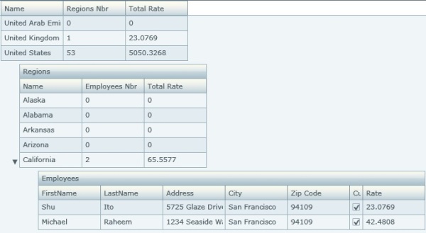
Let's suppose that we run an international company that has employees all across the world. Each employee has a rate. We would like the grid to display the following hierarchy:
Countries
    Regions
        Employees
For each country and region, the grid must display the total rate, which is the sum of the rates of all the employees of the country or the region.
Let's first modify the Person class of our GridBody project.
using Open.Windows.Controls;
using System;

namespace GridBody
{
    public class Person : ContainerDataItem
    {
        public Person(string id, string firstName, string lastName,
                      string address, string city, string zipCode,
                      string stateID, string countryID,
                      double rate, bool isCustomer)
        {
            this.firstName = firstName;
            this.lastName = lastName;
            this.address = address;
            this.city = city;
            this.zipCode = zipCode;
            this.isCustomer = isCustomer;
            this.stateID = stateID;
            this.rate = rate;
        }

        private string firstName;
        public string FirstName
        {
            get { return firstName; }
            set
            {
                if (firstName != value)
                {
                    firstName = value;
                    OnPropertyChanged("FirstName");
                }
            }
        }

        private string lastName;
        public string LastName
        {
            get { return lastName; }
            set
            {
                if (lastName != value)
                {
                    if (string.IsNullOrEmpty(value))
                        throw new Exception("Last name cannot be empty");

                    lastName = value;
                    OnPropertyChanged("LastName");
                }
            }
        }

        private string address;
        public string Address
        {
            get { return address; }
            set
            {
                if (address != value)
                {
                    address = value;
                    OnPropertyChanged("Address");
                }
            }
        }

        private string city;
        public string City
        {
            get { return city; }
            set
            {
                if (city != value)
                {
                    city = value;
                    OnPropertyChanged("City");
                }
            }
        }

        private string zipCode;
        public string ZipCode
        {
            get { return zipCode; }
            set
            {
                if (zipCode != value)
                {
                    zipCode = value;
                    OnPropertyChanged("ZipCode");
                }
            }
        }

        private bool isCustomer;
        public bool IsCustomer
        {
            get { return isCustomer; }
            set
            {
                if (isCustomer != value)
                {
                    isCustomer = value;
                    OnPropertyChanged("IsCustomer");
                }
            }
        }

        private string stateID;
        public string StateID
        {
            get { return stateID; }
            set
            {
                if (stateID != value)
                {
                    stateID = value;
                    OnPropertyChanged("StateID");
                }
            }
        }

        private double rate;
        public double Rate
        {
            get { return rate; }
            set
            {
                if (rate != value)
                {
                    rate = value;
                    OnPropertyChanged("Rate");
                }
            }
        }

        public bool Validate()
        {
            int zipCodeValue = 0;
            int.TryParse(zipCode, out zipCodeValue);
            if ((city.ToUpper() == "NEW YORK") &&
                ((zipCodeValue < 10001) || (zipCodeValue > 10292)))
                return false;

            return true;
        }
    }
}
Let's add a new StateProvince class:
using Open.Windows.Controls;
using System.Collections.Specialized;
namespace GridBody
{
public class StateProvince : ContainerDataItem
{
public StateProvince(string code, string name, string countryRegionCode)
{
this.name = name;
this.code = code;
this.countryRegionCode = countryRegionCode;
this.Children.CollectionChanged += new
System.Collections.Specialized.
GNotifyCollectionChangedEventHandler(Children_CollectionChanged);
}
void Children_CollectionChanged(object sender,
System.Collections.Specialized.GNotifyCollectionChangedEventArgs e)
{
switch (e.Action)
{
case GNotifyCollectionChangedAction.Add:
foreach (Person person in e.NewItems)
{
person.PropertyChanged += new
System.ComponentModel.
PropertyChangedEventHandler(person_PropertyChanged);
this.Rate += person.Rate;
}
break;
case GNotifyCollectionChangedAction.Remove:
foreach (Person person in e.OldItems)
{
person.PropertyChanged -= new
System.ComponentModel.
PropertyChangedEventHandler(person_PropertyChanged);
this.Rate -= person.Rate;
}
break;
case GNotifyCollectionChangedAction.Replace:
foreach (Person person in e.NewItems)
{
person.PropertyChanged += new
System.ComponentModel.
PropertyChangedEventHandler(person_PropertyChanged);
this.Rate += person.Rate;
}
foreach (Person person in e.OldItems)
{
person.PropertyChanged -= new
System.ComponentModel.
PropertyChangedEventHandler(person_PropertyChanged);
this.Rate -= person.Rate;
}
break;
case GNotifyCollectionChangedAction.Reset:
this.Rate = 0;
break;
}
}
void person_PropertyChanged(object sender,
System.ComponentModel.PropertyChangedEventArgs e)
{
if (e.PropertyName == "Rate")
{
double newRate = 0;
foreach (Person person in this.Children)
{
newRate += person.Rate;
}
this.Rate = newRate;
}
}
private string name;
public string Name
{
get { return name; }
set
{
if (name != value)
{
name = value;
OnPropertyChanged("Name");
}
}
}
private string code;
public string Code
{
get { return code; }
set
{
if (code != value)
{
code = value;
OnPropertyChanged("Code");
}
}
}
private string countryRegionCode;
public string CountryRegionCode
{
get { return countryRegionCode; }
set
{
if (countryRegionCode != value)
{
countryRegionCode = value;
OnPropertyChanged("CountryRegionCode");
}
}
}
private double rate;
public double Rate
{
get { return rate; }
set
{
if (rate != value)
{
rate = value;
OnPropertyChanged("Rate");
}
}
}
}
}
Then, let's modify the Country class:
using Open.Windows.Controls;
using System.Collections.Specialized;

namespace GridBody
{
    public class Country : ContainerDataItem
    {
        public Country(string code, string name)
        {
            this.name = name;
            this.code = code;


            this.Children.CollectionChanged += new
              System.Collections.Specialized.
              GNotifyCollectionChangedEventHandler(Children_CollectionChanged);

        }

        void Children_CollectionChanged(object sender,
             System.Collections.Specialized.GNotifyCollectionChangedEventArgs e)
        {
            switch (e.Action)
            {
                case GNotifyCollectionChangedAction.Add:
                    foreach (StateProvince stateProvince in e.NewItems)
                    {
                        stateProvince.PropertyChanged += new
                          System.ComponentModel.
                          PropertyChangedEventHandler(stateProvince_PropertyChanged);
                        this.Rate += stateProvince.Rate;
                    }

                    break;

                case GNotifyCollectionChangedAction.Remove:
                    foreach (StateProvince stateProvince in e.OldItems)
                    {
                        stateProvince.PropertyChanged -= new
                          System.ComponentModel.
                          PropertyChangedEventHandler(stateProvince_PropertyChanged);
                        this.Rate -= stateProvince.Rate;
                    }

                    break;

                case GNotifyCollectionChangedAction.Replace:
                    foreach (StateProvince stateProvince in e.NewItems)
                    {
                        stateProvince.PropertyChanged += new
                          System.ComponentModel.
                          PropertyChangedEventHandler(stateProvince_PropertyChanged);
                        this.Rate += stateProvince.Rate;
                    }

                    foreach (StateProvince stateProvince in e.OldItems)
                    {
                        stateProvince.PropertyChanged -= new
                          System.ComponentModel.
                          PropertyChangedEventHandler(stateProvince_PropertyChanged);
                        this.Rate -= stateProvince.Rate;
                    }

                    break;

                case GNotifyCollectionChangedAction.Reset:
                    this.Rate = 0;
                    break;
            }
        }

        void stateProvince_PropertyChanged(object sender,
             System.ComponentModel.PropertyChangedEventArgs e)
        {
            if (e.PropertyName == "Rate")
            {
                double newRate = 0;
                foreach (StateProvince stateProvince in this.Children)
                {
                    newRate += stateProvince.Rate;
                }

                this.Rate = newRate;
            }
        }

        private string name;
        public string Name
        {
            get { return name; }
            set
            {
                if (name != value)
                {
                    name = value;
                    OnPropertyChanged("Name");
                }
            }
        }

        private string code;
        public string Code
        {
            get { return code; }
            set
            {
                if (code != value)
                {
                    code = value;
                    OnPropertyChanged("Code");
                }
            }
        }

        private double rate;
        public double Rate
        {
            get { return rate; }
            set
            {
                if (rate != value)
                {
                    rate = value;
                    OnPropertyChanged("Rate");
                }
            }
        }
    }
}
Let's modify the constructor of the Page.xaml.cs file and add a new stateProvinceCollection field:
public partial class Page : UserControl
{
    private GObservableCollection<Person> personCollection;
    private GObservableCollection<StateProvince> stateProvinceCollection;
    private GObservableCollection<Country> countryCollection;

    public Page()
    {
        InitializeComponent();

        CreateData();
        MyGridBody.ItemsSource = countryCollection;
    }
    ...
Finally, let's add a CreateData method in the Page class:
private void CreateData()
{
    personCollection = new GObservableCollection<Person>();
    personCollection.Add(new Person("1001", "Terri",
                         "Duffy", "7559 Worth Ct.",
                         "Renton", "98055",
                         "WA", "US", 63.4615, true));
    personCollection.Add(new Person("1002", "Roberto",
                         "Tamburello", "2137 Birchwood Dr",
                         "Redmond", "98052",
                         "WA", "US", 43.2692, true));
    personCollection.Add(new Person("1003", "Michael",
                         "Sullivan", "6510 Hacienda Drive",
                         "Renton", "98055",
                         "WA", "US", 36.0577, false));
    personCollection.Add(new Person("1004", "Sharon",
                         "Salavaria", "7165 Brock Lane",
                         "Renton", "98055", "WA",
                         "US", 32.6923, true));
    personCollection.Add(new Person("1005", "Gail",
                         "Erickson", "9435 Breck Court",
                         "Bellevue", "98004",
                         "WA", "US", 32.6923, true));
    personCollection.Add(new Person("1061", "David", "Hamilton",
                         "4095 Cooper Dr.", "Kenmore", "98028",
                         "WA", "US", 25, true));
    personCollection.Add(new Person("1062", "Jeff", "Hay",
                         "3385 Crestview Drive", "Everett", _
                         "98201", "WA", "US", 25, true));
    personCollection.Add(new Person("1063", "Shane", "Kim",
                         "9745 Bonita Ct.", "Bellevue",
                         "98004", "WA", "US", 25, true));
    .
    .
    .
    .
    .
    .
    personCollection.Add(new Person("1283", "Vamsi", "Kuppa",
                         "9833 Mt. Dias Blv.", "Bothell",
                         "98011", "WA", "US", 9.5, true));
    personCollection.Add(new Person("1284", "Jimmy",
                         "Bischoff", "2176 Brown Street",
                         "Renton", "98055", "WA",
                         "US", 9, true));
    personCollection.Add(new Person("1285", "Susan", "Eaton",
                         "2736 Scramble Rd", "Renton",
                         "98055", "WA", "US", 9, true));
    personCollection.Add(new Person("1286", "Kim", "Ralls",
                         "1226 Shoe St.", "Bothell", "98011",
                         "WA", "US", 9, true));
    personCollection.Add(new Person("1287", "Ken", "S nchez",
                         "4350 Minute Dr.", "Newport Hills",
                         "98006", "WA", "US", 125.5, true));
    personCollection.Add(new Person("1288", "Laura", "Norman",
                         "6937 E. 42nd Street", "Renton",
                         "98055", "WA", "US", 39.06, false));
    personCollection.Add(new Person("1289", "Michael", "Raheem",
                         "1234 Seaside Way", "San Francisco",
                         "94109", "CA", "US", 42.4808, true));
    personCollection.Add(new Person("1290", "Rob", "Walters",
                         "5678 Lakeview Blvd.", "Minneapolis",
                         "55402", "MN", "US", 29.8462, true));


    stateProvinceCollection = new GObservableCollection<StateProvince>();
    stateProvinceCollection.Add(new StateProvince("AB", "Alberta", "CA"));
    stateProvinceCollection.Add(new StateProvince("AK", "Alaska", "US"));
    stateProvinceCollection.Add(new StateProvince("AL", "Alabama", "US"));
    stateProvinceCollection.Add(new StateProvince("AR", "Arkansas", "US"));
    stateProvinceCollection.Add(new StateProvince("AS", "American Samoa", "AS"));
    .
    .
    .
    .
    .
    stateProvinceCollection.Add(new StateProvince("88", "Vosges", "FR"));
    stateProvinceCollection.Add(new StateProvince("89", "Yonne", "FR"));
    stateProvinceCollection.Add(new StateProvince("90", "Belford (Territoire de)", "FR"));
    stateProvinceCollection.Add(new StateProvince("91", "Essonne", "FR"));
    stateProvinceCollection.Add(new StateProvince("92", "Hauts de Seine", "FR"));
    stateProvinceCollection.Add(new StateProvince("93", "Seine Saint Denis", "FR"));
    stateProvinceCollection.Add(new StateProvince("94", "Val de Marne", "FR"));
    stateProvinceCollection.Add(new StateProvince("95", "Val d'Oise", "FR"));

    countryCollection = new GObservableCollection<Country>();
    countryCollection.Add(new Country("AF", "Afghanistan"));
    countryCollection.Add(new Country("AL", "Albania"));
    countryCollection.Add(new Country("DZ", "Algeria"));
    .
    .
    .
    .
    countryCollection.Add(new Country("VE", "Venezuela"));
    countryCollection.Add(new Country("VN", "Vietnam"));
    countryCollection.Add(new Country("VG", "Virgin Islands, British"));
    countryCollection.Add(new Country("VI", "Virgin Islands, U.S."));
    countryCollection.Add(new Country("WF", "Wallis and Futuna"));
    countryCollection.Add(new Country("YE", "Yemen"));
    countryCollection.Add(new Country("ZM", "Zambia"));
    countryCollection.Add(new Country("ZW", "Zimbabwe"));


    foreach (Country country in countryCollection)
    {
        foreach (StateProvince stateProvince in stateProvinceCollection)
        {
            if (stateProvince.CountryRegionCode == country.Code)
                country.Children.Add(stateProvince);
        }
    }

    foreach (Person person in personCollection)
    {
        foreach (StateProvince stateProvince in stateProvinceCollection)
        {
            if (stateProvince.Code == person.StateID)
            {
                stateProvince.Children.Add(person);
                break;
            }
        }
    }
}
Now, let's modify the ItemTemplate property of our GridBody in the Page.xaml file:
<o:HandyContainer.ItemTemplate>
    <g:ItemDataTemplate>
        <Grid>
            <o:HandyDataPresenter DataType="GridBody.Person">
                <g:GStackPanel Orientation="Horizontal">
                    <g:GStackPanel.KeyNavigator>
                        <o:RowSpatialNavigator/>
                    </g:GStackPanel.KeyNavigator>
                    <o:TextCell
                        Text="{Binding FirstName, Mode=TwoWay}"
                        x:Name="FirstName"/>
                    <o:TextCell
                        Text="{Binding LastName, Mode=TwoWay,
                               NotifyOnValidationError=true,
                               ValidatesOnExceptions=true}"
                        x:Name="LastName"/>
                    <o:TextCell
                        Text="{Binding Address, Mode=TwoWay}"
                        x:Name="Address"/>
                    <o:TextCell
                        Text="{Binding City, Mode=TwoWay}"
                        x:Name="City"/>
                    <o:TextCell
                        Text="{Binding ZipCode, Mode=TwoWay}"
                        x:Name="ZipCode"/>
                    <o:CheckBoxCell
                        IsChecked="{Binding IsCustomer, Mode=TwoWay}"
                        x:Name="IsCustomer"/>
                    <o:TextCell
                        Text="{Binding Rate, Mode=TwoWay}"
                        x:Name="PersonRate"/>
                </g:GStackPanel>
            </o:HandyDataPresenter>
            <o:HandyDataPresenter DataType="GridBody.StateProvince">
                <g:GStackPanel Orientation="Horizontal">
                    <g:GStackPanel.KeyNavigator>
                        <o:RowSpatialNavigator/>
                    </g:GStackPanel.KeyNavigator>
                    <o:TextCell
                        Text="{Binding Name, Mode=TwoWay}"
                        x:Name="StateName"/>
                    <o:TextCell
                        Text="{Binding Children.Count}"
                        x:Name="ChildrenCount"
                        CanEdit="False"/>
                    <o:TextCell
                        Text="{Binding Rate}"
                        x:Name="RegionRate"
                        CanEdit="False"/>
                </g:GStackPanel>
            </o:HandyDataPresenter>
            <o:HandyDataPresenter DataType="GridBody.Country">
                <g:GStackPanel Orientation="Horizontal">
                    <g:GStackPanel.KeyNavigator>
                        <o:RowSpatialNavigator/>
                    </g:GStackPanel.KeyNavigator>
                    <o:TextCell
                        Text="{Binding Name, Mode=TwoWay}"
                        x:Name="CountryName"/>
                    <o:TextCell
                        Text="{Binding Children.Count}"
                        x:Name="StateChildrenCount"
                        CanEdit="False"/>
                    <o:TextCell
                        Text="{Binding Rate}"
                        x:Name="CountryRate"
                        CanEdit="False"/>
                </g:GStackPanel>
            </o:HandyDataPresenter>
        </Grid>
    </g:ItemDataTemplate>
</o:HandyContainer.ItemTemplate>
3. Add title
Introduction
When hierarchical data is displayed, the user may sometimes find the display confusing. He may have trouble understanding the different levels of the hierarchy. To make hierarchical data more readable, we will allow our grid to display a title at the top of each level.
ItemTitle control
Control
Let's create an ItemTitle control. This control will be displayed at the top of an item. We will use the NodeLevelActionStates state of the item to make it appear only when the item is the first one after a hierarchical level jump.
Let's add the ItemTitle class in the GoaOpen\Extensions\Grid folder:
using Netika.Windows.Controls;

namespace Open.Windows.Controls
{
    public class ItemTitle : GContentControl
    {
        public ItemTitle()
        {
            this.DefaultStyleKey = typeof(ItemTitle);
        }
    }
}
The ItemTitle control inherits from GContentControl. This will allow us to display almost anything we would like (text, image...) inside it.
Style
Let's create the style of the ItemTitle control and add it to the generic.xaml file just before the Container_RowNodeStyle style:
<Style TargetType="o:ItemTitle">
    <Setter Property="HorizontalAlignment" Value="Stretch" />
    <Setter Property="HorizontalContentAlignment" Value="Stretch" />
    <Setter Property="VerticalContentAlignment" Value="Center" />
    <Setter Property="Cursor" Value="Arrow" />
    <Setter Property="Margin" Value="0"/>
    <Setter Property="Background"
      Value="{StaticResource DefaultDarkGradientBottomVertical}" />
    <Setter Property="Foreground"
      Value="{StaticResource DefaultForeground}"/>
    <Setter Property="FontSize" Value="11" />
    <Setter Property="IsTabStop" Value="False" />
    <Setter Property="BorderBrush"
      Value="{StaticResource DefaultListControlStroke}"/>
    <Setter Property="BorderThickness" Value="1"/>
    <Setter Property="Padding" Value="5,4,4,3" />
    <Setter Property="Template">
        <Setter.Value>
            <ControlTemplate TargetType="o:ItemTitle">
                <Grid x:Name="LayoutRoot">
                    <Grid.RowDefinitions>
                        <RowDefinition Height="1*" />
                        <RowDefinition Height="1*" />
                    </Grid.RowDefinitions>
                    <Rectangle x:Name="BackgroundVisual"
                      Fill="{TemplateBinding Background}"
                      Grid.RowSpan="2"/>
                    <Rectangle
                      Fill="{StaticResource DefaultReflectVertical}"
                      Margin="1,1,1,0" />
                    <g:GContentPresenter
                      x:Name="ELEMENT_ContentPresenter"
                      Content="{TemplateBinding Content}"
                      ContentTemplate="{TemplateBinding ContentTemplate}"
                      OrientatedHorizontalAlignment="Left"
                      OrientatedMargin="{TemplateBinding Padding}"
                      OrientatedVerticalAlignment=
                        "{TemplateBinding VerticalContentAlignment}"
                      PresenterOrientation=
                        "{TemplateBinding PresenterOrientation}"
                      Grid.RowSpan="2"/>
                    <Rectangle x:Name="BorderElement"
                               Stroke="{TemplateBinding BorderBrush}"
                               StrokeThickness=
                                 "{TemplateBinding BorderThickness}"
                               Margin="-1,0,0,-1"
                               Grid.RowSpan="2"/>
                </Grid>
            </ControlTemplate>
        </Setter.Value>
    </Setter>
</Style>
Basically, the ItemTitle control has the same style as a standard GContentControl except that we have added a background and a border to it.
Add the ItemTitle in Container_RowNodeStyle
Let's add the ItemTitle in Container_RowNodeStyle in order that it is displayed at the top of the item.
If we draw on a picture the ControlTemplate part of the the Container_RowNodeStyle style, it will look like this:
The ItemTitle must be displayed exactly above the content of the ContainerItem. It must be located at the right of the Node Expansion button. Therefore, after the insertion of the ItemTitle, our picture will look like this:
Let's modify the Container_RowNodeStyle accordingly:
<Style x:Key="Container_RowNodeStyle" TargetType="o:HandyListItem">
<Setter Property="HorizontalAlignment" Value="Left" />
<Setter Property="HorizontalContentAlignment" Value="Stretch" />
<Setter Property="VerticalContentAlignment" Value="Center" />
<Setter Property="Cursor" Value="Arrow" />
<Setter Property="Padding" Value="0" />
<Setter Property="Margin" Value="0"/>
<Setter Property="Foreground" Value="{StaticResource DefaultForeground}"/>
<Setter Property="Background" Value="{StaticResource DefaultControlBackground}" />
<Setter Property="FontSize" Value="11" />
<Setter Property="Indentation" Value="10" />
<Setter Property="IsTabStop" Value="True" />
<Setter Property="IsKeyActivable" Value="True"/>
<Setter Property="ItemUnpressDropDownBehavior" Value="CloseAll" />
<Setter Property="BorderBrush" Value="{StaticResource DefaultListControlStroke}"/>
<Setter Property="BorderThickness" Value="1"/>
<Setter Property="Indentation" Value="30"/>
<Setter Property="Template">
<Setter.Value>
<ControlTemplate TargetType="o:HandyListItem">
<Grid x:Name="LayoutRoot">
<vsm:VisualStateManager.VisualStateGroups>
<vsm:VisualStateGroup x:Name="CommonStates">
<vsm:VisualState x:Name="Normal"/>
<vsm:VisualState x:Name="Disabled">
<Storyboard>
<DoubleAnimation
Duration="0"
Storyboard.TargetName="ELEMENT_ContentPresenter"
Storyboard.TargetProperty="Opacity" To="0.6"/>
<DoubleAnimation
Duration="0"
Storyboard.TargetName="SelectedVisual"
Storyboard.TargetProperty="Opacity"
To="0.6"/>
<ObjectAnimationUsingKeyFrames
Storyboard.TargetName="SelectedReflectVisual"
Storyboard.TargetProperty="Visibility"
Duration="0">
<DiscreteObjectKeyFrame KeyTime="0">
<DiscreteObjectKeyFrame.Value>
<Visibility>Visible</Visibility>
</DiscreteObjectKeyFrame.Value>
</DiscreteObjectKeyFrame>
</ObjectAnimationUsingKeyFrames>
<DoubleAnimation
Duration="0"
Storyboard.TargetName="HasItem"
Storyboard.TargetProperty="Opacity"
To="0.6"/>
</Storyboard>
</vsm:VisualState>
</vsm:VisualStateGroup>
<vsm:VisualStateGroup x:Name="FocusStates">
<vsm:VisualState x:Name="NotFocused"/>
<vsm:VisualState x:Name="Focused">
<Storyboard>
<ObjectAnimationUsingKeyFrames
Storyboard.TargetName="FocusVisual"
Storyboard.TargetProperty="Visibility"
Duration="0">
<DiscreteObjectKeyFrame KeyTime="0">
<DiscreteObjectKeyFrame.Value>
<Visibility>Visible</Visibility>
</DiscreteObjectKeyFrame.Value>
</DiscreteObjectKeyFrame>
</ObjectAnimationUsingKeyFrames>
</Storyboard>
</vsm:VisualState>
</vsm:VisualStateGroup>
<vsm:VisualStateGroup x:Name="MouseOverStates">
<vsm:VisualState x:Name="NotMouseOver"/>
<vsm:VisualState x:Name="MouseOver">
<Storyboard>
<ObjectAnimationUsingKeyFrames
Storyboard.TargetName="MouseOverVisual"
Storyboard.TargetProperty="Visibility"
Duration="0">
<DiscreteObjectKeyFrame KeyTime="0">
<DiscreteObjectKeyFrame.Value>
<Visibility>Visible</Visibility>
</DiscreteObjectKeyFrame.Value>
</DiscreteObjectKeyFrame>
</ObjectAnimationUsingKeyFrames>
</Storyboard>
</vsm:VisualState>
</vsm:VisualStateGroup>
<vsm:VisualStateGroup x:Name="PressedStates">
<vsm:VisualState x:Name="NotPressed"/>
<vsm:VisualState x:Name="Pressed">
<Storyboard>
<ObjectAnimationUsingKeyFrames
Storyboard.TargetName="PressedVisual"
Storyboard.TargetProperty="Visibility"
Duration="0">
<DiscreteObjectKeyFrame KeyTime="0">
<DiscreteObjectKeyFrame.Value>
<Visibility>Visible</Visibility>
</DiscreteObjectKeyFrame.Value>
</DiscreteObjectKeyFrame>
</ObjectAnimationUsingKeyFrames>
</Storyboard>
</vsm:VisualState>
</vsm:VisualStateGroup>
<vsm:VisualStateGroup x:Name="SelectedStates">
<vsm:VisualState x:Name="NotSelected"/>
<vsm:VisualState x:Name="Selected">
<Storyboard>
<ObjectAnimationUsingKeyFrames
Storyboard.TargetName="SelectedVisual"
Storyboard.TargetProperty="Visibility"
Duration="0">
<DiscreteObjectKeyFrame KeyTime="0">
<DiscreteObjectKeyFrame.Value>
<Visibility>Visible</Visibility>
</DiscreteObjectKeyFrame.Value>
</DiscreteObjectKeyFrame>
</ObjectAnimationUsingKeyFrames>
</Storyboard>
</vsm:VisualState>
</vsm:VisualStateGroup>
<vsm:VisualStateGroup x:Name="HasItemsStates">
<vsm:VisualState x:Name="NotHasItems"/>
<vsm:VisualState x:Name="HasItems">
<Storyboard>
<ObjectAnimationUsingKeyFrames
Storyboard.TargetName="HasItem"
Storyboard.TargetProperty="Visibility"
Duration="0">
<DiscreteObjectKeyFrame KeyTime="0">
<DiscreteObjectKeyFrame.Value>
<Visibility>Visible</Visibility>
</DiscreteObjectKeyFrame.Value>
</DiscreteObjectKeyFrame>
</ObjectAnimationUsingKeyFrames>
</Storyboard>
</vsm:VisualState>
</vsm:VisualStateGroup>
<vsm:VisualStateGroup x:Name="IsExpandedStates">
<vsm:VisualState x:Name="NotIsExpanded"/>
<vsm:VisualState x:Name="IsExpanded">
<Storyboard>
<ObjectAnimationUsingKeyFrames
Storyboard.TargetName="CheckedArrow"
Storyboard.TargetProperty="Visibility"
Duration="0">
<DiscreteObjectKeyFrame KeyTime="0">
<DiscreteObjectKeyFrame.Value>
<Visibility>Visible</Visibility>
</DiscreteObjectKeyFrame.Value>
</DiscreteObjectKeyFrame>
</ObjectAnimationUsingKeyFrames>
<ObjectAnimationUsingKeyFrames
Storyboard.TargetName="ArrowUnchecked"
Storyboard.TargetProperty="Visibility"
Duration="0">
<DiscreteObjectKeyFrame KeyTime="0">
<DiscreteObjectKeyFrame.Value>
<Visibility>Collapsed</Visibility>
</DiscreteObjectKeyFrame.Value>
</DiscreteObjectKeyFrame>
</ObjectAnimationUsingKeyFrames>
</Storyboard>
</vsm:VisualState>
</vsm:VisualStateGroup>
<vsm:VisualStateGroup x:Name="AlternateStates">
<vsm:VisualState x:Name="NotIsAlternate"/>
<vsm:VisualState x:Name="IsAlternate">
<Storyboard>
<ObjectAnimationUsingKeyFrames
Storyboard.TargetName="AlternateBackgroundVisual"
Storyboard.TargetProperty="Visibility"
Duration="0">
<DiscreteObjectKeyFrame KeyTime="0">
<DiscreteObjectKeyFrame.Value>
<Visibility>Visible</Visibility>
</DiscreteObjectKeyFrame.Value>
</DiscreteObjectKeyFrame>
</ObjectAnimationUsingKeyFrames>
<ObjectAnimationUsingKeyFrames
Storyboard.TargetName="BackgroundVisual"
Storyboard.TargetProperty="Visibility"
Duration="0">
<DiscreteObjectKeyFrame KeyTime="0">
<DiscreteObjectKeyFrame.Value>
<Visibility>Collapsed</Visibility>
</DiscreteObjectKeyFrame.Value>
</DiscreteObjectKeyFrame>
</ObjectAnimationUsingKeyFrames>
</Storyboard>
</vsm:VisualState>
</vsm:VisualStateGroup>
<vsm:VisualStateGroup x:Name="InvertedStates">
<vsm:VisualState x:Name="InvertedItemsFlowDirection">
<Storyboard>
<ObjectAnimationUsingKeyFrames
Storyboard.TargetName="ArrowCheckedToTop"
Storyboard.TargetProperty="Visibility"
Duration="0">
<DiscreteObjectKeyFrame KeyTime="0">
<DiscreteObjectKeyFrame.Value>
<Visibility>Visible</Visibility>
</DiscreteObjectKeyFrame.Value>
</DiscreteObjectKeyFrame>
</ObjectAnimationUsingKeyFrames>
<ObjectAnimationUsingKeyFrames
Storyboard.TargetName="ArrowCheckedToBottom"
Storyboard.TargetProperty="Visibility"
Duration="0">
<DiscreteObjectKeyFrame KeyTime="0">
<DiscreteObjectKeyFrame.Value>
<Visibility>Collapsed</Visibility>
</DiscreteObjectKeyFrame.Value>
</DiscreteObjectKeyFrame>
</ObjectAnimationUsingKeyFrames>
</Storyboard>
</vsm:VisualState>
<vsm:VisualState x:Name="NormalItemsFlowDirection"/>
</vsm:VisualStateGroup>
<vsm:VisualStateGroup x:Name="ValidStates">
<vsm:VisualState x:Name="Valid"/>
<vsm:VisualState x:Name="NotValid">
<Storyboard>
<ObjectAnimationUsingKeyFrames
Storyboard.TargetName="ValidElement"
Storyboard.TargetProperty="Visibility"
Duration="0">
<DiscreteObjectKeyFrame KeyTime="0">
<DiscreteObjectKeyFrame.Value>
<Visibility>Visible</Visibility>
</DiscreteObjectKeyFrame.Value>
</DiscreteObjectKeyFrame>
</ObjectAnimationUsingKeyFrames>
</Storyboard>
</vsm:VisualState>
</vsm:VisualStateGroup>
<vsm:VisualStateGroup x:Name="NodeLevelActionStates">
<vsm:VisualState x:Name="NormalLevelNode"/>
<vsm:VisualState x:Name="JumpLevelNode">
<Storyboard>
<ObjectAnimationUsingKeyFrames
Storyboard.TargetName="NodeSpacerRectangle"
Storyboard.TargetProperty="Visibility"
Duration="0">
<DiscreteObjectKeyFrame KeyTime="0">
<DiscreteObjectKeyFrame.Value>
<Visibility>Visible</Visibility>
</DiscreteObjectKeyFrame.Value>
</DiscreteObjectKeyFrame>
</ObjectAnimationUsingKeyFrames>
</Storyboard>
</vsm:VisualState>
</vsm:VisualStateGroup>
</vsm:VisualStateManager.VisualStateGroups>
<Grid.RowDefinitions>
<RowDefinition Height="*"/>
<RowDefinition Height="Auto"/>
</Grid.RowDefinitions>
<Rectangle x:Name="NodeSpacerRectangle"
Height="6" Grid.Row="0" Visibility="Collapsed"/>
<StackPanel Orientation="Horizontal" Grid.Row="1">
<Rectangle Width="{TemplateBinding FullIndentation}" />
<Grid MinWidth="22" Margin="0,0,1,0">
<Grid x:Name="HasItem"
Visibility="Collapsed"
Height="16" Width="16"
Margin="0,0,0,0"
VerticalAlignment="Bottom">
<Path x:Name="ArrowUnchecked"
HorizontalAlignment="Right"
Height="8" Width="8"
Fill="{StaticResource DefaultForeground}"
Stretch="Fill"
Data="M 4 0 L 8 4 L 4 8 Z" />
<Grid x:Name="CheckedArrow" Visibility="Collapsed">
<Path x:Name="ArrowCheckedToTop"
HorizontalAlignment="Right"
Height="8" Width="8"
Fill="{StaticResource DefaultForeground}"
Stretch="Fill"
Data="M 8 4 L 0 4 L 4 0 z"
Visibility="Collapsed"/>
<Path x:Name="ArrowCheckedToBottom"
HorizontalAlignment="Right"
Height="8" Width="8"
Fill="{StaticResource DefaultForeground}"
Stretch="Fill"
Data="M 0 4 L 8 4 L 4 8 Z" />
</Grid>
<ToggleButton
x:Name="ELEMENT_ExpandButton"
Height="16" Width="16"
Style="{StaticResource EmptyToggleButtonStyle}"
IsChecked="{TemplateBinding IsExpanded}"
IsThreeState="False" IsTabStop="False"/>
</Grid>
</Grid>
<g:GDockPanel Background="Transparent">
<o:ItemTitle g:GDockPanel.Dock="Top"
Visibility="Collapsed" x:Name="ItemTitle" />
<Grid g:GDockPanel.Dock="Fill">
<Border x:Name="BackgroundVisual"
Background="{TemplateBinding Background}" />
<Rectangle
Fill="{StaticResource
DefaultAlternativeBackground}"
x:Name="AlternateBackgroundVisual"
Visibility="Collapsed"/>
<Grid x:Name="SelectedVisual"
Visibility="Collapsed" >
<Grid.RowDefinitions>
<RowDefinition Height="1*"/>
<RowDefinition Height="1*"/>
</Grid.RowDefinitions>
<Rectangle Fill="{StaticResource DefaultDownColor}"
Grid.RowSpan="2"/>
<Rectangle
x:Name="SelectedReflectVisual"
Fill="{StaticResource DefaultReflectVertical}"
Margin="0,1,1,0" RadiusX="1"
RadiusY="1"/>
</Grid>
<Rectangle
x:Name="MouseOverVisual"
Fill="{StaticResource
DefaultDarkGradientBottomVertical}"
Visibility="Collapsed" Margin="0,0,1,0"/>
<Grid x:Name="PressedVisual"
Visibility="Collapsed">
<Grid.RowDefinitions>
<RowDefinition Height="1*"/>
<RowDefinition Height="1*"/>
</Grid.RowDefinitions>
<Rectangle
Fill="{StaticResource DefaultDownColor}"
Grid.RowSpan="2"/>
<Rectangle
Fill="{StaticResource
DefaultDarkGradientBottomVertical}"
Grid.Row="1" Margin="0,0,1,0"/>
<Rectangle
Fill="{StaticResource DefaultReflectVertical}"
Margin="0,1,1,0"
RadiusX="1" RadiusY="1"/>
</Grid>
<Rectangle
HorizontalAlignment="Stretch"
VerticalAlignment="Top"
Stroke="{TemplateBinding BorderBrush}"
StrokeThickness="0.5"
Height="1"/>
<Rectangle
Name="ValidElement"
Stroke="Red"
StrokeThickness="1.5"
IsHitTestVisible="false"
Visibility="Collapsed"
Margin="1,2,2,1"/>
<Rectangle
x:Name="FocusVisual"
Stroke="{StaticResource DefaultFocus}"
StrokeDashCap="Round" Margin="1,2,2,1"
StrokeDashArray=".2 2"
Visibility="Collapsed"/>
<g:GContentPresenter
x:Name="ELEMENT_ContentPresenter"
Content="{TemplateBinding Content}"
ContentTemplate=
"{TemplateBinding ContentTemplate}"
Cursor="{TemplateBinding Cursor}"
OrientatedHorizontalAlignment=
"{TemplateBinding HorizontalContentAlignment}"
OrientatedMargin="{TemplateBinding Padding}"
OrientatedVerticalAlignment=
"{TemplateBinding VerticalContentAlignment}"
PresenterOrientation=
"{TemplateBinding PresenterOrientation}"/>
<Rectangle
x:Name="BorderElement"
Stroke="{TemplateBinding BorderBrush}"
StrokeThickness=
"{TemplateBinding BorderThickness}"
Margin="-1,0,0,-1"/>
</Grid>
</g:GDockPanel>
</StackPanel>
</Grid>
</ControlTemplate>
</Setter.Value>
</Setter>
</Style>
Add an ItemTitleSource and an ItemTitleStartDepth property to HandyContainer
The HandyContainer (i.e., our grid's body) needs to know what to put inside the content of the ItemTitle. This will be the purpose of the ItemTitleSource property that we are going to add to the HandyContainer class.
Most of the time, we probably will not want that the ItemTitle to be displayed for all the levels of the hierarchy (generally, not for the first level). Therefore, we will also add the ItemTitleStartDepth property. This property will tell the grid's body from which level it must start to display the titles of the items. In the picture below, the titles are displayed at the first and second levels of the hierarchy, but they are not displayed at the root level.
Let's add these two dependency properties to our HandyContainer partial class. Edit the HandyContainer.cs file located in the GoaOpen\Extensions\Grid folder. Add the two dependency properties at the beginning of the file:
public partial class HandyContainer : HandyListControl
{
    public static readonly DependencyProperty ItemTitleSourceProperty =
      DependencyProperty.Register("ItemTitleSource",
      typeof(string), typeof(HandyContainer), null);
    public static readonly DependencyProperty ItemTitleStartDepthProperty =
      DependencyProperty.Register("ItemTitleStartDepth", typeof(int),
      typeof(HandyContainer), new PropertyMetadata(1));

    public event EventHandler CurrentCellNameChanged;
...
By default, the ItemTitleStartDepth value is "1". This means that the ItemTitle will be displayed from the first level (and not the root level).
Let's also add the corresponding property setters and getters to our class:
public string ItemTitleSource
{
    get
    {
        return (string)this.GetValue(ItemTitleSourceProperty);
    }
    set
    {
        base.SetValue(ItemTitleSourceProperty, value);
    }
}

public int ItemTitleStartDepth
{
    get
    {
        return (int)this.GetValue(ItemTitleStartDepthProperty);
    }
    set
    {
        base.SetValue(ItemTitleStartDepthProperty, value);
    }
}
In our GridBody project, let's modify the Person class and add a Title property to it. This property will be used as the Source of the ItemTitle:
public string Title
{
    get { return "Persons"; }
}
Let's do the same for the Country class...:
public string Title
{
    get { return "Countries"; }
}
...and the StateProvince class:
public string Title
{
    get { return "Regions"; }
}
Let's also modify the Page.xaml file of the GridBody project and give a value to the ItemTitleSource property of the HandyContainer:
<o:HandyContainer
   x:Name="MyGridBody"
   VirtualMode="On"
   AlternateType="Items"
   HandyDefaultItemStyle="Node"
   HandyStyle="GridBodyStyle"
   CurrentCellValidating="MyGridBody_CurrentCellValidating"
   CurrentItemValidating="MyGridBody_CurrentItemValidating"
   ItemTitleSource="Title"
   g:GDockPanel.Dock="Fill">
Reference the ItemTitle and make it visible
We need to make a reference to the ItemTitle control in the OnApplyTemplate method of the ContainerItem class.
Let's edit our ContainerItem partial class located in the GoaOpen\Extensions\Grid folder and modify the OnApplyTemplate method:
private ItemTitle itemTitle;
public override void OnApplyTemplate()
{
    cellCollection = null;

    _OnApplyTemplate();
    base.OnApplyTemplate();

    itemTitle = this.GetTemplateChild("ItemTitle") as ItemTitle;

    ApplyHeadingVisibility();
}
The ApplyHeadingVisibility method will decide of the visibility of the ItemTitle according to the NodeLevelAction state of the item and the ItemTitleStartDepth property value of the parent HandyContainer. The ApplyHeadingVisibility method will call a method named ApplyTitleContent which will fill the contents of the ItemTitle according to the ItemTitleSource value of the parent HandyContainer.
In order to make these two methods work, we will need to add two "using" clauses at the top of the ContainerItem file:
using System.Reflection;
using Netika.Windows.Controls;

internal virtual void ApplyHeadingVisibility()
{
    if (itemTitle == null)
        return;

    Visibility headingVisibility = Visibility.Collapsed;
    if (this.NodeLevelAction == NodeLevelAction.LevelJump)
        headingVisibility = Visibility.Visible;

    HandyContainer parentContainer =
       HandyContainer.GetParentContainer(this);
    int parentCount = this.ParentCount;

    Visibility titleVisibility = Visibility.Collapsed;
    if ((parentContainer.ItemTitleStartDepth >= 0) &&
        (parentCount > parentContainer.ItemTitleStartDepth))
        titleVisibility = headingVisibility;

    if ((itemTitle != null) && (itemTitle.Visibility != titleVisibility))
    {
        if (titleVisibility == Visibility.Visible)
            ApplyTitleContent();

        itemTitle.Visibility = titleVisibility;
    }

}

private void ApplyTitleContent()
{
    if (itemTitle != null)
    {
        HandyContainer parentContainer = HandyContainer.GetParentContainer(this);
        if (!string.IsNullOrEmpty(parentContainer.ItemTitleSource))
        {
            PropertyInfo propInfo =
              this.DataContext.GetType().GetProperty(parentContainer.ItemTitleSource);
            if (propInfo != null)
                itemTitle.Content = propInfo.GetValue(this.DataContext, null);
        }
    }
}
Let's try our changes by starting the GridBody project. The ItemTitles are displayed at the top of the first person item and at the top of the first region at each level of the hierarchy. Now, let's try to scroll the grid. When we scroll, the ItemTitles are displayed erratically. Sometimes they are displayed at the wrong place. Other times, they are not displayed at all. What has happened?
Override the OnNodeLevelActionChanged and the OnRefreshed methods
Our GridBody is working using a VirtualMode. In order to keep the performance of the grid as fast as possible, only the displayed items (and a little more) are created in the Visual Tree. Furthermore, when the grid is scrolled, rather than destroying existing items and creating new ones, existing items are reused as often as possible (creating a new control and adding it to the Visual Tree is a process that is extremely time consuming).
When an item is reused, the OnApplyTemplate of the item is not called anymore. Therefore, the ApplyHeadingVisibility method is not called on these items. This is why the title of the items are not displayed at the correct place as soon as we scroll the grid.
In order to make the ItemTitle display correctly, we must override the OnNodeLevelActionChanged and the OnRefreshed methods of the ContainerItem.
The OnNodeLevelActionChanged method is called each time the NodeLevelAction state of an item has changed. The OnRefresh method is called each time the ContainerItem has been reused and it is bound to another element of the ItemsSource.
The ApplyHeadingVisibility method must be called each time one of these methods is called.
protected override void OnNodeLevelActionChanged(EventArgs e)
{
    base.OnNodeLevelActionChanged(e);

    ApplyHeadingVisibility();
}

protected override void OnRefreshed(EventArgs e)
{
    base.OnRefreshed(e);

    ApplyHeadingVisibility();
}
Furthermore, we must modify ApplyHeadingVisibility in order to take into account that an item can be reused. Let's suppose that an item displays one type of element and its NodeLevelAction state is LevelJump. The user scrolls the grid and the item is reused, but this time, to display another type of element. When it is used again, the item is located at a place where its NodeLevelAction state is LevelJump. As the ItemTitle was already visible before the item was reused, the ApplyTitleContent method is not called inside ApplyHeadingVisiblity and the content of the ItemTitle is not refreshed. Therefore, the ItemTitle displays a wrong title!
To correct this, let's remove the second condition in the if statement of the ApplyHeadingVisibility method:
if ((itemTitle != null) && (itemTitle.Visibility != titleVisibility))

if (itemTitle != null)
{
    if (titleVisibility == Visibility.Visible)
        ApplyTitleContent();

    itemTitle.Visibility = titleVisibility;
}
If we start our application again and scroll the grid, the ItemTitles are displayed at the correct locations.
Dynamic ItemTitleSource or ItemTitleStartDepth
The way ItemTitleSource and ItemTitleStartDepth are implemented, when their values are modified, the titles displayed inside the grid's body are not updated automatically. In order to implement this feature, we should track the ItemTitleSource and ItemTitleStartDepth value changes. This could be implemented in an enhanced version of our grid.
ItemTitle click
If we try to click an item title, we can see that the item containing the item title is selected. This is not the behavior we would like. Clicking an ItemTitle should not have any effect on the item holding it.
Let's modify the ItemTitle class and override the OnMouseLeftButtonDown method to remove this unwanted behavior:
public class ItemTitle : GContentControl
{
    public ItemTitle()
    {
        this.DefaultStyleKey = typeof(ItemTitle);
    }

    protected override void OnMouseLeftButtonDown(
              System.Windows.Input.MouseButtonEventArgs e)
    {
        e.Handled = true;

        base.OnMouseLeftButtonDown(e);
    }
}
ItemTitle MouseOver
If we move the pointer of the mouse over an item title, we can see that the background of the item containing the item title is displayed using an alternate color. This is because the ItemTitle is part of the item holding it.
Let's trap the MouseEnter and MouseLeave events of the ItemTitle to get rid of this behavior.
Let's first modify the OnApplyTemplate method of the ContainerItem:
private ItemTitle itemTitle;
public override void OnApplyTemplate()
{
    cellCollection = null;

    _OnApplyTemplate();
    base.OnApplyTemplate();

    if (itemTitle != null)
    {
        itemTitle.MouseEnter -= new MouseEventHandler(headers_MouseEnter);
        itemTitle.MouseLeave -= new MouseEventHandler(headers_MouseLeave);
    }
    itemTitle = this.GetTemplateChild("ItemTitle") as ItemTitle;
    if (itemTitle != null)
    {
        itemTitle.MouseEnter += new MouseEventHandler(headers_MouseEnter);
        itemTitle.MouseLeave += new MouseEventHandler(headers_MouseLeave);
    }

    ApplyHeadingVisibility();
}
Let's implement the headers_MouseEnter and the headers_MouseLeave methods:
void headers_MouseLeave(object sender, MouseEventArgs e)
{
    GoToState("NotMouseOverHeading", true);
}

void headers_MouseEnter(object sender, MouseEventArgs e)
{
    GoToState("MouseOverHeading", true);
}
We have added two more states to the ContainerItem: the NotMouseOverHeading state and the MouseOverHeading state. We now need to modify the ContainerItem style to take into account these two new states.
Locate Container_RowNodeStyle in the generic.xaml file. Add the following VisualStateGroup at the end of the VisualStateManager.VisualStateGroups of the style:
<vsm:VisualStateGroup x:Name="MouseOverHeadingStates">
    <vsm:VisualState x:Name="NotMouseOverHeading"/>
    <vsm:VisualState x:Name="MouseOverHeading">
        <Storyboard>
            <DoubleAnimation
                Duration="0"
                Storyboard.TargetName="MouseOverVisual"
                Storyboard.TargetProperty="Opacity" To="0"/>
        </Storyboard>
    </vsm:VisualState>
</vsm:VisualStateGroup>
If we start our application again and move the mouse over an ItemTitle, the background of the item holding the title remains unchanged.
4. Body headers
Introduction
We will call "body headers" the headers that are displayed inside the body of the grid. The headers that are displayed at the top of the grid will be called "top headers".
The process to create a grid can be subdivided in to three steps:
- Add a
HandyContainer to our XAML page and set its properties appropriately. - Write the
ItemTemplate of the HandyContainer in order to choose the way the cells inside the rows (i.e., the items) will be displayed. - Fill the
ItemsSource property of the HandyContainer.
Our requirement is the following: we do not want to add a separate step to define the body headers. The headers must be laid out the same way as the cells of the rows.
For instance, if the ItemTemplate of the HandyContainer displays the rows of the grid the following way:
then the header must be displayed the same way:
Therefore, the ItemTemplate that is used to build the rows of the grid will also be used to build the headers.
Update the Cell class
Introduction
The ItemTemplate attached to our GridBody's HandyContainer will be used to build both the rows and the headers. Consequently, it must be possible to define some behaviors of the headers when defining the ItemTemplate of the HandyContainer.
In order to allow this feature, we will add two properties to the Cell class:
Header: This property will allow defining the content of the header attached to the cell. In other words, it will allow to define what will be displayed (text, image...) inside the header.UserResizeType: The way the user can resize the header and, consequently, the cells. Possible values will be None, Right, and Bottom.
Create the HeaderResizeTypes enum
Let's create the enum that will allow populating the UserResizeType property of the Cell class. In the GoaOpen\Extensions\Grid folder, create the new HeaderResizeType file:
using System;

namespace Open.Windows.Controls
{
    [Flags]
    public enum HeaderResizeTypes
    {
        None = 0,
        Right = 1,
        Bottom = 2
    }
}
The options represented by the enum can be combined together in order to have a header that can be right resized and bottom resized at the same time. Therefore, we have applied the "Flags" attribute to the enum.
Let's now add the Header and UserResizeType properties of the Cell class:
public abstract class Cell : Control
{
    public static readonly DependencyProperty CanEditProperty;
    public static readonly DependencyProperty UserResizeTypeProperty;
    public static readonly DependencyProperty HeaderProperty;

    static Cell()
    {
        CanEditProperty = DependencyProperty.Register("CanEdit",
                          typeof(bool), typeof(Cell), new PropertyMetadata(true));
        UserResizeTypeProperty = DependencyProperty.Register("UserResizeType",
                                 typeof(HeaderResizeTypes), typeof(Cell),
                                 new PropertyMetadata(HeaderResizeTypes.Right));
        HeaderProperty = DependencyProperty.Register(
           "Header", typeof(object), typeof(Cell), null);

    }

    public HeaderResizeTypes UserResizeType
    {
        get { return (HeaderResizeTypes)GetValue(UserResizeTypeProperty); }
        set { SetValue(UserResizeTypeProperty, value); }
    }

    public object Header
    {
        get { return GetValue(HeaderProperty); }
        set { SetValue(HeaderProperty, value); }
    }
Create and display the HeadersContainer controls
Introduction
A "grid header" will be made of a HeadersContainer holding the headers.
Let's first start to create an empty HeadersContainer and display it at the right location inside the grid body.
HeadersContainer class
In the GoaOpen\Extensions\Grid folder, let's add the HeadersContainer class:
using System;
using System.Collections.Generic;
using System.Windows;
using System.Windows.Controls;
using System.Windows.Media;
using Netika.Windows.Controls;

namespace Open.Windows.Controls
{
    public class HeadersContainer : GContentControl
    {
        public HeadersContainer()
        {
            this.DefaultStyleKey = typeof(HeadersContainer);
        }
    }
}
The HeadersContainer is a ContentControl. We have chosen to inherit from ContentControl because, later on, we will apply the ItemTemplate of the HandyContainer to the ContentTemplate of the HeadersContainer control. This will allow us to apply the same layout to the headers as the layout that is applied to the cell.
For now, let's just keep the HeadersContainer very simple.
HeadersContainer style
We need to define a style for the HeadersContainer.
At this stage, we will make a very simple one. Open the generic.xaml file of the GoaOpen project and navigate to the end of the file. Add the following style:
<Style TargetType="o:HeadersContainer">
    <Setter Property="Template">
        <Setter.Value>
            <ControlTemplate TargetType="o:HeadersContainer">
                <Grid  x:Name="LayoutRoot">
                    <g:GContentPresenter
                            x:Name="ELEMENT_ContentPresenter"/>
                </Grid>
            </ControlTemplate>
        </Setter.Value>
    </Setter>
</Style>
Display the HeadersContainer inside the GridBody
Introduction
The HeadersContainer will be displayed the same way and just below the ItemTitle. As we have already performed all the necessary steps to be able to display an ItemTitle at the right place inside our grid's body, it is very easy to display the headers. We simply have to repeat the same steps. Right?
Not right!!!!
The ItemTitle is a very simple control that requires only a small amount of time to be laid out and displayed. On the contrary, the HeadersContainer is far more complicated. It requires a DataTemplate to be applied to it in order to be correctly laid out. It will also contain several header children controls. As a header can be resized (not always), it will contain a WindowSizer inside it. Therefore, the headers will be controls that are not simple to lay out and display.
We must take into account the fact that the HeadersContainers will be slow to render, and try to keep the data grid as fast as possible especially when the user scrolls it. Silverlight has a lot of great features, but one of its weaknesses is that it is very slow when laying out and rendering the VisualTree. We must keep this fact in mind when designing new controls.
When we say that the laying out and rendering process is very slow, it does not mean that the process itself takes several seconds to complete. It means that if several operations of this kind are processed at the same time, the whole process can take too much time and make the user interaction with the user interface not smooth anymore.
Until now, we have not really taken care of this aspect because the HandyContainer took it in charge.
Let's take an example. Let's suppose that we have an application displaying the following grid:
Let's suppose that the user press the page-down key and the following rows are displayed:
If we do not take care of what we do, in the case described above, six new headers will be created, laid out, and rendered when the user presses the page-down key. In other cases, it can be worse. This can make the scrolling process a lot slower than it is now.
The only way to avoid this problem is to keep the headers visible in the Visual Tree once they have been created, and reuse them as often as possible.
In order to do that, we will add a Canvas inside our GridBody. We will add our HeadersContainer to this canvas and reuse it as often as possible.
The Canvas is a panel that suits our needs because it allows us to manage exactly the location where the HeadersContainer must be displayed. The fact that it is possible to move a HeadersContainer from one place to another inside the canvas does not imply that the HeadersContainer will be laid out again (as soon as we keep the same height and the same width). This is the most important feature. In our case, the canvas will also be used as a cache. As soon as a HeadersContainer is not needed, it will be moved to a location where it is not visible by the user (for instance, (-1000, -1000)). This way, even if the HeadersContainer is not visible any more, it is still part of the Visual Tree. As soon as we will need a cached HeadersContainer again, we will move it back to the visible area of the canvas. This process will not require the HeadersContainer to be created or laid out again.
Add a Canvas to the HandyContainer
Let's modify the GridBody style and add the canvas that will contain the HeaderContainers inside it.
Locate the GridBodyStyle style inside the generic.xaml file. Locate the Scroller inside the Control template, and replace it with this one:
<g:Scroller
    x:Name="ElementScroller"
    Style="{TemplateBinding ScrollerStyle}"
    Background="Transparent"
    BorderThickness="0"
    Margin="{TemplateBinding Padding}"
    ScrollerOperator="ELEMENT_ItemsPresenter">
    <Grid>
        <g:GItemsPresenter
            x:Name="ELEMENT_ItemsPresenter"
            Opacity="{TemplateBinding Opacity}"
            Cursor="{TemplateBinding Cursor}"
            HorizontalAlignment ="{TemplateBinding HorizontalContentAlignment}"
            VerticalAlignment ="{TemplateBinding VerticalContentAlignment}"/>
        <Grid Margin="-1,0,0,0">
            <g:GCanvas x:Name="HeadersCanvas"
                        Margin="{TemplateBinding Padding}"/>
        </Grid>
    </Grid>
</g:Scroller>
We have added a GCanvas named HeadersCanvas inside the Scroller.
The Scroller is a control allowing to scroll the content of a Panel. The difference between a Scroller (GOA control) and a ScrollViewer (Silverlight control) is that the scroller allows scrolling the content of panels that implement the IScrollerOperator interface. If we place a panel inside a ScrollViewer, when the user scrolls, the panel is moved accordingly. If we place a panel inside a Scroller, when the user scrolls, the panel is not moved but the panel is told to move its content. We will not go into the details here, let's just note that the Scroller is used instead of the ScrollViewer mainly because it is able to support working in Virtual Mode.
As we have added the HeadersCanvas inside the Scroller, the Scroller now holds several panels. Therefore, we have to tell the Scroller which panel it will scroll when the user will use the scrollbars of the control. We have done this by filling the ScrollOperator property of the Scroller with the name of the GItemPresenter.
Note: The GItemsPresenter is not a panel. Nevertheless, its purpose is to "become" the ItemHost of the HandyContainer. It will be "replaced" by an instance of the panel defined in the ItemsPanelModel property of the HandyContainer. Therefore, the Scroller will see the GItemsPresenter as if it was a panel.
Implement the HeadersContainer caching
We are going to add two methods to the HandyContainer: GetHeadersContainer and CacheHeadersContainer.
The GetHeadersContainer method will allow getting a "free" HeadersContainer. A free HeadersContainer is a HeadersContainer that is not currently used (not displayed). The method will get a free HeadersContainer, either from the cache, or it will create a new one if the cache is empty.
The CacheHeadersContainer method will cache a HeadersContainer that is not used anymore.
All the HeadersContainers will not contain the same headers. For instance, if our grid displays the following hierarchy:
Countries
    Regions
        Employees
the headers of the countries will not be the same as the headers of the persons.
We will assume that a HeadersContainer can be reused:
- If the type of the elements that are linked to the items the
HeadersContainer will be linked to is the type of the elements that were linked to the items the HeadersContainer was linked to when it was created. In other words, if a HeadersContainer is linked to items that display persons data, it can be used to become a HeadersContainer linked to other items that display persons data. On the opposite, it cannot be used to become a HeadersContainer linked to items that display countries data (otherwise, the HeadersContainer will need to be rebuilt and this process will take a long time). - If the items linked to the headers are at the same hierarchical level as the items that were linked to the
HeadersContainer when it was created.
This not really easy to understand without a picture. Let's look at the two pictures underneath:
The headers that are surrounded by a red rectangle in the first picture can be reused to display the headers that are surrounded by a red rectangle in the second picture.
On the opposite, the headers that are surrounded by a green rectangle in the first picture cannot be reused to display the headers that are surrounded by a red rectangle in the second picture
In the HandyContainer class, let's first add a reference to HeadersCanvas by modifying the OnApplyTemplate method:
private Control lastFocusControl;
private GCanvas headersCanvas;
public override void OnApplyTemplate()
{
    base.OnApplyTemplate();

    lastFocusControl = this.GetTemplateChild("LastFocusControl") as Control;
    headersCanvas = this.GetTemplateChild("HeadersCanvas") as GCanvas;
}
Then, let's add the following code to our HandyContainer partial class:
private class HeadersContainerCache
{
    public HeadersContainerCache(HeadersContainer headersContainer,
           Type dataType, int level)
    {
        HeadersContainer = headersContainer;
        DataType = dataType;
        Level = level;
    }

    public HeadersContainer HeadersContainer
    {
        get;
        private set;
    }

    public Type DataType
    {
        get;
        private set;
    }

    public int Level
    {
        get;
        private set;
    }
}

private List<HeadersContainerCache> headersContainerCacheCollection;
internal HeadersContainer GetHeadersContainer(Type dataType,
                          int level, ContainerItem item)
{
    if (headersContainerCacheCollection == null)
        headersContainerCacheCollection = new List<HeadersContainerCache>();

    HeadersContainerCache resultCache = null;
    foreach (HeadersContainerCache headersContainerCache in
             headersContainerCacheCollection)
    {
        if ((headersContainerCache.DataType == dataType) &&
            (headersContainerCache.Level == level))
        {
            resultCache = headersContainerCache;
            break;
        }
    }

    HeadersContainer result = null;
    if (resultCache != null)
    {
        headersContainerCacheCollection.Remove(resultCache);
        result = resultCache.HeadersContainer;
    }
    else
    {
        result = new HeadersContainer();

        if (headersCanvas != null)
            headersCanvas.Children.Add(result);
    }

    return result;
}

internal void CacheHeadersContainer(Type dataType, int level,
              HeadersContainer headersContainer)
{
    headersContainer.SetValue(GCanvas.TopProperty, -1000.0);
    headersContainerCacheCollection.Add(
      new HeadersContainerCache(headersContainer, dataType, level));
}
The headersContainerCacheCollection contains all the HeadersContainers that have been cached.
When a HeadersContainer is cached (this is done by the CacheHeadersContainer method), it is not removed from the HeadersCanvas. A reference to the HeadersContainer is added to headersContainerCacheCollection, and the HeadersContainer is moved to a location of the canvas where it is not visible (Top = -1000).
When a headerContainer is needed, the GetHeadersContainer method is called. If a suitable HeadersContainer exists in the headersContainerCacheCollection (same data type and same level in the hierarchy), this headersContainer is returned. Otherwise, a new HeadersContainer is created.
Now that we have implemented the headers cache, we can implement the display of the headers by following almost the same steps we followed when we implemented the ItemTitles.
Headers in Container_RowNodeStyle
The HeadersContainer will not be held by the ContainerItem, but it will be held by the HeadersCanvas of the HandyContainer. Nevertheless, we still need to modify the Container_RowNodeStyle to be able to add a hole at the location where the HeadersContainer will be displayed.
In order to be able to build this hole, let's add a grid just below the ItemTitle inside the Container_RowNodeStyle. Locate Container_RowNodeStyle inside the generic.xaml file. Locate the ItemTitle inside the ControlTemplate. Add a grid named Headers below the ItemTitle:
<g:GDockPanel Background="Transparent">
    <o:ItemTitle g:GDockPanel.Dock="Top"
       Visibility="Collapsed" x:Name="ItemTitle" />
    <Grid g:GDockPanel.Dock="Top"
       Visibility="Collapsed" x:Name="Headers"/>
    <Grid g:GDockPanel.Dock="Fill">
HeadersStartDepth property
The same way we have added an ItemTitleStartDepth property to the HandyContainer, we need to add a HeadersStartDepth property. This property will tell the grid body from which level it must start to display the headers of the items.
Edit the HandyContainer.cs file located in the GoaOpen\Extensions\Grid folder. Add the HeadersStartDepth property:
public partial class HandyContainer : HandyListControl
{
    public static readonly DependencyProperty ItemTitleSourceProperty =
      DependencyProperty.Register("ItemTitleSource", typeof(string),
      typeof(HandyContainer), null);
    public static readonly DependencyProperty ItemTitleStartDepthProperty =
      DependencyProperty.Register("ItemTitleStartDepth", typeof(int),
      typeof(HandyContainer), new PropertyMetadata(1));
    public static readonly DependencyProperty HeadersStartDepthProperty =
      DependencyProperty.Register("HeadersStartDepth",
      typeof(int), typeof(HandyContainer), new PropertyMetadata(1));
By default, the ItemTitleStartDepth value is "1". This means that the headers will be displayed from the first level (not the root level).
Let's also add the corresponding property setters and getters:
public int HeadersStartDepth
{
    get
    {
        return (int)this.GetValue(HeadersStartDepthProperty);
    }
    set
    {
        base.SetValue(HeadersStartDepthProperty, value);
    }
}
Modify the ContainerItem class
Let's modify the ContainerItem class in order that it is able to manage the HeadersContainer it is linked to (if any).
Let's first modify the OnApplyTemplate method to take the headers panel into account:
private Panel headers;
private ItemTitle itemTitle;
public override void OnApplyTemplate()
{
    cellCollection = null;

    _OnApplyTemplate();
    base.OnApplyTemplate();

    if (itemTitle != null)
    {
        itemTitle.MouseEnter -= new MouseEventHandler(headers_MouseEnter);
        itemTitle.MouseLeave -= new MouseEventHandler(headers_MouseLeave);
    }
    itemTitle = this.GetTemplateChild("ItemTitle") as ItemTitle;
    if (itemTitle != null)
    {
        itemTitle.MouseEnter += new MouseEventHandler(headers_MouseEnter);
        itemTitle.MouseLeave += new MouseEventHandler(headers_MouseLeave);
    }

    if (headers != null)
    {
        headers.MouseEnter -= new MouseEventHandler(headers_MouseEnter);
        headers.MouseLeave -= new MouseEventHandler(headers_MouseLeave);
    }

    headers = this.GetTemplateChild("Headers") as Panel;

    if (headers != null)
    {
        headers.MouseEnter += new MouseEventHandler(headers_MouseEnter);
        headers.MouseLeave += new MouseEventHandler(headers_MouseLeave);
    }

    ApplyHeadingVisibility();
}
Let's also modify the ApplyHeadingVisibility method to take the headers into account:
internal virtual void ApplyHeadingVisibility()
{
    if ((itemTitle == null) && (headers == null))
        return;

    Visibility headingVisibility = Visibility.Collapsed;
    if (this.NodeLevelAction == NodeLevelAction.LevelJump)
        headingVisibility = Visibility.Visible;

    HandyContainer parentContainer = HandyContainer.GetParentContainer(this);
    int parentCount = this.ParentCount;

    Visibility titleVisibility = Visibility.Collapsed;
    if ((parentContainer.ItemTitleStartDepth >= 0) &&
            (parentCount > parentContainer.ItemTitleStartDepth))
        titleVisibility = headingVisibility;

    if (itemTitle != null)
    {
        if (titleVisibility == Visibility.Visible)
            ApplyTitleContent();

        itemTitle.Visibility = titleVisibility;
    }

    Visibility headersVisibility = Visibility.Collapsed;
    if ((parentContainer.HeadersStartDepth >= 0) &&
              (parentCount > parentContainer.HeadersStartDepth))
    {
        headersVisibility = headingVisibility;
    }

    if (headers != null)
    {
        if (headersVisibility == Visibility.Visible)
        {
            InitializeHeadersContainer();
            headers.Visibility = Visibility.Visible;

        }
        else
        {
            if (parentContainer != null)
                RemoveHeadersContainer(parentContainer);

            headers.Visibility = Visibility.Collapsed;
        }
    }
}

HeadersContainer headersContainer = null;
private void InitializeHeadersContainer()
{
    HandyContainer handyContainer = HandyContainer.GetParentContainer(this);

    if (headersContainer != null)
    {
        if ((headersContainer.Content.GetType() == this.Content.GetType()) &&
            (headersContainer.SourceLevel == this.ParentCount))
            return;
        else
            RemoveHeadersContainer(handyContainer);
    }

    if (handyContainer != null)
    {
        headersContainer = handyContainer.GetHeadersContainer(
                            this.Content.GetType(), this.ParentCount, this);

        headersContainer.Content = "This is the header";
        headersContainer.Width = this.ActualWidth;
        headers.Height = headersContainer.ActualHeight;
        headersContainer.SizeChanged +=
           new SizeChangedEventHandler(headersContainer_SizeChanged);
    }

}

void headersContainer_SizeChanged(object sender, SizeChangedEventArgs e)
{
    if (headers != null)
        headers.Height = e.NewSize.Height;
}

protected override void OnArranged(Rect rect)
{
    base.OnArranged(rect);

    if (headersContainer != null)
    {
        if (headers != null)
        {
            double top = 0;
            DependencyObject parentElement = headers;
            while (parentElement != null)
            {
                FrameworkElement frameworkElement =
                           parentElement as FrameworkElement;
                if (frameworkElement != null)
                {
                    if (frameworkElement == this)
                        break;

                    top += System.Windows.Controls.Primitives.
                             LayoutInformation.GetLayoutSlot(frameworkElement).Top;
                }

                parentElement = VisualTreeHelper.GetParent(parentElement);
            }

            top += rect.Top;
            GCanvas.SetTop(headersContainer, top);
        }
    }
}

protected override Size ArrangeOverride(Size finalSize)
{
    Size result = base.ArrangeOverride(finalSize);

    if (headersContainer != null)
        headersContainer.Width = result.Width;

    return result;
}


internal void RemoveHeadersContainer(HandyContainer handyContainer)
{
    if (headersContainer != null)
    {
        handyContainer.CacheHeadersContainer(this.Content.GetType(),
                                             this.ParentCount, headersContainer);
        headers.Height = 0;
        headersContainer.SizeChanged -=
          new SizeChangedEventHandler(headersContainer_SizeChanged);
        headersContainer = null;
    }
}
Note that, in the ApplyHeadingVisibility method, we call the InitializeHeadersContainer method when we need a HeadersContainer, and the RemoveHeadersContainer method when we do not need it anymore.
The InitializeHeadersContainer method calls the GetHeadersContainer method of the parent HandyContainer to get a HeadersContainer from the cache. The RemoveHeadersContainer method calls the CacheHeadersContainer method of the parent HandyContainer to put the HeadersContainer back in the cache.
The HeadersContainer need to be located at the right place, and its width must be set according to the width of the items. This is done at several places:
- In the
InitializeHeadersContainer, we initialize the location and the size of the HeadersContainer. - In the
OnArrange method, we calculate the top location of the HeadersContainer. The OnArrange method is called each time the item is arranged (either moved or resized) by the ItemsHost of the HandyContainer. - In the
ArrangeOverride method. The ArrangeOverride method is called by Silverlight each time it must arrange the items.
The RemoveHeadersContainer method is called by ApplyHeadingVisibility when the headings are not visible anymore.
Nevertheless, calling RemoveHeadersContainer from inside the ContainerItem is not enough. If a ContainerItem is removed from the ItemsHost, the ContainerItem is not aware of this action. However, we also need to call the RemoveHeadersContainer method in this case. Luckily, the HandyContainer class has a ClearContainerForItemOverride method that is called each time such an event happens. Let's override the ClearContainerForItemOveride method of the HandyContainer:
protected override void ClearContainerForItemOverride(
          DependencyObject element, object item)
{
    ((ContainerItem)element).RemoveHeadersContainer(this);

    base.ClearContainerForItemOverride(element, item);
}
The InitializeHeadersContainer method takes into account the fact that the ContainerItem could have been "reused" (see explanation about this above in this tutorial). If the HeadersContainer already exists and is linked to data of the right type and is linked to the correct hierarchical level, it is reused. Otherwise, another one is created.
In order to check which hierarchical level an existing HeadersContainer is linked to, the InitializeHeadersContainer method checks the value of the SourceLevel property of the HeadersContainer.
We have not created this property yet. Let's add it to the HeadersContainer class:
public class HeadersContainer : GContentControl
{
    public static readonly DependencyProperty SourceLevelProperty;

    static HeadersContainer()
    {
        SourceLevelProperty = DependencyProperty.Register("SourceLevel",
                   typeof(int), typeof(HeadersContainer),
                   new PropertyMetadata(1));
    }

    public HeadersContainer()
    {
        this.DefaultStyleKey = typeof(HeadersContainer);
    }

    public int SourceLevel
    {
        get { return (int)GetValue(SourceLevelProperty); }
        set { SetValue(SourceLevelProperty, value); }
    }
}
Let's fill the value of the SourceLevel property in the GetHeadersContainer method of the HandyContainer:
private List<HeadersContainerCache> headersContainerCacheCollection;
internal HeadersContainer GetHeadersContainer(Type dataType,
                          int level, ContainerItem item)
{
    ...

    HeadersContainer result = null;
    if (resultCache != null)
    {
        headersContainerCacheCollection.Remove(resultCache);
        result = resultCache.HeadersContainer;
    }
    else
    {
        result = new HeadersContainer();
        result.SourceLevel = level;

        if (headersCanvas != null)
            headersCanvas.Children.Add(result);
    }

    return result;
}
In order to be able to watch the HeadersContainers, we have temporarily filled their content with a "This is the header" string (watch the InitializeHeadersContainer method).
Let's start our application.
The headers are displayed at the correct location. Their indentations are not correct, but this is because we have not created a real style that takes indentation into account for the HeadersContainer yet. We will do that during the next step.
Enhance the HeadersContainer style
Let's add an enhanced style for the HeadersContainer in the generic.xaml file.
<Style x:Key="HeadersContainerStyle" TargetType="o:HeadersContainer">
    <Setter Property="IsEnabled" Value="true" />
    <Setter Property="HorizontalContentAlignment" Value="Stretch" />
    <Setter Property="VerticalContentAlignment" Value="Stretch" />
    <Setter Property="BorderBrush" Value="{StaticResource DefaultListControlStroke}"/>
    <Setter Property="BorderThickness" Value="1"/>
    <Setter Property="Cursor" Value="Arrow" />
    <Setter Property="Background"
            Value="{StaticResource DefaultDarkGradientBottomVertical}" />
    <Setter Property="Foreground" Value="{StaticResource DefaultForeground}"/>
    <Setter Property="FontSize" Value="11" />
    <Setter Property="PresenterOrientation" Value="Horizontal" />
    <Setter Property="IsTabStop" Value="False" />
    <Setter Property="Indentation" Value="30" />
    <Setter Property="Template">
        <Setter.Value>
            <ControlTemplate TargetType="o:HeadersContainer">
                <g:GCanvas Name="RootCanvas" Margin="0,0,-1,-1">
                    <Grid x:Name="LayoutRoot">
                        <g:GStackPanel Orientation="Horizontal">
                            <Rectangle Width="{TemplateBinding FullIndentation}"/>
                            <Rectangle Width="22" Margin="0,0,1,0"/>
                            <Rectangle Stroke="{TemplateBinding BorderBrush}"
                                  StrokeThickness="0.5" Width="1"/>
                            <Grid>
                                <Rectangle Fill="{TemplateBinding Background}" />
                                <Rectangle
                                  Fill="{StaticResource DefaultReflectVertical}"
                                  Margin="1,1,1,0" />
                                <Rectangle
                                  Stroke="{TemplateBinding BorderBrush}"
                                  Margin="-1,0,0,0" />
                                <g:GContentPresenter
                                    x:Name="ELEMENT_ContentPresenter"
                                    Content="{TemplateBinding Content}"
                                    ContentTemplate="{TemplateBinding ContentTemplate}"
                                    Cursor="{TemplateBinding Cursor}"
                                    OrientatedHorizontalAlignment=
                                      "{TemplateBinding HorizontalContentAlignment}"
                                    OrientatedMargin="{TemplateBinding Padding}"
                                    OrientatedVerticalAlignment=
                                      "{TemplateBinding VerticalContentAlignment}"
                                    PresenterOrientation=
                                      "{TemplateBinding PresenterOrientation}"/>
                            </Grid>
                        </g:GStackPanel>
                    </Grid>
                </g:GCanvas>
            </ControlTemplate>
        </Setter.Value>
    </Setter>
</Style>
This style contains the background that will be displayed underneath the ContentPresenter. It is made of two rectangles which are filled with the Background brush and the DefaultReflectVertical brush.
The style also makes use of a horizontal StackPanel in order to be able to indent the headers the same way the rows are indented (see Container_RowNodeStyle). The RootCanvas will be used to move the headers according to the HorizontalOffset of the grid.
Let's now update the HeadersContainer class in order to take advantages of this new style.
Let's first enhance the HeadersContainer class to load the style dynamically.
public HeadersContainer()
{
    this.DefaultStyleKey = typeof(HeadersContainer);
    this.LayoutUpdated += new EventHandler(HeadersContainer_LayoutUpdated);
}

private void HeadersContainer_LayoutUpdated(object sender, EventArgs e)
{
    if (!styleApplied)
    {
        this.ApplyStyle();
    }
}


private bool styleApplied;
private void ApplyStyle()
{
    Style style = ResourceHelper.FindResource("HeadersContainerStyle") as Style;
    if (style != null)
    {
        if (this.Style == null)
        {
            this.Style = style;
            styleApplied = true;
        }
    }
}
The next thing to do is to add the FullIndentation and Indentation properties to the class. The FullIdentation property value will be calculated from the Indentation and SourceLevel property values. It is used inside the style to ensure that the content of the HeadersContainer is indented the same way as the content of the rows (i.e., the items of the HandyContainer).
public class HeadersContainer : GContentControl
{
    public static readonly DependencyProperty FullIndentationProperty;
    public static readonly DependencyProperty IndentationProperty;
    public static readonly DependencyProperty SourceLevelProperty;

    private bool isInReadOnlyChange;

    static HeadersContainer()
    {
        FullIndentationProperty = DependencyProperty.Register("FullIndentation",
            typeof(double), typeof(HeadersContainer),
            new PropertyMetadata(new PropertyChangedCallback(OnFullIndentationChanged)));
        IndentationProperty = DependencyProperty.Register("Indentation",
            typeof(double), typeof(HeadersContainer),
            new PropertyMetadata(new PropertyChangedCallback(OnIndentationChanged)));
        SourceLevelProperty = DependencyProperty.Register("SourceLevel",
            typeof(int), typeof(HeadersContainer),
            new PropertyMetadata(1, new PropertyChangedCallback(OnSourceLevelChanged)));
    }

    public int SourceLevel
    {
        get { return (int)GetValue(SourceLevelProperty); }
        set { SetValue(SourceLevelProperty, value); }
    }

    private static void OnSourceLevelChanged(DependencyObject d,
                   DependencyPropertyChangedEventArgs e)
    {
        (d as HeadersContainer)._OnSourceLevelChanged((int)e.NewValue);
    }

    private void _OnSourceLevelChanged(int newValue)
    {
        UpdateIndentation();

    }

    public double Indentation
    {
        get { return (double)GetValue(IndentationProperty); }
        set { SetValue(IndentationProperty, value); }
    }

    private static void OnIndentationChanged(DependencyObject d,
            DependencyPropertyChangedEventArgs e)
    {
        (d as HeadersContainer)._OnIndentationChanged((double)e.NewValue);
    }

    private void _OnIndentationChanged(double newValue)
    {
        UpdateIndentation();

    }

    public double FullIndentation
    {
        get { return (double)this.GetValue(FullIndentationProperty); }
        private set { this.SetValue(FullIndentationProperty, value); }
    }

    private static void OnFullIndentationChanged(DependencyObject d,
                   DependencyPropertyChangedEventArgs e)
    {
        HeadersContainer item = (HeadersContainer)d;
        if (!item.isInReadOnlyChange)
            throw new InvalidOperationException(
               "FullIndentation property is read only");
    }

    protected virtual void UpdateIndentation()
    {
        isInReadOnlyChange = true;
        FullIndentation = SourceLevel * Indentation;
        isInReadOnlyChange = false;
    }
We also need to modify the GetHeadersContainer method of the HandyContainer to fill the Indentation property of the HeadersContainer with the correct value:
internal HeadersContainer GetHeadersContainer(Type dataType, int level, ContainerItem item)
{
    ...

    HeadersContainer result = null;
    if (resultCache != null)
    {
        headersContainerCacheCollection.Remove(resultCache);
        result = resultCache.HeadersContainer;
    }
    else
    {
        result = new HeadersContainer();
        result.SourceLevel = level;
        result.Indentation = item.Indentation;

        if (headersCanvas != null)
            headersCanvas.Children.Add(result);
    }

    return result;
}
The next thing to do is to use the RootCanvas to move the headers container according to the HorizontalOffset of the grid.
Let's modify the OnApplyTemplate method of the HeadersContainer class:
private GCanvas rootCanvas;
private Grid layoutRoot;
public override void OnApplyTemplate()
{
    base.OnApplyTemplate();

    if (rootCanvas != null)
        rootCanvas.SizeChanged -= new SizeChangedEventHandler(rootCanvas_SizeChanged);

    rootCanvas = this.GetTemplateChild("RootCanvas") as GCanvas;
    if (rootCanvas != null)
    {
        rootCanvas.SizeChanged += new SizeChangedEventHandler(rootCanvas_SizeChanged);
    }

    if (layoutRoot != null)
        layoutRoot.SizeChanged -= new SizeChangedEventHandler(layoutRoot_SizeChanged);

    layoutRoot = this.GetTemplateChild("LayoutRoot") as Grid;
    if (layoutRoot != null)
    {
        if (rootCanvas != null)
        {
            rootCanvas.Height = layoutRoot.ActualHeight;
            UpdateHorizontalSettings();
        }

        layoutRoot.SizeChanged += new SizeChangedEventHandler(layoutRoot_SizeChanged);
    }
}

void rootCanvas_SizeChanged(object sender, SizeChangedEventArgs e)
{
    UpdateHorizontalSettings();
}

void layoutRoot_SizeChanged(object sender, SizeChangedEventArgs e)
{
    if (rootCanvas != null)
        rootCanvas.Height = layoutRoot.ActualHeight;

}

private void UpdateHorizontalSettings()
{
    if ((layoutRoot != null) && (rootCanvas != null) && (gridBody != null))
    {
        layoutRoot.Width = rootCanvas.ActualWidth + gridBody.HorizontalOffset;
        rootCanvas.HorizontalOffset = gridBody.HorizontalOffset;

    }
}
In some of the methods below, we have referenced a gridBody field. Indeed, in order to be able to modify the location of the headers according to the HorizontalOffset of the grid, we need a reference to the grid.
Therefore, let's add a GridBody property to our HeadersContainer class:
private HandyContainer gridBody;
internal HandyContainer _GridBody
{
    get { return gridBody; }
    set
    {
        if (gridBody != value)
        {
            if (gridBody != null)
                RemoveGridBody();
            gridBody = value;
            if (isLoaded && isTemplateApplied)
                PrepareGridBody();
        }
    }
}

private void RemoveGridBody()
{
    if (prepared)
    {
        gridBody.HorizontalOffsetChanged -=
              new EventHandler(gridBody_HorizontalOffsetChanged);
        prepared = false;
    }
}

bool prepared = false;
private void PrepareGridBody()
{
    if (rootCanvas != null)
    {
        UpdateHorizontalSettings();
    }

    if (!prepared)
    {
        gridBody.HorizontalOffsetChanged +=
               new EventHandler(gridBody_HorizontalOffsetChanged);
        prepared = true;
    }

}

private void gridBody_HorizontalOffsetChanged(object sender, EventArgs e)
{
    UpdateHorizontalSettings();
}
PrepareGridBody (which calls UpdateHorizontalSettings) must be called when the HeadersContainer has been fully loaded and the template has been applied. Because, when using Siverlight, sometimes the Loaded event occurs before OnApplyTemplate and sometimes after, we have to use an isLoaded and isTemplateApplied flags.
Let's add a Loaded event to our class:
public HeadersContainer()
{
    this.DefaultStyleKey = typeof(HeadersContainer);
    this.LayoutUpdated += new EventHandler(HeadersContainer_LayoutUpdated);
    this.Loaded += new RoutedEventHandler(HeadersContainer_Loaded);
}

private bool isLoaded;
void HeadersContainer_Loaded(object sender, RoutedEventArgs e)
{
    isLoaded = true;
    if (isTemplateApplied)
    {
        if (gridBody != null)
            PrepareGridBody();

    }
}
Let's modify the OnApplyTemplate class:
private bool isTemplateApplied;
private GCanvas rootCanvas;
private Grid layoutRoot;
public override void OnApplyTemplate()
{
    base.OnApplyTemplate();

    isTemplateApplied = true;

    if (rootCanvas != null)
        rootCanvas.SizeChanged -=
          new SizeChangedEventHandler(rootCanvas_SizeChanged);

    rootCanvas = this.GetTemplateChild("RootCanvas") as GCanvas;
    if (rootCanvas != null)
    {
        rootCanvas.SizeChanged +=
          new SizeChangedEventHandler(rootCanvas_SizeChanged);
    }

    if (layoutRoot != null)
        layoutRoot.SizeChanged -=
          new SizeChangedEventHandler(layoutRoot_SizeChanged);

    layoutRoot = this.GetTemplateChild("LayoutRoot") as Grid;
    if (layoutRoot != null)
    {
        if (rootCanvas != null)
        {
            rootCanvas.Height = layoutRoot.ActualHeight;
            UpdateHorizontalSettings();
        }

        layoutRoot.SizeChanged +=
          new SizeChangedEventHandler(layoutRoot_SizeChanged);
    }

    if (isLoaded)
    {
        if (gridBody != null)
            PrepareGridBody();
    }
}
We still need to modify the GetHeadersContainer method of the HandyContainer in order to fill the _GridBody property of the HeadersContainer:
internal HeadersContainer GetHeadersContainer(Type dataType, int level, ContainerItem item)
{
    ...
    if (resultCache != null)
    {
        headersContainerCacheCollection.Remove(resultCache);
        result = resultCache.HeadersContainer;
    }
    else
    {
        result = new HeadersContainer();
        result.SourceLevel = level;
        result.Indentation = item.Indentation;
        result._GridBody = this;

        if (headersCanvas != null)
            headersCanvas.Children.Add(result);
    }

    return result;
}
If we start our application now, we can see that if we scroll the grid horizontally, the location of the HeadersContainer is moved accordingly. The HeadersContainers are indented correctly and a background is displayed underneath their contents.
Adding the headers to the HeadersContainer
Now that we have HeadersContainers that are displayed at the correct location inside the grid, we need to fill them with the headers.
Create the header class
Let's create the Header class and, for now, make it very simple.
In the GoaOpen\Extensions\Grid folder, let's add the Header class:
using System;
using System.Windows;
using System.Windows.Controls;
using System.Windows.Input;
using System.Windows.Media;
using System.Diagnostics;
using Netika.Windows.Controls;
using System.Collections.ObjectModel;

namespace Open.Windows.Controls
{
    public class Header : ContentControl
    {
        public Header()
        {
            DefaultStyleKey = typeof(Header);
        }
    }
}
Let's also add a style for the Header at the end of the generic.xaml file:
<Style TargetType="o:Header">
    <Setter Property="HorizontalContentAlignment" Value="Left" />
    <Setter Property="VerticalContentAlignment" Value="Center" />
    <Setter Property="FontSize" Value="11" />
    <Setter Property="FontWeight" Value="Normal" />
    <Setter Property="IsTabStop" Value="False" />
    <Setter Property="Padding" Value="5,4,4,3" />
    <Setter Property="Template">
        <Setter.Value>
            <ControlTemplate TargetType="o:Header">
                <Grid >
                    <vsm:VisualStateManager.VisualStateGroups>
                    </vsm:VisualStateManager.VisualStateGroups>
                    <ContentPresenter
                        Content="{TemplateBinding Content}"
                        Cursor="{TemplateBinding Cursor}"
                        HorizontalAlignment=
                          "{TemplateBinding HorizontalContentAlignment}"
                        VerticalAlignment=
                          "{TemplateBinding VerticalContentAlignment}"
                        Margin="{TemplateBinding Padding}"/>
                </Grid>
            </ControlTemplate>
        </Setter.Value>
    </Setter>
</Style>
Load the headers
The headers must be laid out exactly the same way as the cells they are linked to.
In order to achieve this goal, we will follow these steps:
- Apply the
DataTemplate of one of the items it is linked to to the ContentTemplate property of the HeadersContainer. - Apply the
Content of one of the items it is linked to to the Content property of the HeadersContainer.
Therefore, the displayed content of the HeadersContainer will be exactly the same as the displayed content of one of the items it is linked to. After that, we will apply the last step:
- Replace the cells that are inside the displayed content of the
HeadersContainer by headers.
The result will be headers that are located and laid out exactly the same way as the cells of the linked items.
Let's add a SourceDataSample property to the HeadersContainer class. This property will allow to define the data that must be linked to the HeadersContainer.
As the PrepareGridBody method depends on the value of the SourceDataSample property, it must also be called when the value of the property has changed:
private object sourceDataSample;
public object SourceDataSample
{
    get { return sourceDataSample; }
    set
    {
        if (sourceDataSample != value)
        {
            sourceDataSample = value;
            OnSourceDataSampleChanged(EventArgs.Empty);
        }
    }
}

protected void OnSourceDataSampleChanged(EventArgs e)
{
    if (isLoaded && isTemplateApplied)
        if (gridBody != null)
            PrepareGridBody();
}
This property will be filled with the content of one of the items that is linked to the HeadersContainer.
Let's also modify the PrepareGridBody method of the HeadersContainer to initialise the ContentTemplate and the Content of the HeadersContainer.
private void PrepareGridBody()
{
    this.ContentTemplate = gridBody.ItemTemplate;
    this.Content = SourceDataSample;
    this.DataContext = SourceDataSample;


    if (rootCanvas != null)
    {
        UpdateHorizontalSettings();
    }

    if (!prepared)
    {
        gridBody.HorizontalOffsetChanged +=
          new EventHandler(gridBody_HorizontalOffsetChanged);
        prepared = true;
    }
}
Let's modify the GetHeadersContainer method of the HandyContainer to fill the Content and the ContentTemplate of the HeadersContainer with the Content and the ContentTemplate of the item it is linked to:
internal HeadersContainer GetHeadersContainer(Type dataType, int level,
                                              ContainerItem item)
{
    ...
    HeadersContainer result = null;
    if (resultCache != null)
    {
        headersContainerCacheCollection.Remove(resultCache);
        result = resultCache.HeadersContainer;
    }
    else
    {
        result = new HeadersContainer();
        result.SourceLevel = level;
        result.Indentation = item.Indentation;
        result.Content = GetItemSource(item);
        result.DataContext = result.Content;
        result.ContentTemplate = this.ItemTemplate;
        result._GridBody = this;

        if (headersCanvas != null)
            headersCanvas.Children.Add(result);
    }

    return result;
}
We also need to modify the InitializeHeadersContainer method of the ContainerItem class in order that it removes the initialization of the Content property that was temporarily done in this method:
private void InitializeHeadersContainer()
{
    HandyContainer handyContainer = HandyContainer.GetParentContainer(this);

    if (headersContainer != null)
    {
        if ((headersContainer.Content.GetType() == this.Content.GetType()) &&
            (headersContainer.SourceLevel == this.ParentCount))
            return;
        else
            RemoveHeadersContainer(handyContainer);
    }

    if (handyContainer != null)
    {
        headersContainer = handyContainer.GetHeadersContainer(
                              this.Content.GetType(), this.ParentCount, this);

        headersContainer.Width = this.ActualWidth;
        headers.Height = headersContainer.ActualHeight;
        headersContainer.SizeChanged +=
          new SizeChangedEventHandler(headersContainer_SizeChanged);
    }
}
If we start our application now, we see that the HeadersContainer is filled with the same cells as the items it is linked to.
In order to remove these cells from the HeadersContainer and to replace them with headers, let's add a RegsiterCell method to the HeadersContainer class. The purpose of this method is to replace a cell (the one passed as argument to the method) with a header. It will also format the header, giving it the same size as the cell and filling its content with the value of the Header property of the cell.
But first, let's add a static GetParentHeadersContainer method to the HeadersContainer class. We will need it to be able to find the parent HeadersContainer of a cell:
public static HeadersContainer GetParentHeadersContainer(FrameworkElement element)
{
    DependencyObject parentElement = element;
    while (parentElement != null)
    {
        HeadersContainer parentContainer = parentElement as HeadersContainer;
        if (parentContainer != null)
            return parentContainer;

        parentElement = VisualTreeHelper.GetParent(parentElement);
    }

    return null;
}
Let's now create the RegisterCell method:
private List<Header> headersList;
internal void RegisterCell(Cell cell)
{
    if (headersList == null)
        headersList = new List<Header>();

    Header cellHeader = new Header();

    if (cell.Header == null)
        cellHeader.Content = cell.Name;
    else
        cellHeader.Content = cell.Header;

    HandyContainer parentContainer = gridBody;
    int parentCount = SourceLevel;

    if ((parentContainer == null) || (parentCount <= 0))
        return;

    cellHeader.Height = cell.ActualHeight;

    cellHeader.Width = cell.ActualWidth;

    cellHeader.MinHeight = cell.MinHeight;
    cellHeader.MaxHeight = cell.MaxHeight;
    cellHeader.MinWidth = cell.MinWidth;
    cellHeader.MaxWidth = cell.MaxWidth;

    cellHeader.VerticalAlignment = cell.VerticalAlignment;
    cellHeader.HorizontalAlignment = cell.HorizontalAlignment;

    GDock dock = (GDock)cell.GetValue(GDockPanel.DockProperty);
    if (dock != GDock.None)
        cellHeader.SetValue(GDockPanel.DockProperty, dock);

    headersList.Add(cellHeader);

    object cellParent = VisualTreeHelper.GetParent(cell);
    Panel parentPanel = cellParent as Panel;
    if (parentPanel != null)
    {
        int childCellIndex = parentPanel.Children.IndexOf(cell);
        parentPanel.Children[childCellIndex] = cellHeader;

    }
    else
    {
        Border parentBorder = cellParent as Border;
        if (parentBorder != null)
        {
            parentBorder.Child = cellHeader;
        }
        else
        {
            ContentControl parentContentControl = cellParent as ContentControl;
            if (parentContentControl != null)
            {
                parentContentControl.Content = cellHeader;
            }
            else
            {
                ContentPresenter parentContentPresenter =
                                 cellParent as ContentPresenter;
                if (parentContentPresenter != null)
                {
                    parentContentPresenter.Content = cellHeader;
                }
            }
        }
    }
}
The RegisterCell method must be called at the right time. If it is called too early, the cell will not have been laid out yet and the size of the header will not be initialized correctly. If it is called too late, the user may have the possibility to interact with the cell before it is replaced by a header.
Let's add a RegisterCell method to the Cell class. This method will call the RegisterCell method of the parent HeadersContainer, if any:
private void RegisterCell()
{
    HeadersContainer headersContainer =
            HeadersContainer.GetParentHeadersContainer(this);
    if (headersContainer != null)
        headersContainer.RegisterCell(this);
}
The RegisterCell method will be called as soon as the cell is fully loaded (it is loaded and the template is applied). As it is not possible in Silverlight to predict in which order the Loaded event and OnApplyTemplate method call will occur, we will have to work with an isLoaded and an isTemplateApplied flag to keep track of the calls to the method and event.
Let's first implement the Loaded event in the Cell class:
public Cell()
{
    this.BindingValidationError +=
      new EventHandler<ValidationErrorEventArgs>(Cell_BindingValidationError);
    this.Loaded += new RoutedEventHandler(Cell_Loaded);
}

private bool isLoaded;
void Cell_Loaded(object sender, RoutedEventArgs e)
{
    if (isTemplateApplied)
        RegisterCell();


    isLoaded = true;
}
Let's then modify the OnApplyTemplate method:
private bool isTemplateApplied;
public override void OnApplyTemplate()
{
    base.OnApplyTemplate();

    if (string.IsNullOrEmpty(this.Name))
        throw new InvalidCastException("A cell must have a name");

    if (isLoaded)
        RegisterCell();

    isTemplateApplied = true;
}
If we start our application now, we can see that the headers are displayed at the correct place inside the headersContainerss.
Header style
We need to enhance the style of the headers in order to make the headers more attractive.
At the same time, we will add a WindowsSizer inside the header style. It will allow the user to resize the header. The VerticalSizeMode and the HorizontalSizeMode of the WindowSizer inside the header will be bound to the VerticalSizeMode and the HorizontalSizeMode properties of the header.
Let's add these two properties to the Header class:
public class Header : ContentControl
{
    public static readonly DependencyProperty VerticalSizeModeProperty;
    public static readonly DependencyProperty HorizontalSizeModeProperty;

    static Header()
    {
        VerticalSizeModeProperty = DependencyProperty.Register(
          "VerticalSizeMode", typeof(VerticalSizerMode), typeof(Header), null);
        HorizontalSizeModeProperty = DependencyProperty.Register(
          "HorizontalSizeMode", typeof(HorizontalSizerMode), typeof(Header), null);
    }

    public VerticalSizerMode VerticalSizeMode
    {
        get { return (VerticalSizerMode)GetValue(VerticalSizeModeProperty); }
        set { SetValue(VerticalSizeModeProperty, value); }
    }

    public HorizontalSizerMode HorizontalSizeMode
    {
        get { return (HorizontalSizerMode)GetValue(HorizontalSizeModeProperty); }
        set { SetValue(HorizontalSizeModeProperty, value); }
    }
Locate the header style at the end of the generic.xaml file and replace it with this one:
<ControlTemplate x:Key="EmptyBorderTemplate"
TargetType="g:SizerBorder">
<Rectangle Fill="Transparent"/>
</ControlTemplate>
<Style x:Key="HeaderWindowSizerStyle" TargetType="g:WindowSizer">
<Setter Property="VerticalSizeMode" Value="Bottom" />
<Setter Property="HorizontalSizeMode" Value="Right" />
<Setter Property="IsEnabled" Value="True" />
<Setter Property="Background" Value="Transparent"/>
<Setter Property="BorderBrush" Value="Transparent"/>
<Setter Property="BorderThickness" Value="0"/>
<Setter Property="HorizontalContentAlignment" Value="Stretch" />
<Setter Property="VerticalContentAlignment" Value="Stretch" />
<Setter Property="Cursor" Value="Arrow" />
<Setter Property="MinWidth" Value="20"/>
<Setter Property="MinHeight" Value="20"/>
<Setter Property="FontSize" Value="11" />
<Setter Property="IsTabStop" Value="False" />
<Setter Property="Template">
<Setter.Value>
<ControlTemplate TargetType="g:WindowSizer" >
<Grid>
<vsm:VisualStateManager.VisualStateGroups>
<vsm:VisualStateGroup x:Name="CommonStates">
<vsm:VisualState x:Name="Normal"/>
<vsm:VisualState x:Name="Disabled">
<Storyboard>
<ObjectAnimationUsingKeyFrames
Storyboard.TargetName="DisabledVisual"
Storyboard.TargetProperty="Visibility"
Duration="0">
<DiscreteObjectKeyFrame KeyTime="0">
<DiscreteObjectKeyFrame.Value>
<Visibility>Visible</Visibility>
</DiscreteObjectKeyFrame.Value>
</DiscreteObjectKeyFrame>
</ObjectAnimationUsingKeyFrames>
</Storyboard>
</vsm:VisualState>
</vsm:VisualStateGroup>
</vsm:VisualStateManager.VisualStateGroups>
<Grid x:Name="ELEMENT_GridContainer">
<Grid.ColumnDefinitions>
<ColumnDefinition Width="Auto"/>
<ColumnDefinition Width="*"/>
<ColumnDefinition Width="Auto"/>
</Grid.ColumnDefinitions>
<Grid.RowDefinitions>
<RowDefinition Height="Auto"/>
<RowDefinition Height="*"/>
<RowDefinition Height="Auto"/>
</Grid.RowDefinitions>
<ContentPresenter
x:Name="ELEMENT_ContentPresenter"
Grid.ColumnSpan="3"
Grid.RowSpan="3"
Content="{TemplateBinding Content}"
ContentTemplate="{TemplateBinding ContentTemplate}"
Cursor="{TemplateBinding Cursor}"
HorizontalAlignment=
"{TemplateBinding HorizontalContentAlignment}"
VerticalAlignment=
"{TemplateBinding VerticalContentAlignment}"
Margin="{TemplateBinding Padding}" />
<g:SizerBorder
x:Name="ELEMENT_RightSizeBorder"
Grid.Column="2"
Grid.Row="1"
Width="5"
Cursor="SizeWE"
Template="{StaticResource EmptyBorderTemplate}"
/>
<g:SizerBorder
x:Name="ELEMENT_LeftSizeBorder"
Grid.Column="0"
Grid.Row="1"
Width="5"
Cursor="SizeWE"
Template="{StaticResource EmptyBorderTemplate}"
/>
<g:SizerBorder
x:Name="ELEMENT_BottomSizeBorder"
Grid.Column="1"
Grid.Row="2"
Height="5"
Cursor="SizeNS"
Template="{StaticResource EmptyBorderTemplate}"
/>
<g:SizerBorder
x:Name="ELEMENT_TopSizeBorder"
Grid.Column="1"
Grid.Row="0"
Height="5"
Cursor="SizeNS"
Template="{StaticResource EmptyBorderTemplate}"
/>
<g:SizerBorder
x:Name="ELEMENT_BottomRightSizeCorner"
Grid.Column="2"
Grid.Row="2"
Width="5"
Height="5"
Cursor="Hand"
Template="{StaticResource EmptyBorderTemplate}"
/>
<g:SizerBorder
x:Name="ELEMENT_BottomLeftSizeCorner"
Grid.Column="0"
Grid.Row="2"
Width="5"
Height="5"
Cursor="Hand"
Template="{StaticResource EmptyBorderTemplate}"
/>
<g:SizerBorder
x:Name="ELEMENT_TopRightSizeCorner"
Grid.Column="2"
Grid.Row="0"
Width="5"
Height="5"
Cursor="Hand"
Template="{StaticResource EmptyBorderTemplate}"
/>
<g:SizerBorder
x:Name="ELEMENT_TopLeftSizeCorner"
Grid.Column="0"
Grid.Row="0"
Width="5"
Height="5"
Cursor="Hand"
Template="{StaticResource EmptyBorderTemplate}"
/>
<Rectangle x:Name="DisabledVisual"
Grid.RowSpan="3" Grid.ColumnSpan="3"
StrokeThickness="6"
Stroke="{StaticResource DefaultDisabled}"
Visibility="Collapsed" Opacity="0.6" />
</Grid>
</Grid>
</ControlTemplate>
</Setter.Value>
</Setter>
</Style>
<Style TargetType="o:Header">
<Setter Property="Foreground" Value="{StaticResource DefaultForeground}" />
<Setter Property="Background" Value="{StaticResource DefaultBackground}"/>
<Setter Property="HorizontalContentAlignment" Value="Center" />
<Setter Property="VerticalContentAlignment" Value="Center" />
<Setter Property="FontSize" Value="11" />
<Setter Property="FontWeight" Value="Normal" />
<Setter Property="IsTabStop" Value="False" />
<Setter Property="Padding" Value="5,4,4,3" />
<Setter Property="Template">
<Setter.Value>
<ControlTemplate TargetType="o:Header">
<Grid >
<vsm:VisualStateManager.VisualStateGroups>
<vsm:VisualStateGroup x:Name="CommonStates">
<vsm:VisualState x:Name="Normal" />
<vsm:VisualState x:Name="MouseOver">
<Storyboard>
<ObjectAnimationUsingKeyFrames
Storyboard.TargetName="MouseOverVisual"
Storyboard.TargetProperty="Visibility"
Duration="0">
<DiscreteObjectKeyFrame KeyTime="0">
<DiscreteObjectKeyFrame.Value>
<Visibility>Visible</Visibility>
</DiscreteObjectKeyFrame.Value>
</DiscreteObjectKeyFrame>
</ObjectAnimationUsingKeyFrames>
</Storyboard>
</vsm:VisualState>
</vsm:VisualStateGroup>
</vsm:VisualStateManager.VisualStateGroups>
<g:WindowSizer
x:Name="SizerElement"
VerticalSizeMode="{TemplateBinding VerticalSizeMode}"
HorizontalSizeMode="{TemplateBinding HorizontalSizeMode}"
MinWidth="{TemplateBinding MinWidth}"
MaxWidth="{TemplateBinding MaxWidth}"
MinHeight="{TemplateBinding MinHeight}"
MaxHeight="{TemplateBinding MaxHeight}"
Style="{StaticResource HeaderWindowSizerStyle}">
<Grid Background="Transparent" >
<Grid>
<Grid.RowDefinitions>
<RowDefinition Height="*" />
<RowDefinition Height="*" />
<RowDefinition Height="Auto" />
</Grid.RowDefinitions>
<Grid.ColumnDefinitions>
<ColumnDefinition Width="Auto" />
<ColumnDefinition Width="*" />
<ColumnDefinition Width="Auto" />
</Grid.ColumnDefinitions>
<Grid Grid.ColumnSpan="3" Grid.RowSpan="3">
<Grid.RowDefinitions>
<RowDefinition Height="1*" />
<RowDefinition Height="1*" />
</Grid.RowDefinitions>
<Rectangle x:Name="MouseOverVisual"
Fill="{StaticResource
DefaultDarkGradientBottomVertical}"
Grid.Row="1" Margin="1,1,2,2"
Visibility="Collapsed"/>
</Grid>
<ContentPresenter
Grid.RowSpan="3"
Content="{TemplateBinding Content}"
Cursor="{TemplateBinding Cursor}"
HorizontalAlignment=
"{TemplateBinding HorizontalContentAlignment}"
VerticalAlignment=
"{TemplateBinding VerticalContentAlignment}"
Margin="{TemplateBinding Padding}"/>
</Grid>
<Rectangle Width="1"
Fill="{StaticResource DefaultStroke}"
HorizontalAlignment="Right"/>
</Grid>
</g:WindowSizer>
</Grid>
</ControlTemplate>
</Setter.Value>
</Setter>
</Style>
If we start our application now, we can see that the headers are almost well rendered.
Header MouseOver
If we look at the headers style, we can see that there is a MouseOver VisualState that is part of the CommonStates VisualStateGroup and that allows to make an element named "MouseOverVisual" visible or collapsed.
In order to make this VisualState work correctly, we need to add the necessary code to the Header class:
public override void OnApplyTemplate()
{
    base.OnApplyTemplate();

    VisualStateManager.GoToState(this, "Normal", false);
}

protected override void OnMouseEnter(MouseEventArgs e)
{
    base.OnMouseEnter(e);
    if (this.IsEnabled)
        VisualStateManager.GoToState(this, "MouseOver", true);
}

protected override void OnMouseLeave(MouseEventArgs e)
{
    base.OnMouseLeave(e);
    VisualStateManager.GoToState(this, "Normal", true);
}
If we start our application now, we can watch that the background of the header is modified when we move the mouse pointer over it.
Get header from the cell name
In order to be able to access a header from the name of the cell it is linked to, we will add a CellName property to the Header class.
internal string CellName
{
    get;
    set;
}
This property will be filled with a value when the RegisterCell method of the HeadersContainer will be called:
private List<Header> headersList;
internal void RegisterCell(Cell cell)
{
    if (headersList == null)
        headersList = new List<Header>();

    Header cellHeader = new Header();

    cellHeader.CellName = cell.Name;

    ...
We will also add a FindHeader method to the HeadersContainer class:
internal Header FindHeader(string cellName)
{
    if (headersList != null)
    {
        foreach (Header cellHeader in headersList)
            if (cellHeader.CellName == cellName)
                return cellHeader;
    }

    return null;
}
The CellName property and the FindHeader method will be used in the next step to be able to keep the size of a header synchronized with the size of the cells it is linked to.
More generally, this property and method can be used to retrieve the header linked to a cell or vice versa.
Resizing the headers
The header's style contains a WindowSizer inside it, but we have not "activated" it yet. Let's modify the Header class in order to take the WindowSizer into account. The cells have a UserResizeType property allowing to define if they can be resized and how (vertically, horizontally, or both). Let's add the same property to the Header class in order to know if it can be resized.
internal HeaderResizeTypes UserResizeType
{
    get;
    set;
}
As we are working with a WindowSizer inside the header, if we would like to set the size of the header from outside (for instance, to initialize it), we cannot set the size of the header by setting its width and/or height value. If we do this, the size of the header will be fixed and when the WindowSizer will be resized (by the user dragging one of its borders), the header will not be automatically resized. When setting the size of the header from outside, we need to set the size of the WindowSizer and not the size of the header.
Let's modify the OnApplyTemplate method and add SizerHeight and SizerWidth methods to the Header class:
private WindowSizer windowSizerElement;
public override void OnApplyTemplate()
{
    base.OnApplyTemplate();

    windowSizerElement = this.GetTemplateChild("SizerElement") as WindowSizer;
    if (windowSizerElement != null)
    {
        if ((UserResizeType & HeaderResizeTypes.Bottom) == HeaderResizeTypes.Right)
            windowSizerElement.Height = sizerHeight;

        if ((UserResizeType & HeaderResizeTypes.Right) == HeaderResizeTypes.Right)
            windowSizerElement.Width = sizerWidth;
    }

    VisualStateManager.GoToState(this, "Normal", false);
}

private double sizerHeight = double.NaN;
internal double SizerHeight
{
    get
    {
        if (windowSizerElement != null)
            return windowSizerElement.Height;

        return sizerHeight;
    }

    set
    {
        if (windowSizerElement != null)
            windowSizerElement.Height = value;
        else
            sizerHeight = value;
    }
}

private double sizerWidth = double.NaN;
internal double SizerWidth
{
    get
    {
        if (windowSizerElement != null)
            return windowSizerElement.Width;

        return sizerWidth;
    }

    set
    {
        if (windowSizerElement != null)
            windowSizerElement.Width = value;
        else
            sizerWidth = value;
    }
}
The VerticalSizeMode and HorizontalSizeMode properties of the header can be calculated from the UserResizeType property.
Therefore, let's make the VerticalSizeMode and the HorizontalSizeMode properties read only and update their values from the UserResizeType value.
private bool isInReadOnlyChange;
static Header()
{
    VerticalSizeModeProperty = DependencyProperty.Register("VerticalSizeMode",
      typeof(VerticalSizerMode), typeof(Header),
      new PropertyMetadata(new PropertyChangedCallback(OnVerticalSizeModeChanged)));
    HorizontalSizeModeProperty = DependencyProperty.Register("HorizontalSizeMode",
      typeof(HorizontalSizerMode), typeof(Header),
      new PropertyMetadata(new PropertyChangedCallback(OnHorizontalSizeModeChanged)));
}

public Header()
{
    DefaultStyleKey = typeof(Header);
}

public VerticalSizerMode VerticalSizeMode
{
    get { return (VerticalSizerMode)GetValue(VerticalSizeModeProperty); }
    private set { SetValue(VerticalSizeModeProperty, value); }
}

private static void OnVerticalSizeModeChanged(DependencyObject d,
        DependencyPropertyChangedEventArgs e)
{
    Header header = (Header)d;
    if (!header.isInReadOnlyChange)
        throw new InvalidOperationException(
           "VerticalSizeMode property is read only");
}

public HorizontalSizerMode HorizontalSizeMode
{
    get { return (HorizontalSizerMode)GetValue(HorizontalSizeModeProperty); }
    private set { SetValue(HorizontalSizeModeProperty, value); }
}

private static void OnHorizontalSizeModeChanged(DependencyObject d,
        DependencyPropertyChangedEventArgs e)
{
    Header header = (Header)d;
    if (!header.isInReadOnlyChange)
        throw new InvalidOperationException(
             "nHorizontalSizeMode property is read only");
}

private WindowSizer windowSizerElement;
public override void OnApplyTemplate()
{
    base.OnApplyTemplate();

    windowSizerElement = this.GetTemplateChild("SizerElement") as WindowSizer;
    UpdateWindowSizerElementSizeMode();
    UpdateWindowSizerElementSize();

    VisualStateManager.GoToState(this, "Normal", false);
}

private void UpdateWindowSizerElementSizeMode()
{
    if (windowSizerElement != null)
    {
        isInReadOnlyChange = true;
        if ((UserResizeType & HeaderResizeTypes.Bottom) == HeaderResizeTypes.Bottom)
            windowSizerElement.VerticalSizeMode = VerticalSizerMode.Bottom;
        else
            windowSizerElement.VerticalSizeMode = VerticalSizerMode.None;

        if ((UserResizeType & HeaderResizeTypes.Right) == HeaderResizeTypes.Right)
            windowSizerElement.HorizontalSizeMode = HorizontalSizerMode.Right;
        else
            windowSizerElement.HorizontalSizeMode = HorizontalSizerMode.None;
        isInReadOnlyChange = false;
    }
}

private void UpdateWindowSizerElementSize()
{
    if (windowSizerElement != null)
    {
        windowSizerElement.Height = sizerHeight;
        windowSizerElement.Width = sizerWidth;

    }
}
Let's modify the RegisterCell method of the HeadersContainer in order to initialize the UserResizeType, SizerHeight, and SizerWidth properties of the header:
internal void RegisterCell(Cell cell)
{
    if (headersList == null)
        headersList = new List<Header>();

    Header cellHeader = new Header();

    cellHeader.CellName = cell.Name;

    if (cell.Header == null)
        cellHeader.Content = cell.Name;
    else
        cellHeader.Content = cell.Header;

    HandyContainer parentContainer = gridBody;
    int parentCount = SourceLevel;

    if ((parentContainer == null) || (parentCount <= 0))
        return;

    cellHeader.UserResizeType = cell.UserResizeType;

    double childCellActualHeight = cell.ActualHeight;
    if (childCellActualHeight > 0)
        cellHeader.SizerHeight = childCellActualHeight;

    double childCellActualWidth = cell.ActualWidth;
    if (childCellActualWidth > 0)
        cellHeader.SizerWidth = cell.ActualWidth;

    cellHeader.MinHeight = cell.MinHeight;
    cellHeader.MaxHeight = cell.MaxHeight;
    cellHeader.MinWidth = cell.MinWidth;
    cellHeader.MaxWidth = cell.MaxWidth;

    ...
}
If we start our application, we can see that we can resize the headers (on the right by default). However when the headers are resized, the sizes of the cells are not modified.
Keep the cells size synchronized with the headers size
In order to be able to resize the cells when the headers are resized, we need to be warned when a header is resized.
Therefore, let's "connect" to the UserResizing and UserResizeComplete events of the WindowSizer inside the header, and let's add UserResizing and UserResizeComplete events to the Header class.
public override void OnApplyTemplate()
{
    base.OnApplyTemplate();

    windowSizerElement =
      this.GetTemplateChild("SizerElement") as WindowSizer;
    if (windowSizerElement != null)
    {
        windowSizerElement.UserResizing +=
          new EventHandler(windowSizerElement_UserResizing);
        windowSizerElement.UserResizeComplete +=
          new EventHandler(windowSizerElement_UserResizeComplete);
    }

    UpdateWindowSizerElementSizeMode();
    UpdateWindowSizerElementSize();

    VisualStateManager.GoToState(this, "Normal", false);
}

public event EventHandler UserResizeComplete;
private void windowSizerElement_UserResizeComplete(object sender, EventArgs e)
{
    if (UserResizeComplete != null)
        UserResizeComplete(this, e);
}

public event EventHandler UserResizing;
private void windowSizerElement_UserResizing(object sender, EventArgs e)
{
    if (UserResizing != null)
        UserResizing(this, e);
}
Let's "connect" to the UserResizing and UserResizeComplete events of the header in the RegisterCell method of the HeaderContainer.
Because, when a header is resized, all the cells "linked" to a header must be resized, this action should take place inside the HandyContainer (the gridBody). This is the place where all the cells can be accessed. Therefore, when a header is resized, we will call the _HeaderSizeChanged method of the HandyContainer (this method will be created in the next step).
internal void RegisterCell(Cell cell)
{
    ...

    cellHeader.MinHeight = cell.MinHeight;
    cellHeader.MaxHeight = cell.MaxHeight;
    cellHeader.MinWidth = cell.MinWidth;
    cellHeader.MaxWidth = cell.MaxWidth;

    cellHeader.UserResizeComplete +=
      new EventHandler(cellHeader_UserResizeComplete);
    cellHeader.UserResizing += new EventHandler(cellHeader_UserResizing);

    cellHeader.VerticalAlignment = cell.VerticalAlignment;
    cellHeader.HorizontalAlignment = cell.HorizontalAlignment;

    ...
}

void cellHeader_UserResizing(object sender, EventArgs e)
{
    HeaderResized(sender as Header);
}

void cellHeader_UserResizeComplete(object sender, EventArgs e)
{
    HeaderResized(sender as Header);
}

private void HeaderResized(Header cellHeader)
{
    if (gridBody != null)
        gridBody._HeaderSizeChanged(cellHeader.CellName,
            this.DataContext.GetType(),
            new Size(cellHeader.SizerWidth, cellHeader.SizerHeight), SourceLevel);
}
We need now to implement the _HeaderSizeChanged method in the HandyContainer.
When a header is resized, all the cells:
- that have a name corresponding to the
CellName property value or the header - and that are held by an item that is at a hierarchical level corresponding to the
SourceLevel of the HeadersContainer - and that are linked to a source element of the same type as the source element of the
HeadersContainer
must be resized.
Let's create the _HeaderSizeChanged method and implement these rules:
internal void _HeaderSizeChanged(string cellName, Type itemType, Size size, int parentCount)
{
    if (this.ItemsHost == null)
        return;

    UIElementCollection itemsHostChildren = this.ItemsHost.Children;
    foreach (ContainerItem item in itemsHostChildren)
    {
        if ((item.DataContext.GetType() == itemType) && (item._ParentCount == parentCount))
        {
            Cell cell = item.FindCell(cellName);
            if (cell != null)
            {
                cell.Width = size.Width;
                cell.Height = size.Height;
            }
        }
    }
}
The ParentCount property of the ContainerItem class allows knowing how many parent nodes the item has. Therefore, in the above method, it allows us to know if the item is at the correct hierarchical level. However, the ParentCount property of the Item class (from which inherits the ContainerItem class) is protected. In order to be able to access its value, we need to add an internal _ParentCount property to the ContainerItem class:
internal int _ParentCount
{
    get { return this.ParentCount; }
}
If we start our application now, we can see that the cells are resized when the headers are resized. Nevertheless, two problems remain:
- When a header is resized, the other headers that are linked to the same cells are not resized.
- If we scroll the grid after having resized some cells, after some time, items having cells that do not have the correct size are displayed.
The first problem comes from the fact that nothing warns a header that its linked cells have been resized. The second problem comes from the fact that when a new item is created, its cells get their default size values rather than the new sizes defined by the user.
In order to be able to resolve these problems, we need to be able to save and retrieve the size of the cells when they have been resized.
Let's add a SetCellWidth, a SetCellHeight, a GetCellWidth, and a GetCellHeight method to the HandyContainer class:
private Dictionary<string, double> cellWidths;
internal double GetCellWidth(string cellName, int parentCount)
{
    if (cellWidths == null)
        return -1;

    string key = cellName +
     parentCount.ToString(CultureInfo.InvariantCulture.NumberFormat);

    if (!cellWidths.ContainsKey(key))
        return -1;

    return cellWidths[key];
}

internal void SetCellWidth(string cellName, int parentCount, double cellWidth)
{
    if (cellWidths == null)
        cellWidths = new Dictionary<string, double>();

    string key = cellName +
      parentCount.ToString(CultureInfo.InvariantCulture.NumberFormat);

    cellWidths[key] = cellWidth;
}

private Dictionary<string, double> cellHeights;
internal double GetCellHeight(string cellName, int parentCount)
{
    if (cellHeights == null)
        return -1;

    string key = cellName +
      parentCount.ToString(CultureInfo.InvariantCulture.NumberFormat);

    if (!cellHeights.ContainsKey(key))
        return -1;

    return cellHeights[key];
}

internal void SetCellHeight(string cellName, int parentCount, double cellHeight)
{
    if (cellHeights == null)
        cellHeights = new Dictionary<string, double>();

    string key = cellName +
      parentCount.ToString(CultureInfo.InvariantCulture.NumberFormat);

    cellHeights[key] = cellHeight;
}
We need to call the SetCellWidth and the SetCellHeight methods as soon as a header has been resized (in the _HeaderSizeChanged method of the HandyContainer class). We also need to add an event to this method.
Let's modify the _HeaderSizeChange method to take these new rules into account:
public event EventHandler<CellSizeChangedEventArgs> CellSizeChanged;
internal void _HeaderSizeChanged(string cellName,
         Type itemType, Size size, int parentCount)
{
    if (this.ItemsHost == null)
        return;

    UIElementCollection itemsHostChildren = this.ItemsHost.Children;
    foreach (ContainerItem item in itemsHostChildren)
    {
        if ((item.DataContext.GetType() == itemType) &&
            (item._ParentCount == parentCount))
        {
            Cell cell = item.FindCell(cellName);
            if (cell != null)
            {
                cell.Width = size.Width;
                cell.Height = size.Height;
            }
        }
    }

    this.SetCellWidth(cellName, parentCount, size.Width);
    this.SetCellHeight(cellName, parentCount, size.Height);

    if (CellSizeChanged != null)
        CellSizeChanged(this, new CellSizeChangedEventArgs(
                              cellName, itemType, size, parentCount));
}
Let's also create the CellSizeChangedEventArgs that is used inside the _HeaderSizeChange method:
using System;
using System.Windows;

namespace Open.Windows.Controls
{
    public class CellSizeChangedEventArgs : EventArgs
    {
        public CellSizeChangedEventArgs(string cellName,
               Type itemType, Size size, int level)
        {
            this.CellName = cellName;
            this.ItemType = itemType;
            this.Size = size;
            this.Level = level;
        }


        public string CellName
        {
            get;
            private set;
        }

        public Type ItemType
        {
            get;
            private set;
        }

        public Size Size
        {
            get;
            private set;
        }

        public int Level
        {
            get;
            private set;
        }
    }
}
Next, let's modify the HeadersContainer class and connect to the CellSizeChanged event in order to update the headers size accordingly:
private void PrepareGridBody()
{
    if (rootCanvas != null)
    {
        UpdateHorizontalSettings();
    }

    if (!prepared)
    {
        gridBody.HorizontalOffsetChanged +=
          new EventHandler(gridBody_HorizontalOffsetChanged);
        gridBody.CellSizeChanged += new
          EventHandler<CellSizeChangedEventArgs>(gridBody_CellSizeChanged);
        prepared = true;
    }

}

private void RemoveGridBody()
{
    if (prepared)
    {
        gridBody.HorizontalOffsetChanged -=
          new EventHandler(gridBody_HorizontalOffsetChanged);
        gridBody.CellSizeChanged -= new
          EventHandler<CellSizeChangedEventArgs>(gridBody_CellSizeChanged);
        prepared = false;
    }
}

private void gridBody_CellSizeChanged(object sender, CellSizeChangedEventArgs e)
{
    if ((SourceLevel == e.Level))
    {
        Header cellHeader = FindHeader(e.CellName);
        if (cellHeader != null)
        {
            cellHeader.SizerWidth = e.Size.Width;
            cellHeader.SizerHeight = e.Size.Height;
        }
    }
}
Let's also update the RegisterCell method of the HeadersContainer class in order to take into account the values provided by the GetCellWidth and the GetCellHeight methods of the HandyContainer:
internal void RegisterCell(Cell cell)
{
    if (headersList == null)
        headersList = new List<Header>();

    Header cellHeader = new Header();

    cellHeader.CellName = cell.Name;

    if (cell.Header == null)
        cellHeader.Content = cell.Name;
    else
        cellHeader.Content = cell.Header;

    HandyContainer parentContainer = gridBody;
    int parentCount = SourceLevel;

    if ((parentContainer == null) || (parentCount <= 0))
        return;

    cellHeader.UserResizeType = cell.UserResizeType;

    double height = parentContainer.GetCellHeight(cell.Name, parentCount);
    if (height >= 0)
        cellHeader.SizerHeight = height;
    else
    {
        double childCellActualHeight = cell.ActualHeight;
        if (childCellActualHeight > 0)
            cellHeader.SizerHeight = childCellActualHeight;
    }

    double width = parentContainer.GetCellWidth(cell.Name, parentCount);
    if (width >= 0)
        cellHeader.SizerWidth = width;
    else
    {
        double childCellActualWidth = cell.ActualWidth;
        if (childCellActualWidth > 0)
            cellHeader.SizerWidth = cell.ActualWidth;
    }

    cellHeader.MinHeight = cell.MinHeight;
    cellHeader.MaxHeight = cell.MaxHeight;
    cellHeader.MinWidth = cell.MinWidth;
    cellHeader.MaxWidth = cell.MaxWidth;

    ...
}
Finally, let's also initialize the size of the cells according to the values returned by the GetCellWidth and the GetCellHeight methods of the HandyContainer:
Let's add an InitializeSize method to the Cell class:
private void InitializeSize()
{
    HandyContainer parentContainer = HandyContainer.GetParentContainer(this);
    if (parentContainer != null)
    {
        ContainerItem parentItem = ContainerItem.GetParentContainerItem(this);

        double width = parentContainer.GetCellWidth(this.Name, parentItem._ParentCount);
        if (width >= 0)
            this.Width = width;

        double height = parentContainer.GetCellHeight(this.Name, parentItem._ParentCount);
        if (height >= 0)
            this.Height = height;
    }
}
Let's call the InitialSize method from the OnApplyTemplate method of the cell and from the Loaded event of the cell:
void Cell_Loaded(object sender, RoutedEventArgs e)
{
    InitializeSize();

    if (isTemplateApplied)
        RegisterCell();

    isLoaded = true;
}

public override void OnApplyTemplate()
{
    base.OnApplyTemplate();

    if (string.IsNullOrEmpty(this.Name))
        throw new InvalidCastException("A cell must have a name");

    InitializeSize();

    if (isLoaded)
        RegisterCell();

    isTemplateApplied = true;
}
If we try to start our application now, it fails during the call to the InitializeSize method of the cell. If we have a deeper look, we can see that the GetParentContainerItem method of the ContainerItem returns an unexpected null value.
How can it happen that a cell does not have a parent ContainerItem?
In fact, the cell is one of the cells generated by the HeadersContainer when its ContentTemplate and Content properties are filled. As the cell is part of a HeadersContainer, it does not have any parent ContainerItem.
Therefore, let's add a condition to the InitialSize method:
private void InitializeSize()
{
    HandyContainer parentContainer = HandyContainer.GetParentContainer(this);
    if (parentContainer != null)
    {
        ContainerItem parentItem = ContainerItem.GetParentContainerItem(this);

        if (parentItem != null)
        {
            double width = parentContainer.GetCellWidth(this.Name,
                                           parentItem._ParentCount);
            if (width >= 0)
                this.Width = width;

            double height = parentContainer.GetCellHeight(this.Name,
                                            parentItem._ParentCount);
            if (height >= 0)
                this.Height = height;
        }
    }
}
If we start our application and resize a header, we can see that now the size of all the cells and headers keep synchronized.
Note
When a cell width or a cell height has been saved using the SetCellWidth or the SetCellHeight method, this value is kept in memory until the corresponding HandyContainer is destroyed. This means that, if the value of the ItemsSource of the ContainerItem is modified in order to display different kinds of data in the grid, the dirty cell's width and height values are kept in memory. In an enhanced version of the grid, we should clear the contents of the cellWidths and the cellHeights dictionaries when the ItemsSource value is modified.
5. Top headers
Introduction
Our grid is now able to display headers inside the grid body. We still have to implement the top headers. Let's see what happens if we put the HeadersContainer that we have created at the top of the grid. For testing purpose, we will add a top header for the countries rows, a top header for the regions rows, and a top header for the persons rows.
Let's modify the Page.xaml of the GridBody project and add the headers at the top of the GridBody.
<Grid x:Name="LayoutRoot" Background="White">
    <g:GDockPanel>
        <Button Content="Focus Button"
           g:GDockPanel.Dock="Top" Margin="5" Width="200"/>
        <o:HeadersContainer x:Name="CountryHeaders" g:GDockPanel.Dock="Top"/>
        <o:HeadersContainer x:Name="RegionHeaders" g:GDockPanel.Dock="Top"/>
        <o:HeadersContainer x:Name="PersonHeaders" g:GDockPanel.Dock="Top"/>
        <o:HandyContainer
           x:Name="MyGridBody"
           VirtualMode="On"
           AlternateType="Items"
           ...
In order to be able to link the top HeadersContainer to our GridBody, the HeaderContainer must have a public property allowing doing so.
Let's add a GridBody property to the HeadersContainer class:
public HandyContainer GridBody
{
    get { return _GridBody; }
    set { _GridBody = value; }
}
Let's do the "link" between our top HeadersContainers and our GridBody in the constructor in the Page.xaml.cs file:
public Page()
{
    InitializeComponent();

    CreateData();
    MyGridBody.ItemsSource = countryCollection;

    CountryHeaders.GridBody = MyGridBody;
    CountryHeaders.SourceLevel = 1;
    CountryHeaders.Content = new Country(" ", " ");
    CountryHeaders.DataContext = CountryHeaders.Content;
    CountryHeaders.ContentTemplate = MyGridBody.ItemTemplate;

    RegionHeaders.GridBody = MyGridBody;
    RegionHeaders.SourceLevel = 2;
    RegionHeaders.Content = new StateProvince(" ", " ", " ");
    RegionHeaders.DataContext = RegionHeaders.Content;
    RegionHeaders.ContentTemplate = MyGridBody.ItemTemplate;

    PersonHeaders.GridBody = MyGridBody;
    PersonHeaders.SourceLevel = 3;
    PersonHeaders.Content = new Person(" ", " ", " ", " ", " ", " ", " ", " ", 0, true);
    PersonHeaders.DataContext = PersonHeaders.Content;
    PersonHeaders.ContentTemplate = MyGridBody.ItemTemplate;

}
Note that, in the code above, we have filled almost all the field values of the instances of the Country, StateProvince, and Person classes with the space value. As the data of these instances is not displayed (the cells are replaced with headers), we could have used any value to fill the fields of these instances. Nevertheless, it is better to avoid using null or an empty value. The size of the headers are calculated from the size of the cells they replace. A cell holding an empty or a null value can have an unexpected size.
Let's start our application and watch our changes.
Headers are displayed at the top, and they work as expected. Nevertheless, we had to set some properties of the HeadersContainer using code in Page.xaml.cs. It would be easier if those properties could be set directly in the XAML code of the page, or if it was not needed to fill those properties at all.
HeadersContainer ContentTemplate and DataContext properties
When our GridBody displays body headersContainers, the ContentTemplate and DataContext properties are set in the GetHeadersContainer method of the HandyContainer. When we use top headersContainers, the GetHeadersContainer method is not called and we have to set the values of these properties ourselves. However, the ContentTemplate value is the ItemTemplate value of the GridBody. Therefore, it can be known as soon as the GridBody property has been set. The DataContext property value can be set from the Content property.
Let's modify the _GridBody property of the HeadersContainer class to fill the ContentTemplate value automatically.
internal HandyContainer _GridBody
{
    get { return gridBody; }
    set
    {
        if (gridBody != value)
        {
            if (gridBody != null)
               RemoveGridBody();

            gridBody = value;

            if (gridBody != null)
                this.ContentTemplate = gridBody.ItemTemplate;

            if (isLoaded && isTemplateApplied)
                PrepareGridBody();
        }
    }
}
Let's also override the OnContentChanged method of the HeadersContainer in order to fill the DataContext as soon as the content has changed:
protected override void OnContentChanged(object oldContent, object newContent)
{
    base.OnContentChanged(oldContent, newContent);
    this.DataContext = newContent;
}
Let's now remove the DataContext and ContentTemplate settings from the Page constructor:
public Page()
{
    InitializeComponent();

    CreateData();
    MyGridBody.ItemsSource = countryCollection;

    CountryHeaders.GridBody = MyGridBody;
    CountryHeaders.SourceLevel = 1;
    CountryHeaders.Content = new Country(" ", " ");

    RegionHeaders.GridBody = MyGridBody;
    RegionHeaders.SourceLevel = 2;
    RegionHeaders.Content = new StateProvince(" ", " ", " ");

    PersonHeaders.GridBody = MyGridBody;
    PersonHeaders.SourceLevel = 3;
    PersonHeaders.Content = new Person(" ", " ", " ", " ", " ", " ", " ", " ", 0, true);
}
HeadersContainer GridBody property
Let's first replace the GridBody property by a DependencyProperty. The property will hold the name of the GridBody's HandyContainer not the GridBody's HandyContainer itself.
public class HeadersContainer : GContentControl
{
    public static readonly DependencyProperty FullIndentationProperty;
    public static readonly DependencyProperty IndentationProperty;
    public static readonly DependencyProperty SourceLevelProperty;
    public static readonly DependencyProperty GridBodyProperty;


    private bool isInReadOnlyChange;

    static HeadersContainer()
    {
        FullIndentationProperty = DependencyProperty.Register("FullIndentation",
           typeof(double), typeof(HeadersContainer),
           new PropertyMetadata(new PropertyChangedCallback(OnFullIndentationChanged)));
        IndentationProperty = DependencyProperty.Register("Indentation",
           typeof(double), typeof(HeadersContainer),
           new PropertyMetadata(new PropertyChangedCallback(OnIndentationChanged)));
        SourceLevelProperty = DependencyProperty.Register("SourceLevel",
           typeof(int), typeof(HeadersContainer),
           new PropertyMetadata(1, new PropertyChangedCallback(OnSourceLevelChanged)));
        GridBodyProperty = DependencyProperty.Register("GridBody",
           typeof(string), typeof(HeadersContainer),
           new PropertyMetadata(new PropertyChangedCallback(OnGridBodyChanged)));
    }
    ...

    public string GridBody
    {
        get { return (string)GetValue(GridBodyProperty); }
        set { SetValue(GridBodyProperty, value); }
    }

    private static void OnGridBodyChanged(DependencyObject d,
            DependencyPropertyChangedEventArgs e)
    {
        (d as HeadersContainer)._OnGridBodyChanged((string)e.NewValue);
    }

    private void _OnGridBodyChanged(string newValue)
    {
        FindAndApplyGridBodyName(newValue);

    }

    private void FindAndApplyGridBodyName(string gridBodyName)
    {
        if (String.IsNullOrEmpty(gridBodyName))
            return;

        HandyContainer foundGridBody = this.FindName(gridBodyName) as HandyContainer;
        if (foundGridBody != null)
            _GridBody = foundGridBody;
    }
We also need to change the HeadersContainer_Loaded and the OnApplyTemplate methods to call the FindAndApplyGridBodyName method when appropriate:
public override void OnApplyTemplate()
{
    base.OnApplyTemplate();

    ...

    if (isLoaded)
    {
        FindAndApplyGridBodyName(this.GridBody);
        if (gridBody != null)
            PrepareGridBody();
    }
}

void HeadersContainer_Loaded(object sender, RoutedEventArgs e)
{
    isLoaded = true;
    if (isTemplateApplied)
    {
        FindAndApplyGridBodyName(this.GridBody);
        if (gridBody != null)
            PrepareGridBody();

    }
}
Let's remove the setting of the GridBody property of CountryHeaders, RegionHeaders, and PersonHeaders in the Page.xaml.cs file and set the value of this property in the XAML of the Page.xaml file of our GridBody project:
<o:HeadersContainer x:Name="CountryHeaders" g:GDockPanel.Dock="Top" GridBody="MyGridBody" />
<o:HeadersContainer x:Name="RegionHeaders" g:GDockPanel.Dock="Top" GridBody="MyGridBody" />
<o:HeadersContainer x:Name="PersonHeaders" g:GDockPanel.Dock="Top" GridBody="MyGridBody" />
If we start our application, the top headers keep working as expected.
HeadersContainer SourceLevel property
The SourceLevel property is already a DependencyProperty. We can directly set its value in the XAML of the Page.xaml file.
Let's remove the settings of the SourceLevel property of CountryHeaders, RegionHeaders, and PersonHeaders in the Page.xaml.cs file and set the values of these properties in the XAML of the Page.xaml file of our GridBody project. As the default value of SourceLevel is 1, there is no need to set its value for the CountryHeaders.
<o:HeadersContainer x:Name="CountryHeaders"
   g:GDockPanel.Dock="Top" GridBody="MyGridBody"/>
<o:HeadersContainer x:Name="RegionHeaders"
   g:GDockPanel.Dock="Top" GridBody="MyGridBody" SourceLevel="2"/>
<o:HeadersContainer x:Name="PersonHeaders"
   g:GDockPanel.Dock="Top" GridBody="MyGridBody" SourceLevel="3"/>
HeadersContainer Content property
It is not possible to fill the Content property in the XAML of the page (it should be possible, but would imply making actions a lot more complicated than just setting it in the page.xaml.cs file).
We could make changes in our code in order that the grid looks by itself for a value to set in the Content property. After all, the grid has access to the ItemsSource property! It just has to "scan" the ItemsSource looking for an element that meets the conditions (hierarchy level and type) and then put that element in the Content property.
However, implementing such a feature can have a serious performance impact. When working with data located on a remote server (which is the main purpose of a data grid), most of the time, we would not like to make all the data that populates the grid to be loaded at one time. Instead, we will load only a fraction of the elements of the collection from the remote server, and we will populate the elements as needed when they are displayed in the grid (things are more complicated than that, and this topic should be part of another tutorial, but let's keep it simple here). The grid has no way to know where it can find an element in the collection that meets the necessary criteria to be a good candidate for the Content property value. Therefore, the grid must scan the entire ItemsSource collection in order to find one. If the correct element is at the end of the collection, it would imply that the grid will make all our data travel from the remote server in order to find an acceptable element! This is a not a tolerable drawback.
For this reason, we will not implement such a feature inside our grid even if lots of grids on the market do thinks like that.
This member has not yet provided a Biography. Assume it's interesting and varied, and probably something to do with programming.


 General
  News
News  Suggestion
  Question
  Bug
Bug  Answer
  Joke
Joke  Praise
  Rant
Rant  Admin
Admin 


 Submit an article or tip

