Introduction
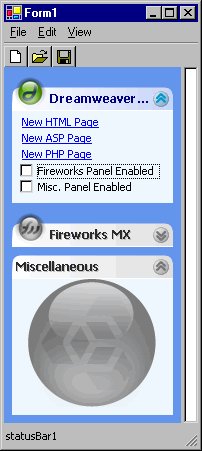
In Windows Explorer under Windows XP, when you hide the Folder View, you get a rather snazy bar that contains a series of collapsible panels that provide shortcuts to common tasks based on the context of the current view.
What I wanted was a control that emulates this functionality. What I came up with was an extended
System.Windows.Forms.Panel class,
CollapsiblePanel, that provides (as the name suggests) the collapsible panel functionality.
CollapsiblePanel allows you to define a gradient fill for the background of the title bar, an image list for the expand/collapse button and an image to display on the left hand side (if you want).
To try and make this hang together as a Windows XP-like bar, I also created the
CollapsiblePanelBar. This is another extended
System.Windows.Forms.Panel, but this one adds some useful design-time support. As you add
CollapsiblePanels to the
CollapsiblePanelBar, it's anchor properties are set to Left, Right and Top and it's position is set just below the previous panel.
I'm currently developing on Windows NT, so properly rendering the panels with the current theme settings was irrelevant and so that feature remains on the TODO list.
Feautures
CollapsiblePanelBar
- User-defined border (left/right margin, top for first panel and bottom for last panel);
- User-defined spacing (distance between adjacent panels);
- Automatic width, position and anchoring settings for contained panels.
CollapsiblePanel
- User-defined font and font colour for the title text;
- User-defined colours for the gradient fill in the title bar;
- User-defined images for expand/collapse button;
- An image can also be displayed in the left-hand corner.
- Runtime control over panel state (expanded/collapsed).
Documentation
I haven't gone in to too much detail about the classes here, because there is some very comprehensive documentation available for download. The documentation has been built from the Visual Studio generated XML using
NDoc, which is an approach I highly reccomend.
Learning Points
The following lists a few points I learnt whilst developing these classes:
Attributes
Properties can easily be grouped together in the property browser using the Category attribute, so you can put all of your custom properties into one category, or add them to an existing category, such as 'Appearance'.
[Category("MyProperties")]
public int MyProperty
{
	get
	{
		return myInt;
	}
	set
	{
		myInt = value;
	}
}
To add a description for your property into the property browser, use the Description attribute. This means that users of your control can get a better idea of the intent of the property.
[Category("MyProperties"),
Description("This property does something really useful")
public int MyProperty
{
	get
	{
		return myInt;
	}
	set
	{
		myInt = value;
	}
}
Runtime properties can be hidden in the property browser using the Browsable attribute.
CollapsiblePanel does this for the
PanelState property, which cannot be set at design time, because it wouldn't know what height to set the panel to when it was expanded.
[Browsable(false)]
public PanelState PanelState
{
	...
}
If you're building a custom control (or inherited control) then you can specify a bitmap to use in the toolbox via the ToolboxBitmap attribute. This bitmap must be a 16 x 16 image in bitmap format.
[ToolboxBitmap(@"C:\mybutton.bmp")]
class MyButton : System.Windows.Forms.Button
{
	...
}
Alternatively, you can use an image defined in another class:
[ToolboxBitmap(typeof(System.Windows.Forms.Button))]
class MyButton : System.Windows.Forms.Button
{
	...
}
However, the easiest way to do this is just to name the custom bitmap the same as the control (i.e. MyButton.bmp for MyButton.cs). Then you don't even need to specifiy the
ToolboxBitmap attribute, it does it all for you.
You can also define your own custom attributes; James T. Johnson has written an excellent article on this subject.
Strings
This probably something you learn in chapter 1 or 2 of a C# programming book, but without one it may be a while before you pick it up (like me). If you place the '@' character before a string literal then characters will not be escaped, which makes it much easier to type and read things like file paths:
[ToolboxBitmap(@"C:\a\path\that\is\long\mybutton.bmp")]
[ToolboxBitmap("C:\\a\\path\\that\\is\\long\\mybutton.bmp")]
Regions
For diehard C++ programmers (I used to be one) it can seem quite bizarre and very untidy to switch from separate headers and source files. However, for C# programmers help is at hand within Visual Studio. By using the
region name and
endregion markers you can easily collapse sections of code. You can see from my source code that I have defined regions for things like Event Handlers, Public Properties, Public Methods, etc. You can even nest region blocks, which helps with things like nested classes or separate functional sections.
<h2alternatives<h2>
Nnamdi Onyeyiri has produced an excellent ExplorerBar control aimed at providing the same functionality (thanks for the source Nnamdi), but I was also looking for something that was more of a general container, so you could put anything into it. Nnamdi's ExplorerBar also includes support for drawing the control according to the current XP theme if one is available. As I mentioned earlier, this will be included in
CollapsiblePanel at some point in the future.
Known Problems
None since version 1.3. Let me know if you find anything.
TODO List
In no particular order:
- Add support for XP Theme rendering
- Add design-time support for
CollapsiblePanel for contained items to ensure they are intially placed below the title bar (and possibly below that last item added). Maybe also set the achoring to Left, Top and Right. - Add a
PanelIndex property to allow design time panel re-ordering - Feature requests (just let me know!)
Update v1.2 21-Oct-2002
- Fixed the run-time/design-time bug by implementing
System.ComponentModel.ISupportInitialize. This then causes the CollapsiblePanelBar to add panels to the end of the internal list (rather than the beginning) during the InitializeComponent call, thus negating the fact that the panels are added in reverse order.
Many thanks to Russell Morris for his help fixing this problem. - The previously reported
ImageIndex bug appears to have been an artifact of an earlier version and no longer appears any more - Added
TitleText truncation (with an ellipsis) for narrow width panels.
Many thanks to Nnamdi Onyeyiri for his help fixing this problem.
Upgrading from v1.1
If you are starting from scratch then the code will be generated to cope with the
ISupportInitialize interface. If you are upgrading from v1.1 then you will need to modify your
InitializeComponent function to add calls to
BeginInit and
EndInit:
((System.ComponentModel.ISupportInitialize)(this.myPanelBar)).BeginInit();
this.myPanelBar.SuspendLayout();
((System.ComponentModel.ISupportInitialize)(this.myPanelBar)).EndInit();
this.myPanelBar.ResumeLayout(false);
Update v1.3 23-Oct-2002
- Having got back to my Windows XP box at home I have discovered that the whole of the title bar is active with the hand cursor being shown, so the panel can be collapsed/expanded by clicking anywhere on the title bar. This version includes the same functionality.
- If the
AutoScroll property is set to true then previously the wrong width would have been set for contained panels. This has also been fixed in this version. - The
ToolboxBitmap attribute has been removed for both controls and the simpler approach described above has been used instead.
Update v1.3 30-Oct-2002
Demo fixed.
Update v1.4 19-Dec-2002
- Added painting of title gradient, title icon and expand/collapse image as grayscale and drawing text as system defined disabled colour when a
CollapsiblePanel is disabled. - Fixed
CollapsiblePanelBar to enable it to contain panels derived from CollapsiblePanel (thanks to flipdoubt for pointing it out).
This member has not yet provided a Biography. Assume it's interesting and varied, and probably something to do with programming.


 General
  News
News  Suggestion
  Question
  Bug
Bug  Answer
  Joke
Joke  Praise
  Rant
Rant  Admin
Admin 


 Submit an article or tip


 I have a complete set for Macromedia Studio MX and also for MS Office. They are actually the source (at a larger scale) for a set of icons that I use on my PC. There are two sets for the Studio MX, one where the background is the product colour and one where the letter is the product colour.


