Article Series
This article is part two of a series of articles on developing an advanced WPF control designed to function like the Calendar view in Microsoft Outlook.
Introduction
The previous article laid out the overall class layout of the control. In this article, some of the smaller building blocks that make up the final control look and feel will be created.
Step 4 - Conceptual Design Layout of Individual Appointments Based Upon Start/End of Period and Appointment
One of the biggest challenges I faced early on was how to layout the visual controls representing the individual appointments. Issues included the possibility of overlapping appointments, the fact that individual appointments will have different sizes depending on the start and end time, the possible variation in the start and end time of the whole control (a view showing a few hours versus twenty-four hours), and the time scale of the view (15 minute blocks versus 30 minute blocks versus ...). While not all of these issues would necessarily present themselves right away, I wanted to come up with a design that would be flexible enough to avoid a complete rewrite later if problems ensued.
In general, when creating a control, one should attempt to make use of pre-existing controls for layout, as long as they make sense. A couple ideas that I thought of were to use a StackPanel where empty space would be filled with invisible controls; a grid with each row representing one "15/30/etc. minute block", setting the width for each row to a single time block, using the RowSpan property to set the total height of each appointment, and using multiple columns to handle overlapping appointments. However, each solution seemed like trying to fit a square peg into a round hole. Each had issues, such as the need to create "fake" controls for layout purposes; appointments that don't fit perfectly into a "block", such as an appointment that begins at 4:05 PM when using 15 minute blocks.
The first decision I made was in how to handle overlapping appointments in a single layout panel. The answer comes from the KISS principle (keep it simple, stupid). It is much easier to assemble small single purpose components than to create a single complex component, and also much easier to modify. So I decided to use one control to layout a single "column" of non-overlapping appointments and cover overlap by using multiple instances of this control side-by-side. Logic in the parent control would take the visual tree representing each appointment, create enough panels to avoid overlap, and add each appointment visual to the appropriate child panel.
The second decision was how to layout non-overlapping appointments within a single panel. Then I thought about how most layout panels work, by adding attached dependency properties to each child control defining various layout characteristics (such as DockPanel.Dock. Grid.Row, Grid.Column). I realized that each appointment's size and location is mainly a reflection of its duration with respect to the start and end time of the control (if the control covers 24 hours, a 6 hour appointment will consume 50% of the height of the control) and a reflection of its start time with respect to the start and end time of the control (if the control covers from the 10 hours 12 AM to 10 AM, an appointment starting at 1 AM will have a location 10% down from the top of the control).
Step 5 - The RangePanel Control
With the decisions in step 4 made, I started to develop the RangePanel, a panel which can layout child controls in proportion to properties defined on the child with respect to properties on the parent control. This will require dependency properties on RangePanel for the values representing the start and end of the control and attached dependency properties to be attached to the children representing the start and end of the child. I decided to support both Vertical and Horizontal orientations and provide defaults for all dependency properties. To permit this control to be reusable, I made the properties that define the control's minimum/maximum and each child's begin/end of type double (even though in the case of the CalendarView, DateTime would be just as good, though a little more painful to calculate) to increase the reusability of the control. Double is also used (instead of int) due to the fact that the Point and Location classes make use of double values as well for X/Y and Height/Width properties respectively.
Another decision was to have explicit Minimum and Maximum properties on the control, instead of just a "range height" property with an implicit Minimum of zero. This will make for easier data binding. For example, using an implicit minimum of 0 and maximum of 3600 (number of minutes in a day), the appointments would need a custom IValueConverter in the binding to calculate the number of minutes since midnight for the beginning and end of that appointment. However, if the minimum is bound to the Ticks property (as a Long, it will auto-convert to a Double) of the period begin and the maximum to the period end, the appointments will automatically be in the same numeric scale.
A debate I'm still having is what the behavior should be with respect to default values. Currently, the control's minimum and maximum are 0 and 100, which make it easy to deal with percentage based begin/end values on the children. However, nothing really stands out as good default values for the child control begin/end properties. I may end up making all of these properties nullable doubles and validate they've been set prior to layout.
using System.Windows;
using System.Windows.Controls;

namespace OutlookWpfCalendar.Windows.Controls
{
    public class RangePanel : Panel
    {
        public static DependencyProperty MinimumProperty =
		DependencyProperty.Register("Minimum", typeof(double),
		typeof(RangePanel), new FrameworkPropertyMetadata(0.0,
		FrameworkPropertyMetadataOptions.AffectsArrange));
        public static DependencyProperty MaximumProperty =
		DependencyProperty.Register("Maximum", typeof(double),
		typeof(RangePanel), new FrameworkPropertyMetadata(100.0,
		FrameworkPropertyMetadataOptions.AffectsArrange));
        public static DependencyProperty OrientationProperty =
		DependencyProperty.Register("Orientation",
		typeof(Orientation), typeof(RangePanel),
		new FrameworkPropertyMetadata(Orientation.Vertical,
		FrameworkPropertyMetadataOptions.AffectsArrange));

        public static DependencyProperty BeginProperty =
		DependencyProperty.RegisterAttached("Begin", typeof(double),
		typeof(UIElement), new FrameworkPropertyMetadata(0.0,
		FrameworkPropertyMetadataOptions.AffectsArrange));
        public static DependencyProperty EndProperty =
		DependencyProperty.RegisterAttached("End", typeof(double),
		typeof(UIElement), new FrameworkPropertyMetadata(100.0,
		FrameworkPropertyMetadataOptions.AffectsArrange));

        public static void SetBegin(UIElement element, double value)
        {
            element.SetValue(BeginProperty, value);
        }

        public static double GetBegin(UIElement element)
        {
            return (double)element.GetValue(BeginProperty);
        }

        public static void SetEnd(UIElement element, double value)
        {
            element.SetValue(EndProperty, value);
        }

        public static double GetEnd(UIElement element)
        {
            return (double)element.GetValue(EndProperty);
        }

        public double Maximum
        {
            get { return (double)this.GetValue(MaximumProperty); }
            set { this.SetValue(MaximumProperty, value); }
        }

        public double Minimum
        {
            get { return (double)this.GetValue(MinimumProperty); }
            set { this.SetValue(MinimumProperty, value); }
        }

        public Orientation Orientation
        {
            get { return (Orientation)this.GetValue(OrientationProperty); }
            set { this.SetValue(OrientationProperty, value); }
        }

        protected override Size ArrangeOverride(Size finalSize)
        {
            double containerRange = (this.Maximum - this.Minimum);

            foreach (UIElement element in this.Children)
            {
                double begin = (double)element.GetValue(RangePanel.BeginProperty);
                double end = (double)element.GetValue(RangePanel.EndProperty);
                double elementRange = end - begin;

                Size size = new Size();
                size.Width = (Orientation == Orientation.Vertical) ?
		finalSize.Width : elementRange / containerRange * finalSize.Width;
                size.Height = (Orientation == Orientation.Vertical) ?
		elementRange / containerRange * finalSize.Height : finalSize.Height;

                Point location = new Point();
                location.X = (Orientation == Orientation.Vertical) ? 0 :
		(begin - this.Minimum) / containerRange * finalSize.Width;
                location.Y = (Orientation == Orientation.Vertical) ?
		(begin - this.Minimum) / containerRange * finalSize.Height : 0;

                element.Arrange(new Rect(location, size));
            }

            return finalSize;
        }

        protected override Size MeasureOverride(Size availableSize)
        {
            foreach (UIElement element in this.Children)
            {
                element.Measure(availableSize);
            }

            return availableSize;
        }
    }
}
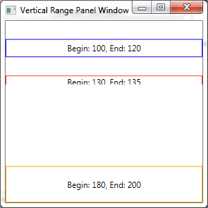
A sample usage of this control is show below. The screen shots are based on vertical and horizontal orientation, respectively. Notice how the controls are sized based on the begin/end values, despite the control having a larger preferred height or width.
<Window x:Class="OutlookWpfCalendar.UI.VerticalRangePanelWindow"
    xmlns="http://schemas.microsoft.com/winfx/2006/xaml/presentation"
    xmlns:controls="clr-namespace:OutlookWpfCalendar.Windows.Controls;
		assembly=OutlookWpfCalendar"
    xmlns:x="http://schemas.microsoft.com/winfx/2006/xaml"
    Title="Vertical Range Panel Window" Height="300" Width="300">
    <controls:RangePanel Minimum="100" Maximum="200" Orientation="Vertical">
        <Border BorderBrush="Blue" BorderThickness="1,1,1,1"
		controls:RangePanel.Begin="110" controls:RangePanel.End="120">
            <TextBlock HorizontalAlignment="Center"
		VerticalAlignment="Center" Text="Begin: 100, End: 120" />
        </Border>
        <Border BorderBrush="Red" BorderThickness="1,1,1,1"
		controls:RangePanel.Begin="130" controls:RangePanel.End="135">
            <TextBlock HorizontalAlignment="Center"
		VerticalAlignment="Center" Text="Begin: 130, End: 135" />
        </Border>
        <Border BorderBrush="Orange" BorderThickness="1,1,1,1"
		controls:RangePanel.Begin="180" controls:RangePanel.End="200">
            <TextBlock HorizontalAlignment="Center"
		VerticalAlignment="Center" Text="Begin: 180, End: 200" />
        </Border>
    </controls:RangePanel>
</Window>

Sample Usage of RangePanel With ListBox
Due to the complexity of the requirement of showing multiple periods (usually days) within a single view, the steps to integrate the RangePanel are in the next article. However, to provide an example usage of the material above, we can make use of the RangePanel in a restyled ListBox that will show a single period with no overlapping appointments.
<Window x:Class="OutlookWpfCalendar.UI.RestyledListBoxWindow"
    xmlns="http://schemas.microsoft.com/winfx/2006/xaml/presentation"
    xmlns:x="http://schemas.microsoft.com/winfx/2006/xaml"
    xmlns:local="clr-namespace:OutlookWpfCalendar.UI"
    xmlns:controls="clr-namespace:OutlookWpfCalendar.Windows.Controls;
					assembly=OutlookWpfCalendar"
    xmlns:sys="clr-namespace:System;assembly=mscorlib"
    Title="Restyled ListBox" Height="300" Width="300">
    <Window.Resources>
        <sys:DateTime x:Key="Minimum">03/02/2009 12:00 AM</sys:DateTime>
        <sys:DateTime x:Key="Maximum">03/02/2009 7:00 AM</sys:DateTime>
        <Style x:Key="OutlookStyle" TargetType="{x:Type ListBox}">
            <Style.Resources>
                <Style TargetType="{x:Type ListBoxItem}">
                    <Style.Setters>
                        <Setter Property="HorizontalContentAlignment" Value="Stretch" />
                        <Setter Property="VerticalContentAlignment" Value="Stretch" />
                        <Setter Property="controls:RangePanel.Begin"
				Value="{Binding Path=Start.Ticks}" />
                        <Setter Property="controls:RangePanel.End"
				Value="{Binding Path=Finish.Ticks}" />
                    </Style.Setters>
                </Style>
            </Style.Resources>
            <Style.Setters>
                <Setter Property="ScrollViewer.HorizontalScrollBarVisibility"
							Value="Disabled" />
                <Setter Property="ScrollViewer.VerticalScrollBarVisibility"
							Value="Disabled" />
                <Setter Property="ItemTemplate">
                    <Setter.Value>
                        <DataTemplate>
                            <Border BorderBrush="#5076A7"
				BorderThickness="1,1,1,1" CornerRadius="4,4,4,4">
                                <Border.Background>
                                    <LinearGradientBrush StartPoint="0,0" EndPoint="0,1">
                                        <GradientStop Color="#FFFFFF" Offset="0.0" />
                                        <GradientStop Color="#C0D3EA" Offset="1.0" />
                                    </LinearGradientBrush>
                                </Border.Background>
                                <StackPanel TextElement.FontFamily="Segoe UI"
						TextElement.FontSize="12">
                                    <TextBlock FontWeight="Bold" Padding="3,0,0,0"
						Text="{Binding Path=Subject}" />
                                </StackPanel>
                            </Border>
                        </DataTemplate>
                    </Setter.Value>
                </Setter>
                <Setter Property="ItemsPanel">
                    <Setter.Value>
                        <ItemsPanelTemplate>
                            <controls:RangePanel Minimum="{Binding Source=
				{StaticResource Minimum}, Path=Ticks}"
				Maximum="{Binding Source={StaticResource
				Maximum}, Path=Ticks}" />
                        </ItemsPanelTemplate>
                    </Setter.Value>
                </Setter>
            </Style.Setters>
        </Style>
    </Window.Resources>
    <DockPanel>
        <ListBox Style="{StaticResource OutlookStyle}">
            <ListBox.Items>
                <local:Appointment Start="03/02/2009 2:00 AM"
			Finish="03/02/2009 3:00 AM" Subject="Meet with John"
			Location="Southwest Meeting Room" Organizer="Jim Smith" />
                <local:Appointment Start="03/02/2009 4:00 AM"
			Finish="03/02/2009 5:00 AM" Subject="Meet with Rick"
			Location="Southwest Meeting Room" Organizer="Jim Smith" />
                <local:Appointment Start="03/02/2009 6:00 AM"
			Finish="03/02/2009 6:30 AM" Subject="Meet with Dave"
			Location="Southwest Meeting Room" Organizer="Jim Smith" />
            </ListBox.Items>
        </ListBox>
    </DockPanel>
</Window>
Several points about the XAML above:
- A single style has been created for the
ListBox control itself and it is referenced by name when creating the ListBox instance. - The style overrides the default panel for layout of individual
ListBoxItems, via the ItemsPanel property, to use the RangePanel. The RangePanel's Minimum/Maximum have been bound to two static resources. This is not ideal, but I could not figure out how to bind to resources defined on the ListBox instance itself. The point was to show how we could bind the RangePanel properties to DateTime values. - The
ItemTemplate has been copied from the previous example (though the TextBoxs for displaying the location and organizer have been removed). - The scroll bar visibility has been disabled. This is an important piece because by default, a
ListBox will allow the ItemsPanel to be as big as possible to contain all the items and use scrollbars when that size is larger than the viewable area. However, this conflicts with the concept of the RangePanel which is designed to size and locate each item based upon the available space. Therefore, the RangePanel cannot have "as much space as needed". - Each
ListBoxItem is stretched vertically and horizontally so that it uses the full space allocated by the RangePanel. Otherwise, the ListBox would size it to only as much space as is needed for the ItemTemplate content. Each ListBoxItem also has the RangePanel attached properties set based upon the Start and End properties of the appointment. Again, we've used the Ticks property to provide the RangePanel a variable of type double.
Next Steps
With the RangePanel in place as a key layout panel, the next step is to make use of this control in a layout panel designed to handle appointment overlap by creating multiple instance of the RangePanel and placing the ListViewItems in the appropriate RangePanel.
History
- 04/17/2009: Initial version
Richard Gavel is a Solutions Architect with Catalyst Software Solutions in Chicago, IL with a focus in Microsoft .NET technologies and SQL databases. He has been a developer in the industry for 12 years and has worked on both small scale and enterprise projects with thick and thin client front ends.


 General
  News
News  Suggestion
  Question
  Bug
Bug  Answer
  Joke
Joke  Praise
  Rant
Rant  Admin
Admin 


 Submit an article or tip


