Introduction
This is the second release of this control, so my previous article was a bit poor, I decided to update it too. I based the development of this control on Vista start menu, but as you can see in the image above, it can be easily customized to support other styles, themes, etc. See demo project for more details (mac style menus, applying themes at runtime, etc.).
Using the Code
Using this control is extremely easy. Just add it to your toolbox, then drag & drop on your form.

Next, populate the menu control, adding menu items. There are several overloaded methods you can use to achieve this:
-
public VistaMenuItem Add(string sText);
-
public VistaMenuItem Add(string sText, string sDescription);
-
public VistaMenuItem Add(string sText, string sDescription, Image img);
-
public VistaMenuItem Add(string sText, Image img);
-
public void Add(VistaMenuItem btn);
So, if you want rich menu items, you should use the third method. Here is a simple code to add some items:
for(int idx = 0; idx < 5; idx++)
   vmcMenu.MenuItems.Add(
           "Item " + idx,
       "Description " + idx,
            img
    );
Structure
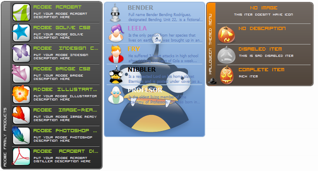
The image below shows different elements of a menu control. Menu items are rich-rendered, that means, they have an image representation, caption to identify them, and a short description. Every menu item is limited by a separator. They can be flat, 3D, and in this release of a control, you can also specify not to render them at all. This feature will be presented later on. With a menu sidebar you can group different menus, using distinct name, and also provide an icon that will be rendered next to sidebar caption.
Menu panel is rendered using gradient colors as shown in the image.
The control implements a lot of properties related to menu's appearance, like start and end gradient colors, inner/ outer border colors, sidebar gradient colors:
-
public Color MenuStartColor
-
public Color MenuEndColor
-
public Color MenuInnerBorderColor
-
public Color MenuOuterBorderColor
-
public Color SideBarStartGradient
-
public Color SideBarEndGradient
Vista menu control is also able to render background image. You can set the image alignment, defined by ContentAlignment enumeration, and then DrawBackImage is invoked to draw the image.
private void DrawBackImage(
           Graphics gfx,
           Rectangle rc
           )
       {
           if (m_bmpBackImage != null)
           {
               int lW =  m_bmpBackImage.Width;
               int lH = m_bmpBackImage.Height;
               Rectangle rcImage = new Rectangle(
                   0,
                   0,
                   lW,
                   lH
                   );

               switch (m_ImageAlign)
               {
                   case ContentAlignment.BottomCenter:
                       rcImage.X = rc.Width / 2 - lW / 2;
                       rcImage.Y = rc.Height - lH - 2;
                       break;
                   case ContentAlignment.BottomLeft:
                       rcImage.X = rc.Left + 2;
                       rcImage.Y = rc.Height - lH - 2;
                       break;
                   case ContentAlignment.BottomRight:
                       rcImage.X = rc.Right - lW -  2;
                       rcImage.Y = rc.Height - lH - 2;
                       break;
                   case ContentAlignment.MiddleCenter:
                       rcImage.X = rc.Width / 2 - lW / 2;
                       rcImage.Y = rc.Height / 2 - lH / 2;
                       break;
                   case ContentAlignment.MiddleLeft:
                       rcImage.X = rc.Left + 2;
                       rcImage.Y = rc.Height / 2 - lH / 2;
                       break;
                   case ContentAlignment.MiddleRight:
                       rcImage.X = rc.Right - lW - 2;
                       rcImage.Y = rc.Height / 2 - lH / 2;
                       break;
                   case ContentAlignment.TopCenter:
                       rcImage.X = rc.Width / 2 - lW / 2;
                       rcImage.Y = rc.Top + 2;
                       break;
                   case ContentAlignment.TopLeft:
                       rcImage.X = rc.Left + 2;
                       rcImage.Y = rc.Top + 2;
                       break;
                   case ContentAlignment.TopRight:
                       rcImage.X = rc.Right - lW - 2;
                       rcImage.Y = rc.Top + 2;
                       break;
               }

               gfx.DrawImage(
                   m_bmpBackImage,
                   rcImage
               );
           }
       }
Implementation
DrawMenuItems is a core method of a menu control.
private void DrawMenuItems(
Graphics gfx,
Rectangle rc,
float r
)
{
Rectangle rcItem = new Rectangle();
bool bVertical = (m_eMenuOrientation == VistaMenuOrientation.Vertical)
? true : false;
if (bVertical)
{
rcItem.X = 5;
rcItem.Y = 4;
rcItem.Width = rc.Width - 10;
rcItem.Height = m_lItemHeight;
}
else
{
rcItem.X = 5;
rcItem.Y = 4;
rcItem.Width = m_lItemWidth;
rcItem.Height = rc.Height - 7;
}
if (m_bDrawBar){
rcItem.X = m_lBarWidth;
rcItem.Width -= m_lBarWidth - 5;
}
Rectangle rcUpRect = rcItem;
Rectangle rcDownRect = rcItem;
rcUpRect.Height /= 2;
rcDownRect.Height /= 2;
rcDownRect.Y = rcUpRect.Height + 3;
if (items == null || items.Count == 0)
return;
gfx.SmoothingMode = SmoothingMode.HighQuality;
gfx.CompositingQuality = CompositingQuality.HighQuality;
gfx.TextRenderingHint = TextRenderingHint.ClearTypeGridFit;
foreach (VistaMenuItem item in items) {
#region Draw selection / checked state
try
{
item.Left = rcItem.X;
item.Top = rcItem.Y;
Rectangle rcItemInner = rcItem;
if (item.Checked)
{
if (item.Hovering)
{
FillMenuItem(
gfx,
rcUpRect,
rcDownRect,
item.CheckedStartColor,
item.CheckedEndColor,
item.CheckedStartColorStart,
item.CheckedEndColorEnd,
r
);
DrawItemBorder(
gfx,
rcItemInner,
item.MouseDown,
item.InnerBorder,
item.OuterBorder,
r
);
}
else
{
FillMenuItem(
gfx,
rcUpRect,
rcDownRect,
item.CheckedStartColor,
item.CheckedEndColor,
item.CheckedStartColorStart,
item.CheckedEndColorEnd,
r
);
DrawItemBorder(
gfx,
rcItemInner,
item.MouseDown,
item.InnerBorder,
item.OuterBorder,
r
);
}
}
else
{
if (item.Hovering)
{
if (!item.Disabled)
{
FillMenuItem(
gfx,
rcUpRect,
rcDownRect,
item.SelectionStartColor,
item.SelectionEndColor,
item.SelectionStartColorStart,
item.SelectionEndColorEnd,
r
);
DrawItemBorder(
gfx,
rcItemInner,
item.MouseDown,
item.InnerBorder,
item.OuterBorder,
r
);
}
}
}
}
catch (Exception e)
{
MessageBox.Show(
e.ToString()
);
}
#endregion
#region Draw icons
if (item.Image != null)
{
Rectangle rcIcon = new Rectangle();
rcIcon.X = rcItem.X + 2;
rcIcon.Y = rcItem.Bottom - item.Image.Height;
rcIcon.Width = item.Image.Width;
rcIcon.Height = item.Image.Height;
if (item.Disabled)
{
ControlPaint.DrawImageDisabled(
gfx,
item.Image,
rcIcon.X,
rcIcon.Y,
Color.Transparent);
}
else
{
gfx.DrawImage(
item.Image,
rcIcon
);
}
}
#endregion
#region Draw separators
if (m_bSeparators)
{
Point pStart = new Point();
Point pEnd = new Point();
if (bVertical)
{
pStart = new Point(rcItem.Left + 3, rcItem.Bottom);
pEnd = new Point(rcItem.Right - 3, rcItem.Bottom);
}
else
{
pStart = new Point(rcItem.Right, rcItem.Top);
pEnd = new Point(rcItem.Right, rcItem.Bottom);
}
using (Pen pInner = new Pen(m_clrInnerBorder),
pOuter = new Pen(m_clrOuterBorder))
{
if (!m_bFlatSeparators)
{
if (items.IndexOf(item) < items.Count - 1)
{
if (bVertical)
{
gfx.DrawLine(pOuter, pStart, pEnd);
pStart.Y += 1; pEnd.Y += 1;
gfx.DrawLine(pInner, pStart, pEnd);
}
else
{
gfx.DrawLine(pOuter, pStart, pEnd);
pStart.X += 1; pEnd.X += 1;
gfx.DrawLine(pInner, pStart, pEnd);
}
}
}
else
{
Pen pFlat = new Pen(m_clrFlatSeparators);
pStart.Y += 1; pEnd.Y += 1;
if (items.IndexOf(item) < items.Count - 1)
gfx.DrawLine(pFlat, pStart, pEnd);
pFlat.Dispose();
}
}
}
#endregion
#region Draw item's text
StringFormat sf = new StringFormat();
StringFormat sfUpper = new StringFormat();
sfUpper.Trimming = StringTrimming.EllipsisCharacter;
sfUpper.FormatFlags = StringFormatFlags.LineLimit;
sf.Trimming = StringTrimming.EllipsisCharacter;
sf.FormatFlags = StringFormatFlags.LineLimit;
Rectangle rcCaption = rcUpRect;
Rectangle rcContent = rcDownRect;
if (item.Image != null)
{
sfUpper.Alignment = StringAlignment.Near;
sfUpper.LineAlignment = StringAlignment.Near;
sfUpper.LineAlignment = StringAlignment.Center;
sf.Alignment = StringAlignment.Near;
Rectangle rcImage = new Rectangle(
rcItem.X + 2,
rcItem.Y,
item.Image.Width,
item.Image.Height);
rcCaption.X = rcImage.Right + 2;
rcContent.X = rcImage.Right + 4;
rcCaption.Width -= rcImage.Width;
rcContent.Width -= rcImage.Width + 4;
}
else
{
sfUpper.Alignment = StringAlignment.Center;
sfUpper.LineAlignment = StringAlignment.Near;
sfUpper.LineAlignment = StringAlignment.Center;
sf.Alignment = StringAlignment.Center;
}
SolidBrush sbCaption = new SolidBrush(Color.Empty);
SolidBrush sbContent = new SolidBrush(Color.Empty);
if (item.Checked)
{
sbCaption.Color = item.CheckedCaptionColor;
sbContent.Color = item.CheckedContentColor;
}
else
{
sbCaption.Color = item.CaptionColor;
sbContent.Color = item.ContentColor;
}
gfx.DrawString(item.Text, item.CaptionFont, sbCaption,
rcCaption, sfUpper);
gfx.DrawString(item.Description, item.ContentFont,
sbContent, rcContent, sf);
sfUpper.Dispose();
sf.Dispose();
sbCaption.Dispose();
sbCaption.Dispose();
#endregion
#region Update positions
if (bVertical)
{
rcUpRect.Y += rcItem.Height + 2;
rcDownRect.Y += rcItem.Height + 2;
rcItem.Y += rcItem.Height + 2;
}
else
{
rcUpRect.X += rcItem.Width + 2;
rcDownRect.X += rcItem.Width + 2;
rcItem.X += rcItem.Width + 2;
}
#endregion
}
}
It controls the rendering process of menu items, depending on item's state (disabled, hovering, checked). Also, it specifies how item caption, description, image and separators are rendered according to the orientation of a menu.
Each of the menu items is represented by VistaMenuItem class. As shown in the class diagram, there are a huge number of properties to customize an item's appearance. VistaMenuItems is a class extended from CollectionBase and it holds all menu items, and controls the addition / deletion. This way, we can easily perform hittest operations, when searching the hovering item, or detecting mouse clicks over target menu item.
Other important methods, related to menu's functionality are HitTestItem, and CalcMenuSize.
private int HitTestItem(
int x,
int y
)
{
int code = -1;
VistaMenuItem item = null;
if ((x > m_lBarWidth) && (x <= this.ClientRectangle.Width))
{
if ((y >= 2) && (y <= this.ClientRectangle.Height))
{
for (int idx = 0; idx < items.Count; idx++)
{
item = items[idx];
if (y >= item.Top)
{
if (y < item.Top + m_lItemHeight)
{
code = idx;
break;
}
}
}
}
}
if (code == -1)
{
for (int i = 0; i < items.Count; i++)
{
items[i].Hovering = false;
Cursor = Cursors.Default;
Invalidate();
}
}
return code;
}
public void CalcMenuSize()
{
if (!this.DesignMode){
int lHeight = (items.Count ) * (m_lItemHeight + 3 ) + 1 ;
int lWidth = (items.Count) * (m_lItemWidth + 4) + 1;
if (m_eMenuOrientation == VistaMenuOrientation.Vertical)
{
this.MaximumSize = new Size(this.Width, lHeight);
this.Size = new Size(this.Width, lHeight);
}
else
{
this.MinimumSize = new Size(this.m_lItemWidth, this.m_lItemHeight);
this.MaximumSize = new Size(lWidth, this.m_lItemHeight + 5);
this.Size = new Size(lWidth, this.m_lItemHeight + 5);
}
Invalidate();
}
}
}
The first of them is used to find an hovering item when the sidebar is rendered. It first checks if mouse is inside the menu area, excluding sidebar rectangle width. If condition evaluates to true, then we iterate through items collection, and find the correct item index. The second one dynamically adjusts menu height or width, depending on menu's orientation.
New Features
One of the new cool features in this update is the ability to show menu horizontally. This feature is controlled by MenuOrientation property. I found this feature specially interesting to use in the main application's window where you can introduce parts of your application. For example, Nero StartSmart Essentials. Note that, when menu is shown horizontally, sidebar can't be rendered.
Another useful feature implemented, is checked state. When item is checked, you can specify , item's gradient colors, and also caption / description font color. To activate this feature you should set CheckOnClick feature to true.
You can programmatically get / select menu item using SelectedItem property.
public int SelectedItem
{
     get
     {
         int idx = -1;
         for (int i = 0; i < items.Count; i++) {
               if (items[i].Checked)
                    idx = items.IndexOf(items[i]);
         }
         return idx;
      }
      set
      {
         if (value < 0 || value > items.Count)
            return;

         for (int i = 0; i < items.Count; i++){
              if (items[value].Disabled)
                  return;

              items[value].Checked = true;
         }
         Invalidate();
      }
}
The last feature provided in this release is the possibility to disable separators rendering.
Demo Project
Please make sure that you copy Visitor TT2 BRK font to your Fonts folder, before running the sample project.
History
- 7th November, 2008: Initial version
- 21th November, 2008: Repainting issue fixed
- 25th November, 2008: Added new features
- 28th December, 2008: Second release
This member has not yet provided a Biography. Assume it's interesting and varied, and probably something to do with programming.


 General
  News
News  Suggestion
  Question
  Bug
Bug  Answer
  Joke
Joke  Praise
  Rant
Rant  Admin
Admin 


 Submit an article or tip


