|
Try using Visual Studio or Expression Blend to edit / open your xaml files.
The funniest thing about this particular signature is that by the time you realise it doesn't say anything it's too late to stop reading it.
|
|
|
|
|
I've look at Blend, but the reason is I cannot pay for that. So I'm searching for a free simple tool. Since I'm not doing any commercial stuff that a simple tool is enough. 
I appreciate your help all the time...
CodingLover
|
|
|
|
|
Download Visual C# Express, (or Visual Studio Express). It's free, and it's easier to work with than just coding in notepad.
|
|
|
|
|
Actually I've install all VS 2005, 2008, 2010. But what I've found from further reading is that VS cannot do the best in styling and all in XAML. Blend or such similar tools done the best.
I appreciate your help all the time...
CodingLover
|
|
|
|
|
Glad to help. VS2010 is probably your best bet because the Cider engine (that's the name of the XAML designer) is vastly superior to the one in VS2008. You can't do WPF development at all in VS2005 (and you can't target .NET 4 in VS2008).
|
|
|
|
|
You are right. And I cannot go ahead with VS 2010, it's just web developer express 2010.
I appreciate your help all the time...
CodingLover
|
|
|
|
|
|
Thanks for the comment.
Anyway I got a start with vs 2008 mainly and kaxaml for UI design if necessary.
I appreciate your help all the time...
CodingLover
|
|
|
|
|
No problem. I'm glad to help.
|
|
|
|
|
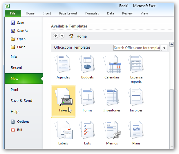
I'm fairly new to styling in WPF, and I could use some help. Truth is, I'm not really sure what to search for...
I want to style a RadioButton so that it looks like the buttons in Excel 2010'sBackStage area...
1) Open Excel 2010
2) Go to the File tab
3) In the Available Templates area, I want my buttons to look and behave like the Blank Workbook, Recent Templates, Sample, ect..., buttons as far as the MouseOver and Pressed styles.
Can anyone point me in the right direction?
Everything makes sense in someone's mind
|
|
|
|
|
You mean the orange button here? Are you trying to do the entire view with the scrollable list of buttons? Or just one button that looks like that?
I don't think we can really explain control styling in one or two posts .
Do you have Expression Blend? Or do you just have Visual Studio?
Personally, I'd use Expression Blend and dump out the control template for a stock button and modify it. That'll give you most of what you need. Click behavior, etc.
I'd probably define a new button class (derived from Button) that has an image DP as well so you make the whole thing reusable.
|
|
|
|
|
Yes, that's exactly what I' looking for.
Personally, I'd use Expression Blend and dump out the control template for a stock button and modify it. That'll give you most of what you need. Click behavior, etc.
Know any decent tutorials on how to do this?
Thanks
Everything makes sense in someone's mind
|
|
|
|
|
This is assuming the stock Expression Blend window layout.
1) create a new project in Expression Blend
2) click on the assets tab in the upper left
3) select the controls folder (2nd item down in the left list)
4) drag a button onto the form (3rd item down in the right list)
5) in the bottom left window (Objects and Timelines), right click on the button and select Edit Template | Edit a Copy
6) Hit OK in the dialog
7) now your objects and Tiemlines window should say Template as the root item in the tree
8) right click on Template and select View XAML
The XAML will have the complete style for the stock WPF button control.
* <Style x:Key="ButtonFocusVisual"> is responsible for drawing the dashed line
* there are a few brushes defined
* <Style x:Key="ButtonStyle1" TargetType="{x:Type Button}"> is your main button style
Give that a look, if you know XAML already, it should be pretty easy to understand. You would just get rid of most of the look and feel and leave the content presenter, or maybe change that into a textblock and add an image.
Now, Aero buttons use the RenderXXX DPs to do some of the drawing, so you need to get rid of those... RenderMouseOver, RenderPressed, RenderDefaulted, etc. and move those into the Trigger section so you can customize it.
-- Modified Monday, April 4, 2011 2:57 PM
|
|
|
|
|
I looked at the template a bit further and yeah, I'd get rid of the
<Microsoft_Windows_Themes:ButtonChrome ... > </Microsoft_Windows_Themes:ButtonChrome > tags and replace that with a Image and TextBlock.
The IsKeyboardFocused trigger needs to be modified. The ToggleButton.IsChecked event trigger can be removed. The IsEnabled trigger needs to be modified too (or removed if you don't need to support disabled buttons).
You need to also add the IsMouseOver and IsPressed triggers.
Its just a matter of having just the Image and TextBlock as the "default state" and then in the various triggers set the properties to give you the mouse over.
For example, you could do something like:
<Border Name="border" Background="Transparent" ... >
<TextBlock Name="textBlock" ...>
and then in the trigger, you would set "border".Background = "Orange"
Thats the basic concept of it, you have some stuff hidden or not visible in the default state and then make it visible or change colors, etc. in the triggers.
|
|
|
|
|
Excellent. Thanks alot. I'll take a look at it now.
Everything makes sense in someone's mind
|
|
|
|
|

I got it. Here's my code:
<UserControl
	xmlns="http://schemas.microsoft.com/winfx/2006/xaml/presentation"
	xmlns:x="http://schemas.microsoft.com/winfx/2006/xaml"
	xmlns:d="http://schemas.microsoft.com/expression/blend/2008"
	xmlns:mc="http://schemas.openxmlformats.org/markup-compatibility/2006"
	mc:Ignorable="d"
	xmlns:Microsoft_Windows_Themes="clr-namespace:Microsoft.Windows.Themes;assembly=PresentationFramework.Aero" x:Name="Screen_1_Name"
	x:Class="WpfPrototype2Screens.Screen_1"
	Width="640" Height="480">

	<UserControl.Resources>
		<!--
		<ControlTemplate x:Key="ButtonTemplate" TargetType="Button">
			<ContentPresenter Content="{TemplateBinding Content}"/>
		</ControlTemplate>
 		-->

		<Style x:Key="ButtonFocusVisual">
			<Setter Property="Control.Template">
				<Setter.Value>
					<ControlTemplate>
						<Rectangle Stroke="Black" StrokeDashArray="1 2" StrokeThickness="1" Margin="2" SnapsToDevicePixels="true"/>
					</ControlTemplate>
				</Setter.Value>
			</Setter>
		</Style>

		<LinearGradientBrush x:Key="ButtonNormalBackground" EndPoint="0,1" StartPoint="0,0">
			<GradientStop Color="#F3F3F3" Offset="0"/>
			<GradientStop Color="#EBEBEB" Offset="0.5"/>
			<GradientStop Color="#DDDDDD" Offset="0.5"/>
			<GradientStop Color="#CDCDCD" Offset="1"/>
		</LinearGradientBrush>

		<SolidColorBrush x:Key="ButtonNormalBorder" Color="#FF707070"/>

		<Style x:Key="ButtonStyle1" TargetType="{x:Type Button}">
			<Setter Property="FocusVisualStyle" Value="{StaticResource ButtonFocusVisual}"/>
			<Setter Property="Background" Value="{StaticResource ButtonNormalBackground}"/>
			<Setter Property="BorderBrush" Value="{StaticResource ButtonNormalBorder}"/>
			<Setter Property="BorderThickness" Value="1"/>
			<Setter Property="Foreground" Value="{DynamicResource {x:Static SystemColors.ControlTextBrushKey}}"/>
			<Setter Property="HorizontalContentAlignment" Value="Center"/>
			<Setter Property="VerticalContentAlignment" Value="Center"/>
			<Setter Property="Padding" Value="1"/>
			<Setter Property="Template">
				<Setter.Value>
					<ControlTemplate TargetType="{x:Type Button}">
						<Microsoft_Windows_Themes:ButtonChrome x:Name="Chrome" SnapsToDevicePixels="true" Background="{TemplateBinding Background}" BorderBrush="{TemplateBinding BorderBrush}" RenderDefaulted="{TemplateBinding IsDefaulted}" RenderMouseOver="{TemplateBinding IsMouseOver}" RenderPressed="{TemplateBinding IsPressed}">
							<ContentPresenter HorizontalAlignment="{TemplateBinding HorizontalContentAlignment}" Margin="{TemplateBinding Padding}" VerticalAlignment="{TemplateBinding VerticalContentAlignment}" SnapsToDevicePixels="{TemplateBinding SnapsToDevicePixels}" RecognizesAccessKey="True"/>
						</Microsoft_Windows_Themes:ButtonChrome>

						<ControlTemplate.Triggers>
							<Trigger Property="IsKeyboardFocused" Value="true">
								<Setter Property="RenderDefaulted" TargetName="Chrome" Value="true"/>
							</Trigger>
							<Trigger Property="ToggleButton.IsChecked" Value="true">
								<Setter Property="RenderPressed" TargetName="Chrome" Value="true"/>
							</Trigger>
							<Trigger Property="IsEnabled" Value="false">
								<Setter Property="Foreground" Value="#ADADAD"/>
							</Trigger>

							<Trigger Property="IsMouseOver" Value="false">
								<Setter Property="Background" Value="Transparent"/>
							</Trigger>
						</ControlTemplate.Triggers>
					</ControlTemplate>
				</Setter.Value>
			</Setter>
		</Style>
	</UserControl.Resources>

	<Grid x:Name="LayoutRoot" Background="White">
		<Button Margin="241,142,279,163"
				Style="{DynamicResource ButtonStyle1}"
				BorderBrush="Transparent"
				Content="Button"/>
	</Grid>
</UserControl>
What did it was the Trigger and the transparent border brush on the button. When the mouse is NOT over the button, it's transparent. When the mouse is over it, the theme shows.
Coud you please elaborate on this:
<Microsoft_Windows_Themes:ButtonChrome ... > </Microsoft_Windows_Themes:ButtonChrome > tags and replace that with a Image and TextBlock.
Everything makes sense in someone's mind
modified on Monday, April 4, 2011 4:33 PM
|
|
|
|
|
You want it to look like the button in that screen shot right? So, you'll notice that the default state is just the text and the image, only the hover and pressed states show orange. Microsoft_Windows_Themes:ButtonChrome is a Microsoft class in PresentationFramework.Aero. Its responsible for drawing the Aero button. You'll notice Aero buttons have a lot of cross fade effects, glow effects, etc. You don't need that anymore for this type of button.
You might want to make a few adjustments...
1) You implemented this as a UserControl. What you probably want to do is implement this as a Control derived from Button. That will come into play later. For example, if you name your new control BackStageButton:
public class BackStageButton : Button
{
}
2) Now you should change your style declaration to:
// define a xmlns called local or whatever
<Style TargetType="{x:Type local:BackStageButton}">
this way you'll automatically style all BackStageButton instances instead of having to manually set the style.
3) get rid of all the RenderXXX setters (but leave the events) in your triggers, the RenderXXX setters will draw your button like Aero which is not what we want.
4) You probably want to structure your XAML something like this:
<Border name="BdOuter" Background="Transparent" CornerRadius="2,2"> <-- this will be the outside orange border
<Border name="BdInner" Background="Transparent" CornerRadius="2,2"> <-- this will be the white border
<Border name="BdFill" Background=Transparent" CornerRadius="2,2"> <-- this will be the orange gradient fill
<StackPanel Orientation="Vertical">
<Image Source="{Binding Whatever}" /> <-- you'll need to add a DP of type ImageSource so the user can specify the image
<TextBlock Text="{Binding Content}" /> <-- this will bind to the Button.Content property which is already there.
You'll need to screw around with the various RGB values and properties and so forth...
Then in your mouse over trigger, you would set BdOuter.Background -> Orange, BdInner.Background -> White and BdFill.Background to your GradientBrush static resource
and then do something similiar for the pressed state, just altering the RGB values to match.
Makes sense?
-- Modified Monday, April 4, 2011 5:16 PM
|
|
|
|
|
Just a side note on this, you might need to tweak that XAML structure to get the button to look exactly like that. For example, the gradient fill looks like its actually in 2 parts. The upper orange part and the bottom white part. My previous response should get you on your way though .
|
|
|
|
|
See A Style for Round Glassy WPF Buttons. This article might help you.
The funniest thing about this particular signature is that by the time you realise it doesn't say anything it's too late to stop reading it.
|
|
|
|
|
Hi
I am having trouble displaying a WebBrowser control in my WPF application. The control seems to be invisible.
The WebBrowser is on my main form. The main form has a non rectangular shape, so it basically is a PNG image I use as the background, which also has a alpha channel. To enable the alpha channel I had to set the 'AllowsTransparent' property to true, but when I do this the WebBrowser Control turns invisible. I can see that it is only invisible since the mouse pointer still changes when I move my mouse over it, but the control it self is invisible.
I have changed some settings and I have seen that this is definitely caused by the 'AllowsTransparent' setting. I don't want to change this setting since turning it off removes the alpha channel from my PNG background.
Any help or ideas on how to fix this would be appreciated. Maybe there is another way to use the alpha channel or some other WebBrowser control.
thanks in advance
KOM UIT DAAAAA!!!
|
|
|
|
|
|
How are people using ListView.SelectedItems (note the 'S' at the end) in MVVM since its not a DP?
|
|
|
|
|
Code behind - but then I'm only interested in getting the job done, I'm not a purist on MVVM or TDD.
Never underestimate the power of human stupidity
RAH
|
|
|
|
|
You need to use something that implements the ICollectionView interface. This interface, if implemented correctly, will give you the list of selected items.
The funniest thing about this particular signature is that by the time you realise it doesn't say anything it's too late to stop reading it.
|
|
|
|
|
Would an ObservableCollection<> work?
Everything makes sense in someone's mind
|
|
|
|


 General
  News
News  Suggestion
  Question
  Bug
Bug  Answer
  Joke
Joke  Praise
  Rant
Rant  Admin
Admin 


 Submit an article or tip


