Introduction
The word Responsive, itself suggests a technique for providing flexible UI for different view-ports. The Responsive Design allows designers or developers to build websites that adapt to every screen size, in result, it should respond to the needs of the users and the devices they are using. Adapting Responsive Web Design, developers or designers will get a strategic solution for performance issue, starts from excessive downloads of images, JavaScript and CSS and HTML. The main advantage is – the layout changes based on the size and capabilities of the device.
For example – on a phablet, users would see the content with a single column view, on a tablet, it might show the same content in two columns and on a lappy, the same might show in more than two columns.
But, let me think, why I am discussing the above stuff… :-|
Probably, I should give an example, what exactly I am going to represent here.
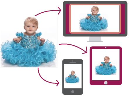
The above image specifies, one image in three different view-ports. Here, the same image has been represented in 3 different sizes.
To get the above output – the developer/designer might have to write the following code:
<!DOCTYPE html>
<html>
<head>
<style>
body {
background: url('images/abc.jpg') no-repeat;
background-size: 1400px auto;
}
@media only screen and (min-width: 480px) and (max-width: 768px) {
body {
background: url('images/abc.jpg') no-repeat;
background-size: 700px auto;
}
}
@media only screen and (max-width: 479px) {
body {
background: url('images/abc.jpg') no-repeat;
background-size: 300px auto;
}
}
</style>
</head>
<body></body>
</html>
OR
If we don’t want to load the same high resolution images in all the scenarios, then we can check with the below code:
<!DOCTYPE html>
<html>
<head>
<style>
body {
background: url('images/abc-high-res.jpg') no-repeat;
background-size: 1400px auto;
}
@media only screen and (min-width: 480px) and (max-width: 768px) {
body {
background: url('images/abc-med-res.jpg') no-repeat;
background-size: 100% auto;
}
}
@media only screen and (max-width: 479px) {
body {
background: url('images/abc-low-res.jpg') no-repeat;
background-size: 100% auto;
}
}
</style>
</head>
<body></body>
</html>
We can customize more with the above code for best view in all the scenarios.
But, what is the use of picture element here :?: :-?
.
.
.
.
No worries :-P – let's put some light on the picture element now, the reason why we are reading this blog. :D
The output that we got from the above code, can be done easily, using picture element.
<!DOCTYPE html>
<html>
    <body>
        <picture>
            <source media="(max-width: 479px)" src="images/abc-low-res.jpg">
            <source media="(max-width: 768px)" src="images/abc-med-res.jpg">
            <source src="images/abc-high-res.jpg">
            <img src="images/abc-high-res.jpg"
            alt="This picture loads on non-supporting browsers.">
            <p>Accessible text.</p>
        </picture>
    </body>
</html>
That’s it :-). Isn’t it really interesting, that with the 4 lines of code only, we can achieve the above thing easily :-). Hmmm… sounds really interesting :) :).
Note: Please check here for browser support details.
Thanks and I will be happy to hear from you.
CodeProject


Software engineer with around 6 years of web application development experience in open source technologies like PHP, MySQL, HTML, HTML5, CSS, CSS3, Javascript, jQuery etc.
I love to learn and share my knowledge in which manner I can and like to solve the issues as in the coding perspective. I am an active contributor in community forums like StackOverflow, CodeProject etc. Besides that, I write blogs in free time and speak in various technical community events.


 General
  News
News  Suggestion
  Question
  Bug
Bug  Answer
  Joke
Joke  Praise
  Rant
Rant  Admin
Admin 


 Submit an article or tip


