This article describes several simple but very useful generic Avalonia controls CustomWindow, AutoGrid and LabeledControl located in NP.Ava.Visuals open source library. NP.Ava.Visuals is also available as a nuget package.
Introduction
Note that both the article and the samples code have been updated to work with latest version of Avalonia - 11.0.6
Avalonia is a great multiplatform open source UI framework for developing
- Desktop solutions that will run across Windows, Mac and Linux
- Web applications to run in Browser (via WebAssembly)
- Mobile applications for Android, iOS and Tizen.
Avalonia is very similar to WPF, but more powerful and less buggy than WPF and considerably better than any of its competitors among multi-platforms frameworks.
I am in love with Avalonia and have been working extensively with it for the past 6 months. During this time, I created (or ported from my previous WPF libraries) a number of Avalonia controls, utilities and behaviors of various kinds which proved to be very useful for building Avalonia applications. All of them are open source, shared under the most permissive MIT license and are located within NP.Avalonia.Visuals. NP.Avalonia.Visuals nuget package is available from nuget.org.
This article describes the most useful controls from the NP.Avalonia.Visuals library, providing working usage examples for each of them. All the samples have been tested and found working on Windows 10, Mac Catalina and Ubunty 20.04.
The controls described here are:
CustomWindow - Window with customizable headerAutoGrid - Grid panel whose row and column definitions are created automatically depending on the rows and columns specified for its childrenLabeledControl - Assigning a text label to other controls or sets of controls
In order to read this article, you should understand the basics of WPF or Avalonia concepts and development.
If you are a beginner, you can start with the following articles:
- Multiplatform UI Coding with AvaloniaUI in Easy Samples. Part 1 - AvaloniaUI Building Blocks
- Basics of XAML in Easy Samples for Multiplatform Avalonia .NET Framework
- Multiplatform Avalonia .NET Framework Programming Basic Concepts in Easy Samples
- Avalonia .NET Framework Programming Advanced Concepts in Easy Samples
Also do not miss UniDock, the powerful Avalonia mulitplatform UI Docking package that I recently released at UniDock - A New Multiplatform UI Docking Framework. UniDock Power Features.
NP.Avalonia.Visuals library also contains Theming and L10N functionality which will not be described here since it already has been presented in another article - Theming and Localization Functionality for Multiplatform Avalonia UI Framework.
All the source code for the demos in this article is located under NP.Demos.VisualSamples.
If you want to create your own projects that use NP.Avalonia.Visuals library, you should install it as a nuget package it from nuget.org. In that case, you do not have to install Avalonia packages, since they will be pulled by NP.Avalonia.Visuals. Also if you use the UniDock Framework, you do not have to install NP.Avalonia.Visuals, as it will be pulled by the UniDock installation.
CustomWindow Control
Undoubtedly, the most useful among the controls that I created is the CustomWindow control that allows to customize the way the window and its header look, place some useful custom information or controls into the window's header and remove the default window chrome.
The samples below describe various usages of CustomWindow.
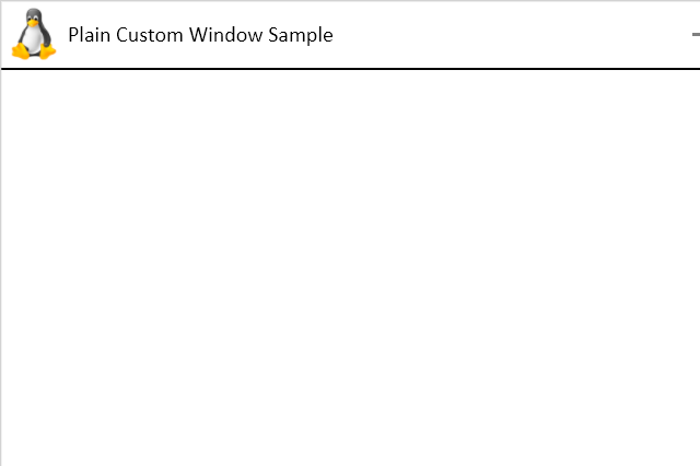
Plain CustomWindow Sample
NP.Demos.CustomWindowSample solution demonstrates a plane CustomWindow without any additional customization. It provides a custom header with Linux icon and title instead of the window chrome:
Two XAML files were modified within the solution to achieve this window layout - App.axaml and MainWindow.axaml.
App.axaml contains a reference to CustomWindowStyles.axaml on top of the references to the default Avalonia theme:
<Application.Styles>
<StyleInclude Source="avares://Avalonia.Themes.Default/Accents/BaseLight.xaml"/>
<StyleInclude Source="avares://Avalonia.Themes.Default/DefaultTheme.xaml"/>
<StyleInclude Source="avares://NP.Avalonia.Visuals/Themes/CustomWindowStyles.axaml"/>
</Application.Styles>
Changes to MainWindow.axaml are also very simple:
<np:CustomWindow
         ...
         Classes="PlainCustomWindow"
         CustomHeaderIcon="/Assets/LinuxIcon.png"
         HeaderHeight="50"
         Title="Plain Custom Window Sample"
         Width="600"
         Height="400"/>
Classes set to "PlainCustomWindow" refers to a Style predefined within the NP.Avalonia.Visuals package. Note that we are setting not the Window's Icon property, but CustomHeaderIcon to point to the file containing the window's icon image. It also sets the icon within the task bar.
HeaderHeight property allows us to set the height of the header of the window.
The rest of the properties are pretty much self explanatory.
CustomWindow with Icon and Title Customization
Our next sample - NP.Demos.CustomWindowIconAndTitleCustomizationSample shows how to modify a few more parameters related to the window's title and icon:

Note that the window title is large, bold, green, fancy and underscored. Also note that there is a bigger horizontal distance between the icon and the title.
Here is the custom code inside MainWindow.axaml file:
<Window
...
Classes="PlainCustomWindow"
CustomHeaderIcon="/Assets/LinuxIcon.png"
HeaderHeight="50"
CustomHeaderIconHeight="30"
CustomHeaderIconWidth="30"
CustomHeaderIconMargin="10"
Title="Plain Custom Window Sample"
TitleMargin="40,0,0,0"
TitleClasses="DefaultWindowTitle TitleText"
CanClose="False"
... >
<Window.Styles>
<Style Selector="TextBlock.TitleText">
<Setter Property="FontWeight"
Value="Bold"/>
<Setter Property="Foreground"
Value="Green"/>
<Setter Property="FontSize"
Value="18"/>
<Setter Property="FontFamily"
Value="Lucida Calligraphy"/>
<Setter Property="TextDecorations"
Value="Underline"/>
</Style>
</Window.Styles>
</Window>
CustomHeaderIconHeight, CustomHeaderIconWidth and CustomHeaderIconMargin allow to specify the icon's width, height and margin correspondingly.
TitleMargin specifies the margin around the title - it can be used (as it is in our case) to set the distance between the icon and the title.
TitleClasses specifies the Style classes for Title text. One of the classes - "DefaultWindowTitle" we take from the NP.Avalonia.Visuals package and the other one - "TitleText" we define within the Window.Styles tag:
<Window.Styles>
<Style Selector="TextBlock.TitleText">
<Setter Property="FontWeight"
Value="Bold"/>
<Setter Property="Foreground"
Value="Green"/>
<Setter Property="FontSize"
Value="18"/>
<Setter Property="FontFamily"
Value="Lucida Calligraphy"/>
<Setter Property="TextDecorations"
Value="Underline"/>
</Style>
</Window.Styles>
It is precisely this style that makes the title text bold, green, large, fancy and underlined.
Changing Buttons at the Right Top Corner
Each window usually has minimize, maximize/restore and close buttons. On Windows and Linux, they are usually located on the right, on Mac - on the left.
Our next sample - NP.Demos.CustomWindowChangingButtonsSample shows how to add another button - Edit to the three usually buttons:
When toggle button is checked, its icon is bluish and one can modify the text within the TextBox in the middle of the window. When toggle button is unchecked, its icon is gray and the TextBox in the middle is disabled.
In order to control whether the window is in editable state or not, we add CanEdit boolean Style property to MainWindow.axaml.cs file:
#region CanEditContent Styled Avalonia Property
public bool CanEditContent
{
    get { return GetValue(CanEditContentProperty); }
    set { SetValue(CanEditContentProperty, value); }
}

public static readonly StyledProperty<bool> CanEditContentProperty =
    AvaloniaProperty.Register<MainWindow, bool>
    (
        nameof(CanEditContent),
        true
    );
#endregion CanEditContent Styled Avalonia Property
Reminder - Style properties in Avalonia are essentially the same as Dependency properties in WPF.
In MainWindow.axaml file, we change the button area by setting the ButtonAreaTemplate:
<np:CustomWindow ...>
<np:CustomWindow.ButtonsAreaTemplate>
<ControlTemplate>
<StackPanel x:Name="FloatingWindowButtonsPanel"
Orientation="Horizontal">
<ToggleButton Classes="WindowIconButton IconButton IconToggleButton"
Opacity="0.5"
np:AttachedProperties.IconData="{StaticResource Pencil}"
ToolTip.Tip="Edit"
IsChecked="{Binding Path=$parent[Window].CanEditContent,
Mode=TwoWay}"/>
<TemplatedControl Template="{StaticResource CustomWindowButtonsTemplate}"/>
</StackPanel>
</ControlTemplate>
</np:CustomWindow.ButtonsAreaTemplate>
...
</np:CustomWindow>
The new "Edit" ToggleButton with IconData set to Pencil geometry is added to the old button row represented by CustomWindowButtonsTemplate. Note that its IsChecked property is two-way bound to the CanEditContent property on the window.
The window's content contains only TextBox whose IsEnabled property is bound to CanEditContent Style property of the window:
<TextBox HorizontalAlignment="Center"
         VerticalAlignment="Center"
         Width="200"
         IsEnabled="{Binding Path=$parent[Window].CanEditContent}"/>
Custom Content within the Window's Header
Our next sample shows how to insert a TextBox (or any other controls) into the header. Moreover, it shows how to connect such control to another control within the window's content via a View Model.
The Samples code is located within NP.Demos.CustomWindowHeaderContentSample solution. It contains a class MyTestViewModel that has only one notifiable property Text:
public class MyTestViewModel : VMBase
{
    #region Text Property
    private string? _text;
    public string? Text
    {
        get
        {
            return this._text;
        }
        set
        {
            if (this._text == value)
            {
                return;
            }

            this._text = value;
            this.OnPropertyChanged(nameof(Text));
        }
    }
    #endregion Text Property
}
The rest of the interesting code is all located within MainWindow.axaml file:
<np:CustomWindow ...
                 HeaderContent="{DynamicResource TheViewModel}">
    <np:CustomWindow.HeaderContentTemplate>
        <DataTemplate>
            <TextBox Text="{Binding Text, Mode=TwoWay}"
                     Width="120"
                     Height="25"/>
        </DataTemplate>
    </np:CustomWindow.HeaderContentTemplate>
    <np:CustomWindow.Resources>
        <local:MyTestViewModel x:Key="TheViewModel"/>
    </np:CustomWindow.Resources>
    <TextBlock HorizontalAlignment="Center"
               VerticalAlignment="Center"
               Text="{Binding Text, Source={StaticResource TheViewModel}}"
               FontSize="34"/>
</np:CustomWindow>
We define the MyTestViewModel as the resource of the window:
<np:CustomWindow.Resources>
    <local:MyTestViewModel x:Key="TheViewModel"/>
</np:CustomWindow.Resources>
CustomWindow sets its HeaderContent property to the view model instance: HeaderContent="{DynamicResource TheViewModel}". Note that we are using DynamicResource extension, because the view model is defined below the HeaderContent assignment within MainWindow.axaml file.
The TextBox is inserted into the header via HeaderContentTemplate property:
<np:CustomWindow.HeaderContentTemplate>
    <DataTemplate>
        <TextBox Text="{Binding Text, Mode=TwoWay}"
                 Width="120"
                 Height="25"/>
    </DataTemplate>
</np:CustomWindow.HeaderContentTemplate>
The DataContext of the visuals provided by the HeaderContentTemplate is given by the HeaderContent, so it will be set to our view model instance, so that we can easily bind the TextBox.Text to the Text property of the view model: Text="{Binding Text, Mode=TwoWay}".
In a similar way, we bind the Text of the TextBlock within the window's content to the same Text property of the view model:
<TextBlock HorizontalAlignment="Center"
           VerticalAlignment="Center"
           Text="{Binding Text, Source={StaticResource TheViewModel}}"
           FontSize="34"/>
Completely Changing the Window's Header
Our last CustomWindow sample shows how to restyle the window's header completely without leaving any semblance to the original header:
The sample's code can be found under NP.Demos.CustomWindowCompleteHeaderChangeSample.
<np:CustomWindow ...
                 Classes="PlainCustomWindow"
                 BorderThickness="1"
                 BorderBrush="Black"
                 HeaderSeparatorHeight="3"
                 HeaderSeparatorBrush="Blue"
                 Background="Beige"
                 Width="600"
                 Height="400">
    <np:CustomWindow.HeaderTemplate>
        <ControlTemplate>
            <Grid Height="100"
                  Margin="0,0,0,-3"
                  DataContext="{Binding RelativeSource=
                               {RelativeSource AncestorType=np:CustomWindow}}">
                <Grid.ColumnDefinitions>
                    <ColumnDefinition Width="*"/>
                    <ColumnDefinition Width="Auto"/>
                </Grid.ColumnDefinitions>
                <Border Background="Aquamarine"
                        CornerRadius="5,5,0,0"
                        Grid.ColumnSpan="3"/>
                <TextBlock Text="My Goofy Window"
                           HorizontalAlignment="Center"
                           VerticalAlignment="Center">
                    <TextBlock.RenderTransform>
                        <RotateTransform Angle="-45"/>
                    </TextBlock.RenderTransform>
                </TextBlock>
                <StackPanel Orientation="Horizontal"
                            VerticalAlignment="Center"
                            Grid.Column="1">
                    <Image Source="/Assets/LinuxIcon.png"
                           VerticalAlignment="Center"
                           Stretch="Uniform"
                           np:CallAction.TheEvent="{x:Static InputElement.DoubleTappedEvent}"
                           np:CallAction.MethodName="Close"
                           Margin="2"/>
                    <Button Content="Close"
                            VerticalAlignment="Center"
                            Margin="2"
                            np:CallAction.TheEvent="{x:Static Button.ClickEvent}"
                            np:CallAction.MethodName="Close"/>
                </StackPanel>

                <TextBlock Text="My Goofy Window"
                           Grid.Column="2"
                           HorizontalAlignment="Center"
                           VerticalAlignment="Center">
                    <TextBlock.RenderTransform>
                        <RotateTransform Angle="45"/>
                    </TextBlock.RenderTransform>
                </TextBlock>
            </Grid>
        </ControlTemplate>
    </np:CustomWindow.HeaderTemplate>
</np:CustomWindow>
In order to completely re-skin the CustomWindow's header, we use HeaderTemplate property into which we can put whatever we want.
AutoGrid
Another very useful control from NP.Avalonia.Visuals is AutoGrid. It is similar to Grid panel, but
- does not require to specify the row and column definitions. Instead the only rows and columns corresponding to
AutoGrid.Row and AutoGrid.Column attached properties defined on its children will be created. - allows to have negative
AutoGrid.Row and AutoGrid.Column values: the rows and columns are arranged from the lowest number to highest irrespectively of whether the numbers are positive or negative - for example, the row with AutoGrid.Row = -10 will always be on top of the row with AutoGrid.Row = -9.
Flexibility coming from the two points above allows the children of AutoGrid easily change their mutual positions as will be shown in the sample.
By default, the rows and columns created with the corresponding GridLength set to Auto - meaning that the default row or column is sized to its content.
There is, however, a way to specify a number or a star ("*") for the height or a row or width of a column as will be explained in the sample.
The sample's code is located under NP.Demos.AutoGridSamples.
Here is what you'll see after running the sample:
Press "Change Layout" button and the "Button 3" will move to the topmost/leftmost position (from rightmost/bottommost):
Here is the interesting part of the MainWindow.axaml file:
<Grid RowDefinitions="*,Auto"
      Margin="10">
    <np:AutoGrid x:Name="MyAutoGrid"
                 Width="200"
                 HorizontalAlignment="Center"
                 VerticalAlignment="Center"
                 ShowGridLines="True">
        <np:AutoGrid.RowsHeights>
            <GridLength x:Key="1">100</GridLength>
        </np:AutoGrid.RowsHeights>
        <np:AutoGrid.ColumnsWidths>
            <GridLength x:Key="0">*</GridLength>
        </np:AutoGrid.ColumnsWidths>
        <Border Width="50"
                Height="50"
                HorizontalAlignment="Left"
                VerticalAlignment="Top"
                Background="Yellow"/>
        <Button Content="Button 2"
                np:AutoGrid.Row="1"
                np:AutoGrid.Column="1"/>
        <Button x:Name="Button3"
                Content="Button 3"
                np:AutoGrid.Row="2"
                np:AutoGrid.Column="1"/>
    </np:AutoGrid>
    <Button x:Name="ChangeLayoutButton"
            Content="Change Layout"
            Grid.Row="1"
            HorizontalAlignment="Right"/>
</Grid>
The button at the bottom serves to enact the layout change within the AutoGrid. The AutoGrid contains a yellow border 50x50 (within default cell whose Row=0 and Column=0). It also contains two buttons:
- "
Button 2" within row=1 and column=1 - "
Button 3" within row=2 and column=1
We set the width of the AutoGrid to be 200.
Lines:
<np:AutoGrid.RowsHeights>
    <GridLength x:Key="1">100</GridLength>
</np:AutoGrid.RowsHeights>
mean that row 1 of our AutoGrid has height 100.
Lines:
<np:AutoGrid.ColumnsWidths>
    <GridLength x:Key="0">*</GridLength>
</np:AutoGrid.ColumnsWidths>
mean that column 0 or our AutoGrid has width "*" (meaning that it takes whatever width is left from other columns to make sure that the total width of the grid is 200).
You can see, that in the first screen, column 0 takes much more width than required by the yellow border. Also, column 1 takes height 100 which is much more than is required for "Button 2".
Pressing "Change Layout" button (with the help of code behind) changes the AutoGrid.Row and AutoGrid.Column parameters defined on "Button 3" from 2 and 1 correspondingly to -1 and -1. The button moves to the top left corner. Note that the new row and column are indexed with -1 and -1 correspondingly, so that the row 0 and column 0 are now in the middle and row 1 and column 1 are now at the bottom and right correspondingly. Row 1 (now the bottom row) still has height 100 and column 0 (now the middle column) still has star width (takes the rest of the space to make the full width of the grid).
LabeledControl
Various applications often have control fields with some text that describes them next to the field. Some applications have such text above the fields, some next to them, and some can even - to the right of them, but within a single application, the position of the text with respect to the fields they describe is usually the same (if it is not the same - you should probably fix it).
Working on variuos projects, I came across this paradigm again and again and built custom controls to simplify dealing with such fields.
Here, I present such control (called LabeledControl) built for Avalonia as part of NP.Avalonia.Visuals package. I used the flexible AutoGrid described in the previous section so that changing the position of control with respect to the text can be easily achieved.
NP.Demos.LabeledControlSamples contains the usage samples for LabeledControl. Note that in order to show various possible label-field arrangements, I created several different styles for horizontal, and vertical layouts, but usually within a single application or even a single application suite, you should only be using one label-field layout.
Here is what you'll see when you run the application:
There are three sections:
- Top one shows how to create horizontal labeled controls with
TextBox and ComboBox as fields - Middle one shows how to create the vertical
LabeledControls with the same fields - Bottom one shows how to create a
LabeledControl with a fancy label style that wraps
All the interesting code is located under MainWindow.axaml file.
Here is the style for the horizontal label-field arrangement:
<Style Selector="np|LabeledControl">
    <Setter Property="ControlRow"
            Value="0"/>
    <Setter Property="ControlColumn"
            Value="1"/>
    <Setter Property="VerticalTextAlignment"
            Value="Center"/>
    <Setter Property="Padding"
            Value="5,0,0,0"/>
    <Setter Property="Margin"
            Value="5,5,20,5"/>
</Style>
ControlRow and ControlColumn set the field's row and column within an AutoGrid with respect to the text. ControlRow=0 means it is in the same row with the text, while ControlColumn=1 means that it is to the left of the text.
Padding specifies the control's shift with respect to the text - in our case, Padding="5,0,0,0 means that our control is shifted to the right 5 generic pixels away from the text.
Here is how we create the LabeledControl:
<np:LabeledControl Text="Enter Text:"
                   np:AutoGrid.Row="1">
    <np:LabeledControl.ContainedControlTemplate>
        <ControlTemplate>
            <TextBox Width="100"/>
        </ControlTemplate>
    </np:LabeledControl.ContainedControlTemplate>
</np:LabeledControl>
Note that we use ContainedControlTemplate property to place the control (or a set of controls) next to the text.
Here is the style for vertical text/control arrangement:
<Style Selector="np|LabeledControl">
    <Setter Property="ControlRow"
            Value="1"/>
    <Setter Property="VerticalTextAlignment"
            Value="Center"/>
    <Setter Property="Padding"
            Value="15,0,0,0"/>
    <Setter Property="Margin"
            Value="5,5,20,5"/>
</Style>
ControlColumn is now 0 (default) and ControlRow=1 meaning that the control is under the text. Padding=15,0,0,0 to create a bit of a shift to the right from the text.
For the fancy text in the bottom row, we create a fancy text style providing a class name - "FancyStyle":
<Style Selector="TextBlock.FancyStyle">
    <Setter Property="FontWeight"
            Value="Bold"/>
    <Setter Property="FontFamily"
            Value="Lucida Calligraphy"/>
</Style>
Then we pass this class into LabeledControl.TextClasses property to use it to style the label of the LabeledControl:
<np:LabeledControl Text="Please, enter text:"
                   MaxTextWidth="70"
                   TheTextWrapping="WrapWithOverflow"
                   TextClasses="FancyStyle"
                   VerticalTextAlignment="Center"
                   ControlColumn="1"
                   ControlRow="0"
                   np:AutoGrid.Row="1">
    <np:LabeledControl.ContainedControlTemplate>
        <ControlTemplate>
            <TextBox Width="100"/>
        </ControlTemplate>
    </np:LabeledControl.ContainedControlTemplate>
</np:LabeledControl>
We can also use the MaxTextWidth for specifying the MaxWidth property of the text and TheTextWrapping to specify whether the label should wrap on exceeding the MaxWidth or not.
Conclusion
In this article, I describe the functionality of the most useful controls within NP.Avalonia.Visuals open source library available also as a nuget package. In particular, I describe in detail:
CustomWindowAutoGridLabeledControl
I plan more articles regarding the NP.Avalonia.Visuals functionality placing emphasis on some very useful behaviors, utilities and converters located in that library.
History
- 21st December, 2021: Initial version
- 26th December, 2023: Upgraded text and samples to work with Avalonia 11


 General
  News
News  Suggestion
  Question
  Bug
Bug  Answer
  Joke
Joke  Praise
  Rant
Rant  Admin
Admin 


 Submit an article or tip


