Let’s summarize our story here. We started with Problem statement and Algorithm selection by formulating of the task of predicting which species of iris a particular flower belongs to by using physical measurements of the flower and then we prepare our project and load the associated dataset. We used a dataset of measurements that was annotated by an expert with the correct species to build our model, making this a supervised learning task (three-class classification problem). After that, we start exploring and visualizing the data to understand it, then split our data to training and test sets reaching to build our model and fit it by training and then test.
Introduction
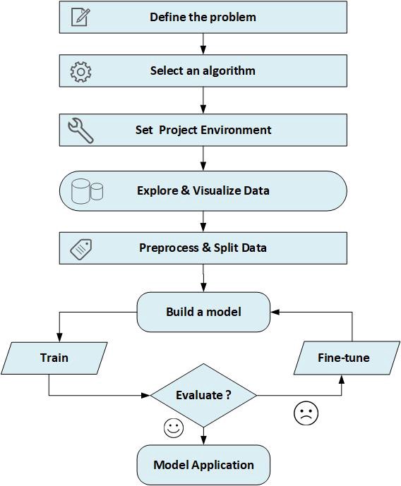
In this article, I'll demonstrate some sort of a framework for working on machine learning projects. As you may know, machine learning in general is about extracting knowledge from data therefore, most of machine learning projects will depend on a data collection - called dataset - from a specific domain on which, we are investigating a certain problem to build a predictive model suitable for it. This model should follow certain set of steps to accomplish its purpose. In the following sections, I will practically introduce a simplified clarification about the main steps for performing statistical learning or building machine learning model.
Background
I assumed that the explanation project is implemented in Python programming language inside Jupiter Notebook (IPython) depending on using Numpy, Pandas, and Scikit-Learn packages.
Problem Statement
To build better models, you should clearly define the problem that you are trying to solve, including the strategy you will use to achieve the desired solution. I’ve chosen a simple application of Iris Species Classification in which we will create a simple machine learning model that could be used in distinguishing the species of some iris flowers by identifying some measurements associated with each iris such as the petals’ length and width as well as sepals’ length and the width, all measured in centimetres. We will depend on a data set of previously identified measurements by experts, the flowers have been classified into the species stosa, versicolor, or virginica. Our mission is to build a model that can learn from these measurements, so that we can predict the species for a new iris.

Algorithm Selection
Depending on the nature and characteristics of the problem under investigation, we need to select algorithms and techniques suitable for solving it. Since we have measurements for which we know the correct species of iris, this is a Supervised Learning problem. In this problem, we want to predict one of several options (the species of iris). This is an example of a classification problem. The possible outputs (different species of irises) are called classes. Every iris in the data set belongs to one of three classes, so this problem is a three-class classification problem. The desired output for a single data point (an iris) is the species of this flower. For a particular data point, the species it belongs to is called its label or class.
Project Preparation
To begin working with our project’s data, we’ll first import the functionalities we need in our implementation such as Python libraries, setting our environment to allow us to accomplish our mission as well as loading our dataset successfully:
import numpy as np
import pandas as pd
import matplotlib.pyplot as plt
import seaborn as sns
%matplotlib inline
from IPython.display import display
import warnings
warnings.filterwarnings("ignore")
Then, we start loading our dataset into a pandas DataFrame. The data that will be used here is the Iris dataset, a classical dataset in machine learning and statistics. It is included in scikit-learn within datasets module.
from sklearn.datasets import load_iris
iris=load_iris()
print('features: %s'%iris['feature_names'])
print('target categories: %s'%iris['target_names'])
print("Shape of data: {}".format(iris['data'].shape))
full_data=pd.DataFrame(iris['data'],columns=iris['feature_names'])
full_data['Classification']=iris['target']
full_data['Classification']=
full_data['Classification'].apply(lambda x: iris['target_names'][x])
with Sci-kit Learn library but in practice,
use a code looks like the following commented one:
delimiter=';',encoding='latin1',na_values="n/a")
The output will be as follows:
features: ['sepal length (cm)', 'sepal width (cm)', 'petal length (cm)', 'petal width (cm)']
target categories: ['setosa' 'versicolor' 'virginica']
Shape of data: (150, 4)
The data of iris flowers contains the numeric measurements of sepal length, sepal width, petal length, and petal width and is stored as Numpy array, so we have converted it to pandas Dataframe.
Note: Here we are using built-in dataset that comes with Sci-kit Learn library but in practice, the data set often comes as csv files so we could use code that looks like the following commented code:
#myfile='MyFileName.csv'
#full_data=pd.read_csv(myfile, thousands=',', delimiter=';',
                       encoding='latin1', na_values="n/a")
Then we start loading our dataset into a pandas DataFrame. The data that will be used here is the Iris dataset, a classical dataset in machine learning and statistics. It is included in scikit-learn within datasets module.
from sklearn.datasets import load_iris
iris=load_iris()
print('features: %s'%iris['feature_names'])
print('target categories: %s'%iris['target_names'])
print("Shape of data: {}".format(iris['data'].shape))
The output will be as follows:
features: ['sepal length (cm)', 'sepal width (cm)', 'petal length (cm)', 'petal width (cm)']
target categories: ['setosa' 'versicolor' 'virginica']
Shape of data: (150, 4)
The data of iris flowers contains the numeric measurements of sepal length, sepal width, petal length, and petal width and is stored as NumPy array, so to convert it to pandas DataFrame, we will write the following code:
full_data=pd.DataFrame(iris['data'],columns=iris['feature_names'])
full_data['Classification']=iris['target']
full_data['Classification']=full_data['Classification'].apply(lambda x: iris['target_names'][x])
Data Exploration
Before building a machine learning model, we must first analyze the dataset we are using for the problem, and we are always expected to assess for common issues that may require preprocessing. So data exploration is a necessary action that should be done before proceeding with our model implementation. This is done by showing a quick sample from the data, describing the type of data, knowing its shape or dimensions, and if needed, having basic statistics and information related to the loaded dataset, as well as exploring of input features and any abnormalities or interesting qualities about the data that may need to be addressed. Data exploration provides you with a deeper understanding of your datasets, including Dataset schemas, Value distributions, Missing values and Cardinality of categorical features.
To start exploring our dataset represented by the iris object that is returned by load_iris() and stored in mydata pandas DataFrame, we could display the first few entries for examination using the .head() function.
display(full_data.head())
To display more information about the structure of the data:
full_data.info() or full_data.dtypes
To check if there are any null values present in the dataset:
full_data.isnull().sum()
Or use the following function to get more details about these null values:
def NullValues(theData):
 	null_data = pd.DataFrame(
 	{'columns': theData.columns,
 	'Sum': theData.isnull().sum(),
 	'Percentage': theData.isnull().sum() * 100 / len(theData),
 	'zeros Percentage': theData.isin([0]).sum() * 100 / len(theData)
 	}
 	)
 	return null_data
From the above sample of our dataset, we can see that the dataset contains measurements for 150 different flowers. Individual items are called examples, instances or samples in machine learning, and their properties (the five columns) are called features (four features and one column is the Target or the class for each instance or example). The shape of the data array is the number of samples multiplied by the number of features. This is a convention in scikit-learn, and our data will always be assumed to be in this shape.
Given below is the detailed explanation of the features and the classes contained in our dataset:
- sepal length: Represents the length of the sepal of the specified iris flower in centimetres
- sepal width: Represents the width of the sepal of the specified iris flower in centimetres
- petal length: Represents the length of the petal of the specified iris flower in centimetres
- petal width: Represents the width of the petal of the specified iris flower in centimetres
For displaying statistics about the new dataset, we could use:
full_data.describe()
You could compare min and max and see if scale is large and there’s a need for Scaling of numerical features.
Since we’re interested in the classification of iris flowers, i.e., we are observing only the classes or label of each flower based on the given measurements or features, we can remove the Classification feature from this dataset and store it as its own separate variable Labels. We will use these labels as our prediction targets. The code below will remove Classification as a feature of the dataset and store it in Labels.
Labels = full_data['Classification']
mydata = full_data.drop('Classification', axis = 1)display(mydata.head())display(Labels.head())
The Classification feature is removed from the DataFrame. Note that data (the iris flowers data) and Labels (the labels or classifications of iris flowers) are now paired. That means for any iris flower mydata.loc[i], they have the a classification or label Labels[i].
To filter the input data by removing elements that do not match certain provided condition, the following function takes a data list as input and returns a filtered list as shown in the code below:
def filter_data(data, conditionField,conditionOperation,conditionValue):
"""
Remove elements that do not match the condition provided.
Takes a data list as input and returns a filtered list.
Conditions passed as separate parameters for the field, operation and value.
"""
field, op, value = conditionField,conditionOperation,conditionValue
try:
value = float(value)
except:
value = value.strip("\'\"")
if op == ">":
matches = data[field] > value
elif op == "<":
matches = data[field] < value
elif op == ">=":
matches = data[field] >= value
elif op == "<=":
matches = data[field] <= value
elif op == "==":
matches = data[field] == value
elif op == "!=":
matches = data[field] != value
else:
raise Exception("Invalid comparison operator. Only >, <, >=, <=, ==, != allowed.")
data = data[matches].reset_index(drop = True)
return data
As an example, we could filter our data to be a list of all flowers that have the attribute sepal width (cm) less than 3 as follows:
filtered_data=filter_data(mydata, 'sepal width (cm)','<','3')
display(filtered_data.head())
Data Visualization
Before building a machine learning model, it is a good idea to look at our data for more understanding about the relationships between the various components constituting it. Inspecting our data is a good way to find abnormalities and peculiarities. Maybe some of your irises were measured using inches and not centimetres, for example. In the real world, inconsistencies in the data and unexpected measurements are very common. One of the best ways to inspect data is to do some visualization over our data. We could use python matplotlib library or seaborn library for plotting and visualizing the data using different types of plots like bar plot, box plot, scatter plot, etc.
The following function displays BarGraph for any single arbitrary attribute from our data:
def BarGraph(theData,target,attributeName):
    xValues = np.unique(target)
    yValues=[]
    for label in xValues:
        yValues.append(theData.loc[target==label, attributeName].idxmax())
    plt.bar(xValues,yValues)
    plt.xticks(xValues, target)
    plt.title(attributeName)
    plt.show()
The code below tests the above function by displaying bar graph illustration for sepal length (cm) as an example.
BarGraph(mydata,Labels,'sepal length (cm)')
Also, we could display multiple bar graphs together at the same time using the following function:
def BarGraphs(theData,target,attributeNamesList,graphsTitle='Attributes Classifications'):
xValues = np.unique(target)
fig, ax = plt.subplots(nrows=int(len(attributeNamesList)/2), ncols=2,figsize=(16, 8))
k=0
for row in ax:
for col in row:
yValues=[]
for label in xValues:
yValues.append(theData.loc[target==label, attributeNamesList[k]].idxmax())
col.set_title(attributeNamesList[k])
col.bar(xValues,yValues)
k=k+1
fig.suptitle(graphsTitle)
plt.show()
Example:
BarGraphs(mydata,Labels,['sepal length (cm)','sepal width (cm)',
          'petal length (cm)','petal width (cm)'])
Visualizing value distribution across our dataset gives more understanding of attribute distributions inside the dataset to check the nature of that distribution if it is normal or uniform distribution and this could be done as follows:
def Distribution(theData,datacolumn,type='value'):
if type=='value':
print("Distribution for {} ".format(datacolumn))
theData[datacolumn].value_counts().plot(kind='bar')
elif type=='normal':
attr_mean=theData[datacolumn].mean()
attr_std_dev=full_data[datacolumn].std()
ndist=np.random.normal(attr_mean, attr_std_dev, 100)
norm_ax = sns.distplot(ndist, kde=False )
plt.show()
plt.close()
elif type=='uniform':
udist = np.random.uniform(-1,0,1000)
uniform_ax = sns.distplot(udist, kde=False )
plt.show()
elif type=='hist':
theData[datacolumn].hist()
To test visualizing value distribution for the Classification attribute, we could write:
Distribution(full_data, 'Classification')
Another visualization example is to show the Histogram diagram for a certain attribute. We use the following:
Distribution(full_data, 'sepal length (cm)',type='hist')
sns.distplot(full_data['sepal length (cm)'])
It appears that the attribute sepal length (cm) has a normal distribution.
To explore how these features are correlated to each other, we could use heatmap in seaborn library. We can see that Sepal Length and Sepal Width features are slightly correlated with each other.
plt.figure(figsize=(10,11))
sns.heatmap(mydata.corr(),annot=True)
plt.plot()
To observe relationships between features in our dataset, we could use a scatter plot. A scatter plot of the data puts one feature along the x-axis and another along the y-axis, and draws a dot for each data point. For scatter plotting how our data is distributed based on Sepal Length Width features, we could use the code below:
sns.FacetGrid(full_data,hue="Classification").map(plt.scatter,"sepal length (cm)",
              "sepal width (cm)").add_legend()
plt.show()
To plot datasets with more than three features, we could use a pair plot, which looks at all possible pairs of features. If you have a small number of features, such as the four we have here, this is quite reasonable. You should keep in mind, however, that a pair plot does not show the interaction of all features at once, so some interesting aspects of the data may not be revealed when visualizing it this way. We could use the pairplot function in the seaborn library as follows:
sns.pairplot(mydata)
Another way to do scatter plotting is to use scatter matrix existed in plotting module comes with pandas library. the following code creates a scatter matrix from the dataframe, and colors will be by Classes or labels:
from pandas.plotting import scatter_matrix
colors = list()
palette = {0: "red", 1: "green", 2: "blue"}
for c in np.nditer(iris.target): colors.append(palette[int(c)])
grr = scatter_matrix(mydata, alpha=0.3,figsize=(10, 10),
      diagonal='hist', color=colors, marker='o', grid=True)
From the plots, we can see that the three classes seem to be relatively well separated using the sepal and petal measurements. This means that a machine learning model will likely be able to learn to separate them.
To show density of the length and width in the species, we could use violin plot of all the input variables against output variable which is Species.
plt.figure(figsize=(12,10))
plt.subplot(2,2,1)
sns.violinplot(x="Classification",y="sepal length (cm)",data=full_data)
plt.subplot(2,2,2)
sns.violinplot(x="Classification",y="sepal width (cm)",data=full_data)
plt.subplot(2,2,3)
sns.violinplot(x="Classification",y="petal length (cm)",data=full_data)
plt.subplot(2,2,4)
sns.violinplot(x="Classification",y="petal width (cm)",data=full_data)
The thinner part denotes that there is less density whereas the fatter part conveys higher density.
And similarly, we may use boxplot to see how the categorical feature Classification is distributed with all other input and also, to check for Outliers variables:
plt.figure(figsize=(12,10))
plt.subplot(2,2,1)
sns.boxplot(x="Classification",y="sepal length (cm)",data=full_data)
plt.subplot(2,2,2)
sns.boxplot(x="Classification",y="sepal width (cm)",data=full_data)
plt.subplot(2,2,3)
sns.boxplot(x="Classification",y="petal length (cm)",data=full_data)
plt.subplot(2,2,4)
sns.boxplot(x="Classification",y="petal width (cm)",data=full_data)
To check Cardinality:
def count_unique_values(theData, categorical_columns_list):
    cats = theData[categorical_columns_list]
    rValue = pd.DataFrame({'cardinality': cats.nunique()})
    return rValue
Splitting Dataset Into Training and Testing Data
We cannot use the same data we used to build the model to evaluate it. This is because our model can always simply remember the whole training set, and will therefore always predict the correct label for any point in the training set. This remembering does not indicate to us whether our model will generalize well, i.e., whether it will also perform well on new data. So, Before using a machine learning model that can predict from unseen data, we should have some way to know whether it actually works or not. Hence, we need to split the labeled data into two parts. One part of the data is used to build our machine learning model, and is called the training data or training set. The rest of the data will be used to measure how well the model works; this is called the test data, or test set.
scikit-learn contains a function that shuffles the dataset and splits it for you: the train_test_split function. This function extracts 75% of the rows in the data as the training set, together with the corresponding labels for this data. The remaining 25% of the data, together with the remaining labels, is declared as the test set.
In scikit-learn, data is usually denoted with a capital X, while labels are denoted by a lowercase y. This is inspired by the standard formulation f(x)=y in mathematics, where x is the input to a function and y is the output. Following more conventions from mathematics, we use a capital X because the data is a two-dimensional array (a matrix) and a lowercase y because the target is a one-dimensional array (a vector). Let’s call train_test_split on our data and assign the outputs using this following code:
from sklearn.model_selection import train_test_split
X_train, X_test, y_train, y_test =
 train_test_split(mydata,Labels, random_state=0)print("X_train shape: {}".format(X_train.shape))
print("y_train shape: {}".format(y_train.shape))
print("X_test shape: {}".format(X_test.shape))
print("y_test shape: {}".format(y_test.shape))
Before making the split, the train_test_split function shuffles the dataset using a pseudorandom number generator. If we just took the last 25% of the data as a test set, all the data points would have the label 2, as the data points are sorted by the label (see the output for iris[‘target’] shown earlier). Using a test set containing only one of the three classes would not tell us much about how well our model generalizes, so we shuffle our data to make sure the test data contains data from all classes. To make sure that we will get the same output if we run the same function several times, we provide the pseudo random number generator with a fixed seed using the random_state parameter. This will make the outcome deterministic, so this line will always have the same outcome. The output of the train_test_split function is X_train, X_test, y_train, and y_test, which are all NumPy arrays. X_train contains 75% of the rows of the dataset, and X_test contains the remaining 25%.
Build the Model
Now we can start building the actual machine learning model. There are many classification algorithms in scikit-learn that we could use. Here, we will use a k-nearest neighbors classifier, which is easy to understand. Building this model only consists of storing the training set. To make a prediction for a new data point, the algorithm finds the point in the training set that is closest to the new point. Then it assigns the label of this training point to the new data point.
The k in k-nearest neighbors signifies that instead of using only the closest neighbor to the new data point, we can consider any fixed number k of neighbors in the training (for example, the closest three or five neighbors). Then, we can make a prediction using the majority class among these neighbors. For simplification, we’ll use only a single neighbor.
All machine learning models in scikit-learn are implemented in their own classes, which are called Estimator classes. The k-nearest neighbors classification algorithm is implemented in the KNeighborsClassifier class in the neighbors module. Before we can use the model, we need to instantiate the class into an object. This is when we will set any parameters of the model. The most important parameter of KNeighbor sClassifier is the number of neighbors, which we will set to 1:
from sklearn.neighbors import KNeighborsClassifier
knn = KNeighborsClassifier(n_neighbors=1)
The knn object encapsulates the algorithm that will be used to build the model from the training data, as well the algorithm to make predictions on new data points. It will also hold the information that the algorithm has extracted from the training data. In the case of KNeighborsClassifier, it will just store the training set. To build the model on the training set, we call the fit method of the knn object, which takes as arguments the NumPy array X_train containing the training data and the NumPy array y_train of the corresponding training labels:
knn.fit(X_train, y_train)
The fit method returns the knn object itself (and modifies it in place), so we get a string representation of our classifier. The representation shows us which parameters were used in creating the model. Nearly all of them are the default values, but you can also find n_neighbors=1, which is the parameter that we passed. Most models in scikit-learn have many parameters, but the majority of them are either speed optimizations or for very special use cases. You don’t have to worry about the other parameters shown in this representation. Printing a scikit-learn model can yield very long strings, but don’t be intimidated by these. So, we will not show the output of fit because it doesn’t contain any new information.
We can now make predictions using this model on new data for which we might not know the correct labels. Imagine we found an iris in the wild with a sepal length of 5 cm, a sepal width of 2.9 cm, a petal length of 1 cm, and a petal width of 0.2 cm. What species of iris would this be? We can put this data into a NumPy array, again by calculating the shape — that is, the number of samples (1) multiplied by the number of features (4):
X_new = np.array([[5, 2.9, 1, 0.2]])
print("X_new.shape: {}".format(X_new.shape))
Note that we made the measurements of this single flower into a row in a twodimensional NumPy array, as scikit-learn always expects two-dimensional arrays for the data.
To make a prediction, we call the predict method of the knn object:
prediction = knn.predict(X_new)
print("Prediction: {}".format(prediction))
Our model predicts that this new iris belongs to the class or label or species setosa. But how do we know whether we can trust our model? We don’t know the correct species of this sample, which is the whole point of building the model!
Model Evaluation
For any project, we need to clearly define the metrics or calculations, we will use to measure performance of our model or the results in our project, i.e., to measure the performance of our predictions, we need a metric to score our predictions against the true classifications of the given examples. These calculations and metrics should be justified based on the characteristics of the problem and problem domain. In machine learning classification models, we usually use a variety of performance measure metrics. From the measures that are commonly applied to classification problems, we could mention Accuracy (A), Precision (P), Recall (R), and F1-Score, ... etc.
Classification Performance metrics
Accuracy
Accuracy or the classification rate measures how often is the classifier correct and it is defined as the fraction of predictions our model got right. The accuracy score is computed from the following formula:
To know how accurate our predictions are, we will calculate the proportion of cases where our prediction of their diagnosis is correct. The code below will create our GetAccuracy() function that calculates the accuracy score.
def GetAccuracy(datasetClasses, PredictedClasses)
if len(datasetClasses) == len(PredictedClasses):
return "Predictions have an accuracy of
{:.2f}%.".format((datasetClasses == PredictedClasses).mean()*100)
else:
return "Number of predictions does not match number of Labels/Classes!"
Example: *Out of the first five flowers, if we predict that all of them are the list predictions = ['setosa','versicolor','versicolor','setosa','setosa'], so we would expect the accuracy of our predictions to be as follows:
predictions = ['setosa','versicolor','versicolor','setosa','setosa']
print(GetAccuracy(Labels[:5], predictions))Predictions have an accuracy of 60.00%.
Also, as a second example, we could assume as a prediction that all flowers in our dataset are predicted as setosa. So, the code below will always predict that all flowers in our dataset are setosa.
def predictions_example(data):
predictions = []
for flower in data:
predictions.append('setosa')
return pd.Series(predictions)
predictions = predictions_example(Labels)
- To know how accurate a prediction would be that all of the flowers have species of
setosa? The code below shows the accuracy of this prediction.
print(GetAccuracy(Labels, predictions))Predictions have an accuracy of 33.33%.
Confusion Matrix
In the case of statistical classification, we could use the so called confusion matrix, also known as an error matrix. A confusion matrix is considered as a summary of prediction results on a classification problem. The number of correct and incorrect predictions are summarized with count values and broken down by each class. This is the key to the confusion matrix. The confusion matrix shows the ways in which your classification model is confused when it makes predictions. It gives us insight not only into the errors being made by a classifier but more importantly, the types of errors that are being made.
A confusion matrix is constructed as a table that is often used to describe the performance of a classification model (or “classifier”) on a set of test data for which the true/real/actual values are known. They are defined in terms of Positive classes which are the observations that are positive (for example: Chest X-ray image indicates presence of Pneumonia) and the Negative Classes which are the observations that are not positive (for example: Chest X-ray image indicates absence of Pneumonia, i.e., Normal). To compute performance metrics using confusion matrix, we should count the following four values:
- True Positives (
TP): Observations that are positive, and are predicted to be positive. - False Positives (
FP): Observations that are negative, but are predicted positive (Type 1 Error). - True Negatives (
TN): Observations that are negative, and are predicted to be negative. - False Negatives (
FN): Observations that are positive, but are predicted negative (Type 2 Error).
True here means cases that correctly classified either positive or negative while False indicates cases that are incorrectly classified as positive or negative.
Confusion Matrix used typically in supervised learning algorithms (in unsupervised learning, it is usually called a matching matrix) and most performance measures are computed from the confusion matrix. Therefore, if we considered the accuracy score, it would be calculated as ((TP+TN)/total) using the confusion matrix as follows:
There are problems with accuracy measure that it assumes equal costs for both kinds of errors. A 99% accuracy can be excellent, good, mediocre, poor or terrible depending upon the problem. It could be a reasonable initial measure if the classes in our dataset are all of similar sizes.
Precision
Precision reflects the fraction of reported actual cases/classes that are so (i.e., the proportion of positive identifications was actually correct). It is calculated by dividing the total number of correctly classified positive examples by the total number of predicted positive examples(TP/Predicted Yes) as follows:
Precision is used when it predicts Yes, and measures how often is it correct. High Precision indicates an example labelled as positive is indeed positive (a small number of FP).
Recall
We could define Recall as the fraction of true classes that are found by the classifier(TP/Actual Yes), i.e., the proportion of actual positives was identified correctly. It is sometimes called Sensitivity and it is the ratio of the total number of correctly classified positive examples divide to the total number of positive examples so is calculated as follows:
Recall is used when it’s actually yes, and measures how often does the classifier predicts yes. It is known as Sensitivity or True Positive Rate(TPR). High Recall indicates the class is correctly recognized (a small number of FN). Sensitivity is a metric that tells us among ALL the positive cases in the dataset, how many of them are successfully identified by the algorithm, i.e., the true positive. In other words, it measures the proportion of accurately-identified positive cases. You can think of highly sensitive tests as being good for ruling out negative. If someone has a negative result on a highly sensitive algorithm, it is extremely likely that they don’t have the positive since a high sensitive algorithm has low false negative.
Note that:
High recall, low precision: This means that most of the positive examples are correctly recognized (low FN), but there are a lot of false positives.
Low recall, high precision: This shows that we miss a lot of positive examples (high FN), but those we predict as positive are indeed positive (low FP).
F1-Score
Since we have two measures (Precision and Recall), it helps to have a measurement that represents both of them. We calculate an F-measure which uses Harmonic Mean in place of Arithmetic Mean as it punishes the extreme values more. The F-Measure will always be nearer to the smaller value of Precision or Recall. F1-Score is a measure of a test's accuracy and is expressed in terms of Precision and Recall (Harmonic Mean between precision and recall), it could be considered as a measure that punishes false negatives and false positives equally but weighted by their inverse fractional contribution to the full set to account for large class number hierarchies. It is computed as follows:
Fall-out (False Positive Rate)
It is used when it’s actually No, and measures how often does the classifier predicts yes. I is computed as (FP/Actual No).
Specificity
Specificity measures ALL the negative cases in the dataset, how many of them are successfully identified by the algorithm, i.e., the true negatives. In other words, it measures the proportion of accurately-identified negative cases. You can think of highly specific tests as being good for ruling in negative. If someone has a positive result on a highly specific test, it is extremely likely that they have the positive since a high specific algorithm has low false positive. It is know also as True Negative Rate, and is used when it's actually No, hence it measures how often the classifier predicts No.
To try calculating our previously mentioned evaluation metrics, this is where the test set that we created earlier comes in. This data was not used to build the model, but we do know what the correct species is for each iris in the test set. Therefore, we can make a prediction for each iris in the test data and compare it against its label (the known species). Use the following code:
y_pred = knn.predict(X_test)
print("Test set predictions:\n {}".format(y_pred))Test set predictions:
 ['virginica' 'versicolor' 'setosa' 'virginica' 'setosa' 'virginica'
 'setosa' 'versicolor' 'versicolor' 'versicolor' 'virginica' 'versicolor'
 'versicolor' 'versicolor' 'versicolor' 'setosa' 'versicolor' 'versicolor'
 'setosa' 'setosa' 'virginica' 'versicolor' 'setosa' 'setosa' 'virginica'
 'setosa' 'setosa' 'versicolor' 'versicolor' 'setosa' 'virginica'
 'versicolor' 'setosa' 'virginica' 'virginica' 'versicolor' 'setosa'
 'virginica']
We can measure how well the model works by computing the accuracy, which is the fraction of flowers for which the right species was predicted:
print(GetAccuracy(y_test, y_pred))Predictions have an accuracy of 97.37%.
We can also use the score method of the knn object, which will compute the test set accuracy for us:
print("Test set score: {:.2f}".format(knn.score(X_test, y_test)))Test set score: 0.97
For this model, the test set accuracy is about 0.97, which means we made the right prediction for 97% of the irises in the test set. Under some mathematical assumptions, this means that we can expect our model to be correct 97% of the time for new irises. For our application, this high level of accuracy means that our model may be trustworthy enough to use. In most of the cases, the initial model we have built is fine-tuned to improve its performance and we re-evaluate it again and again to get final accepted model for application.
Now, let’s use SciKit-Learn to create our Confusion Matrix, and calculate the performance evaluation metrics:
from sklearn.metrics import confusion_matrix
from sklearn.metrics import accuracy_score
from sklearn.metrics import classification_report
import itertoolsCM = confusion_matrix(y_test, y_pred)print ('Confusion Matrix :')
print(CM)Confusion Matrix :
[[13  0  0]
 [ 0 15  1]
 [ 0  0  9]]print ('Accuracy Score :',
        accuracy_score(y_test, y_pred) )Accuracy Score : 0.9736842105263158print ('Report : ')
print(classification_report(y_test, y_pred))Report :
              precision    recall  f1-score   support   setosa     1.00    1.00   1.00    13
  versicolor       1.00      0.94      0.97        16
   virginica       0.90      1.00      0.95         9   accuracy                  0.97    38
   macro avg       0.97      0.98      0.97        38
weighted avg       0.98      0.97      0.97        38
To plot the confusion matrix:
def plot_confusion_matrix(cm, classes,normalize=False,title='Confusion matrix',cmap=plt.cm.Blues):
"""
This function prints and plots the confusion matrix.
Normalization can be applied by setting `normalize=True`.
"""
if normalize:
cm = cm.astype('float') / cm.sum(axis=1)[:, np.newaxis]
print("Normalized confusion matrix")
else:
print('Confusion matrix, without normalization')
print(cm) plt.imshow(cm, interpolation='nearest', cmap=cmap)
plt.title(title)
plt.colorbar()
tick_marks = np.arange(len(classes))
plt.xticks(tick_marks, classes, rotation=45)
plt.yticks(tick_marks, classes) fmt = '.2f' if normalize else 'd'
thresh = cm.max() / 2.
for i, j in itertools.product(range(cm.shape[0]), range(cm.shape[1])):
plt.text(j, i, format(cm[i, j], fmt),
horizontalalignment="center",
color="white" if cm[i, j] > thresh else "black") plt.ylabel('True label')
plt.xlabel('Predicted label')
plt.tight_layout()
plt.figure()
plot_confusion_matrix(CM, classes=iris['target_names'],
title='Confusion matrix, without normalization',normalize=True)
plt.show()
History
- 14th May, 2020: Initial version
Machine learning engineer with a solid experience in building predictive models using cutting edge machine learning algorithms such as deep learning and more.


