Overview
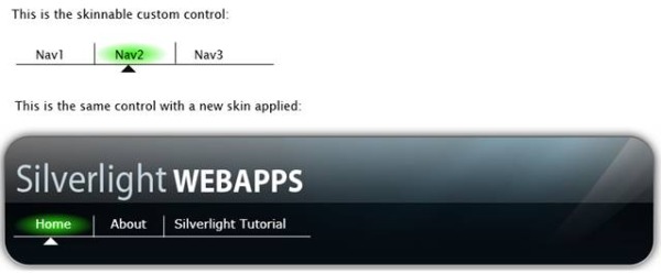
Below is a screenshot of the skinnable custom control that you will be able to make by the end of this tutorial. The top image is of the generic control. The bottom image is the same control with a skin applied. The control is an animated navigation bar. You can see a working example of the animated navigation bar by following this link.
Introduction
This article is a step-by-step tutorial on how to use Silverlight 2.0 to make a skinnable custom control - specifically, an animated navigation bar similar to the one at the top of the silverlight.net website. By the end of this tutorial, you will get practical hands-on experience in all of the following:
- Visual state manager
- Custom controls
- Skinning (a way to change the look of a control without changing the underlying code)
- Dependency properties (a way of adding custom attributes to your custom control)
This article is divided into three parts. In part one, we create a fully functioning animated navigation bar that, from a user's perspective, is identical to the final control we're going to make. If you're only making a control, you might just stop after part one. However, if you want to take that control and package it up in a way that is easily reusable, then you'll want to go on to part 2 of the tutorial where I show you how to turn the navigation bar into a "skinnable" custom control. "Skinnable" means that you can change the look of the control without changing the underlying code, and that brings me to part three of the tutorial. In part three, I demonstrate skinning of the newly developed custom control.
Note: The project in this tutorial uses Silverlight 2 beta 2, Visual Studio 2008, and the June 2008 Preview of Expression Blend 2.5.
Update: I have recompiled this project using the full Silverlight 2 release candidate, and the only change I needed to make was to create a custom folder called "themes" and move generic.xaml to that folder. Once I've done that, everything works fine.
Tutorial Part 1: Creating a Navigation Bar Using the Visual State Manager
- In VS2008, select New Project, Empty Web Site. Name the website SkinnableNavbar. Note: although we're calling this project "skinnable", what we're going to make in the first part of the tutorial is just a regular user control. We're doing it this way so that we can use Expression Blend to get all the visual and behavioral aspects of our design right before we go the extra step of turning it into a generic control. This will also give us a chance to introduce the VisualStateManager.
- Right click on the solution, click Add Project, and add a Silverlight Application named SkinnableNavbarXap, and leave checked Add Test Page.
- Click on page.xaml in SkinnableNavbarXap and open in Expression Blend 2.5.
- The first step is to create all the visual aspects of this control. Create something that looks something like what you see below. This is made with three lines, three boxes with radial gradients, with the left side of the gradient set to bright green and the right side to transparent. A pen path is used to make the triangle. The active parts we will be working with are the green gradient boxes, which we'll call
Nav1Highlight to Nav3Highlight, the triangle which we'll call the NavIndicator, and the labels which we'll call Nav1Label through Nav3Label. The lines are there for artistic purposes, and are not active parts of the navigation bar. 
- Next, we need to define the regions that the user will click or mouse over when they interact with the Nav1, Nav2, or Nav3 navigation items. To do this, put a large box over the entire Nav1 region, make its opacity 0, and label it
Nav1ClickTarget. We want the click targets to be see through so the customer can see the region they want to click on, but it's important to accomplish this by setting the opacity to 0 instead of setting it to no fill and no stroke, because if you set it to no fill and no stroke, it doesn't generate mouse events, and therefore is obviously not useful as a click target. Do the same for Nav2 and Nav3.
- By default, we're going to have Nav1 selected, so let's visually set it up this way. Select
Nav2Highlight and set its Visibility to Collapsed, and do the same for Nav3Highlight.
- Now it's time to add each of our states. Click on the + symbol in the state box and add the state group
MouseOverStates. Click the + symbol in the MouseOverStates group and add the states Nav1Highlighted, Nav2Highlighted, and Nav3Highlighted.
- Now we're going to define what each of these states look like. Click on the state
Nav2Highlighted. Note the red border around the workspace and the words in the upper right hand corner that says "State recording is on". This is recording the changes from the base that are required to be in the Nav2Highlighted state. Set the visibility of Nav1Highlight to collapsed, set the visibility of Nav2Highlight to visible, and move the NavIndicator under Nav2. The results should be similar to below. Click on Nav3Highlight and treat it similarly.
- Now we're going to start to link the user actions to the various states. Select
Nav1ClickTarget and go to Events in the property panel (events is the little lightning bolt symbol). Under the section MouseEnter, type in Nav1MouseEnter and hit the Enter key. This will wake up VS2008 and add a Nav1MouseEnter method to your Page.xaml.cs code-behind file. Do the same with Nav2ClickTarget and Nav3ClickTarget.
- For each of the methods, add the code below so that the
VisualStateManager transitions to each of the defined states based on the mouse entering the ClickTarget regions.
private void Nav1MouseEnter(object sender, MouseEventArgs e)
{
    VisualStateManager.GoToState(this, "Nav1Highlighted", true);

}

private void Nav2MouseEnter(object sender, MouseEventArgs e)
{
    VisualStateManager.GoToState(this, "Nav2Highlighted", true);
}

private void Nav3MouseEnter(object sender, MouseEventArgs e)
{
    VisualStateManager.GoToState(this, "Nav3Highlighted", true);
}
- Build and view the test page. What you should see when you mouse over the different regions, the navbar snaps to having the
NavIndicator pointing under the moused over item and the highlight pops on. That's cool, and is a really nice way of demonstrating states, but isn't very satisfying as an animated navigation bar. Let's experiment and see if we can make it better by adding transitions between states. - Let's add a transition between
Nav1Highlighted and Nav2Highlighted. Click on the + sign beside Nav1Highlighted and add the transition.
- Set the transition time to .3 seconds. Save the changes.
- Do a clean project, then rebuild, and then view the test page. What you should see is that the
NavIndicator smoothly transitions from Nav1 to Nav2 when you highlight Nav2 (whereas all other transitions jump to the state as before). The problem is a smooth transition isn't very satisfying visually. I want there to be acceleration. So let's delete the transition we just created in Expression Blend. To do this, click on the - sign right next to the Nav2Highlighted transition. - Now, let's click on the
Nav2Highlighted state and adjust the associated storyboards to something more to our liking. If it's not already visible, make the timeline visible by clicking on the arrow next to the state box in the Objects and Timeline panel. Move the NavIndicator key frame to .3 seconds. Click on the key frame and set the Easing in the KeySpline graph to x1 =0, x2=1, y1=1, y2=1, as shown below. This will make the horizontal (i.e., x direction) movement start off slow and then reach full speed. Build the project and view it in a test page. What you should see is, the NavIndicator transition to Nav2 should have the type of motion as described above. Note that you get the desired animation effect whether you're started at Nav1 or Nav3. The animation storyboard for the effect is within the state and is not a separate transition between states as it was when we explicitly defined transitions between states.
- Repeat the above process for the
Nav3Highlighted state so that it too has the NavIndicator animate into place over .3 seconds with an accelerating movement. Interestingly, it doesn't appear that you can duplicate this same method for the Nav1Highlighted state, because for some reason, I can't bring up the easing KeySpline graph for the NavIndicator keyframe. I can't think of any legitimate reason why this is the case, so it may well be a bug in the June 2008 Preview version of Expression Blend 2.5 that is triggered by the fact that the position of the NavIndicator is the same in the Base state as it is in the Nav1Highlighted state. To get around it, I just copied the DoubleAnimationUsingKeyFrames XAML that animated the NavIndicator in one of the other two states, and pasted it as a storyboard under the Nav1Highlighted VisualState. I then changed the value of the key frame at .3 seconds to 0 to indicate that at .3 seconds, I want the NavIndicator to be at X position 0. Note that in Silverlight animations, objects animate relative to a coordinate system whose origin is that of their original position in the base state. Another thing that should be obvious from looking at the XAML below is that states are nothing more than storyboards, even if sometimes they are one frame storyboards.
<vsm:VisualState x:Name="Nav1Highlighted">
  <Storyboard>
    <DoubleAnimationUsingKeyFrames BeginTime="00:00:00"
          Storyboard.TargetName="NavIndicator"
          Storyboard.TargetProperty="(UIElement.RenderTransform).
               (TransformGroup.Children)[3].(TranslateTransform.X)">
      <SplineDoubleKeyFrame KeyTime="00:00:00.3000000" Value="0">
        <SplineDoubleKeyFrame.KeySpline>
          <KeySpline ControlPoint1="0,1" ControlPoint2="1,1"/>
        </SplineDoubleKeyFrame.KeySpline>
      </SplineDoubleKeyFrame>
    </DoubleAnimationUsingKeyFrames>
  </Storyboard>
</vsm:VisualState>
- Now that we have the mouse over states animating like we want, the last thing we need to do is add the functionality of navigating to an HTML page when clicked. Highlight
Nav1ClickTarget, then go to the Properties panel and select the Events icon (the one with the little lightning bolt). In the MouseLeftButtonDown box, type Nav1Clicked. This will activate Visual Studio and add a Nav1Clicked method to your code-behind file. Do the same with Nav2ClickTarget and Nav3ClickTarget.
- In a future tutorial, I'm going to show you how to make a custom control and easily customize the destinations that you navigate to, but since this tutorial is focused on the Visual State Manager, I'm just going to hard code that clicking on Nav1 takes you to the other tutorials at my website SilverlightWebApps.com, Nav2 takes you to yahoo.com, and Nav3 takes you to google.com. To do this, add the
System.Windows.Browser.HtmlPage.Window.Navigate calls to the NavClicked methods, as shown below:
private void Nav1Clicked(object sender, MouseButtonEventArgs e)
{
    System.Windows.Browser.HtmlPage.Window.Navigate(
      new Uri("http://www.silverlightwebapps.com/Tutorials.aspx"));
}

private void Nav2Clicked(object sender, MouseButtonEventArgs e)
{
    System.Windows.Browser.HtmlPage.Window.Navigate(new Uri("http://www.yahoo.com"));
}

private void Nav3Clicked(object sender, MouseButtonEventArgs e)
{
    System.Windows.Browser.HtmlPage.Window.Navigate(new Uri("http://www.google.com"));
}
- Build and open the test page in a browser. What you should see is a
NavIndicator that accelerates into position whenever you mouse over a Nav area, a NavHighlight that blinks on whenever you mouse over a Nav area, and you should see yourself navigate to a different URL when you click on a Nav area. That's it, you're done!
Tutorial Part 2: Turning the Navigation Bar into a Custom Control
- Click on the solution for the project and select Add, New Project, Sliverlight Class Library. Call the project NavbarCustomControl.
- Rename Class1.cs to Navbar.cs and allow VS2008 to refactor the class. Make the class derive from
Control. Assign DefaultStyleKey to be the new Navbar type.
namespace NavbarCustomControl
{
    public class Navbar : Control
    {
        public Navbar()
        {
            this.DefaultStyleKey = typeof(Navbar);
        }

    }
}
- Add a text file to the project called generic.xaml (apparently, it really does have to be called exactly that).
- Change the Build Action to Resource, and delete the text in the Custom Tool box.
- Fill in generic.xaml with the default content for this control. Note the line
xmlns:vsm. Because we use the VisualStateManager later in our project, we need this line as well. As an example, just to get something up and running quickly, the XAML below just displays a rectangle for our custom control.
<ResourceDictionary
    xmlns="http://schemas.microsoft.com/winfx/2006/xaml/presentation"
    xmlns:x="http://schemas.microsoft.com/winfx/2006/xaml"
    xmlns:custom="clr-namespace:NavbarCustomControl;assembly=NavbarCustomControl"
    xmlns:vsm="clr-namespace:System.Windows;assembly=System.Windows">
  <Style TargetType="custom:Navbar">
    <Setter Property="Template">
      <Setter.Value>
        <ControlTemplate TargetType="custom:Navbar">
          <Grid x:Name="LayoutRoot">
            <Rectangle x:Name="BodyElement" Width="200" Height="100" Stroke="Black"/>
          </Grid>
        </ControlTemplate>
      </Setter.Value>
    </Setter>
  </Style>
</ResourceDictionary>
- Build the solution. That's it. You've just built a custom control that doesn't do anything except display a 200x100 rectangle. To see the result of this control, let's build a custom project where we can use the new control. Go to the solution, right click and select Add New Project, and add a new Silverlight Application. Call it ControlDemo. Allow VS2008 to add a start page, don't make it the default page, and allow Silverlight debugging.
- Delete the auto generated ControlDemo.aspx. Leave the ControlDemo.html.
- Go to Page.xaml in the Control demo and add the tag
<custom:Navbar> to the page. To be able to add this to the page and have the system make sense of it, you need to add the xmlns:custom attribute shown below to the UserControl tag. Also, you'll need to right click on the ControlDemo project and add a reference to the NavbareCustomControl project.
<UserControl x:Class="ControlDemo.Page"
   xmlns="http://schemas.microsoft.com/winfx/2006/xaml/presentation"
   xmlns:x="http://schemas.microsoft.com/winfx/2006/xaml"
   xmlns:custom="clr-namespace:NavbarCustomControl;assembly=NavbarCustomControl"
   Width="400" Height="300">
<Grid x:Name="LayoutRoot" Background="White">
<custom:Navbar/>
</Grid>
</UserControl>
- Build the solution. View ControlDemoTestPage.html in a browser and this is what you should see. (Another good way to see the results of your custom control is to open the Page.xaml of the ControlDemo project in ExpressionBlend. It also tends to give you better error messages.)
- That wasn't so bad, was it? We just made a do almost nothing custom control. Now let's make this a navbar. Go to SkinnableNavbar.xap and copy over the entire
Grid element (including all the child elements) from Page.xaml and replace the current Grid in generic.xaml. In other words, take just about everything from Page.xaml except the UserControl tag. If you were to build the application right now and then try to look at it in Expression Blend, you'd get the error AG_E_PARSER_BAD_PROPERTY_VALUE. This is because as you see in the excerpt below, we have event handlers defined in the XAML. This is perfectly okay in a user control, but is not allowed in generic.xaml.
<Rectangle x:Name="Nav1ClickTarget" ...
  MouseEnter="Nav1MouseEnter" MouseLeftButtonDown="Nav1Clicked"/>
<Rectangle x:Name="Nav2ClickTarget" ...
  MouseEnter="Nav2MouseEnter" MouseLeftButtonDown="Nav2Clicked"/>
<Rectangle x:Name="Nav3ClickTarget" ...
  MouseEnter="Nav3MouseEnter" MouseLeftButtonDown="Nav3Clicked"/>
- Delete the
MouseEnter and MouseLeftButtonDown attributes from the XAML and rebuild. Now when you look at the test page, below is what you should see:
- Of course, nothing happens when you mouse over the elements or click them, but we're going to change that now. First, cut and paste all the
NavMouseEnter and NavMouseClicked event handlers from the SkinnableNavbarXap page.xaml.cs code-behind. Then, we manually wire the MouseEnter and MouseLeftButtonDown events of each of the click targets to our event handlers. One other trick that you need to know to do the manual wiring of the events is that you can't use the GetTemplateChild method to find elements from within the constructor. Instead, you have to do it later in the OnApplyTemplate method. What you end up with is as follows:
namespace NavbarCustomControl
{
public class Navbar : Control
{
public Navbar()
{
this.DefaultStyleKey = typeof(Navbar);
}
public override void OnApplyTemplate()
{
base.OnApplyTemplate();
FrameworkElement Nav1ClickTarget =
(FrameworkElement)GetTemplateChild("Nav1ClickTarget");
FrameworkElement Nav2ClickTarget =
(FrameworkElement)GetTemplateChild("Nav2ClickTarget");
FrameworkElement Nav3ClickTarget =
(FrameworkElement)GetTemplateChild("Nav3ClickTarget");
Nav1ClickTarget.MouseEnter += new MouseEventHandler(Nav1MouseEnter);
Nav2ClickTarget.MouseEnter += new MouseEventHandler(Nav2MouseEnter);
Nav3ClickTarget.MouseEnter += new MouseEventHandler(Nav3MouseEnter);
Nav1ClickTarget.MouseLeftButtonDown +=
new MouseButtonEventHandler(Nav1Clicked);
Nav2ClickTarget.MouseLeftButtonDown +=
new MouseButtonEventHandler(Nav2Clicked);
Nav3ClickTarget.MouseLeftButtonDown +=
new MouseButtonEventHandler(Nav3Clicked);
}
private void Nav1MouseEnter(object sender, MouseEventArgs e)
{
VisualStateManager.GoToState(this, "Nav1Highlighted", true);
}
private void Nav2MouseEnter(object sender, MouseEventArgs e)
{
VisualStateManager.GoToState(this, "Nav2Highlighted", true);
}
private void Nav3MouseEnter(object sender, MouseEventArgs e)
{
VisualStateManager.GoToState(this, "Nav3Highlighted", true);
}
private void Nav1Clicked(object sender, MouseButtonEventArgs e)
{
System.Windows.Browser.HtmlPage.Window.Navigate(
new Uri("http://www.silverlightwebapps.com/Tutorials.aspx"));
}
private void Nav2Clicked(object sender, MouseButtonEventArgs e)
{
System.Windows.Browser.HtmlPage.Window.Navigate(
new Uri("http://www.yahoo.com"));
}
private void Nav3Clicked(object sender, MouseButtonEventArgs e)
{
System.Windows.Browser.HtmlPage.Window.Navigate(
new Uri("http://www.google.com"));
}
}
}
- Clean and rebuild all. Open the demo page. What you should see is that now the navbar completely animates as it did in the tutorial posted earlier. Congratulations! You now have a completely functional custom control! The only problem is that it's not very skinnable and there are a number of hard-coded elements. Let's now get rid of the hard-coded URLs and navigation text.
- To get rid of the hard-coded URLs, we're going to add the properties
Nav1Url, Nav2Url, and Nav3Url. We'll allow the user of the control to specify these URLs by setting them as attributes of the control XAML tag. We'll also set a default URL of www.silverlightwebapps.com (my website!) if the user doesn't specify a tag. To do this, add a property for Nav1Url as shown below, and repeat for Nav2Url and Nav3Url:
public static readonly DependencyProperty Nav1UrlProperty =
                DependencyProperty.Register(
                "Nav1Url", typeof(string),
                typeof(Navbar), null
            );
public string Nav1Url
{
    get { return (string)GetValue(Nav1UrlProperty); }
    set { SetValue(Nav1UrlProperty, value);}
}
Change the click event to use this newly created property. Repeat this for Nav2Clicked and Nav3Clicked:
private void Nav1Clicked(object sender, MouseButtonEventArgs e)
{
   System.Windows.Browser.HtmlPage.Window.Navigate(new Uri(Nav1Url));
}
The default values for the properties are added to generic.xaml as shown below:
<Style TargetType="custom:Navbar">
<Setter Property="Nav1Url" Value="http://www.silverlightwebapps.com"/>
<Setter Property="Nav2Url" Value="http://www.silverlightwebapps.com"/>
<Setter Property="Nav3Url" Value="http://www.silverlightwebapps.com"/>
- Now, let's show how a user could use these new properties. Go to page.xaml in the ControlDemo project. Find the
Navbar tag and modify it as shown below:
<custom:Navbar Nav1Url="http://www.msdn.com"/>
- Rebuild all, and open the demo page in a browser. You should see that if you click on Nav1, you go to MSDN as specified in your
Navbar XAML attribute, and if you click on any of the other items, you go to the default website. - Okay, let's take care of one other thing. "Skinnable" means that the visual aspect of the control can change, but the underlying code, in this case, the code in Navbar.cs, does not change. To make it so, Navbar.cs remains the same; we need to be a little cleaner in how we wire up events, or to put it better, we need to unwire events from the old framework elements before we wire them up to the new framework elements. Take a look at the property below. By default, our click targets are rectangles, but maybe when a new skin is applied, it will be wired up to an ellipse. There is no reason the underlying code has to care. The only thing that needs to happen is that when we switch from the default rectangle to the new element, the events are unwired from the old element and then wired up to the new element. The code below does this.
private FrameworkElement m_nav1ClickTarget = null;
private FrameworkElement Nav1ClickTarget
{
get { return m_nav1ClickTarget;}
set
{
FrameworkElement old_click_target = m_nav1ClickTarget;
if (old_click_target != null)
{
old_click_target.MouseEnter -= new MouseEventHandler(Nav1MouseEnter);
old_click_target.MouseLeftButtonDown -=
new MouseButtonEventHandler(Nav1Clicked);
}
m_nav1ClickTarget = value;
if (m_nav1ClickTarget != null)
{
m_nav1ClickTarget.MouseEnter += new MouseEventHandler(Nav1MouseEnter);
m_nav1ClickTarget.MouseLeftButtonDown +=
new MouseButtonEventHandler(Nav1Clicked);
}
}
}
Follow the above model and create similar properties for Nav2ClickTarget and Nav3ClickTarget.
- Now we need to use these new properties. Go to
OnApplyTemplate and change it to what you see below. With the changes below, when the template is changed, as it would when applying a new skin, the property now automatically handles the unwiring of the old events and wiring up the new events.
public override void OnApplyTemplate()
{
base.OnApplyTemplate();
Nav1ClickTarget = (FrameworkElement)GetTemplateChild("Nav1ClickTarget");
Nav2ClickTarget = (FrameworkElement)GetTemplateChild("Nav2ClickTarget");
Nav3ClickTarget = (FrameworkElement)GetTemplateChild("Nav3ClickTarget");
}
- The last thing we need to do to complete our skinnable control is to add some attributes that ExpressionBlend can read so that it can help us (in theory - more about that later) skin our control. These attributes have no affect on the control itself. It is solely something that can be discovered by the development tools via Reflection to understand what you, as a developer, consider the critical parts of the control. For this control, the critical part is that there be three click targets and that there be states defined for mousing over these targets. Exactly what these states are and exactly what the click targets are can be customized by the user through the process of skinning.
[TemplateVisualState(Name = "Nav1Highlighted", GroupName = "MouseOverStates"),
 TemplateVisualState(Name = "Nav2Highlighted", GroupName = "MouseOverStates"),
 TemplateVisualState(Name = "Nav3Highlighted", GroupName = "MouseOverStates"),
 TemplatePart(Name = "Nav1ClickTarget", Type = typeof(FrameworkElement)),
 TemplatePart(Name = "Nav2ClickTarget", Type = typeof(FrameworkElement)),
 TemplatePart(Name = "Nav3ClickTarget", Type = typeof(FrameworkElement))]
public class Navbar : Control
{
- Okay, that's it. You now have a skinnable custom control. Go ahead and rebuild everything and open up ControlDemoTestPage.html.
Tutorial Part 3: Demonstration of Skinning the New Custom Control
- Now that we have created a skinnable custom control, let's skin it and show by example how much we can change the look of a skinnable control and still not have to go back and recompile the underlying control.
- Open up page.xaml of your ControlDemo project in ExpressionBlend. Paste a second navbar control on the page. (To see them both, you may need to adjust the margins or they may be pasted one on top of the other.)
- Right click the second navbar control and select "Edit control parts (Template)". Select "Edit a copy". Name the new template "SkinnedNavbar".
What you should see now if you're using Expression Blend 2.5 June preview (the latest version available at the time I'm writing this tutorial) is an empty box with a little yellow square in the upper left hand corner, which of course doesn't look right. If you look at the XAML, however, you can see why. The template copied over for the Navbar is completely empty. If you compare this to the behavior when you try to skin a built-in control such as a scroll bar, when you edit a copy, you'll find the template completely filled with the default control template. When I first saw this, this threw me, but apparently, according to the answer I got from Microsoft employee Li-Lun Lou at http://silverlight.net/forums/t/22965.aspx, it's a known bug in the June preview version of Expression Blend 2.5, and will hopefully be fixed in the production release. Because of the bug, Expression Blend only copies over the XAML from built-in controls. This means we're going to have to copy over the default XAML from our generic.xaml by hand. (Yes, this is a real pain.)
<UserControl.Resources>
  <ControlTemplate x:Key="SkinnedNavbar" TargetType="custom:Navbar"/>
</UserControl.Resources>
- To copy over the code by hand, you'll need to do two things. One, you need to add the following attribute, providing a reference to the visual state manager to the
UserControl tag:
xmlns:vsm="clr-namespace:System.Windows;assembly=System.Windows"
Secondly, you'll need to paste the control template from generic.xaml as a child of the SkinnedNavbar ControlTemplate tag.
- Now, go back in Expression Blend, right click on the bottom Navbar, and what you should see is what I show below - an editable and therefore skinnable control. Whew! Everything about making the skinnable control seems pretty clean, except for that hand cutting and pasting.
- Now that you're this far, you can edit this any way you want. As a simple demo, try replacing the word Nav1 with something else. For my own purposes, what I want to do is customize this so that it has the logo for my website. (This is not only a tutorial, this is also me upgrading my website.) What I want to do is replace the background with some artwork I had made. So if you want to exactly duplicate the skinning I did, first add this image to the control demo project. (You can get a better version of the image from the source code attached to this article.)
- Next, delete everything except the
NavHighlight items, the NavIndicator, and the NavClickTarget items. An easy way to do this is to click the eyeball icon of each of these items so they disappear, leaving only the items that we want to delete visible. Go ahead and delete those items. - Now add in the background image.
- Next, we need to position some of the key elements so they line up with this new image. Position the
NavHighlights and ClickTargets. Change the NavIndicator to white, add new text for each of the navigation destinations, and draw a new line underneath the whole thing. When I did this, I had to use the eyeball icon to get things out of my way on occasion. I also had to temporarily make some of the NavHighlights visible that normally won't be visible. Two other keys to getting this right, was that I needed to send my image to the back and bring the click targets to the front.
- Next, we need to make sure all the states are properly defined. For the
Base state, collapse Nav2Highlight and Nav3Highlight. Next select the Nav2Highlighted state. Look at the timeline. Recall from part one of this tutorial that we don't define the position of navIndicator at time 0, so drag the timeline bar to 300ms. Make sure the NavIndicator is lined up in the middle of the second position. Do the same for Nav3Highlighted.
- Add the desired web addresses to the
Nav2Url and Nav3Url attributes of the Navbar tag. Build, and you're done. You've skinned your control.
Mike Dobbles is a freelance software developer specializing in Silverlight and C#. Mike has over 15 years of software development experience.


 General
  News
News  Suggestion
  Question
  Bug
Bug  Answer
  Joke
Joke  Praise
  Rant
Rant  Admin
Admin 


 Submit an article or tip


