Introduction
Presentation layer is always an important aspect of a software, NextUI provides a list of unique controls in the hope that it is useful to someone.
Background
This control provides a speedometer like panel that is easy to use and configure.
Using the Code
This control has a few properties to be configured:
| Name | Description |
|---|
 | BackGrdColor | Set the background color of the control, the color is used to paint the back ground as a linear gradient brush.
To fill a solid color, consider using an image |
| BackGroundImage | Use this to set the background, for example, you can set the background to solid color by setting this image to solid color image |
| DisplayFont | The font that is used to display the label |
| GapWidth | Determine how wide the gap is in angle. |
| InnerBorderRing | Set to true will show an inner circle border, by default it is true |
| LabelFontColor | Use this to set the color of the font, the font is used to display the label |
| Labels | It returns a collection that allows user to add a meterlabel. "Image" property for this control is currently not supported. |
| Number | The Value to be shown in the control, the
minimum and maximum depends on the "Value" property of Meterlabel. |
| PointerColor | The color of the pointer, by default it is red. |
| PointerHandleColor | The color of the pointer base. |
| StartGapAngle | Provides the starting angle of gap, measure from the positive x axis. |
MeterLabel class defines the property of each label.
| Name | Description |
|---|
| Desc | This property is used for the actual text display for a label. You can set Desc to "Hello", but Value to 10, so this label will be displayed as Hello but the numerical 10 will be the actual representation of the label. |
| Image | Used to show an Image for the label, Note: This control
does not support Image and thus setting this value has no effect. |
| MainColor | This is used to determine the color of the shade between label |
| Value | Value is the actual numeric value of the label. It is the actual value that will be raised when meter label is used for control like knob. It is also the actual value that is used to calculate the position of the pointer. |
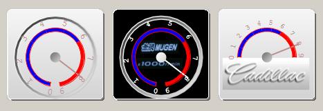
Example 1
The code snippet below is extracted from the sample code, and will generate a control that looks like the one below. Take note that this control does not support "Image" property of meterlabel, so setting the Image property will have no effect.
this.pointerMeter1.BackGrdColor = System.Drawing.Color.LightGray;
this.pointerMeter1.BackGroundImage = null;
this.pointerMeter1.DisplayFont = new System.Drawing.Font("Courier New", 9.75F,
System.Drawing.FontStyle.Regular, System.Drawing.GraphicsUnit.Point, ((byte)(0)));
this.pointerMeter1.GapWidth = 20F ;
this.pointerMeter1.InnerBorderRing = true;
this.pointerMeter1.LabelFontColor = System.Drawing.Color.RosyBrown;
this.pointerMeter1.Number = 0;
this.pointerMeter1.PointerColor = System.Drawing.Color.RosyBrown;
this.pointerMeter1.PointerHandleColor = System.Drawing.Color.DimGray;
this.pointerMeter1.StartGapAngle = 80F;
MeterLabel m0 = new MeterLabel(0, "0");
m0.MainColor = Color.Blue;
MeterLabel m1 = new MeterLabel(1000,"1");
m1.MainColor = Color.Blue;
MeterLabel m2 = new MeterLabel(2000,"2");
m2.MainColor = Color.Blue;
MeterLabel m3 = new MeterLabel(3000,"3");
m3.MainColor = Color.Blue;
MeterLabel m4 = new MeterLabel(4000,"4");
m4.MainColor = Color.Blue;
MeterLabel m5 = new MeterLabel(5000, "5");
m5.MainColor = Color.Blue;
MeterLabel m6 = new MeterLabel(6000,"6");
MeterLabel m7 = new MeterLabel(7000,"7");
MeterLabel m8 = new MeterLabel(8000,"8");
MeterLabel m9 = new MeterLabel(9000,"9");
this.pointerMeter1.Labels.Add(m0);
this.pointerMeter1.Labels.Add(m1);
this.pointerMeter1.Labels.Add(m2);
this.pointerMeter1.Labels.Add(m3);
this.pointerMeter1.Labels.Add(m4);
this.pointerMeter1.Labels.Add(m5);
this.pointerMeter1.Labels.Add(m6);
this.pointerMeter1.Labels.Add(m7);
this.pointerMeter1.Labels.Add(m8);
this.pointerMeter1.Labels.Add(m9);
Example 2
The code snippet below is extracted from the sample code. See how a background Image can affect the look and feel of the control. Another thing to take note is the StartGapAngle and GapWidth. In this case, you can notice a small gap within the inner circle, starting from 80 degree from x axis, with 20 degree wide gaps.
this.pointerMeter2.BackGrdColor = System.Drawing.Color.Gray;
this.pointerMeter2.BackGroundImage =
	global::SpeedometerDemo.Properties.Resources.speeddemo3;
this.pointerMeter2.DisplayFont = new System.Drawing.Font("Courier New", 8.25F,
<bsystem.drawing.fontstyle.bold>
this.pointerMeter2.GapWidth = 20F;
this.pointerMeter2.InnerBorderRing = true;
this.pointerMeter2.LabelFontColor = System.Drawing.Color.White;
this.pointerMeter2.Number = 0;
this.pointerMeter2.PointerColor = System.Drawing.Color.White;
this.pointerMeter2.PointerHandleColor = System.Drawing.Color.White;
this.pointerMeter2.StartGapAngle = 80F;
MeterLabel m0 = new MeterLabel(0, "0");
m0.MainColor = Color.Blue;
MeterLabel m1 = new MeterLabel(1000,"1");
m1.MainColor = Color.Blue;
MeterLabel m2 = new MeterLabel(2000,"2");
m2.MainColor = Color.Blue;
MeterLabel m3 = new MeterLabel(3000,"3");
m3.MainColor = Color.Blue;
MeterLabel m4 = new MeterLabel(4000,"4");
m4.MainColor = Color.Blue;
MeterLabel m5 = new MeterLabel(5000, "5");
m5.MainColor = Color.Blue;
MeterLabel m6 = new MeterLabel(6000,"6");
MeterLabel m7 = new MeterLabel(7000,"7");
MeterLabel m8 = new MeterLabel(8000,"8");
MeterLabel m9 = new MeterLabel(9000,"9");
this.pointerMeter2.Labels.Add(m0);
this.pointerMeter2.Labels.Add(m1);
this.pointerMeter2.Labels.Add(m2);
this.pointerMeter2.Labels.Add(m3);
this.pointerMeter2.Labels.Add(m4);
this.pointerMeter2.Labels.Add(m5);
this.pointerMeter2.Labels.Add(m6);
this.pointerMeter2.Labels.Add(m7);
this.pointerMeter2.Labels.Add(m8);
this.pointerMeter2.Labels.Add(m9);
Example 3
The code snippet below is extracted from the sample code. Notice how the control turns into a half circle by setting StartGapAngle = 0 and GapWidth = 180.
By setting InnerBorderRing = FALSE, it turns off the inner border.
this.pointerMeter4.BackGrdColor = System.Drawing.Color.LightGray;
this.pointerMeter4.BackGroundImage =
	global::SpeedometerDemo.Properties.Resources.speeddemo4;
this.pointerMeter4.DisplayFont = new System.Drawing.Font("Courier New", 8F);
this.pointerMeter4.GapWidth = 180F;
this.pointerMeter4.InnerBorderRing = false;
this.pointerMeter4.LabelFontColor = System.Drawing.Color.RosyBrown;
this.pointerMeter4.Number = 0;
this.pointerMeter4.PointerColor = System.Drawing.Color.RosyBrown;
this.pointerMeter4.PointerHandleColor = System.Drawing.Color.DimGray;
this.pointerMeter4.StartGapAngle = 0F;
MeterLabel m0 = new MeterLabel(0, "0");
m0.MainColor = Color.Blue;
MeterLabel m1 = new MeterLabel(1000,"1");
m1.MainColor = Color.Blue;
MeterLabel m2 = new MeterLabel(2000,"2");
m2.MainColor = Color.Blue;
MeterLabel m3 = new MeterLabel(3000,"3");
m3.MainColor = Color.Blue;
MeterLabel m4 = new MeterLabel(4000,"4");
m4.MainColor = Color.Blue;
MeterLabel m5 = new MeterLabel(5000, "5");
m5.MainColor = Color.Blue;
MeterLabel m6 = new MeterLabel(6000,"6");
MeterLabel m7 = new MeterLabel(7000,"7");
MeterLabel m8 = new MeterLabel(8000,"8");
MeterLabel m9 = new MeterLabel(9000,"9");
this.pointerMeter4.Labels.Add(m0);
this.pointerMeter4.Labels.Add(m1);
this.pointerMeter4.Labels.Add(m2);
this.pointerMeter4.Labels.Add(m3);
this.pointerMeter4.Labels.Add(m4);
this.pointerMeter4.Labels.Add(m5);
this.pointerMeter4.Labels.Add(m6);
this.pointerMeter4.Labels.Add(m7);
this.pointerMeter4.Labels.Add(m8);
this.pointerMeter4.Labels.Add(m9);
Points of Interest
This control is still in development. If you have any cool enhancements that you would like to suggest, please send me an email at sllow@nextwavesoft.com.
History


 Submit an article or tip


 News
News  Suggestion
  Question
  Bug
Bug  Answer
  Joke
Joke  Praise
  Rant
Rant  Admin
Admin