Introduction
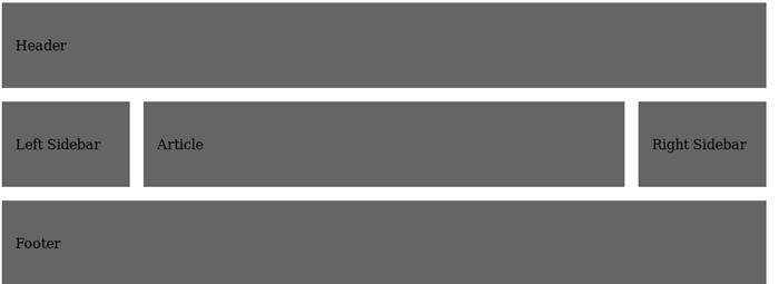
The holy grail layout is a layout that consists of fixed width header, footer, left sidebar, right sidebar and fluid hero item as below:
Traditionally, it is composed via negative margins technique.
To be honest, this doesn’t communicate much to me and looks more like a bunch of hacks. Luckily display: grid has arrived which allows to build 2-dimensional layout in more semantically meaningful style.
Markup
Let’s define our markup as follows:
<div class="grid">
  <header>
    Header
  </header>

  <aside class="sidebar-left">
    Left Sidebar
  </aside>

  <article>
    Article
  </article>

  <aside class="sidebar-right">
    Right Sidebar
  </aside>

  <footer>
    Footer
  </footer>

</div>
Styles
First, we define that container employs grid layout:
.grid {
  display: grid;
}
As you might already have noticed, our grid has 3 rows. Let’s make them equal for the sake of simplicity.
grid-template-rows: repeat(3, 100px);
We use repeat function for that which repeats row specified number of times.
Also we have 3 columns: the first and the last of them are fixed width whereas the middle one occupies all the remaining space.
grid-template-columns: 150px 1fr 150px;
Here fr is a new unit that indicates a fraction of a free space. Here, middle column consumes one fraction of a free space.
Our complete container styles look as follows:
.grid {
  display: grid;
  grid-template-columns: 150px 1fr 150px;
  grid-template-rows: repeat(3, 100px);
}
Now we have to make our header and footer span for all 3 available columns:
header, footer {
  grid-column: 1 / 4;
}
Which is the shorthand for:
header, footer {
  grid-column-start: 1;
  grid-column-end: 4;
}
Or:
header, footer {
  grid-column-start: 1;
  grid-column-end: span 3;
}
Which means that header and footer span for 3 columns.
Now we just have to assign grid rows:
header {
  grid-row: 1;
}

.sidebar-left {
  grid-column: 1;
  grid-row: 2;
}

article {
  overflow: hidden;
  grid-column: 2;
  grid-row: 2;
}

.sidebar-right {
  grid-column: 3;
  grid-row: 2;
}

footer {
  grid-row: 3;
}
Internet Explorer 11 Support
This feature is available for all modern browsers but in case you still have support for Internet Explorer 11, you will require some special prefixes:
.grid {
display: -ms-grid;
display: grid;
-ms-grid-columns: 150px 1fr 150px;
grid-template-columns: 150px 1fr 150px;
-ms-grid-rows: 100px 100px 100px;
grid-template-rows: repeat(3, 100px);
}
And some prefixes for grid-column and grid-row in the following fashion:
header, footer {
-ms-grid-column: 1;
grid-column-start: 1;
-ms-grid-column-span: 3;
grid-column-end: span 3;
}
Conclusion
As you have seen in this article, grid layouts allow us to create 2-dimensional layouts in a more semantically concise way without employing CSS hacks. As they are supported for all modern browsers, they are now de-facto standard for creating 2-dimensional layouts.
Team leader with 8 years of experience in the industry. Applying interest to a various range of topics such as .NET, Go, Typescript and software architecture.


 General
  News
News  Suggestion
  Question
  Bug
Bug  Answer
  Joke
Joke  Praise
  Rant
Rant  Admin
Admin 


 Submit an article or tip


