Introduction
One of the main reasons for using .NET Core is that you can run it on multiple platforms and architectures. So you can build an application on one platform and run it on Windows, Linux, MacOS, and on different architectures like x86 and ARM. In this article, I will demonstrate how to create a cross-platform chart application using the ASP.NET Core (2.0) MVC.
In the past, when creating a chart application with WinForm or WPF, the code or the library usually runs on the server. For example, the Microsoft (MS) Chart Control was developed for Windows Forms and ASP.NET applications, and it runs on the server side. Here, I will show you how to create an ASP.NET Core chart application using a client-side chart library – Google Charts.
Google Charts API provides a large number of ready-to-use chart types. It offers sensible default appearance that may usually be all you need, but has flexible options to allow for customization when needed. Better than most other free to use charting libraries, Google Charts has great documentation provided by Google. It uses a predictable API, meaning that once you learn to use it for one chart type, it is easy to begin creating other types of charts.
One drawback for using Google Charts is that even though it is free, but it is not open-source. Google’s licensing does not allow you to host their library on your server. This means that you cannot use the Google Charts offline. If you are with a big enterprise and have some sensitive data, Google Charts might not be the best option.
Charts with DataTable
Google Charts API use the DataTable to pass data into a chart. All charts store their data in a table. Data is stored in cells referenced as (row, column), where row is a zero-based row index, and column is either a zero-based column index or a unique ID that you can specify.
Here, I will use a simple example to show you how to create charts directly using DataTable. Open Visual Studio 2017, start with a new ASP.NET Core (2.0) MVC project, and name it NetCoreChart. Add a new controller named ChartController to the Controllers folder and add the following code to the controller:
public IActionResult UseDataTable()
{
   return View();
}
Add a new folder named Chart to the Views folder. Add a new view named UseDataTable.cshtm to the Chart folder and replace its content with the following code:
<div class="container">
<div class="row">
<div class="col-md-6">
<h4 style="margin-left:200px">Simple Pie Chart</h4>
<div id="chart1"></div>
</div>
.......
</div>
@section scripts{
<script type="text/javascript" src="https://www.gstatic.com/charts/loader.js"></script>
<script>
google.charts.load('current', { 'packages': ['corechart'] });
google.charts.setOnLoadCallback(drawChart);
function drawChart() {
var data = new google.visualization.DataTable();
data.addColumn('string', 'Tax Type');
data.addColumn('number', 'Tax Percentage');
data.addRows([
['Soc. Sec. Tax', { v: 30, f: '30%' }],
['Income Tax', { v: 35, f: '35%' }],
['Borrowing', { v: 15, f: '15%' }],
['Corp. Tax', { v: 12, f: '12%' }],
['Misc', { v: 8, f: '8%' }]
]);
var option = {
title: 'Tax Structure in US',
width: 500,
height: 400
};
var chart = new google.visualization.PieChart(document.getElementById('chart1'));
chart.draw(data, option);
option.is3D = true;
chart = new google.visualization.PieChart(document.getElementById('chart2'));
chart.draw(data, option);
option.is3D = false;
option.slices = {
1: { offset: 0.3 },
3: { offset: 0.5 }
};
chart = new google.visualization.PieChart(document.getElementById('chart3'));
chart.draw(data, option);
option.is3D = true;
chart = new google.visualization.PieChart(document.getElementById('chart4'));
chart.draw(data, option);
}
</script>
}
This code first loads the current version of corechart API using google.chart.load method and implements a function named drawChart. Here, we use the same data to create four different pie charts: a normal pie chart, a pie chart with 3D effect, an exploded pie chart, and an exploded pie chart with 3D effect. The difference between these charts are specified by configuring the option for each chart.
Running the project produces the output shown in Figure 1.
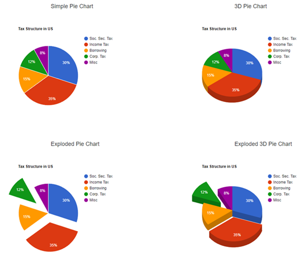
Figure 1: Pie charts created using DataTable
Use Data Array
Google Charts offers a helper function named arrayToDataTable that can be used to create and populate a DataTable using a data array. We will use an example to demonstrate how to use a data array to create charts.
Add the following code to the ChartControl.cs:
public IActionResult UseDataArray()
{
   return View();
}
Add a new view named UseDataArray.cshtml to the Views/Chart folder and replace its content with the following code:
<div class="container">
<div class="row">
<div class="col-md-6">
<h4 style="margin-left:200px">Simple Pie Chart</h4>
<div id="chart1"></div>
</div>
<div class="col-md-6">
<h4 style="margin-left:200px">Line Chart</h4>
<div id="chart2"></div>
</div>
</div>
</div>
@section scripts{
<script type="text/javascript" src="https://www.gstatic.com/charts/loader.js"></script>
<script>
google.charts.load('current', { 'packages': ['corechart'] });
google.charts.setOnLoadCallback(drawChart);
function drawChart() {
var arr = [
['Tax Type', 'Tax Percentage'],
['Income Tax', { v: 35, f: '35%' }],
['Borrowing', { v: 15, f: '15%' }],
['Corp. Tax', { v: 12, f: '12%' }],
['Misc', { v: 8, f: '8%' }]
];
var data = google.visualization.arrayToDataTable(arr, false);
var option = {
title: 'Tax Structure in US',
width: 600,
height: 500
};
var chart = new google.visualization.PieChart(document.getElementById('chart1'));
chart.draw(data, option);
arr = [];
arr.push(['x', 'sin(x)', 'cos(x)', 'sin(x)^2']);
for (var i = 0; i < 70; i++) {
var x = 0.1 * i;
arr.push([x, Math.sin(x), Math.cos(x), Math.sin(x) * Math.sin(x)]);
}
data = google.visualization.arrayToDataTable(arr, false);
chart = new google.visualization.LineChart(document.getElementById('chart2'));
chart.draw(data, option);
}
</script>
}
This code creates two charts: a pie chart and a line chart. In the pie chart, we define an array manually, while in the line chart, we create the data array using three math functions: sin(x), cos(x), and sin(x)^2. It then calls the arrayToDataTable function to define and populate the DataTable.
Running this example generates the results shown in Figure 2.

Figure 2: Charts created using data arrays
Use Json Data
You can also pass the Json data into the DataTable constructor. This will be useful when you generate data on server. The main advantage of this approach is that it processes much faster than other methods (such as using data array) for large tables. While the disadvantage is its complex syntax format that is tricky to get right, and prone to typos, resulting in a not very readable code.
Add the following code snippet to the ChartController.cs:
public IActionResult UseJsonData()
{
    return View();
}
Add a new view named UseJsonData.cshtml to the Views/Chart folder and replace its content with the following code:
<div class="container">
......
</div>
@section scripts{
<script type="text/javascript" src="https://www.gstatic.com/charts/loader.js"></script>
<script>
google.charts.load('current', { 'packages': ['corechart'] });
google.charts.setOnLoadCallback(drawChart);
function drawChart() {
var json = {
cols: [
{ id: 'taxType', label: 'Tax Type', type: 'string' },
{ id: 'percent', label: 'Tax Percentage', type: 'number' }
],
rows: [
{ c: [{ v: 'Soc. Sec. Tax' }, { v: 30, f: '30%' }] },
{ c: [{ v: 'Income Tax' }, { v: 35 }] },
{ c: [{ v: 'Borrowing' }, { v: 15 }] },
{ c: [{ v: 'Corp. Tax' }, { v: 12 }] },
{ c: [{ v: 'Misc' }, { v: 8 }] },
],
};
var data = new google.visualization.DataTable(json);
var option = {
title: 'Tax Structure in US',
width: 500,
height: 400
};
var chart = new google.visualization.PieChart(document.getElementById('chart1'));
chart.draw(data, option);
......
}
</script>
}
This code is basically the same as what we used in the UseDataTable example, except that we use a Json string object to populate the DataTable. You can see that the Json data object consists of two required top-level properties, cols and rows, and other optional p property (not used in this example) that is a map of arbitrary values.
The code then puts the Json object directly into the DataTable's constructor to populate the table. Running this example produces the same results as shown in Figure 1.
Use Data From Server
We can also use the data from the server side to create charts. Let's consider a simple example, where we want to create a line chart with data from server.
Add a ModelHelper.cs class to the Model folder. Here is the code for this class:
using System.Collections.Generic;

namespace NetCoreChart.Models
{
    public static class ModelHelper
    {
       public static List<object> MultiLineData()
        {
            List<object> objs = new List<object>();
            objs.Add(new[] { "x", "sin(x)", "cos(x)", "sin(x)^2" });
            for(int i = 0; i < 70; i++)
            {
                double x = 0.1 * i;
                objs.Add(new[] { x, Math.Sin(x), Math.Cos(x), Math.Sin(x) * Math.Sin(x) });
            }
            return objs;
        }
    }
}
The MultiLineData method generates a data list that will be used to create a line chart at the client side. Add the following code snippet to the ChartController.cs:
public IActionResult UseDataFromServer()
{
    return View();
}

public JsonResult JsonData()
{
    var data = ModelHelper.MultiLineData();
    return Json(data);
}
The JsonData method converts the data list into a Json object. Add a new view named UseDataFromServer.cshtml to the Views/Chart folder and replace its content with the following code:
<div class="container">
    <div id="chart1"></div>
</div>

@section scripts{
    <script type="text/javascript" src="https://www.gstatic.com/charts/loader.js"></script>

    <script>
        google.charts.load('current', { 'packages': ['corechart'] });
        google.charts.setOnLoadCallback(drawChart);

        function drawChart() {
            $.get('JsonData', function (jsonData) {
                data = google.visualization.arrayToDataTable(jsonData, false);
                var option = {
                    title: "Line Chart",
                    width: 800,
                    height: 600
                };
                chart = new google.visualization.LineChart(document.getElementById('chart1'));
                chart.draw(data, option);
            })
        }
    </script>
}
This code first retrieves the Json data from the server using AJAX .get function, and then converts the Json data into DataTable using the arrayToDataTable helper function. Running this example produces the results shown in Figure 3.
Figure 3: Chart created using the data from server
Real-Time Charts
Real-time charts have wide applications, such as the stock charts in finance and temperature changes in weather forecast. Here, I will show you how to create a real-time chart using ASP.NET Core MVC and Google Charts API.
Here, we assume that the data source will be from the server side, simulating the real-time stock quote. Add a new class named RealTimeData to the end of ChartController.cs:
public class RealTimeData
{
    public DateTime TimeStamp { get; set; }
    public double DataValue { get; set; }
}
Add the following two methods to ChartController.cs:
Random rdn = new Random();

public IActionResult RealTimeChart()
{
    return View();
}

public JsonResult GetRealTimeData()
{
    RealTimeData data = new RealTimeData
    {
        TimeStamp = DateTime.Now,
        DataValue = rdn.Next(0, 11)
    };
    return Json(data);
}
The GetRealTimeData method converts the previous RealTimeData object into a Json object. Here, for simplicity's sake, we create data with a time stamp and a random number. In real world applications, you should replace the RealTimeData object with the actual data source.
Add a new view named RealTimeChart.cshtml to the Views/Chart folder and replace its content with the following code:
<div class="container">
    <div id="chart1"></div>
</div>

@section scripts{
    <script type="text/javascript" src="https://www.gstatic.com/charts/loader.js"></script>
    <script src="~/lib/node_modules/moment/moment.min.js"></script>

    <script>
        google.charts.load('current', { 'packages': ['corechart'] });
        google.charts.setOnLoadCallback(callback);

        function callback() {
            var option = {
                title: "Real-Time Chart",
                width: 900,
                height: 650,
                legend: { position: 'none' },
                vAxis: { viewWindow: { min: -1, max: 11 }, baselineColor: 'transparent'  },
                chartArea: { height: '80%', width: '85%', left: 100,
                             backgroundColor: { stroke: "gray", strokeWidth: 1 } },
                pointSize: 10
            };
            var chart = new google.visualization.LineChart(document.getElementById('chart1'));
            var data = new google.visualization.DataTable();
            data.addColumn('datetime', 'TimeStamp');
            data.addColumn('number', 'Value');

            drawChart();
            setInterval(drawChart, 1000);

            function drawChart() {
                $.get('GetRealTimeData', function (d) {
                    var timeStamp = new Date(d.timeStamp);
                    var time = { v: timeStamp, f: moment(timeStamp).format('HH:mm:ss') };
                    var val = d.dataValue;
                    data.addRow([time, val]);
                    if (data.getNumberOfRows() > 20) {
                        data.removeRow(0);
                    }
                    chart.draw(data, option);
                });
            }
        }
    </script>
}
This code is basically the same as in the UseDataFromServer example, except that here we use the setInterval(drawChart, 1000) method to update the chart in every second (1000 milliseconds). In addition, we only keep 20 data points on the screen. If the data points are more than 20, we will remove the oldest data points using the removeRow method.
Running this example gives you a smooth real-time chart, as shown in Figure 4.
Figure 4: Real-time chart created using data from server
Here, I have presented the detailed procedure on how to create cross-platform charts using ASP.NET Core MVC and a client-side chart library - Google Charts API.
Jack Xu has a PhD in theoretical physics. He has over 25-year programming experience in Basic, FORTRAN, C, C++, Matlab, C#, WPF, and R, specializing in numerical computation methods, algorithms, physical modeling, computer aided design tools, graphical user interfaces, 3D graphics, and database systems. In recent years, he works as a quant analyst and developer on Wall Street and is responsible for quantitative analysis, trading strategy development, and real-time trading system implementation. He has published 9 books on C#, .NET chart/graphics programming, numerical methods, and quantitative finance. Recently, he developed a new graphics creation and technical analysis platform called Gincker.com, which allows users to create advanced charts and graphics just by typing in a mathematical formula or loading a dataset without the need to write a single line of code or rely on any special software package.


 General
  News
News  Suggestion
  Question
  Bug
Bug  Answer
  Joke
Joke  Praise
  Rant
Rant  Admin
Admin 


