Introduction
Today I will be explaining the concept behind and the implementation of a custom split panel using WPF all the way from A to backwards R. The trek to build this thing has been a long one; however, I am satisfied with the final implementation.
Motivation
My motivation for making the split panel was not to invent something that was not already available, but really to get back into the swing of WPF development. I wanted to see if I could develop a functional custom control that did the business. After that, I wanted to share my experience in case the control could be of use to anybody and to provide a unique perspective on the development. I used WPF way back in 2007- 08 and fell in love with it at first sight. I then had a brief stint with it for several months at a job in 2011. After that, I hadn't touched it since due to my job not being in PC UI development, but rather firmware development. Right now, I have some down time at my job, so I wanted to get back into UI development.
Download Package
The zip file contains the WPF test program as well as my common library that I have been building up for the past couple of years for various PC app needs. The relevent code for this article is contained in the common library project in the WPF/Controls/SplitPanel folder. The Themes folder contains the WPF styles for the WPF portion of the library.
Background
There are several split panel controls available that can be found from some brief reserarch, but nothing had an interface that seemed quite right to me. Believe it or not, I spent about 3 weeks trying to implement the best interface for this control until I finally settled on the current one. I must have rewritten the control about 10 times in the process. What I wanted was a control that I could just add children to and splitters would automagically appear in the middle of said children to allow resizing of them. That said, here are some of the interface ideas I had:
1. Splitters and Children Collection
This interface allows the user to create sub containers by adding to the Splitters collection.
<SplitPanel>
    <SplitPanel.Splitters>
        <Splitter Position="0.5"/>
        <Splitter Position="0.4"/>
        <Splitter Position="0.7"/>
        <Splitter Position="0.2"/>
        <Splitter Position="0.1"/>
    </SplitPanel.Splitters>

    <Button Position="1"/>
    <Button Position="2"/>
    <Button Position="3"/>
    <Button Position="0"/>
</SplitPanel>
Pros:
- User can individually style each and every splitter.
- Positioning each sub container by the user is easy because the user specifies the absolute position of each splitter from 0 - 1.0 like a slider.
- The user uses the position attached property on children to position children in sub containers like a grid.
- The user can have empty sub containers if they want by not specifying a child in a given sub container via the position attached property.
Cons:
- Synchronizing the absolute positions of splitters becomes a nightmare. Each splitter that is added to the collection must have its position less than the position of the next splitter in the collection. This hard requirement can seep all the way down to the measure and arrange passes depending on how its implemented, making the code complicated.
- A sorted insert into the splitters collection based on splitter position cannot be performed because of how the WPF xaml loader works. The xaml loader adds splitters to the Splitters collection before the Position DP of the splitter is set.
2. Size Definitions and Children Collection
Here we optionally replace the splitters collection with a size definitions collection that is like the column definitions or row definitions of a grid. Overall we have up to 3 collections to populate in order to perform splitting.
<SplitPanel>
    <SplitPanel.SizeDefinitions>
        <SizeDefinition Size="Auto"/>
        <SizeDefinition Size="2*"/>
    </SplitPanel.SizeDefinitions>

    <SplitPanel.Splitters>
        <Splitter/>
        <Splitter/>
    </SplitPanel.Splitters>

    <Button Position="1"/>
    <Button Position="2"/>
    <Button Position="3"/>
    <Button Position="0"/>
</SplitPanel>
Pros:
- Positioning becomes relative based on the size definitions, therefore no hard requirements inside each collection have to be made.
- User can specify a grid length size: Auto, Pixel, or Star.
Cons:
- Very hard to synchronize all the collections working together making the code complicated.
3. Recursive Split Panel
A well known implementation of a split panel is one that only allows 2 children inside the panel and a splitter between them.
<SplitPanel Proportion="0.5">
    <SplitPanel.FirstChild>
        <Button/>
    <SplitPanel.FirstChild>
    <SplitPanel.SecondChild>
        <Button/>
    <SplitPanel.SecondChild>
</SplitPanel>
which would produce something like this:

So far so good. So let's try a slightly more complicated panel:
The xaml for this would look something like this:
<SplitPanel Proportion="0.3">
    <SplitPanel.FirstChild>
        <Button/>
    <SplitPanel.FirstChild>

    <SplitPanel.SecondChild>
        <SplitPanel Proportion="0.5">
            <SplitPanel.FirstChild>
                <Button/>
            <SplitPanel.FirstChild>

            <SplitPanel.SecondChild>
                <SplitPanel Proportion="0.5">
                    <SplitPanel.FirstChild>
                        <SplitPanel Proportion="0.6">
                            <SplitPanel.FirstChild>
                                <Button/>
                            <SplitPanel.FirstChild>

                            <SplitPanel.SecondChild>
                                <Button/>
                            <SplitPanel.SecondChild>
                        <SplitPanel/>
                    </SplitPanel.FirstChild>

                    <SplitPanel.SecondChild>
                        <Button/>
                    <SplitPanel.SecondChild>
                </SplitPanel>
            </SplitPanel.SecondChild>
        </SplitPanel>
    <SplitPanel.SecondChild>
</SplitPanel>
Pros:
- Easy for the most basic use case of essentially a single panel.
Cons:
- Complexity spirals out of control fast, I mean really fast, for even the simplest use cases above a single panel. I need a degree in astrophysics just to decipher the layout of the above code.
- You need just about as many split panels as you do controls you want to place inside the panels.
I went back to the drawing board to squeeze out my actual requirements for the panel and came to some realizations.
Requirements
When I went back to the drawing board, I was basically pulling my hair out at this point, because everything I had done up until this point ended in failure. I had a few attempts at an implementation that threatened to work, but the code and interface smelled pretty bad.
After some deliberation, I cut the control down to the essentials. I still wanted people to be able to style the splitters used inside the control, but maybe they don't have to style each and every one. After all, a consistent UI should have the same style for controls of the same type (such as splitters). So the user can style the splitters using a global style or providing a style to the split panel using a DP when it internally adds splitters to the panel. Right now, my panel does not offer a style DP for setting the style of splitters within the panel, because I don't require this functionality, but it would be easy for somebody to add this DP to the panel to extend it. Currently, I am just using a global style for all the splitters inside panels.
Once you get rid of the notion of allowing the user to style each and every splitter in the panel, the splitters collection can be removed from user interaction and the panel can add splitters to itself easily when children are added.
Nextly, how do we handle initial positions of the sub containers with children? Well, users are used to star sizing in column or row definitions inside a grid, so let's go with that. The initial position / sizing of a child inside the panel uses an attached dependency property called size which implictly uses star sizing. I originally wanted to use the full grid length allowing users to be able to specify auto, pixel, or star, but after trying this implementation, auto and pixel don't really make sense and the code gets more complicated. Generally with the panel, I expect the developer to specify initial positions for the children inside the panel and then let the user resize using the splitters.. I mean that's the whole point of the panel in the first place. Using star size has a side effect, which I don't really think matters much. The side effect is that when the user resizes the control (which can be done by resizing the window), star sizing will take effect and the children inside the panel will adjust their sizes in line with the star sizing. This means its not possible to "fix" a child size during a panel resize operation. In the grand scheme, I don't think this is an issue because the user can resize the window for example and then just resize the children if they want to. The star sizing side effect also makes the code less complicated because all of the other types of sizing do not have to be dealt with.
Now, let's discuss orientation. The panel has an orientation when it positions its children: horizontal or vertical. Notice in my above discussions I am careful to say "size" and not "width" or "height" of children. This is because "size" will apply to both orientations. For example, a size of 1 (star) means the same thing for both horizontal or vertical orientations. Splitter controls that are implictly added to the panel when children are added have an orientation DP that is opposite of the parent panel's orientation. So if a panel has an orientation of horizontal, every child splitter has an orientation of vertical. The orientation DP was added to the splitters so that they can be styled based on orientation.
So after that lengthly discussion: here is the summary of requirements for the panel:
- The panel has a children collection in which the user adds children and they get positioned based on the panel orientation.
- The panel has an orientation so it can position children horizontally or vertically. Any implict splitters added to the panel have the opposite orientation from the parent panel for consistency.
- The panel uses star sizing for its children. The size of a child can be set through an attached property: size.
- The panel should expose a minimum child size DP that is used for resizing using splitters.
- Whenever a child is added to the panel, an implicit splitter control used for resizing is added to the panel as well. Splitter controls are only added to the panel if there are at least 2 children in the panel.
- The user of the panel has no access to the splitters inside the panel. The children collection of the panel should be exposed as is; the panel should not be implictly adding controls to the children collection that appear in the user's interface.
The xaml code interface then looks like this:
<SplitPanel Orientation="Horizontal" MinChildSize="50">
    <Button/>
    <Button/>
    <Button SplitPanel.Size="2"/>
</SplitPanel>
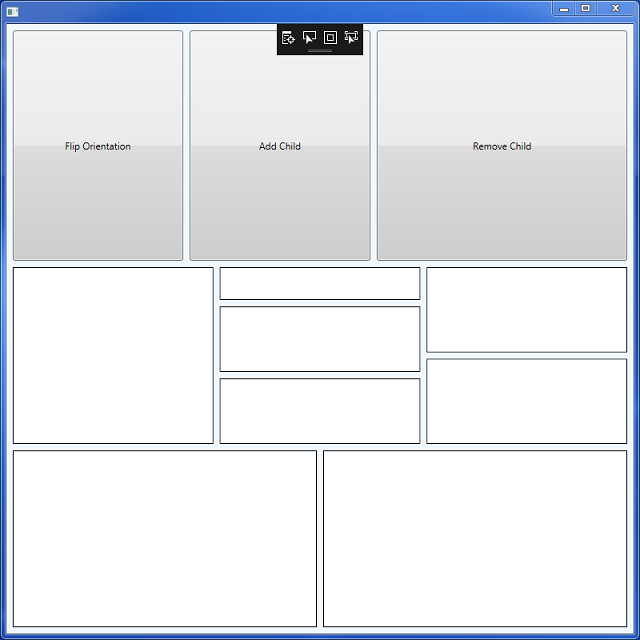
The above code would produce the following:
Implementation
The implementation of the panel is divided up into several items: the panel itself, the children collection, and the splitter controls.
Split Panel
Derive from What?
The choice of what WPF element to derive from is an important one that will affect the interface to the control. Most people religiously derive from Panel. Since the last revision of this article, I did a little research and came upon this article:
https://www.codeproject.com/Articles/24982/Conceptual-Children-A-powerful-new-concept-in-WPF
This article explains what the features of panel are and also how the Children collection ties into the panel class. Basically, deriving from the Panel class gives you a few benefits, which we will discuss below.
ZIndex
Deriving from Panel gives you ZIndex handling if you decide to use the built in Children collection (which most or all provided Panels in the framework do). The ZIndex attached property can be set on a child and if the derived Panel supports it, such as a grid, the ZIndex will have an effect on how children overlay each other.
For my custom split panel, ZIndex has no meaning. Therefore, if we lose the ability to set the ZIndex on children, it won't be missed.
ItemsControl
This is quite arguably the biggest sticking point for a custom panel. The Panel class has built in support for items controls, which means you can set a panel as the template of one. The WPF system will automatically manage children added to the item control with the panel template. For example, if a child is added or removed from the items control, the Panel class will handle adding or removing the child to / from the panel as well.
I personally would have no issue with deriving from Panel if I could customize the Children collection for the requirements in my requirements section. The biggest issue here though is that the Panel's ItemsControl handling is tightly tied to internal code within the Children UIElementCollection of the panel. As the article states, UIElementCollection gives off a fake vibe that you can essentially override all of the collection behavior by allowing you to override the generic collection operations: Add, Insert, Remove, Clear, etc.. However, there are internal functions such as InternalAdd, InternalInsert, etc.. that do the heavy lifting for the collection operations. These functions are marked internal and non virtual, so they cannot be overridden. When your Panel is an ItemsHost as part of an ItemsControl, the Panel class uses these internal functions instead of using the user overridable functions: Add, Insert, etc..
The above Panel / UIElementCollection behavior poses a big issue, because in order to implement my SplitPanel, I need to run custom code every time children are added to the collection. For example, I may need to add a splitter control to the panel when a child is added. I think the WPF team made an oversight here, because the internal functions probably should have been marked: protected internal virtual allowing users to override the behavior. Although all seems bleak, there is one way that I found in the article to run custom code when operations are performed on the collection using the internal functions.
The one way to run custom code lies in the Visual class. This class provides a callback called OnVisualChildrenChanged. When an operation be it an InternalAdd, InternalRemove, Add, whatever, is performed, the UIElementCollection ultimately will call AddVisualChild or RemoveVisualChild. This triggers the OnVisualChildrenChangedCallback wherein now you can run custom code such as what we need to do with the custom Split Panel.
So from the above discussion, there is in fact a way to derive the SplitPanel from Panel and provide a custom collection through the Panel's CreateUIElementCollection callback and make the interface work like I want; however, I still opted to derive from FrameworkElement. The reason is because I did not build the SplitPanel to be part of an ItemsControl, and from a logical standpoint, having a SplitPanel be an ItemsHost, just doesn't seem right. The children of a SplitPanel can be resized using the splitters, and because of that the Panel inherits an overall different class of functionality in my mind.
Children
The Panel class provides the Children and InternalChildren collections that work closely with the ItemsControl handling. The Panel will handle properly hooking up each child to the parent when the collection is modified.
In order to override this functionality and provide a custom collection, you can use the Panel's CreateUIElementCollection callback when it goes and creates the Children collection for the panel. The custom collection must derive from UIElementCollection. From what we have seen, the UIElementCollection puts on a facade of being overridable / customizable, but really isnt, because of the internal functions that are needed to fully customize it.
Derive from FrameworkElement
So in the end, the SplitPanel derives from FrameworkElement. The Panel class provides a background DP that is manually rendered by overiding the OnRender function. The SplitPanel does the same since it does not derive from Panel and needs to manually implement the background DP.
In order to tell WPF that our panel will hold multiple children that will also be rendered, we need to override a few FrameworkElement functions to make this happen. The functions are: VisualChildrenCount, and GetVisualChild. The custom ElementCollection that is implemented for the control holds all the Visuals that need to be rendered in the VisualTree of the control. For the GetVisualChild override, we simply return the Visual at the given index, and for the VisualChildrenCount we return the number of Visuals stored in the collection.
FrameworkElements that override the two above functions, seem to not be able to be styled and as a result, anything that needs to be shown on the panel such as a Background must be manually rendered in the OnRender function.
Layout
The meat of the code of the panel is contained in the measure and arrange overrides. The overridden functions call either MeasureHorizontal, MeasureVertical, ArrangeHorizontal, and ArrangeVertical depending on the orientation of the panel. The 2 pairs of functions do the same things except the horizontal functions operate using width and the vertical functions operate using height.
Measure
During the measure phase we calculate the star sizing for the children and also the size for each of the splitters contained in the panel. The desired size for the splitters always take precedence over measurement of the children. This means the splitters are measured first and whatever size is left over goes to the children.
How is star sizing calculated for a child? Star sizing can be thought of as a proportion based sizing mechanism. When you specify a star size, you are specifying a proportion of the available size (width or height) of the panel to be distributed to your child during layout. Let's take a look at the picture:
The picture shows a panel with 3 children inside. The first child has a star size specified as 1, the second specifies a star size of 1, and the third specifies a star size of 2. At the end of the day, the actual widths of the children will be calculated as 25, 25, and 50. The calculation to arrive at the actual widths is quite simple. Divide the available size by the addition of all the star sizes of the children in the panel. In our case: 100 / (1 + 1 + 2) which yields 25. This number in my implementation is called the "star unit size". Subsequently to calculate the actual width of a child at this point, you take the star unit size and multiply by the star size of each child. For the first two children, the calculation becomes: 1 * (25) which yields an actual width of 25 for the children. For the last child, the calculation is: 2 * (25) which yields an actual width of 50 for the child.
The same calculations are used for either horizontal or vertical orientations. The only difference between the orientations is that you are either acting on width or height.
Keep in mind that the example is simplified. The example shows an available width to the children of 100. The available width for the children is calculated by taking the width passed into MeasureOverride and subtracting from it the addition of all of the desired sizes of each splitter in the panel.
The code for the measure pass is shown below.
private Size MeasureHorizontal(Size constraint)
{
Size panelSize = constraint;
double width = HorizontalSplittersMeasure(constraint);
constraint.Width -= width;
HorizontalChildrenMeasure(constraint);
return panelSize;
}
private double HorizontalSplittersMeasure(Size constraint)
{
double width = 0;
foreach (Splitter splitter in Children.Splitters)
{
splitter.Measure(constraint);
double splitterWidth = splitter.DesiredSize.Width;
width += splitterWidth;
constraint.Width -= splitterWidth;
}
return width;
}
private void HorizontalChildrenMeasure(Size constraint)
{
double width = constraint.Width;
if ((width != 0) && (Children.Count > 0))
{
StarMeasure(width);
}
foreach (UIElement child in Children)
{
constraint.Width = (GetSize(child) * starUnitSize);
child.Measure(constraint);
}
}
private void StarMeasure(double constraint)
{
foreach (UIElement child in Children)
{
starUnitSize += GetSize(child);
}
if (starUnitSize == 0)
{
starUnitSize = constraint;
SetSize(Children.LastElement, starUnitSize);
}
starUnitSize = (constraint / starUnitSize);
}
Arrange
The arrange pass is pretty simple. Previously in the measure pass, the star unit size was calculated. The arrange code simply arranges child, splitter pairs until the last child in the panel is reached. Then the last child is arranged. The reason it is done this way is because there is one less splitter control in the panel compared to the number of children in the panel.
To arrange everything in the panel, we keep an offset variable. The children or splitters are arranged left to right for a horizontal orientation or top to bottom for a vertical orientation. In each case, the offset is updated after each item is arranged by the width or height of the item.
The width or height of a child can be calculated by taking the star unit size and multiplying by the star size as explained in the measure section.
private Size ArrangeHorizontal(Size size)
{
int numChildren = Children.Count;
double offset = 0;
double height = size.Height;
for (int count = 0; count < (numChildren - 1); count++)
{
offset = HorizontalChildArrange(Children[count], offset, height);
offset = HorizontalSplitterArrange(Children.Splitters[count], offset, height);
}
if (numChildren > 0)
{
HorizontalChildArrange(Children.LastElement, offset, height);
}
return size;
}
private double HorizontalChildArrange(UIElement child, double offset, double height)
{
if (starUnitSize == 0)
{
return offset;
}
double width = (GetSize(child) * starUnitSize);
child.Arrange(new Rect(offset, 0, width, height));
return (offset + width);
}
private double HorizontalSplitterArrange(Splitter splitter, double offset, double height)
{
double width = splitter.DesiredSize.Width;
splitter.Arrange(new Rect(offset, 0, width, height));
return (offset + width);
}
Orientation
The split panel implements an orientation property. Whenever a splitter is created through the ElementCollection, the splitter binds to the SplitPanel's orientation property. The splitter then uses the CoerceOrientation function to force the orientation of the splitter to be opposite to that of the Panel.
ElementCollection
The element collection is what is directly accessible to the user to add children to the panel. All operations in the collection are implemented in terms of Insert and RemoveAt because all other collection operations can be implemented just by using these two functions.
The split panel creates an element collection inside its constructor. The panel exposes the Children DP to remain consistent with other panels which internally accesses the custom element collection.
Internally, the collection keeps another collection called Visuals. All splitters and child elements are added to the visuals collection so that the SplitPanel can query them for the VisualChildrenCount and GetVisualChild overrides.
Insert Operation
When a child is inserted into the collection, a new splitter control is implictly created if there is already at least one element in the collection. The collection will then wire up the splitter and child to the panel by calling AddLogicalChild and AddVisualChild on the elements. The collection also adds the elements to the visuals collection.
Remove Operation
When a child is removed, a splitter is removed from the collection if there is at least one element left in the collection. The collection will call RemoveLogicalChild and RemoveVisualChild on the splitter and child elements to unhook them from the panel. The collection will also remove the elements from the visuals collection.
Panel Invalidate
Whenever an operation on the collection is performed that modifes the collection, the panel's InvalidateMeasure function must be called to tell the WPF layout system to execute a layout pass on the panel.
Splitters
The splitter control is what is used to resize children inside the panel. The splitter overrides the various mouse events to implement that behavior, but from a logical standpoint, how do perform a resize using star sizing?
Star Sizing Resize
To figure out how resizing worked with star sizing, I actually had to perform some tests using the grid splitter, because I didn't know how to do it off the top of my head. It was probably something that could be figured out fairly easily given some thought, but I opted to take a faster approach and implement a test program using a few children with grid splitters.
Let's look at a picture to see what grid splitter is doing to perform a resize on star children. In the picture, we have a grid with 3 column definitions which have the width as follows: 1 star, Auto, and 1 star. Then 2 child buttons and a grid splitter are put into the grid.
Before any resizing takes place on the left, we can see that the column definitions widths are both 1 star and the actual widths of the 2 child buttons are 50.
When I first click on the grid splitter, it does something interesting. For each column definition in the grid that has star sizing set for its width, the grid splitter transfers the actual width of each corresponding child into the width of the column definition. Now notice the grid splitter doesn't just set the column definition width to 50, but 50 star. This is important.
Now since the width of the column definition is set to an actual width that can be resized, the grid splitter performs the resize operation between the children by just applying the mouse delta to the width of the each column definition.
So overall, what the grid splitter is doing is converting each column definition that has a star size to a "pixel" width which it can then use in resize operations. If it did not do this, it would have to operate on the star sizes directly with more complicated math. The grid splitter will perform this conversion each and every time you click on one so as to keep the size of the definition in a fresh state for resizing.
Now remember when I said the grid splitter converts to actual width (star) and not just actual width? Why is it doing this? If you run the math, converting to actual width (star) actually keeps the proportions that were originally set by the user. Let's run the math for star sizing on the panel before and after the conversion operation.
Before Resize
AvailableWidth = 100
Button1_Size = 1*
Button2_Size = 1*
StarUnitSize = (100 / (1 + 1)) = 50
Button1_Width = (StarUnitSize * Button1_Size) = (50 * 1) = 50
Button2_Width = (StarUnitSize * Button2_Size) = (50 * 1) = 50
After Conversion (Or Resize)
AvailableWidth = 100
Button1_Size = 50*
Button2_Size = 50*
StarUnitSize = (100 / (50 + 50)) = 1
Button1_Width = (StarUnitSize * Button1_Size) = (1 * 50) = 50
Button2_Width = (StarUnitSize * Button2_Size = (1 * 50) = 50
Application
So the conversion that the grid splitter is doing above is pretty neat because as we have proven, changing the size of the column definitions keeps the original star sizing proportions. So how do we apply this to the splitters in our panel? We do the exact same thing!
When the splitter control is about to perform a resize, it will cause a transfer of the current actual size (width or height) into each child's size attached property. It does this by calling UpdateSize on the panel that owns the splitter. The panel iterates through all of its children and does the transfer. Once the sizes of the children are updated, the splitter acquires the needed information for the resize between two children and then executes the resize operation using the various mouse events.
MinChildSize
The splitter control uses the MinChildSize DP of the panel to calculate the new size of the two corresponding children it is resizing. The MinChildSize is not used by the panel to set a hard limit on the minimum child size of a child something like MinWidth or MinHeight might do, but just used by the splitter during resize.
The splitter allows a user to resize a control beyond its current size if the corresponding control that is shrinking does not violate the MinChildSize DP.
Using the code
Using the control is fairly straightforward from xaml:
<Window
    xmlns="http://schemas.microsoft.com/winfx/2006/xaml/presentation"
    xmlns:x="http://schemas.microsoft.com/winfx/2006/xaml"
    Width="800" Height="800"
    x:Class="WPFTest.MainWindow"
    Background="AliceBlue">

    <SplitPanel Name="panel1" Margin="8" Background="AliceBlue" Orientation="Vertical" MinChildSize="50">
        <SplitPanel Name="panel2" MinChildSize="50">
            <Button Name="button1" Content="Flip Orientation"/>
            <Button Name="button2" Content="Add Child"/>
            <Button Name="button3" Content="Remove Child"/>
        </SplitPanel>
        <SplitPanel Name="panel3" Background="AliceBlue" Orientation="Vertical" MinChildSize="50">
            <SplitPanel Name="panel4" Background="AliceBlue" MinChildSize="50">
                <Border BorderBrush="Black" BorderThickness="1" Background="White"/>

                <SplitPanel Name="panel5" Orientation="Vertical" Background="AliceBlue" MinChildSize="50">
                    <Border SplitPanel.Size="0.5" BorderBrush="Black" BorderThickness="1" Background="White"/>
                    <Border BorderBrush="Black" BorderThickness="1" Background="White"/>
                    <Border BorderBrush="Black" BorderThickness="1" Background="White"/>
                </SplitPanel>

                <SplitPanel Name="panel6" Background="AliceBlue" Orientation="Vertical" MinChildSize="50">
                    <Border BorderBrush="Black" BorderThickness="1" Background="White"/>
                    <Border BorderBrush="Black" BorderThickness="1" Background="White"/>
                </SplitPanel>
            </SplitPanel>

            <SplitPanel Name="panel7" Background="AliceBlue" Orientation="Horizontal" MinChildSize="50">
                <Border BorderBrush="Black" BorderThickness="1" Background="White"/>
                <Border BorderBrush="Black" BorderThickness="1" Background="White"/>
            </SplitPanel>
        </SplitPanel>
    </SplitPanel>
</Window>
The demo program provided in the package, allows all major operations to be played with on a split panel: insert / remove children, split child, combine children, and flip orientation. The demo program code is fairly straightforward to understand, because it's basically all brute force. I understand that the code is very sloppy, but I just needed something to test out split panels.
As it is not immediately apparent how the textboxes work in the demo program, I will briefly explain here.
Set Panel
Set the panel index that is being operated on. Specify an index from 0 - NumPanels.
Set Index
Set the index into the Children collection of the split panel that is being operated on. For example, an index of 1 would be Children[1].
Set Size
Set the star size of the child to be inserted into the panel.
Set Count
Set the number of children to combine with the child at the given index of the SplitPanel. A value of 2 indicates combine the child at the given index with the next 2 children in the collection. A value of -3 indicates combine the child at the given index with the previous 3 children in the collection. A value of 0 means don't combine any children.
Set Proportion
Sets the size proportion for a split operation. The valid range is -1 to 1. A value of -0.5 will split the given child at the index exactly in two and place the new child before the existing child. A value of 0.5 will split the given child at the index exactly in two and place the new child after the existing child.
WPF Control Library
I am not a huge fan of specifying the xmlns:(Name Here) in my xaml, so I applied an xmlns attribute in the assembly information to the default xaml namespace: "http://schemas.microsoft.com/winfx/2006/xaml/presentation". This means that I do not have to use the (Name Here):SplitPanel like syntax when I use the controls from xaml. This suits my use case but may not suit yours, so you would end up having to remove that.
Final Notes
SplitChild
The split panel implements a SplitChild function that allows a child to be split in two based on a proportion. The proportion can be specified from -1 to 1. A negative value will split the child in two and add the new child before the existing child, and a positive value will split the child in two and add the new child after the existing child. To split the child exactly in two, a value of 0.5 (-0.5) can be used.
CombineChildren
The split panel implements a CombineChildren function that can combine any number of children inside the SplitPanel. The count parameter specifies the number of children to combine. A negative value specifies that all the children before the starting index will be combined, and a positive value specifies that all the children after the starting index will be combined.
Difference between Children.Insert / SplitChild and Children.Remove / CombineChildren
The difference between the pairs of functions is that the generic collection operations will operate directly on the collection without taking the actual size of existing children into account. For example, inserting a child into the Children of a split panel will cause a new layout pass and you will see all of the children in the panel shuffle around to accomodate the new size.
The SplitChild / CombineChildren functions take into account the current size of the existing children in the panel. Therefore, when a split or combine is done, you will not see all of the children that are not affected by the operation, shuffle around due to the new star sizes.
You can experiment with both types of operations and how they affect the layout using the demo program.
History
8/7/17
- Article Inception
8/8/17
- Added pictures to the article
- Rewrote various parts of the article
8/11/17
- Updated SplitPanel control
- Updated demo app
- Rewrote various parts of the article in line with research and updated code
This member has not yet provided a Biography. Assume it's interesting and varied, and probably something to do with programming.


 General
  News
News  Suggestion
  Question
  Bug
Bug  Answer
  Joke
Joke  Praise
  Rant
Rant  Admin
Admin 


 Submit an article or tip

