Introduction
- Make it easy to create a web-app that looks better than Windows program
- Wide range of tools including easy form creation that can resize - drag - hide and show!
- ActiveX-like controls - but easier and with NO DEPENDENCIES!
- SMALL FILE! Downloading ONLY what is needed for the current page-app (it will be cached too!)
- Inclusive of open forms ribbon with optional classic or digital clock
- Multilingual support for every single text!
- Custom styling for every piece - using
ThemeEditor WebApi (can serve as example too) - Easy to program and use
- Working with EFON - E-Forms Object Notation, which is Base64 object notation suitable for over-the-network transferring of ALL data
Changes from Previous Version
EF.Open() changed to suit OOP programmingEF.Run() changed to serve the Open function and to better initialize the SDKThemeEditor.htm API had a bug of saving images - it automatically saved them as base64 into variables leading to unnecessary enlarge the CSS file - this been corrected. Now it is very easy to create custom StyleSheet.
Overview
eForms (or its short name “EF”) derived from “Electronic Forms” is a Software Development Kit which contains set of controls and system for easy developing single or multi page web-app.
The name starting in a small “e” which looks like the symbol for “internet explorer” which became the symbol for internet/web, and this system is designed for web use.
Although developers are looking for clear and readable code, our goal is for a typical user it shall not be readable, but for the programmer it shall be clear enough for work. This is also a way to protect the code and the data.
Starting a New Project
First, let's take a look at the stylesheet that the SDK provides, and how easy it is to create themes.
The file ThemeEditor.htm that is included within this SDK can help to generate the final CSS along with necessary dynamic variables, using basic theme profile. The files that this compiler makes are ef.css and Style.js which shall be included in each new project. The content of Style.js which is a single EFON variable, shall be placed AFTER <script src="/ef/ef.js"></script>. Following are some examples, and you can have a look at each example HTML page.
Basic Empty Page
<html><head>
<meta http-equiv="content-type" content="text/html; charset=UTF-8">
<link rel="shortcut icon" href="efico.ico"></link>
<link rel="StyleSheet" href="ef.css" type="text/css"></link>
<script src="/ef/ef.js"></script>
<script src="Style.js"></script>
<script>
function Init() {
}
</script>
</head>
<body onload="EF.Run(Init)">
<!—This section will be generated by the power of eForms,
you shall avoid editing this part. -->
</body></html>
IMPORTANT: Note the onload event in <body> with the function EF.Run(). This is a magical function that initializes the SDK. The parameter that this function receives is either a function to run first, or a string calling specific form type to first load (like in Microsoft Visual Studio C#), or a hash with some settings. If a hash is given, its properties are the same as for EF.Open() for launching new eForm - which will be described later.
NOTE: The initialization function EF.Run() needs to be called to initialize the SDK, but it does NOT have to be in <body> onload event, it can be called from within any other function. This function is responsible for launching Side Ribbon, Title and Footer. If a page is intended to NOT use these, can ignore the Run() function.
Hello World Code Example
<html><head>
<meta http-equiv="content-type" content="text/html; charset=UTF-8">
<link rel="shortcut icon" href="efico.ico"></link>
<link rel="StyleSheet" href="ef.css" type="text/css"></link>
<script src="/ef/ef.js"></script>
<script src="Style.js"></script>
<script>
function HelloWorld_Form() {
var _=this;
_.inf= {
w:300,
h:300,
txt:"Hello World",
min:[100,100],
max:[600,600],
chl:{
C1:["FLD",{
x:16,y:16,
w:268,
max:32,
anch:"LR",
lbl:"Your name:"
}],
C2:["CMB",{
x:16,y:48,
w:268,
alt:"Other...",
mlg:1,
max:32,
anch:"LR",
lbl:"Pick a color:",
src:[
EF.L({"EN-US":"Red","ZH-CN":"?"}),
EF.L({"EN-US":"Green","ZH-CN":"?"}),
EF.L({"EN-US":"Blue","ZH-CN":"?"}),
EF.L({"EN-US":"Yellow","ZH-CN":"?"}),
EF.L({"EN-US":"White","ZH-CN":"?"}),
EF.L({"EN-US":"Black","ZH-CN":"?"})
],
}],
B1:["SBT",{
x:16,y:188,
txt:"Click me!",
img:"Example.png",
cbk:F2,
anch:"B",
}]
}
};
_.onload=function() {
EF.Put("SBT","B2",{
x:128,y:188,txt:"Try to click me!",
img:"Example.png",anch:"BR",
tp:"X"
},_.base);
_.eF.Block({txt:"Just sample progressbar",prg:1,min:0,max:100});
_.RR();
}
_.RR=function() {
_.base.blk.Prog('+');
if(_.base.blk.prg.value<100) setTimeout(_.RR,20);
else _.base.XBLK();
}
function F1() { EF.Alert({txt:"Notification",msg:"Form loaded!"}); }
function F2() { EF.Alert({txt:"Notification",msg:"Button clicked!"}); }
}
function Init() {
EF.Open("HelloWorld_Form");
}
</script>
</head>
<body onload="EF.Run(Init)">
</body></html>
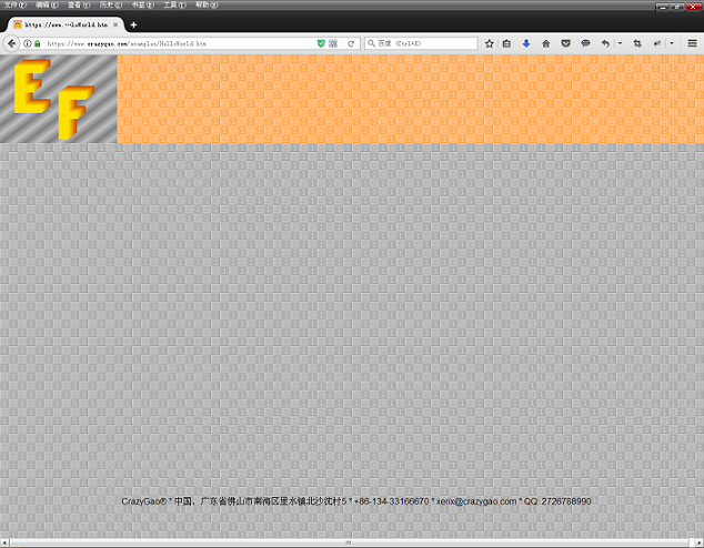
Preview

The page layout
Dragged and resized
The page with the ribbon
Empty page
Controls
EF.Put(Control type, Name, Properties hash, Parent element)Control type: 3 characters code, each of them is explained laterName: The name for the control which shall be unique within parent element scope. The SDK will convert it to DOM id, as per parent element’s id up to root, i.e., If our control name is “x” and parent control name is “y” which is placed on form (parent control too) name “z” and form is placed on the document.body which means is the last parent in the loop, the full id of current control will be: “z_y_x”. Clearly that “_” is a path separator here.Properties hash: depends on control type. Explanation for each control and its properties are later in this manual.Parent element: Can be DOM object or full ID. Empty string or if omitted, represents document.body.
Note: After control creation, the given properties for creation no longer exist. For dynamic editing, it is typical JS/HTML editing or if manipulating the CSS. For typical application changes, most of the functions already built in within each control, in order to ease the programming. This way, for simple change, there is no need to update too many parts of the code/data.
Form
Open eForm on Top of document.body
EF.Open(“FormName”);
The above function will open a new instance of form class “FormName”.
Important note: Each form better to sit in NEW JavaScript file in local directory “frm”. The SDK will look if this class exists (means been loaded), and if not, will load the script for you.
Note: If the Open gets as parameter string, it will give the form the same name as the type, assuming it is a form that has only one instance. If you want to give a unique name and/or other parameters, the below hash will apply.
EF.Open({
typ: The form OOP class name. When string provided, the SDK will convert it to “typ:’FormName’”.
id: Unique form name, for the DOM id, it has the same behavior as mentioned above for “Put”.
x: Position X. If omitted, form will be horizontally centered.
y: Position Y. If omitted, form will be vertically centered.
v: Parameter object for the form initialization constructor.
pmt: Parameter object for the eForm “onload” event.
});
Note: All properties are optional except “typ”.
Declaring an eForm Class
Function FormName(A) {
var _=this;
_.inf={ };
_.onload=function(B) {
}
}
Basic properties for “inf”
w: Width of formh: Height of form – not including the title bartxt: Title text which can be multilingual. Though you can decide to hide title bar, this text can be seen in the ribbon icon.
Optional Properties for “inf”
min[width,height]: Minimal size. If omitted, form will have fixed size.max[width,height]: Maximal size. If omitted, form will have fixed size.xt: If set to 1, form title bar will be hidden.drg: If set to 1, form will have no dragging option.xcls: If set to 1, close button “X” will be hidden.xhid: If set to 1, hide (minimize) button will be hidden.blk: If set, will block parent element. This will give a little similar effect to a dialog-box form. This property is a hash which contains the following optional sub-properties:
txt: Displayed text on the blocker screen, can be multilingual field.prg: If set to 1, will add progress bar element.max: Progress maximum value (default: 100)min: Progress minimum value (default: 0)
Public Functions
Focus(): Focus the form. The same can be achieved by double clicking a form element or when clicking on the form icon on the ribbon.Open(v): Open child form as mentioned above. v represents variable hash.Close(): Close the form. Shall avoid removing the <form> element using removeChild(), because the Close() function not only removes the Form element, but also checks for related forms and data, and cleans related memory parameters.Val(v): This is a magic function that collects all fields of the form and returns a hash containing each field name as key, and value as value. If v is given as string, it can contain a list of field names to collect values from, to make a selective collection. List elements separated by comma.Block(v): Block the form. Good for running long event that needs preventing the user from clicking buttons or editing fields on this form. Parameters for v are the same as for blk above.XBLK(): Remove the blocker screen with the progress bar if was.Rename(v): Rename the text in the title. v can be multilingual too.
Public Parameters
ctr: Controls hash. Control can be accessed by his name on current form. Names on current form shall be unique. No matter how deep the control in the hierarchy inside the form is, all controls sitting in this hash in 1st level.PNT: Parent form (null or undefined if form is placed directly on document.body).CHL: Child forms hash, like EF.CHL.blk: Blocker screen element – null if not blocked.
Form Blocker – Public Parameters
lbl: Blocker text label DOM elementprg: Progress bar DOM elementprg.max: Maximum progress valueprg.min: Minimum progress valueprg.value: Progress current value
Form Blocker – Public Functions
Prog(m) for setting the progress. If m is a number, will set the progress value to m. If m is ‘+’, will increase the progress value in 1.
Open Child eForm to Existing eForm
Call “Open” from within form object, i.e., Parent form is initialized earlier via: EF.Open(“F1”); Then we create his child: EF.chl.F1.Open(“F2”); Note that the <Form> element and EF.chl.F1 here are the same, so can call “Open” on the <form> element, if been created using this SDK.
NOTE: Though it is possible to create a new form via EF.Put(“WIN”,”formName”,{ … },parent); it is recommended to use JavaScript eForm class and EF.Open().
Every new opened form is stored in EF.chl hash as child form of document.body, the name is the access key. Note that all created forms lie directly on document.body, regardless of who is the given parent. Therefore, a pnt “Parent” parameter exists here for help. There is no EF.pnt, as all direct forms on document.body technically have no parent. Incandescent forms already have pnt.
General Example
function F1() {
       var _=this;
       _.inf={ w:300,h:200,txt:"Form without titlebar",xt:1 };
}
function F2() {
       var _=this;
       _.inf={ w:300,h:200,txt:"Form with titlebar" };
}
function F3() {
       var _=this;
       _.inf={ w:300,h:200,txt:"Form without close button",xcls:1 };
}
function F4() {
       var _=this;
       _.inf={ w:300,h:200,txt:"Form without hide button",xhid:1 };
}
function F5() {
       var _=this;
       _.inf={ w:300,h:200,txt:"Form without any button",xcls:1,xhid:1 };
}
function F6() {
       var _=this;
       _.inf={ w:300,h:200,txt:"Blocked form" };
       _.onload=function() { _.eF.Block({txt:"No content available
                             for clicking or editing!"}); }
}
function Init() {
       EF.Open({ typ:"F1",x:216,y:224 });
       EF.Open({ typ:"F2",x:216,y:456 });
       EF.Open({ typ:"F3",x:532,y:224 });
       EF.Open({ typ:"F4",x:532,y:456 });
       EF.Open({ typ:"F5",x:848,y:224 });
       EF.Open({ typ:"F6",x:848,y:456 });
}
System Button
Control type code: “SBT”. This gives unified styling for all buttons in the system.
Basic Properties
x: Position Xy: Position Ytxt: Caption textcbk: onclick event function
Optional Properties
img: Display image. If omitted, no image will be presented. Image file including extension, but not including full path, assuming that images are stored in “img” folder that sits in the same folder as the main *.htm file. Therefore, in HTML, the “src” value will be “img/”+img.anch: Anchor. This “holds” the control in a way it will follow parent resizing direction, like in Microsoft Visual Studio. Value is string consisting of one or more of the following options: “L” Left, “R” Right, “T” Top, “B” Bottom, i.e., we want the button to stick to the bottom-right corner of the form, we will write anch:”BR” or anch:”RB”. The default is stick to left-top of the form, which means no effect will be taken, no matter if we specify “L” or “T” or “LT” or “TL” – they are all the same non effective notations.- Note: Despite system button has fixed size, anchors like “LR” or “TB” may lead to no effect.
tp: Button type. The default is typical active button. By specifying this variable, we want either: “X” which will create disabled button, or “A” if we want alert style button which is the same style that is used in Alert form.- Note: Disabled button image will be converted to gray scale. This is available only if working on the server and not in local computer, as “Cross Domain” issue may taint the canvas that the SDK is using to make the color conversion.
upk: If specified, will make the button file upload button. This property is a hash, containing the following sub-properties:
cgi: If is a string, it will be treated as CGI program path not including extension, then uploaded content will be sent to that script for processing. If omitted, the uploaded files will stay in memory as Blobs.cbk: A function to perform when content is loaded to memory or sent to the specified CGI script.mul: If set to 1, will allow select and upload many files at once, not only single file.
- This will create internal variable
ftp in the button object. This variable is a hash that holds per file the following parameters (filename is the key):
f: fileReader JS objectz: file size in bytest: file MIME type
A key named “_” holds array of all filenames in the hash.
Example – Dynamic Creation
var C=EF.Put("SBT","B1",{ x:16,y:16,txt:"Typical",img:"Example.png", Clicked });
Example – On Form Creation
function ButtonExampleForm() {
        var _=this;
        _.inf={ w:240,h:240,txt:"System Buttons",chl:{
               B1:["SBT",{ x:16,y:16,txt:"Typical",img:"Example.png",cbk:Clicked }],
               B2:["SBT",{ x:128,y:16,txt:"Disabled",
                          img:"Example.png",cbk:Clicked,tp:"X" }],
               B3:["SBT",{ x:16,y:128,txt:"Alert",
                           img:"Example.png",cbk:Clicked,tp:"A" }],
               B4:["SBT",{ x:128,y:128,txt:"No image",cbk:Clicked }]
        }};
        function Clicked() { EF.Alert({txt:"Notification",
                             msg:"Thank you for clicking!"}); }
}
Textbox Field
Control type code: “FLD”. The magic of this field upon <input type”text”> is not only the simplicity of writing this control, but also the functionality it gives and described below.
Basic Properties
x: Position xy: Position yw: width of fieldmax: Max input length. If this variable is 0, the field will be read-only.
Optional Properties
Note: The label control name will be the same, with “~L” suffix.
anch: Anchor, the same as in System Button. Here, anchor like “LR” or “RL” may result in extending the width of the field. Anchors like “TB” or “BT” are meaningless and will result in no effect, as this type of control has fixed height and is not multiline. For multiline, see Multiline Textbox below.alg: Text alignment. The default is alignment to left, while these options available: “R” Right, “C” Center, “P” Password. Note: Password field does not need any special alignment, so its alignment is always left.txt: Initial text value.lbl: Will add label component. The value here is text only. This will make automatic calculation here for the total width – so the specified width here includes the label. This way, spacing between label and text-box fields are minimal, regardless of the language presented in the current browser settings, as the label width is dynamic.acm: Special styled autocomplete feature. This is a small array of two components, which are:
0: DB array of values from where to pick suggestions1: Max shown suggestions below the current field
enter: On <Enter> keypress event. This event is not listed in JavaScript core, and therefore is one of the added features.chng: onchange eventclk: onclick eventtb: Tab index. This gives easy move from field to field by hitting <Tab> key.
Public Functions
Val(v): Set value to v. If v omitted, will return given field value
Example – Dynamic Creation
var C=EF.Put("FLD","C1",{ x:16,y:16,w:368,max:12,lbl:"Editable:" });
Example – On Form Creation
function TextboxFormExample() {
        var _=this;
        _.inf={ w:400,h:400,txt:"Single line textbox",min:[400,300],max:[900,600],chl:{
               C1:["FLD",{ x:16,y:16,w:368,max:12,lbl:"Editable:" }],
               C2:["FLD",{ x:16,y:48,w:368,max:12,lbl:"Editable anchored:",anch:"LR" }],
               C3:["FLD",{ x:16,y:80,w:368,max:0,lbl:"Readonly" }],
               C4:["FLD",{
                       x:16,y:112,w:368,max:12,enter:EnterHitted,
                       chng:ContentChange,clk:Clicked
               }],
               C5:["FLD",{
                       x:16,y:144,w:368,max:12,lbl:"With auto complete:",anch:"LR",
                       acm:[[
                              "Green","Purple","White","Brown","Yellow",
                              "Grey","Red","Blue","Black","Orange"
                       ],4]
               }],
               C6:["FLD",{ x:16,y:176,w:368,max:12,lbl:"Password:",alg:"P" }],
               C7:["FLD",{ x:16,y:208,w:368,max:12,lbl:"Centered:",alg:"C" }],
               C8:["FLD",{ x:16,y:240,w:368,max:12,lbl:"To right:",alg:"R" }]
        }};
        function ContentChange() {
               EF.Alert({txt:"Notification",
               msg:"You changed the content to "+_.eF.ctr.C4.Val()+"!"});
        }
        function EnterHitted() { EF.Alert({txt:"Notification",
                 msg:"You hit keyboard <Enter> key!"}); }
        function Clicked() { EF.Alert({txt:"Notification",msg:"You clicked!"}); }
}
The anchor effect:
The autocomplete:
Label
Control type code: “LBL”. This control is not related with any other control and count as separate control even if it had been created along with another control like Textbox or Combo Box.
Basic Properties
x: Position xy: Position ytxt: Content text
Optional Properties
w: Gives fixed width. The height of the label will be as per field height, or if the content exceeded the given width and needs to wrap to new lines.
Note: w shall be avoided when used in “lbl” property in another control.alg: Text alignment. Available options here are “C” Centered, or “R” Right. This will take effect only if the label has fixed size (by setting w).anch: Anchor. It will have no effect if this control had been created along with other control, like textbox or combo. If the anchor of the Textbox, for example, is “LR”, the anchor of the label can only remain “L”. If the anchor of the Textbox is “R”, then the label follows the Textbox with “R” anchor. Combination of “TB” or “BT” may resize the label if w been preset, but the text will remain aligned to top.color: Can set the text color of the label. If array of 2 components is given, content will be:
0: Text color1: Background color
Color values are CSS string.
Note: Label object can be styled by external CSS class, by internal CSS “Style” properties, or via JS using the DOM element that results from the Put. The DOM element is typical DIV, with absolute position and with settings of this SDK suitable to make it looks like a label.
Example – Dynamic Creation
var c=EF.Put("LBL","L1",{ x:16,y:16,txt:"Dynamic sized typical label" });
Example – On Form Creation
function LabelExampleForm() {
        var _=this;
        _.inf={ w:400,h:208,txt:"Label",min:[400,208],max:[900,600],chl:{
               L1:["LBL",{x:16,y:16,txt:"Dynamic sized typical label"}],
               L2:["LBL",{x:16,y:48,txt:"Centered typical label",
                          w:368,alg:"C",anch:"LR"}],
               L3:["LBL",{x:16,y:80,txt:"Right aligned typical label",
                          w:368,alg:"R",anch:"LR"}],
               L4:["LBL",{x:16,y:112,txt:"Custom styled label",color:"#ff0000"}],
               L5:["LBL",{
                       x:16,y:144,txt:"Another custom styled label",
                                       color:["#ffff00","rgba(0,0,255,0.7)"]
               }],
               L6:["LBL",{x:16,y:176,txt:"External styling applied here"}]
        }};
        _.onload=function() {
               _.eF.ctr.L6.style.border="2px double rgb(0,255,0)";
               _.eF.ctr.L6.style.fontWeight="bold";
        }
}
After resizing, based on Anchor Tag:
Check Box
Control type code: “CHK”. Like a typical <input type=”checkbox”> but with preset label in the appropriate styling. The label here is part of the control and sits in <label> DOM element and not in a <div>. Like typical control in this SDK, simple way to create.
Basic Properties
x: Position xy: Position ytxt: Label text. The label is accessed by id of the control + “~L” suffix.
Optional Properties
anch: Anchor. Because the nature of dynamic sized label, anchors like “LR”, “RL”, “TB” or “BT” are useless. The only available anchors are “R” Right, “B” Bottom, “RB” for both Right and Bottom. Note that “BR” is the same as “RB”.chng: onchange event
Public Functions
Val(v): Set the checkbox value based on v, true or false. If omitted, this function will return the current checked status, true or false.
Example – Dynamic Creation
var c=EF.Put("CHK","C1",{ x:16,y:16,txt:"Check me",chng:Tick });
Example – on Form Creation
function CheckboxExampleForm() {
        var _=this;
        _.inf={ w:200,h:100,txt:"Checkbox",min:[200,100],max:[900,600],chl:{
               C1:["CHK",{x:16,y:16,txt:"Check me",chng:Tick}]
        }};
        function Tick() {
               EF.Alert({txt:"Notification",
               msg:"Checkbox is checked? "+(_.eF.ctr.C1.Val()?"Yes":"No")});
        }
}
Radio Button Group
Control type code: “RDO”. This gives a group of radio buttons aligned in a <fieldset> panel.
Note: The name of the control will be the name of the radio group in the form – this includes the hierarchy names, like for id.
Basic Properties
Optional Properties
lw: Label width. This will help align the radio buttons to “jump” each fixed space. Only if the length exceeded the inner width of the panel, it will wrap to a new line.sel: Selected radio index. If omitted, 1st radio in the group will be selected.anch: Anchor for the entire panel. Every combination can take place here. Radios will realign in accordance.chng: onchange callback
Public Functions
Val(v): Select radio based on index v. If v omitted, will return selected radio index.
Example – Dynamic Creation
var c=EF.Put("RDO","R1",{
        x:16,y:16,w:368,h:268,txt:"Not aligned radio group",rb:[
               "Red","Green","White","Purple","Orange","Blue",
               "Black","Cyan","Magenta","Sea green","Lawn green"
        ],anch:"LR"
});
Example – On Form Creation
function RadioGroupExampleForm(A) {
        var _=this;
        _.inf={ w:400,h:468,txt:"Radio Groups",min:[150,468],max:[1200,900],chl:{
               R1:["RDO",{ x:16,y:16,w:368,h:168,
                    txt:"Not aligned radio group",rb:A,anch:"LR" }],
               R2:["RDO",{
                      x:16,y:200,w:368,h:268,txt:"Aligned radio group",
                      rb:A,anch:"LRTB",lw:120,sel:5
               }],
        }};

}
NOTE: Passing parameters to form constructor is only possible via keyword "v". This is an object that can get every value, so the constructor will only get 1 parameter. The initialization function here will then look like the following:
EF.Run({typ:'RadioGroupExampleForm',v:[
        "Red","Green","White","Purple","Orange","Blue",
        "Black","Cyan","Magenta","Sea green","Lawn green"
]});
Wide resizing, how it affects the auto-alignment
Picture Box
Control type code: “IMG”. This will create special <img> tag with many options, including image pixel manipulation. When a target *.htm file is loaded locally or if content is from another domain, the canvas it uses for manipulation may be tainted and therefore not usable. Suggest working with a server for these purposes.
Basic Properties
x: Position xy: Position yw: Image widthh: Image heightsrc: Initial image source, including full path
Optional Properties
anch: Anchor. All combinations are available.clk: onclick eventonl: onload eventalg: Image alignment. The default is image with its original size, so if the size is smaller than the size given for the picture box, a background may be seen in a color of Field Background declared in the stylesheet. If the image size is bigger, scrollbars may appear. Values here can be:S: Image will be stretched to the size of the picture box.Z: Zoomed to fit the size of the picture box without breaking width and height ratio, so image content will not look deformed.upk: Uploading image by click feature. If set to 1, will allow image uploading from local machine to this control. Only images are applicable. Supported formats are all formats that the browser supports.
Public Functions
Val(v): Sets image source based on v. All given images sit in “img” folder that sits in the same folder where the main *.htm file is. If v is omitted, will return the source image path (if has) or the image content as base64 if this is the value in “src”.Raw(): Returns the image content as imageData object for pixel manipulation. For more information on pixel manipulation, see JavaScript documentation for Canvas.getContext(“2d”).getImageData().FromData(v): Updates image source using imageData Object in v.ToB64(): Returns image content as base64 URI encoded string for easy over the network transferring.
Example – Dynamic Creation
var c=EF.Put("IMG","IX",{ x:16,y:16,w:256,h:256,src:"img/Pic.jpg",anch:"LRTB" });
Example – On Form Creation
function F1() {
       var _=this;
       _.inf={ w:288,h:288,txt:"Fixed size image",min:[80,80],max:[800,800],chl:{
               I:["IMG",{x:16,y:16,w:256,h:256,src:"img/Pic.jpg",anch:"LRTB"}]
       }};
}
function F2() {
       var _=this;
       _.inf={ w:288,h:288,txt:"Stretched image",min:[80,80],max:[800,800],chl:{
               I:["IMG",{x:16,y:16,w:256,h:256,src:"img/Pic.jpg",anch:"LRTB",alg:"S"}]
       }};
}
function F3() {
       var _=this;
       _.inf={ w:288,h:288,txt:"Zoomed image",min:[80,80],max:[800,800],chl:{
               I:["IMG",{x:16,y:16,w:256,h:256,src:"img/Pic.jpg",anch:"LRTB",alg:"Z"}]
       }};
}
function F4() {
       var _=this;
       _.inf={ w:288,h:288,txt:"Magical image - click it!",
               min:[80,80],max:[800,800],chl:{
               I:["IMG",{x:16,y:16,w:256,h:256,
               src:"img/Pic.jpg",anch:"LRTB",clk:Rework}]
       }};
       var itr=0;
       function Rework() {
               var V=EF.chl.F1.ctr.I.Raw();
               for(var y=0 ; y<V.height ; y++)
                       for(var x=0 ; x<V.width ; x++) {
                              var p=y*V.width*4+x*4,
                              c=Math.floor((V.data[p]+V.data[p+1]+V.data[p+2])/3);
                              if(itr%4==0) V.data[p]=V.data[p+1]=V.data[p+2]=c;
                              if(itr%4==1) { V.data[p]=c; V.data[p+1]=V.data[p+2]=0; }
                              if(itr%4==2) { V.data[p+1]=c; V.data[p]=V.data[p+2]=0; }
                              if(itr%4==3) { V.data[p+2]=c; V.data[p]=V.data[p+1]=0; }

                       }
               _.eF.ctr.I.FromData(V); itr++;
       }
}
function Init() {
       EF.Open({ typ:"F1",x:32,y:192 });
       EF.Open({ typ:"F2",x:352,y:192 });
       EF.Open({ typ:"F3",x:672,y:192 });
       EF.Open({ typ:"F4",x:992,y:192 });
}
After form resizing:
Magical image – after click (custom effect – every pixel manipulation can be done):
Canvas
Control type code: “CVS”. This will create a canvas element with advanced options. Extension is available on top of this control, for ComplexImage™ Manipulation. ComplexImage™ is a programming language for creating complex images, including 3D, shading, and so on.
Basic Properties
x: Position xy: Position yw: Canvas widthh: Canvas height
Optional Properties
anch: Anchor. All combinations are available.
Public Functions
Val(): Get image as URI encoded sourceCTX(): Short writing for getContext(“2d”)Raw(): Get imageData object of the canvas for pixel manipulation.
Trackbar
Control type code: “TRK”. Trackbar component with “min”/”max” labels.
Basic Properties
x: Position xy: Position yw: Width. The height is standard and depends on your browser.min: Minimal valuemax: Maximal valuestep: Each movement step valueval: Starting value
Optional Properties
anch: Anchor tag. Combination of “TB” or “BT” has no effectchng: onchange event
Public Functions
Val(v): Set the position of the trackbar. If v omitted, function will return its current position.
Example – Dynamic Creation
var c=EF.Put("TRK","C",{ x:16,y:16,w:288,min:0,max:10,step:1,val:5,anch:"LR" });
Example – On Form Creation
function TrackbarExampleForm() {
        var _=this;
        _.inf={ w:320,h:120,txt:"Trackbar",min:[80,80],max:[800,200],chl:{
               C:["TRK",{x:16,y:16,w:288,min:0,max:10,step:1,val:5,anch:"LR"}]
        }};
}
After resizing:
Changing the value:
Title Control
Control type code: “TIT”. This gives special styled label for in-form sectional title separation.
Basic Properties
x: Position xy: Position yw: Width. The height is constant and equal to twice form title height defined in stylesheet.txt: Content text
Optional Properties
anch: Anchor tag. Combination of “TB” or “BT” has no effect.mod: Specify the visibility of the title. The default is inset font. If this value is “O”, content font will be outset.xclr: If set to 1, content font will be transparent with shadow effect. The default is colored font in readonly field BG color, with shadow effect.
Example – Dynamic Creation
var c=EF.Put("TIT","C1",{ x:16,y:16,w:368,txt:"Regular",anch:"LR" });
Example – On Form Creation
function TitleControlExampleForm() {
        var _=this;
        _.inf={ w:400,h:400,txt:"Title control",min:[300,400],max:[1200,800],chl:{
               C1:["TIT",{x:16,y:16,w:368,txt:"Regular",anch:"LR"}],
               C2:["TIT",{x:16,y:96,w:368,txt:"Outset",anch:"LR",mod:"O"}],
               C3:["TIT",{x:16,y:176,w:368,
                    txt:"Regular but transparent",anch:"LR",xclr:1}],
               C4:["TIT",{
                       x:16,y:256,w:368,txt:"Both outset and transparent",
                       anch:"LR",mod:"O",xclr:1
               }],
        }};

}
Panel Container
Control type code: “PAN”. Shorthand for <fieldset>, with solid system styling.
Basic Properties
x: Position xy: Position yw: WidthH: Height
Note: The size is including inner padding of 16px from each size, both horizontal and vertical. Therefore, inner size is smaller in 32px in width and in height.
Optional Properties
anch: Anchor tag. All combinations are available.txt: Legend text. If omitted, no legend element will be generated.chl: Deeper hash of child controls
Example – Dynamic Creation
var c=EF.Put("PAN","P",{ x:16,y:16,w:268,h:80,txt:"Fieldset",anch:"LRTB" });
Example – On Form Creation
function FieldsetExampleForm() {
        var _=this;
        _.inf={ w:300,h:300,txt:"Fieldset",min:[200,200],max:[600,600],chl:{
               P:["PAN",{x:16,y:16,w:268,h:268,txt:"Fieldset",anch:"LRTB",chl:{
                       C1:["FLD",{x:16,y:16,w:236,max:4,lbl:"Label",anch:"LR"}],
                       C2:["FLD",{x:16,y:48,w:236,max:0,anch:"LR"}],
                       C3:["CVS",{x:16,y:80,w:128,h:128,anch:"LRTB"}]
               }}],
        }};
}
Multiline Textbox
Control type code: “TAR”. Shorthand for <textarea> with solid system styling.
Basic Properties
x: Position xy: Position yw: WidthH: Heightmax: Content maximal length in characters. If set to 0, will be read-only and have read-only field styling
Optional Properties
anch: Anchor tag. All combinations are available.chng: onchange eventwrp: If set to 1, will disable word wrapping. The default is non-breaking word wrapping.txt: Preset content
Public Functions
Val(v): Set content to v. If v omitted, function will return the content.
Example – Dynamic Creation
var c="EF.Put("TAR","P",{ x:16,y:16,w:368,h:368,max:30000,anch:"LRTB",txt: "" });
Example – On Form Creation
function F1(A) {
var _=this;
_.inf={ w:400,h:400,txt:"Multiline Textbox",min:[200,200],max:[600,600],chl:{
P:["TAR",{x:16,y:16,w:368,h:368,max:30000,anch:"LRTB",txt:A}]
}};
}
function F2(A) {
var _=this;
_.inf={
w:400,h:400,txt:"Multiline Textbox - without word wrap",
min:[200,200],max:[600,600],chl:{
P:["TAR",{x:16,y:16,w:368,h:368,
max:30000,anch:"LRTB",wrp:1,txt:A}]
}
};
}
function Init() {
var TX="... Existing in its present form since 1985,
the CE marking indicates that the manufacturer
or importer claims compliance with the relevant EU
legislation applicable to a product, regardless of
where manufactured.\nBy affixing the CE marking on a product,
a manufacturer is declaring, at its sole responsibility,
conformity with all of the legal requirements to achieve
CE marking which allows free movement and sale of the product
throughout the European Economic Area.\nFor example,
most electrical products must comply with the Low Voltage Directive
and the EMC Directive; toys must comply with the Toy Safety Directive.
\nThe marking does not indicate EEA manufacture or that a product
has been approved as safe by the EU or by another authority.
The EU requirements may include safety, health, and environmental
protection, and, if stipulated in any EU product legislation,
assessment by a Notified Body or manufacture according to a
certified production quality system.\nThe CE marking also
indicates that the product complies with directives in relation to
'Electro Magnetic Compatibility' - meaning the device
will work as intended, without interfering with the use or function
of any other device.\nNot all products need CE marking to be traded
in the EEA; only product categories subject to relevant directives
or regulations are required (and allowed) to bear CE marking.
Most CE-marked products can be placed on the market subject only
to an internal production control by the manufacturer
(Module A; see Self-certification, below), with no independent
check of the conformity of the product with EU legislation;
ANEC has cautioned that, amongst other things, CE marking
cannot be considered a \"safety mark\" for consumers.
CE marking is a self-certification scheme. Retailers sometimes
refer to products as \"CE approved\", but the mark
does not actually signify approval. Certain categories of products
require type-testing by an independent body to ensure conformity
with relevant technical standards, but CE marking in itself
does not certify that this has been done. ...";
EF.Open({ typ:"F1",x:16,y:192,v:TX });
EF.Open({ typ:"F2",x:448,y:192,v:TX });
}
After resizing the form:
Combo Box
Control type code: “CMB”. It is more than just <select> element, but also has advanced features.
Basic Properties
x: Position xy: Position yw: Width. Height is the same as Single line Textboxsrc: Options list
Optional Properties
alt: Alternative text field, if user want to select “other” option than those that exist in the list. The text appearing as “other…” is the value of this property that may change to anything else you may choose. Along with this property, there are other properties that can be used for supporting this special text field, see below.srt: Sort mode. Available values are “A” Ascending, or “D” Descending. If omitted, items order in the list will remain in the same order as they enter.all: Optional value for filtering purposes. For example: In a big table, we want to show only one category, and then we may use a combo box for selecting category. What if we want to remove the filter? We can still do it with the same combo: using “All” option. The text “All” is the value of this property that may change to anything else you may choose.anch: Anchor tag. Combinations are the same as for Single line Textbox.chng: onchange event.sel: Default selected value or index. By default, the 1st item is selected.lbl: Label text for associated label control, like in Single line Textbox.tb: Tab index.
Alternative Text Field Properties
max: Maximum characters count in the “Other…” text field. The default is 128 characters.acm: Autocomplete feature. Settings are the same as for Single line Textbox.mlg: If set to 1, will force “Other…” field value to be Multilingual Textbox.
Public Functions
Sort(d): Sort the combo options list by direction d, values are “A” or “D” like in srt.Add(d): Add an “option” to the combo box. If d is array, function will add all options in d, one by one, to the combo box.Exists(value,r): Check if value exists within the options of this combo. Will return requested item’s index if exists, or -1 if not exists. If r set to “v”, it will return array of all matching items containing value as their part. If r is “i”, will make the same lookup like “v”, but return array of indexes instead of values.Del(v): Remove item from the combo. v can be value or index. If v omitted, will remove the selected item.Val(v): Select an item v or index v. If v omitted, function will return selected item value.Clean(): Remove all items from the combo, except “Other” and “All” if exists.Replace(old,new): Replace item old by item new. old can be also index, not limited to value.toArray(): Return array of all items in the combo, excluding “All” and “Other”.
Example – Dynamic Creation
var c=EF.Put("CMB","P",{ x:16,y:16,w:268,lbl:"Typical: ",src:[
        "Orange","Peach","Banana","Apple","Strawberry",
        "Grape","Lemon","Watermelon","Appricot","Pear"
],anch:"LR",sel:6 });
Example – On Form Creation
function ComboBoxExampleForm(X) {
        var _=this;
        _.inf={ w:300,h:300,txt:"Combo Box",min:[300,300],max:[600,600],chl:{
               C1:["CMB",{x:16,y:16,w:268,lbl:"Typical: ",src:X,anch:"LR",sel:6}],
               C2:["CMB",{x:16,y:48,w:268,lbl:"With alt.: ",
                    src:X,anch:"LR",alt:"New fruit..."}],
               C3:["CMB",{
                       x:16,y:80,w:268,lbl:"Multilingual alt.: ",
                       src:X,anch:"LR",alt:"New fruit...",mlg:1
               }],
               C4:["CMB",{x:16,y:112,w:268,lbl:"Sorted: ",
                    src:X,anch:"LR",srt:"A",sel:"Lemon"}]
        }};
}
EF.Run({typ:"ComboBoxExampleForm",v:[
        "Orange","Peach","Banana","Apple","Strawberry",
        "Grape","Lemon","Watermelon","Appricot","Pear"
]});
Alternative selection:
Sorted list:
Note: The sort mode for numeric or alphabetic is automatic. The SDK knows to detect if the values compared are all numeric or not.
Multilingual Textbox
Control type code: “MLG”. This is a special control available only in eForms™, and is one of the OEM benefits of this SDK. This field allows declaring value that is multilingual, and the displayed value will be only the one matching browser’s language. The user decides which languages to support in each value. This helps to make the Web App multilingual in a very easy way.
Basic Properties
x: Position xy: Position yw: Width. Height is the same as Single line Textbox
Optional Properties
anch: Anchor tag. Combinations are the same as for Single line Textbox.alg: Text alignment. Default is left alignment. Available values are the same as for Single line Textbox, except “P” for password, as this field is not suited for password field.txt: Initial value. Despite multilingual field construction is a hash, to be stored as string and make it easier to transfer over the network is easier to convert it to EFON (E-Forms Object Notation) which is a special base64 notation of object. To use this, you may create a hash with language ISO code as key (upper-case), and then convert it to EFON. Here is an example:
var V=EF.L({
        "EN-US":"English text value",
        "ZH-CN":"Chinese text value",
        "ES-ES":"Spanish text value"
});
- This will create ML object type in V. ML (
MultiLingual) object type is also part of eForms SDK. lbl: Label text for associated label control, like in Single line Textboxtb: Tab indexchng: On change event
Public Functions
Val(v): Set the value to v. If v omitted, function will return control’s value as ML object.
Example – Dynamic Creation
var c=EF.Put("MLG","P",{ x:16,y:16,w:268,lbl:"Visible text: ",anch:"LR" });
Example – On Form Creation
function MLG() {
        var _=this;
        _.inf={ w:300,h:100,txt:"Multilingual Textbox",min:[300,100],max:[800,100],chl:{
               C:["MLG",{x:16,y:16,w:268,lbl:"Visible text: ",anch:"LR"}]
        }};
}
After clicking the field, can see the table of language values on the left, and the available languages on the right, with their flags for convenience:
Note: Languages on the right panel are sorted for easy use. The window contains splitter container control which can be resized, so you can choose whether to increase or decrease each of the visible parts.
Note the “X” button, for removing language from the table on the left.
For selecting language, first scroll to see the requested language on screen and then click its flag. The language will be added to the table on the left, while the flag button will move to the top of the list for later convenience, as “common used languages” shall be first:
The yellow selected line in the table is content-editable, so can enter a value there.
After clicking “OK”, this is what will happen (English is shown as the browser language running this example is “EN-US” – American English):
Splitter Container
Control type code: “SPL”. This is a double container with vertical or horizontal orientation and with option for both containers to resize.
Basic Properties
x: Position xy: Position yw: Total widthh: Total heightf: Left initial width or Top initial height (depend on orientation)
Optional Properties
ori: Define the orientation of the split. The default is horizontal orientation, when containers are 1 on left and 1 on right, with horizontal resizing bar. If this property is set to 1, the orientation will switch to vertical, which means 1 container on top and 1 on bottom with vertical resizing bar.anch: Anchor tag. All combinations are available.chl: Child controls. This property has this time array of two parts, one for 1st container and one for the 2nd:
0: Left or Top container1: Right or Bottom container
Each of the elements mentioned above, shall have a hash of the controls, like usual. For manual adding controls, the DOM element of each of the containers is accessible via wing variable, which contains array of two parts, relation is the same as in chl.
Example – Dynamic Creation
var c=EF.Put("SPL","C",{ x:16,y:16,w:268,h:268,anch:"LRTB",f:120,chl:[
{
C1:["FLD",{x:16,y:16,w:80,max:7,anch:"LR"}],
C2:["FLD",{x:16,y:48,w:80,max:7,anch:"LR"}],
C3:["FLD",{x:16,y:80,w:80,max:7,anch:"LRB"}]
},
{
C4:["FLD",{x:16,y:16,w:80,max:7,anch:"LR"}],
C5:["FLD",{x:16,y:48,w:80,max:7,anch:"LR"}],
C6:["FLD",{x:16,y:80,w:80,max:7,anch:"LRB"}]
}
] });
Example – On Form Creation
function F1() {
var _=this;
_.inf={ w:300,h:300,txt:"Splitter container - Horizontal",
min:[300,300],max:[600,600],chl:{
C:["SPL",{ x:16,y:16,w:268,h:268,anch:"LRTB",f:120,chl:[
{
C1:["FLD",{x:16,y:16,w:80,max:7,anch:"LR"}],
C2:["FLD",{x:16,y:48,w:80,max:7,anch:"LR"}],
C3:["FLD",{x:16,y:80,w:80,max:7,anch:"LRB"}]
},
{
C4:["FLD",{x:16,y:16,w:80,max:7,anch:"LR"}],
C5:["FLD",{x:16,y:48,w:80,max:7,anch:"LR"}],
C6:["FLD",{x:16,y:80,w:80,max:7,anch:"LRB"}]
}
] }]
}};
}
function F2() {
var _=this;
_.inf={ w:300,h:300,txt:"Splitter container - Vertical",
min:[300,300],max:[600,600],chl:{
C:["SPL",{ x:16,y:16,w:268,h:268,anch:"LRTB",f:120,ori:1,chl:[
{
C1:["FLD",{x:16,y:16,w:80,max:7,anch:"LR"}],
C2:["FLD",{x:16,y:48,w:80,max:7,anch:"LR"}],
C3:["FLD",{x:16,y:80,w:80,max:7,anch:"LRB"}]
},
{
C4:["FLD",{x:16,y:16,w:80,max:7,anch:"LR"}],
C5:["FLD",{x:16,y:48,w:80,max:7,anch:"LR"}],
C6:["FLD",{x:16,y:80,w:80,max:7,anch:"LRB"}]
}
] }]
}};
}
function F3() {
var _=this;
_.inf={ w:300,h:300,txt:"Splitter container - Complex",
min:[300,300],max:[600,600],chl:{
CM:["SPL",{ x:16,y:16,w:268,h:268,anch:"LRTB",f:120,chl:[
{
C1:["FLD",{x:16,y:16,w:80,max:7,anch:"LR"}],
C2:["FLD",{x:16,y:48,w:80,max:7,anch:"LR"}],
C3:["FLD",{x:16,y:80,w:80,max:7,anch:"LRB"}]
},
{
CD:["SPL",{ x:0,y:0,w:140,h:268,anch:"LRTB",
f:120,ori:1,chl:[
{
C4:["FLD",{x:16,y:16,w:160,
max:15,anch:"LR"}],
C5:["FLD",{x:16,y:48,w:160,
max:15,anch:"LR"}],
C6:["FLD",{x:16,y:80,w:160,
max:15,anch:"LRB"}]
},
{
C7:["FLD",{x:16,y:16,w:160,
max:15,anch:"LR"}],
C8:["FLD",{x:16,y:48,w:160,
max:15,anch:"LR"}],
C9:["FLD",{x:16,y:80,w:160,
max:15,anch:"LRB"}]
}
] }]
}
] }]
}};
}
function Init() {
EF.Open({ typ:"F1",x:16,y:192 });
EF.Open({ typ:"F2",x:332,y:192 });
EF.Open({ typ:"F3",x:648,y:192 });
}
After resizing:
Table
Control type code: “TBL”. Not just simple <table> HTML tag, but closer to Microsoft Visual Studio DataGridView object with advanced options.
Basic Properties
x: Position xy: Position yw: Total widthh: Total heightcol: columns list. Each column item in this array is a hash of optional properties, as follows:
tag: Capture textw: Width of columnmin: Minimal width for resizingmax: Maximal width for resizing
Note: If one of the properties min or max is omitted, column will be of fixed size.
flt: If set, filter will be applied to the column. A filter is a combo box which contains all existing values in specific column, without repetition, with “ALL” option, named by default as “-“, unless specified in flt.all.srt: Sort mode. If specified, column will have sort icon that allows to sort the table using this column ascending or descending. This property can be set for initial sort. Values can be “A” Ascending or “D” Descending.
hid: If set to 1, column will be hidden.edt: If set to 1, column will be content editable – text box.
Optional Properties
anch: Anchor tag. All combinations are available.lh: If set to 1, left column will have header styling to looks header column.sel: Selection mode. By default, there is no row selection. This property can be set to “S” for single row selection, or “M” for multi-row selection. In this SDK, full row selection mode is applied, and selection styling does not apply to header cells.chng: On selection change eventsrc: Source content, a 2D array of values to fill the table with
Public Functions
Sort(col): Sort the table based on specific column col. Sorting direction is taken based on the column current sort settings.Add(Cells array): Add row to the table. Cells array length must fit the existing column count of the table.
Note: The first column (index=0) is a key column. Values cannot duplicate among other rows! Trying to add row that its 1st cell value already exists in other rows in the 1st column, will result in updating that specific row. This is good for quick updating without the need of a first look up call. Note that the table 1st row is reserved, and not counts. Therefore, 1st valid row of the table will have “1” as index.AddCol(Column data,Rows info): Add column to the table. Properties in Column data are the same as in single col property item. Rows info is optional, and is a list of all cells values in the new column, for all rows. Length must be equal to the existing rows count of the table.Del(row): Delete row. If row is omitted, selected rows, if any, will be removed. row can be key or index.Sel(row): Select/Deselect row. If selection mode is single, row can only be selected, while the other row will be automatically deselected. If selection mode is multi-row selection, selected row will be deselected. row can be key or index.Clean(): Clears the table, keeping the reserved row.Val(sel,Filter): Query for retrieving table content. If sel is “T”, the entire table is returned. If sel is number, will return column[sel] as array of cells. If sel omitted, function will return selected row as array of cells in single selection mode, or 2D array of selected rows in multi-row selection mode. Filter is optional for filtering use, it shall then contain query string of required columns, delimited by comma.Exists(key): Check if specific row key exists. It will return row index if yes, or 0 if not exists. Row[0] is not valid – so there is no chance to have values there.
Accessible Elements
TableControl.tbl: The table DOM element itselfTableControl.hdr: The header table DOM element
Note: The purpose of separating the header from the table is for scrolling convenience. To achieve this feature just by JS/CSS is still hard work that this SDK saves from you.
Example – Dynamic Creation
var c=EF.Put("TBL","C",{ x:16,y:16,w:468,h:268,anch:"LRTB",sel:"S",col:[
        { tag:"Col A",w:80,min:80,max:400,srt:"A" },
        { tag:"Col B",w:80,srt:"A" },
        { tag:"Col C",w:80,hid:1 },
        { tag:"Col D",w:80,srt:"A",flt:1 },
        { tag:"Col E",w:80,min:80,max:400,srt:"D",flt:1 }
] });
Example – On Form Creation
function F1(C) {
var _=this;
_.inf={ w:500,h:300,txt:"Table - typical",min:[100,100],max:[900,600],chl:{
C:["TBL",{ x:16,y:16,w:468,h:268,anch:"LRTB",sel:"S",src:C,col:[
{tag:"Col A",w:80,min:80,max:400,srt:"A"},
{tag:"Col B",w:80,srt:"A"},
{tag:"Col C",w:80,hid:1},
{tag:"Col D",w:80,srt:"A",flt:1},
{tag:"Col E",w:80,min:80,max:400,srt:"D",flt:1}
] }]
}};
}
function F2(C) {
var _=this;
_.inf={ w:500,h:300,txt:"Table - with row header",
min:[100,100],max:[900,600],chl:{
C:["TBL",{ x:16,y:16,w:468,h:268,anch:"LRTB",sel:"S",src:C,lh:1,col:[
{tag:"Col A",w:80,min:80,max:400,srt:"A"},
{tag:"Col B",w:80,srt:"A"},
{tag:"Col C",w:80},
{tag:"Col D",w:80,srt:"A",flt:1},
{tag:"Col E",w:80,min:80,max:400,srt:"D",flt:1}
] }]
}};
}
function Init() {
var C=[];
for(var i=0 ; i<500 ; i++) {
var E=[];
for(var k=0 ; k<5 ; k++)
E.push(Math.floor(Math.random()*((k==0)?1000000:30))+"");
C.push(E);
}
EF.Open({ typ:"F1",x:16,y:192,v:C });
EF.Open({ typ:"F2",x:564,y:192,v:C });
}
Items in combo filter are sorted (automatically, regardless of column sort mode):
Filtered by one column:
Filtered by two columns:
Sorted:
Column resized:
Selected row:
Scrolled vertically, header remains visible:
TreeView
Control type code: “TRE”. This gives well-visualized tree-view control with optional line grids and icons.
Basic Properties
x: Position xy: Position yw: Total widthh: Total height
Optional Properties
anch: Anchor tag. All combinations are available.xsel: If set to 1, disable node selection.xlin: If set to 1, remove line grids.chng: On selection change callbackndh: Nodes hash for presetting. This hash keys are each node key, shall be unique within brothers scope. Properties are:
txt: Visible textimg: Icon for the nodesel: Icon that will show if this node is selectednodes: sub-children, act the same as ndh
Public Functions
Val(v): Select node by key path v. If v omitted, function will return selected treenode DOM object.Add(n,p): Add treenode n to parent node p. n is a hash of node properties, and p shall be key path.Del(k): Remove node by key path k. k can be TreeNode object too. If k is omitted, selected node will be removed.GetPath(): Will return selected node full pathGetNode(k): Will return TreeNode object from key path k
Useful Parameters
TreeView.SN: Selected node objectTreeNode.KY: Specific node unique key (not path!).
Note: If, for example, specific node key is “E2”, and parent key is “D1”, and “D1” parent key is “C4”, the full path of “E2” node will then be: “C4_D1_E2”. Path separator is “_”. If the treeview name is “TV” and it sits directly on form named “F” which sits directly on document body, the full ID of the tree-view is then “F_TV”, hence the full ID of “E2” node will then be: “F_TV_C4_D1_E2”.
Example – Dynamic Creation
var c=EF.Put("TRE","T",{ x:16,y:16,w:468,h:268,anch:"LRTB" });
Example – On Form Creation
function TreeViewExampleForm() {
        var _=this;
        _.inf={ w:500,h:300,txt:"TreeView",min:[100,100],max:[1200,800],chl:{
               T:["TRE",{ x:16,y:16,w:468,h:268,anch:"LRTB",ndh:{
                       N1:{txt:"Colors",img:"tre/colors.png",nodes:{
                              N1:{txt:"Red"},
                              N2:{txt:"Green"},
                              N3:{txt:"Blue"},
                              N4:{txt:"White"},
                              N5:{txt:"Black"}
                       }},
                       N2:{txt:"Shapes",img:"tre/shapes.png",nodes:{
                              N1:{txt:"Circle"},
                              N2:{txt:"Square"},
                              N3:{txt:"Triangle"},
                              N4:{txt:"Octagon"},
                              N5:{txt:"Ellipse"}
                       }},
                       N3:{txt:"Countries",img:"tre/countries.png",nodes:{
                              N1:{txt:"Germany",nodes:{
                                      N1:{txt:"Dusseldorf"},
                                      N2:{txt:"Berlin"},
                                      N3:{txt:"Bonn"},
                                      N4:{txt:"Koln"}
                              }},
                              N2:{txt:"U.S.A.",nodes:{
                                      N1:{txt:"New York"},
                                      N2:{txt:"Los Angeles"},
                                      N3:{txt:"Miami"},
                                      N4:{txt:"Chicago"}
                              }},
                              N3:{txt:"China",nodes:{
                                      N1:{txt:"Guangdong",img:"tre/center.png"},
                                      N2:{txt:"Liaoning"},
                                      N3:{txt:"Sichuan"},
                                      N4:{txt:"Shanghai"},
                                      N5:{txt:"Beijing"}
                              }},
                              N4:{txt:"Israel",nodes:{
                                      N1:{txt:"Tel-Aviv"},
                                      N2:{txt:"Jerusalem"},
                                      N3:{txt:"Eilat"}
                              }}
                       }}
               } }]
        }};
}
Expanded:
Selected node:
Tab Page Selector
Control type code: “TAB”.
Basic Properties
x: Position xy: Position yw: Total widthh: Total height, including the title bartabs: Array of tab pages. Each value is an array of the following:
0: Access key1: Text capture
Note: The reason I didn’t choose to use hash, is that elements in hash have no fixed order, and it may affect the order the tab pages are shown – which in most cases is critical for the user.
Optional Properties
Note: As tabs can be added and deleted, certain tab may “change” its actual index. This is why it is the best to use access key for manipulating tab pages.
anch: Anchor tag. All combinations are available.sel: Selected tab. This value shall be access key, but it can also be index. If omitted, 1st tab will be selected.chng: On tab page selection changed eventchl: Children controls for easy preset
Public Functions
Add(v): Add tab page which has key v[0], and capture text v[1].Del(k): Remove tab with access key k. If k omitted, selected tab will be removed.Select(k): Select tab by key k. k can also be index.
Useful Parameters
TabControl.wing[TabKey]: Specific TabPage objectTabControl.wing[TabKey].PG: TabPage internal page containerTabControl.wing[TabKey].innerText: The title of specific TabPage
Example – Dynamic Creation
var c=EF.Put("TAB","T",{ x:16,y:16,w:468,h:318,anch:"LRTB",tabs:[] });
Example – On Form Creation
function TabPagesExampleForm() {
        var _=this;
        _.inf={ w:500,h:350,txt:"Tab pages",min:[100,100],max:[1200,800],chl:{
               T:["TAB",{ x:16,y:16,w:468,h:318,anch:"LRTB",sel:"P3",tabs:[
                       ["P1","1st page"],
                       ["P2","2nd page"],
                       ["P3","3rd page"],
                       ["P4","4th page"]
               ],chl:[
                       {
                              C1:["FLD",{x:16,y:16,w:200,anch:"LR",max:0}],
                              C2:["FLD",{x:16,y:48,w:200,anch:"LR",max:32}],
                              C3:["IMG",{x:16,y:80,w:400,h:200,anch:"LRTB",
                                         src:"img/Pic.jpg"}]
                       },{
                              C4:["FLD",{x:16,y:16,w:300,anch:"LR",max:6}],
                              C5:["CHK",{x:16,y:48,txt:"Check it"}],
                              C6:["RDO",{x:16,y:80,w:200,h:150,
                                 rb:[ "Option A","Option B","Option C" ]}]
                       },{
                              C7:["FLD",{x:16,y:16,w:300,max:32,anch:"LR"}],
                              C8:["FLD",{x:16,y:48,w:250,max:0,anch:"LR"}],
                              C9:["FLD",{x:16,y:80,w:400,max:64,anch:"LRB"}]
                       },{
                              C10:["FLD",{x:16,y:16,w:300,max:32,alg:"R",anch:"LR"}],
                              C11:["PAN",{x:16,y:48,w:300,h:140,chl:{
                                      C11X:["IMG",{
                                             x:4,y:16,w:200,h:120,anch:"LRTB",
                                             src:"img/Pic.jpg",alg:"Z"
                                      }]
                              },anch:"LRTB",txt:"Settings"}],
                              C12:["SBT",{x:16,y:192,txt:"OK!",img:"OK.png",anch:"B"}]
                       }
               ] }]
        }};
}
Color Picker
Control type code: “CPK”. Basically, it is a button that shows color, with option for modification. This control has a special color picker which allows also optional alpha channel.
Basic Properties
x: Position xy: Position yw: Control button widthtxt: The title to appear on the color-picking dialog box
Optional Properties
alp: If set to 1, will add alpha channel. Default is RGB only.anch: Button anchor tag. Combinations like “TB” or “BT” has no effect, due to fixed height of field control.sel: Preset color. The default is white, fully opaque if alpha channel is applied.chng: On color change eventrdo: If set to 1, will be read-onlylbl: Label text for associated label control, like in Single line Textbox
Public Functions
Val(v): Set color to be v. The value in v shall be array of [R,G,B] or [R,G,B,A], depends if alpha channel applicable. Each of the RGB channels value can be 0 to 255, alpha channel value is 0 (transparent) to 1 (opaque). If omitted, will return selected color as array of RGB or RGBA, depends if alpha channel is applicable or not.
Example – Dynamic Creation
var c=EF.Put("CPK","C",{ x:16,y:16,w:268,lbl:"Without alpha:",
              txt:"Color picker",sel:[255,255,0] });
Example – On Form Creation
function ColorPickerExampleForm() {
        var _=this;
        _.inf={ w:300,h:100,txt:"Color pickers",chl:{
               C1:["CPK",{ x:16,y:16,w:268,lbl:"Without alpha:",
                           txt:"Color picker",sel:[255,255,0] }],
               C2:["CPK",{ x:16,y:48,w:268,lbl:"With alpha:",
                           txt:"Pick a color",alp:1,sel:[0,0,255,0.5] }]
        }};
}
Can see that dark colors have white text, and light colors have black text for clear visibility. After clicking the blue button:
After clicking the yellow button:
Selecting color example:
After clicking OK:
Date Picker
Control type code: “CAL”. Basically, this field is to show date and time, with option for modification. This control has date and time picker. You can set it to pick only time, only date, or both.
Basic Properties
x: Position xy: Position yw: Control button widthtxt: The text to appear on the date/time picker form
Optional Properties
anch: Button anchor tag. Combinations like “TB” or “BT” has no effect, due to fixed height of field control.val: Preset value. This shall be timestamp of JavaScript, which is the number of milliseconds passed since 01-01-1970 midnight 00:00:00. If omitted, current date will be taken.tm: If set to “y”, both “date” and “time” will be applicable. If set to “o”, only “time” will be applicable. If omitted, only “date” will be applicable.lbl: Label text for associated label control, like in Single line Textbox.rdo: If set to 1, will be read-only.
Public Functions
Val(v): Set the date and/or time of this control by timestamp v. If v is -1, this function will set the date to now. If v omitted, this function will return selected date and/or time, depending on what is applicable.
Useful Parameters
DateTimePicker.dto: A DateTime object.
Example – Dynamic Creation
var c=EF.Put("CAL","C",{ x:16,y:16,w:468,lbl:"Date only:",txt:"Pick date" });
Example – On Form Creation
function DateTimePickerExampleForm() {
        var _=this;
        _.inf={ w:500,h:150,txt:"Date and/or time pickers",chl:{
               C1:["CAL",{ x:16,y:16,w:468,lbl:"Date only:",txt:"Pick date" }],
               C2:["CAL",{ x:16,y:48,w:468,lbl:"Time only:",txt:"Pick time",tm:"o" }],
               C3:["CAL",{ x:16,y:80,w:468,lbl:"Date and time:",
                    txt:"Pick date and time",tm:"y" }]
        }};
}
After clicking the 1st:
After clicking the 2nd:
After clicking the 3rd:
<a id="TTP" name="TTP"></a>ToolTip
Can be added to each of the above controls, by specifying ttp property. This is balloon with option for error style or regular style. ttp is a hash containing the following properties:
Basic
Optional
tit: Title text. If omitted, system will use preset text for tool tip.at: Fade in time in 0.01 sec. If set to 0, balloon will immediately appear. Default is to 1 sec.wt: Wait time AFTER mouse left the field (in ms). Default waiting time is 3000ms.ot: Fadeout time - in 0.01 sec. If set to 0, balloon will immediately disappear. Default is 1 sec.alr: If set to 1, class color will be for error style.
Example of Use
function ToolTipExampleForm() {
        var _=this;
        _.inf={ w:300,h:160,txt:"ToolTip",chl:{
               C1:["FLD",{ x:16,y:16,w:268,max:6,lbl:"User code:",ttp:{
                       tit:"Note:",
                       msg:"Typical user code starts with 1, VIP starts with 2."
               } }],
               C2:["SBT",{ x:16,y:48,txt:"Send",cbk:Validate }]
        }};
        function Validate() {
               var v=_.eF.ctr.C1.Val();
               if(v[0]!=="1" && v[0]!=="2") {
                      EF.Put("TTP","",{
                               tit:"Input error",
                               msg:"User code is wrong!",
                               alr:1
                      },_.eF.ctr.C1);
               }
        }
}
Basic – On Mouse Over:
Error – after clicking “Send”:
History
- 1st August, 2017: Initial version
This member has not yet provided a Biography. Assume it's interesting and varied, and probably something to do with programming.


 General
  News
News  Suggestion
  Question
  Bug
Bug  Answer
  Joke
Joke  Praise
  Rant
Rant  Admin
Admin 


 Submit an article or tip


